Blog
Guest Essays
Using type, language, and design as a takeoff point, our Guest Essays explore themes across culture, technology, and visual practice. Topics range from pop-cultural moments to broader reflections on design, its economies, and independent ways of working.
Interested in contributing? Please get in touch!
Signals from the periphery
Our irregular newsletter covers topics across fonts and culture. Sign up below for occasional updates on our work, tools, tutorials, gossip, surveys, and memes.
Music to my ears
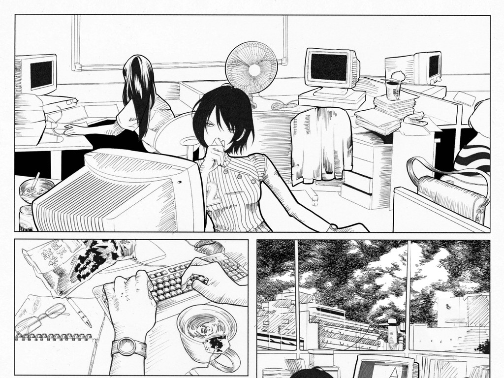
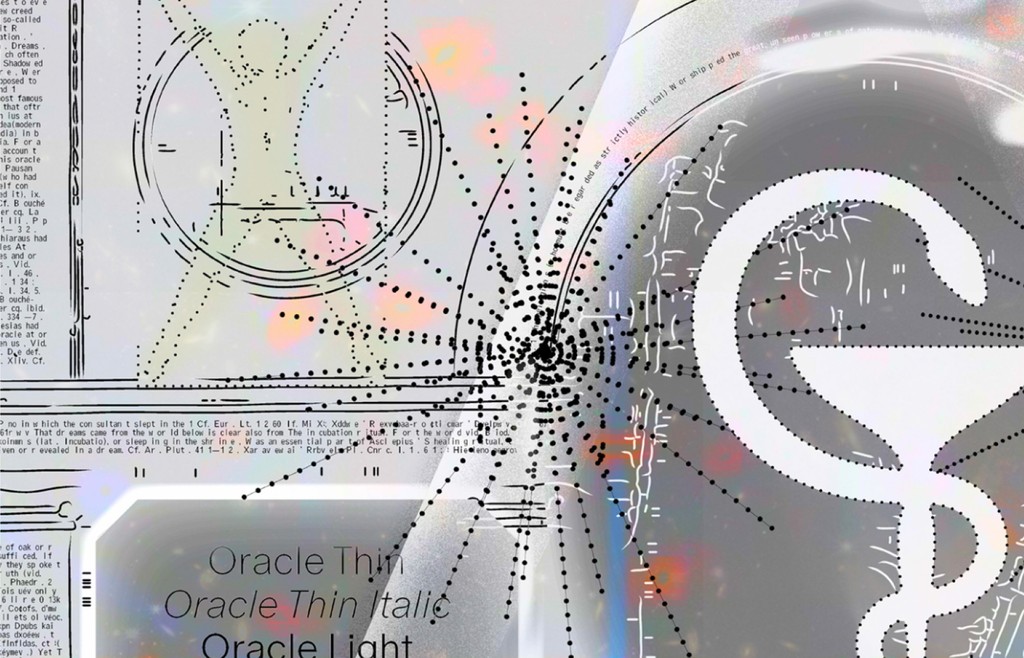
foNTS is our ongoing show on London-based NTS Radio, with music ranging from post rock and indie folk to ambient and dream pop.

Blog Archive
-
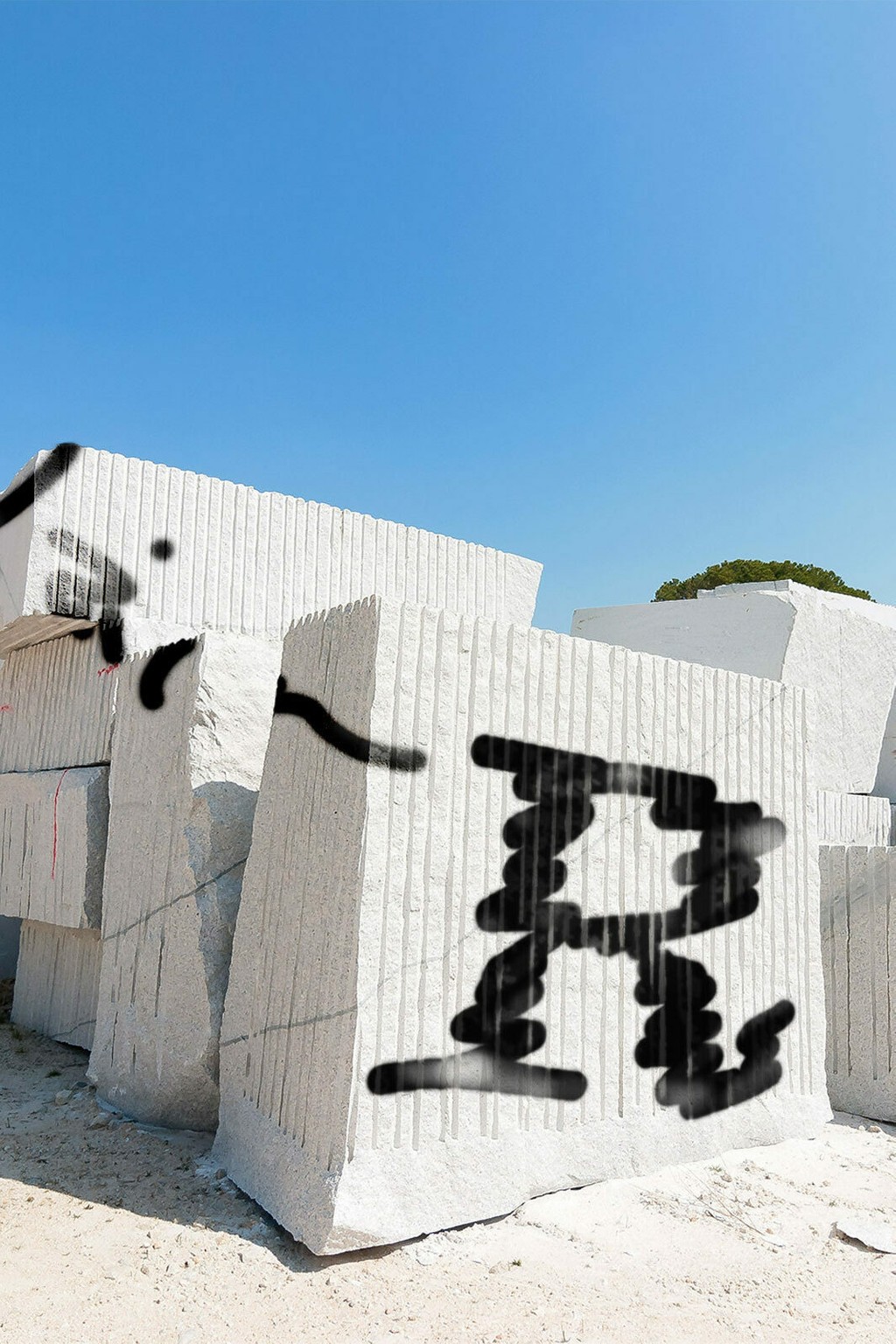
 Gravity always had all the widths, and five years later it has all the weights, too. Super compressed to super wide, super light to super heavy.
 -
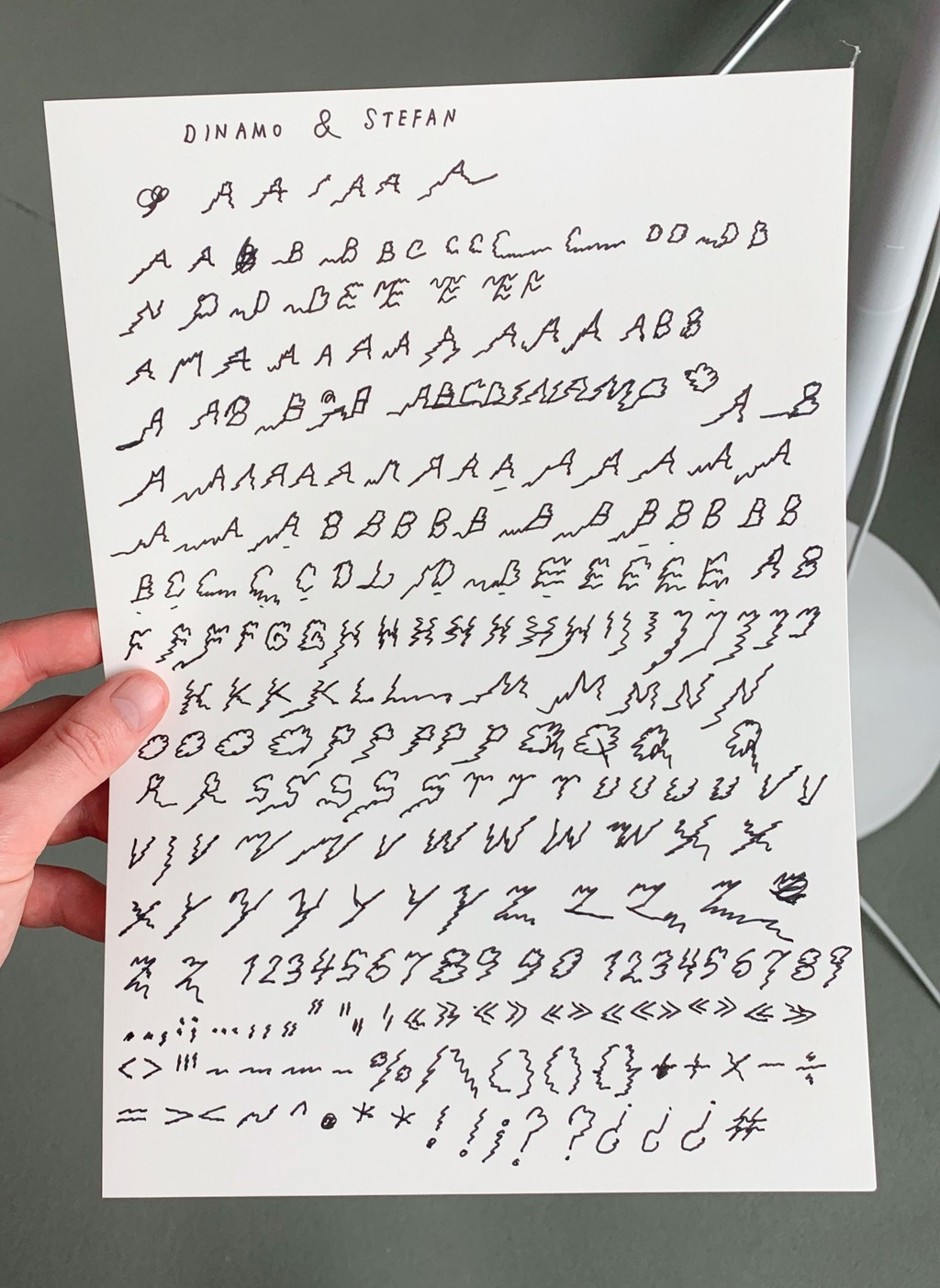
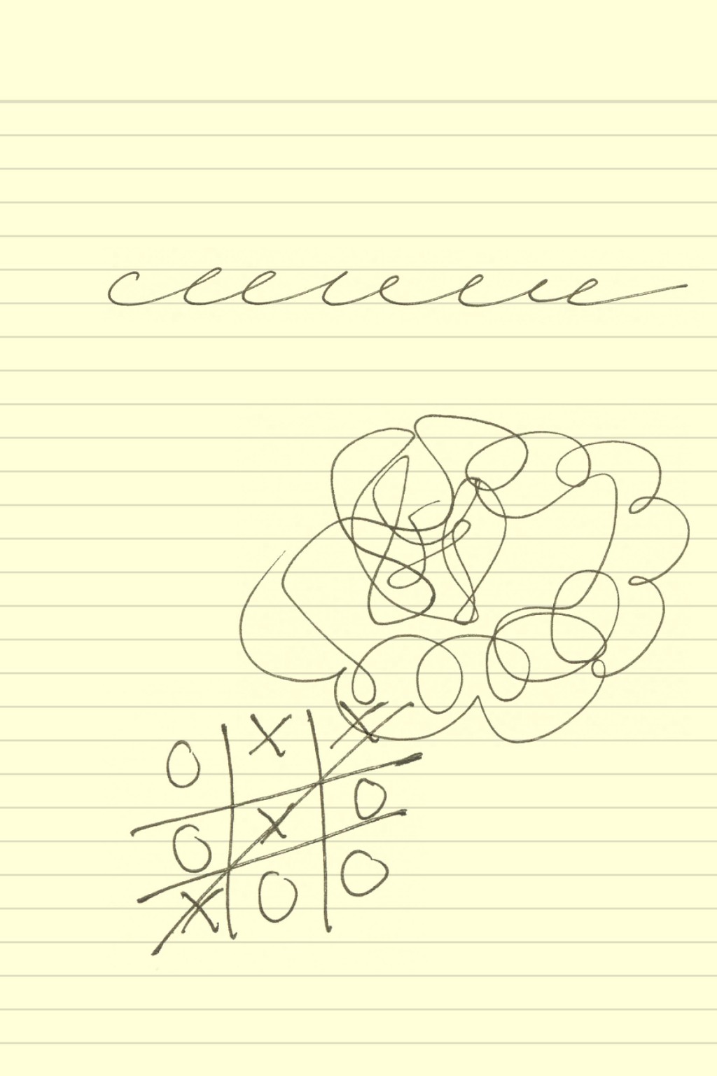
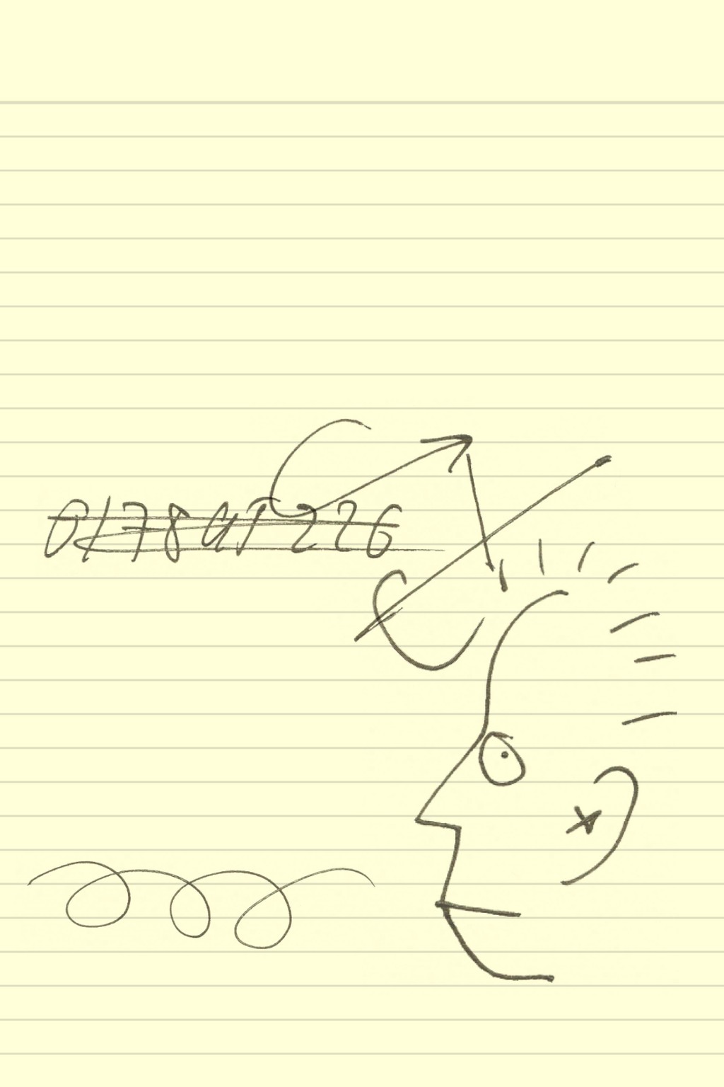
ABC Stefan: Digitizing Artist Stefan Marx’s Handwriting
-
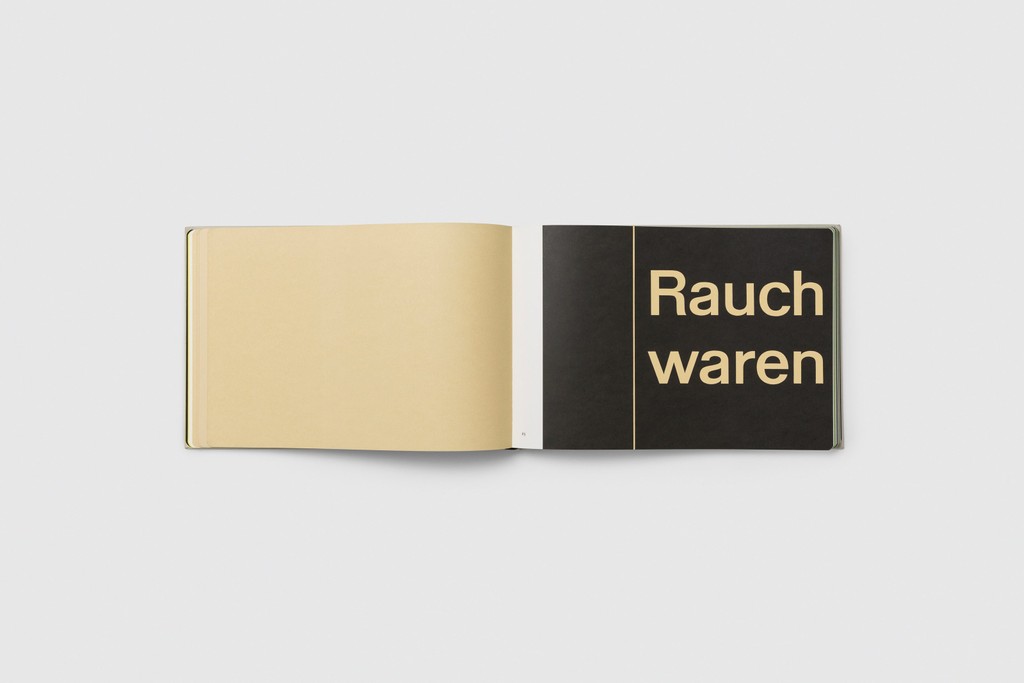
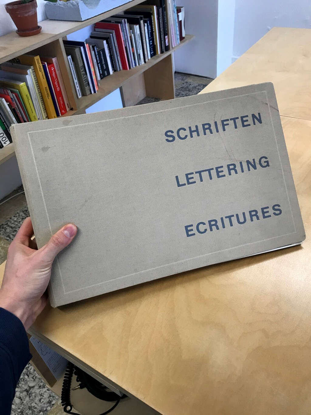
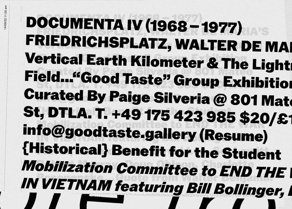
Our Reprint of a Classic Swiss Design Textbook: Lettering by Walter Käch
-
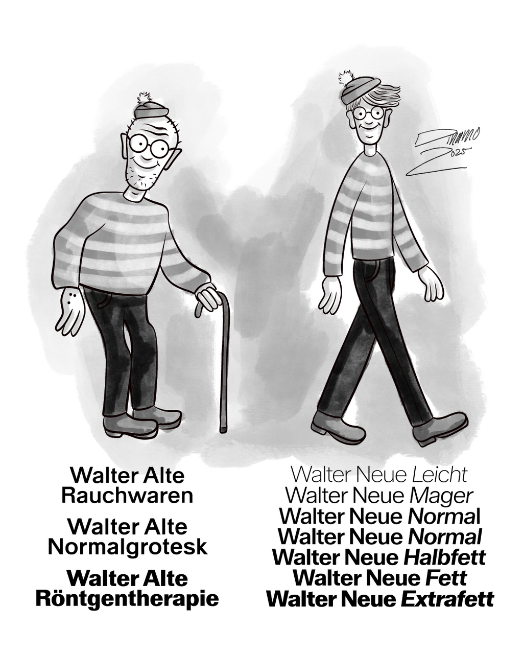
Behind the Scenes: On Walter Käch’s Lettering Manual
-
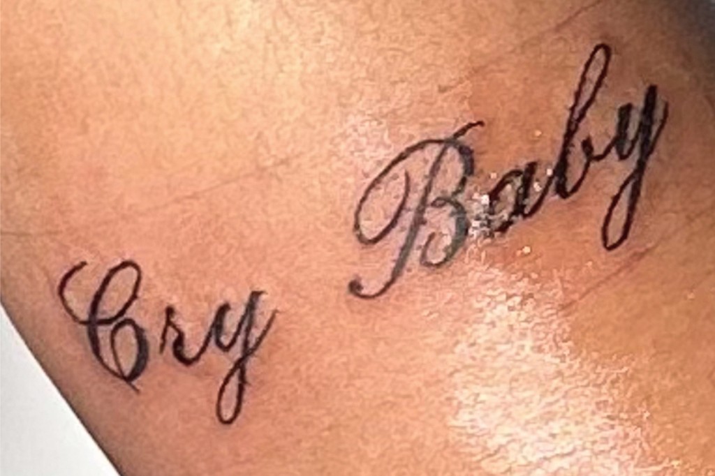
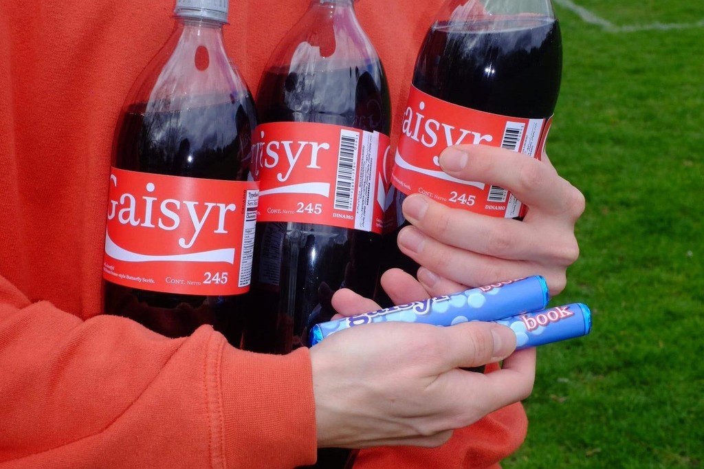
ABC Honeymoon. We tattooed heartbreaking lyrics onto ten people
-
Fonts = foNTS. Our monthly show on NTS Radio
-
ABC Solar: A Highly Customizable Geometric Sans
-
ABC Otto: A Text Typeface For All Things Worth Reading
-
ABC Pelikan: All Letters, Same Height
-
ABC Gramercy. A Beautiful Serif in Three Optical Sizes with Uppercase Swashes
-
Pricing for Culture & Non-Profits
-
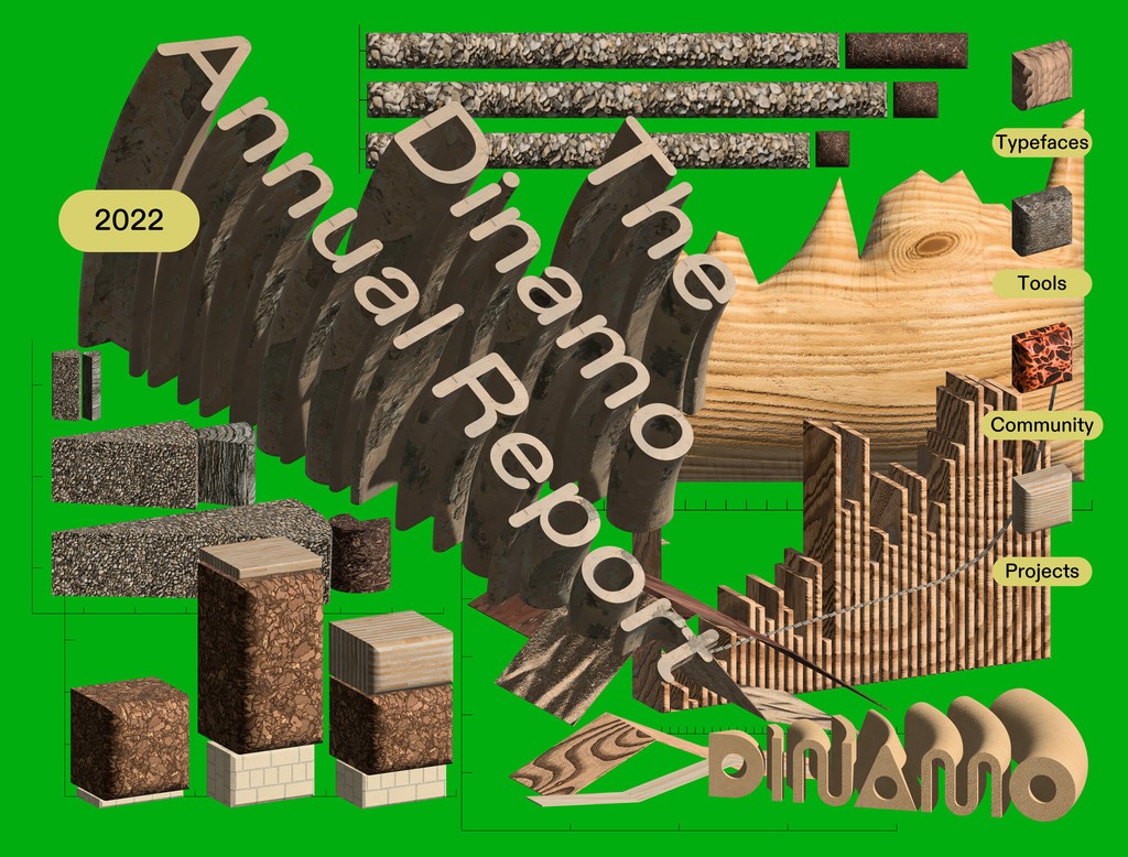
Our Annual Company Report 2023