MIGLĖ Transforms Asfalt Letters into Silver Jewellery
Miglė Kazlauskaitė creates beautiful jewellery from her studio in Berlin. Think earring earplugs, typographic necklaces, amber orbs, and blobby, soft silver rings. I’ve been a big fan of her practice ever since she founded MIGLĖ in 2018 and used an early access version of our Asfalt typeface for her identity.
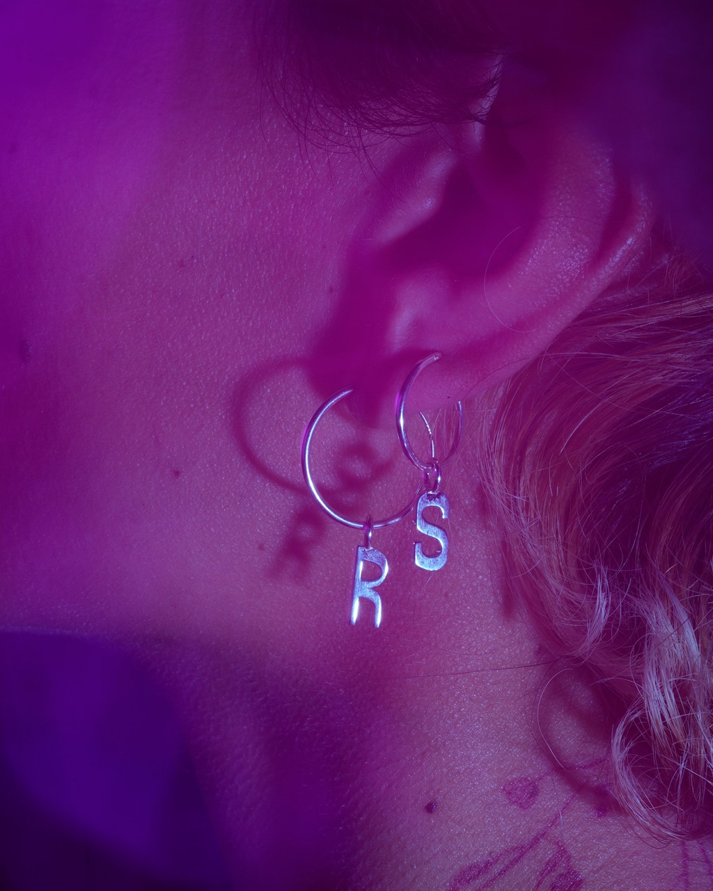
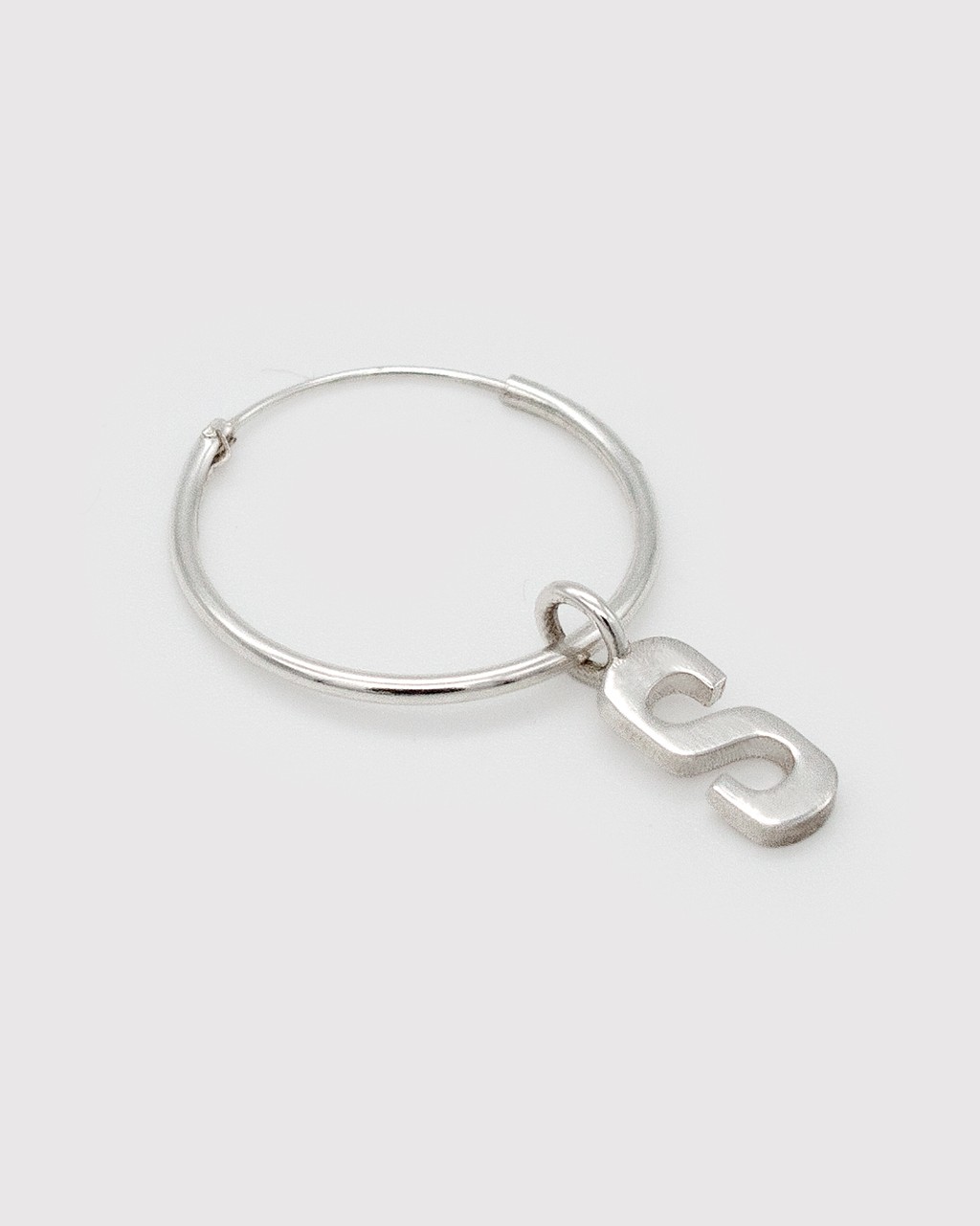
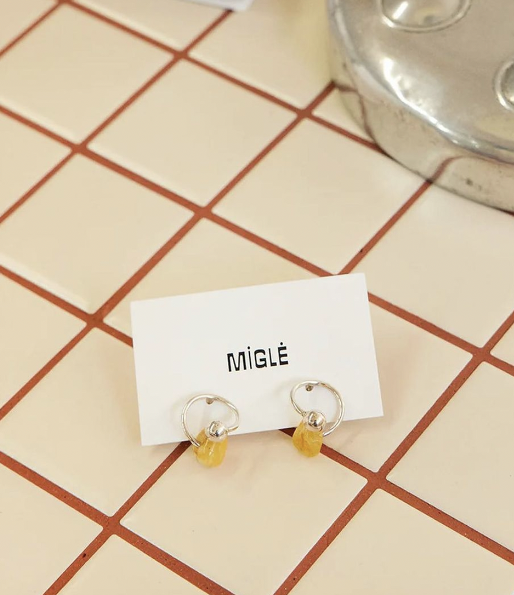
This winter, Miglė has released a new line of earrings, necklaces, and bracelets that transform Asfalt into silver charms. I love them — and highly recommend the pendants as holiday gifts or simply for your own jewellery box.
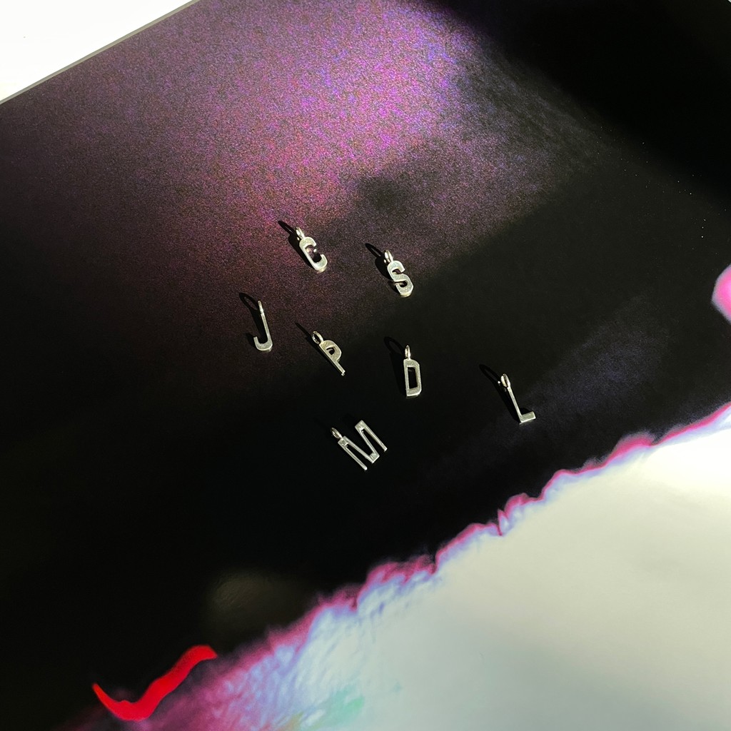
Made-to-order, customers can write with the silver letters or spell out initials using their shapes. Our editor Maddy spoke with Miglė to hear more BTS details — as well as what else the graphic designer-turned-goldsmith has been thinking for the upcoming new year 💅♡
Photograp by Danna Salih
Hey! I really admire your work. How it feels so warm and nostalgic and soft. It’s very much jewellery as artwork <3 How did the idea for creating charms with Asfalt first come about?
I’ve been using Asfalt as my brand typeface since I started MIGLĖ, with the identity designed by Eliose Harris. Dinamo customized the typeface for me at the time. You added an extra glyph, which is my logo, as well as Lithuanian characters.
Then two years ago, Dinamo released an extended version of Asfalt. As soon as I saw it I knew it was a great opportunity to use my own typeface in some kind of jewellery. I’ve already done a typographic project — my Letterchains — and drawing from my own identity was a natural starting point for a second letter product. I love those early 2000s, kitchy necklaces with initials strung on them.
Can you tell me how you turned the 2D letters into silver charms?
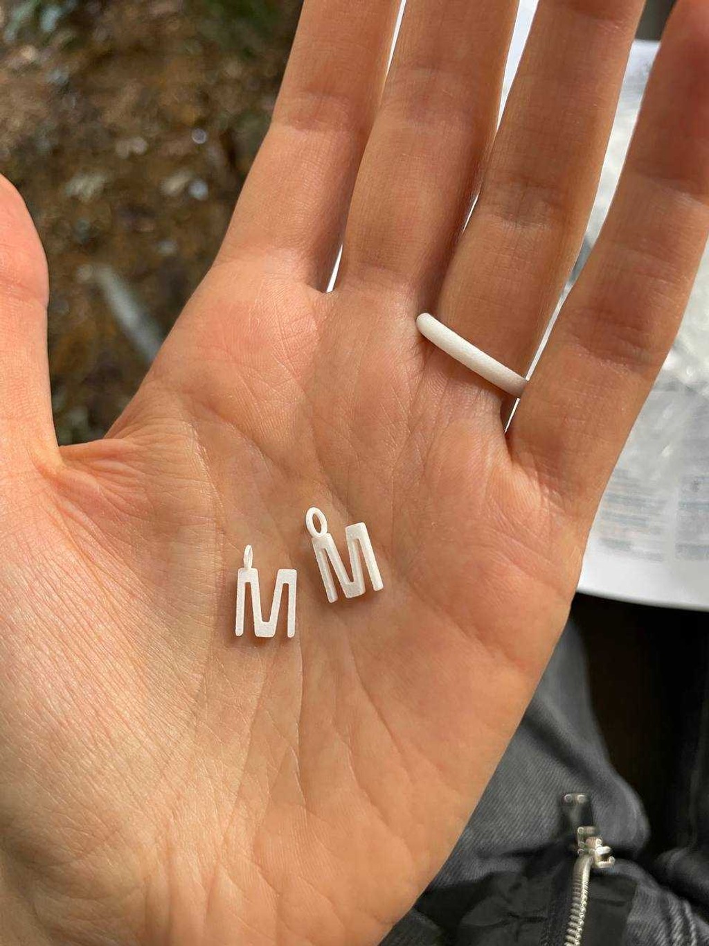
I knew I would keep the letters flat. Asfalt is such a flat typeface anyway, and I didn’t want it to be round. I asked my brother, who knows 3D modelling, to create 3D files of each letter. And then we had to work out from there where to put the little eyelids for the chains on each of the characters. Some of them, like an M, don’t have a middle for them to hang with, so I had to decide where they’d dangle from the left or right stems (I chose the left).
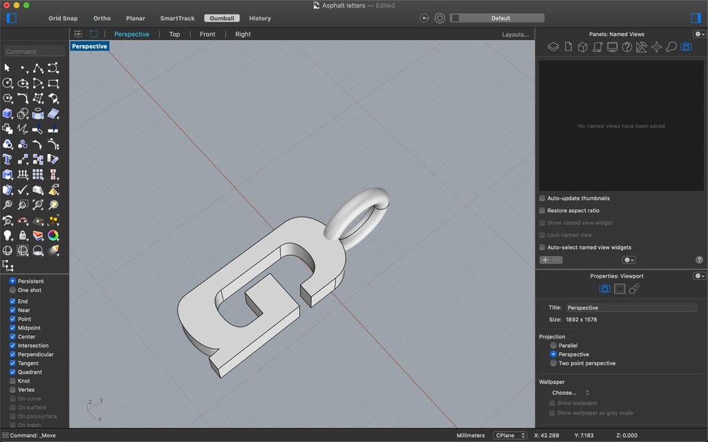
3D font rendering by Kipras Kazlauskas
Wax cast M
There’s two ways I could transform the 3D files into silver objects. I could create moulds for casting — but because it’s an entire alphabet, that’s a lot of moulds to make. So I decided to go for a different process: Wax casting. This way, you encapsulate the wax object in a temporary plaster mould. When you break the plaster, you get the positive.
I always wonder with name related products: What’s the most popular letter?
I had to research this quite a bit! I assumed that the letters would mostly be used for initials and names. First I looked at how old my customers are and then looked at most popular baby names in the 1990s. Just to know what letters I should stock up on. A and J and F are popular. As is M and C. The usual suspects.
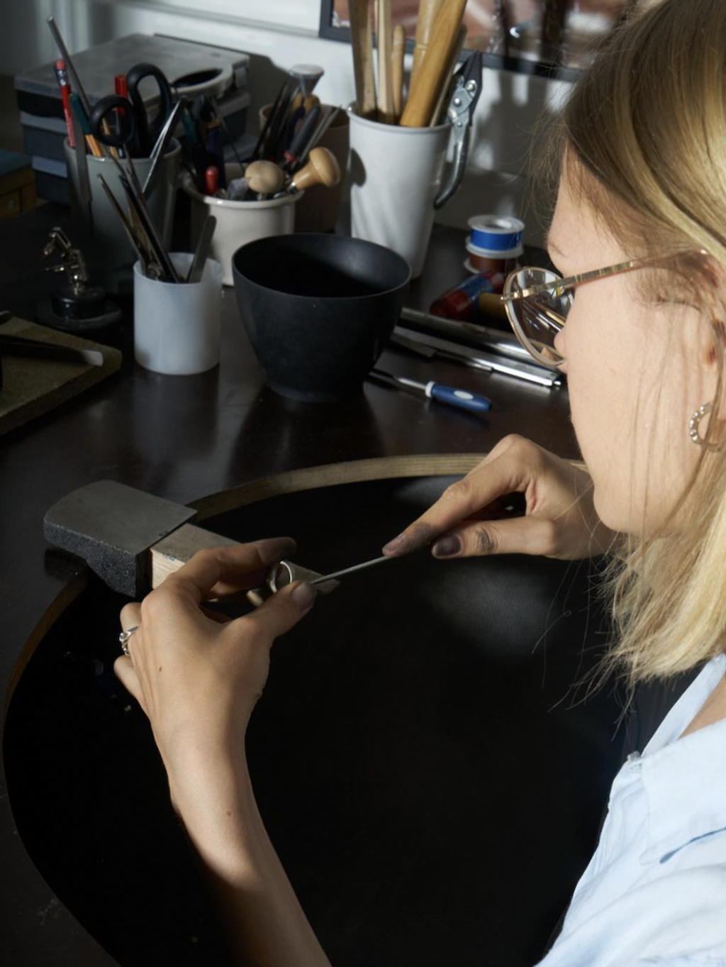
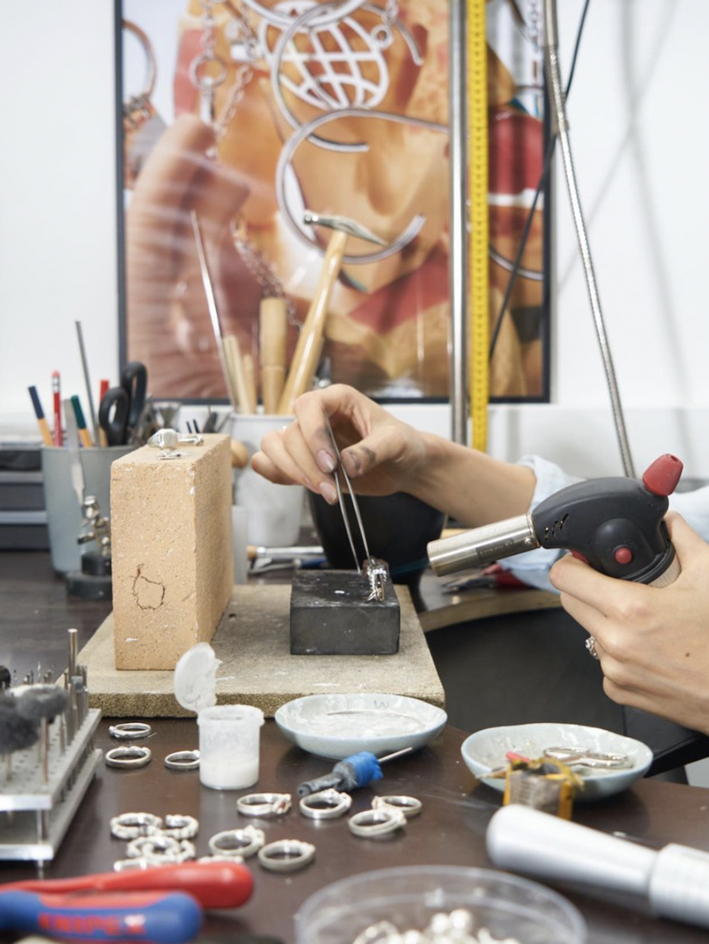
In the studio. Photos by Elena Krukonytė
Any strange places you’ve ever seen your jewellery?
I can’t really think of a weird place but it’s always very nice to see my jewellery in unexpected places. A friend once recognized my pieces on someone – a complete stranger to both of us – at a music festival in Portugal and sent me a picture.
Here’s a strange order, though: A client asked to set her baby's first lost milk tooth in gold and make a pendant of it. I was too curious not to take the commission. So I did it, and she liked it so much that she ordered another one for her husband, with one more lost milk tooth.
I feel like you have a real eye for moods and aesthetic trends, which you subvert or make strange in your designs and campaigns. What aesthetics or trends have really defined this year for you?
I’d say that the “-core” suffix aesthetics define 2023 quite well. Both in the worst way — by labelling any kind of choice someone is making and putting it into boxes — and best, in the way of fuelling humor and reflection.
Speaking of trends, I’ve been listening to a podcast by Zeit Magazine called “Die sogenannte Gegenwart” (“The So-called Present”), hosted by three journalists. At the beginning of each episode they present current trends that they’ve observe and give points to each other based on how much they think those trends are reflective of the zeitgeist. It’s a good podcast!
Anything you’d like to see more of next year?
Less polarization, more unity :)
Thank you MIGLĖ!!