Caroline Calloway Loves (Our) Fonts
This young entrepreneur achieved early fame for writing those long long captions, then for tricking people into her creativity workshops. Then, it was her OnlyFans (as I heard from a friend). Yep, we’re talking about (and with) internet legend and self-proclaimed scammer Caroline Calloway.
Like many others, we’re fascinated by Caroline’s many activities, and so when I saw that she released a memoir using (jaw drop) our own ABC Prophet on the cover, I reached out to her. The Queen of scamming herself was kind enough to reply and share her feelings on the typeface. Plus, the book’s designer Sam West told us about design process. Thank you Caroline and Sam ♥️ It’s been a pleasure.
I fell in love with Prophet after seeing it on the covers of the English translations of Tove Ditlevsen, who’s like the Sylvia Plath of Copenhagen and a real hero of mine. What I like about Prophet (besides reminding me of one of my favorite female memoirists!) is the way that it looks both machine-made and hand-written all at once. The crisp-edged, sans serif, Helvetica-like letters bring to mind the fonts of emails, Tweets, and Instagram captions. While the carved-out, sliced-off, more calligraphic characters remind me of penmanship, first drafts, and the Lydian craze of every book cover in America in the 1950s.Caroline 🌺🐍
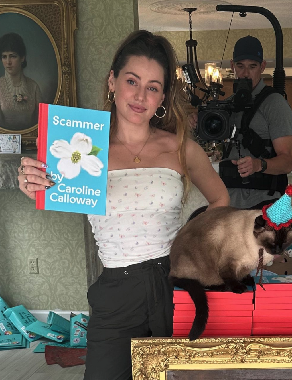
BTS with Book Designer Sam West
The book cover is very bold and evocative. I appreciate the simplicity of a single icon, type, and a flash of colour. Can you tell me about the overarching concept?
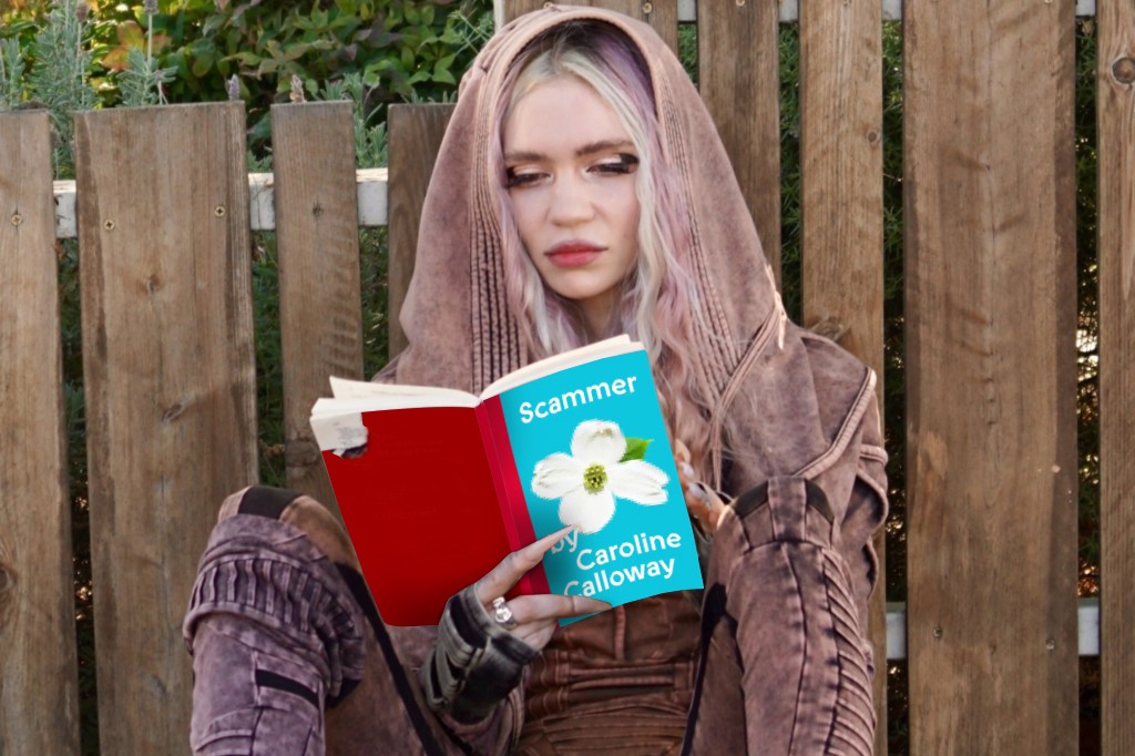
Caroline has been using some iteration of this cover since she first announced her memoir, long before we met. First there were flowers, then sunglasses, then flowers and sunglasses, until finally just the isolated dogwood remained — the flower of Caroline’s home state, Virginia. Knowing Caroline both as a friend and a collaborator, it was clear how the dogwood is significant in Caroline’s origin story. I wanted to explore abstracting and obscuring it, the way her story and life have been online (by herself, her peers, and strangers alike).
We went back and forth for weeks but finally landed on the inclusion of “by” in the cover attribution, “Scammer by Caroline Calloway.” We know it’s an uncommon book cover design choice but wanted to underscore her reclaiming the title of scammer (both literally and figuratively).
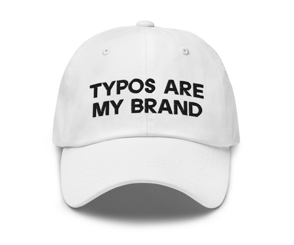
Hat designed by Sam West and Caroline Calloway using ABC Prophet
How did you and Caroline work together to create the overall design?
Caroline and I have been working together for nearly two years and have developed a working relationship like no other. Mostly two-hour-long FaceTimes between Florida and New York and her frantic descriptions and my frantic notetaking. Caroline has a pretty clear idea of what she wants when we begin a project, and she will send me dozens of iPhone pictures of her sketches. Most of my work as Caroline’s designer and illustrator is distilling her ideas and executing them in a way so as to build her brand and help her visualize the “Caroline Calloway cinematic universe.”
Could you describe how the written story is felt in the cover?
Caroline’s story, while one that’s deeply human and fleshy and extremely intimate, is also one that is inextricably linked to the internet. Scammer explores Caroline’s experiences with sexuality, addiction, loss, betrayal. These concepts traditionally manifest in the real world but Caroline’s story largely takes place on or near the digital one. So we used a typeface that felt as if it could belong in both the online and offline world and pixelated a naturally beautiful and organic shape, obscuring the details ;)
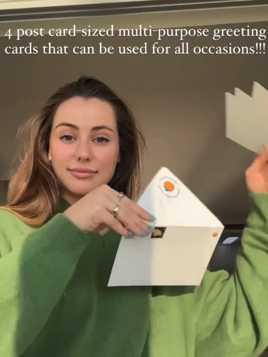
More Prophet in Use
Lastly, could you tell me a bit more about your thinking in using Prophet? Not just for the book, but also Caroline's online web identity, too?
Caroline had been using ATF’s Lydian for a long time, way before we met. It’s bookish! But when it was finally time to begin designing for Scammer, we wanted to try something new, something that better complemented the story she was telling. Caroline had seen Prophet used on the covers of Tove Ditlevsen’s English translations and was immediately drawn to them, and when she first told me, a longtime Dinamo fan, I immediately began testing trial fonts on the cover drafts. We both loved its dynamism (;)) and the way it balances a handmade and mechanized feel all at once — it resonates with the content of the book in a way no other typeface could. When I finished the cover, I thought to myself it looked like a sort of epitaph, punctuation on a story that was a long time coming. She bought the license faster than I’ve seen her do almost anything.