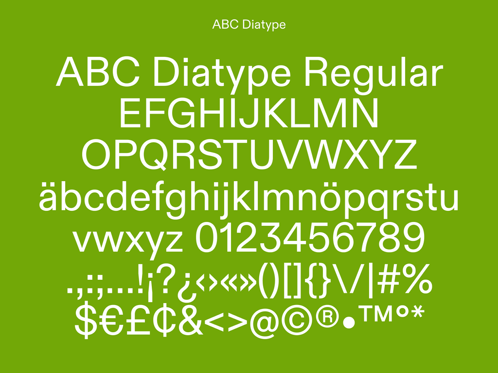
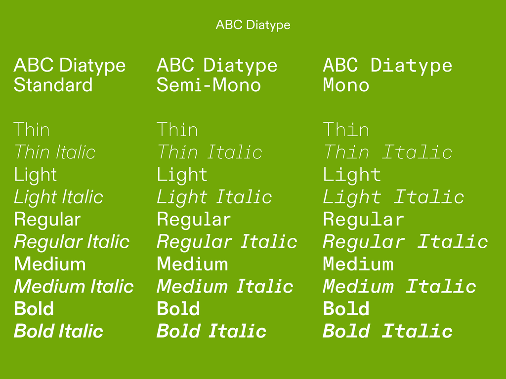
Typeface Release: ABC Diatype
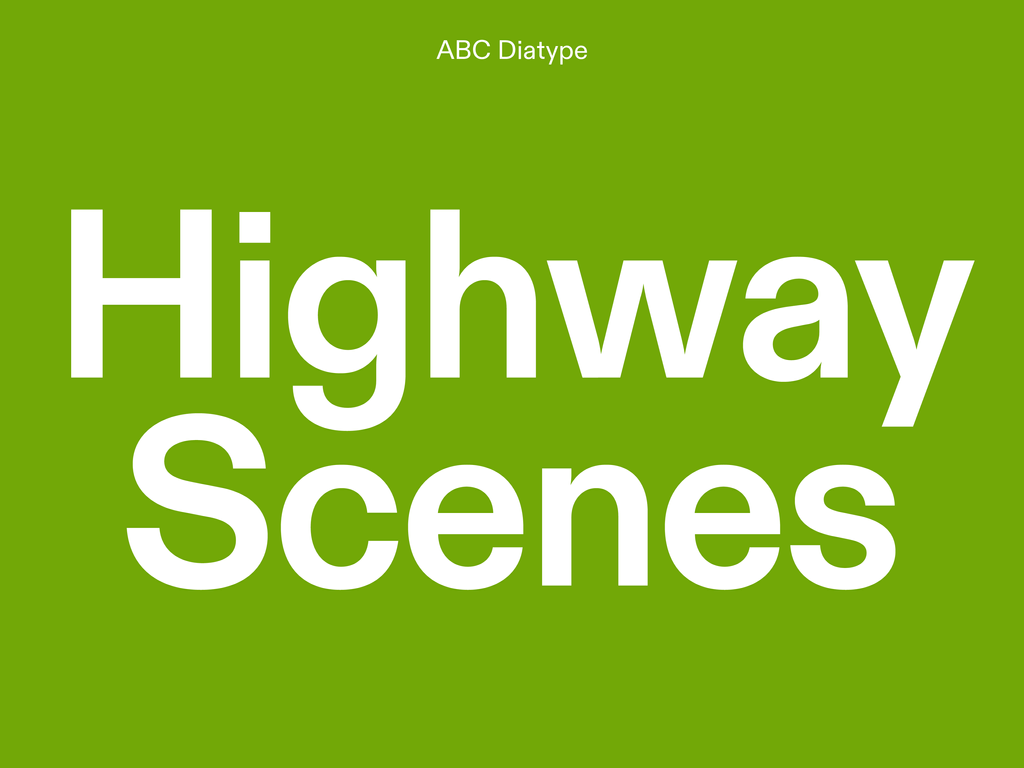
ABC Diatype is a warm yet sharp grotesque, ideal for text and reading on screen. We’re releasing it today to occupy an unfilled spot in our library as our first warm-hearted grotesque. It began its life during Fabian Harb’s student days, as an eager exploration of the Swiss Neo-grotesque genre; its name harks back to the clunky, pre-digital typesetting machines that informed its shapes. After a variety of versions created by Fabian for different school projects, ABC Diatype then transformed into a slightly lighter Regular. A while later, it had its curves polished, and finally its terminals were closed horizontally.

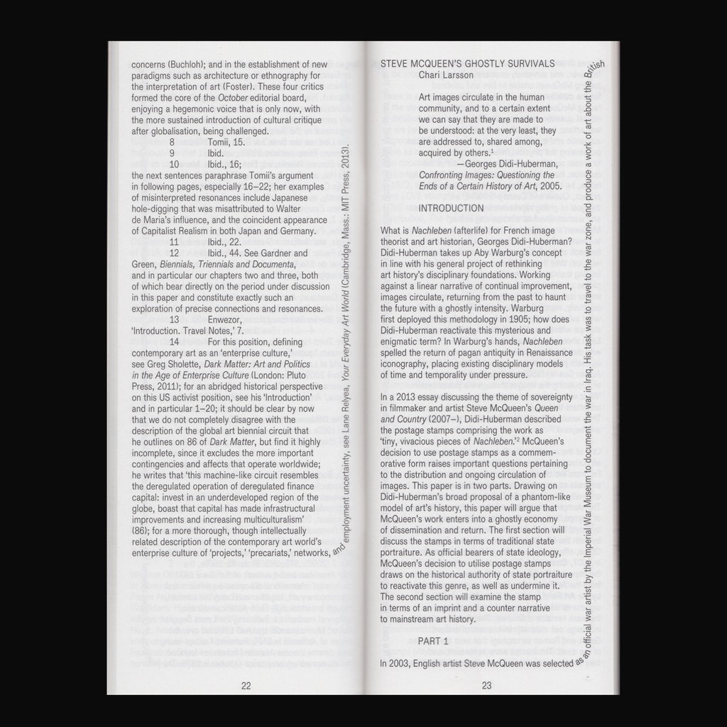
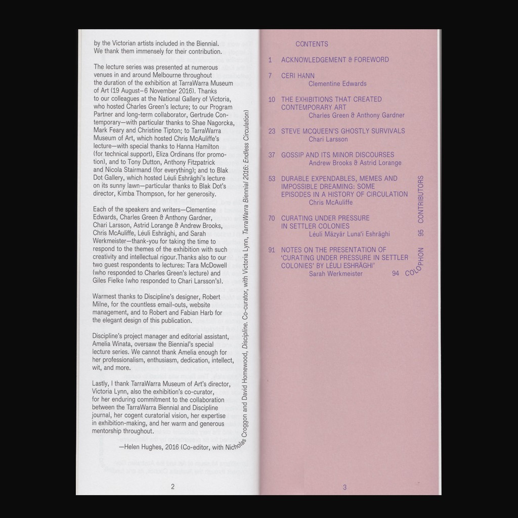
ABC Diatype made its first public appearance in 2013, featuring on posters for Oslo10, a temporary exhibition space in Basel, designed by graphic designer Dan Solbach. Dinamo friend Rob Milne uses it for the Melbourne-based contemporary art journal ‘Discipline’, and the Milan studio Dallas also used it for its identity for Istituto Svizzero in 2017.
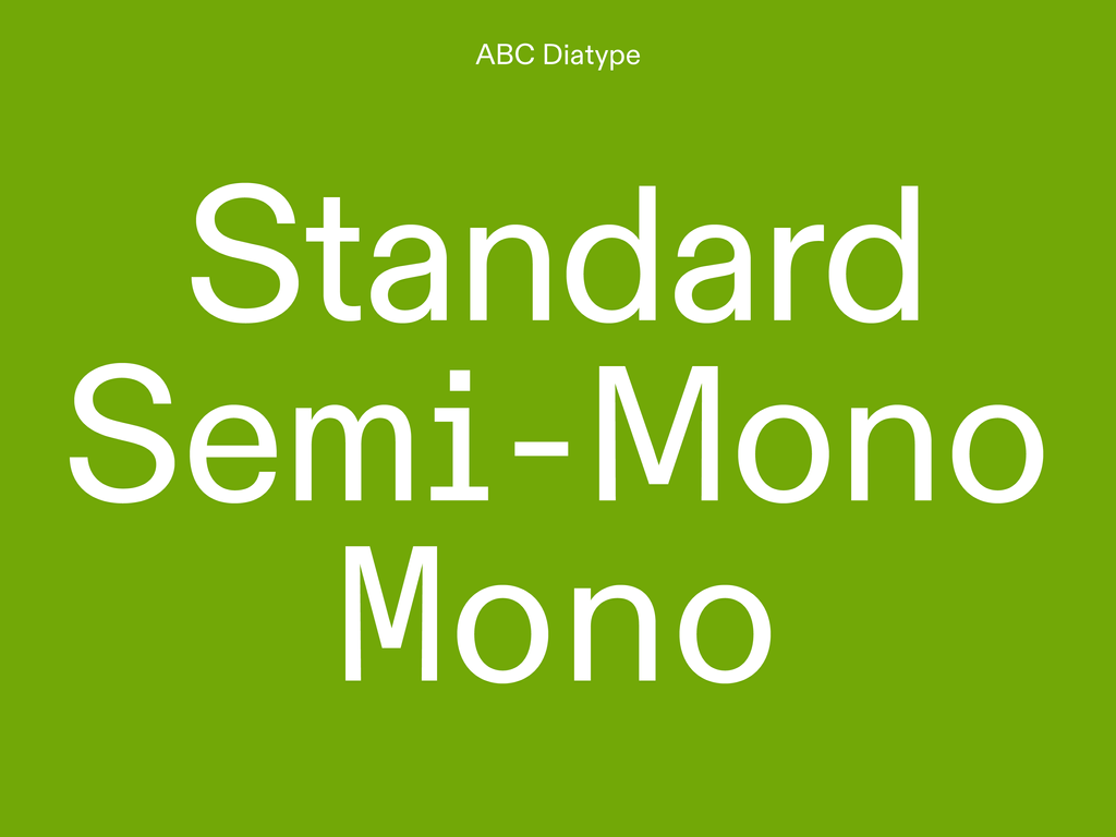
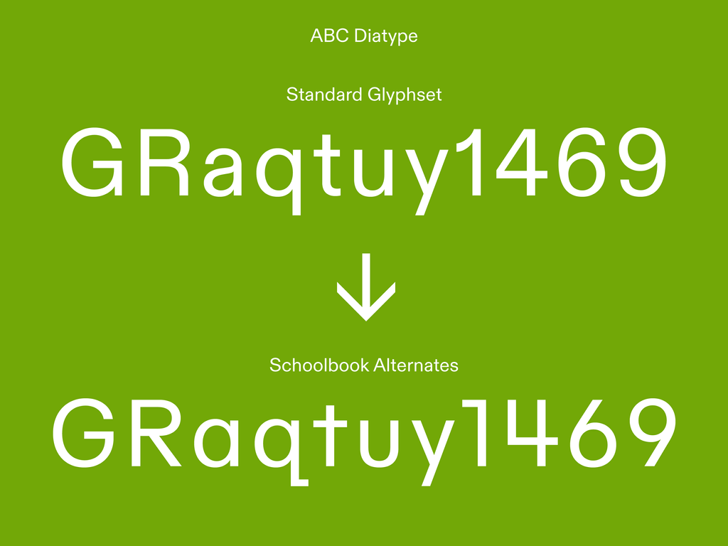
In 2018, Dinamo’s long-standing family member Elias Hanzer finished ABC Diatype by extending the single weight Upright and Italic design to a family with Light, Regular, Medium, and Bold, with corresponding Monospace and Italics. A Schoolbook Stylistic Set is also available, which includes a single story a, a tombstone-style t, and simplified numbers that rise diagonally.
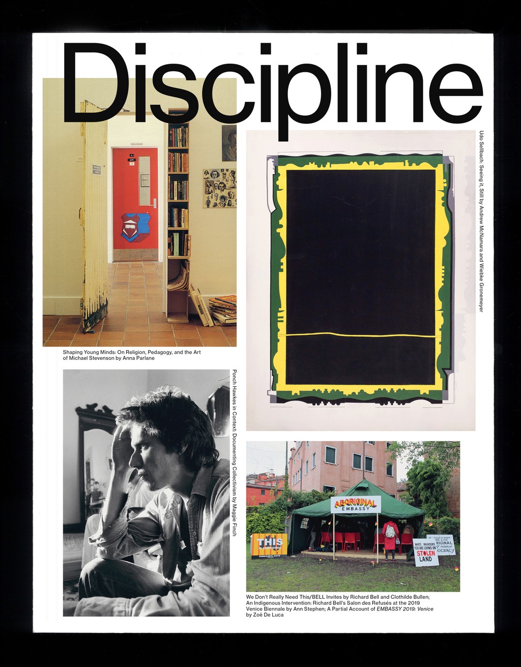
'Discipline,' issue 5, edited by Helen Hughes and David Homewood. Designed by Robert Milne using ABC Diatype
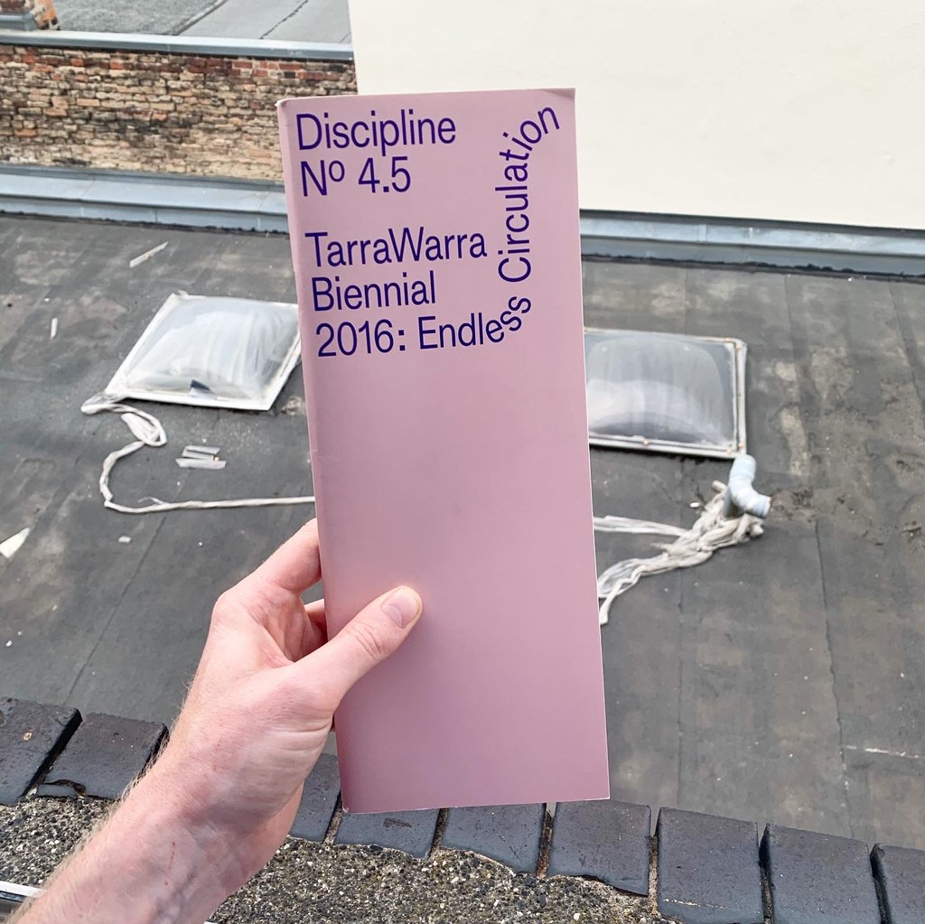
'Discipline,' issue 4.5. Designed by Robert Milne in 2017 using ABC Diatype

Credits
Design: Dinamo (Johannes Breyer & Fabian Harb, with Elias Hanzer)
Kerning and Spacing: Igino Marini
Production: Dinamo (Robert Janes)