Typeface Release: ABC Maxi
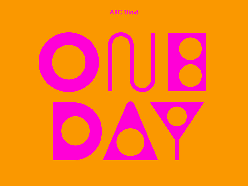
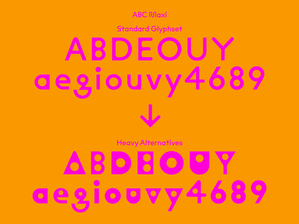
ABC Maxi is a heavily-engineered yet warm and witty type system of spaghetti movements and angular lines. Its familiar shapes, informed by the long history of the International Style, can be newly exaggerated and emboldened by way of variable font technology.
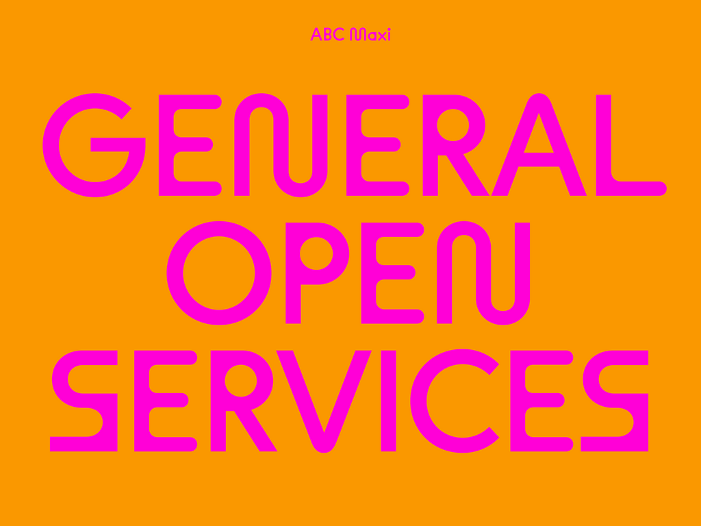
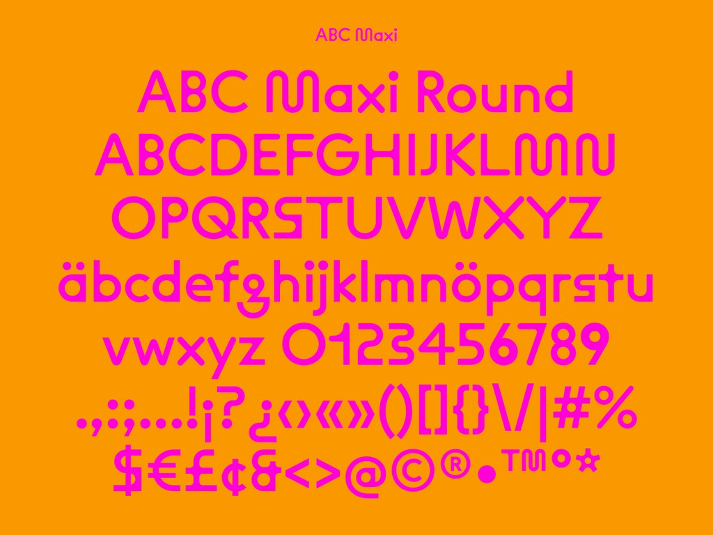
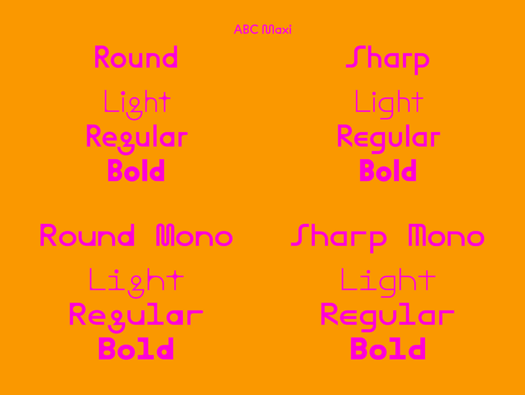
With an underlying skeleton referencing mid-century and post-modern Swiss designs—including Josef Müller-Brockmann’s CWS word mark (1958) and Marlyse Schmid and Bernard Müller Swatch logo (1981)—Maxi’s forms can by altered and animated by the user, stretching from Hairline to Black to everything in-between. While designing the font, we were interested in how subtle manipulations in shape could affect the tone of the overall typeface. To explore this further, we created two stylistic variations for emphasis, rather than a standard Italics. Four subfamilies of the font are therefore available: Round, Round Mono, Sharp, and Sharp Mono.
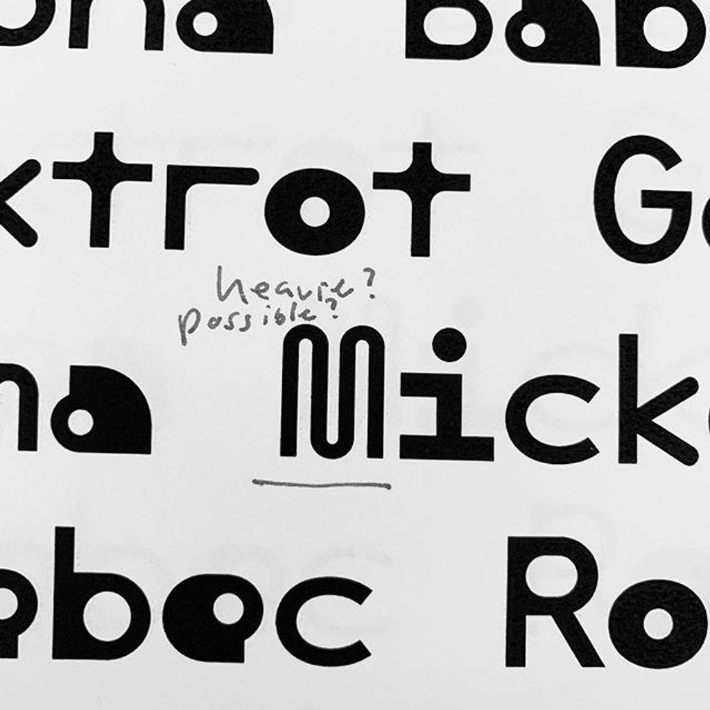
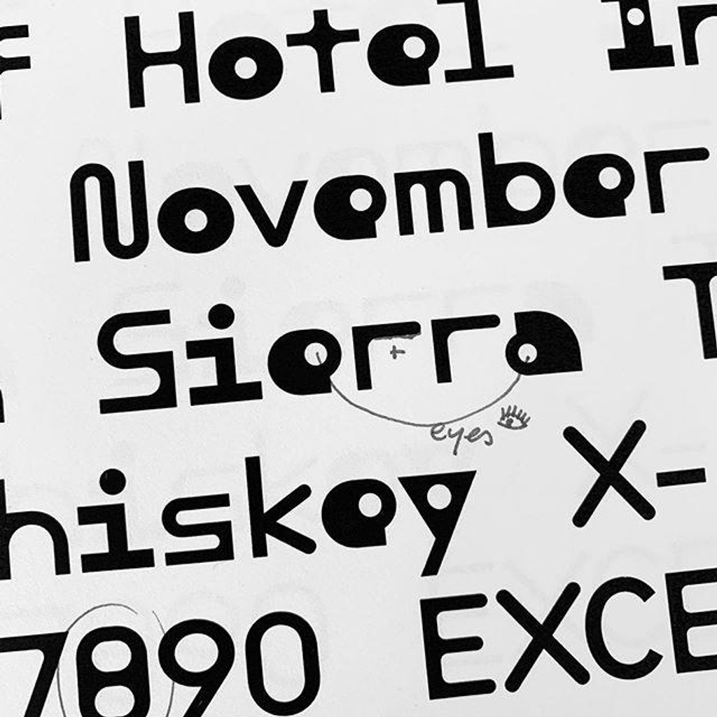
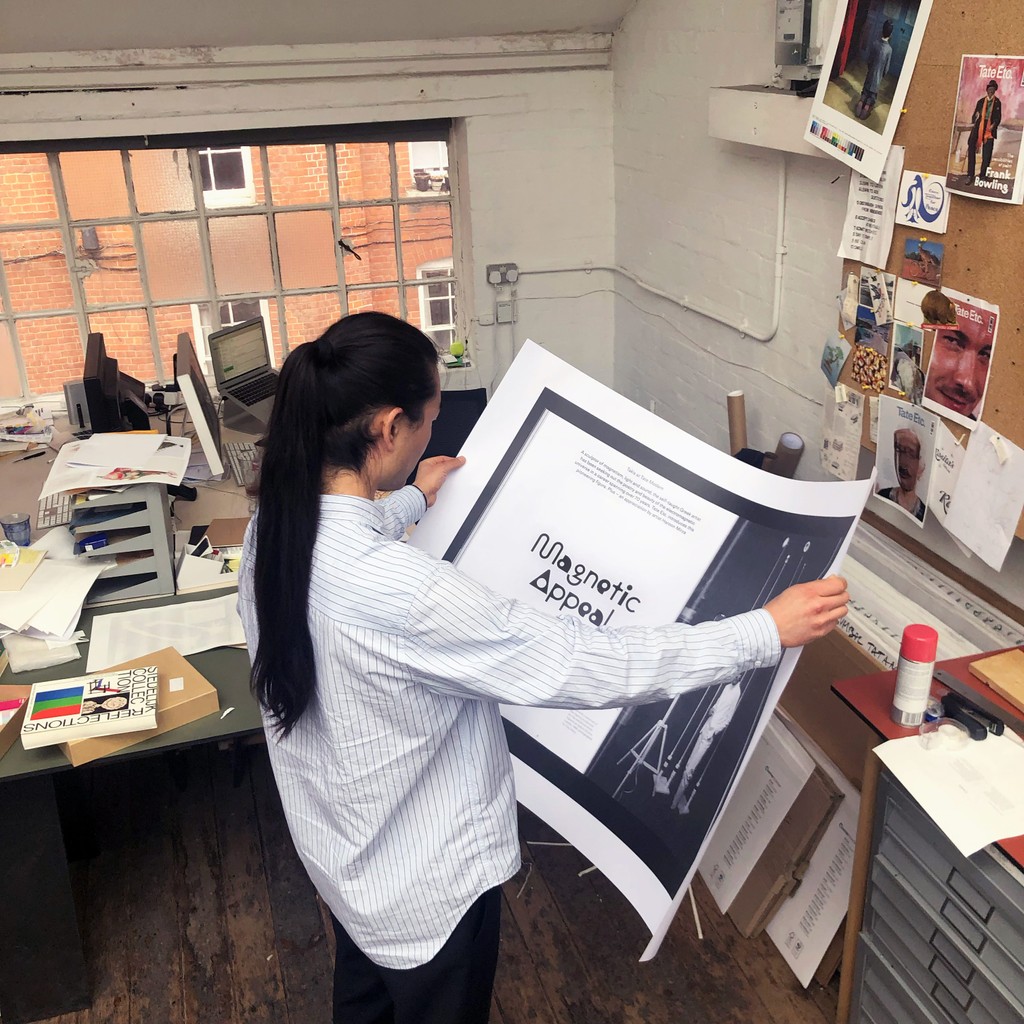
Proofing process while working on ABC Maxi
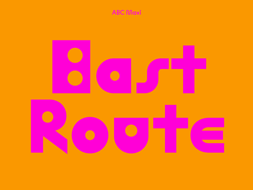
ABC's Sharp and Round subfamilies have a basic monolinear, rational, and geometric style, gesturing to 1920s experiments in “universal typography” by Herbert Bayer and Jan Tschichold. The Sharp families melds transitions into solid, boxy joints—a futuristic look, some might say, that creates subtle tensions in longer texts. ABC Maxi's Round subfamilies go a step further: Inspired by Max Bill’s 1960s theories of legibility—in particular, the notion that emphasizing vowels eases readability—the font’s own vowels and diagonal shapes are rendered disproportionately bold and blocky.
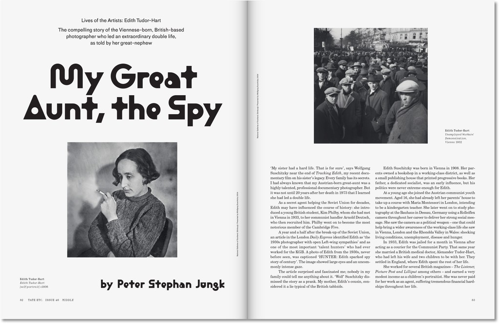
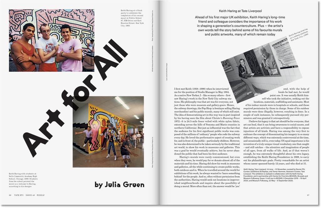
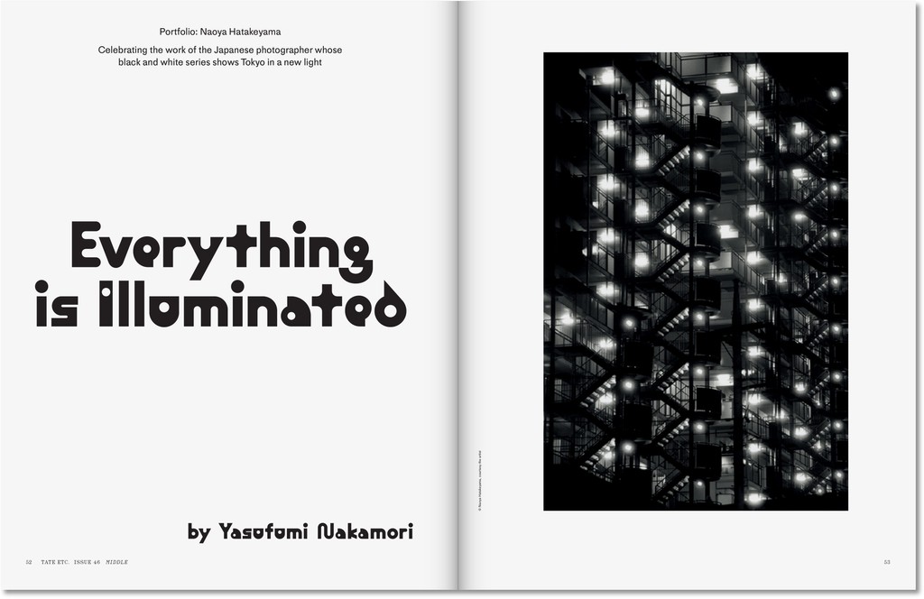
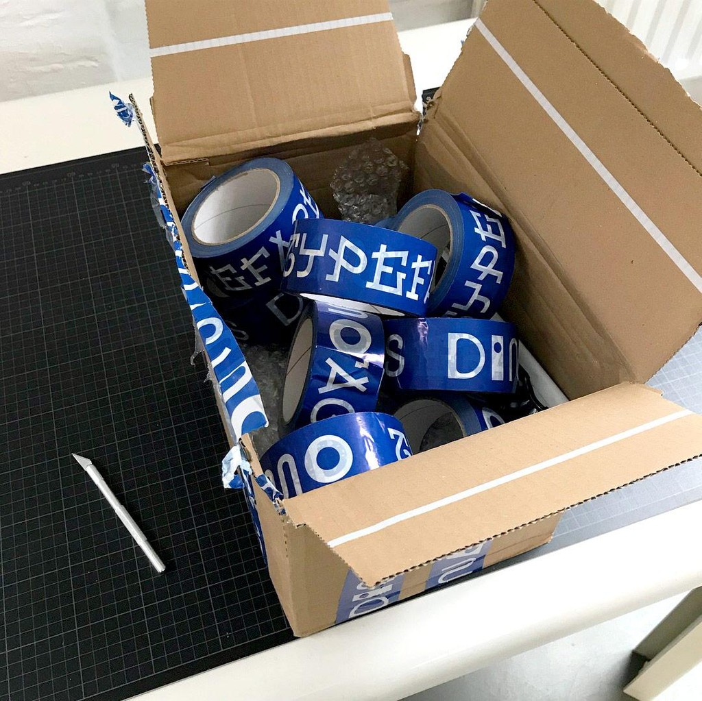
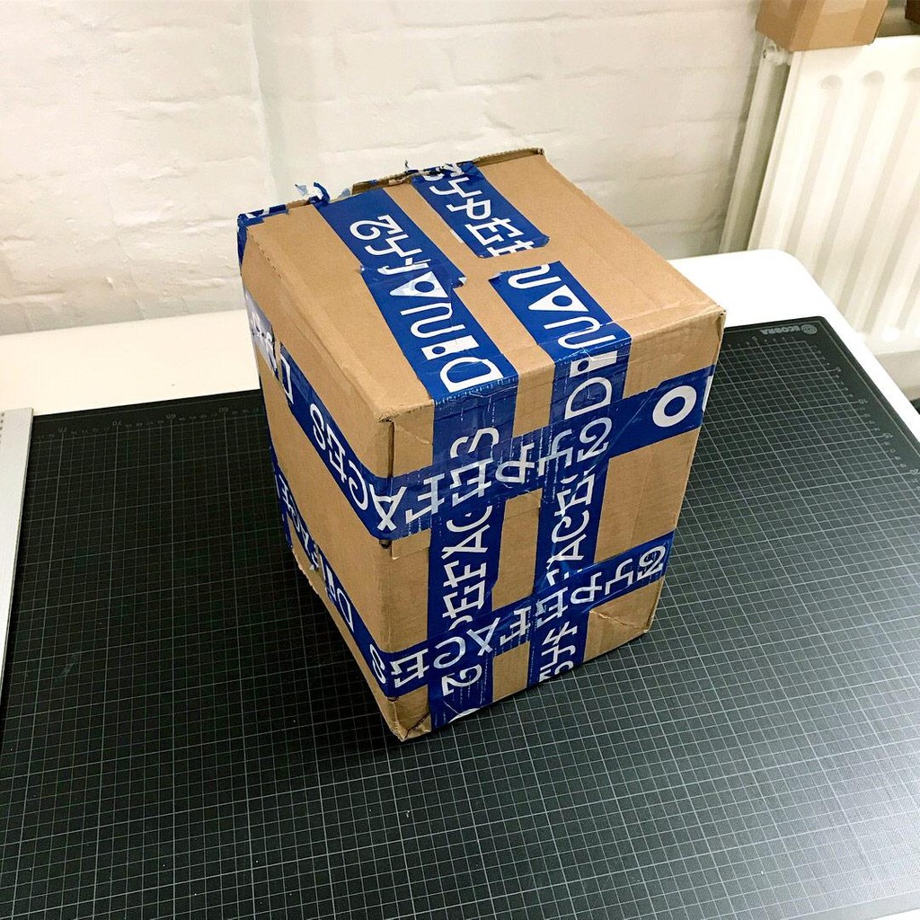
The first iteration of Maxi emerged through digitizing Bill’s own experiment in 2016, and we used the initial design for our Dinamo logo and our special packaging tape. The following year, we combined this skeleton with ABC Favorit lowercase letters for the opening titles of Joji Koyama's film KURO (2017). ABC Maxi evolved further in 2018 in collaboration with our intern Risto Kujanpää; its latest iterations have found themselves on posters by common-interest and as the headline typeface in Studio Ard’s design for London’s 'Tate ETC' magazine.
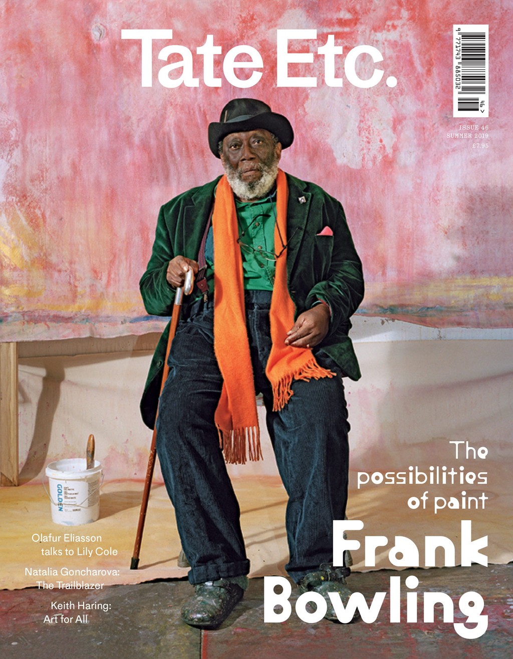
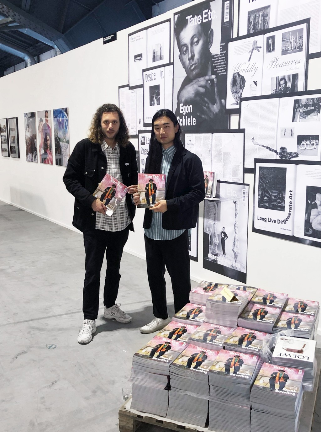
'Tate Etc. issue 46. design by Studio Ard
ABC Maxi’s latest iteration, and development into a typeface system that merges “International style” shapes with contemporary variable font technology, has been supported through conversations with Erich Schmid from the Max Bill Foundation, as well as Bill and Jan Tschichold experts Hans Rudolf Bossart and Jonas Vögeli from the Müller Brockmann Foundation.
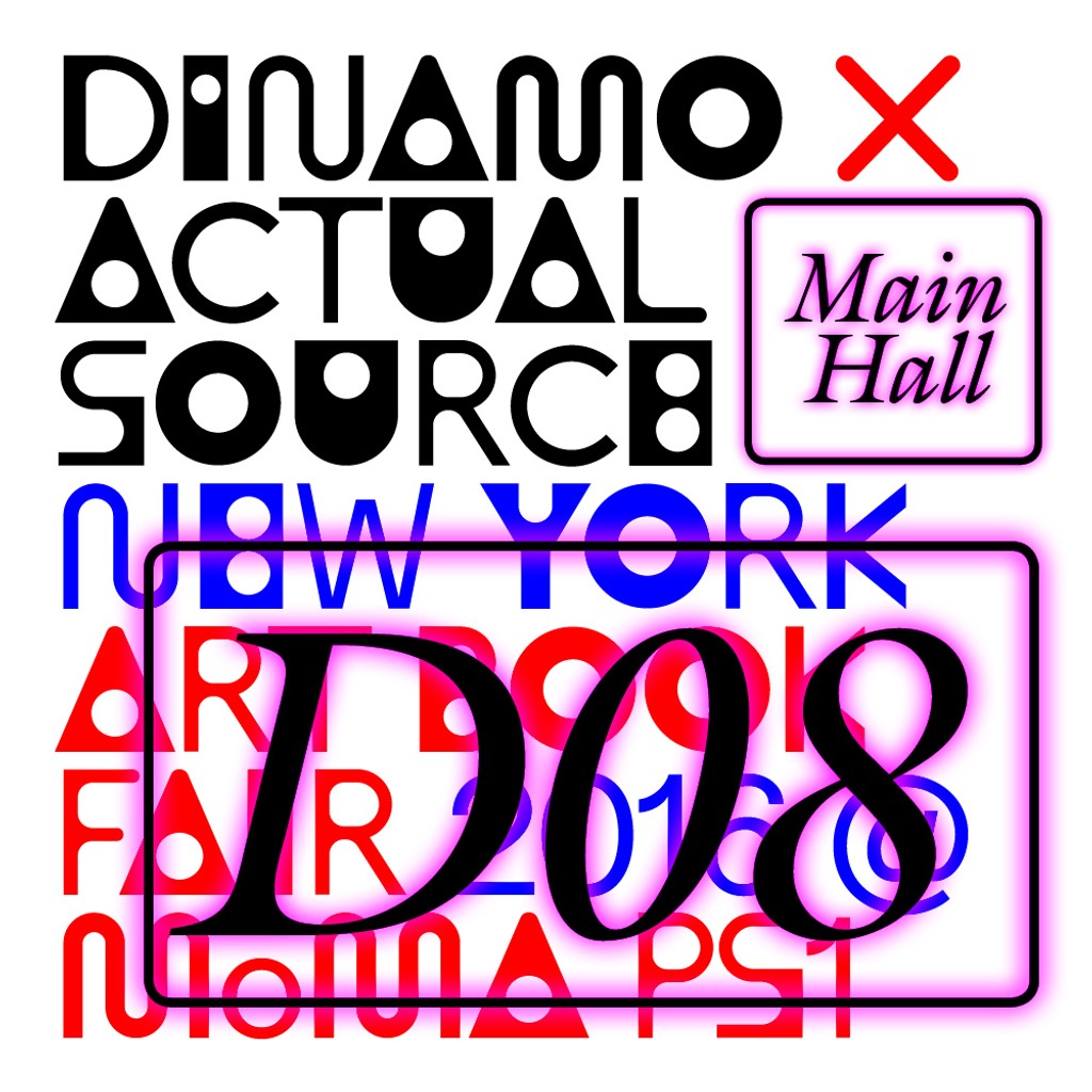
Flyer for the shared booth of Actual Source & Dinamo at the New York Art Book Fair 2016, which used an early version of ABC Maxi
Credits
Design: Dinamo (Johannes Breyer & Fabian Harb, with Andree Paat)
Spacing and Kerning: Igino Marini
Production: Dinamo (Robert Janes)