Solar: A Highly Customizable Geometric Sans
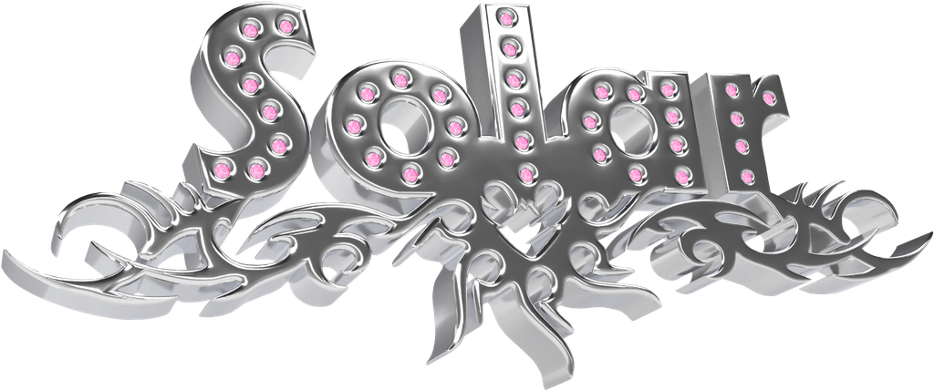
New year, new font :^) ABC Solar is a highly customizable geometric sans with a large weight spectrum and matching italics. You can change how it looks by selecting from a huge range of alternates (like a make-up kit) — and by choosing between straight or angled cuts.
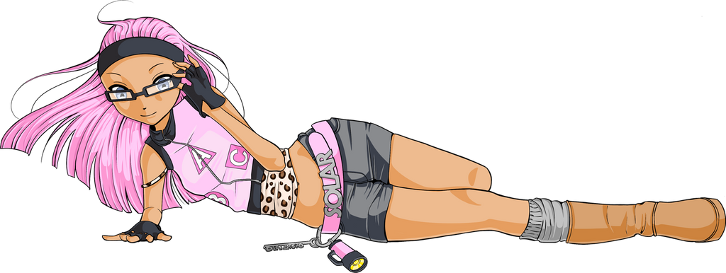
Bye bye Snail/Demure/Tomato/Rat/Lazy Girl and friends… it’s 2025 and Solar Girl has entered the scene. And oh boy she really loves the fonts!
ABOUT
It’s giving Kabel, Vogue, Metro No. 2, Johnston, and Erbar-Grotesque plus Futura of course, but if I’m calling it what it is, Solar lives in—no, she owns—that space between Remix and Homage of all the above—with a dash of type designer Renan Rosatti’s own poetic license thrown in.
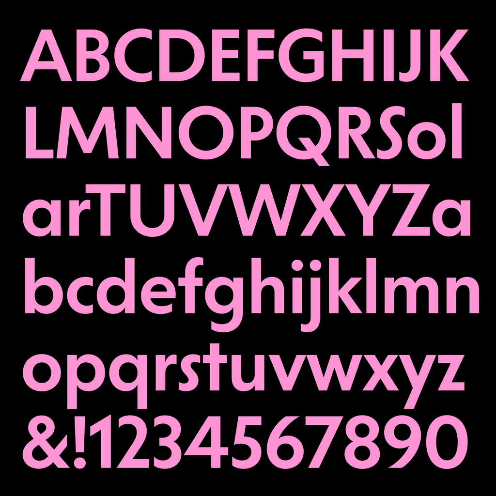
Solar is essentially a geometric sans for text and display; its multiple alternates can be picked from and mixed together, with 18 stylistic sets referencing various geometric and humanistic typefaces from the early 20th century.
The Solar subfamily is made for legibility and functionality, while Solar Display has been imagined for tight and punchy headlines.
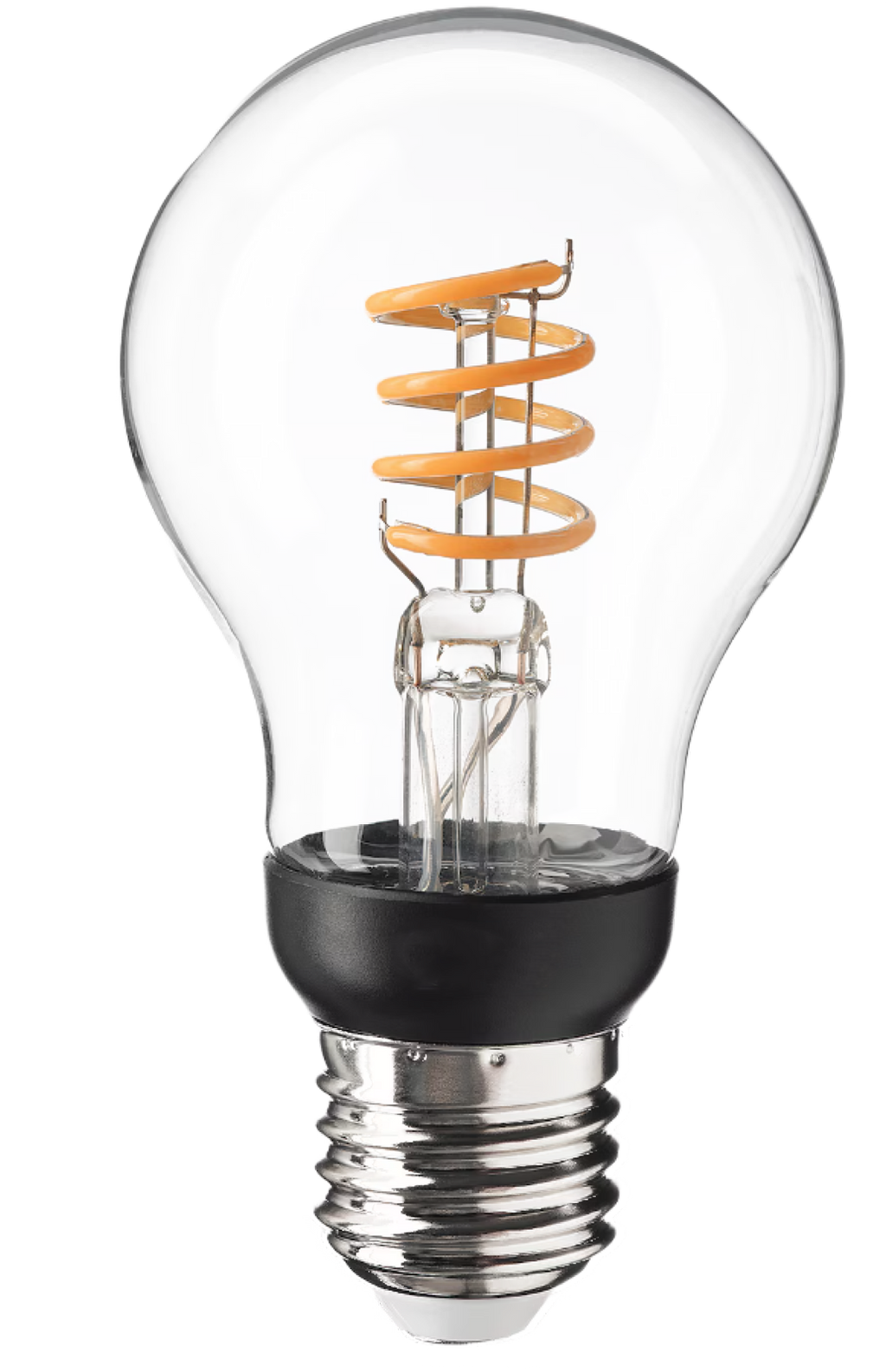
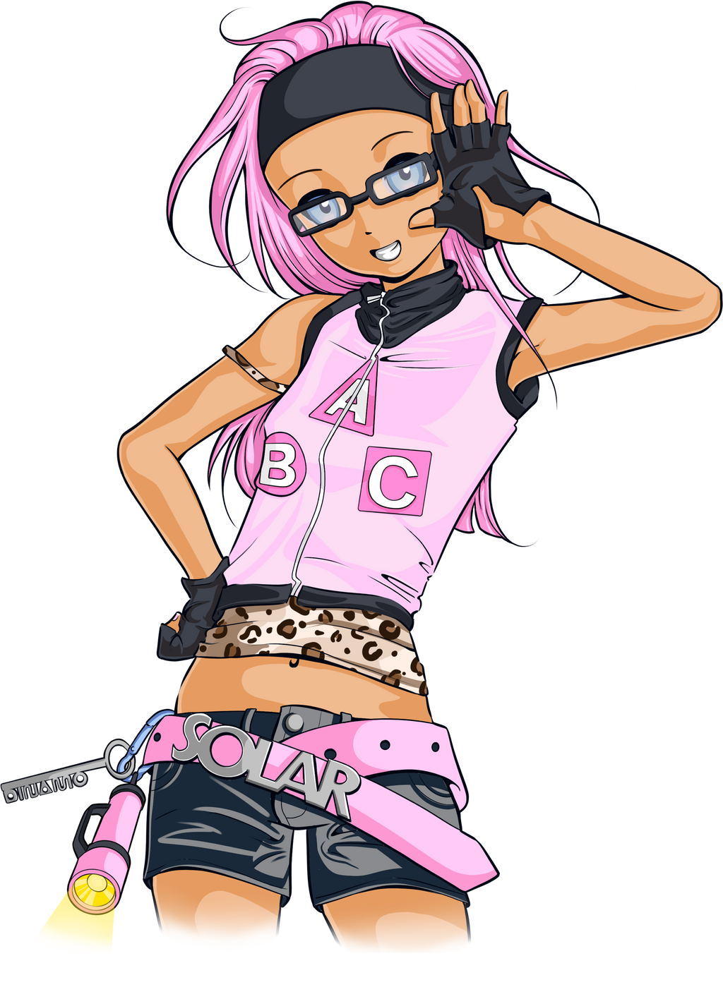
Solar Girl #reddit #fandom #takeover
Weights & Families
Solar has eight weights, which span from the elegant Extralight through to Regular and Bold to punchy Ultra. Each of the weights has an italic companion, adding up to a total of 16 styles. And everything is variable, of course.
The Solar Display subfamily covers the same weights and is ideal for impactful headlines due to its enlarged x-height, “tight but not touching” spacing, and generous forms.
VIBE
One of Solar’s defining characteristics is its round shapes, like its almost circular capital O. Some of its letters are simple in their construction—think single-storey a and cross-like t. But the open counters and straight terminals in characters like c and s break from this geometry, creating a sense of fluidity. You can’t pin Solar down!!
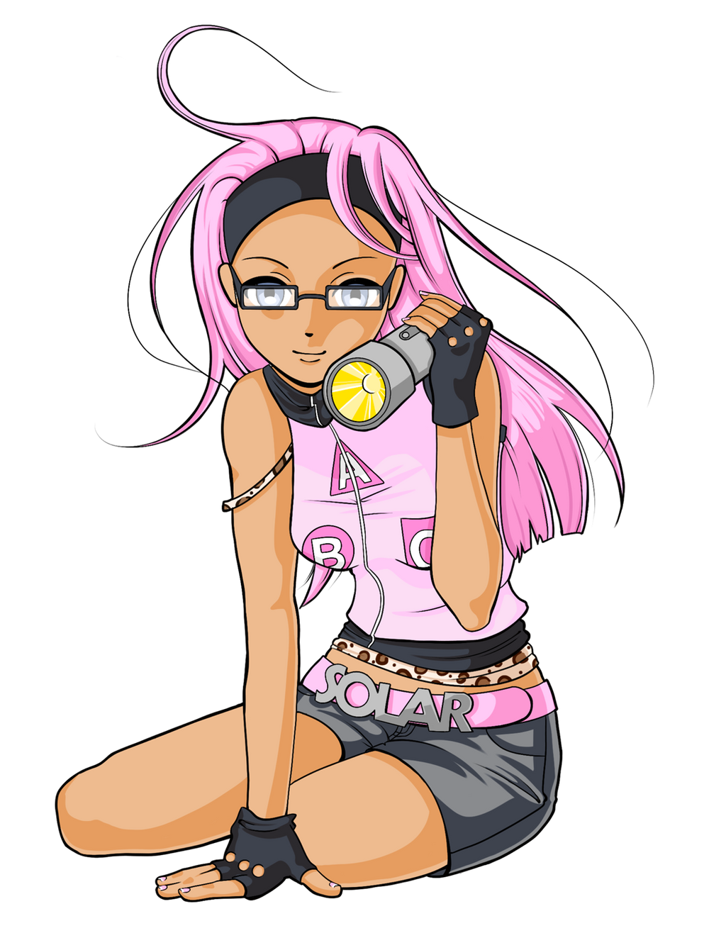
Solar tan energy in the making (is she a graphic designer?)
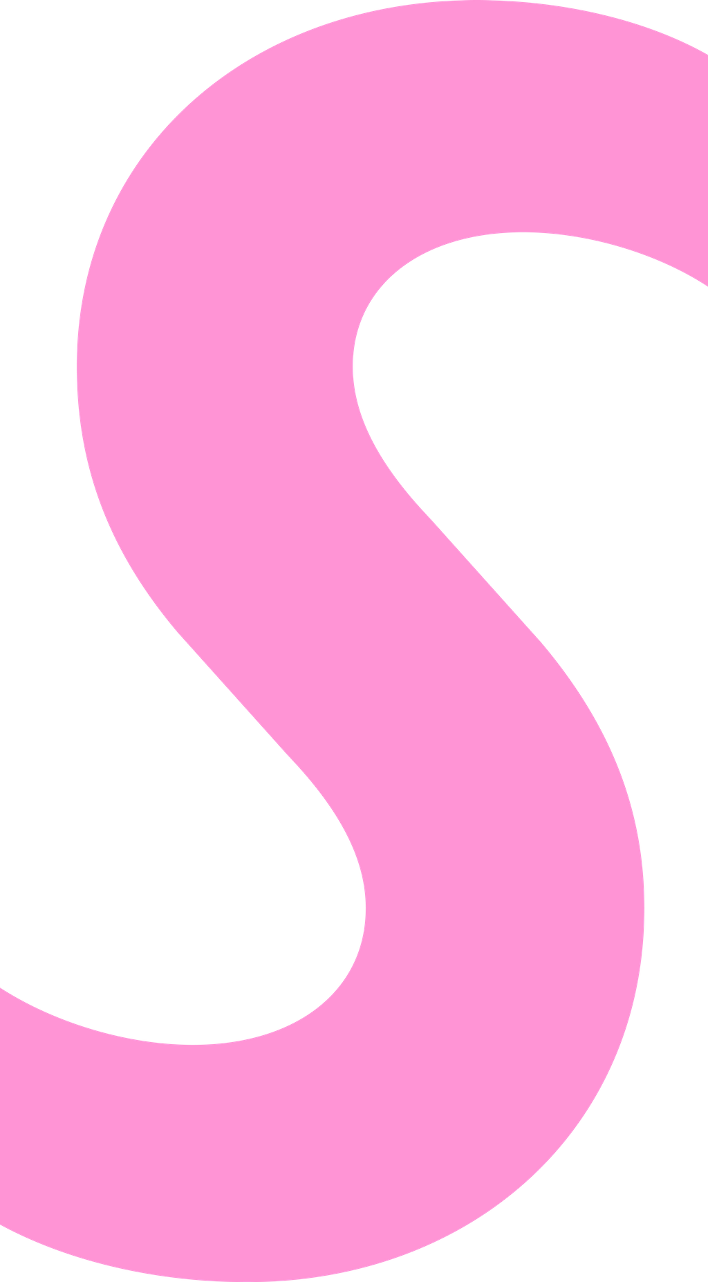
The narrow and forward-leaning s and S duo are just a lil cat-eye flick away from classic Futura
END STROKES
Solar also has two different options for its end strokes: the standard vertically-cut ones and the alternate angled ones, which are sharper and give a slightly different flavor to the whole thing. This option is available in combination with all the other stylistic sets, and can be accessed in the same way.

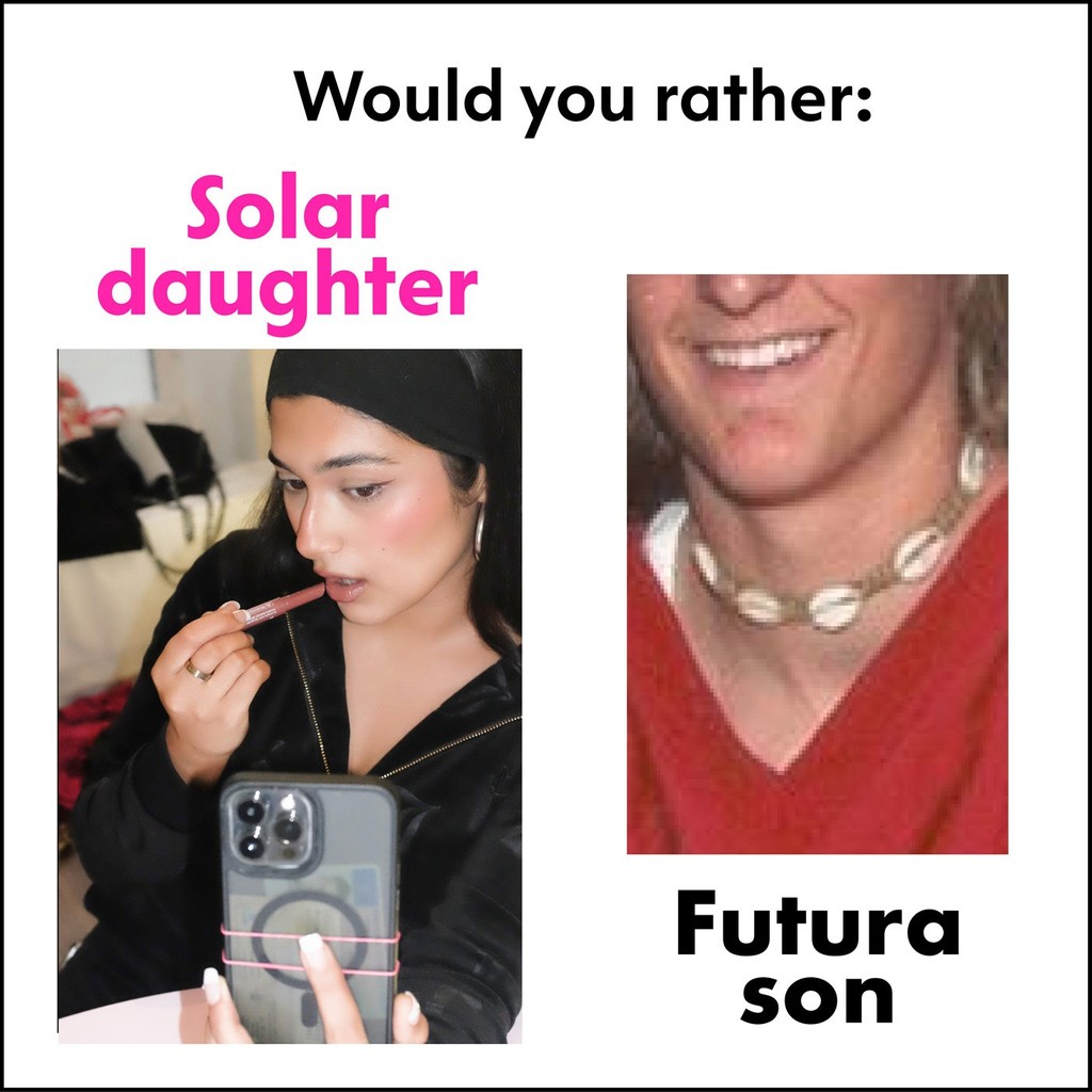
MEME ZONE (ADULTS:OUT)
ALTERNATES

Algorithmic burn
My favorite Solar characters are smuggled into the stylistic sets, like the straight-top a, the diamond dots, and the straight-bar Q. Solar has plenty alternates to get lost in, which point to its wide range of different design references.

Switch them up to switch up the typeface’s look. There are alternate versions of all the above, which can be accessed using OpenType features on any design software and on the web. Here’s our tutorial shedding light on that OpenType mystery. It’s also possible to choose between round and diamond-shaped dots for i and j.
Remember: Use the Dinamo Font Customizer at check-out to generate font files with your favorite characters set as the default. This is a great opportunity for those who want a font that’s unique to their project but can’t go the whole way of commissioning a bespoke typeface.
STYLE IT LIKE A...


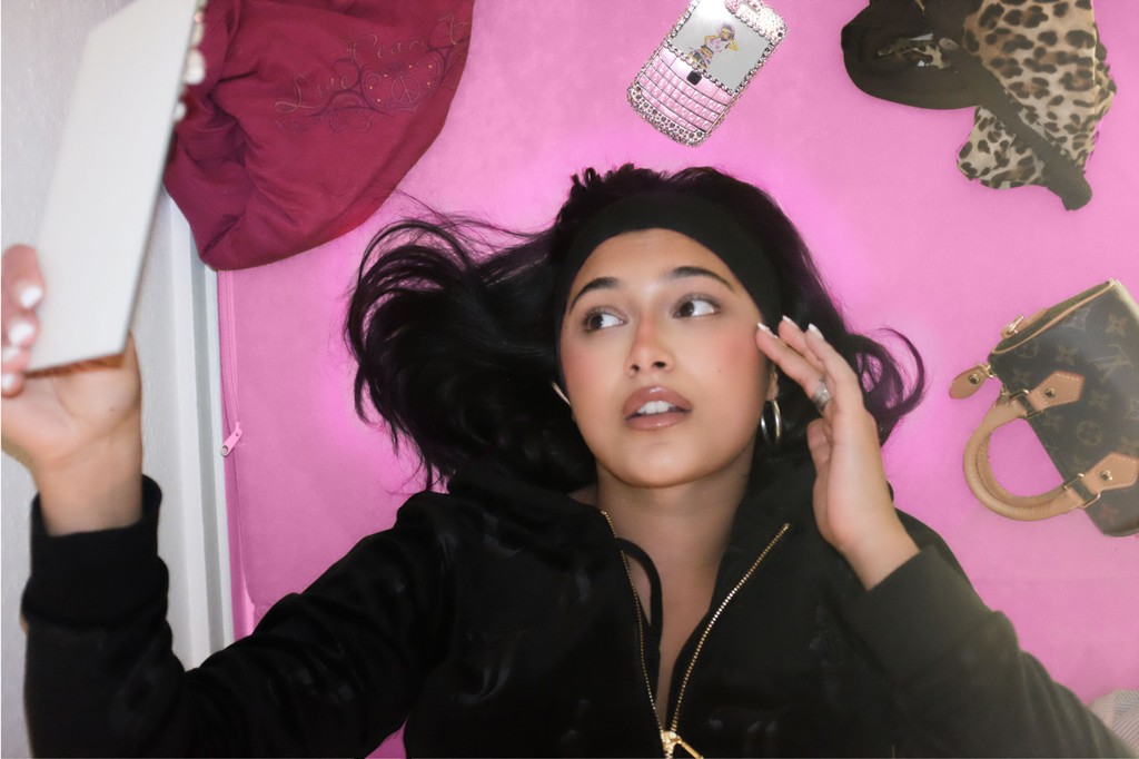
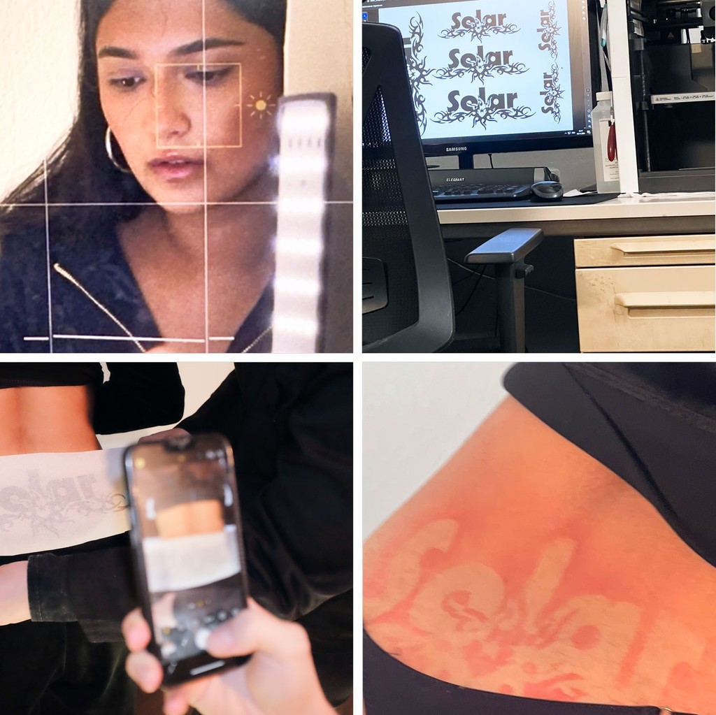
Campaign by Dinamo with Shortnotice. Illustration Dinamo (Melanie Schmidt), model Susan Arian, photography Shortnotice.

Info dump over. Can’t wait to see what you do with it.