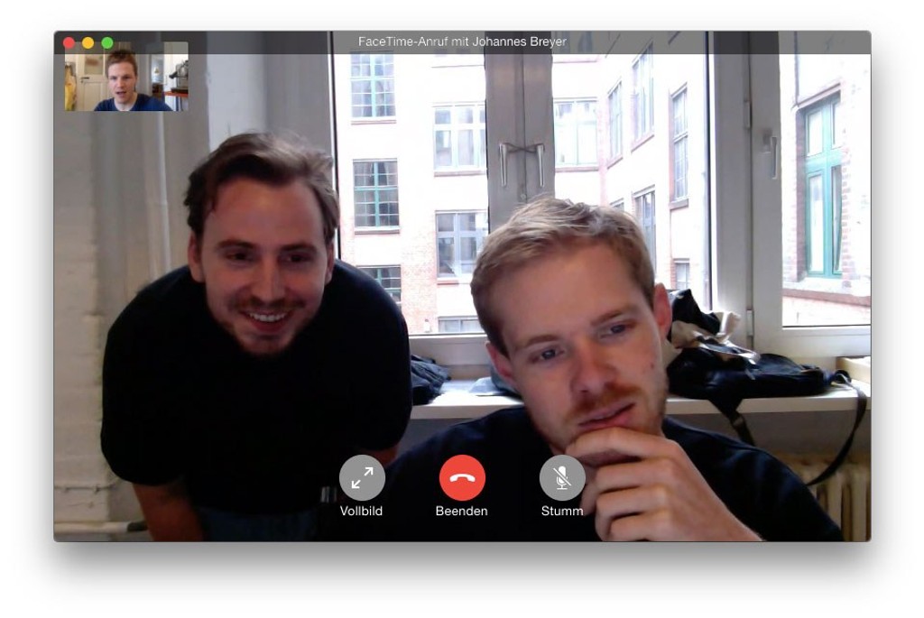
Meet the Team: Erkin Karamemet on Designing Systems Font Repro
Repro is a friendly, flexible sans serif inspired by signage and digital operating systems, merging clean design with complex font engineering. Designed by our longest collaborator and first intern Erkin Karamemet over six long years, the typeface has its own smart circle function embedded straight into the file. With it, users can encircle letters with the click of a button.
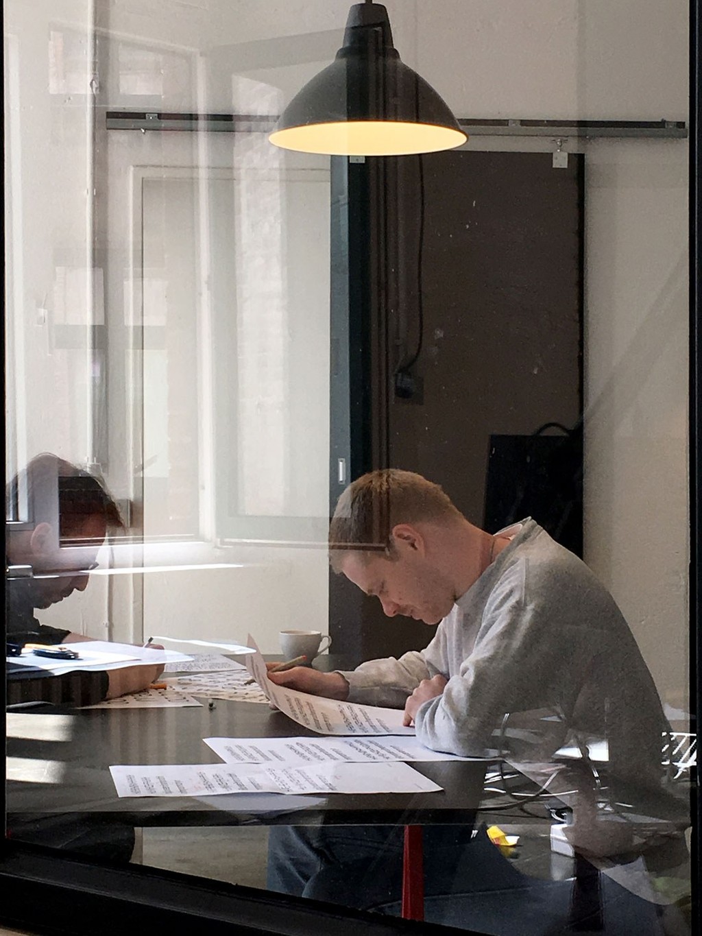
Below, Erkin remembers the long and winding process of creating his dynamic giant below.
The drive to create Repro has been inside me for a long time.
I grew up in a space filled with signs and different wayfinding systems, because my dad was a sign maker in the German town of Bielefeld. He’s also a Jujutsu black belt, but that’s a different story. And operating systems are just a part of everyday life for most of us, right? So I wanted to develop a tool made for our everyday surroundings, one that performed beautifully within them.
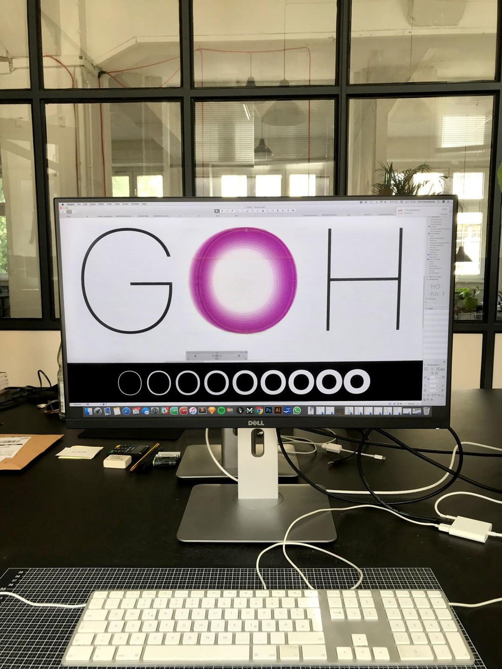
The idea for the typeface started as a little note to myself on a post-it way back in 2016. I was thinking about different ways of emphasizing text — like how we have bold, italic, and underline. I wondered if there were any other ways to create emphasis? And then I thought about how people circle words when they’re writing notes to themselves on paper. Why don’t we have a digital version of that, too?
I came up with the idea of developing a function that would let users encircle text. From there, the next question arose: What kind of typeface should it be connected to? My process became a long back-and-forth, sparring between creating the main character set and developing the circle functionality.
I love to begin a project with an idea rather than a solution. It means that everything grows from that core. And because I began Repro in this way, new features emerged from the Circle concept all the time.
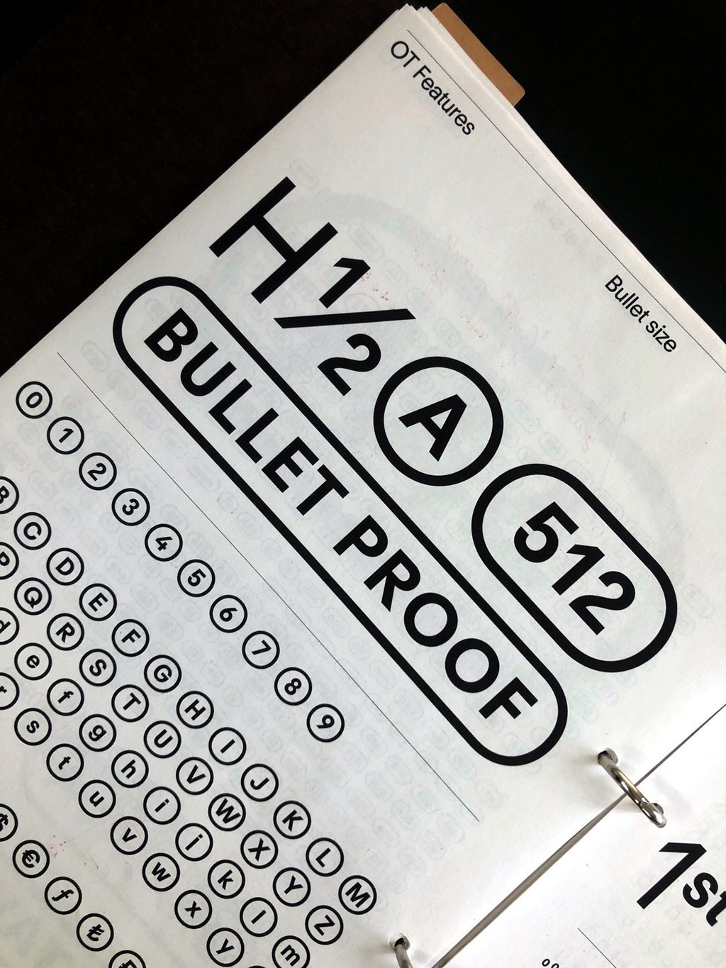
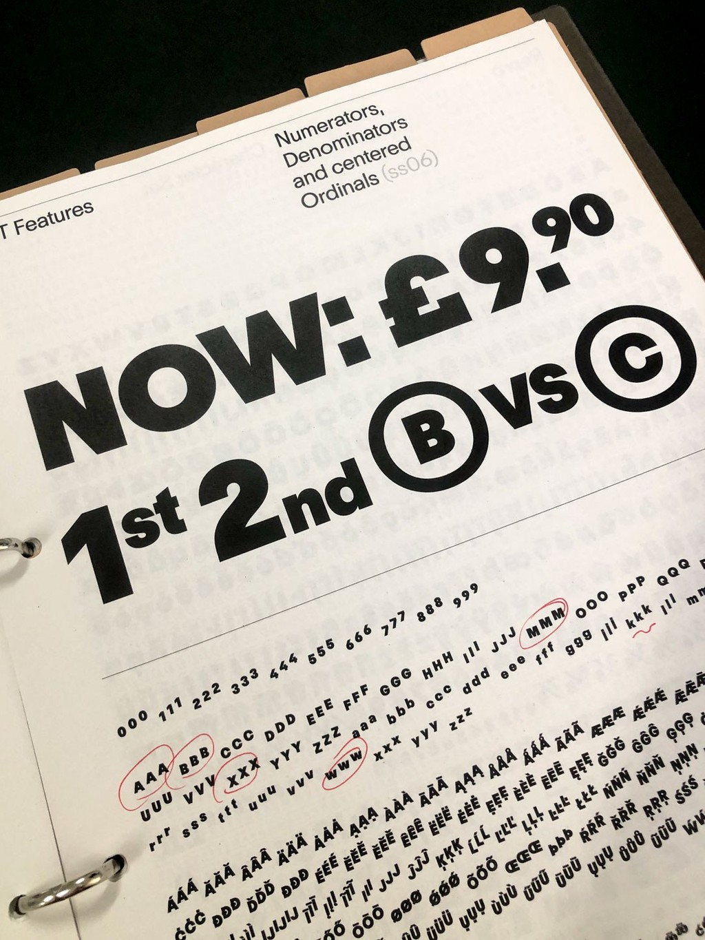
Here’s just one example. Because the circles don’t wrap themselves around the regular font size, we needed to create a second size glyphs. Whenever text is encircled, the letters are slightly smaller and sit above the baseline to make room for the “circle” to go round and enclose the forms.
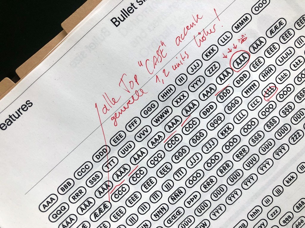
Through creating this second size glyph set, we had the idea to also create three new positions for them as an additional feature. Users can position smaller text either at the top, center, or bottom of the baseline. New feature ideas like this emerged from the central concept all the time.
At its core, Repro is a hybrid of two strong genres. It lies somewhere between geometric hardness and humanistic warmth, and tries to serve both worlds rather than just one of them. It’s neutral and functional, while still forming its own distinctive character. The slightly locked terminals are a small personal rebellion of mine – proof that open contours are not the only solution for friendly, legible type.
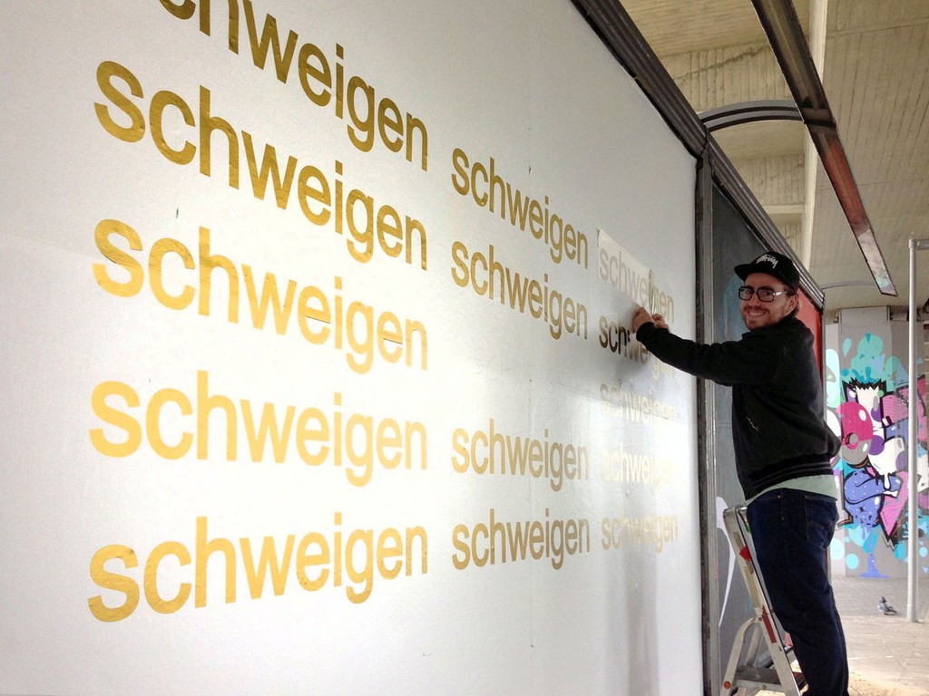
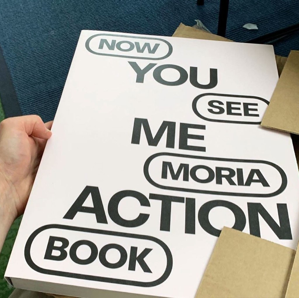
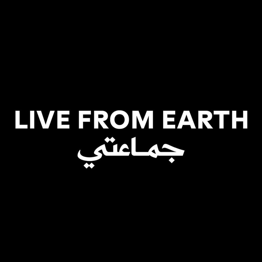
Early on during its development, I sent Repro out onto journeys into the real world. I find seeing a typeface on real applications is always the best way to test it. Nothing better than seeing it in real life, on posters, websites, videos, social media. And I noticed by looking at work by early adopters that Repro can be used in very different ways. So I decided to create a variety of alterates for the font, to help it adapt to different contexts.
Straight or curled stems on the l, t, and j can be selected depending on whether you’re going for the most readable, or most stylish, look. Alternates like the Space Odyssey S or the umbrella y are ideal for branding. There’s lots of other options, too. Designers can use The Dinamo Font Customizer, which lets customers customize they’re fonts at check-out, to mix and match their favorite alternates. After seeing how Repro was used online, I also decided to include a range of special web-specific characters.
I learned a lot from the process of developing Repro, in terms of working with software. Dealing with a large character set requires a different mode of thinking. You work a bit differently. After the 100th repetition, you start to ask yourself: How can I automate this process? It’s easy to get lost if you don’t give yourself structure. You need to plan. To create a logic that is totally systematic.
I ended up adopting the name “Repro” because it’s a strong word, rich in vowels. It makes me think of signage produced by a printing press, and wayfinding that’s digitally reproduced across our everyday interfaces. It’s a very graphic, production-like word.
“Repro” as a name also carries memories from my old professional background. Before moving to Berlin to become Dinamo’s first intern in 2014 — and before starting my design studies at FH Bielefeld — I worked as a prepress technician in what’s known in German as a “Werbetechnik” shop. I carried these memories through the years, and you can see their traces in the final font. In the end, Repro took more than 6 years to complete. Of course you don’t work on it constantly. You pause, you brood, you ponder, you despair. Or you’re just busy with other things. And then 6 years goes by, and at the end, you have an immense, beautiful font.