- Diatype16
- Diatype Compressed16
- Diatype Condensed16
- Diatype Extended16
- Diatype Expanded16
- Diatype Semi Mono16
- Diatype Mono16
Diatype
- Thin & Italic
- Light & Italic
- Regular & Italic
- Medium & Italic
- Bold & Italic
- Heavy & Italic
- Black & Italic
- Ultra & Italic
Diatype Compressed
- Thin & Italic
- Light & Italic
- Regular & Italic
- Medium & Italic
- Bold & Italic
- Heavy & Italic
- Black & Italic
- Ultra & Italic
Diatype Condensed
- Thin & Italic
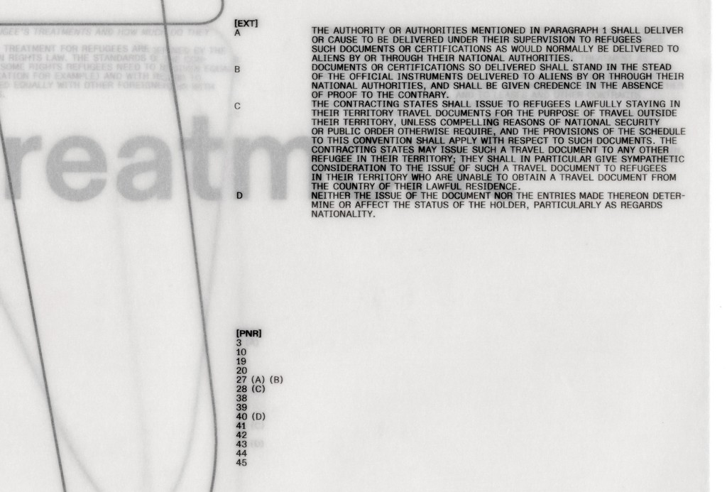
- Light & Italic
- Regular & Italic
- Medium & Italic
- Bold & Italic
- Heavy & Italic
- Black & Italic
- Ultra & Italic
Diatype Extended
- Thin & Italic
- Light & Italic
- Regular & Italic
- Medium & Italic
- Bold & Italic
- Heavy & Italic
- Black & Italic
- Ultra & Italic
Diatype Expanded
- Thin & Italic
- Light & Italic
- Regular & Italic
- Medium & Italic
- Bold & Italic
- Heavy & Italic
- Black & Italic
- Ultra & Italic
Diatype Semi Mono
- Thin & Italic
- Light & Italic
- Regular & Italic
- Medium & Italic
- Bold & Italic
- Heavy & Italic
- Black & Italic
- Ultra & Italic
Diatype Mono
- Thin & Italic
- Light & Italic
- Regular & Italic
- Medium & Italic
- Bold & Italic
- Heavy & Italic
- Black & Italic
- Ultra & Italic
Diatype
Diatype
- Thin & Italic
- Light & Italic
- Regular & Italic
- Medium & Italic
- Bold & Italic
- Heavy & Italic
- Black & Italic
- Ultra & Italic
Diatype Compressed
Diatype Compressed
- Thin & Italic
- Light & Italic
- Regular & Italic
- Medium & Italic
- Bold & Italic
- Heavy & Italic
- Black & Italic
- Ultra & Italic
Diatype Condensed
Diatype Condensed
- Thin & Italic
- Light & Italic
- Regular & Italic
- Medium & Italic
- Bold & Italic
- Heavy & Italic
- Black & Italic
- Ultra & Italic
Diatype Extended
Diatype Extended
- Thin & Italic
- Light & Italic
- Regular & Italic
- Medium & Italic
- Bold & Italic
- Heavy & Italic
- Black & Italic
- Ultra & Italic
Diatype Expanded
Diatype Expanded
- Thin & Italic
- Light & Italic
- Regular & Italic
- Medium & Italic
- Bold & Italic
- Heavy & Italic
- Black & Italic
- Ultra & Italic
Diatype Semi Mono
Diatype Semi Mono
- Thin & Italic
- Light & Italic
- Regular & Italic
- Medium & Italic
- Bold & Italic
- Heavy & Italic
- Black & Italic
- Ultra & Italic
Diatype Mono
Diatype Mono
- Thin & Italic
- Light & Italic
- Regular & Italic
- Medium & Italic
- Bold & Italic
- Heavy & Italic
- Black & Italic
- Ultra & Italic
Diatype Global
Features
Alternate Capital G & u & y
Grungy
Alternate a
a → a
Alternate q
q → q
Alternate t
t → t
Standard vs Alternate Punctuation
“Hey, what!
Who’s there?”
Alternate R
R → R
Alternate I
I → I
Alternate J
J → J
Alternate 1 & 4 & 6 & 9
No 1 wants to
pay $614.99
Alternate Arrows
Slide → Back ↑
Swipe ← Scroll ↓
About Diatype
About this typeface
Info
Diatype is a warm yet sharp grotesque ideal for text and reading on screen. Its name refers to the clunky, pre-digital typesetting machines that informed its shapes and the Swiss Neo-grotesque genre at large.
Credits
Design: Dinamo (Johannes Breyer & Fabian Harb, with Elias Hanzer, Erkin Karamemet, Renan Rosatti, Andree Paat, Đức Cao [Vietnamese])
Spacing and Kerning: Igino Marini
Production: Dinamo (Renan Rosatti, Hugo Jourdan)
Multiscript Art Direction: Dinamo (Ethan Cohen)
Supported Languages
Latin: Spanish, English, Portuguese, Swahili (individual language), German, Italian, Javanese, Malay (individual language), French, Vietnamese, Turkish, Polish, Filipino, Indonesian, Yoruba, Standard Malay, Sundanese, Igbo, Northern Uzbek, Romanian, West Central Oromo, Amahuaca, Malagasy, Dutch, Tagalog, North Azerbaijani, Cebuano, Somali, Northern Kurdish, South Azerbaijani, Haitian, Hungarian, Zulu, Nyanja, Shona, Czech, Quechua, Swedish, Kikuyu, Kinyarwanda, Umbundu, Hiligaynon, Iloko, Rundi, Kalenjin, Ganda, Xhosa, Central Kurdish, Afrikaans, Turkmen, Madurese, Low German, Luba-Lulua, Kongo, Danish, Neapolitan, Croatian, Southern Sotho, Minangkabau, Wolof, Finnish, Kituba (Democratic Republic of Congo), Slovak, Swiss German, Paraguayan Guaraní, Pedi, Sicilian, Eastern Oromo, Norwegian, Luo (Kenya and Tanzania), Catalan, Bemba (Zambia), Buginese, Venetian, Borana-Arsi-Guji Oromo, Kamba (Kenya), Lombard, Banjar, Soga, Achinese, Gheg Albanian, Nyankole, Balinese, Jamaican Creole English, Hassaniyya, Yao, Lithuanian, Bosnian, Waray (Philippines), Slovenian, K'iche', Gusii, Kimbundu, Southern Qiandong Miao, Northern Qiandong Miao, Soninke, Meru, Afar, Pampanga, Hani, Tosk Albanian, Standard Latvian, Central Aymara, Southern Aymara, Batak Toba, Toba, North Ndebele, Chiga, Sena, Bini, Galician, Tumbuka, Scots, Tonga (Zambia), Dimli (individual language), Kirmanjki (individual language), Acholi, Anaang, Makonde, Sardinian, Mandinka, Guadeloupean Creole French, Batak Simalungun, Batak Dairi, Batak Mandailing, South Ndebele, Standard Estonian, Ngazidja Comorian, Morisyen, Khasi, Upper Guinea Crioulo, Chokwe, Gourmanchéma, Kabuverdianu, Lushai, Ndonga, Uab Meto, Kekchí, Occitan (post 1500), Yucateco, Bari, Basque, Lozi, Picard, Piemontese, Welsh, Chavacano, Bena (Tanzania), Nobiin, Konzo, Walloon, Friulian, Kara-Kalpak, Balkan Romani, Crimean Tatar, Vlax Romani, Maltese, Samoan, Silesian, Batak Karo, Mam, Western Frisian, Kaqchikel, Sango, Zapotec, Tzeltal, Jola-Fonyi, Tzotzil, Ladino, Efik, Tetun Dili, Tetum, Luxembourgish, Asturian, Papiamento, Tedim Chin, Fijian, Icelandic, Wayuu, Mandjak, Mapudungun, Kölsch, Macedo-Romanian, Kaonde, Montenegrin, Breton, Talysh, Latgalian, Garifuna, Tonga (Tonga Islands), Amis, Caribbean Hindustani, Huastec, Maore Comorian, Mískito, Irish, Otuho, Gagauz, Sranan Tongo, Corsican, Purepecha, Tok Pisin, Gilbertese, Kashubian, Mwani, Arbëreshë Albanian, Saramaccan, Võro, Atayal, Papantla Totonac, Bikol, Mankanya, Sangu (Tanzania), Seselwa Creole French, Faroese, Andaandi, Tahitian, Orma, Páez, Chamorro, Kalaallisut, Scottish Gaelic, Marshallese, Aguaruna, Chuukese, Maori, Mattokki, Romansh, Ladin, Central Nahuatl, Ojitlán Chinantec, Karelian, Asháninka, Naga Pidgin, Pohnpeian, Muslim Tat, Shipibo-Conibo, Northern Sami, Shuar, Alekano, Pijin, Walser, Tsakhur, Rarotongan, Acheron, Kaingang, Palauan, Mirandese, Upper Sorbian, Dehu, Tuvalu, Aragonese, Bislama, Chachi, Pichis Ashéninka, Ashéninka Perené, Yanesha', Zuni, Ixcatlán Mazatec, Kven Finnish, Niuean, Achuar-Shiwiar, Lower Sorbian, Hopi, Nomatsiguenga, Eastern Arrernte, Creek, Rotokas, Mohawk, Tokelau, Algonquin, Cofán, Warlpiri, Matsés, Murrinh-Patha, Chiltepec Chinantec, Veps, Amarakaeri, Interlingua (International Auxiliary Language Association), Oroqen, Cashinahua, Cashibo-Cacataibo, Candoshi-Shapra, Esperanto, Kala Lagaw Ya, Seri, Lule Sami, Southern Sami, Pipil, Caquinte, Inari Sami, Cimbrian, Istro Romanian, Anuta, Meriam Mir, Shawnee, Ido, Aleut, Pintupi-Luritja, Gooniyandi, Ume Sami, Pite Sami, Wiradjuri, Volapük, Han, Ahtna, Western Abnaki, Záparo, Munsee, Lojban, Interlingue, Potawatomi, Minang, Manx, Interglossa, Latin, Klingon, Cornish, Novial and Eastern Abnaki
Character Overview
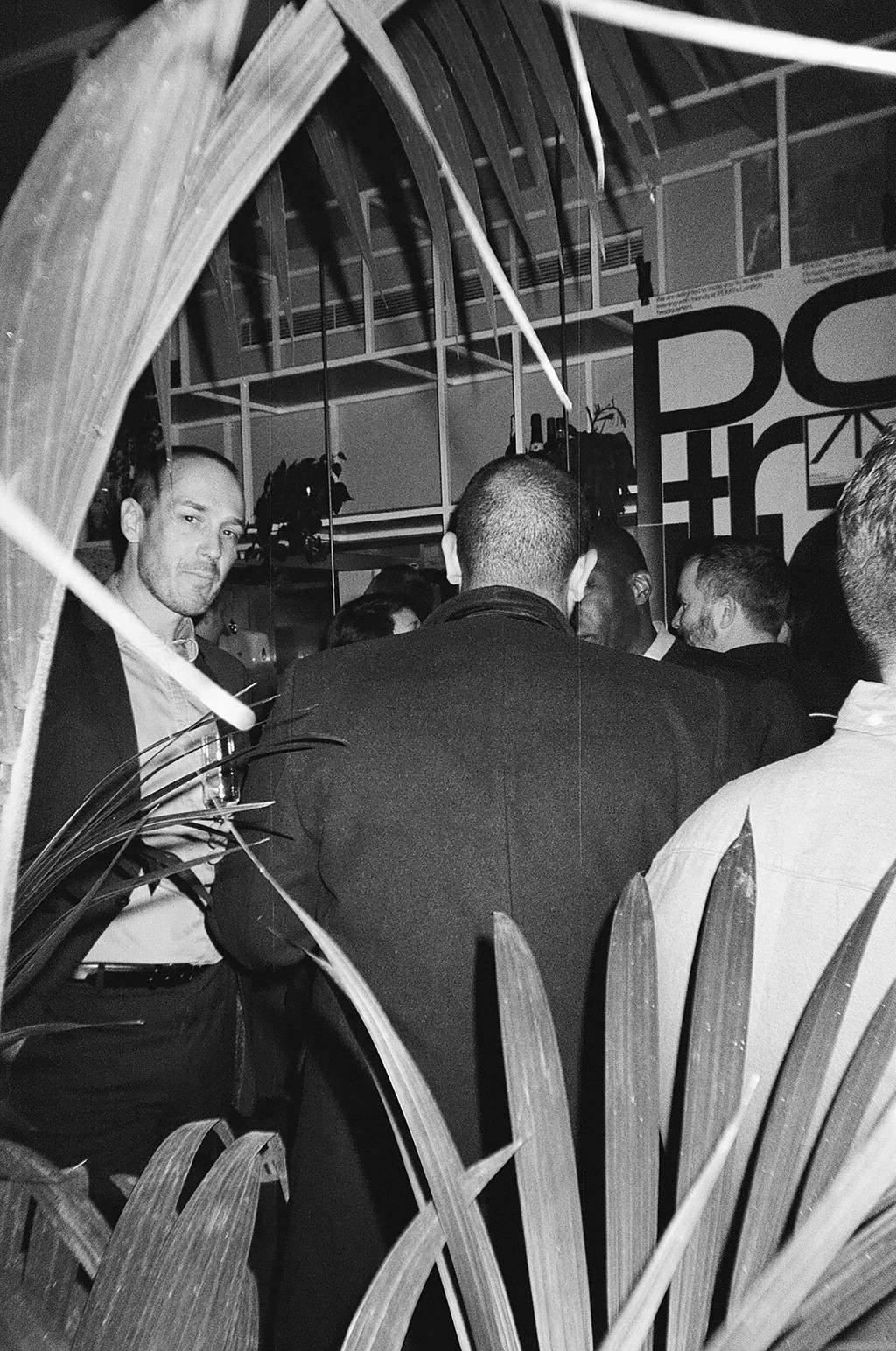
Diatype In Use
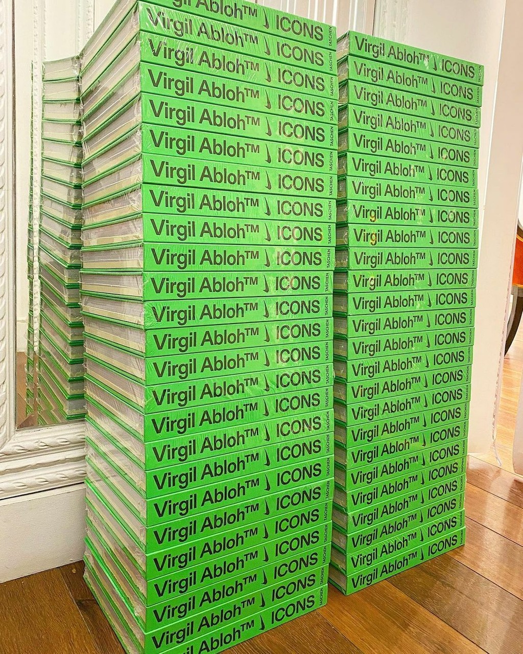
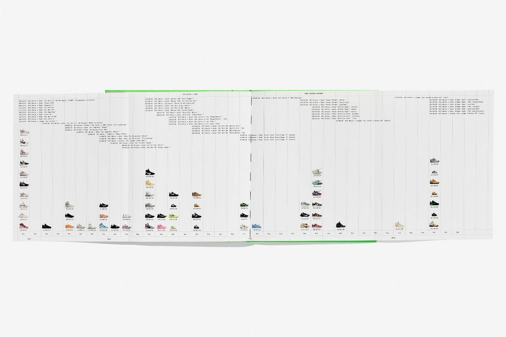
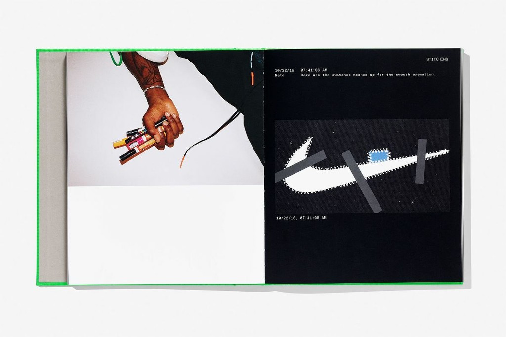
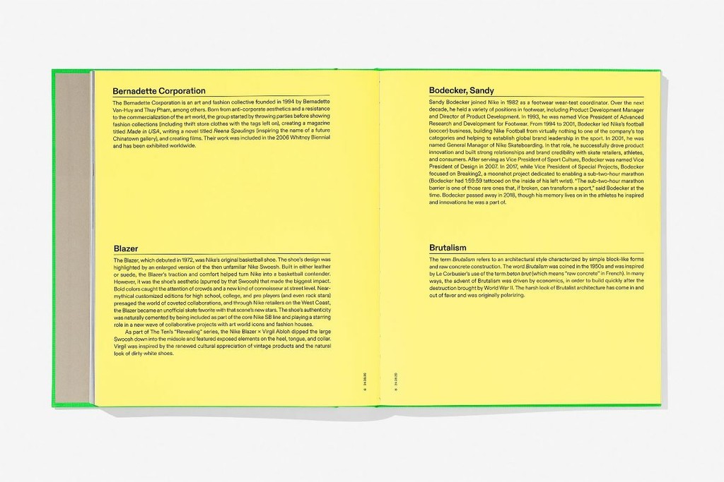
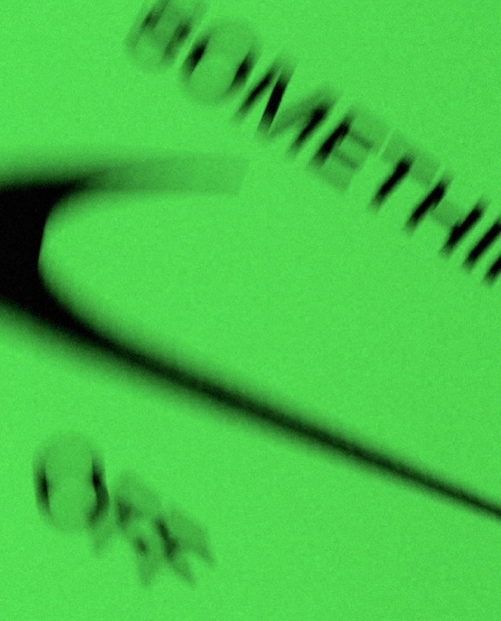
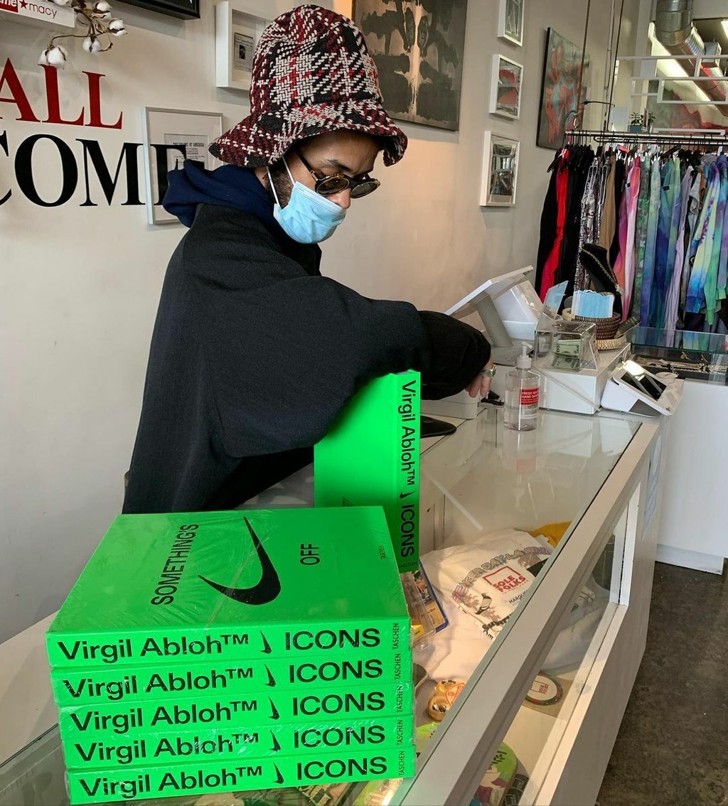
Virgil Abloh Icons. Design by ZAK group

on running.
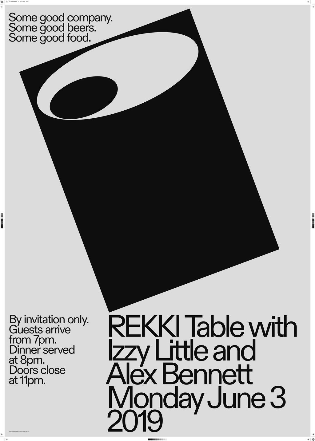
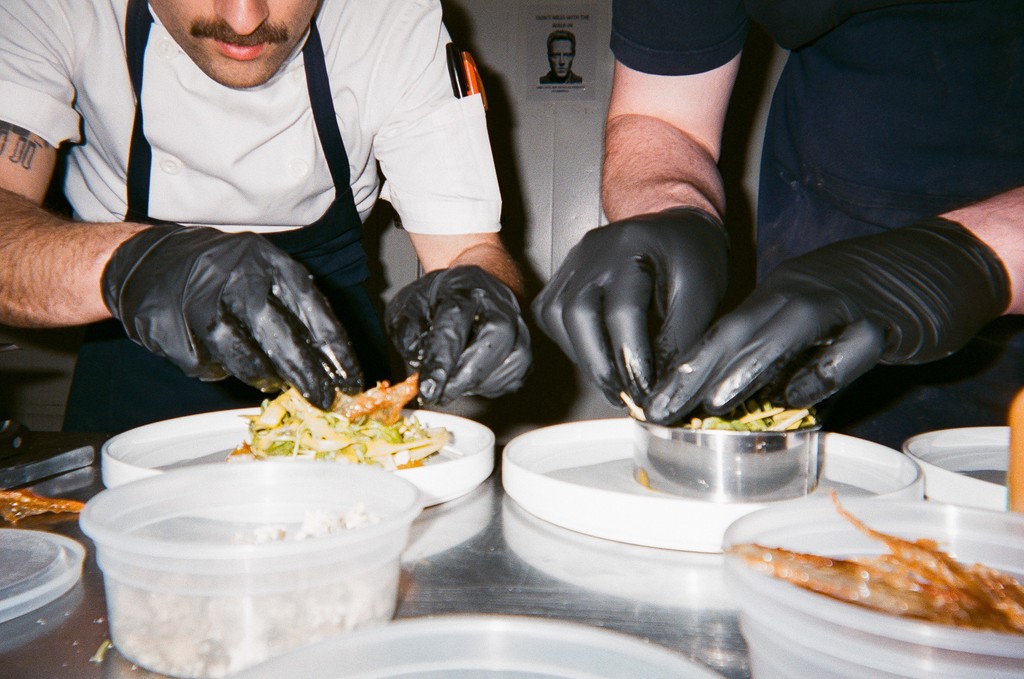
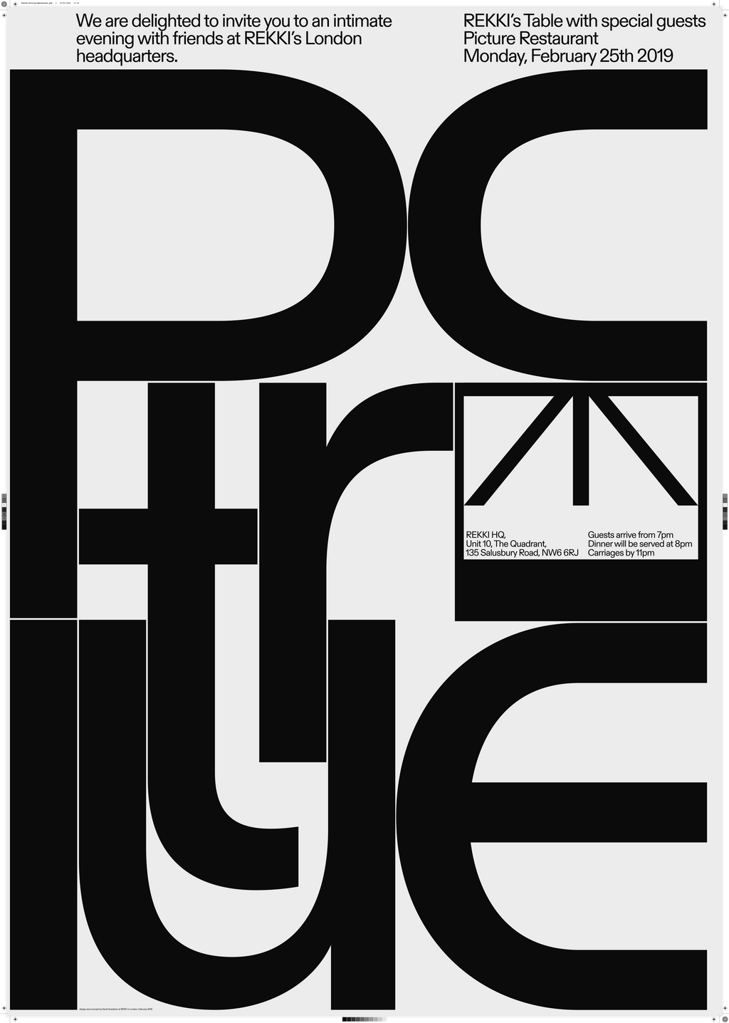
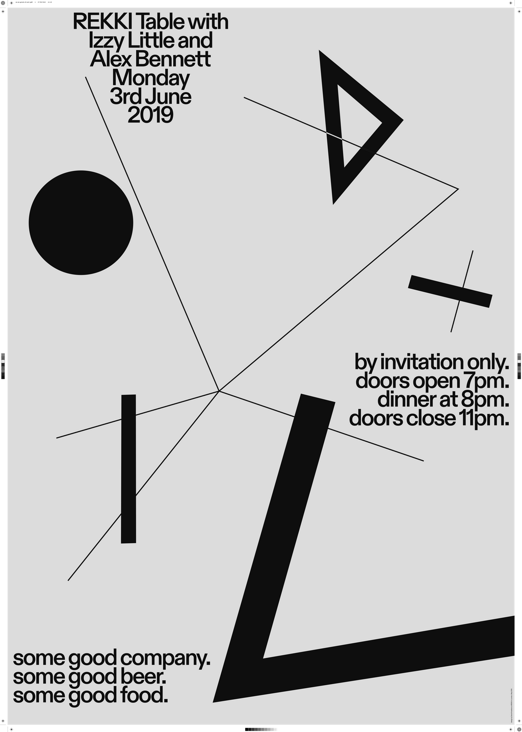
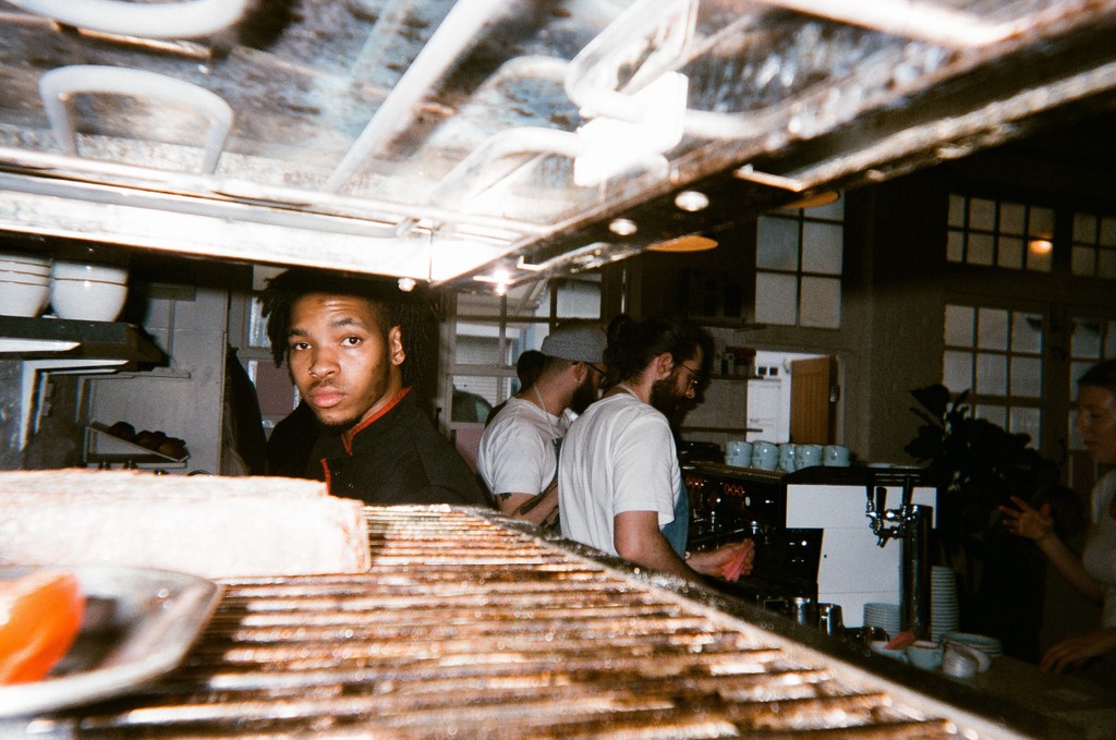
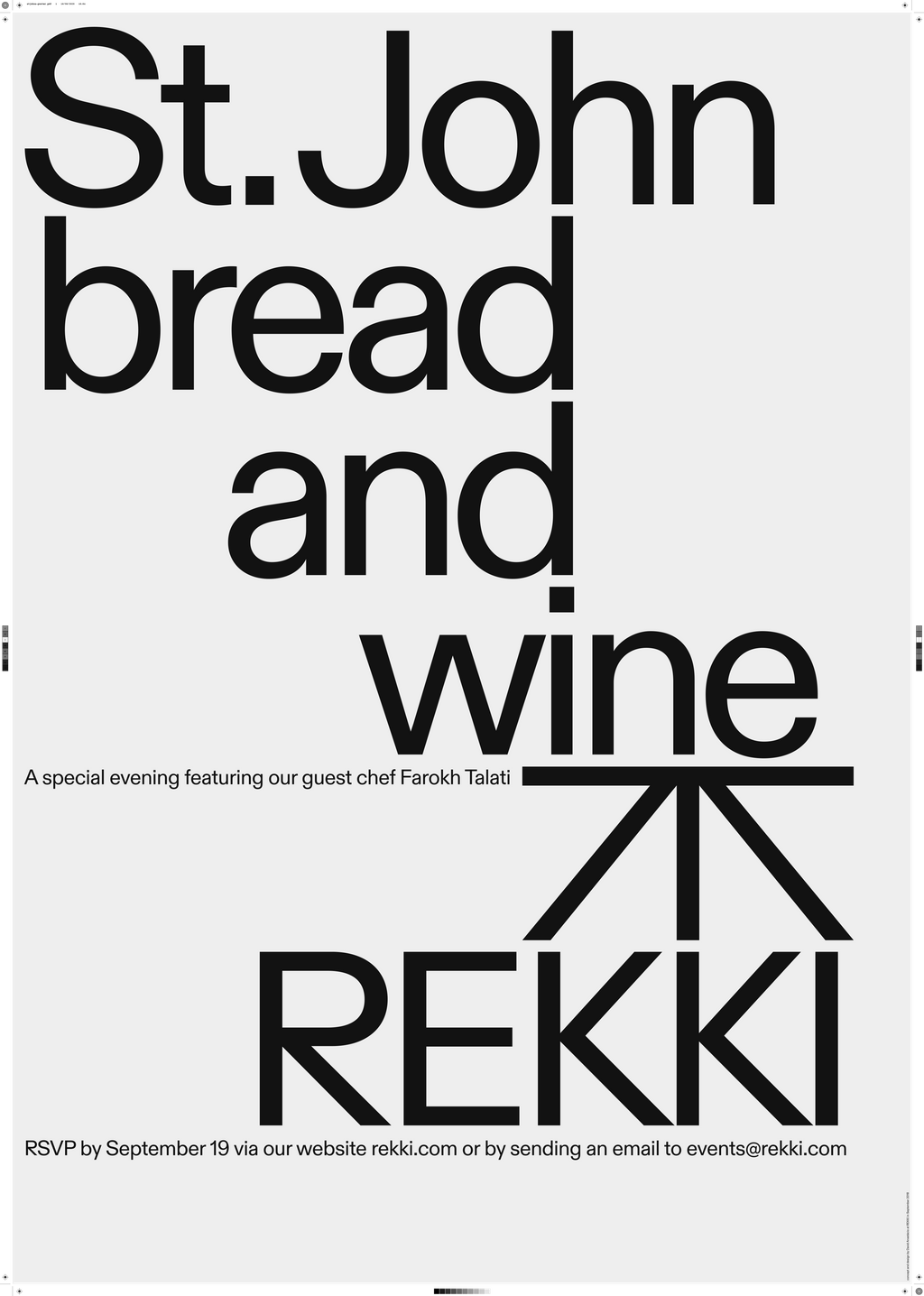
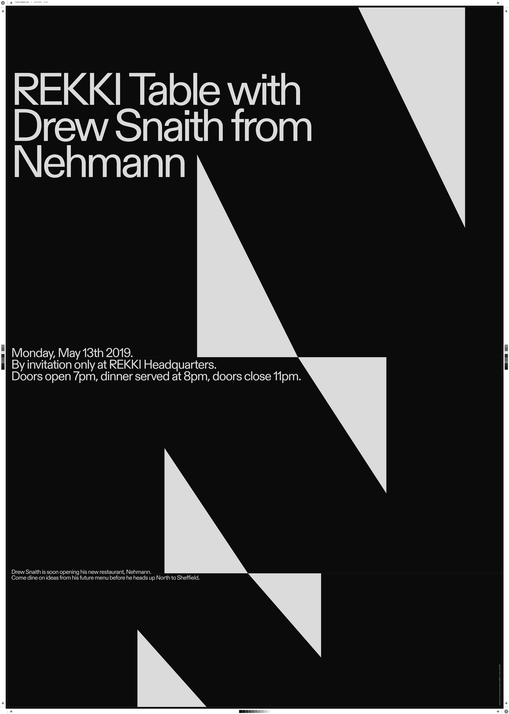
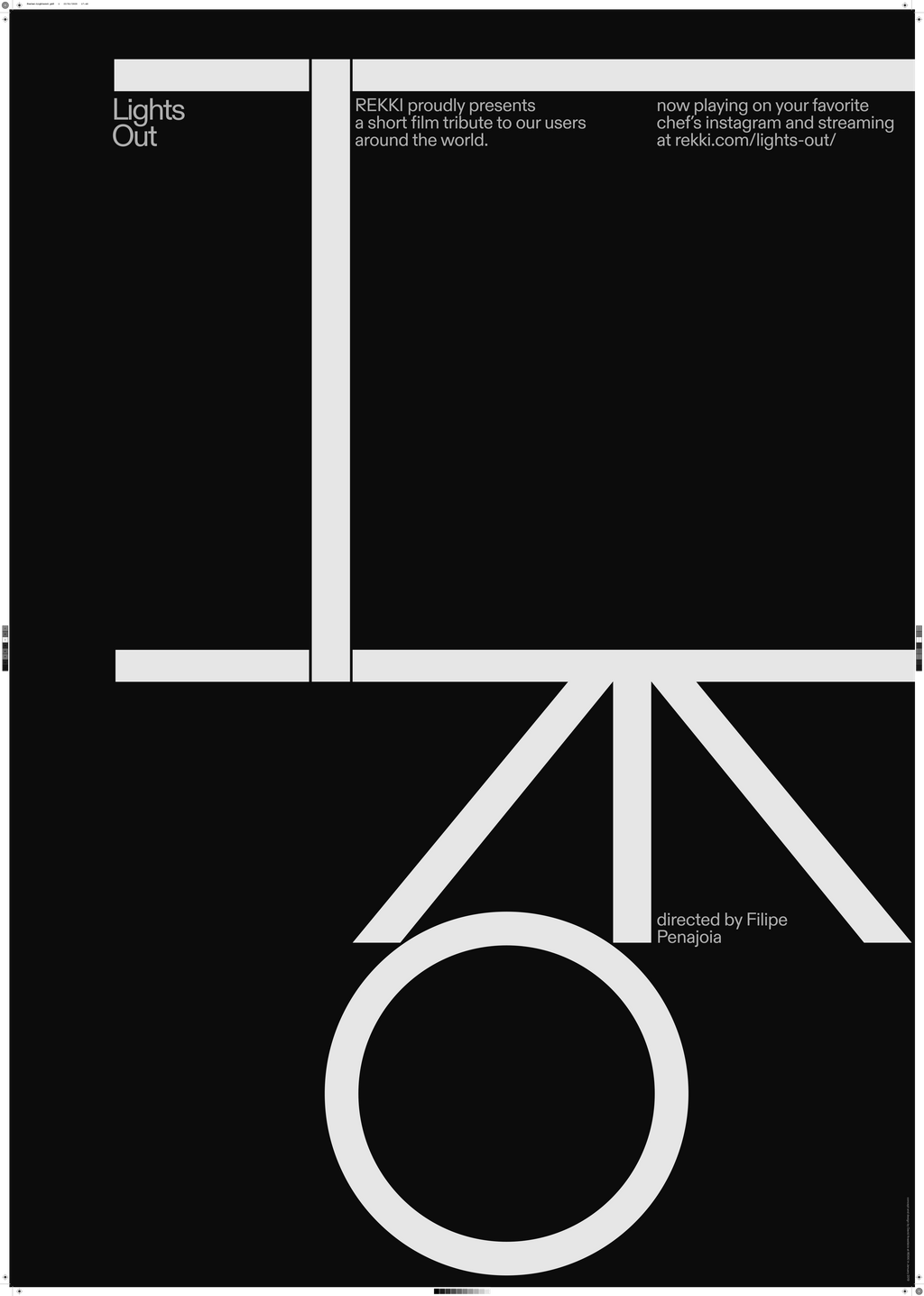
Customised Diatype for Rekki, London. Design with Rekki
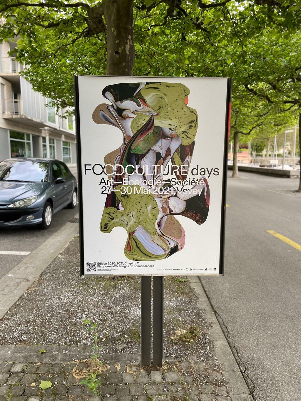
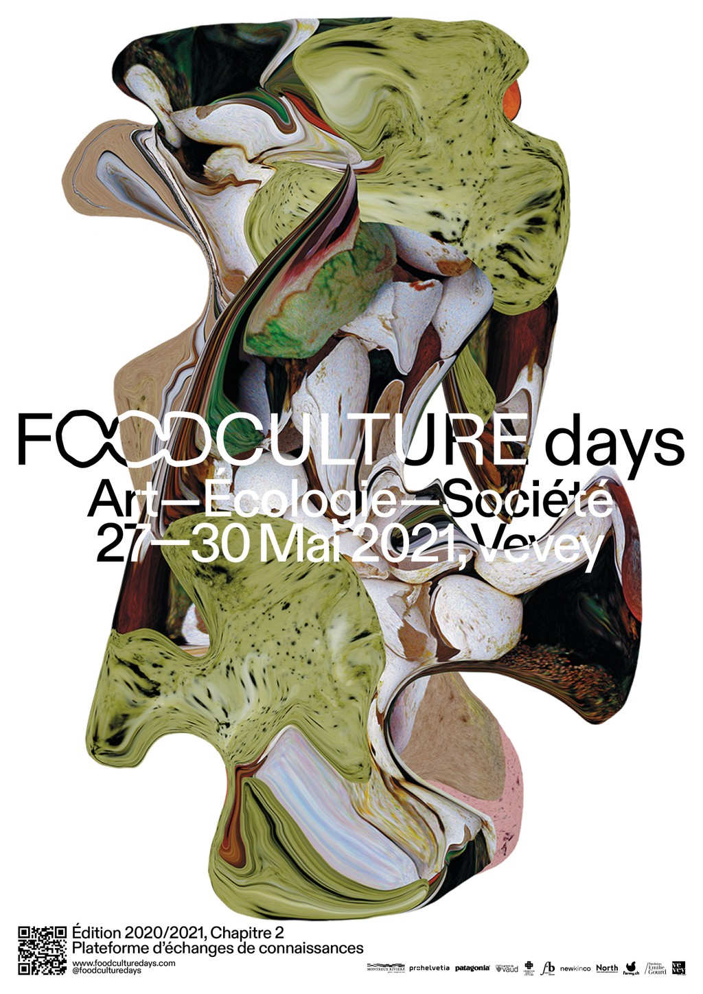
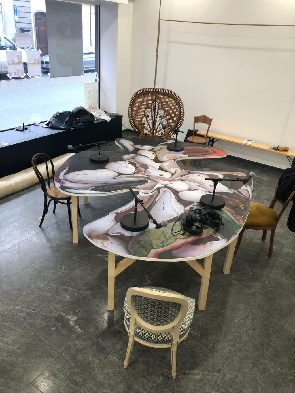
Foodculture Days. Design by Sarah Discours
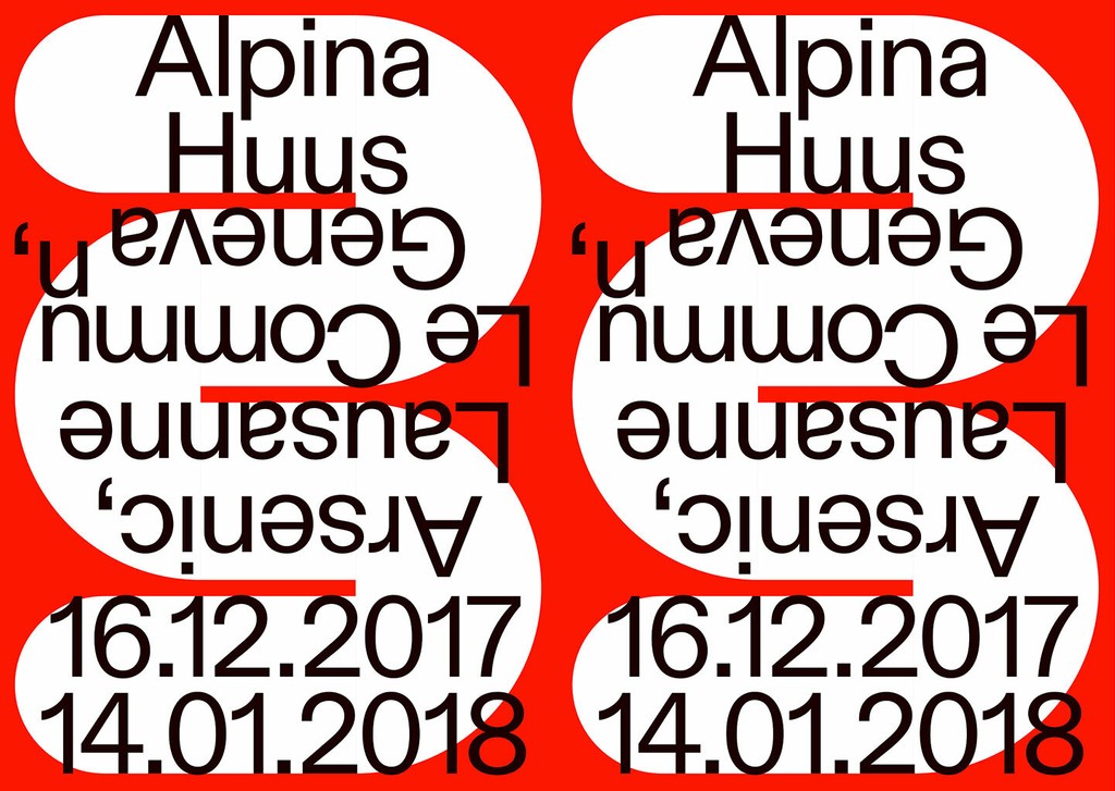
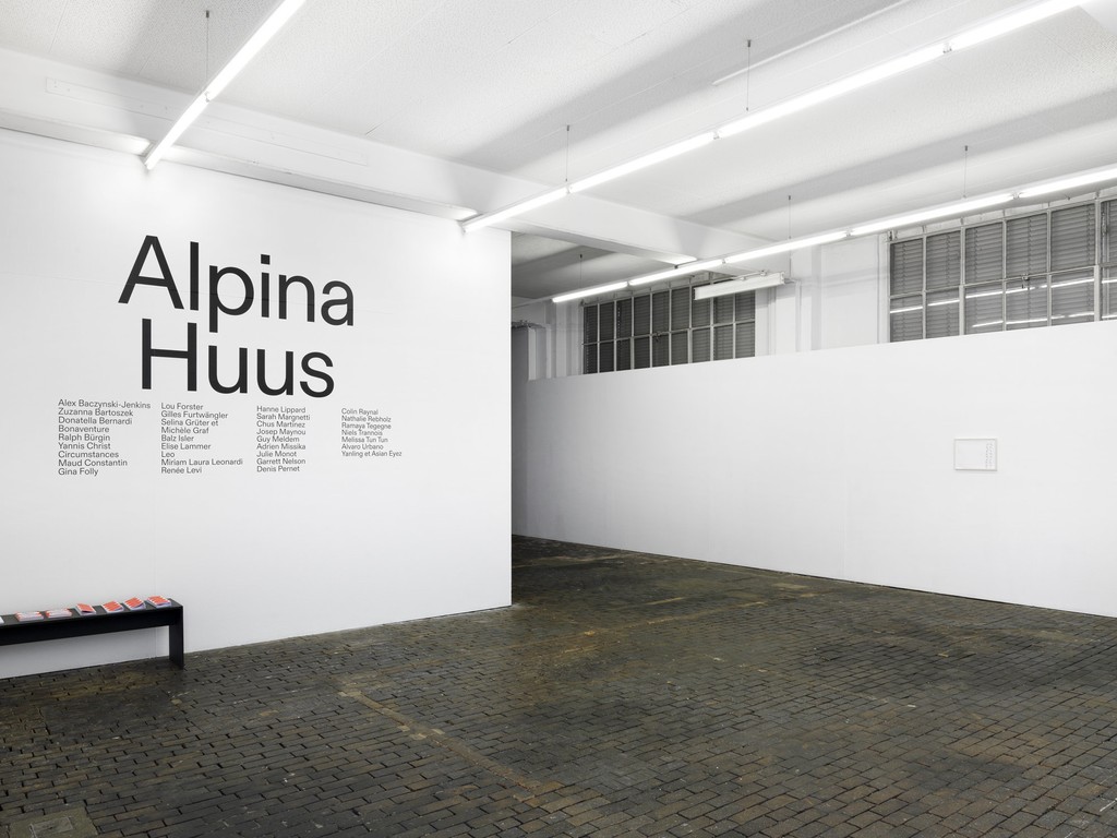
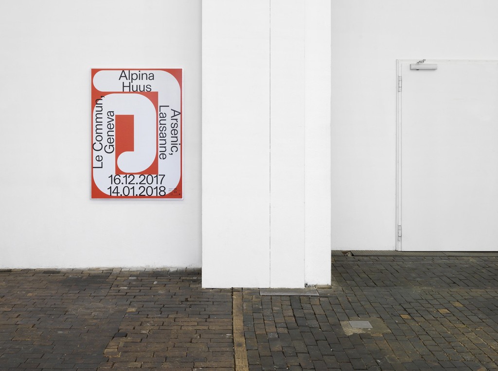
Alpina Huus. Design by Dan Solbach Studio
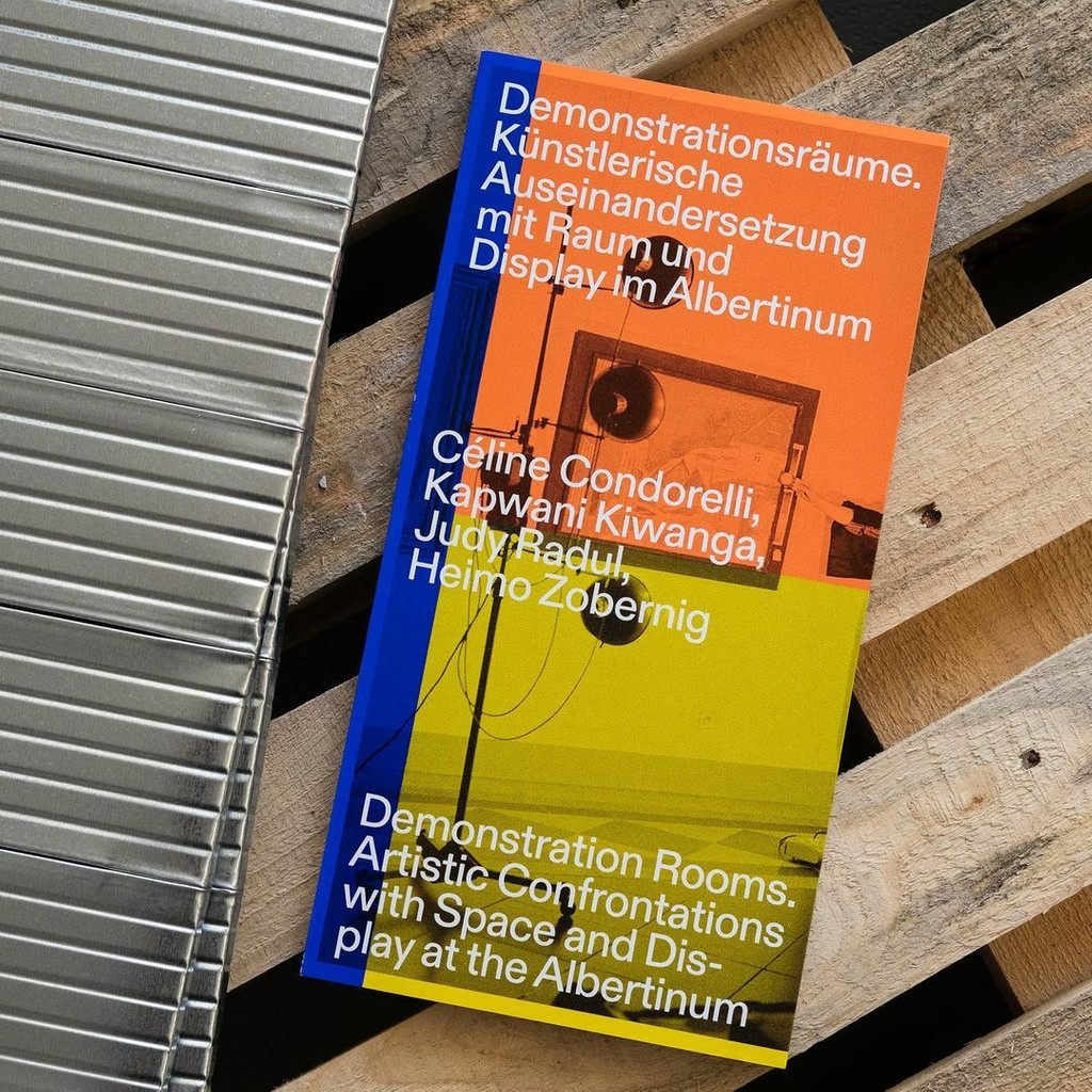
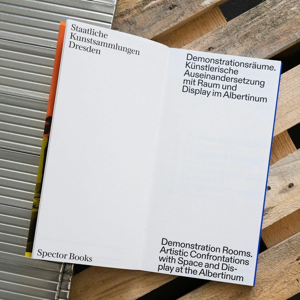
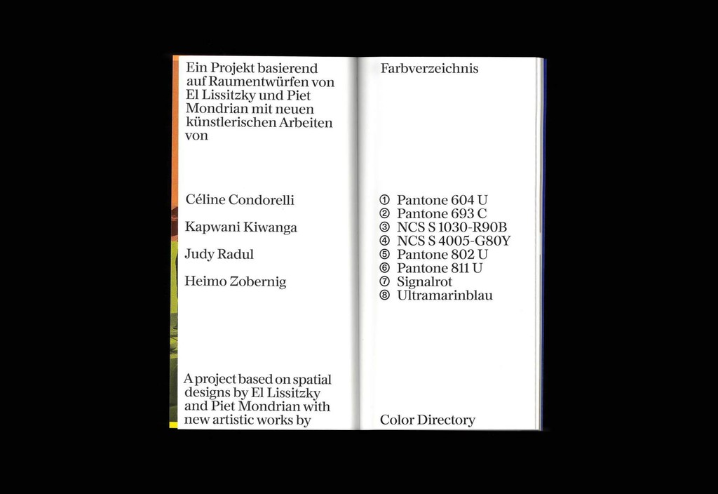
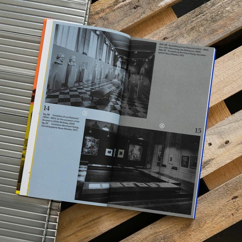
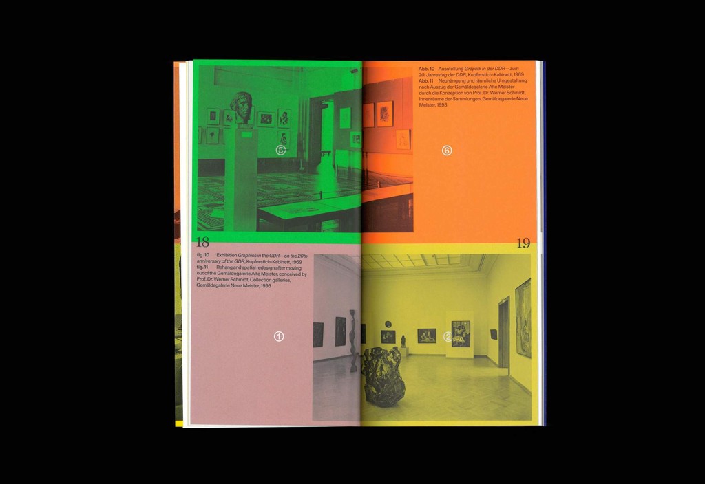
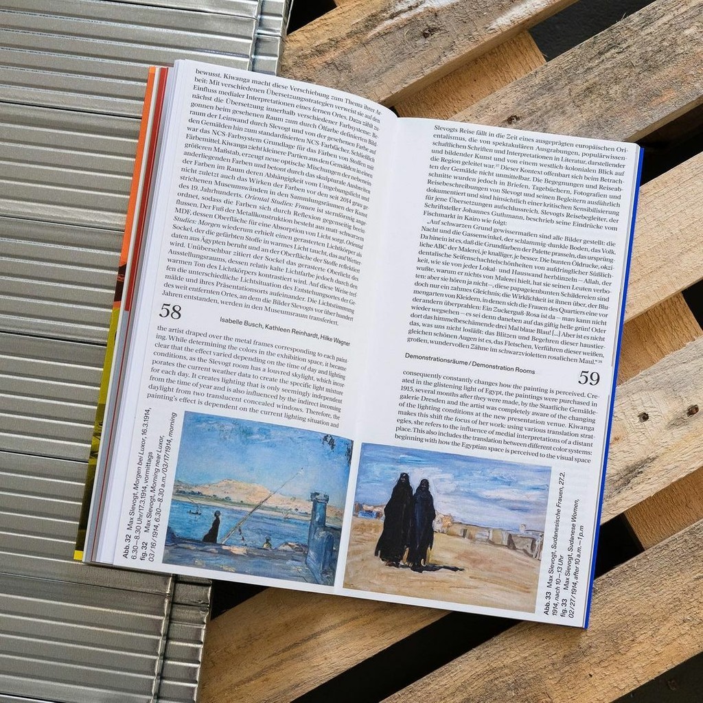
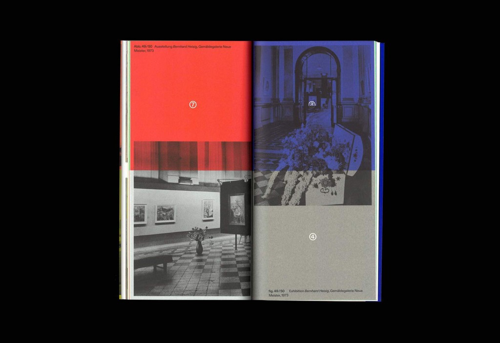
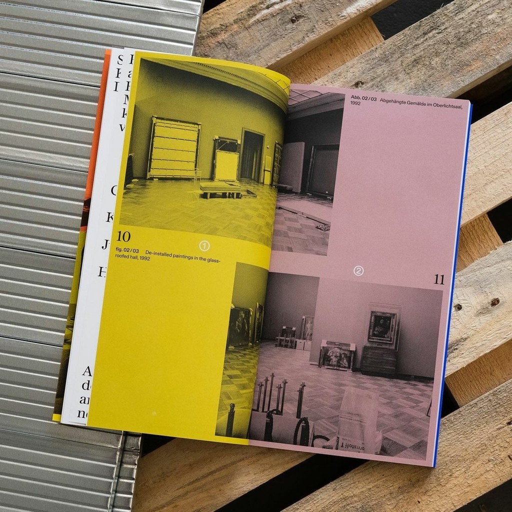
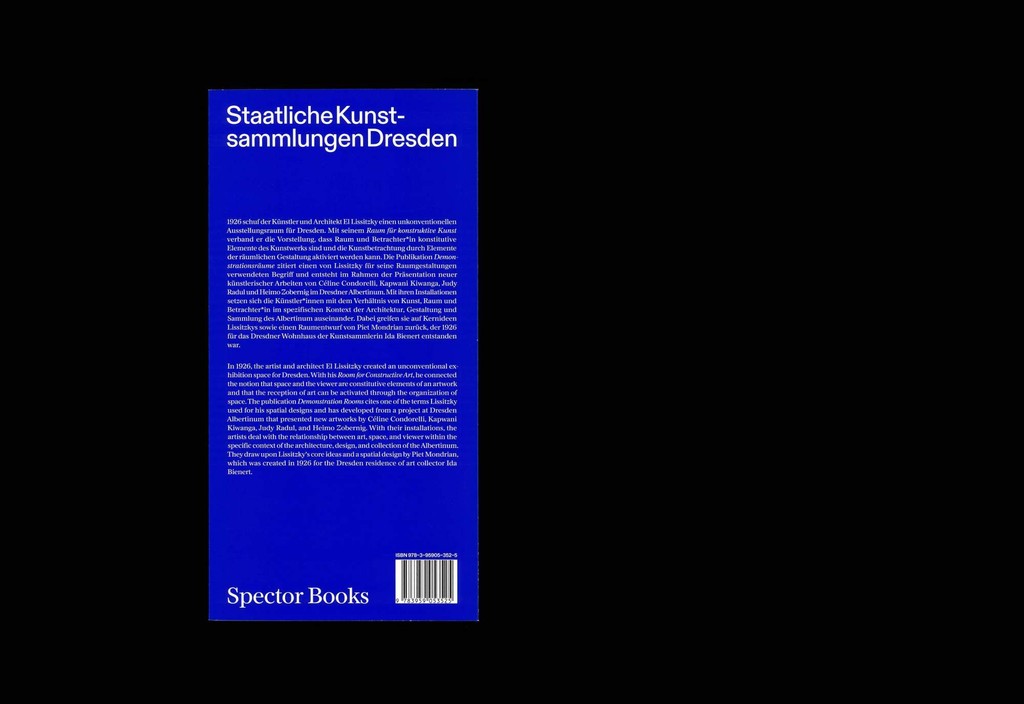
Demonstration Rooms, Spector Books. Design by Lamm & Kirch
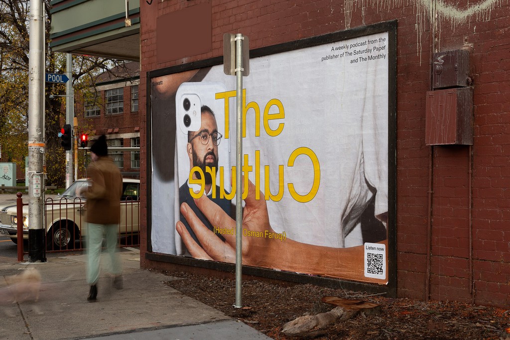
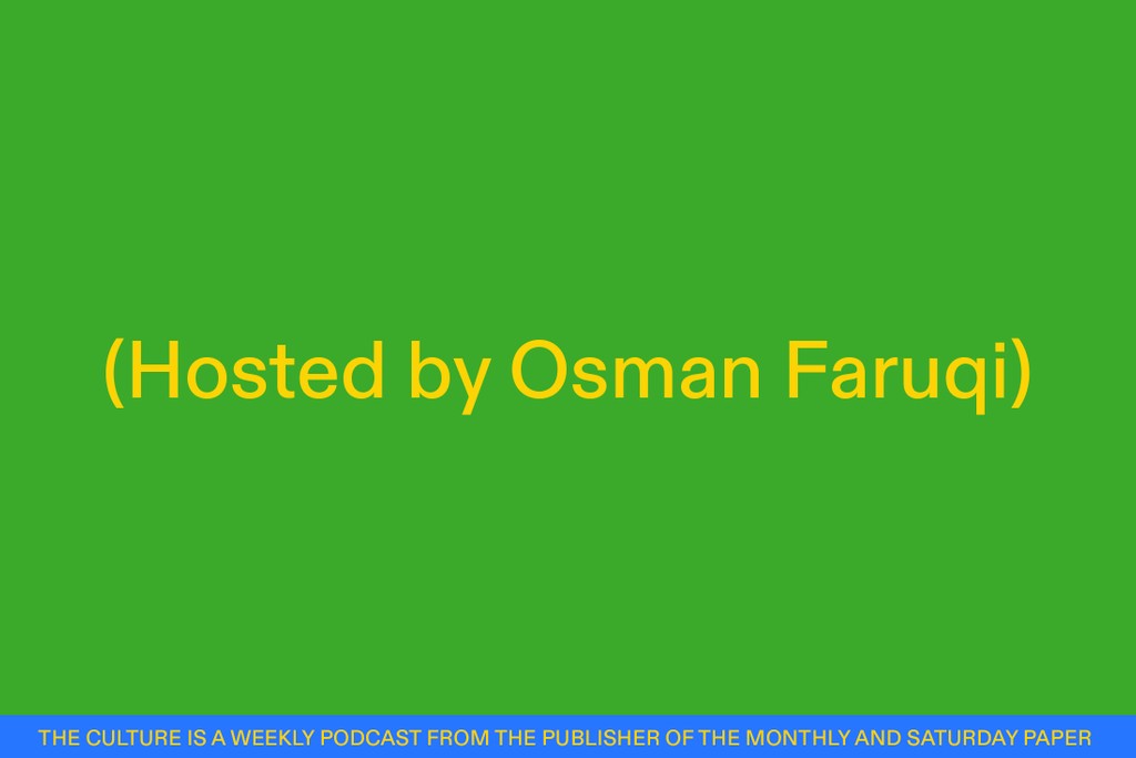
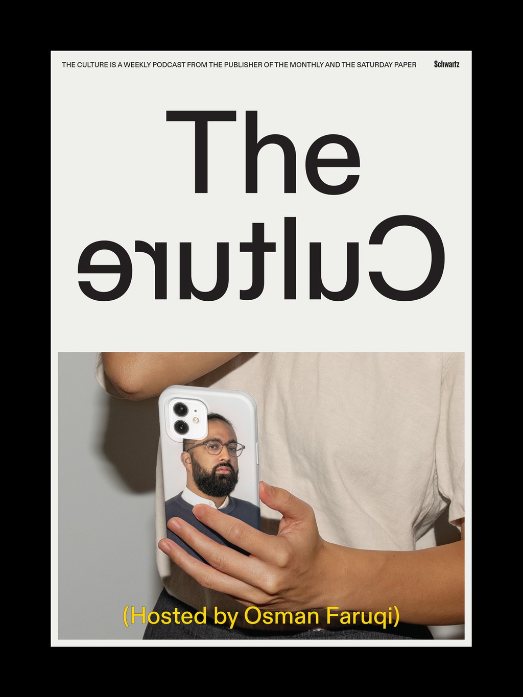
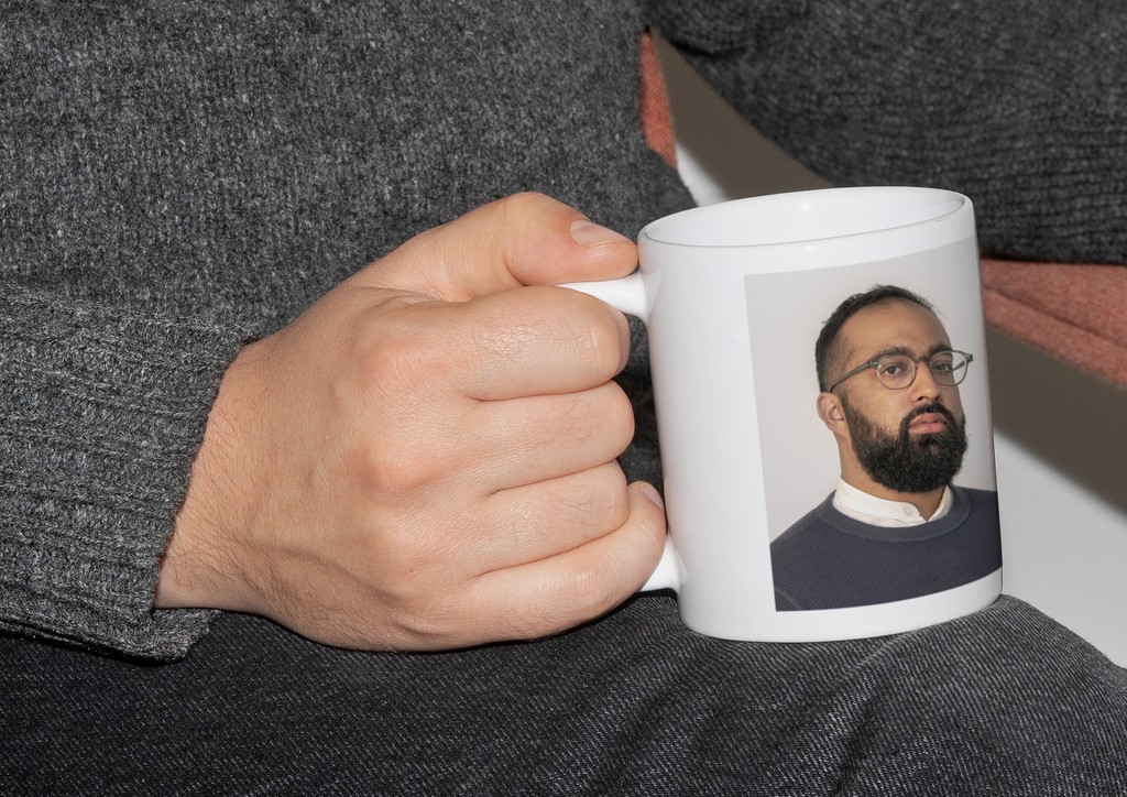
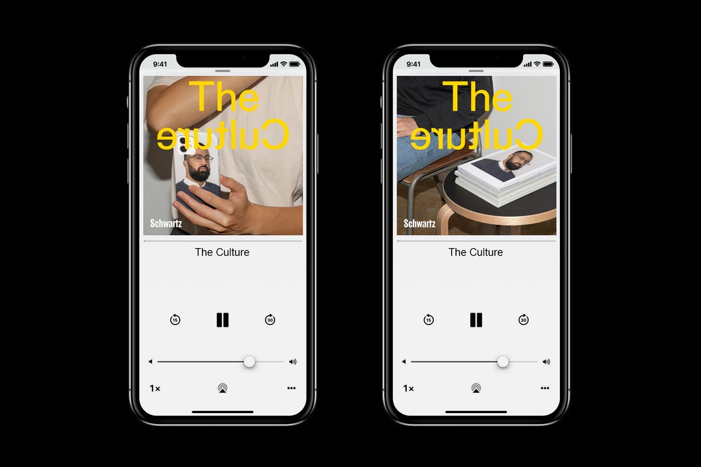
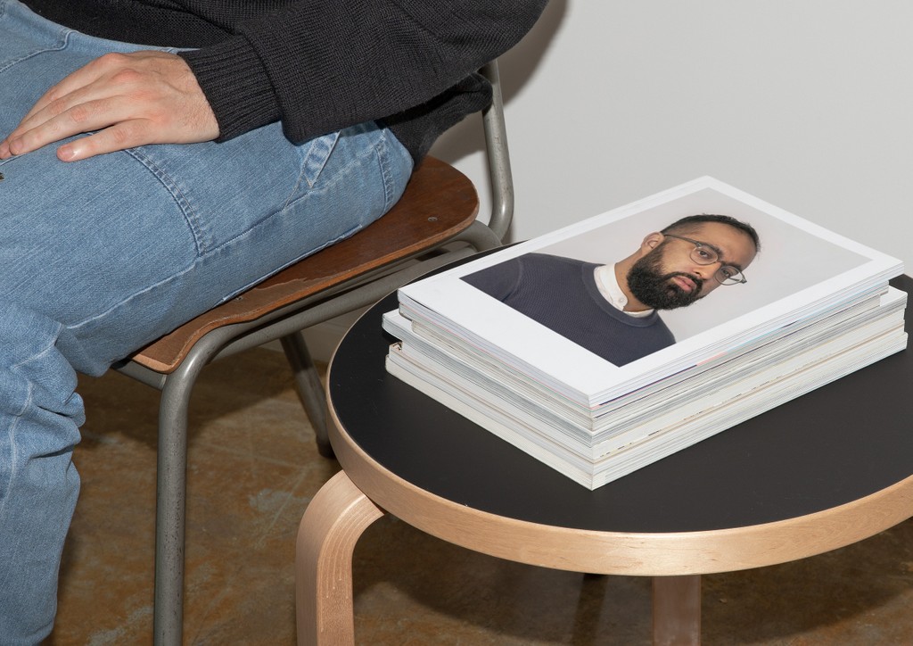
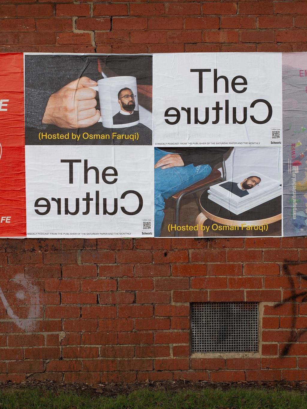
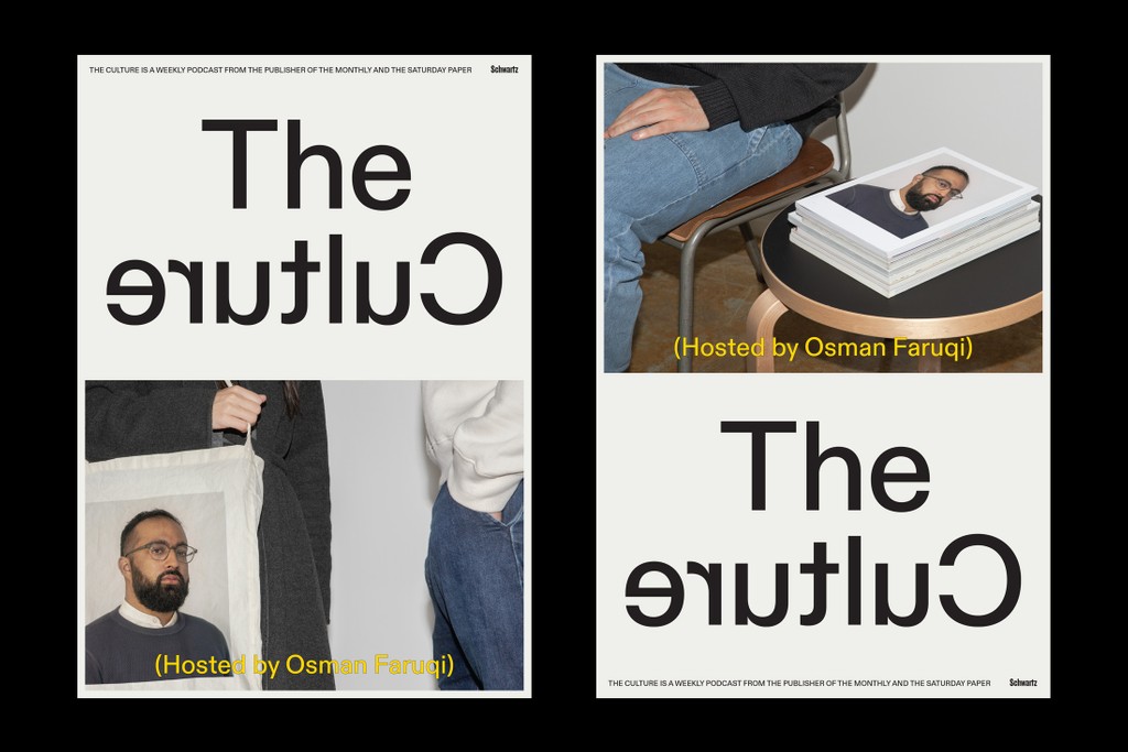
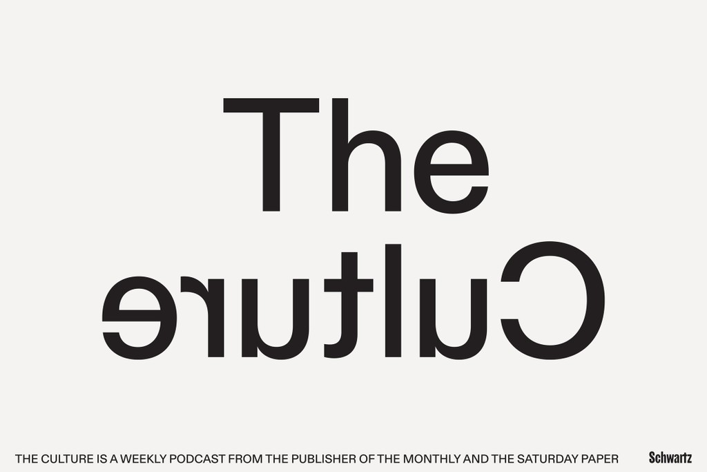
The Culture Podcast. Design by U-P
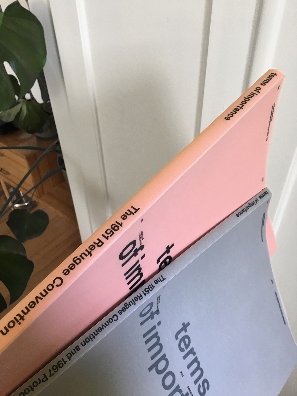
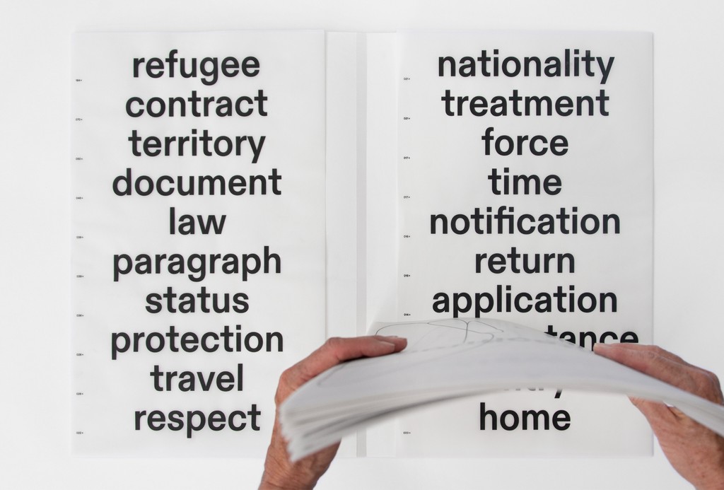
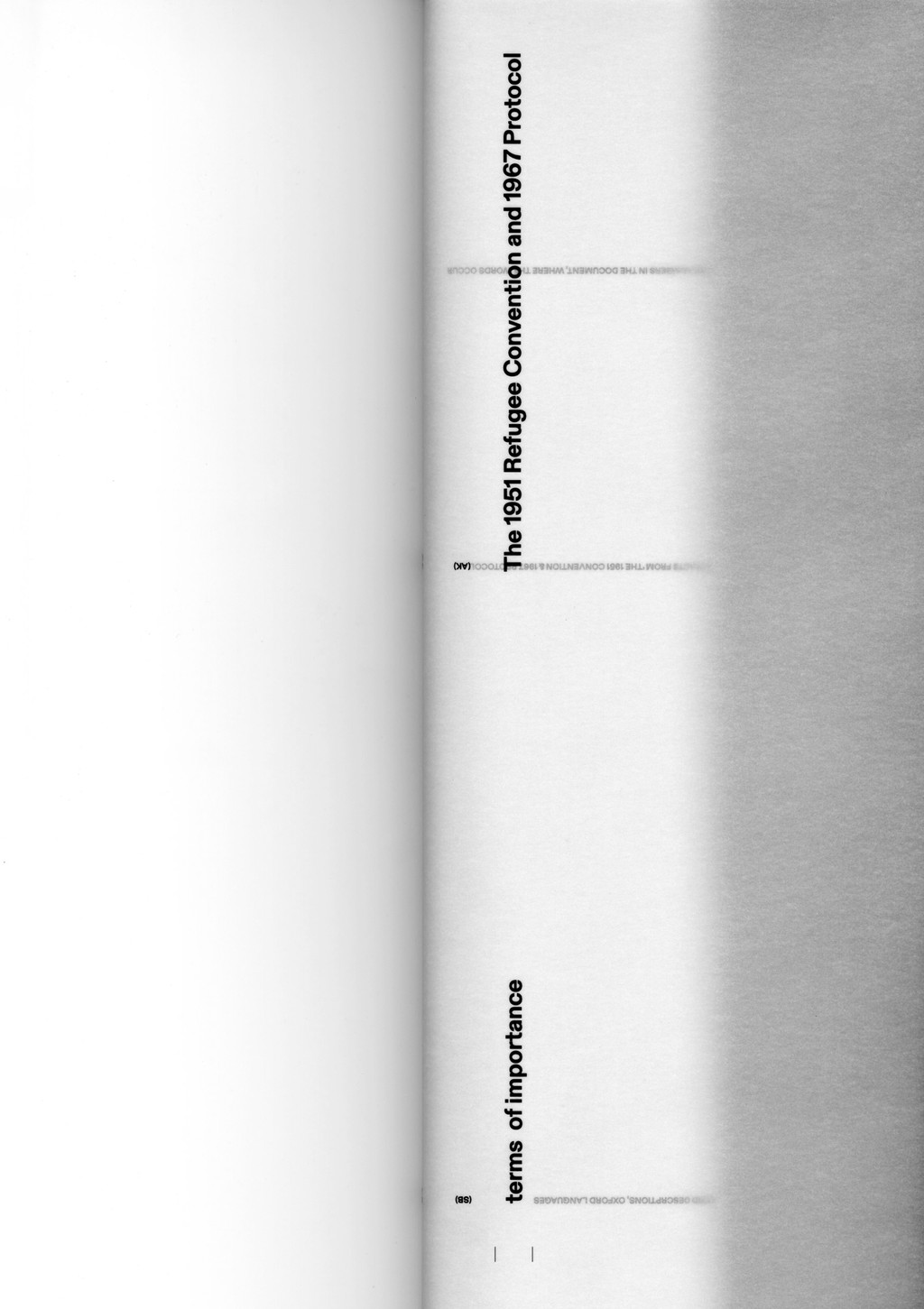
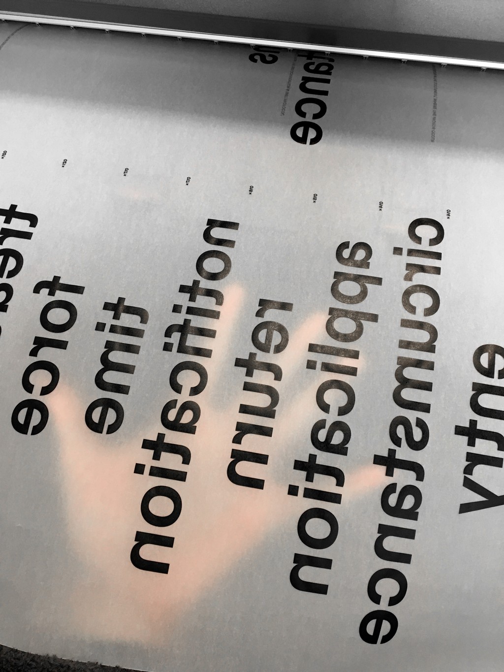
terms of importance. Design by Samira Schneuwly
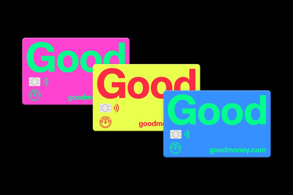
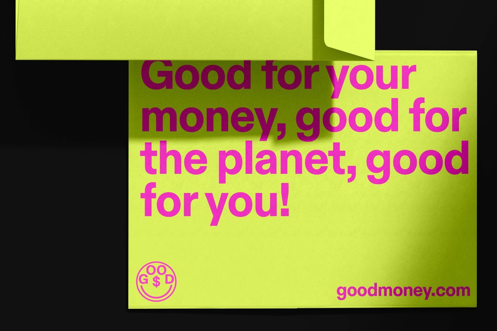
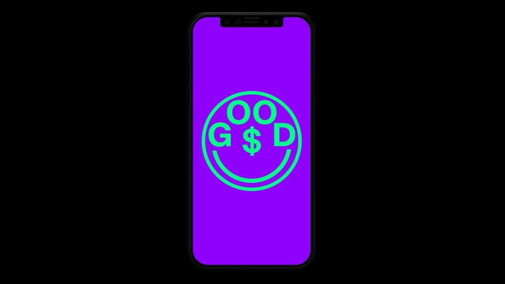
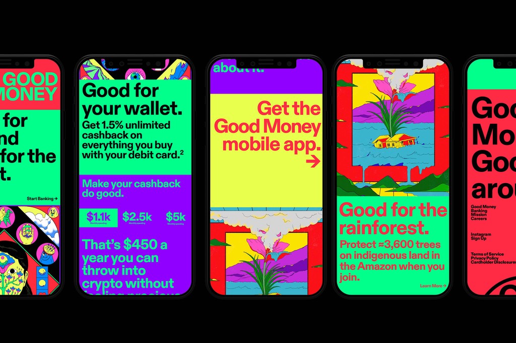

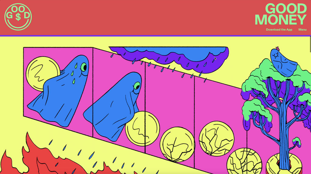
Good Money. Identity by New Studio

The Face.