We Made A MASCHINE Mk3 Dinamo with Native Instruments
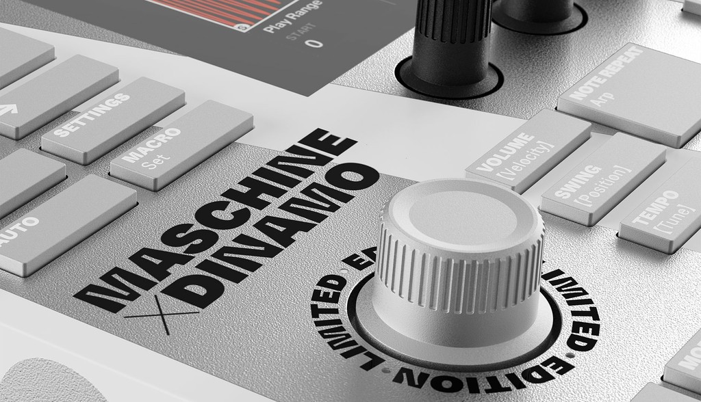
We’re excited to announce the release of a hardware project that’s been two years in the making: The Native Instruments MASCHINE Mk3 Dinamo.
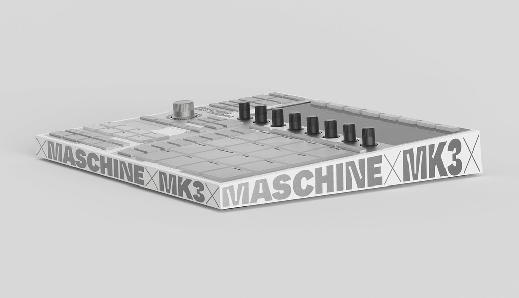
As a producer of code and tools ourselves, we continuously feel drawn to software, engineering, and the whole cosmos around these fields. And we’ve been feeling extremely humbled by this opportunity to produce the MASCHINE DINAMO, which features ABC Whyte Inktrap across every detail of the controller, laser-cut or printed in white, silver, and black. Limited to 750 units only.
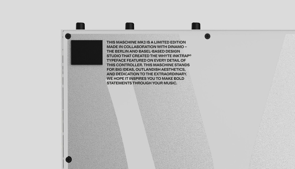
We first met NI hardware designer Johannes Schroth at a dinner party seven or eight years ago — a long time in Berlin. A few years later, Schroth approached us with the idea of bringing type to the forefront of the MASCHINE storyline. We didn’t know that he was working on the product at the time and were completely blown away by the technology. As we have our Hardware sub label that’s dedicated to the production of tangible objects, it was an obvious, dream partnership for us.
NI interviewed us about MASCHINE DINAMO for its blog. Below is a small, edited excerpt, or you can read the whole thing here. 🌌
“One of the defining features of the typeface Dinamo and Schroth settled on for the MASCHINE collaboration has an anachronistic edge to it—with a surprising benefit. MASCHINE DINAMO’s typeface, ABC Whyte, uses the idea of ink traps. ‘Today, with high-res screens and modern printing, you don’t need ink traps—everything is super sharp,’ explain Dinamo. ‘So we wanted to look again at ink traps through the lens of modern technology.’
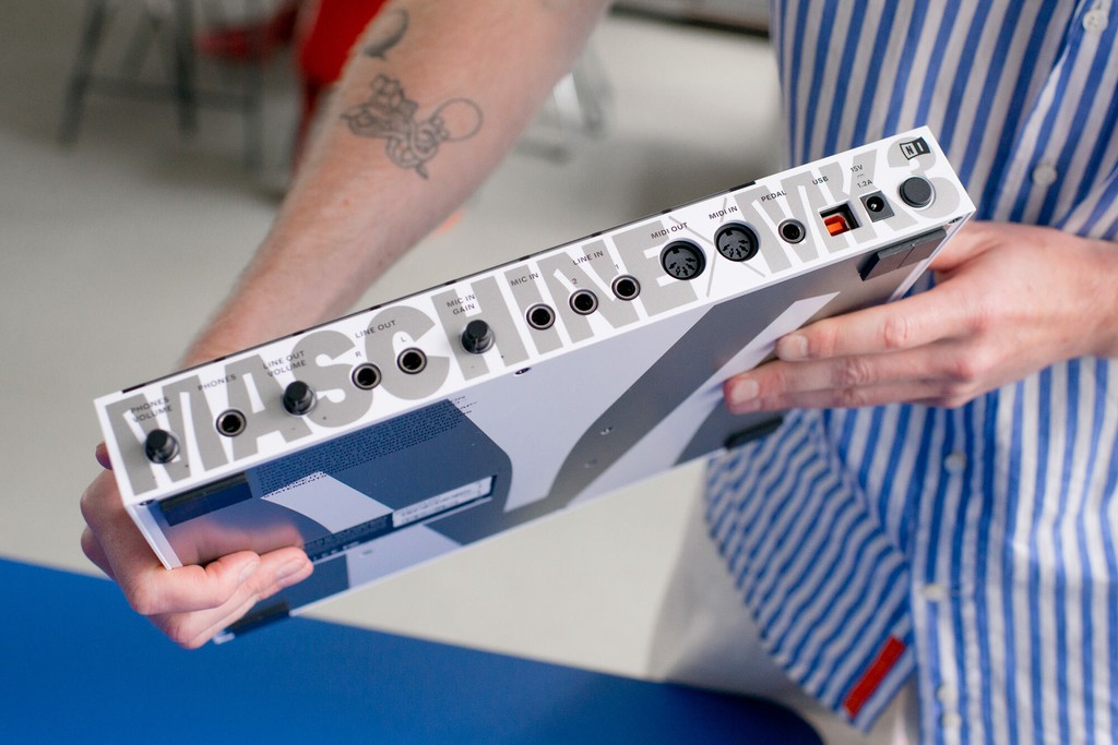
“As a variable font, designers can, for example, morph between having no ink traps at all and having huge ink traps that dominate the look of the glyphs at any size. And on close inspection, it’s clear that this adaptability is put to good use on the MASCHINE DINAMO—from the huge, squared-off M shape that sandwiches the the hardware, to the ‘ticker tape’ running around its edge and the tiny labels on each button and pad.
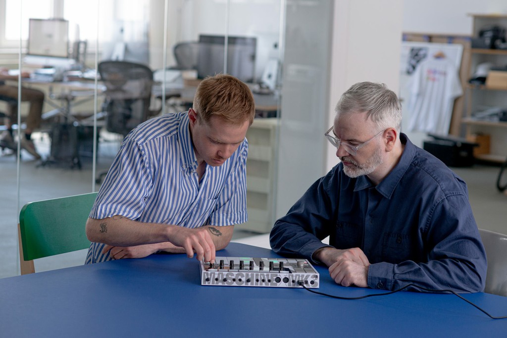
Clueless Dinamo representative with NI’s industrial designer Johannes Schroth
“‘What I find so interesting,’ Schroth says, ‘is that something that was designed to minimize ink bleed in a traditional printing press can also help minimize light bleed in a modern application. The function labels on Maschine’s buttons are lasered in, and the backlight shines through to make them readable. The ink traps actually serve to make those labels appear better defined than they otherwise would.’
“Dinamo was insistent that the overall design ought not to add anything extraneous, and rather ‘celebrate the object itself by labelling it. We think, often, in these kinds of collaborations you see people adding adjectives and so on—‘made in Berlin’ or whatever. We’re obviously not on board with any of that, we just wanted to call it what it is.’”