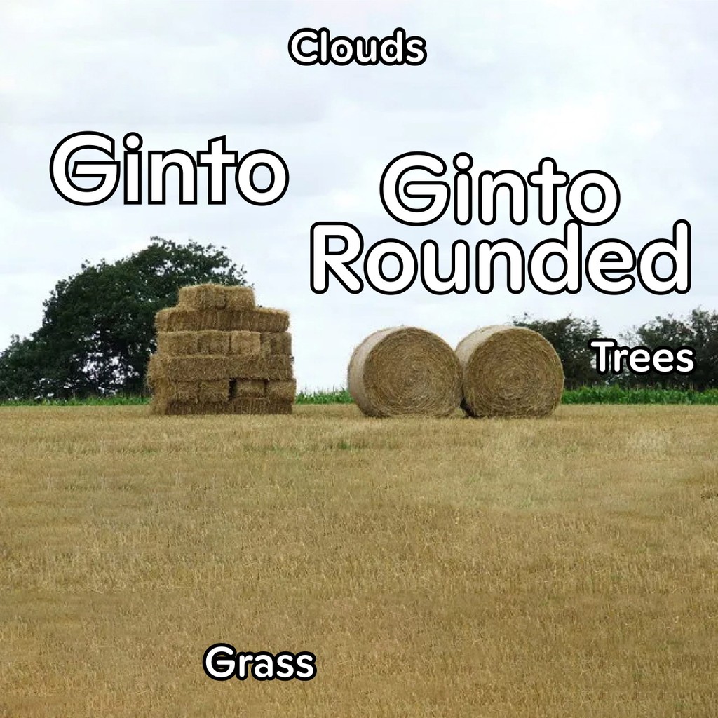
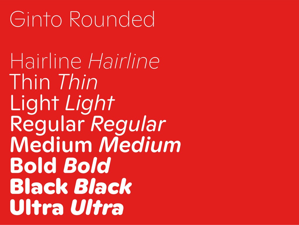
Ginto Rounded is Ginto’s Softer Cousin
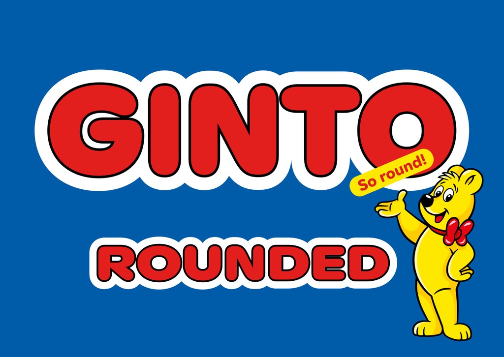
Ginto Rounded is a geometric-humanist font of soft edges and playful forms. Like its non-rounded older cousins Ginto, Ginto Nord, and Ginto Nord Condensed, the Ginto Rounded subfamilies explore the tension between circular shapes and moments of sharpness.
Think of it like a field recording that captures baroque, animated styles from the ’60s and ’70s as they exchange whispers with stricter, “modern” proportion models (like that of Futura).
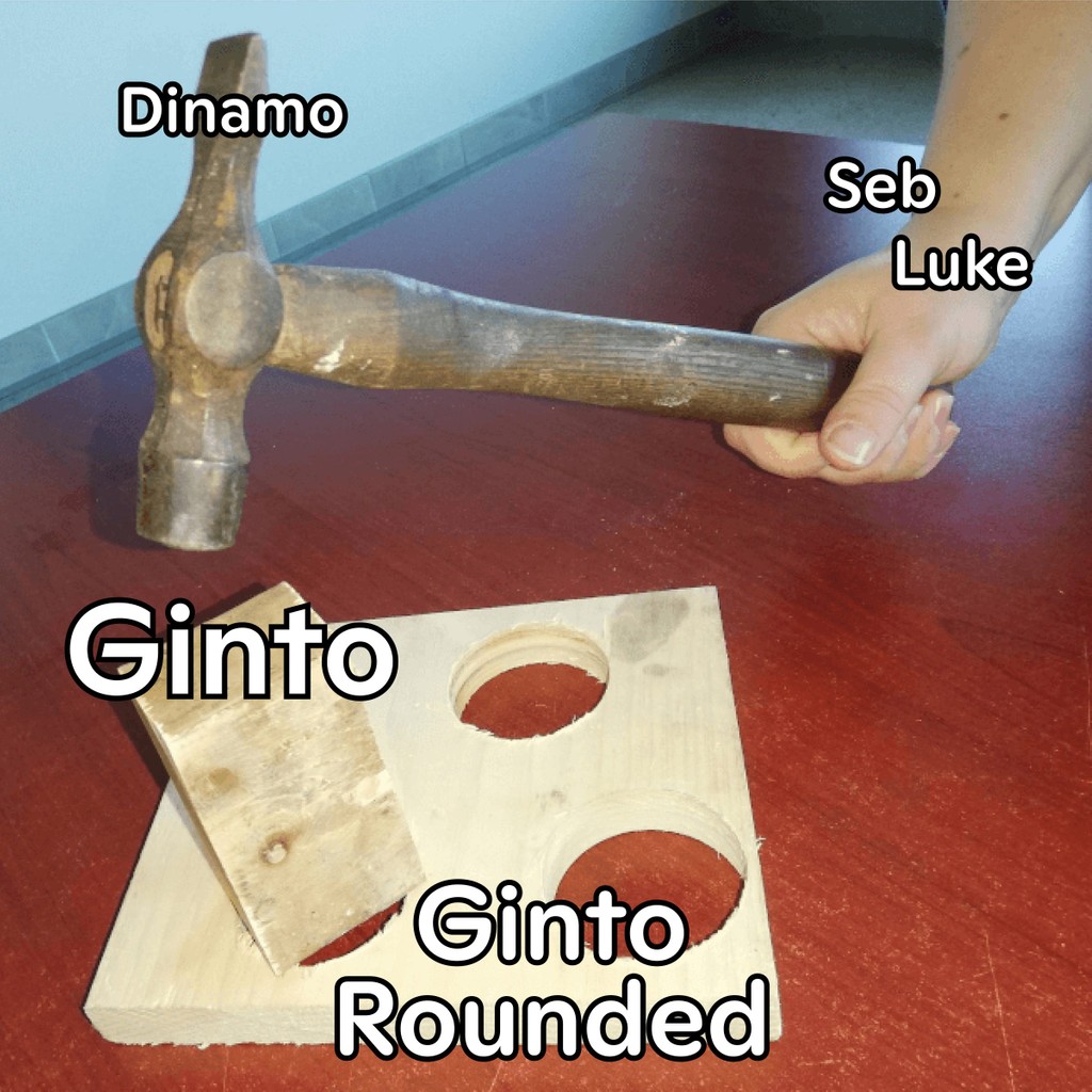
Educational meme #1
This release marks the completion of the Ginto project. All rounded and non-rounded Ginto subfamilies create a full package of fonts, which can be combined to support or create visual tension with one another (I’d even say that an entire branding project could be completed with this toolbox alone).
Let's dive in!

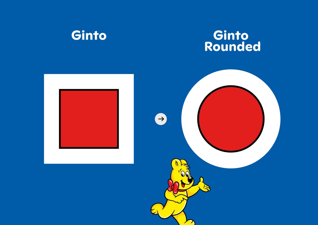


Educational meme #2
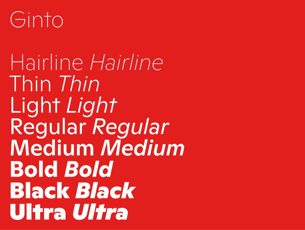
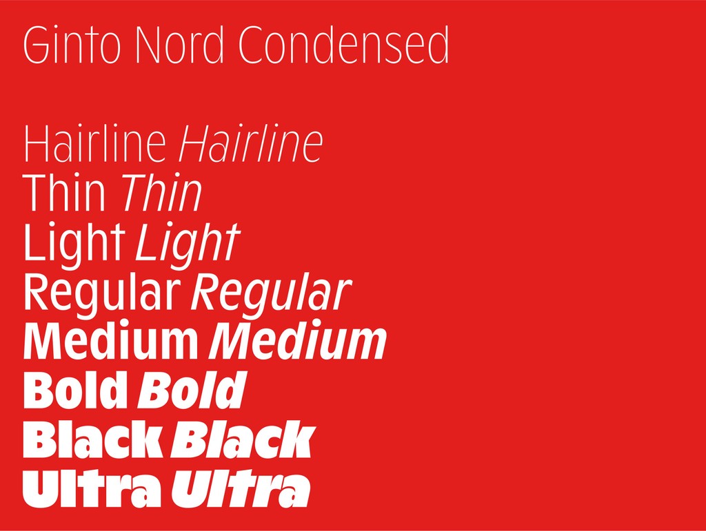
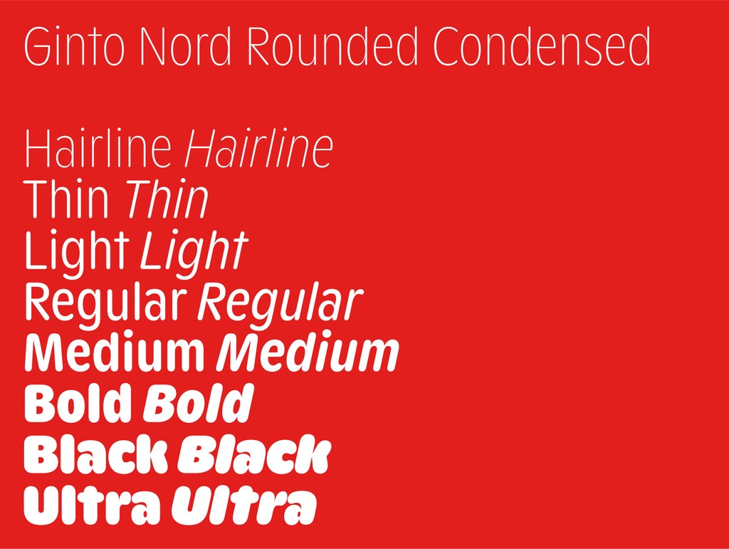
The Complete Range
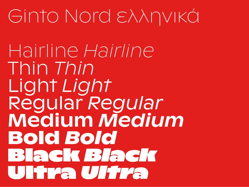
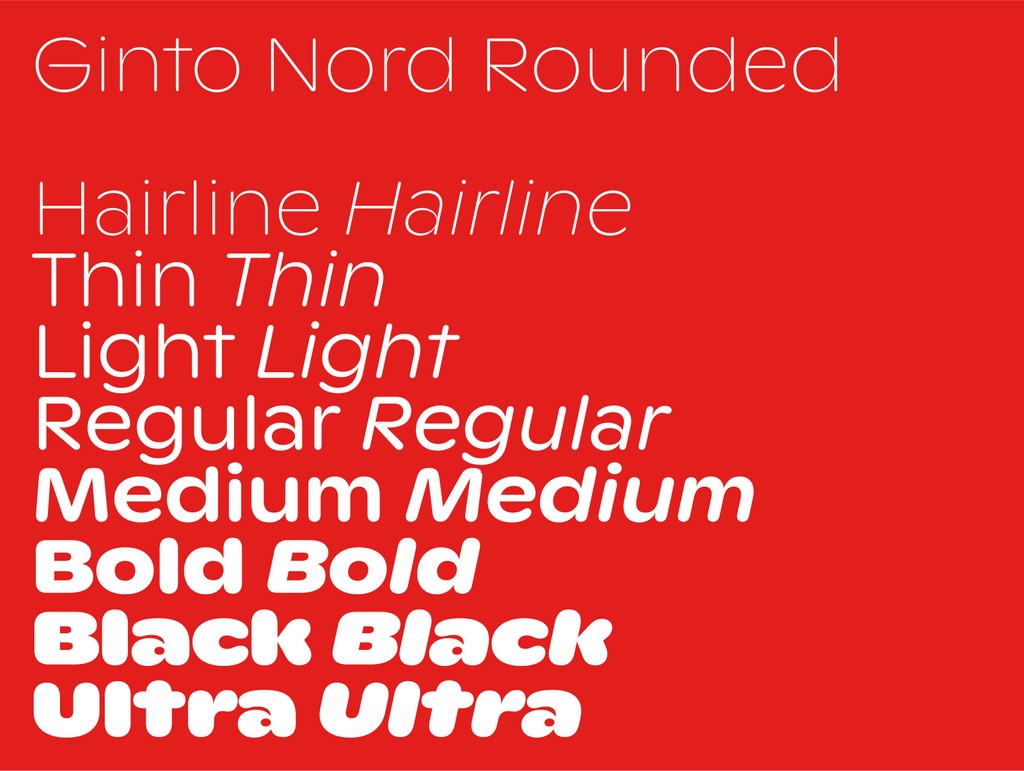
What’s the difference between Ginto Rounded and Ginto Nord Rounded, you ask?
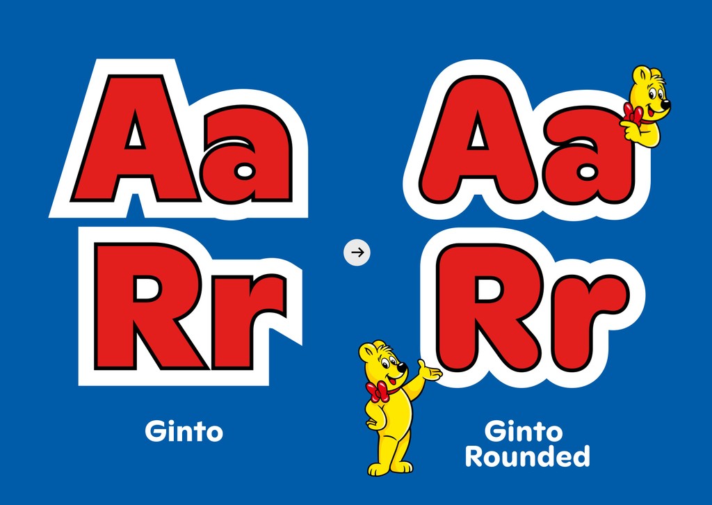
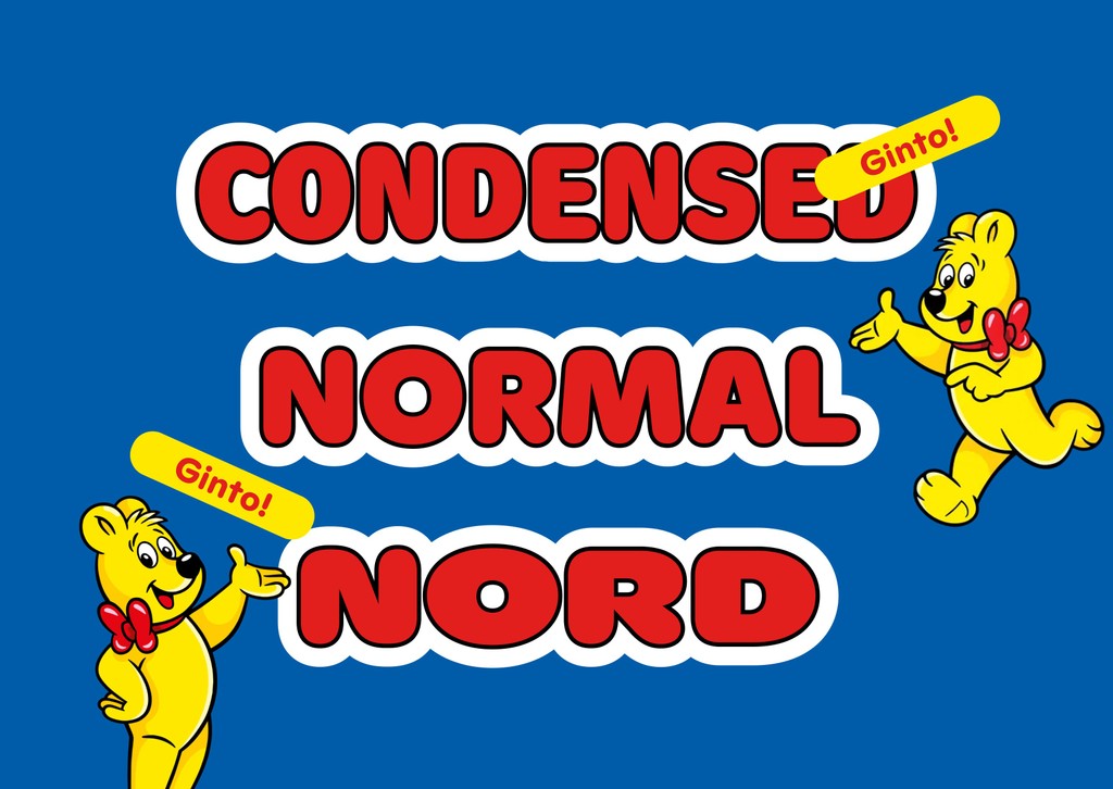
Both families cover the same weight range, from Thin to Ultra with corresponding Italics. As often is the case with subfamilies, the difference between them comes down to their underlying skeleton and proportions. Standard Ginto Rounded comes with a regular x-height and compact lowercase characters, making it good for smaller text sizes. Ginto Nord Rounded has a higher x-height and wider characters – making it a good fit for chunky display contexts.
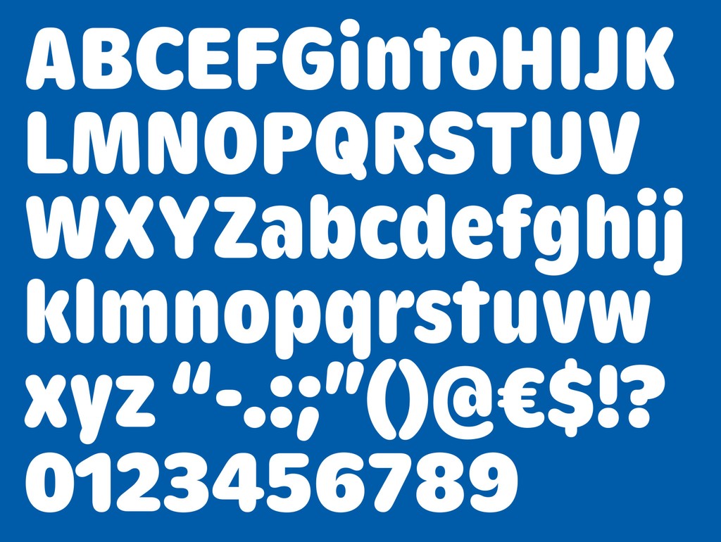
Core characters (in Ginto Nord Condensed Rounded)
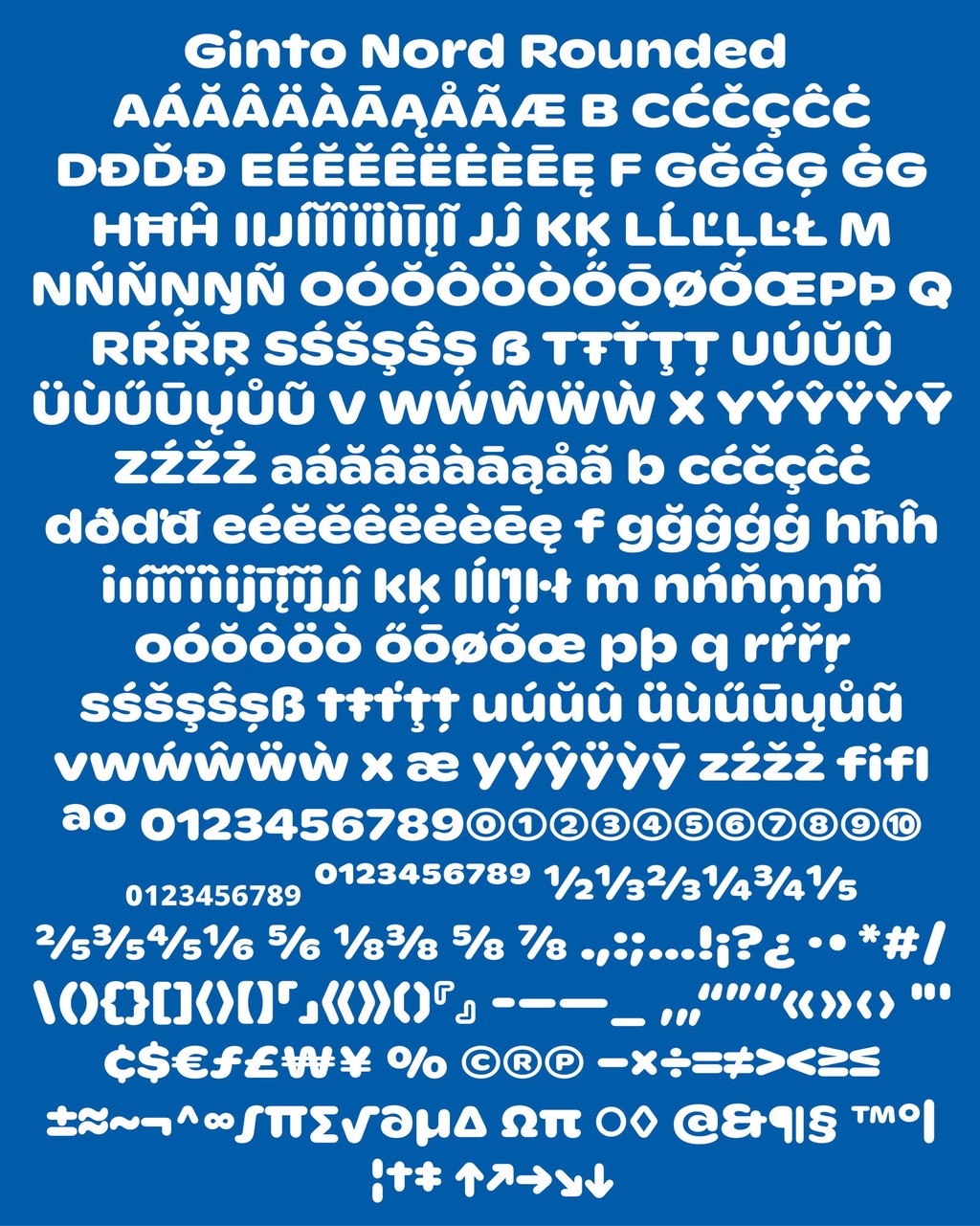
Complete character set (in Ginto Nord Rounded)
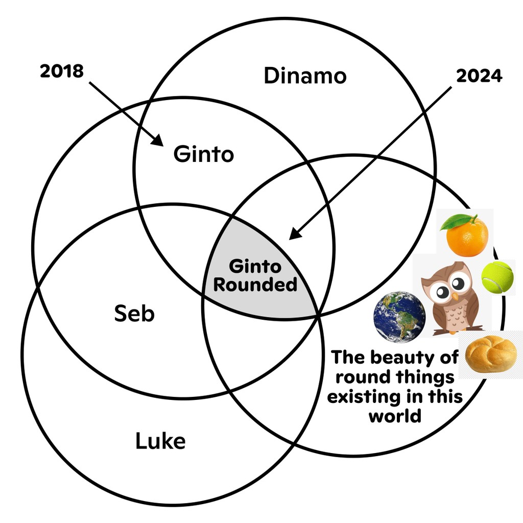
The new Ginto Rounded spin-off also includes Ginto Rounded Nord Condensed. There’s a Variable Font that bridges both Nords, allowing you to fine-tune width and find solutions for a variety of spatial contexts. NB: The non-rounded subfamilies are divided in exactly the same way. Let’s take one last look at the full Ginto family tree:
The Team
Seb McLauchlan began collaborating with us and designing ABC Ginto in 2016. Originally from New Zealand, he moved to the UK in 2015 and has been working in between type and graphic design ever since.
Seb started developing Ginto while researching sans-serif typefaces from the twentieth century, focusing on the shift from Modernist “purity” to the more dynamic styles of the post-phototypesetting period. He’s also the designer behind our ABC Marist and ABC ROM.

Educational meme #3
Educational meme #4
Alongside Seb, Luke Charsley worked on all the Ginto Rounded subfamilies, taking Seb’s initial sketches over the finish line. And Kasper Pyndt Rasmussen created the Nord Condensed family, with Addison Copas — a former student of Seb’s from Kingston School of Art in London — collaborating with our own Hugo Jourdan to update and produce the complete avalanche of fresh Ginto font files.