Typeface Release: ABC Grow
ABC Grow was the first typeface that we released under the name Dinamo, and it was also our first introduction to building specialized software in order to implement a modular concept. The process planted the seed of an early (but also ongoing) preoccupation of ours: Drawing from the history of type design while using new technology, in order to create subjective yet also entirely engineered surprises.
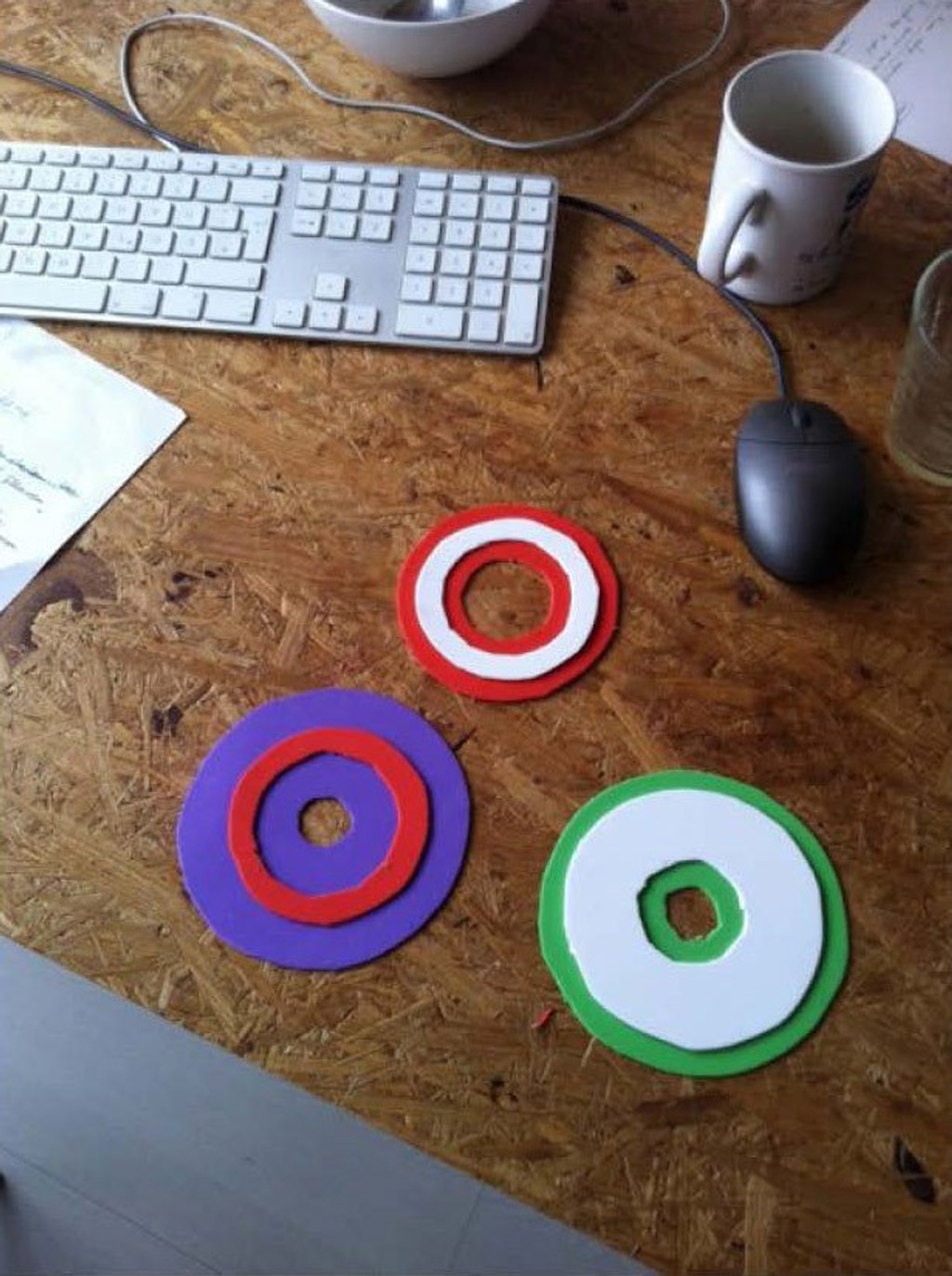
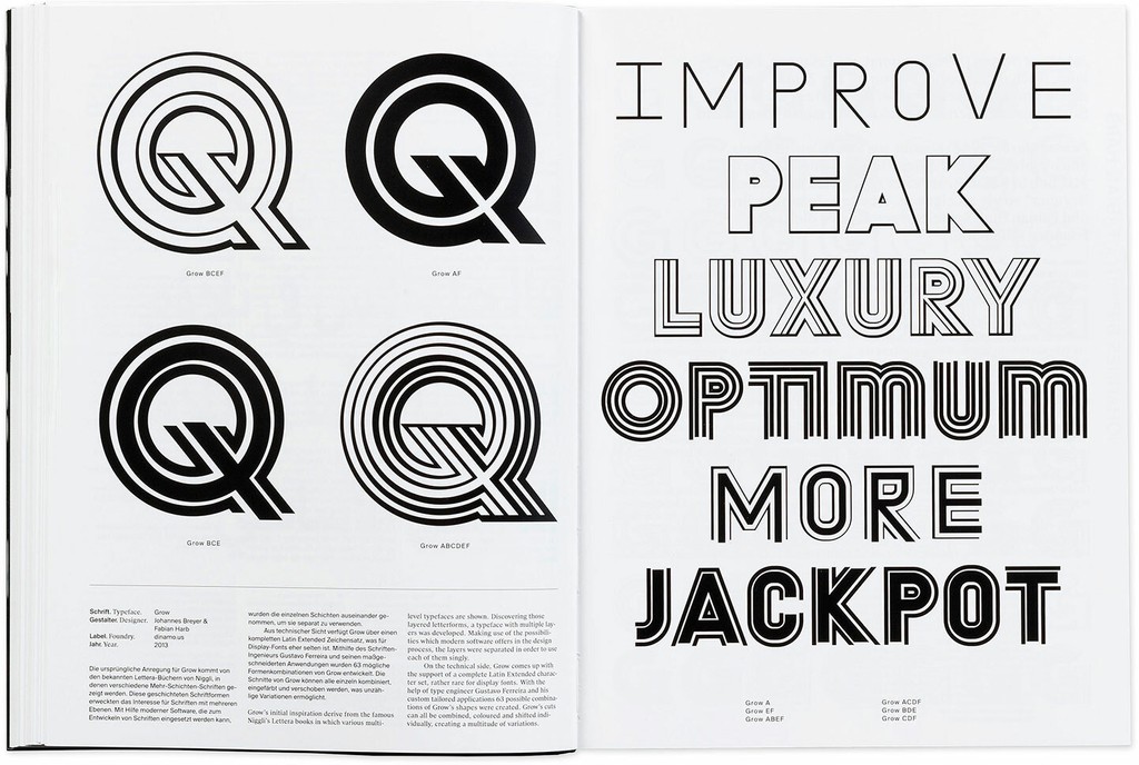
The idea for ABC Grow first emerged when Fabian Harb discovered a 1970s Letraset phototypesetting typeface made from several layers, just like the rings of an onion. We were curious about what would happen if you could dissect these layers and then mix-and-match them to form different combinations. After some time spent sketching the six base layers and labelling them A through F—as well as a few distracting experiments with multi-colored PVC foam paper—we realized that organizing all of the layers into every possible combination by hand would take quite a while… Luckily for us, at the time the type engineer Gustavo Ferreira lived just one street away from Johannes Breyer in Amsterdam.
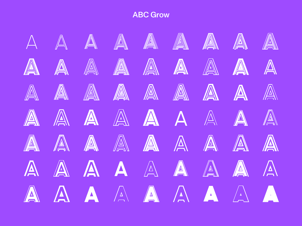
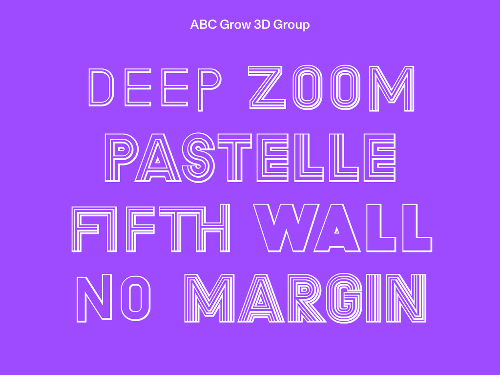
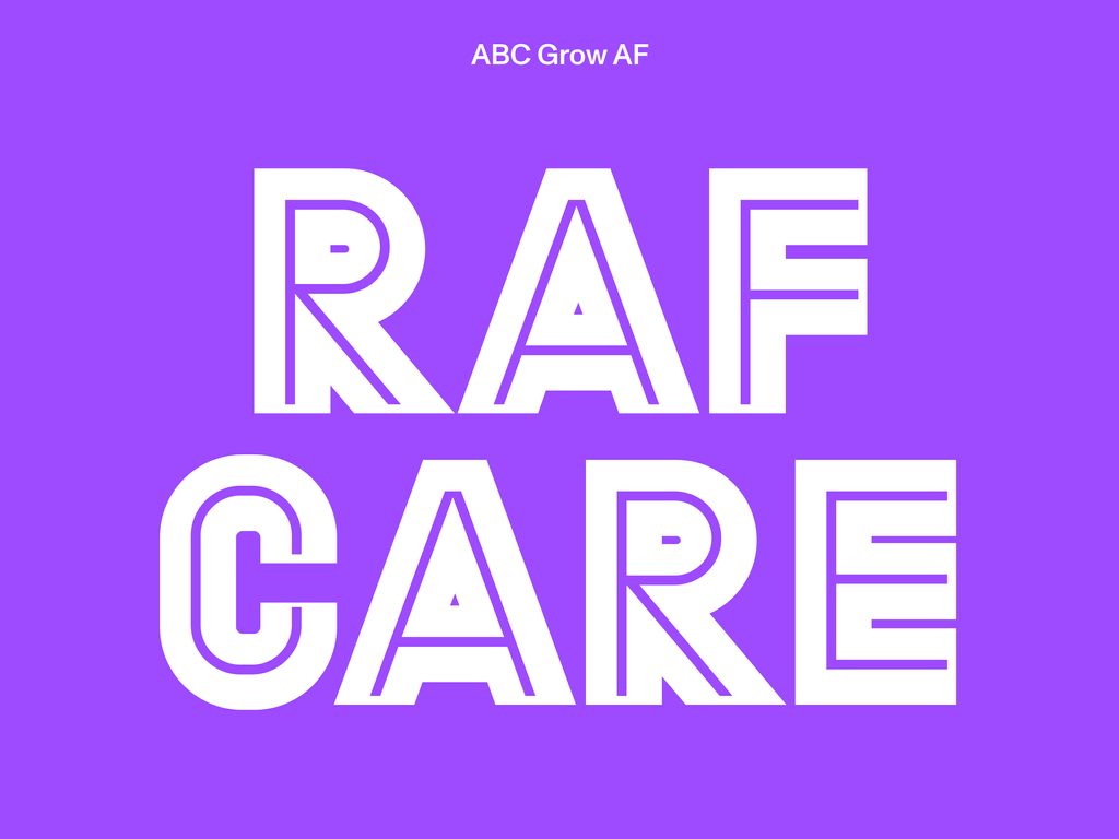
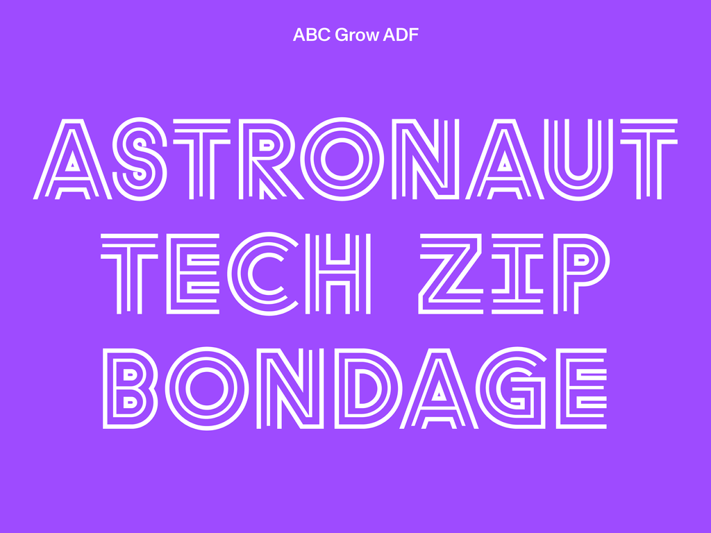
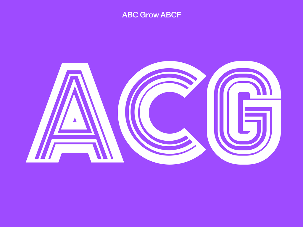
With Gustavo’s help, in 2012 we developed a software plugin that allows us to preview all the different combinations of the six layers of the typeface—which form 63 individual styles in total. The plugin imports the six basic shapes and then the user can tick layer boxes to hide or group the layers. We were personally pleasantly surprised by all of the unexpected Frankenstein variations created by the tool, as it implemented a system that we’d designed but not been able to fully envision in its totality. Combine all layers together (ABCDEF), and you’ll see the original inspiration from the phototypesetting sample.
Grow can only exist in uppercase, because of the shapes of the layers. We created 14 alternative characters for those looking for a more economical and less chunky feel—so we have narrow versions of the circular O, as well as a tighter M. The typeface also includes fractions, roman numerals, arrows, and ligatures. You can purchase each combination individually, or the entire set is available, if you think you can handle the beast.
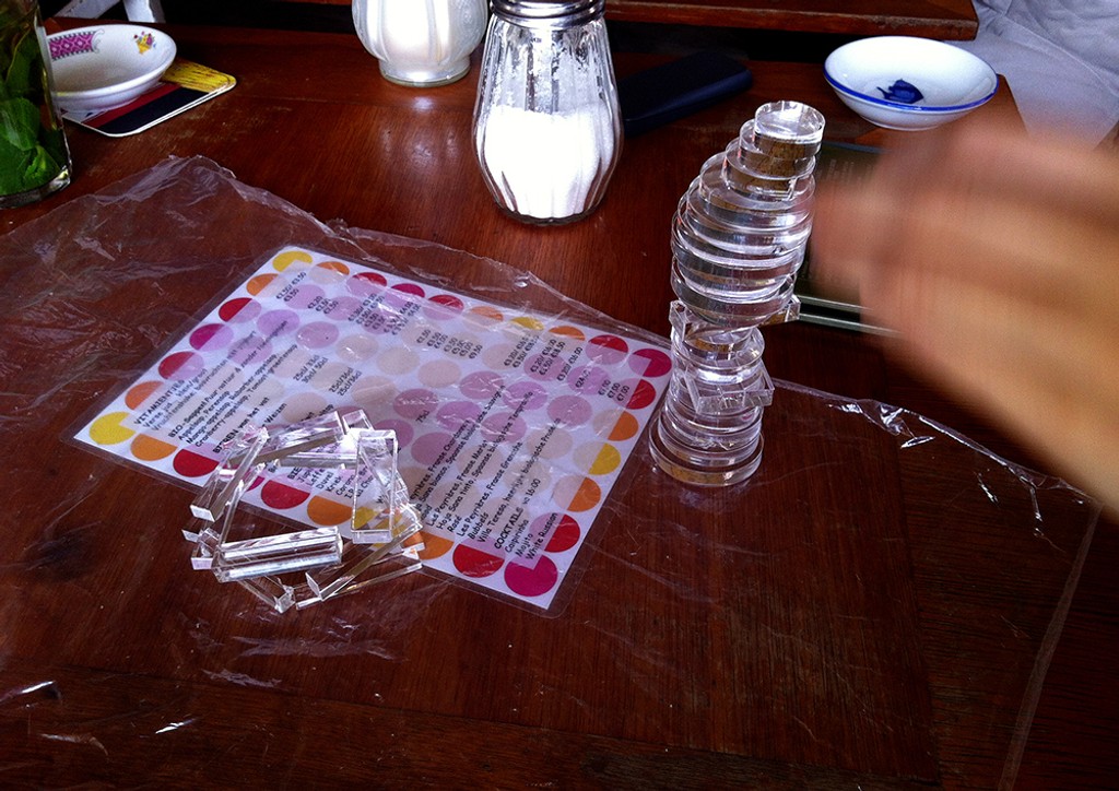
Proofing cut glass prototype of ABC Grow with Laura Pappa, Amsterdam, 2013

ABC Grow featured in 'Neue Schriften. New Typefaces.,' by Petra Eisele, 2013, Niggli Verlag
Credits
Design: Dinamo (Johannes Breyer & Fabian Harb)
Spacing and Kerning: Dinamo (Johannes Breyer)
Mastering and Technical Support: Gustavo Ferreira