How We Design Our Typeface Campaigns

A little over a year ago, our good friends Sascia Reibel and Mathias Lempart joined the Dinamo ship to take charge of our art direction. The collaboration has pushed our graphic design to new heights, so we wanted to dedicate a story to their gorgeously detailed typeface campaigns.
To give you more insight into how they work, Maddy and Johannes visited Sascia and Mathias in their studio next to Kottbusser Tor in Berlin to reflect a little on recent poster designs.
Maddy: How do you begin a new font campaign?
Mathias: We try to give every typeface its own unique identity. Its own stand alone campaign. To be able to do that — and to come up with something that really stands for the font — we first need something to hook into. Something to play around with. Sometimes, that’ll be a source that originally inspired the type designer to create the font. Or sometimes it’ll be something else entirely.
Maddy: What’s interesting is that each campaign is so visually different. We don’t have this one aesthetic running through all of them. If anything, what unites them is more of an attitude.
Sascia: That actually happened by accident. We started with the Marist campaign, where we went down this route of creating an imaginary archive in the style of The Da Vinci Code or Indiana Jones. And then the next campaign was Walter, where we made all these New Yorker-style cartoons. Both approaches were so vastly different, and that immediately put out the fire of us coming up with one visual language for all typeface campaigns.
Johannes: It’s about creating a world around a font. Which can be silly or unrealistic. With the Repro campaign, the poster feels like this crazy photograph of some strange, secret laboratory. You start to imagine a story when you look at it. Is this a hidden area where this font was built, with a mad scientist walking around? We’re trying to create the seed of a narrative.
Maddy: Some people might say that we should just showcase the font, because we don’t want to be too prescriptive about how the font should be used. Why do you not lean into that? Why create these type fictions instead?
Johannes: It’s just more fun. And it’s more interesting to talk about fonts like they’re people, or as if they’ve emerged from these weird universes.
Sascia: Also, it would reduce and take away a lot of the context around making a font if we just showed them in a blank way. Designing a font takes a lot of time. There’s a person behind a typeface. And there’s a personality behind the font. So why should it just be A-Z in green, blue, or yellow?
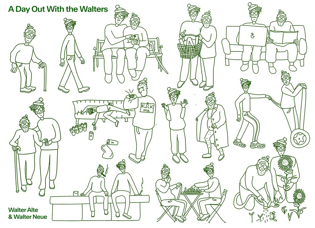
Maddy: One of my personal favorite ways you brought out the context of a font is the Walter campaign. The two cartoon characters really get the viewer into the font. Because it adds this second layer of understanding to the whole thing. There are two Walter type families, one is old and one is more contemporary, so you’ve made two mascots, an old Walter and a young one. How did those characters come about?
Sascia: It was very literal at first. We started trying to emulate Where’s Waldo-style “wimmelbild”, and we made one of the Dinamo Berlin Studio…
Johannes: And it even started earlier than that, too. Omnigroup, who we co-designed the font with, would send around pictures of the source Walter was inspired by out in the wild in Switzerland. It became like a Where’s Walter? joke. A meme. So I said to Sascia and Mathias, let’s do a quick campaign based on this Where’s Walter joke. And then it became this huge, beautiful thing.
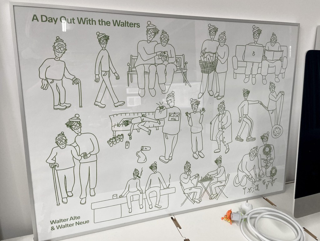
Sascia: The first Wimmelbild didn’t work at all! All three of us looked at it and were like, ooof. That’s bad. I love when you’re so wrong, even though a direction feels so right at the start.
Johannes: It’s a part of the process.
Mathias: So we started talking again and Johannes was like, “the style is working really well, but it needs to be a story of the old and the young Walter.”
Sascia: And we had the idea of combining old and young versions of them.
Johannes: And then we got this crazy poster of the Walters doing unusual things. They’re like vaping together. Planting together. It always clicks when the campaign feels strange.
Mathias: You also don’t understand the relationship. Are they buddies? Or is this the same person?
Johannes: Is it the caretaker who wants the inheritance money?
An early campaign designed by M + S in the pages of Flash Art
I found this one in our Slack
Maddy: You’re not illustrators. So who drew them?
Mathias: We both did!
Sascia: Mathi was better at doing the faces. So we split them.
Mathias: Often you’ll find the same face on different bodies. That’s why they look eerily similar.
Sascia: You can tell who did a body by looking at the legs. I made them wear pants. And Mathi’s are wearing leggings.
Maddy: Is that usually how you work? By tossing a design back and forth?
Mathias: The idea is that we approach every project with an open outcome. So we allow it to become something we don’t know yet. We try to allow ourselves to be influenced by the content.
Sascia: We try to make use of the fact that we have two different brains. We have a lot in common but want to be very mindful of trusting each other when we diverge.
Maybe one of us has an idea first, but we need to visualize it as it’s hard to explain in words. I often have to try something out to see if it works in reality. As soon as there is something there, we get into a conversation together. Exchange thoughts. And then switch it around. When one of us doesn’t know where to go anymore, we’ll hand the file over to the other.
We’re not machines and everything is a different situation. Sometimes I feel like starting a design straight away. Sometimes I feel like starting with research.
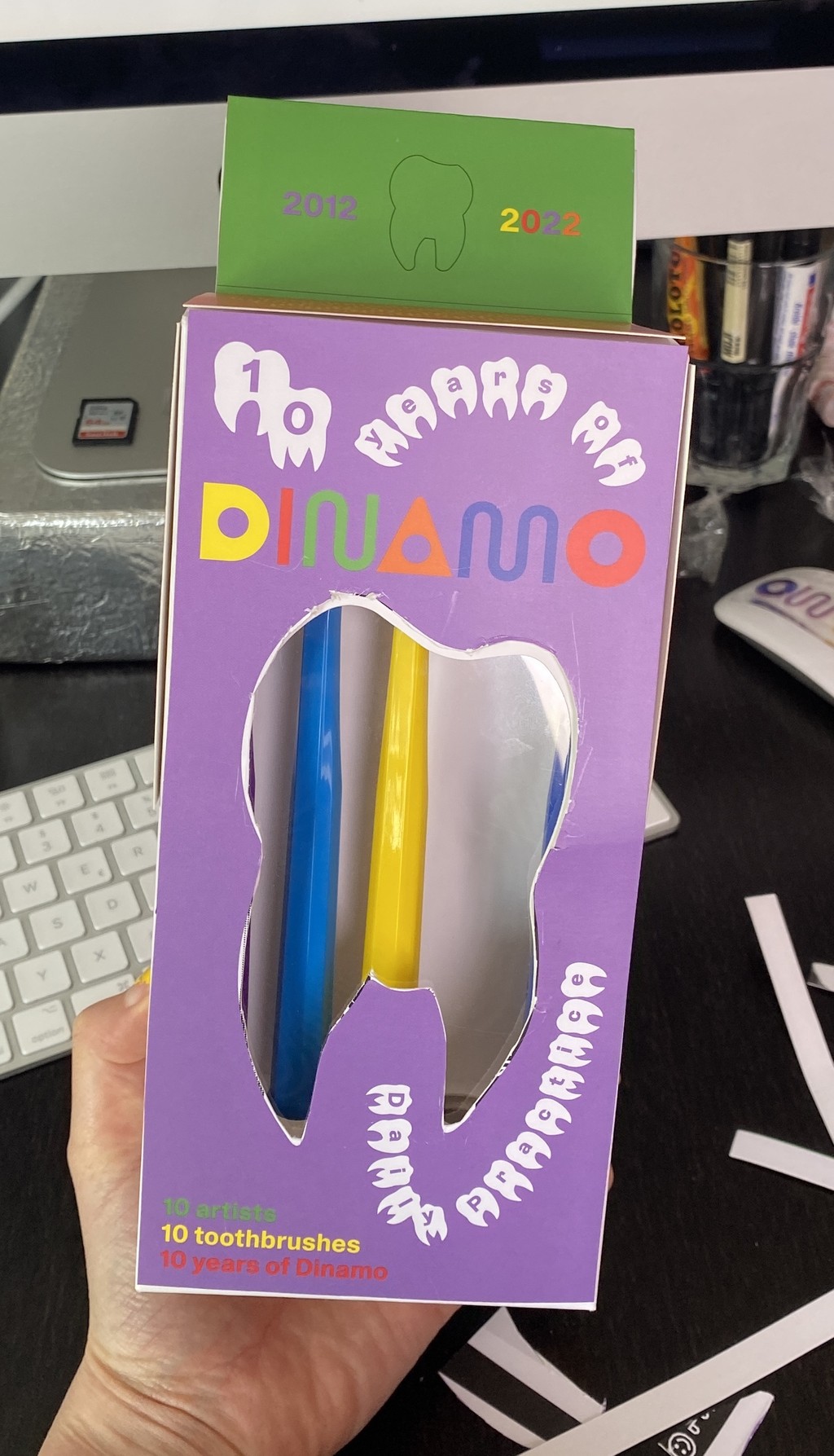
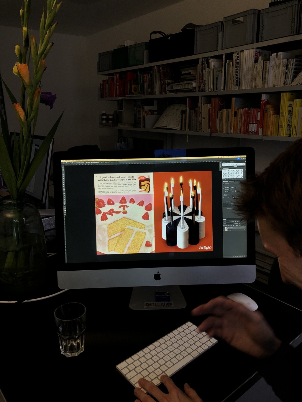
Behind-the-scenes: The making of our Artist Edition Toothbrush Pack....
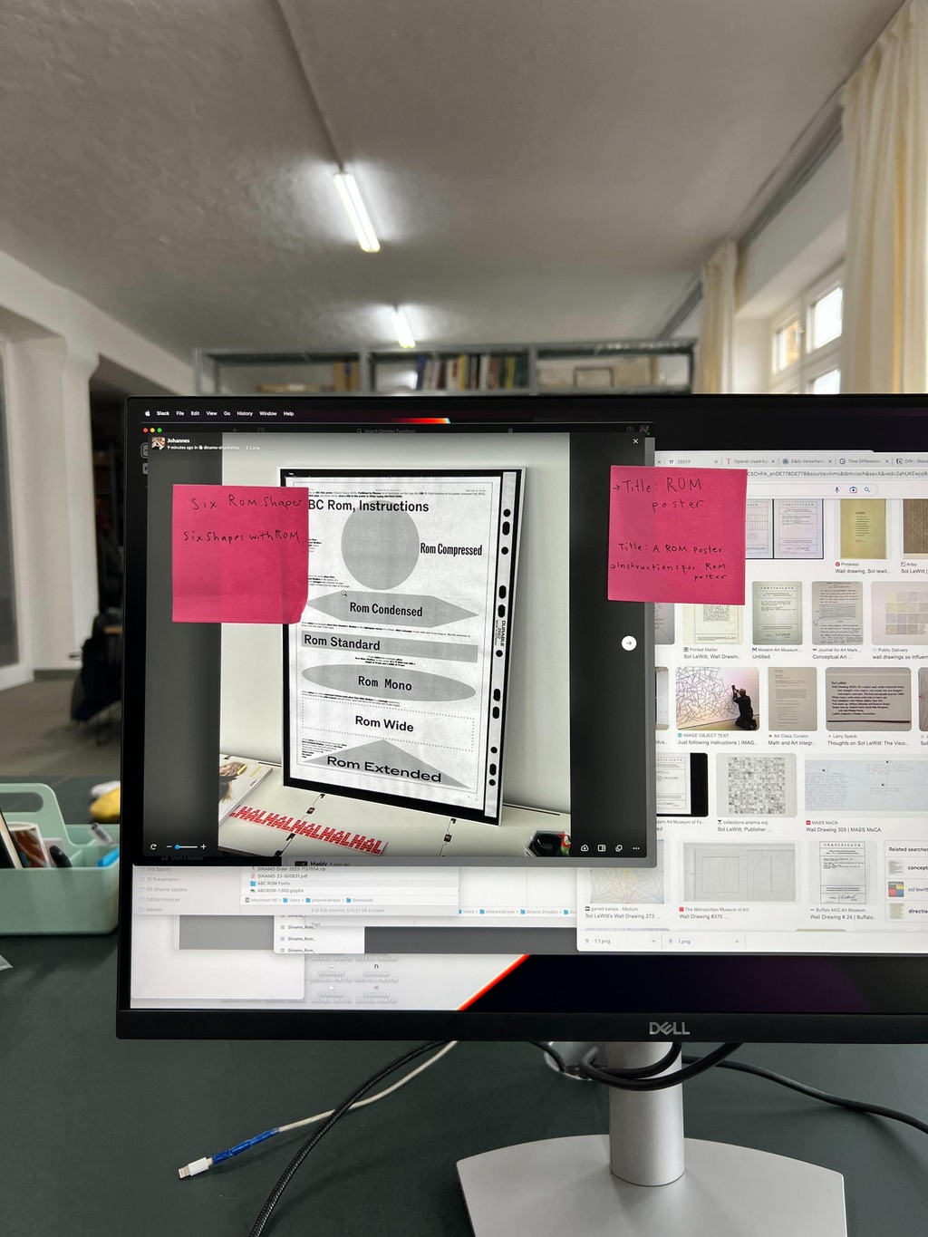
...And the making of our upcoming ROM campaign
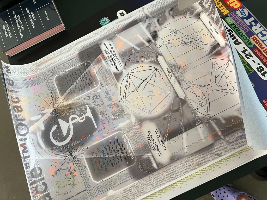
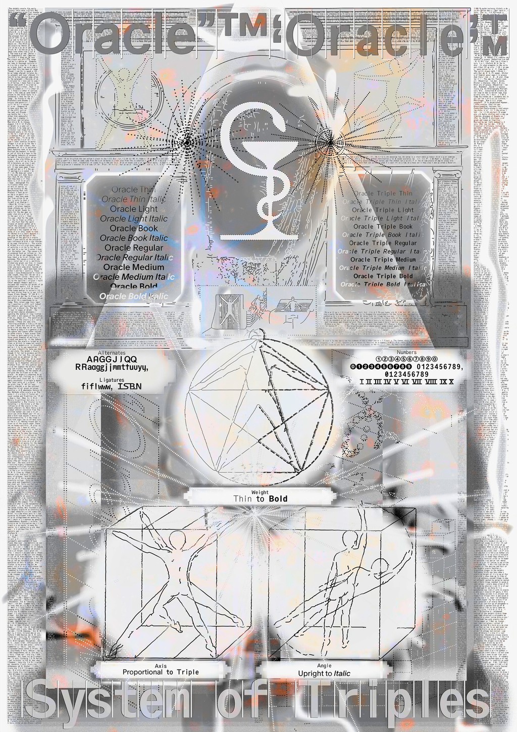
Maddy: Let’s talk about Oracle. That campaign felt very research heavy.
Johannes: It began with me talking to Sascia and describing the world of the font. A place that felt almost like a temple.
Sascia: And I started diving into all these alternative music notation references, which I’ve always found very interesting but not yet gotten around to applying anywhere.
Maddy: How do you know about them?
Sascia: I wouldn’t say I have an exceptionally great memory. People tell me that I know a little bit about a lot of things. Sometimes if I see something, it reminds me of what I already know but forgot about. I remember things through a prompt. So Johannes asked me: “What if aliens had the ten commandments?” And then all these references in my memory came back to me. For Oracle, I started looking at experiments in movement, astrology, and notation styles.
Mathias: Oracle is called Oracle in reference to the Oracle of Delphi in Ancient Greek mythology, who breathed in fumes to make her predictions. So that’s also where the campaign video’s smokiness came from. We also wondered: Could Oracle be an alien, too? And so we made it into this creature. That’s where the mascot came from, which you see in the poster.
Fresh off the press
Sascia: So we reference the Ancient Greek aspect in a metaphor. But then we also show the technical aspect of how the font is drawn using the mascot, specifically the subfamily Oracle Triple, which has a bounding box that’s been segmented into units of thirds. Our mascot, she stands in three positions, taking up three units of space like the typeface. And she also moves from upright to italic, like the font.
Johannes: All the campaigns are very detailed and complex and smart. This one really clicked for me when we realized the mascot could start representing the font. We’re not just using an image of the Oracle, but there is an italic Oracle, a bold Oracle. It’s very pragmatic.
Maddy: It’s like Marist, too. There are all these details that add to the font’s fiction — it’s not just decoration.
Mathias: Everything on it is obviously pseudoscience, but you get a story when you look at it all together.
Johannes: And these tiny little captions, they add a whole other level to it. Like, what is the Dinamo Research Institute? And it doesn’t end with Marist, you might see the DRI appear again in another campaign.
This one was for our birthday
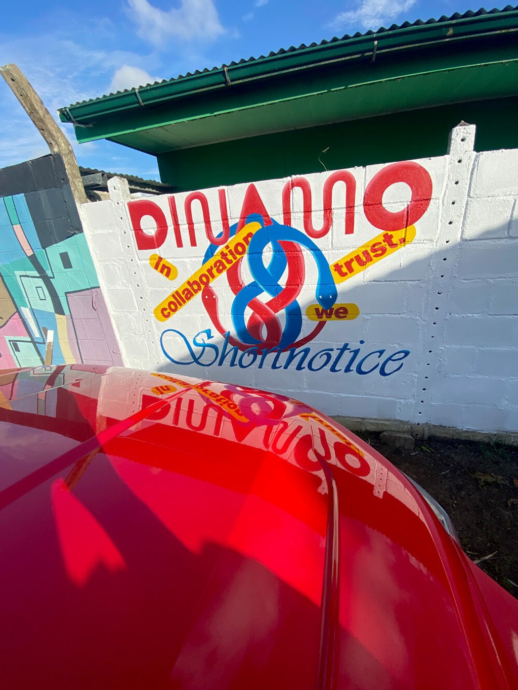
Collab launch mural in Paramaribo
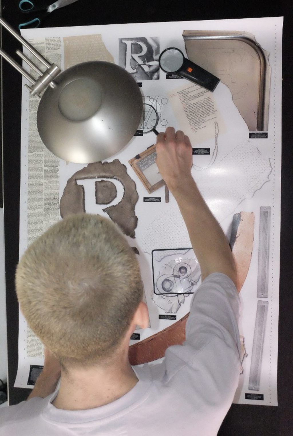
Archeology with Mathi
Maddy: Why do we always make a poster?
Sascia: That also just happened. It’s still not set in stone. It can also be… What if the campaign is an object? And then maybe we make a poster out of it?
Maddy: Well, like the toothbrush cake for our 10 year anniversary. That was an object that became a poster.
Johannes: This way of working is where a lot of Dinamo comes from. We’re graphic designers. So I think about designing with a font, it’s something we always want to honor. The type design always begins with that in mind.
Maddy: You’ve been creating these campaigns for us and working as our ADs now for exactly a year. How do you reflect on the last year?
Sascia: Even though it’s been a year, it feels very fresh. We are still in the Kindergarten days, which is really nice because sometimes a year is enough for not wanting to work with someone anymore!
Like all things, we started with expecting to get into a groove. But we never do and we’re always surprised, and that’s fine and exciting. With Dinamo, there are more parties involved, which means there’s more communication, but also better results. Without you both, the campaigns wouldn’t be half as good.
Mathias: One of the first campaigns we did together was the mural in Paramaribo, and that feels like a long time ago. But it was just last year, produced in a completely different continent. That’s what feels exciting – that you’re open to ideas like that mural.
Over the year, we’ve become really aware of how long fonts take to be designed and drawn. We want to give that effort a lot of space and attention. We’ve also learned each font is always a different story, deserving of a different outcome, and there’s a beauty in that.
Recent Campaigns
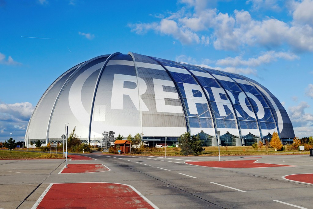
- Repro is a flexible sans serif inspired by signage and digital operating systems. It’s a comprehensive toolkit, with its range of OpenType features, alternates, web glyphs, nine weights, and unique circle function. Our campaign shows that — with the encircle feature taking center stage on a photorealistic mock-up of a laboratory. Zoom in closer to see many other ways that Repro’s many weights and functions could appear.
- Walter comprises of Walter Alte and Walte Neue, two related yet ideologically opposed subfamilies celebrating design educator Walter Käch. The triple styles of Walter Alte are a faithful study of Käch’s lessons, while Walter Neue is an extension, update, and digitally-minded interpretation. Our cartoons take that literally, with the young and Walters helping each other in a bunch of situations.
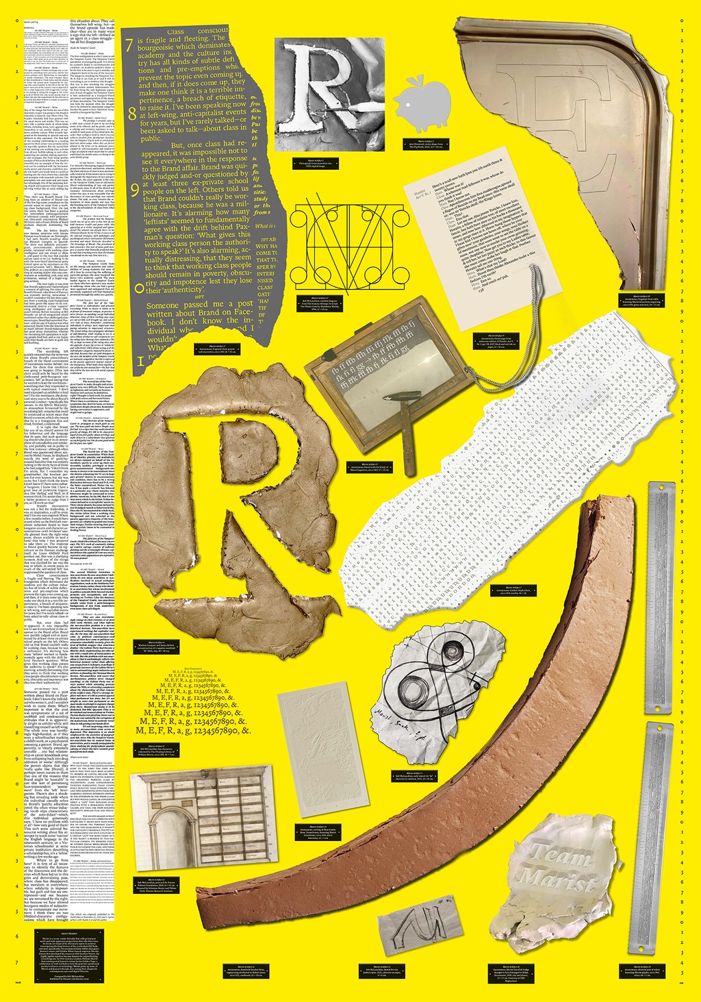
- Marist is a warm and robust re-examination of the Old Style genre first imagined by Nicolas Jenson in 1470. Imagine a quiet library with stained glass windows and stacks of books, a place where time seems to slow down and the mind has space for careful traveling. This is where designer Seb first uncovered Marist.
- Oracle is a double family, and its Triple version is an exploration of a strict rhythm with silly results. Taking the logic of monospaced letterforms to an extreme, its bounding box has been segmented into units of thirds. The family’s name is inspired by the Ancient Greek Oracle of Delphi, who made mystical predictions by breathing in vapors. For the typeface’s release campaign, the font and its namesake combine, with a mascot dancing in a 3D bounding box. She stretches into italics and moves her hands and feet in units of thirds.