Whitney Mallett: When Kylie Minogue Was a Font
Sometimes we invite artists, writers, and other friends to take over our newsletter and write about fonts from a cultural perspective. And this time, New York-based writer and editor Whitney Mallett took a deep dive into the 1997 Towa Tei track GBI (German Bold Italic), for which Kylie Minogue sang from the perspective of a typeface.

Whitney is the editor of The Whitney Review of New Writing, a biannual print bulletin of new criticism, and she was also the co-editor of Barbie Dreamhouse: An Architectural Survey. Below, she enlightens us on the highly under-appreciated history of Towa Tei’s data-track font release.
“I Contrast, It’s Cool”: When Kylie Minogue Was a Font
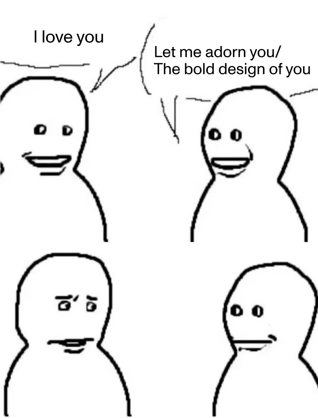
Kylie Minogue announces “I am a typeface” in a 1997 song she made with producer Towa Tei. As this lyric suggests, the techno-pop track in question, “GBI (German Bold Italic)”, is delivered from the perspective of a font. Minogue’s breathy, almost robotic vocals bring the absurdist premise to life, reciting declarations of design compatibility over a minimalist reverb-drenched beat. “You will like my sense of style” is her most oft-repeated refrain.
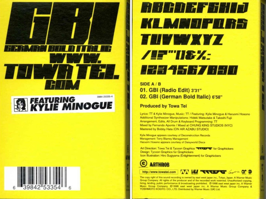
German Bold Italic (three words Minogue intones throughout the track with staccato punctuation) is a real typeface, which was created to accompany the musical release. To develop it, Tei tapped artist Hiro Sugiyama, who had that same year launched the commercial design studio Enlightenment. The high-impact techno typography not only defined the record’s text-centric cover, but a glyph set was made available as a data track on Tei’s Sound Museum CD and also downloadable from both Tei’s and Minogue’s official websites. Extra-thick and geometric, the font had something in common with the heavy black frames that were Tei’s hallmark at the time. Another line from the song: “I contrast, it’s cool.”

When this offbeat track came out, Minogue was one of the biggest pop stars in the world. The Australian “I Should Be So Lucky” singer rose to fame as a teenager in the late 1980s for clear vocals that complemented the precision of disco and dance-pop perfectly. She’s like Donna Summer in that way, a vessel for songs that can be hugely innovative and futuristic without compromising mainstream appeal. By her fifth studio album, the eponymously titled Kylie Minogue (1994), she was starting to show she was curious about experimenting with different sounds and high-concept visuals. In 1995 she collaborated on a murder ballad duet with Nick Cave, and by the time she joined forces with Tei, she was dating music video director (and Björk ex) Stéphane Sednaoui, who’s often credited with influencing Minogue’s art-pop risk-taking. Sednaoui directed the video for “GBI (German Bold Italic).” In it, Minogue is dressed like a geisha roaming the streets of Tokyo (despite Tei’s involvement, the video no doubt reads today as cultural appropriation.)
Tei was a big deal back then too. Originally from Japan, he had moved to New York to study fashion in the 1980s and became one of the founding members, along with Lady Miss Kier and DJ Dmitry, of the dance music group Dee-Lite. Their breakthrough hit, “Groove is In the Heart” (1990), undeniably one of the decade’s defining house music tracks, peaked at #4 on the Billboard Hot 100. A few years before Tei’s collaboration with Minogue, at Dee-Lite’s height, he decided to quit the group and move back to Japan to focus on solo projects — in part because he’d suffered a back injury from a fall which affected his ability to tour. Sound Museum — which “GBI” the song and glyph set feature on — was his second solo album. In addition to Minogue, he recruited an eclectic group of artists for the project, from rappers Biz Markie and Mos Def to bossa nova royalty Bebel Gilberto. “GBI,” however, is the only song about a font.
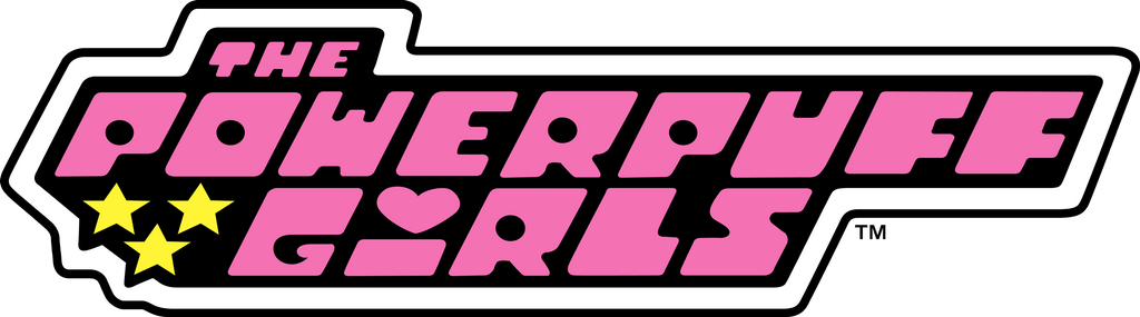
Leading up to the turn of the millennium, typography trends included a revival of thick, rounded, condensed, futuristic san-serifs from the late ’60s and early ’70s. German Bold Italic feels part of this wave. So does The Powerpuff Girls logo, designed for the TV show which first aired in 1998, a year after Tei and Minogue’s song. In the comments section of fontsinsuse.com, the site’s editor Florian Hardwig compares German Bold Italic to Futura Extra Bold Italic. He points out, however, that while Futura is German, released by the Bauer Foundry in Frankfurt in 1927, Futura Extra Bold isn’t German at all: “It was added by Edwin W. Shaar for Intertype in the US in 1952, based on Paul Renner’s design. The oblique followed in 1955, made by Shaar together with Tommy Thompson.” Another user named Thiago, points out that, rather ironically, the glyph set for German Bold Italic doesn’t support the German language.
Despite being made available for anyone to download (you can still download it via an old version of Minogue’s website, accessible using the Wayback Machine), German Bold Italic’s only documented usage outside of Tei and Minogue’s promo is by artist Cory Arcangel. In 2015, Arcangel used the font for merch he designed for the Brooklyn pop group Wet. Heather grey sweatshirts were screenprinted “WWW. / KANYEWET / .BIZ” in super chunky black all-caps. (The band long used this URL for their website as a cheeky gag, though today the domain is dead.) In an interview with The Fader, Arcangel explained:
I’ve used the font a few times in the past for artworks (I showed some drawings on paper watermarked with my name in GBI at my Whitney show in 2011) but I’ve always wanted to use it to make a shirt for a pop group… one pop group used to advertise the next. Also it’s a sick classic vector techno font, and super rare these days.
It’s a style that’s less rare today. But still, German Bold Italic in particular, I’d love to see it more.
Minogue sings, “Let me adorn you / The bold design of you.”