Otto Book Launch @ San Serriffe

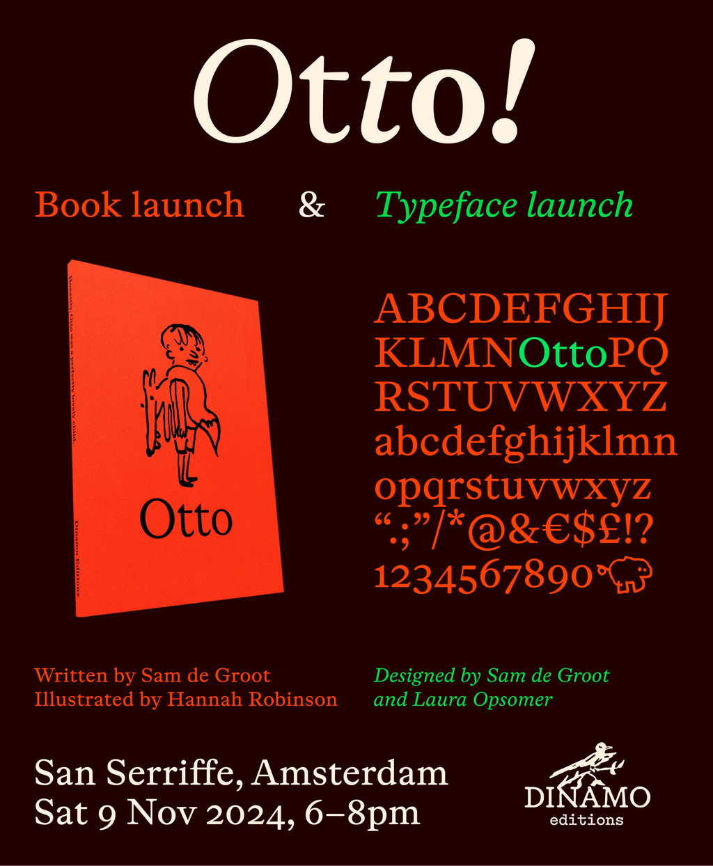
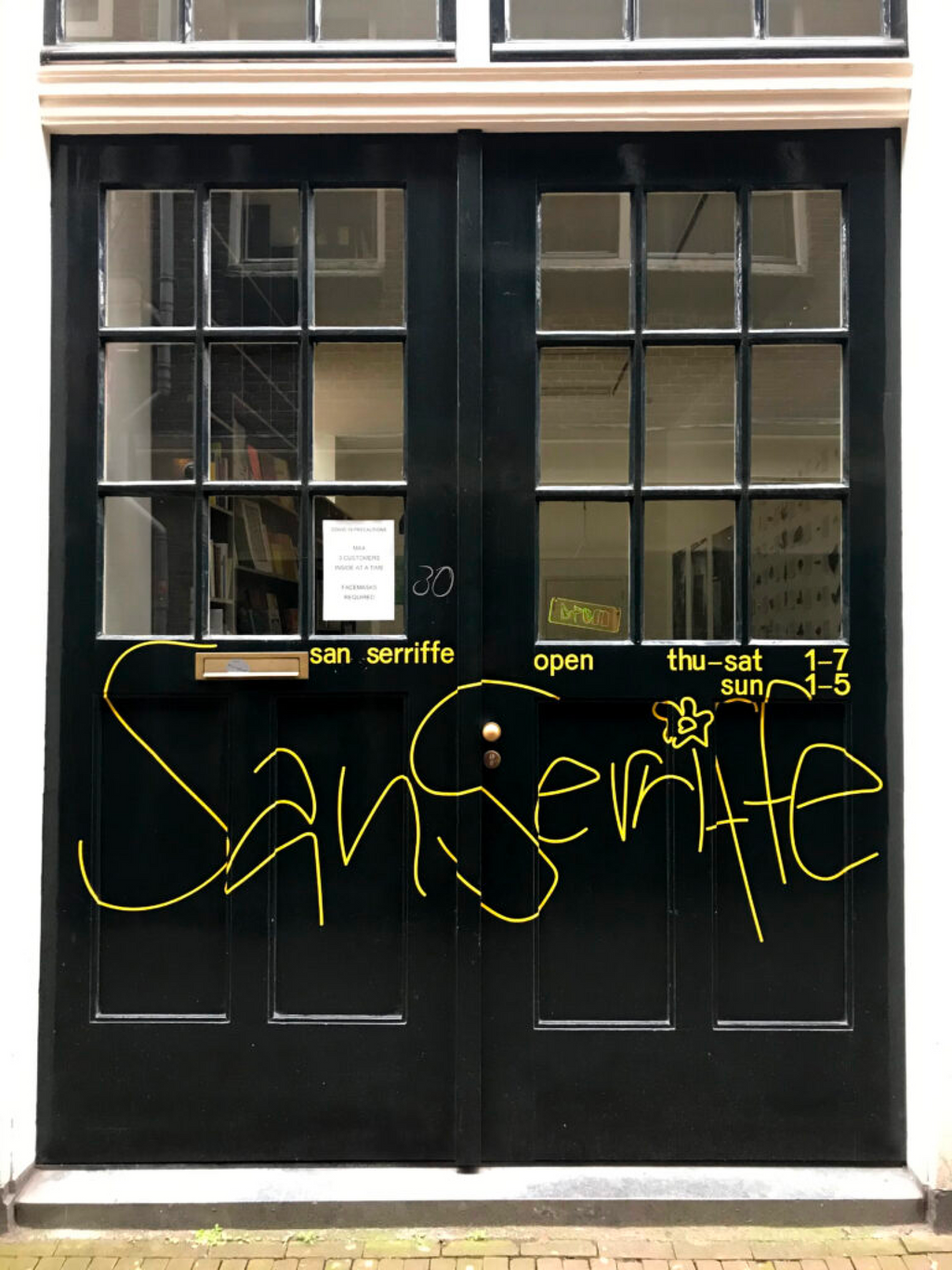
We’re inviting you today to a two-part launch for two intertwined things: a book and a typeface. We’ll be celebrating in Amsterdam at San Serriffe—a serif-friendly bookstore—on Nov. 9 at 6pm and hope to see you there!

Otto, the book, is a fable of modern parenting, a story about a perfectly lovely child with a bad temper. A children’s book for adults and Aesopian Bildungsroman of sorts, it was written and designed by Sam de Groot and illustrated by the London-based illustrator Hannah Robinson. It’s the first official articulation of Dinamo Editions, the publishing imprint run by Madeleine Morley and Simon Merz. Get in touch if you’d like to stock the title in your shop—otherwise it’ll be on sale from next week on! Children may proceed with caution.
Otto, the typeface, is a cheerful text font with a sturdy, wide rhythm and beautifully lilting italics. You’ll be hearing more about it in this newsletter very soon. ABC Otto was designed by Sam de Groot and Laura Opsomer Mironov, and engineered and published by Dinamo Typefaces.

For the launch, Sam will read from the book, and our co-founder Fabian will be in conversation with ABC Otto designers Laura and Sam for some sort of casual panel.
Dinamo’s co-founders Johannes and Fabian briefly overlapped in Amsterdam around 12 years ago (one studying, the other interning), where they also met young Sam, who was already spiralling (upwards) into the life of the Netherlandish book maestro he is today. Attending book launches at San Seriffe was already a thing back then, and we’re happy to come back home for this special occasion.
Please join us!
ABOUT THE TEAM

Sam de Groot works as a freelance graphic designer in Amsterdam, mostly in close collaboration with artists, publishers, and galleries. Under the imprint TRUE TRUE TRUE he has released books and music, often in collaboration with artist Paul Haworth. He has taught typography at the graphic design department of the Gerrit Rietveld Academie since 2011.
Laura Opsomer Mironov is an artist, type designer, and calligrapher with an MA in Typography from École Estienne. Fascinated by theater and cinema, she began working on film credits and theater titles, which led her to reconnect with her desire to act. She’s made a number of short films at the Fémis film school, and acted in several French theaters.
Hannah Robinson is an illustrator and cartoonist based in London, with a degree in art history from Edinburgh University. Her clients include The New Yorker, The New York Times, The Washington Post, The Guardian, and Hermès.

PS. takeover by sam de GRoot
• If you like short books featuring a speaking fox (like ours), illustrated in black and orange (also like ours), simultaneously entertaining and profound (again, like ours), look no further than George Saunders’ brilliant Fox 8
• Speaking of George Saunders, the algorithm just fed me this lovely conversation between him and Dua Lipa
• Salivating over Eric Schmidt’s sense of color in his restored vintage backgammon boards
• I never cared for MJ’s music one way or another, but I keep coming back to this unsettling monotonal hack
• I enjoy reading Max Falkowitz’s weekly tea journalism—have to get my shit together and make his ripe puer ice cream recipe
• Only a few days ago I got hip to the news that Anchor Brewing, the legendary San Francisco brewery, went out of business. They’ve since been bought by Chobani, a company I only know because Berton Hasebe designed their custom typeface. You see, kids: type is everywhere (and hopefully the Old Foghorn barleywine will be brewed once again)
• Revisiting this conversation with the one and only Ka, who died earlier this month
