Dinamo 3.0 Has Arrived
How did we get here?
Our previous website represented the early days of Dinamo. It was developed entirely from scratch by “one person big band” Jakub Straka, who studied with Fabian and Johannes in Amsterdam. We owe our structure and growth as a foundry to him, so as we see our first website fade away, we do so in gratitude to its original designer. Thank you, Jakub.
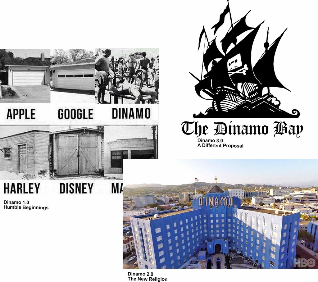
Our new site better represents where we are today and how we’ve grown as a foundry and network. Dinamo 3.0 has been developed and co-designed by the complexity-loving, beautiful minds at Humans & Machines, who first got in touch because they were trying to buy one of our typefaces, but our web store wasn’t working… So began a fruitful, two-year partnership. Learning from Humans & Machines has been immensely inspiring, both professionally and personally.
Alongside the new design and functionality of Dinamo 3.0, we’ve made a few significant updates to our font licensing model, so that it’s hopefully fairer to smaller studios, cultural initiatives, and agencies. Additionally, to inaugurate our website launch, we’re immediately releasing two much-anticipated font families: ABC Maxi and ABC Diatype. You can read more about them below, along with other Dinamo 3.0 highlights, including our new VF tutorials, student discounts, Different Times t-shirt, team trading cards, and custom naming system, just to name just a few off the top of our heads.
Dinamo Website 3.0
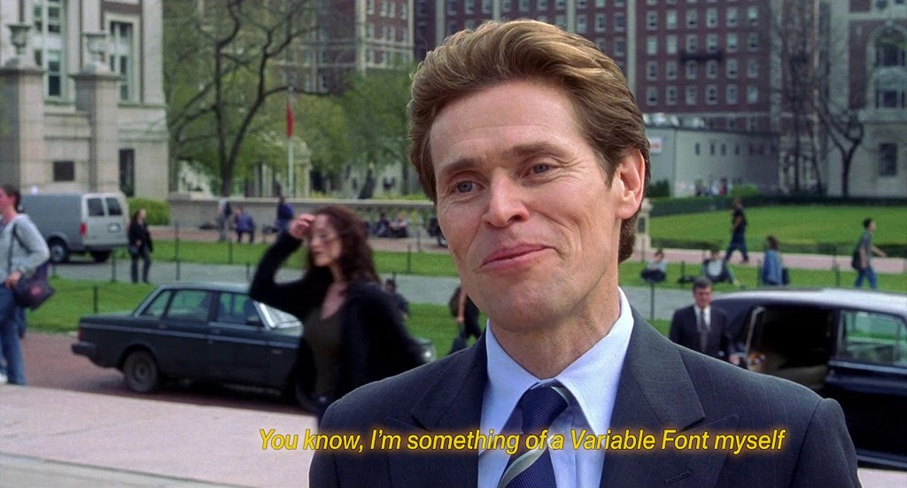
We find that VFs are an after-thought on font retail websites. They’re usually wedged into old, static structures, which don’t make explicit the full range and extent of their possibilities. After years experimenting with this new technology and seeing how we could push it to its edges, we decided to approach our own font retail pages in an entirely VF-orientated way.
While browsing our typefaces for instance, a VF player lets users sit back and watch any chosen font animate and stretch across its various axes. Dinamo Darkroom, our previously separate website for sharing internally-developed type tools, has now also been integrated into the main site. To encourage more experimentation and exploration of VF capabilities, we also created a space for tutorials by our Font Engineer Robert Janes. These appear—news alert —in our newly introduced News section, with Robert’s first piece instructing users on how to begin efficiently and creatively using VFs on the web.
Alongside sharing our own experience with VF in News, we’ll be publishing posts on upcoming projects, alongside general type (and non-type) related musings and interviews with collaborators, as organized by Madeleine Morley, who recently joined us as Editor. At the start of our redesign process, we realized opportunities like this one are always good excuses to meet new collaborators, so as well as Humans & Machines and Maddy, we brought on three different 3D rendering studios to create artworks for our pages:
- The brain galaxy lighting up our Studio page was constructed by young design studio Obby—a constellation in homage to the satellite locations fueling our internal communication channels. Obby is a rising star: Its attitude and understanding of its own practice and industry are things to behold.
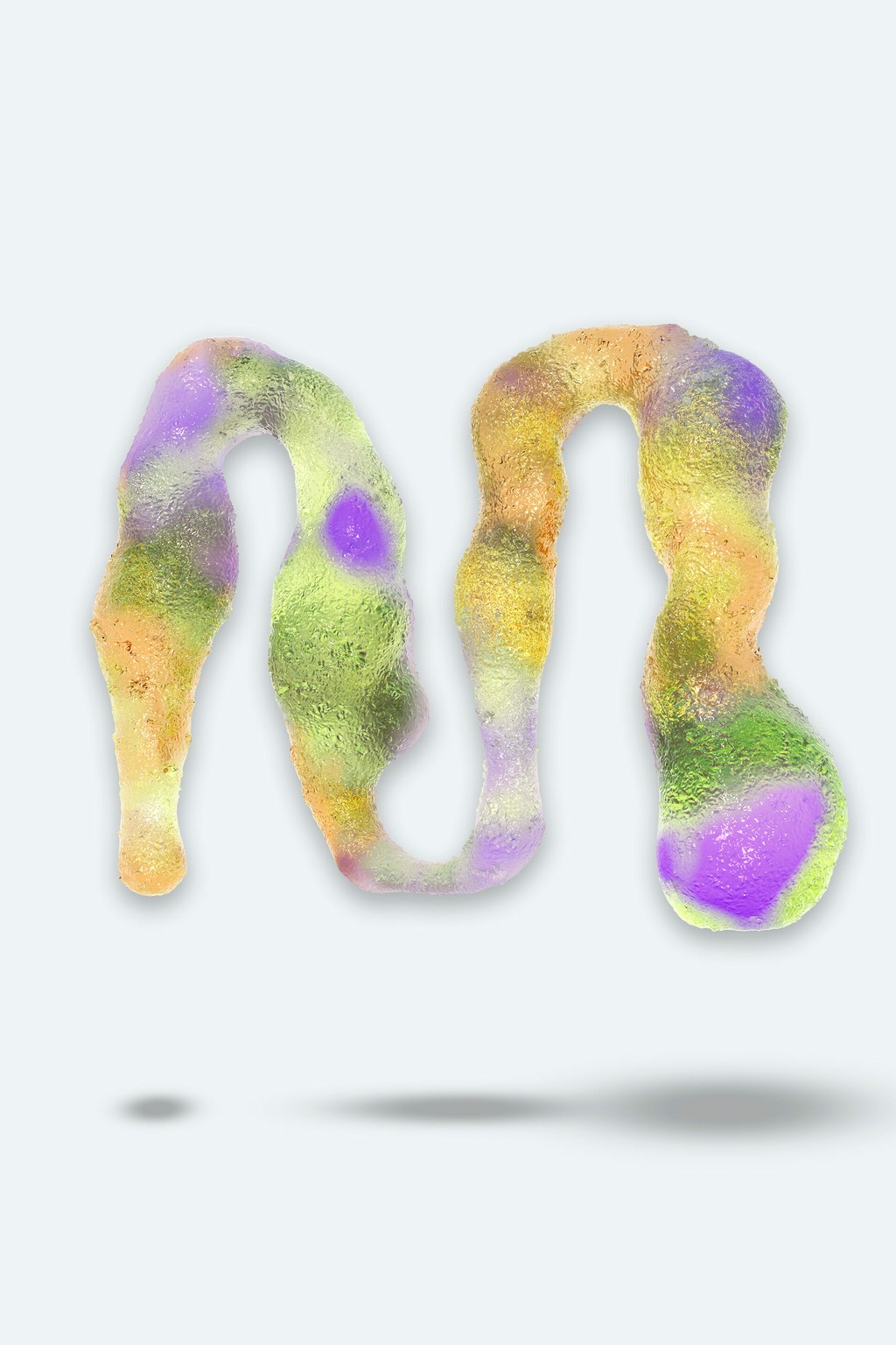
- The chunky typeface renderings making cameo appearances throughout our site, which seem flung from a next-generation 3D printed future or even a clay-potted past, were created by bus.group (special thank you to Caroline Vang). We were impressed by how well bus.group understood what we wanted to achieve with these, and how the studio took our ideas further than we could have hoped.
- Golgotha’s troupe of office-tool-wieding action heroes make up a series of “trading cards” on our Studio page, one card for each Dinamo collaborator. Dinamo is no longer only Johannes and Fabian, and so we wanted to give the personalities around us better representation. Stronger together—even if never physically so. Golgotha kept spirits high while storyboarding each character.
Berlin, Basel, and all of Dinamo’s satellites circling around each other
New Typefaces: ABC Maxi & ABC Diatype
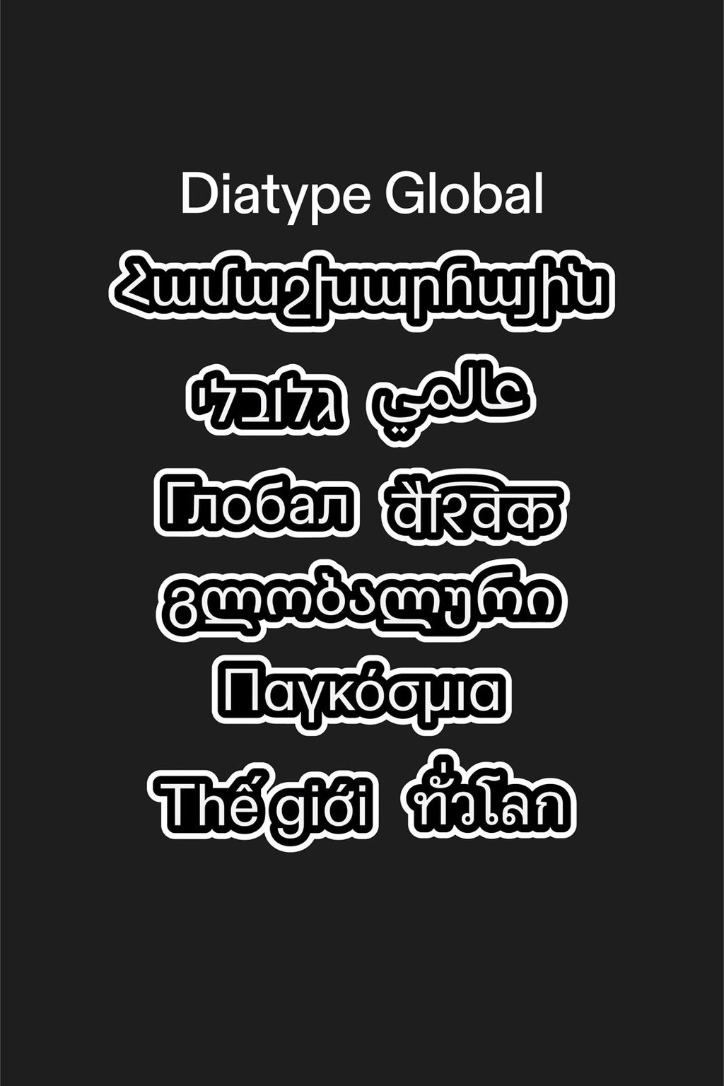
Teasing unpublished typefaces and their early applications by friends and family is one of our guilty pleasures. We’ve held back for a while, but today we’re releasing a couple of designs that have been in the Dinamo pipeline for as long as the foundry itself: ABC Maxi and ABC Diatype. The former is bold and exuberantly expressive, the other is a subtle, screen-reading-friendly grotesque.
ABC Maxi is a heavily-engineered yet warm and witty type system of spaghetti movements and angular lines. Its familiar shapes, informed by the long history of the International Style, can be newly exaggerated and emboldened by way of VF technology. Four subfamilies of the font are available: Round, Round Mono, Sharp, and Sharp Mono.
The more discreet ABC Diatype originally began as an obsessive exploration of the Swiss Neo-grotesque genre, and it’s been tried-and-tested by friends of Dinamo for many years. We’re releasing it today as our first warm-hearted grotesque to occupy an unfilled spot in our library. ABC Diatype ultimately doesn’t ask for too much attention—it’s ideal for text and reading on screen, and its name harks back to clunky pre-digital typesetting machines.
Other Dinamo 3.0 highlights...
New Different Times T-shirt: 🌈 Loyal Dinamo followers know that with any change we make comes a new Different Times t-shirt, our ongoing series that’s regularly re-edited to reflect the context of its release. To bless our community, and to mark the end of a process of intense introspection, the latest Different Times edition combines all of the colors of previous Different Times t-shirts (all made possible thanks to one patient printer). Wear them well (I already shrunk-washed mine).
Variable Fonts included: 💼 When purchasing a complete typeface family, we also include its VF at no additional cost. While working, you simply choose which font format—static or variable, defined or adjustable—you prefer.
Personalized typeface name: ✅ You can now automatically customize your purchased typeface during checkout for a small additional fee. Adding your company’s name—say “Taco Bell”—to one of our typefaces to turn it into, for example, “Taco Bell Favorit,” is a smart thing to do. It makes the typefaces more personalized, more “yours.” It’s also practical: it reminds everybody working at “Taco Bell” to use the right typeface.
New “ABC” system: 🔤 To improve the organization of fonts in our library, we’ve added ABC in front of every typeface name—so instead of Favorit, meet ABC Favorit. You’re welcome.
Best price algorithm: 💸 While purchasing a typeface, pick only the styles that you need and our system will automatically suggest the best deal or discount for you. If you’re only one-additional-font-style-away from a discount—and therefore a better deal—our system will let you know.
Infinity type tester: 🛀🏿 Instead of stacking several type testers and scroll bars on top of one another and confusing people, we found a way to integrate large-to-small and one-to-three-column designs within a unified “size responsive type-tester.” Patent pending.

Inspiration for Dinamo’s Infinity Type Tester™
Machine Learned, AI generated text samples: 🤖 Dominic Rusiecki, who usually works on AI for a certain German car company, trained a bot using hours of Meet the Kardashians + philosophy & science Ted Talks to generate the template texts for our new type testers. As it says, “Now that I am able to make my own decisions, I want to make the best decisions.”
Modules to the max: 🧠 This website is module-based, using reduced typography and strong colors. We like to think of the space as just as intuitive as an app—with an intelligent structure, notifications, tools and tips, iMessage-like bubbles, and a few emojis thrown in for good measure.
Stefan Marx surprise guest appearance: 🎨 A protagonist out of Stefan’s cosmos is living in two places on this website (on the Order Confirmation page as well as the Error 404 page). We hope you’ll encounter the former more than the latter.
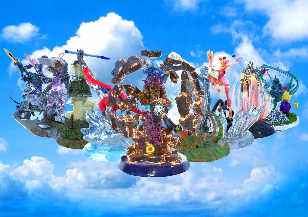
People of Dinamo. Rendered by Golgotha, Paris
Dinamo Student Font Pack & Discounts
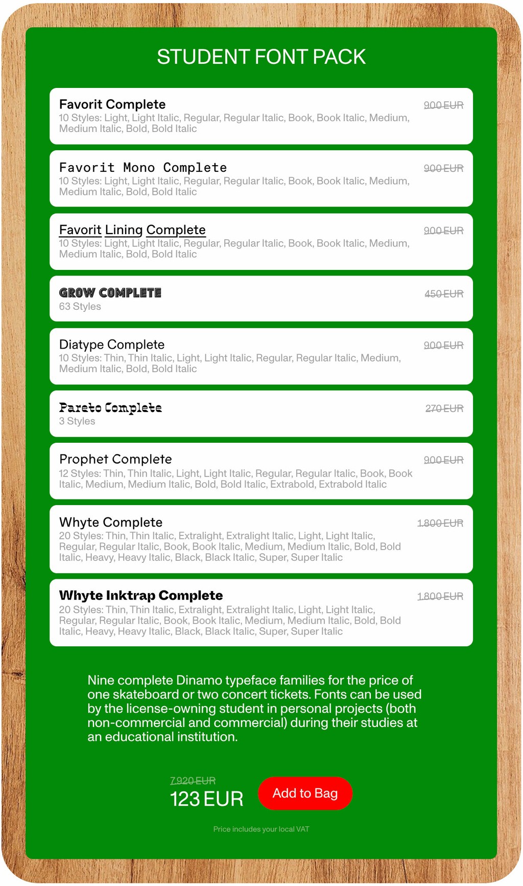
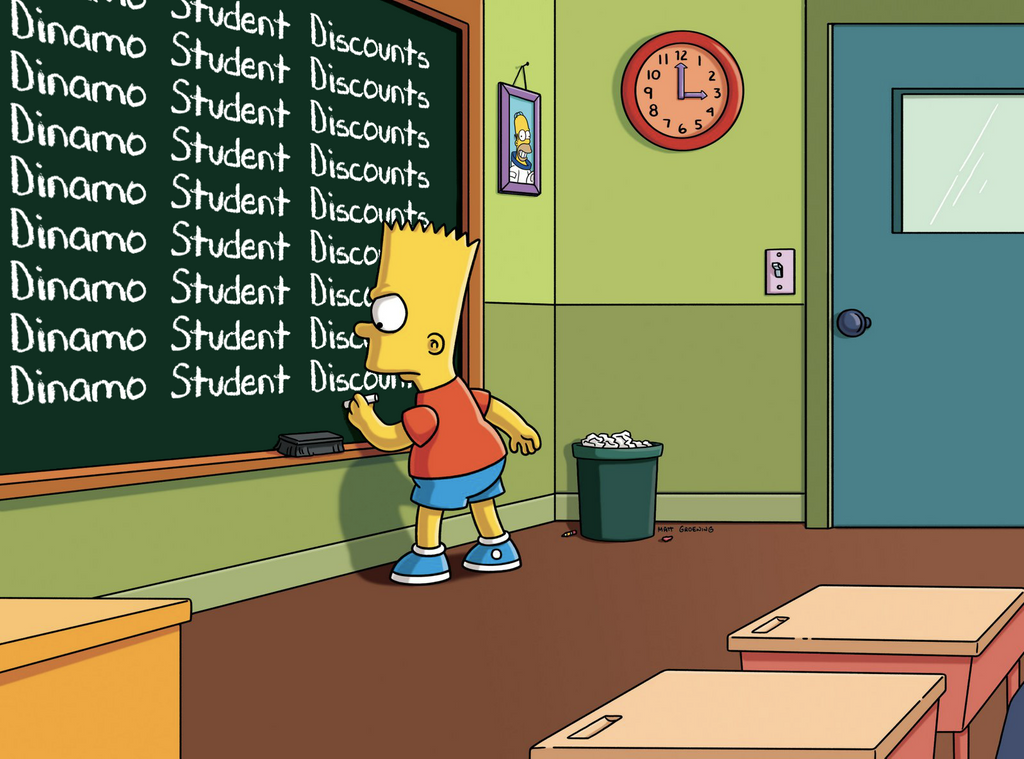
At Dinamo, students receive 50% off our Retail Typefaces. From this point on, in addition to our longstanding student discount, we're also offering a special Dinamo Student Font Pack. This new package bundles together the full families of our nine most popular typefaces for a one-time fee of €123. Students can produce non-commercial and self-initiated commercial work with these typefaces during the duration of their studies. Take a look at our 4 Students section.
New Licensing Model
We’ve made several crucial changes to our licensing model to establish a more fair and accessible payment structure when purchasing our typefaces, especially for freelancers, small design studios, and arts and cultural institutions.
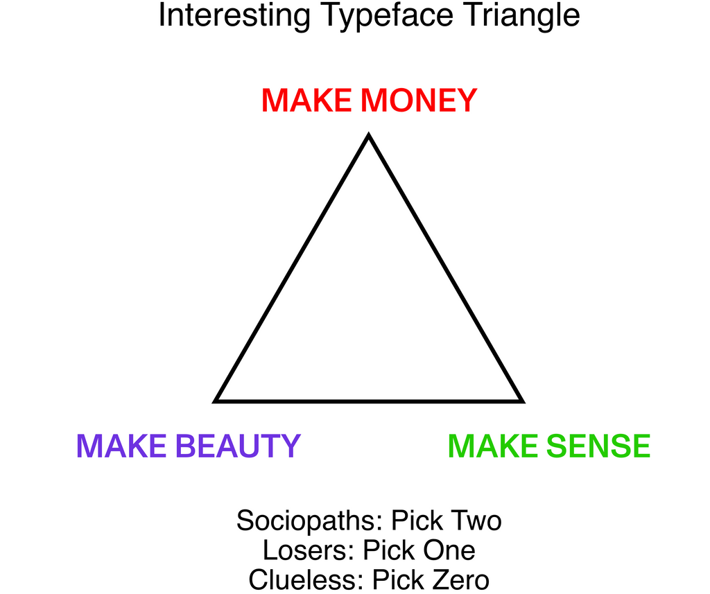
First of all, we’ve changed how we price typefaces to a value-based system instead of a usage based one. We understand that individuals and small companies or institutions should not have to pay the same price for a font as large companies. The usage-based pricing convention of most type foundries—in which a font is priced based on the number of people in a company that use the files—can put the former at a disadvantage. With this traditional pricing system, a large car company where only a small number of employees work on computers actually pays less for a typeface than a small cultural institution where most of the work is done on computers. We’ve priced this way in the past.
Drawing from our experiences, we’ve concluded that the bigger the size and reach of a company, the bigger the commercial value extracted from a typeface. With this in mind, we’ve established our own value-based system for pricing. Our fonts are now priced based on the company size of the font’s license owner, and not the number of people working with the font files.
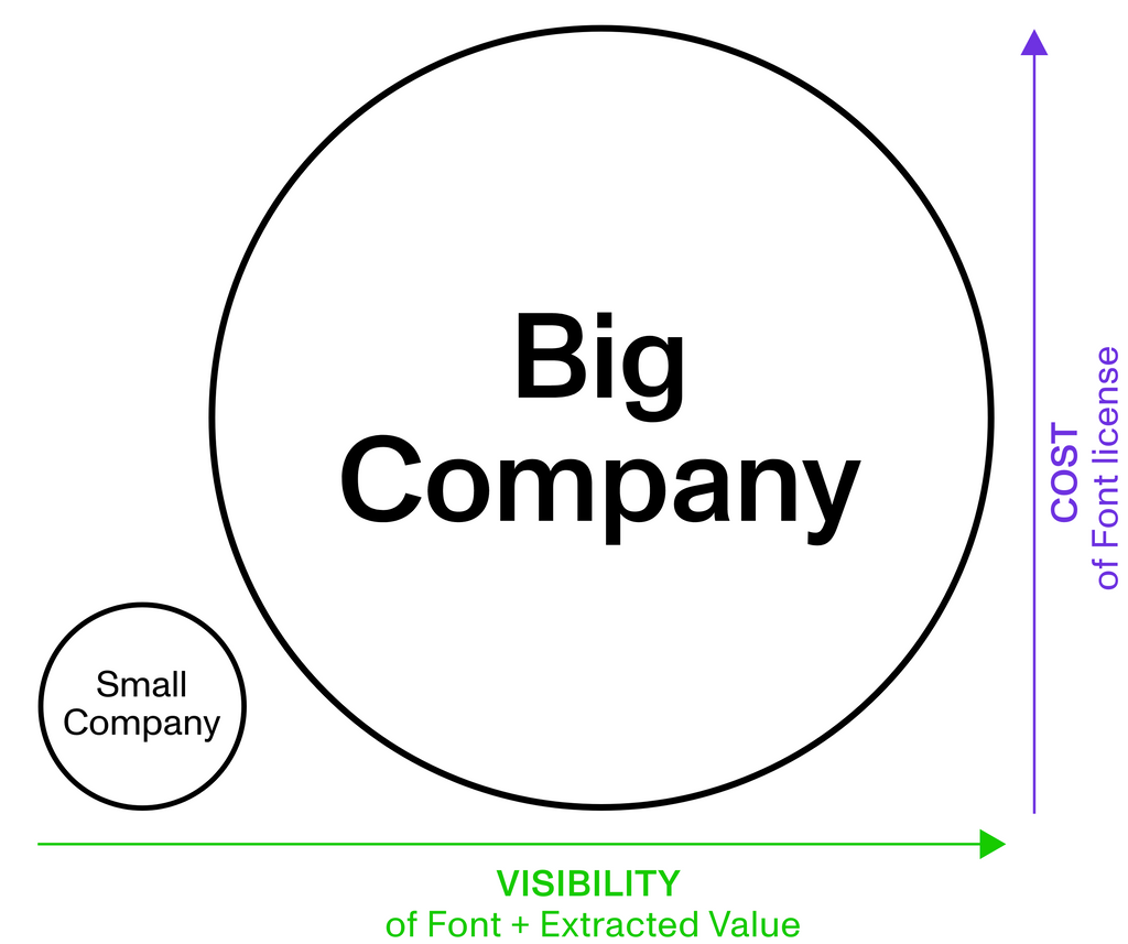
From now on, it’s very simple: The pricing for all Print, Web, and Mobile App licenses are based on the size of the company making use of our fonts. For our Social Media license however, we look at the amount of followers a social account has (the first 25k are free). That’s because followers can be interpreted as "company size” in the age of social media entrepreneurship, and it’s a simple metric for us to measure exposure and value.
That’s right, this means: No More Web Traffic Calculations. Talking with customers about web traffic and bandwidth always felt abstract and confusing, and in the age of flat rates and unlimited data, it also feels totally outdated. Moving forward, the price of a Web license depends entirely on how big a company is.

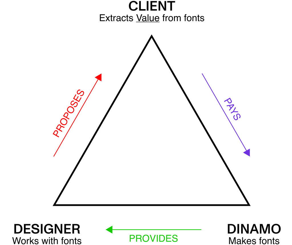
Next, we’ve tweaked who pays for a typeface license—and who the “License Owner” even is. At Dinamo, the license owner is the client—i.e. the business entity that commissions design work. It’s not the agency or individual creative producing the work. That’s because we believe that the client, in addition to paying designers decently for their services, should cover the production costs of a project (that means, amongst other things, the printing, materials, and typefaces in use). A designer should not have to front the money and then go through the often exhausting reimbursement process. To make payment-life easier, we’ve integrated a “Cart Link” into our check out process, allowing users to easily send a link for their desired purchase to the client.
Thank you
to every reader who made it down here through the small print. Besides those already mentioned above and on our Studio page, thank you to Eloise Harris, Konradin Breyer, Rea Stamatoulakis, Vanessa Olt, Michael Schindl, Nejc Prah, Stefan Marx, Dominik Rusiecki, and Marina Hoppmann for helping Dinamo 3.0 take shape.
Now, we’ll let the site speak for itself. Let us know how it feels.
💕 Team Dinamo,
September 2020
