Otto: A Text Typeface For All Things Worth Reading
We’re releasing ABC Otto today, a cheerful text typeface available in four considered weights. Otto has a sturdy, wide rhythm and beautifully lilting italics that will make your editor very happy.
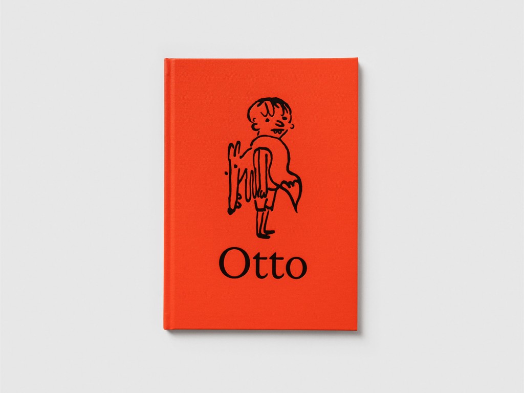
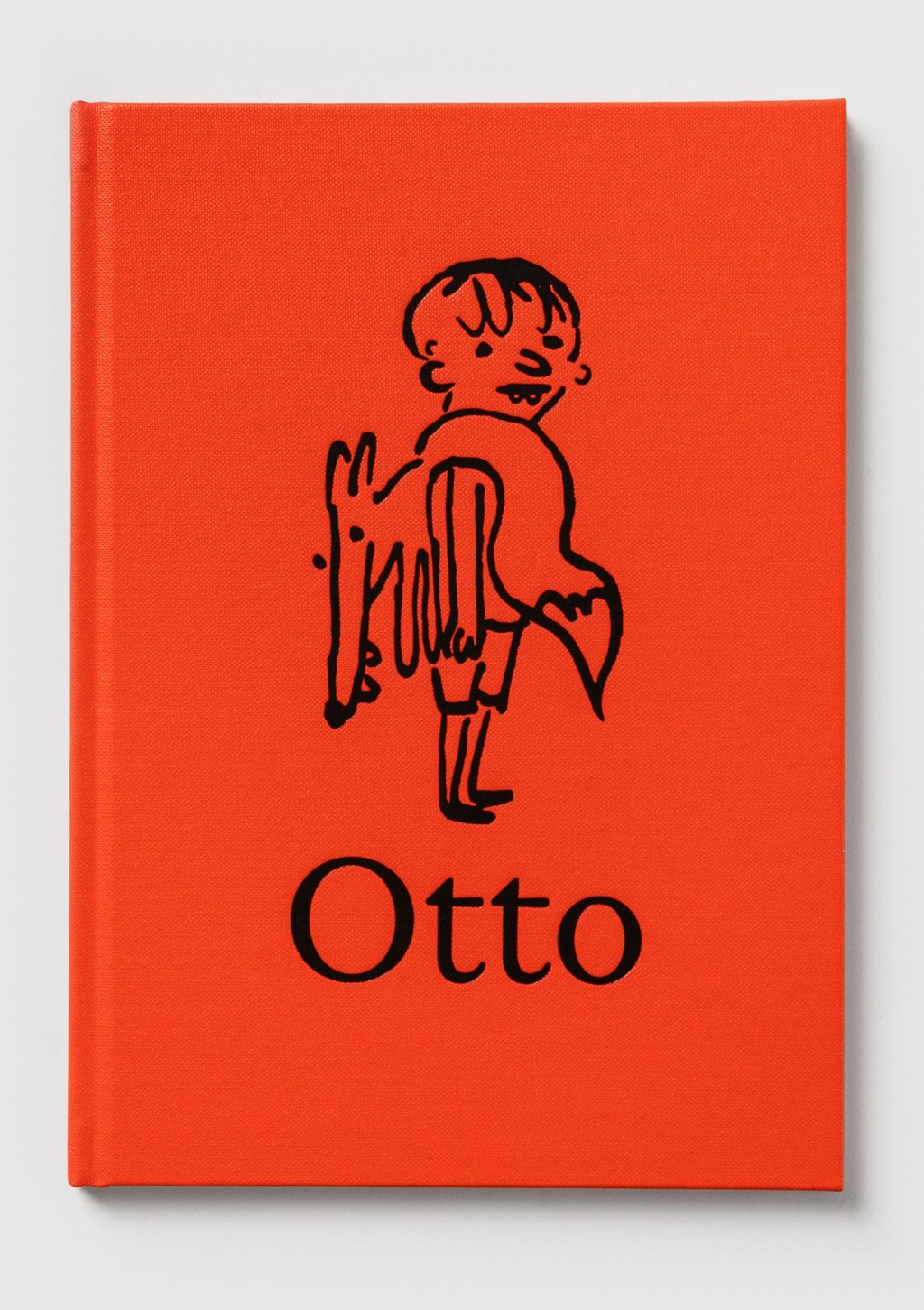
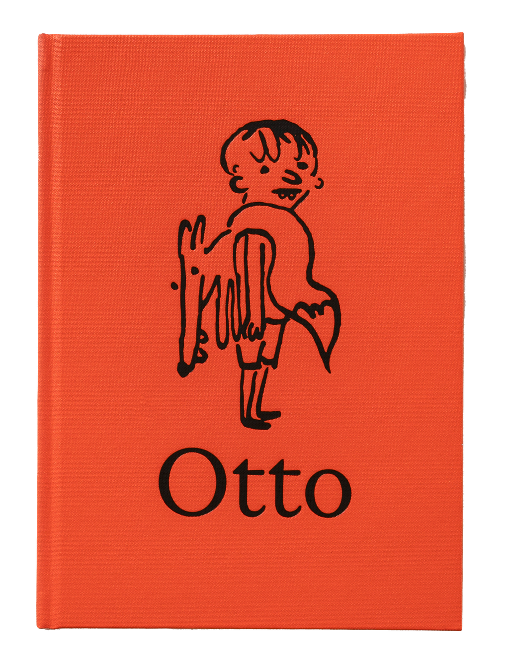
Fittingly, we’re launching this font by publishing a book—also called Otto. It’s a real hardback with its own ISBN number and everything; the newest title from our emerging Dinamo Editions imprint.
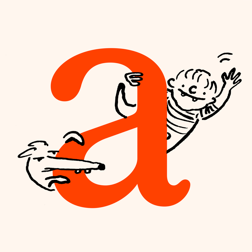
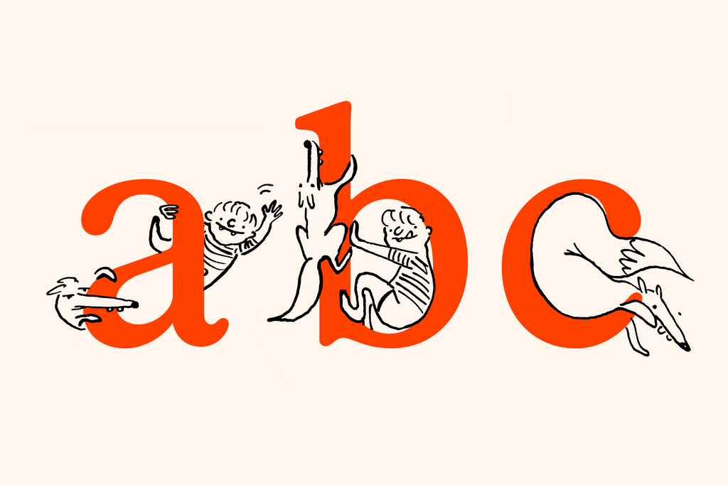
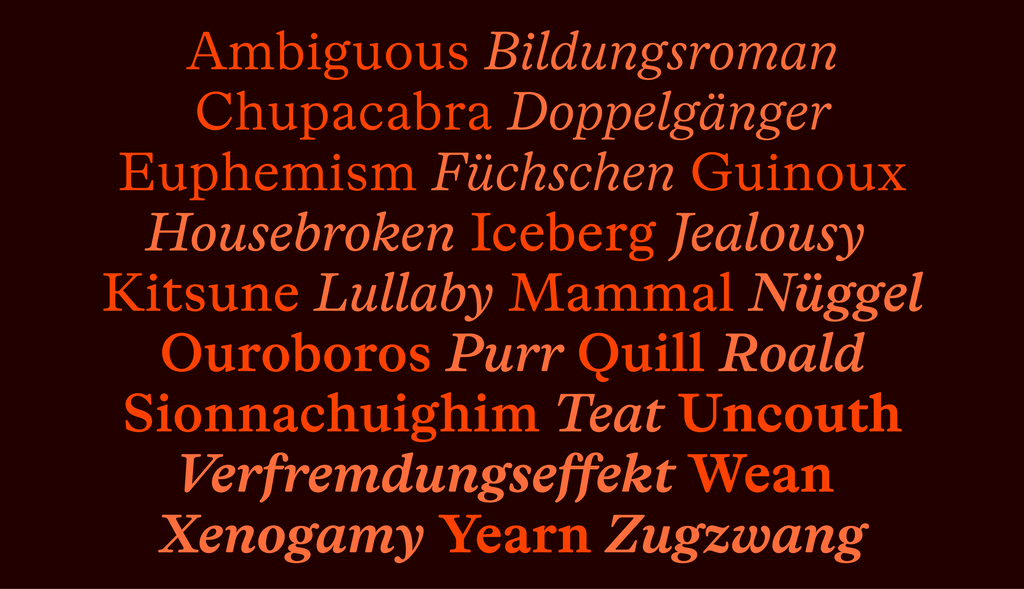
Otto the font can cosplay as a display face, with its subtly cartoonish presence and anthropomorphic shapes. It was developed and designed by Amsterdam-based graphic designer Sam de Groot and type-designer-meets-actor Laura Opsomer Mironov, and is a typeface for all things worth reading.
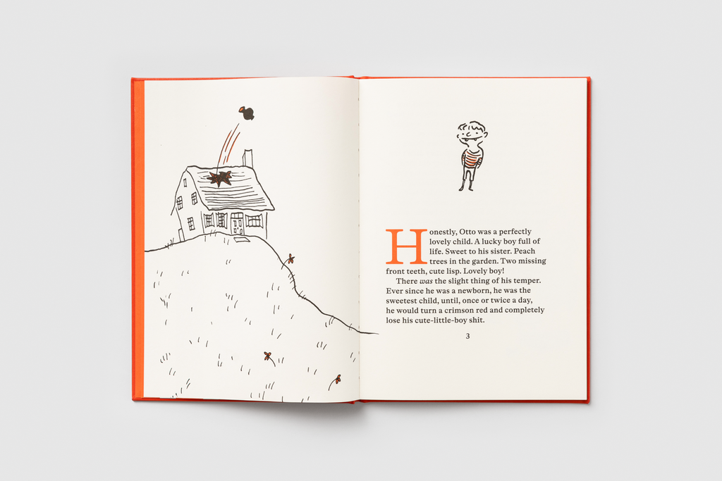
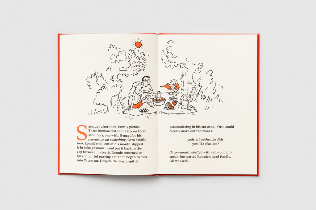
Otto the book was also designed and written by Sam. It’s a fable of modern parenting, a story about a perfectly lovely child with a bad temper and his somewhat, ehem, I guess it’s a pretty weird, maybe even toxic, relationship with a fox. This book might be one of the best things I’ve ever worked on. I hope you love it too.
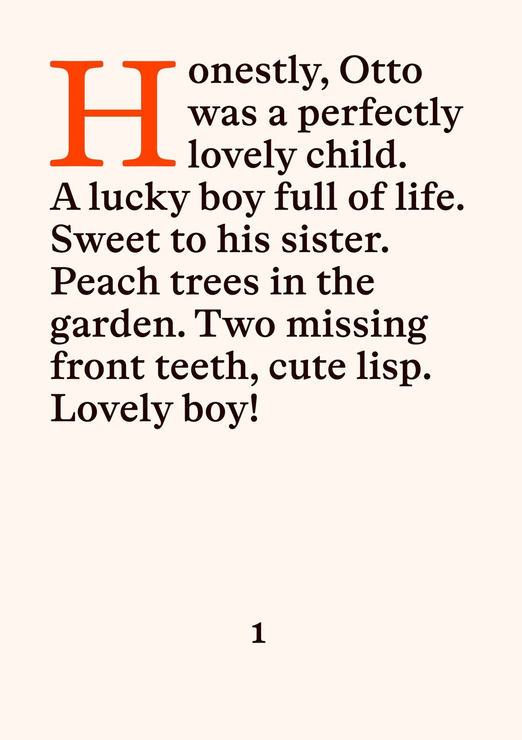

VIBE
ABC Otto began its life as an irreverent remix of the 17th-century type of Miklós Kis, but over the years it gradually metamorphosized into something of its own. If you insist, it could still be seen as freewheeling fan fiction of the Baroque serif genre known as “le goût hollandois” (“the Dutch taste”), of which the Amsterdam-based Hungarian Kis was one of the leading figures. But with its much larger x-height, its round evenness rather than Kis’s stern jaggedness, and its occasionally top-heavy proportions, Otto is a proudly ahistorical design.
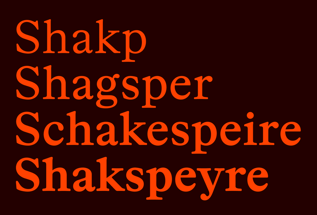
Styles and Family
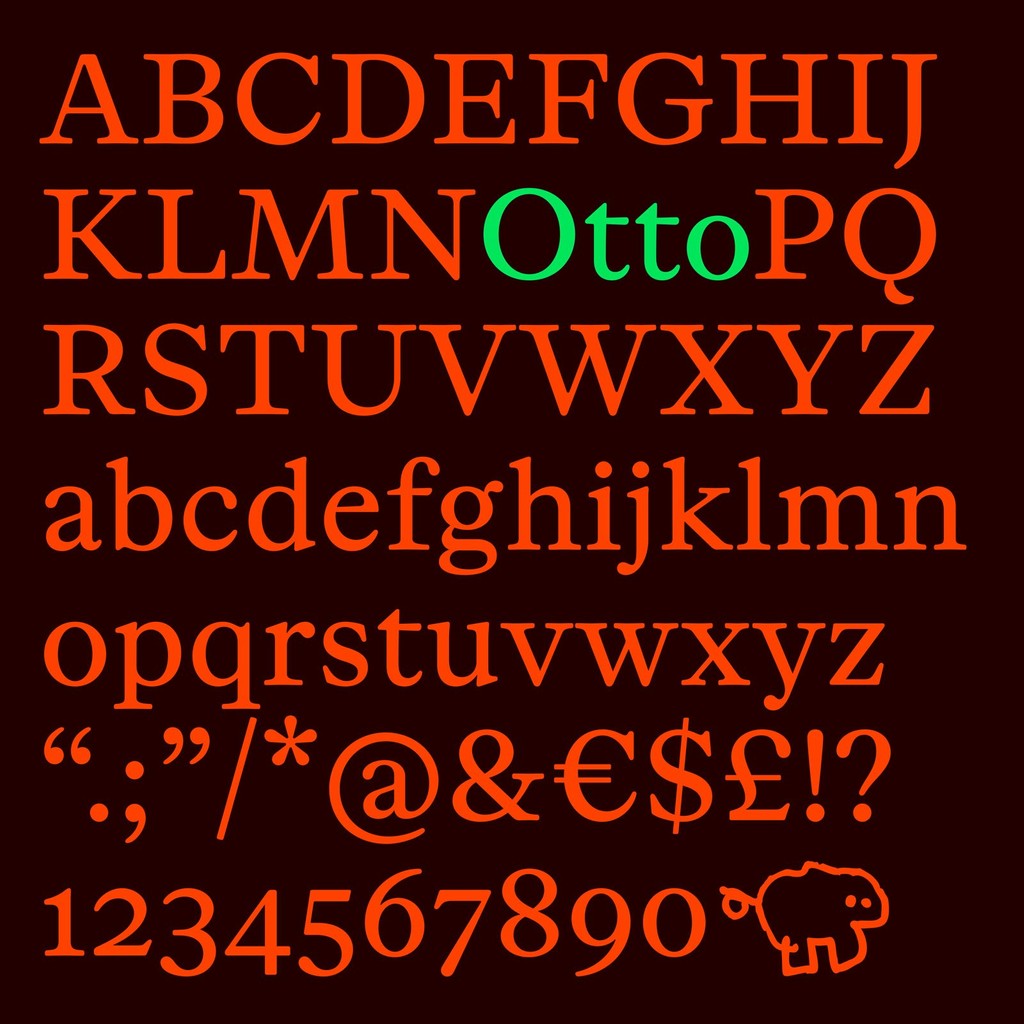
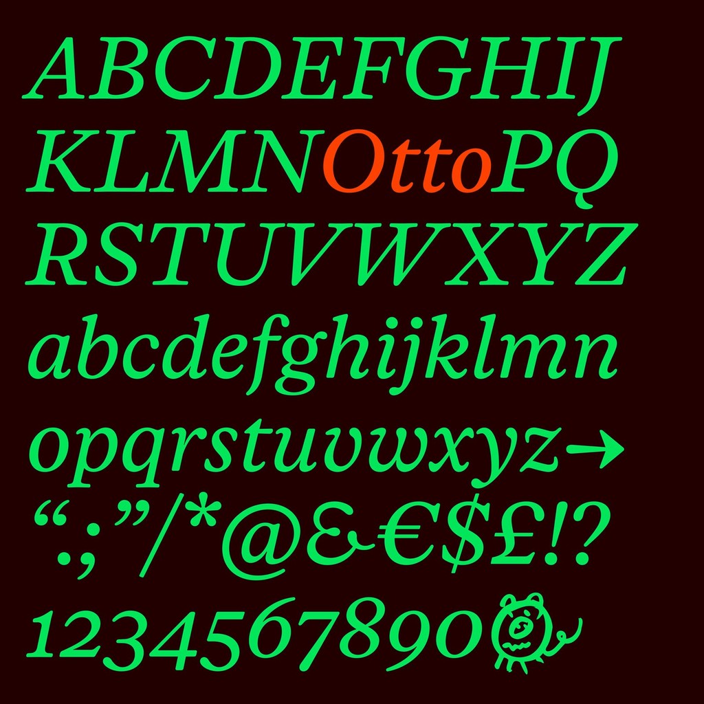
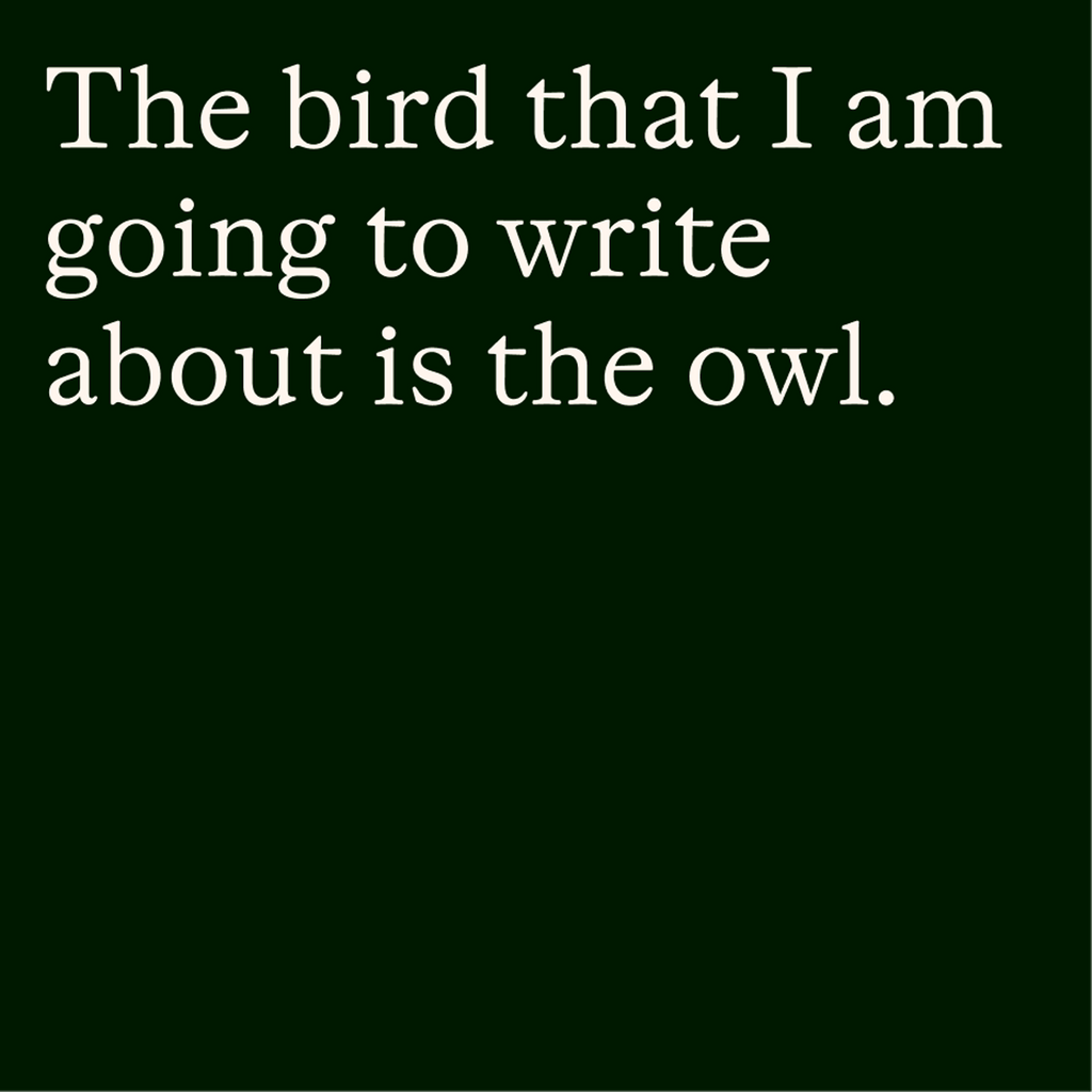
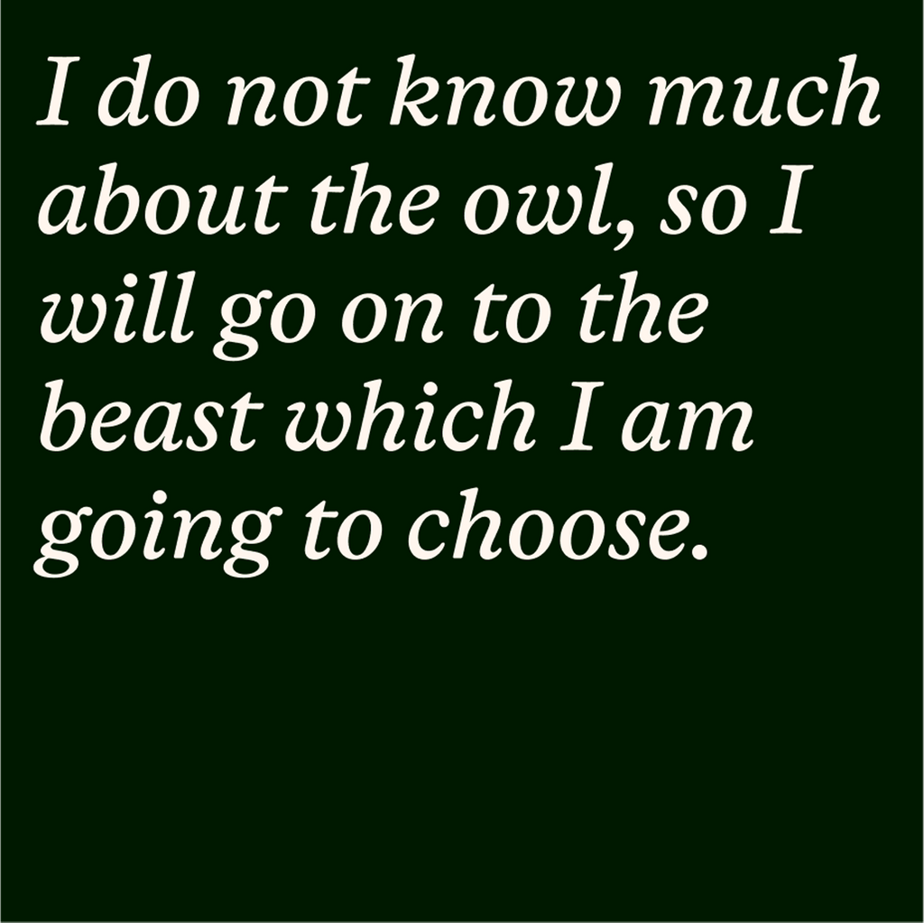
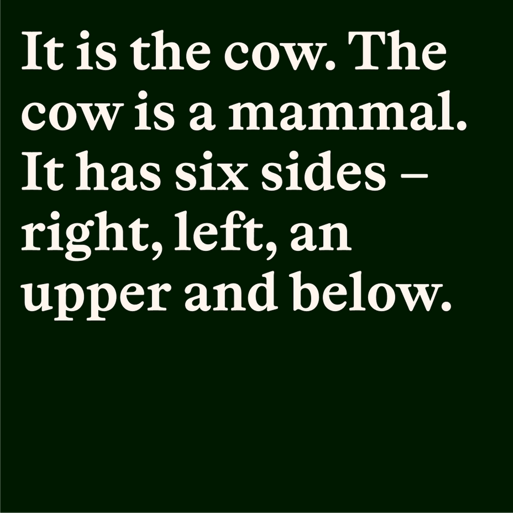
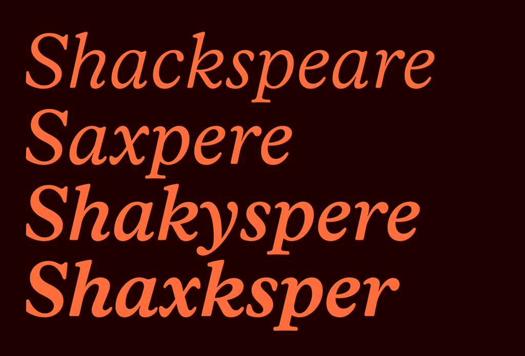
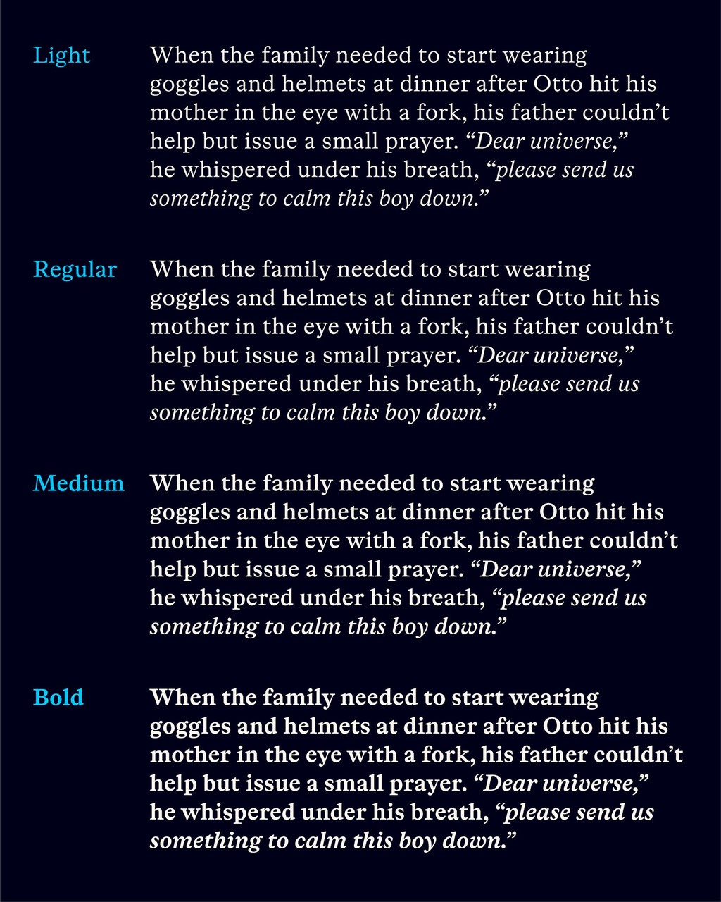
Otto is available in only four weights, spanning Light to Bold plus italics. While Otto’s upright styles still bear a relation to the work of Miklós Kis (even if 3 x removed), the italics are an entirely new design by Laura and Sam. The usual flowery tropes of Baroque italics are abandoned in favor of a bubbly simplicity. Even though the italics have a dynamic rhythm with a strongly varying slope, their vibe is open-faced and understated, bashful and coy.
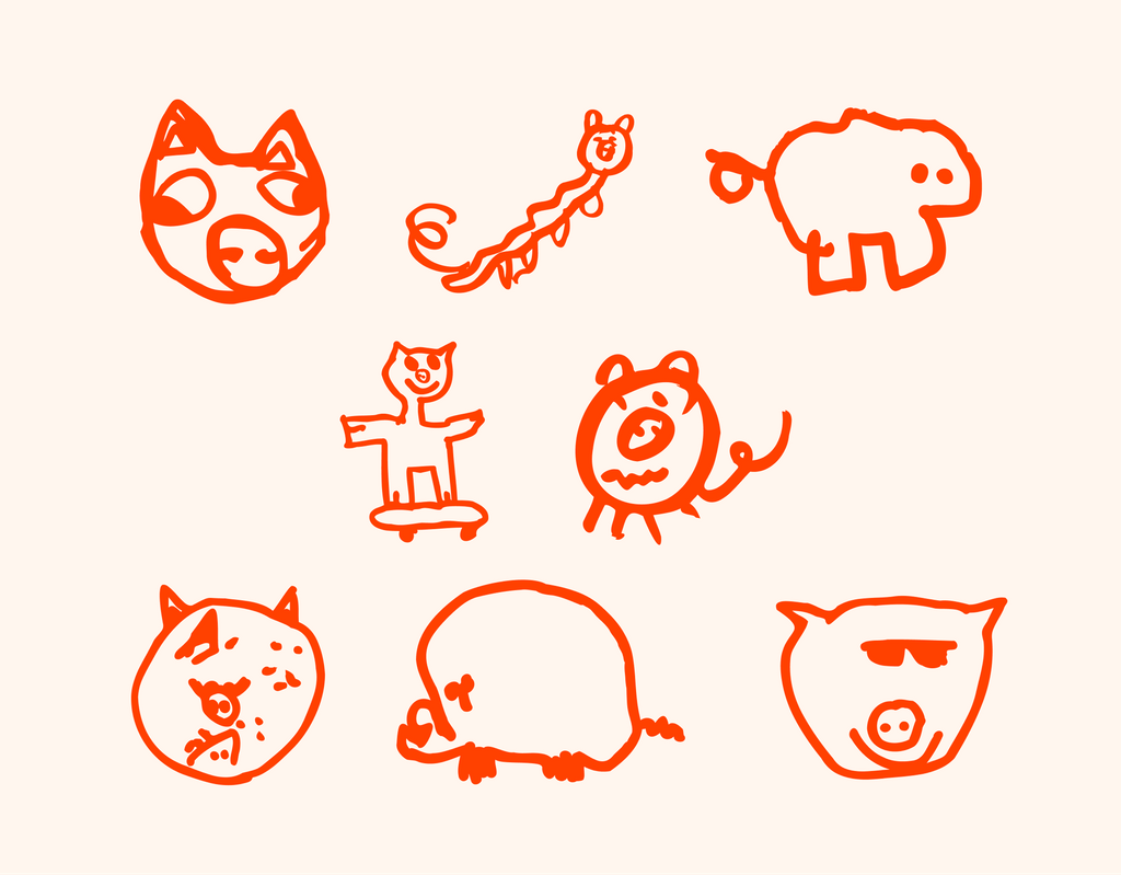
Otto also has eight Dinamo pigs smuggled into its glyph set, three of which were drawn by Sam’s son and font namesake Otto, with three more drawn by Otto’s twin sister Pia. Dinamo co-founder Fabian’s son, also called Otto (we love a palindrome), also drew two pigs.

Key Characters
While characters like R, S and & steal the show with their impish lopsidedness, J and Q are understated and (dare I say) demure. Smoothly viscous terminals reappear in a, c and the italic w, among others. My favorite punctuation mark has got to be ?: a little ode to curiosity itself?
Features
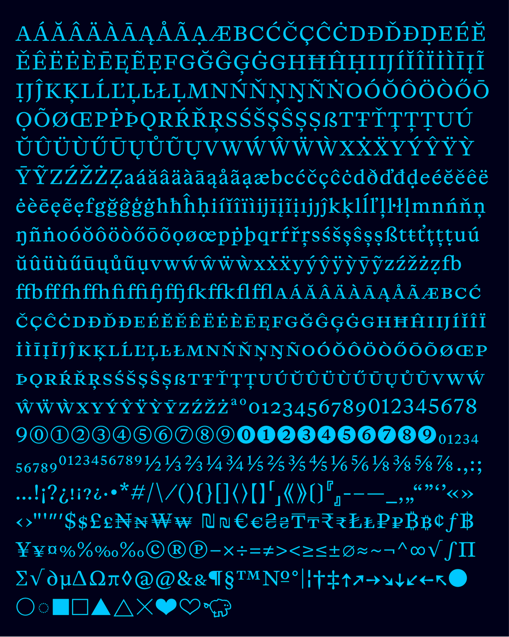
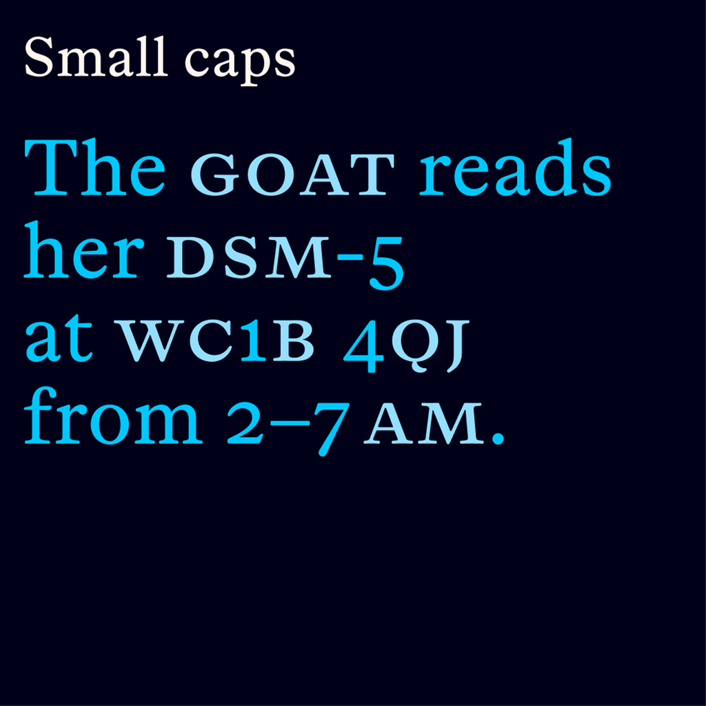
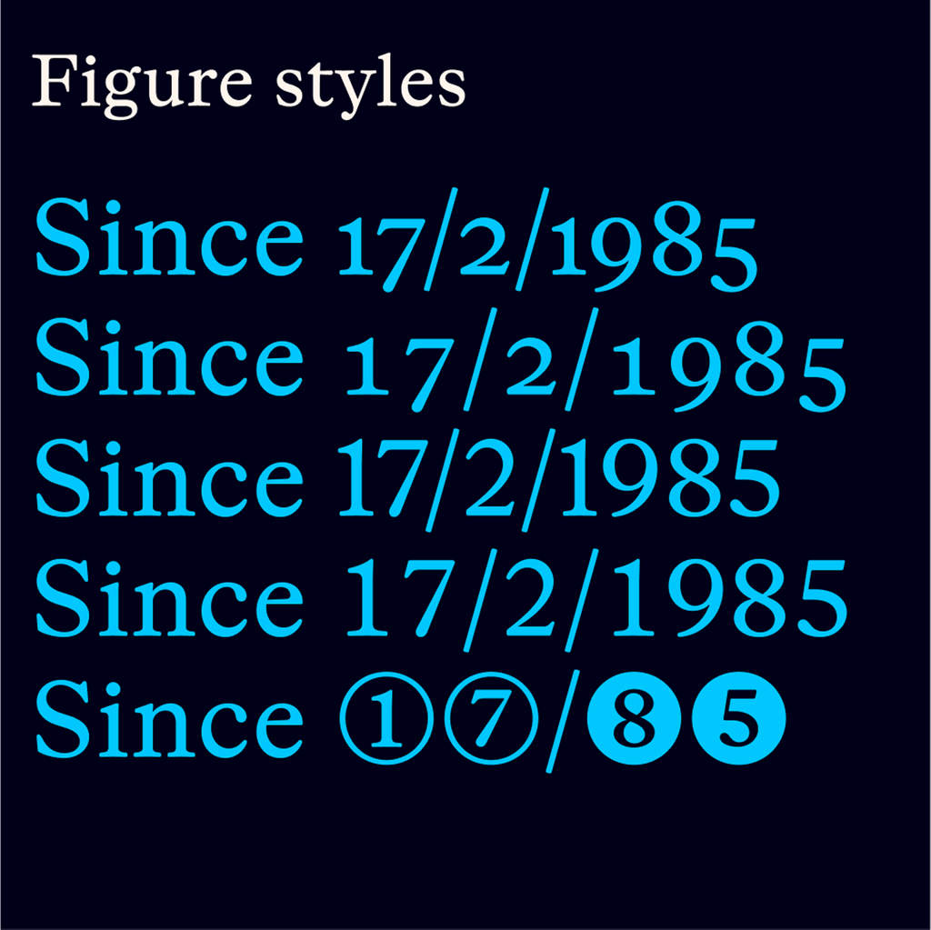
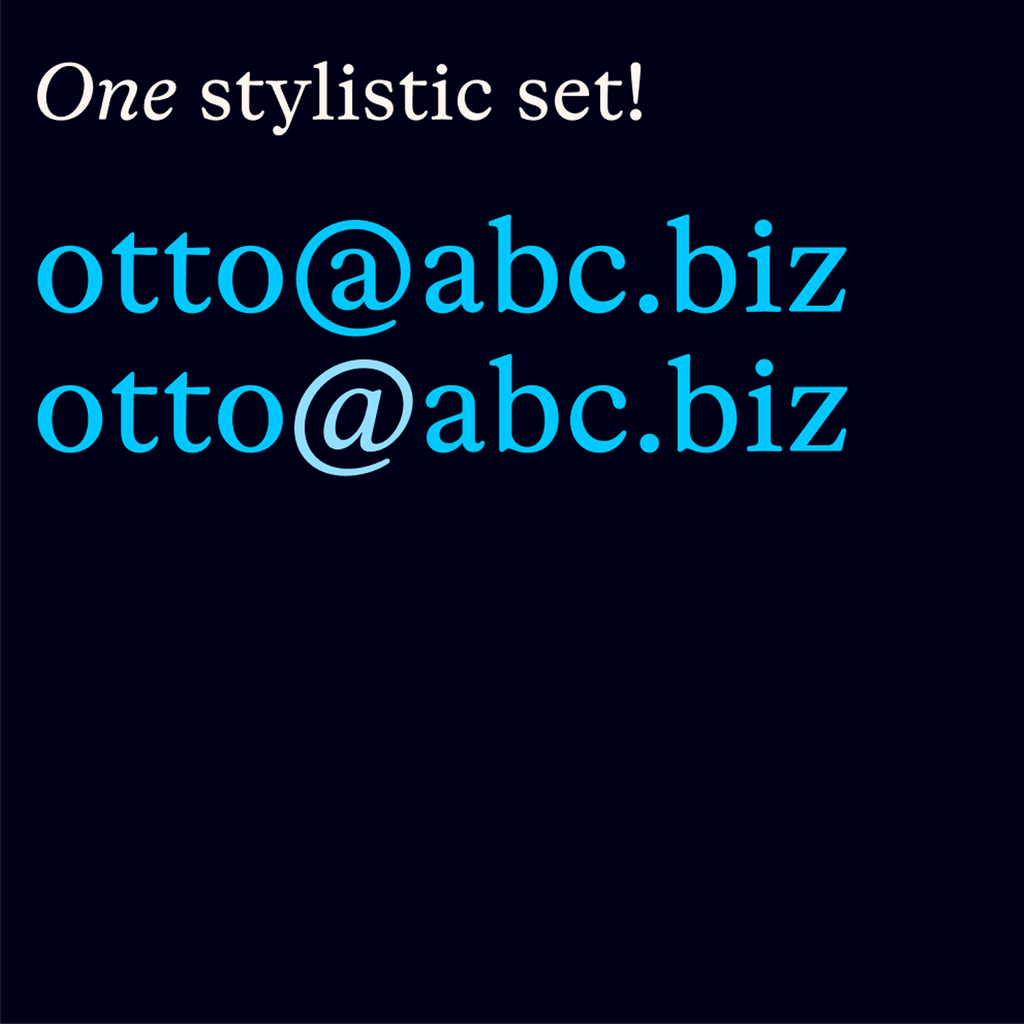
Celebrating the traditions of book typography, Otto’s default figure style is oldstyle (don’t worry: for all your annual reports and phone-book redesigns, tabular and lining figures are included as well). Unusual for Dinamo and in a small gesture of defiance of the limitless possibilities of digital fonts, Sam and Laura only included one alternate glyph: you have the choice between a roman and a cursive @.
In addition to the usual ligatures, Otto also features pairs like fb, fh, fj, and fk—rare in English, but common in Dutch and some other languages.
Languages
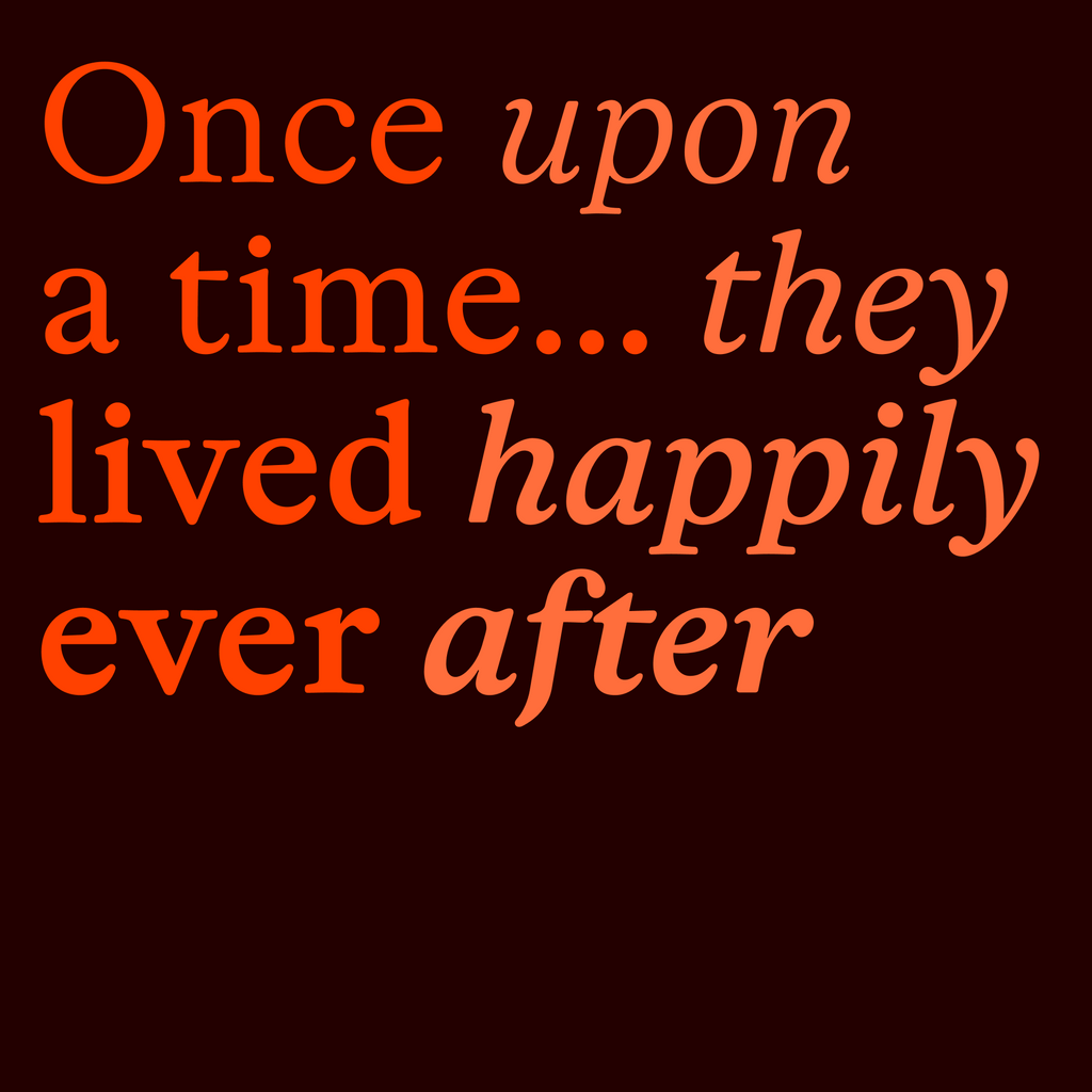
Traditional fairy tale openings in Maltese, Faroese, Czech, Catalan, Hungarian, and Irish Gaelic. Thank you to Diana (Maltese), George (Faroese), Tomáš (Czech), Miquel and Montserrat (Catalan), Boldizsár (Hungarian), and Aisling (Irish Gaelic) for the translation help.
THE BOOK
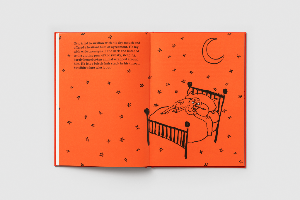
In homage to the boy that inspired the font, Otto is a children’s book for adults, complete with illustrations by Hannah Robinson, whose charming and joyful cartoon dogs for The New Yorker initially caught my eye. Otto the book is hardback, bound with orange-red library linen, and printed by Grammlich in Baden-Württemberg (a stone's throw from the Black Forest that inspired the Grimm tales). Otto is an Aesopian Bildungsroman about a boy and his, um, as I mentioned before, it’s a complicated relationship with a fox, designed and written by Sam. Here’s the movie trailer voice-over:
Otto was a perfectly lovely child… although there was the slight thing of his temper. After Otto hit his mother in the eye with a fork, his family had to start wearing helmets at the dinner table, and his father couldn’t help but issue a small prayer. “Dear universe,” he whispered, “please send us something to calm this boy down.”
Enter Ronnie.
