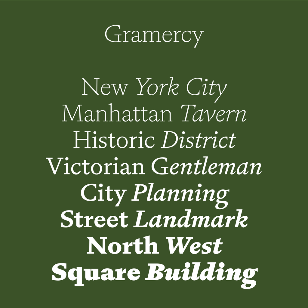
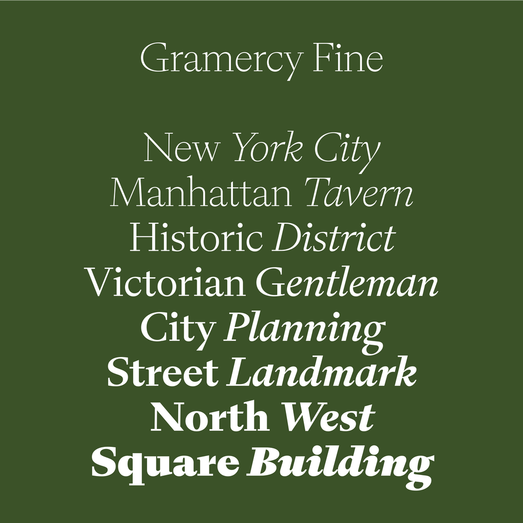
ABC Gramercy. A Beautiful Serif in Three Optical Sizes with Uppercase Swashes
Gramercy is an elegant, contemporary serif that balances painterly and whimsical strokes with functionality and sturdiness.
This is a font that beautifully synthesises calligraphic and playful typeface aesthetics with more rigid genres and established proportions. 48 styles in total, its three subfamilies — Standard, Fine, and Display — each come with uppercase swashes.
All in all, Gramercy is a font that invites extreme editorial flexibility. It’s a true winner. Let’s see what it can do.

Vibe
Gramercy is an immense and beautiful text + display font. Designed by our long-term collaborator Robert Janes, a recurring theme is its overhanging, misproportioned details, like the calligraphic S, the hooded C, and the bulbous B. Where another typeface might have ball terminals, Gramercy has flared strokes. That’s what makes it feel painterly.
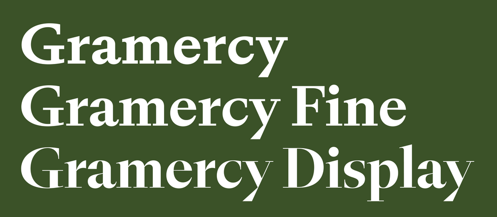
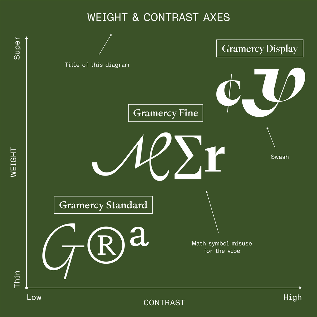
3 subfamilies, 3 contrasts

One for the lovers
Rob’s first sketches were heavily informed by F.H. Ernst Schneidler’s Amalthea (1956), a typeface that served as the Italic companion to his eponymous Schneidler-Mediäval (1938). While quite sober, Amalthea features some curious details that echo in our Gramercy, like its clipped descenders and set of swash capitals. Gramercy’s proportions borrow from a range of more rigid 16th and 17th Century French types. All these ingredients combine to create the typeface’s graceful, performative aesthetic.
STYLES & FAMILIES
Gramercy, Gramercy Fine, and Gramercy Display all cover eight weights with corresponding Italics. The variable font files allow you to elegantly sashay from high to low contrast. Using the second variable axis, you can wax and wane from Thin to Super.
Imagine Rob drawing each glyph 16 times to cover the expansive weight, optical size, and Italic range. With 726 glyphs in each master, that means Gramercy was generated from 11,616 individual drawings.


🏆 Standard

🏆🏆 Fine

🏆🏆🏆 Display
Pandora’s box contents revealed
SWASHES
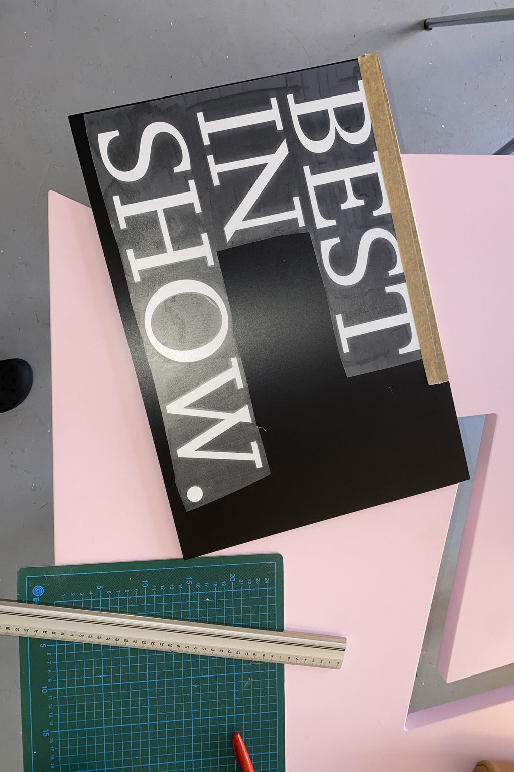
Hearts beat faster when Gramercy’s swashes appear, a series of uppercase flourishes that cover all weights and subfamilies. There are two swash features: One OpenType setting that transforms all capital letters into their swash counterpart, and another that effects the initial letter of every typed word.

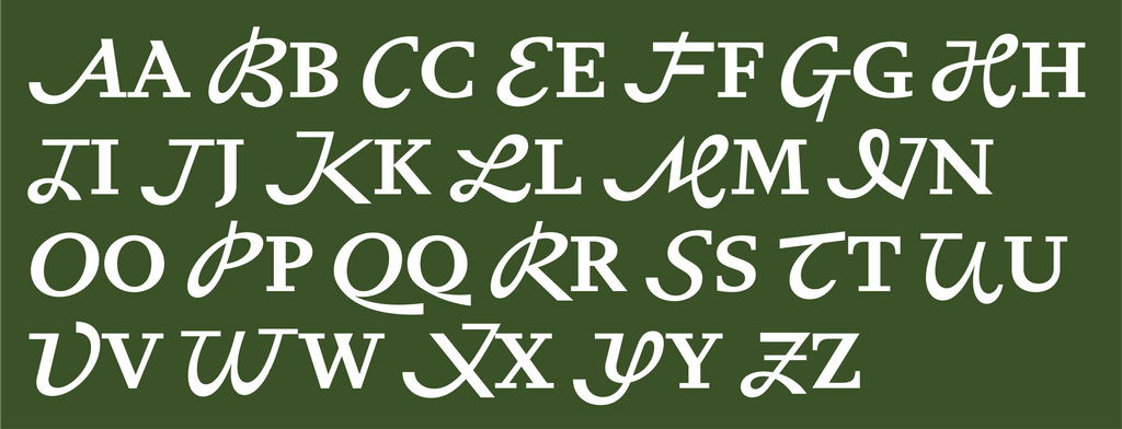
Uppercase + swash pairs

5 ways to style a wood-loving legend

What society thinks I do

What I think I do

Star Characters
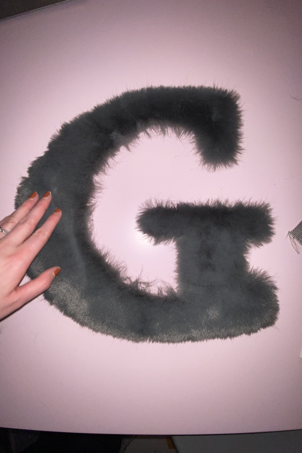
Gramercy’s N is particularly dear to me, with its diagonal stroke protruding through its bottom right tip, something I’ve seen in Italics but never an upright Roman design before. The G is confident with its spiked spur and hunched curve. And the tail of the Q seamlessly connects to its body, creating an energetic stroke. Both the lowercase c and uppercase C have attitude with their unusual, distinctive bites. Here are a few more stand out characters:


Early In Use
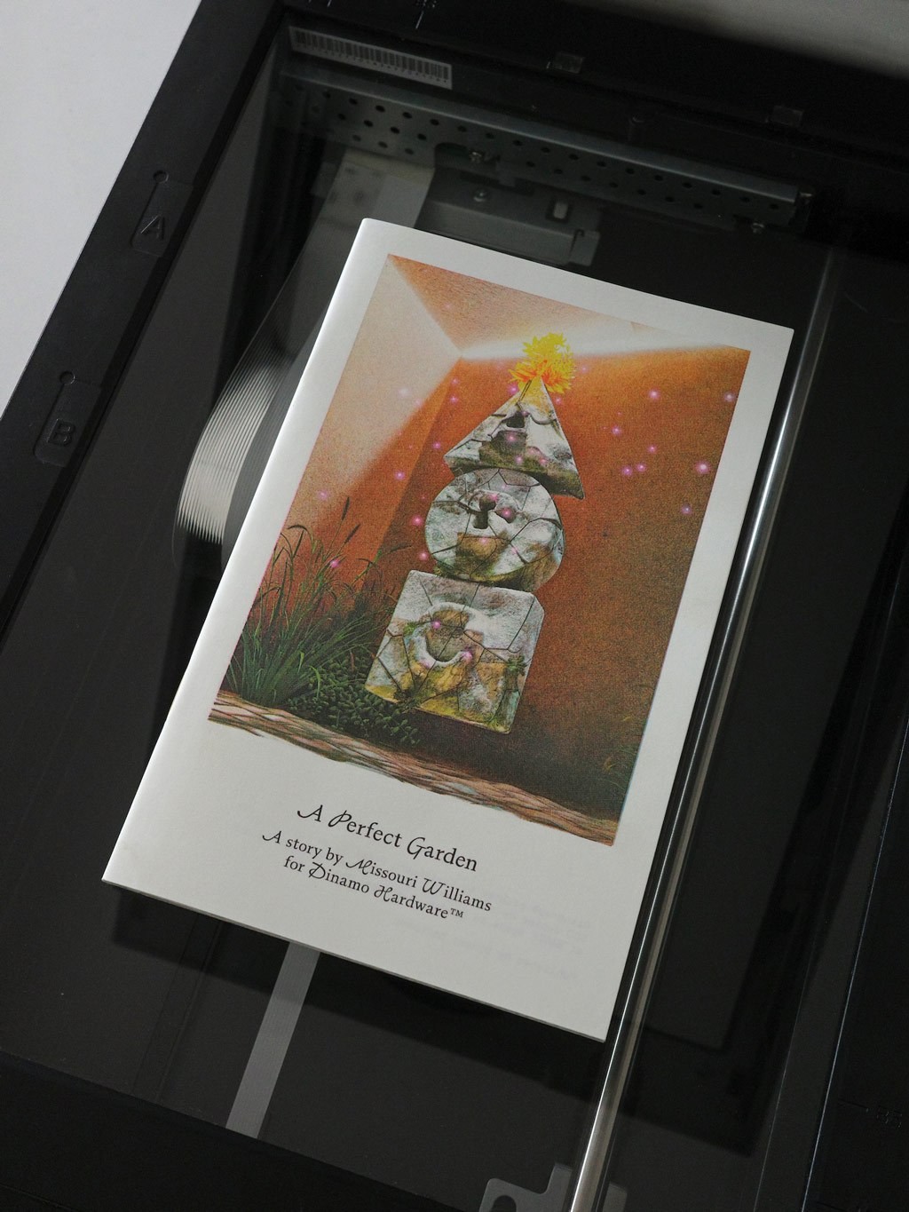
Gramercy shines whether in display or text contexts. I insisted we use it for our recent Hardware zine, A Perfect Garden — our first foray into fiction publishing via a dystopian short story by novelist Missouri Williams. Simon used a swash capital to start each sentence.
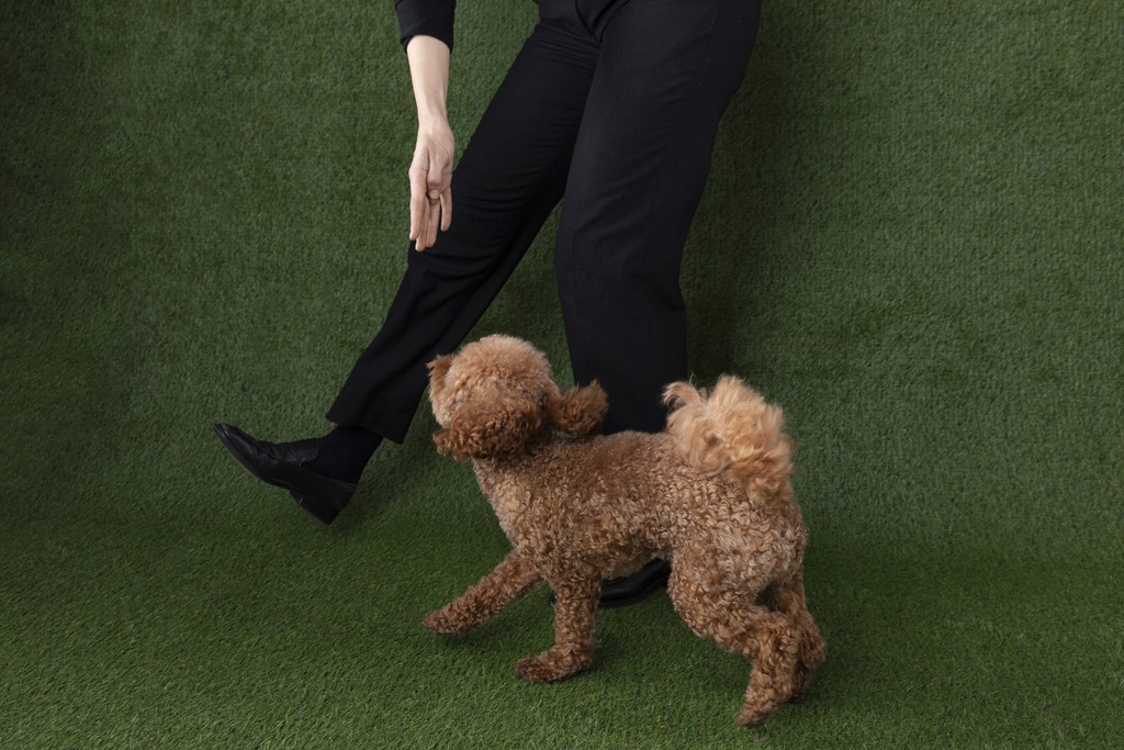
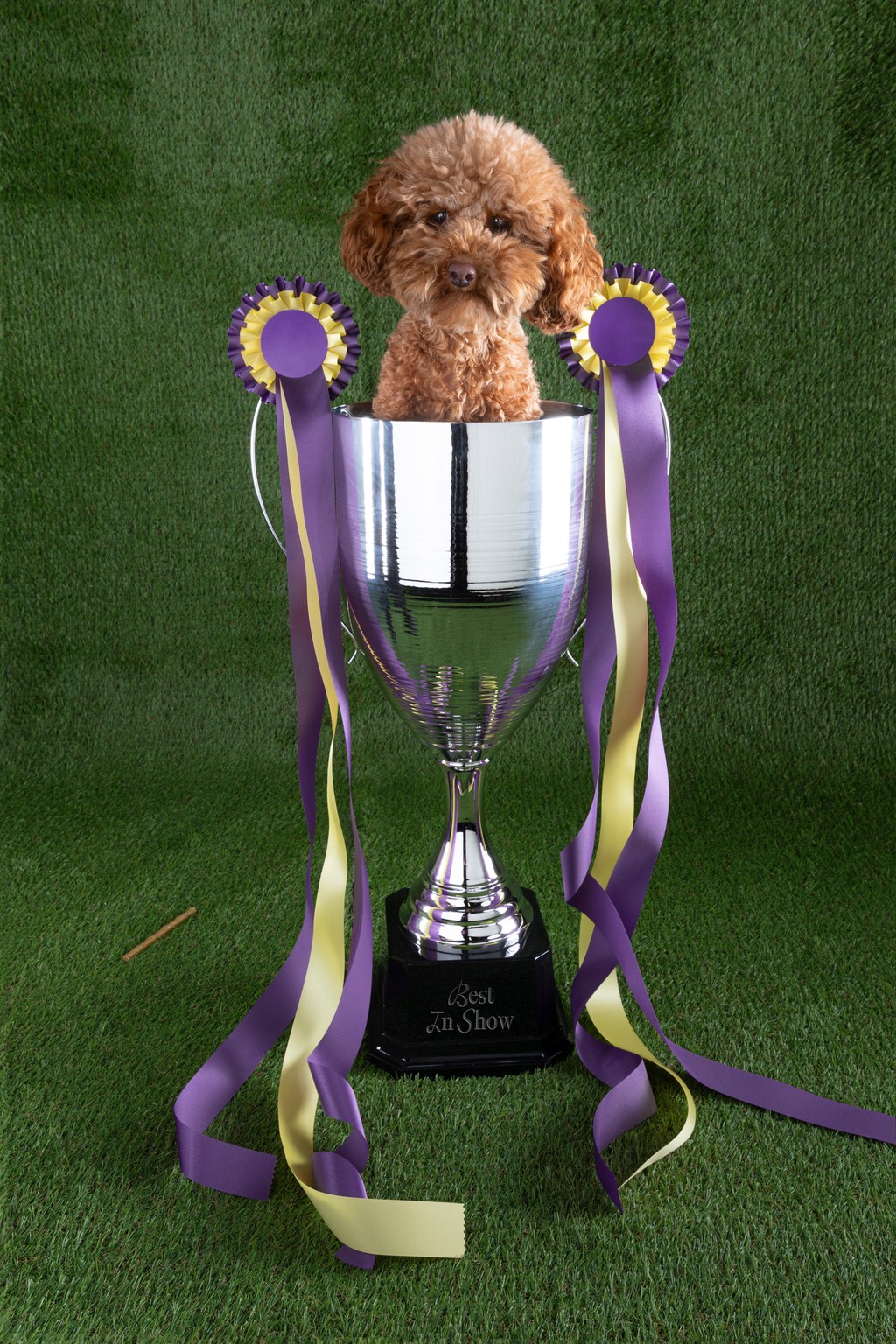
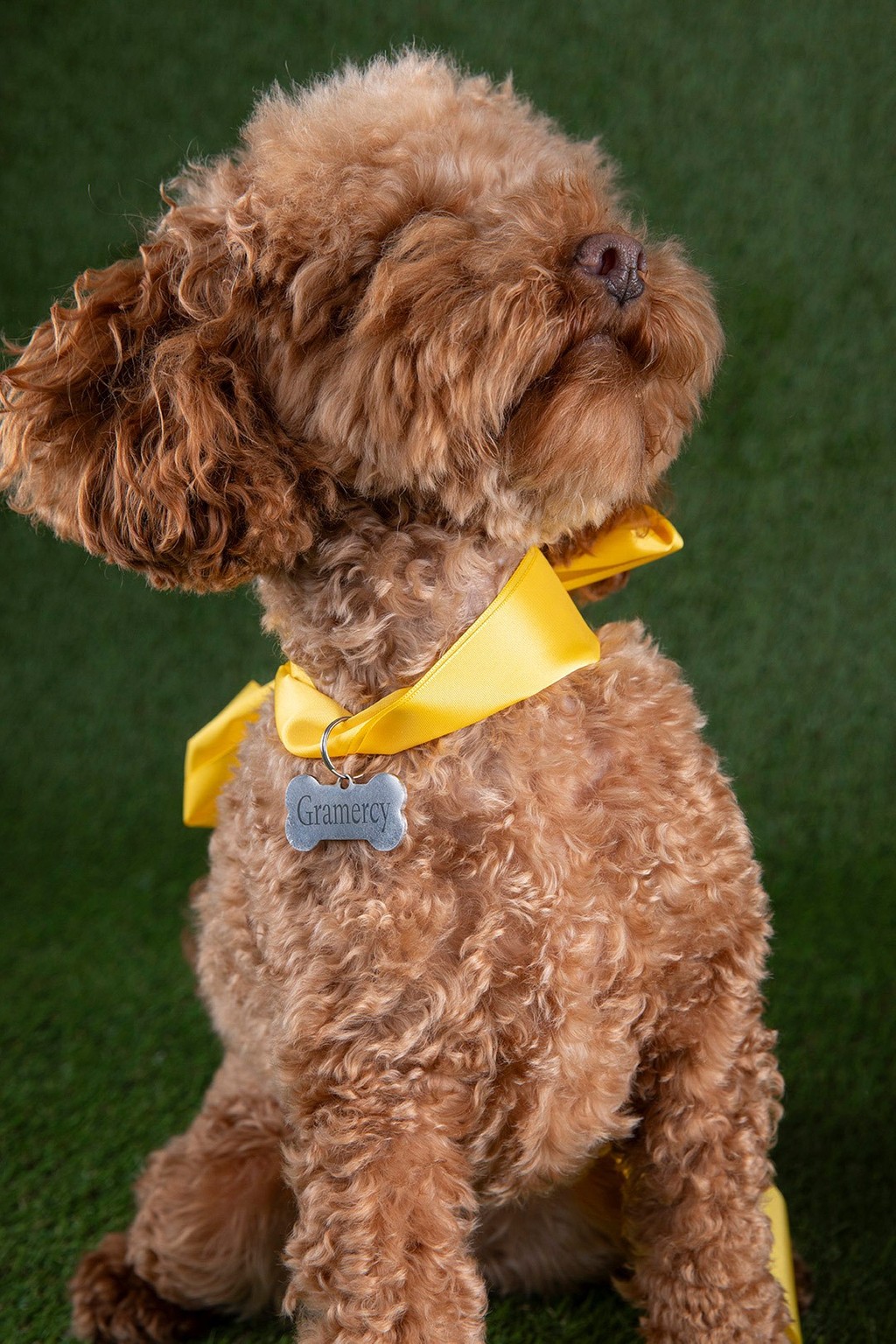
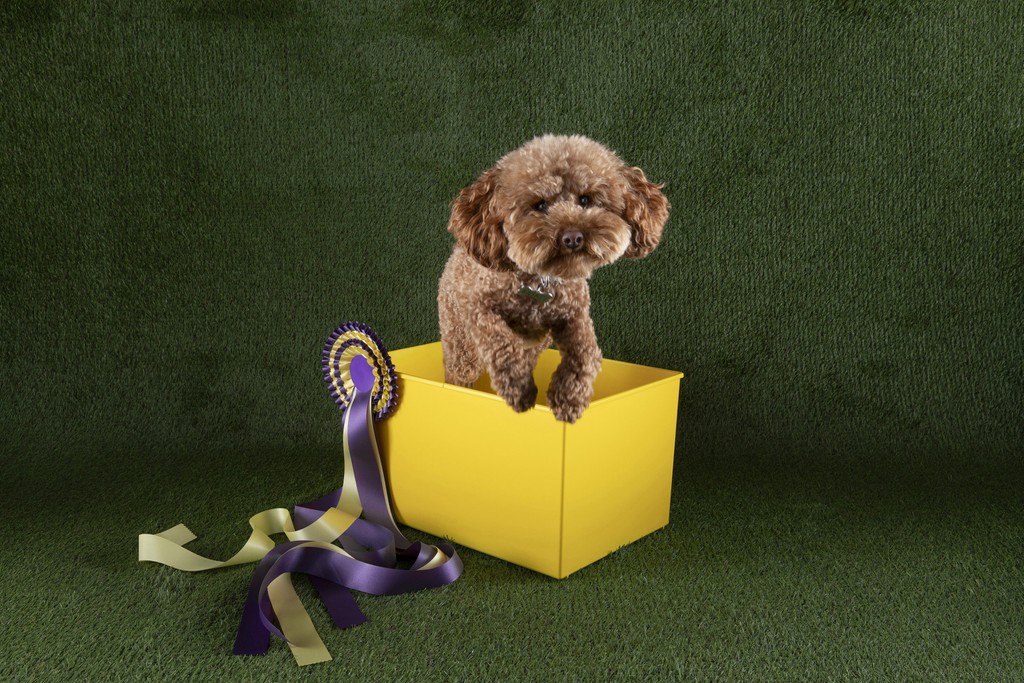
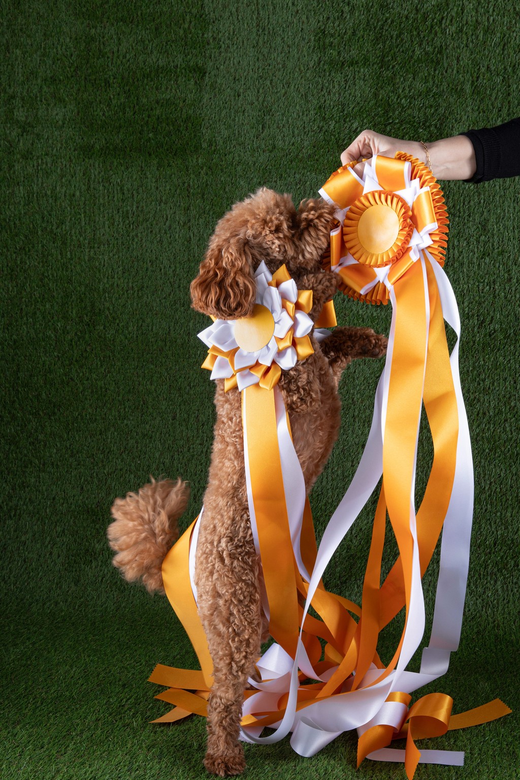
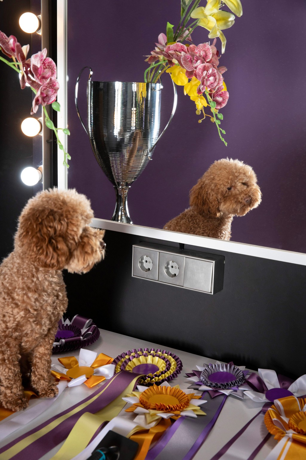
ABOUT “THE DOG”
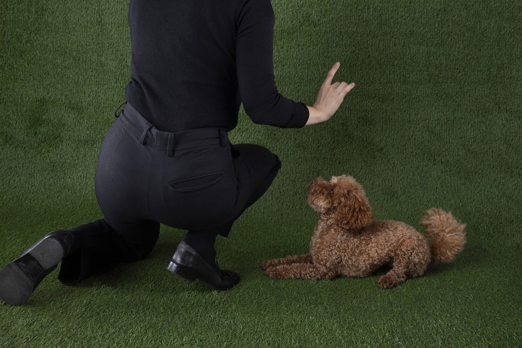
Basket is our Berlin studio dog, and the companion of our Head of Publishing and The Dinamo Update editor Maddy. She likes tennis balls, long walks, and attention. She gave us a fair price in exchange for social media exposure. Follow @basket_is_a_basket for more.
A brief moment of introspection
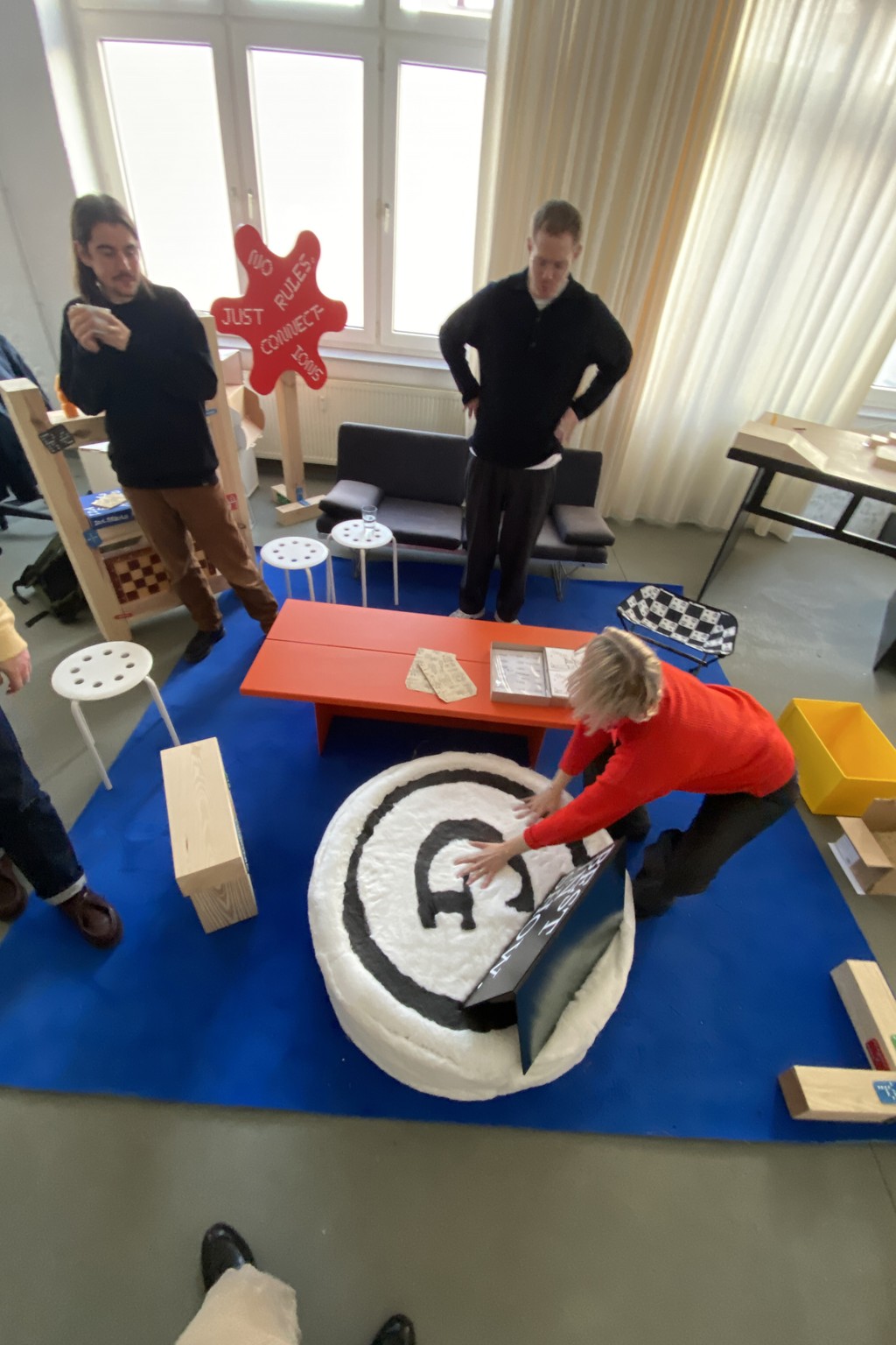
Behind the Shoot
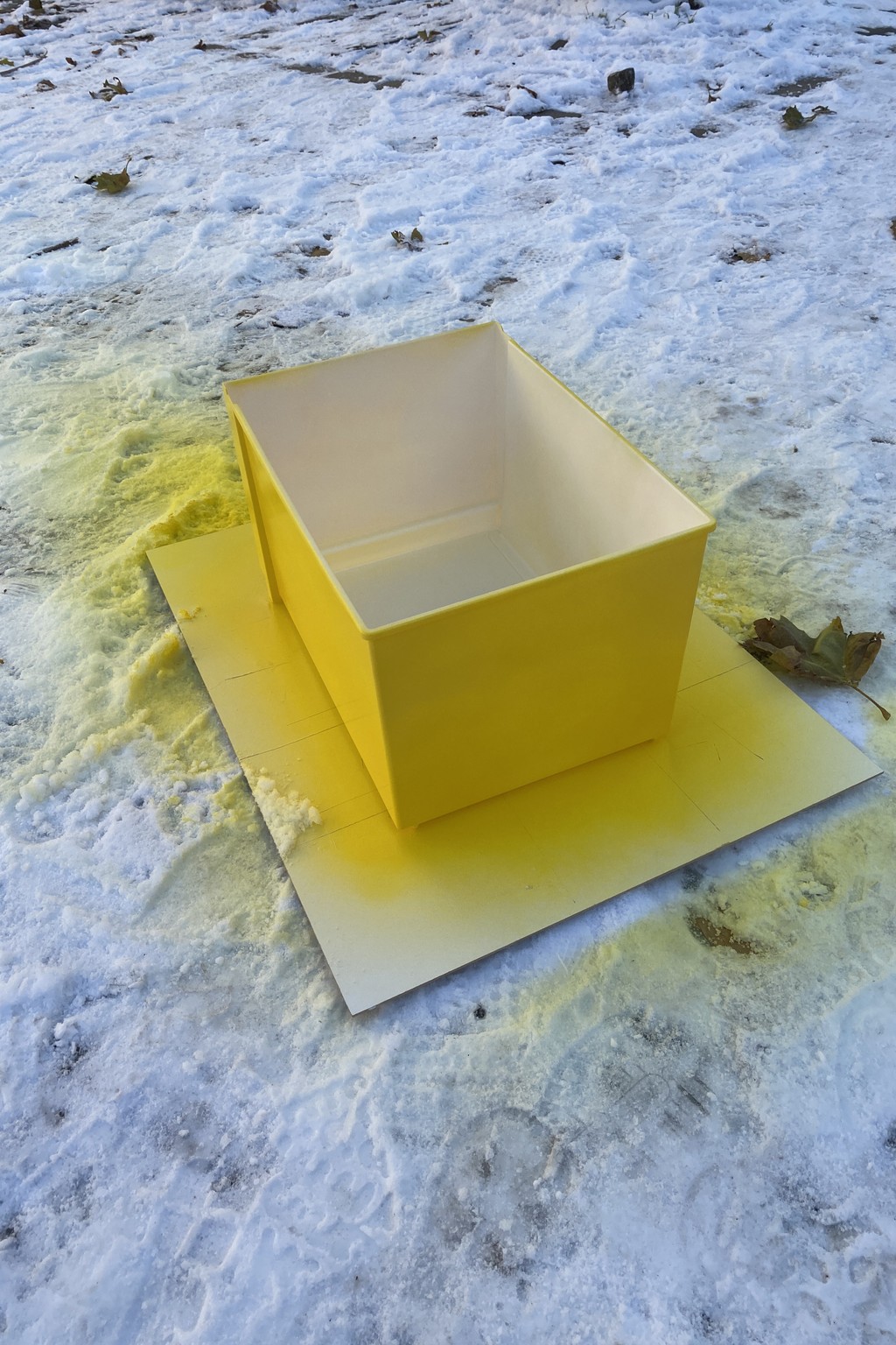
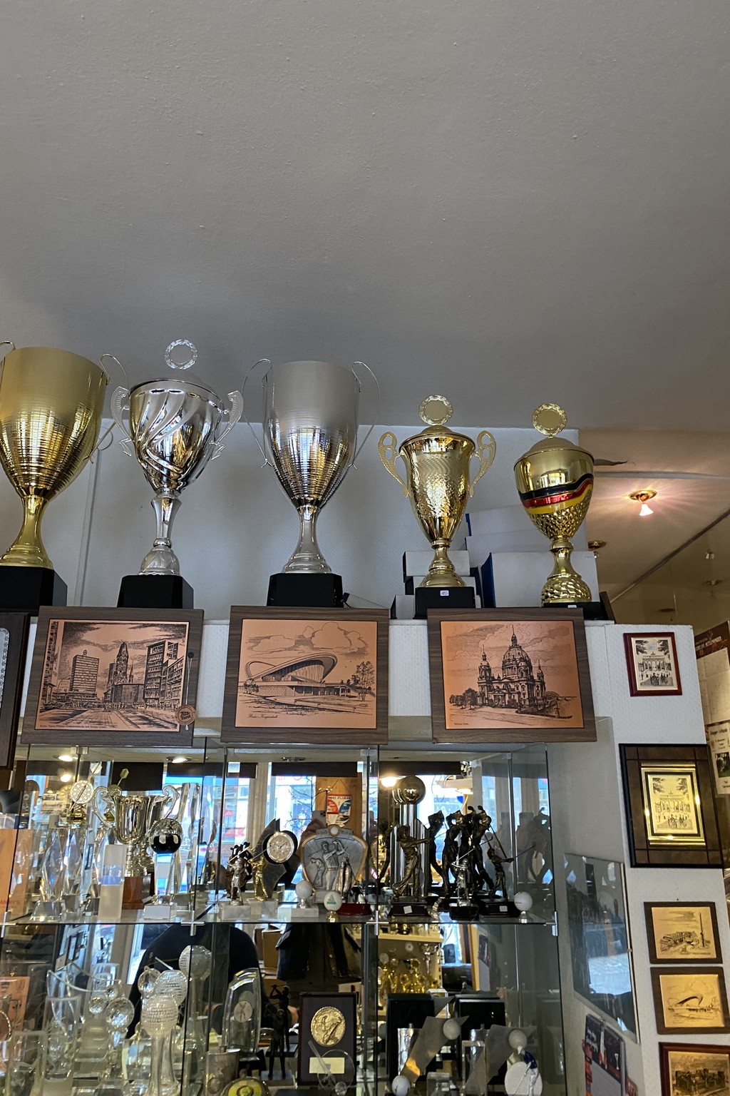
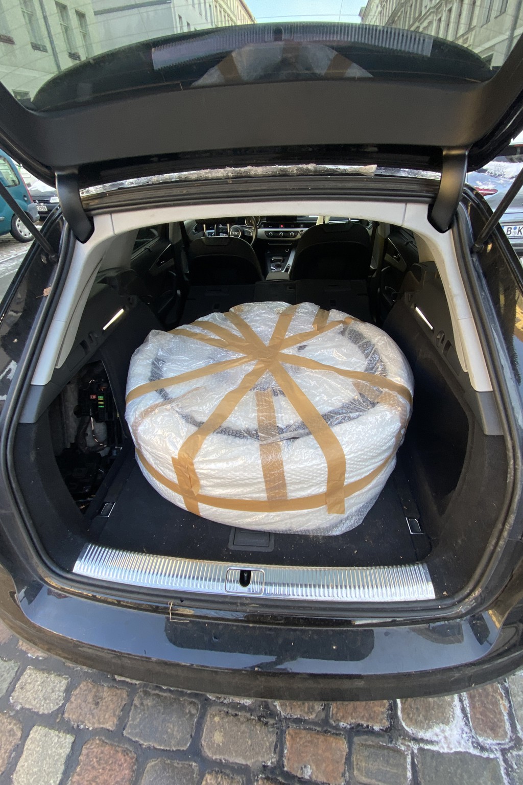
Art directors Sascia Reibel and Mathias Lempart built everything you see here themselves. The box was painted in the Lidl car park, the trophy carefully sourced and chosen — and Basket now naps on her handmade Gramercy pedestal in the studio every day. I am continually blown away by their world-building.
Michelle Mantel is the patient eye behind these beautiful photographs. Tina Lehmkuhl edited the BTS video.