Typeface Release: ABC Ginto
ABC Ginto is an exuberant geometric-humanist typeface that delights in tension, especially between circular and rectangular forms. London-based graphic designer Seb McLauchlan developed the font while researching sans-serif typefaces from the twentieth century, focusing on the shift from strict Modernist “purity” to the more baroque, animated styles that emerged during the phototypesetting period of the ’50s and ’60s. These two historic impulses have been remixed to create a dynamic and charismatic set of forms.
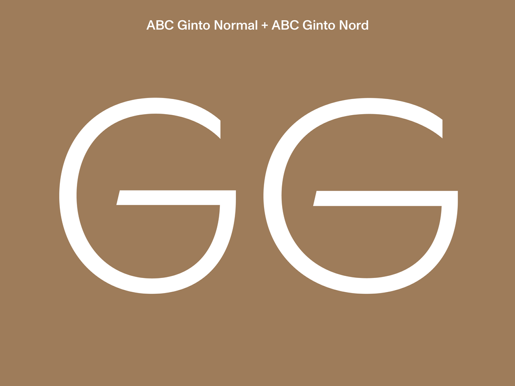
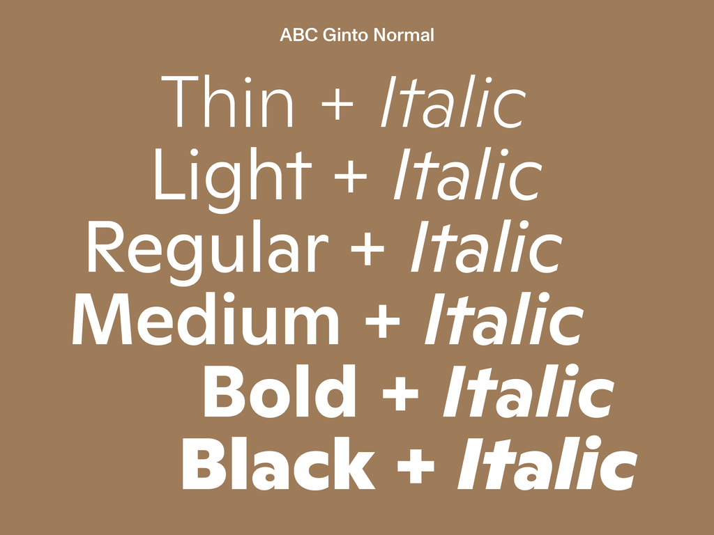
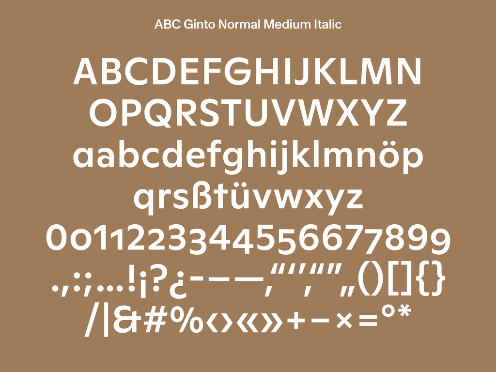
ABC Ginto consists of the two sister-families, Normal and Nord. ABC Ginto Normal is compact and poised, and encompasses a sensible set of weights ranging from Thin to Black, allowing the typeface to perform well in a variety of sizes and environments. For those seeking to tame the typeface a little, the more erratic characters of this family—like the a, t, M, and &—can be swapped out for better behaved alternatives via the OpenType feature.
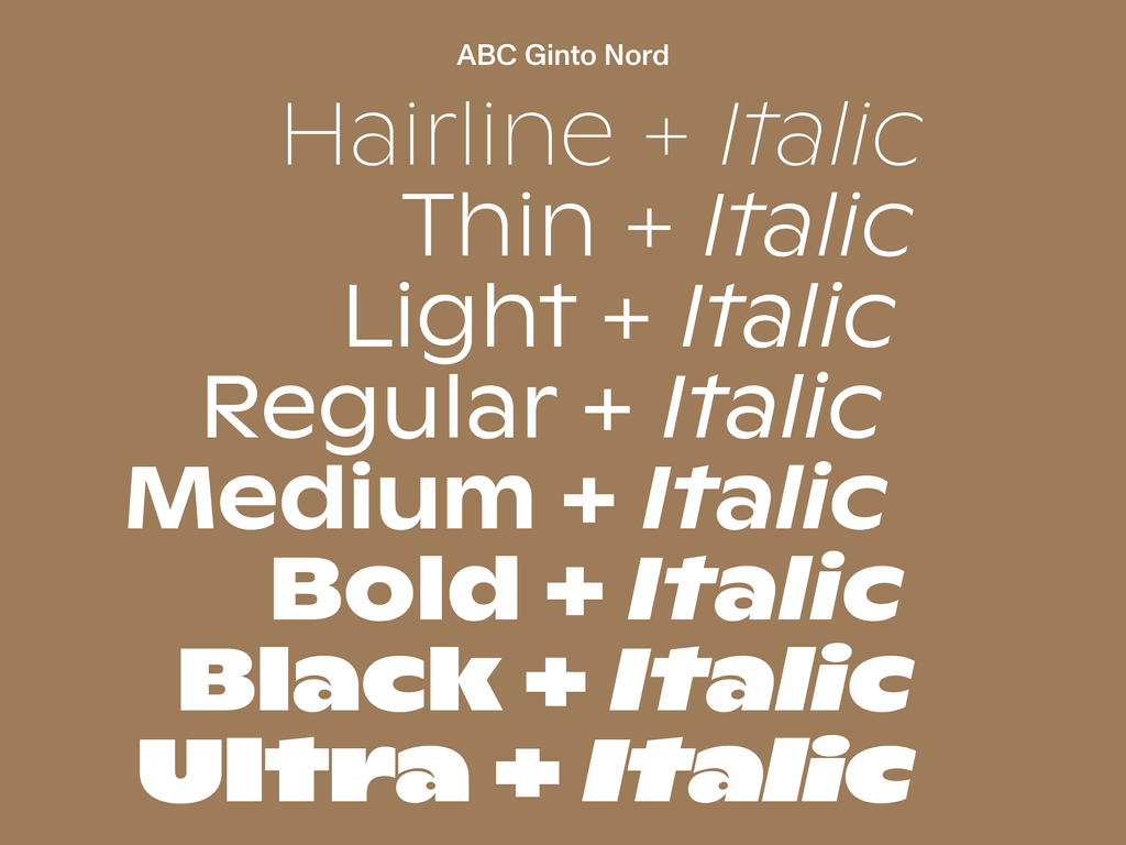

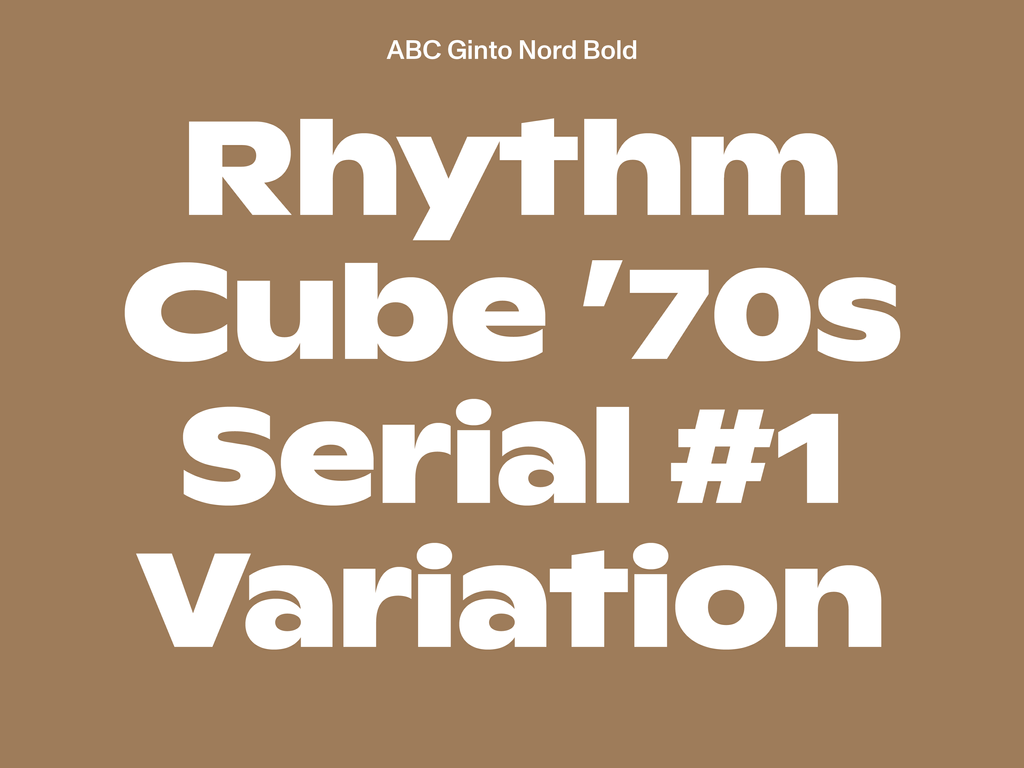
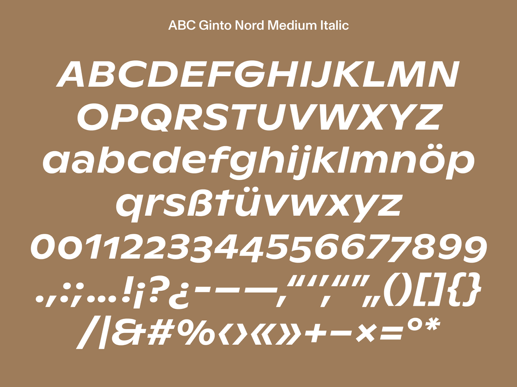
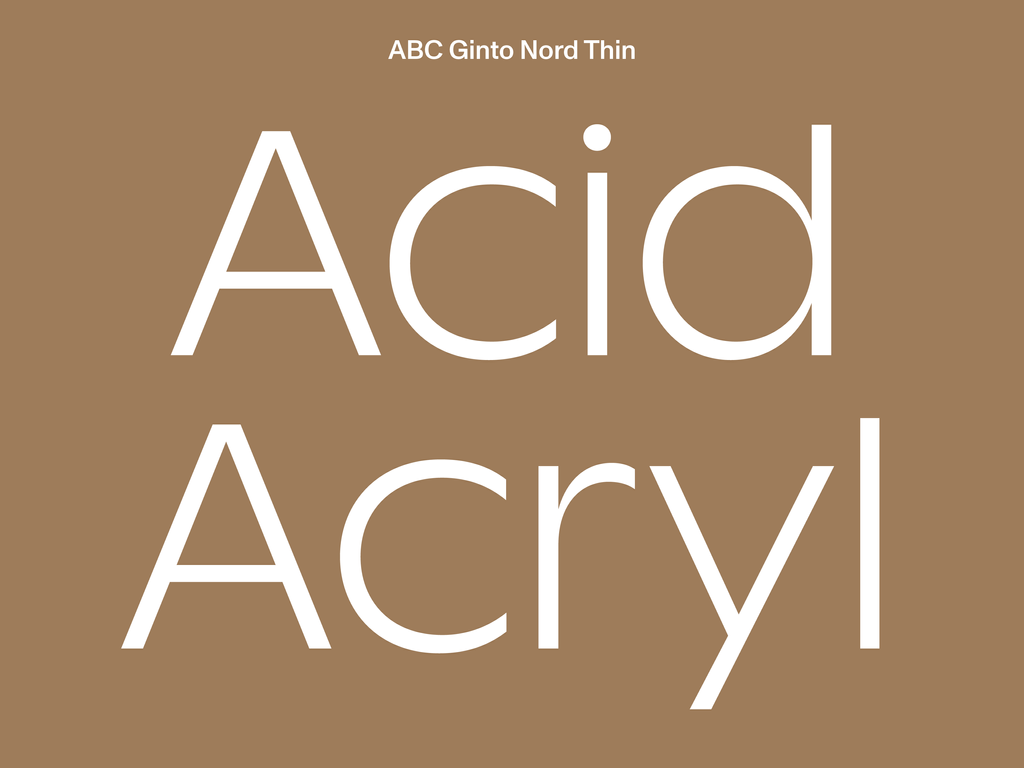
The Nord sibling takes the tone and timbre of ABC Ginto Normal and amps up the volume to 11, reverberating like the greatest hits of Roger Excoffon, Ed Benguiat, and Joseph Churchward. It borrows Normal’s structure but expands the x-height and character width. It also includes two more weights, stretching from a fine Hairline to a monolithic Ultra Bold.
Both sister families feature over 700 glyphs, supporting the majority of Latin-based scripts. They also include a variety of symbols and arrows, and a set of special brackets and quotation marks for our friends in East Asia. Head over to our Font Gauntlet for a more active role in animating ABC Ginto using variable font technology.
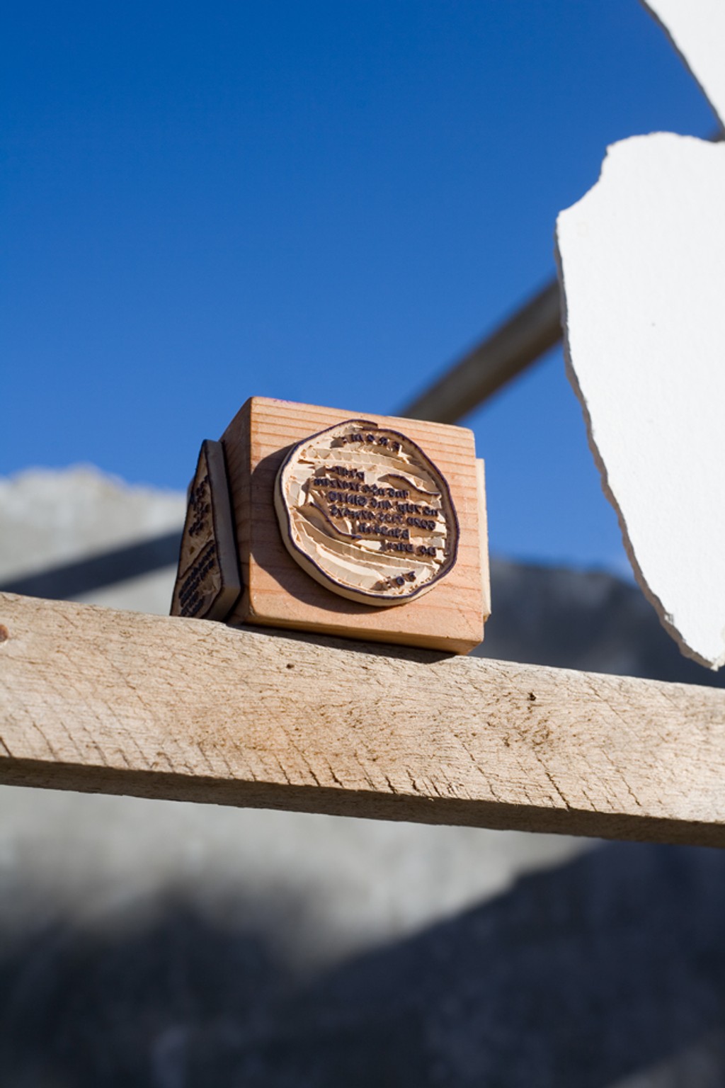
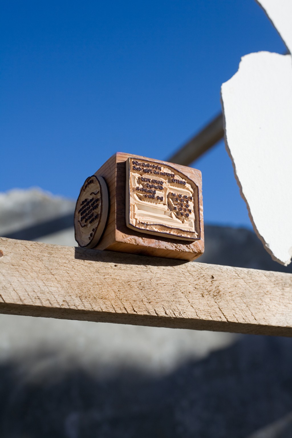
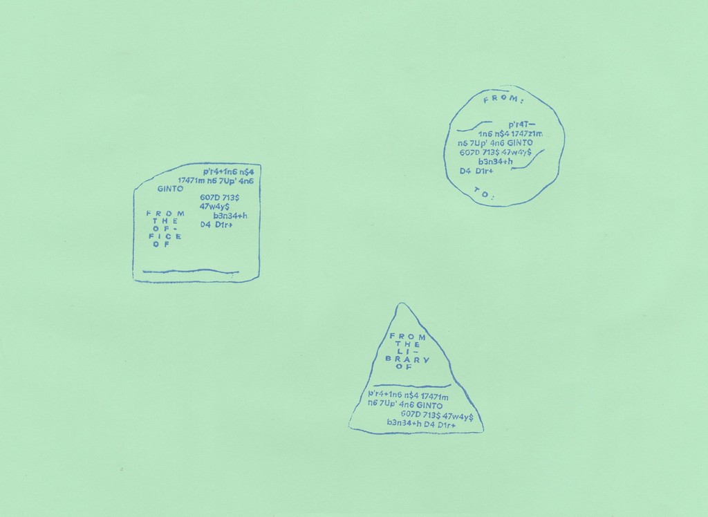
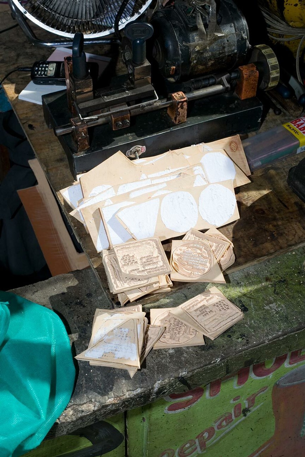
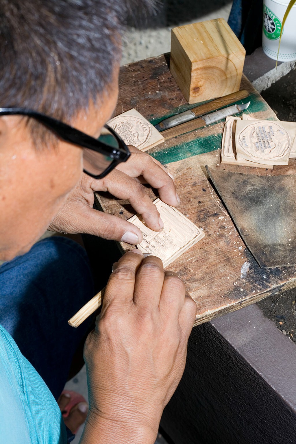
While the name “Ginto” was initially chosen for its punchy sound, Seb was surprised to learn that it also means “gold” in Tagalog, the main language spoken in the Philippines and his mom’s native tongue. To celebrate such a serendipitous coincidence, our friends at the Manila-based book studio Hardworking Goodlooking created a customizable ex lib stamp featuring the typeface—think Bauhaus meets Ginto going full-on Jejemon. It’ll be landing in our Hardware store soon.
Credits
Design: Seb McLauchlan 💕
Spacing and Kerning: Igino Marini
Mastering: Chi-Long Trieu
Ginto Stamps
Concept and Design: Hardworking Goodlooking
Production: Hardworking Goodlooking
Photography: Czar Kristofer
Location: Philippines