Arizona: Five Fonts in One — From Sans to Sans Serif
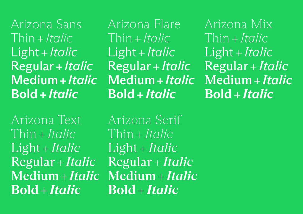
ABC Arizona is the first ever sans to serif “superfamily” that packages its five looks—Sans, Flare, Mix, Text, and Serif—into one single font file. As a multi-purpose Variable Font, ABC Arizona slides from sans to serif, allowing you to explore every step and genre in-between the two. In other words, it’s a slim, all-genres-in-one happy-meal, versatile and adjustable for any context.
The idea for the font first took shape back in early 2018—a time when Variable Fonts were first being used on the web—as type designers Elias Hanzer and Lucas Liccini studied a sketch by Arizona-residing Tom Carnase. In his design, letters were built around serifs, so that the Bold version had only small tails. During a Dinamo company retreat in Lago Di Como of the same year, Elias then began exploring the idea of an interplay between the two genres of typography, building on design history’s own fascination with bridging sans and serif in one project (like Otl Aicher’s Rotis), but with the additional hand of new variable technology.
Throughout the process, Elias kept designing on both ends of the spectrum, trying to make sure that all of the typeface’s parts could shine individually, while also chiming as a whole. And working on a project like this had its additional challenges. A considerable amount of brain power was required in order to focus on all the tiny details within each style, all the while keeping the overarching concept in sight. Each character needed to be drawn in a way that ensured every letter is “interpolatable,” so that it’s possible to segue from one of the font’s extremes to the other.
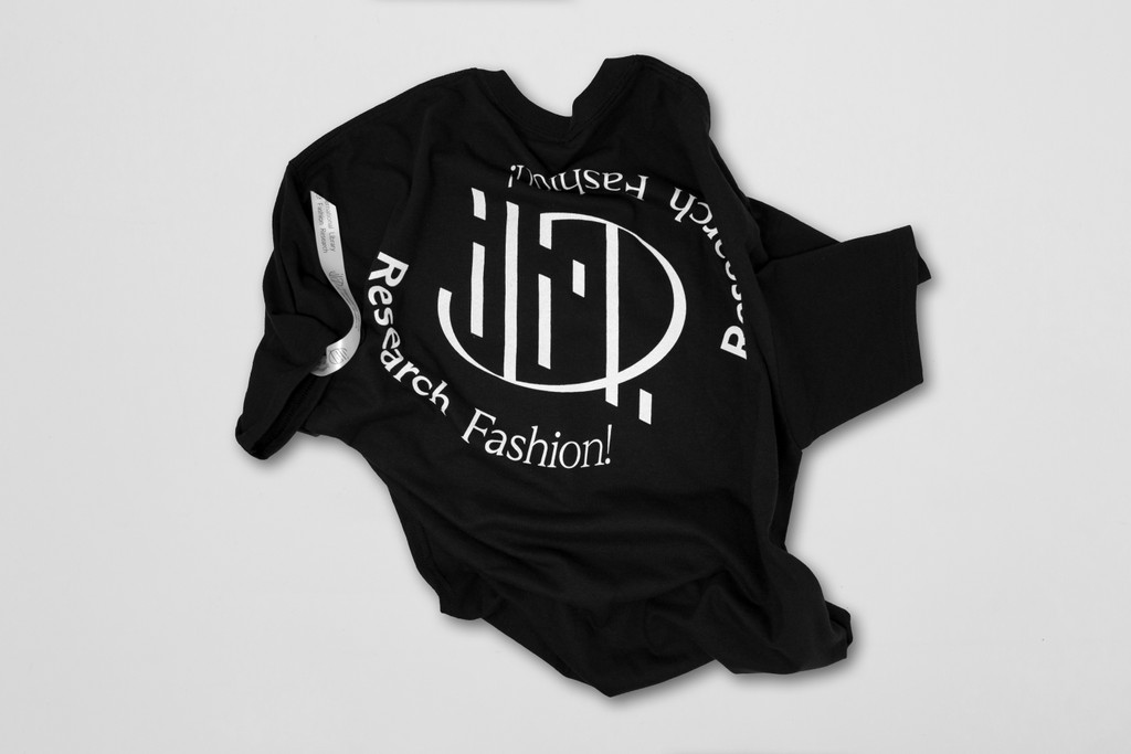
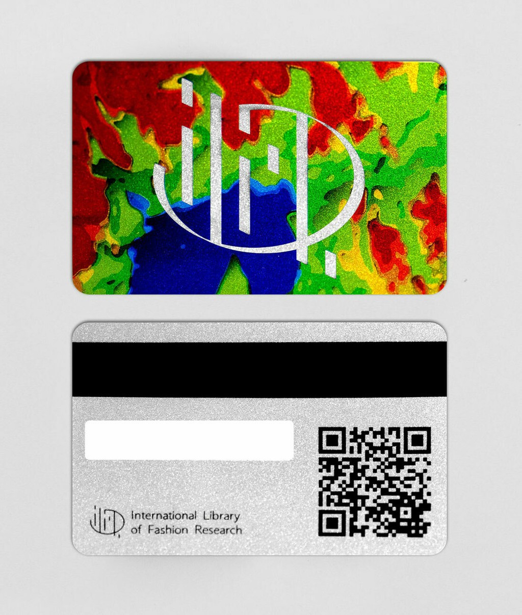
ABC Arizona in use by the Fashion Research Library, by Elise by Olsen. Graphic design by Morteza Vaseghi and Eric Hu.
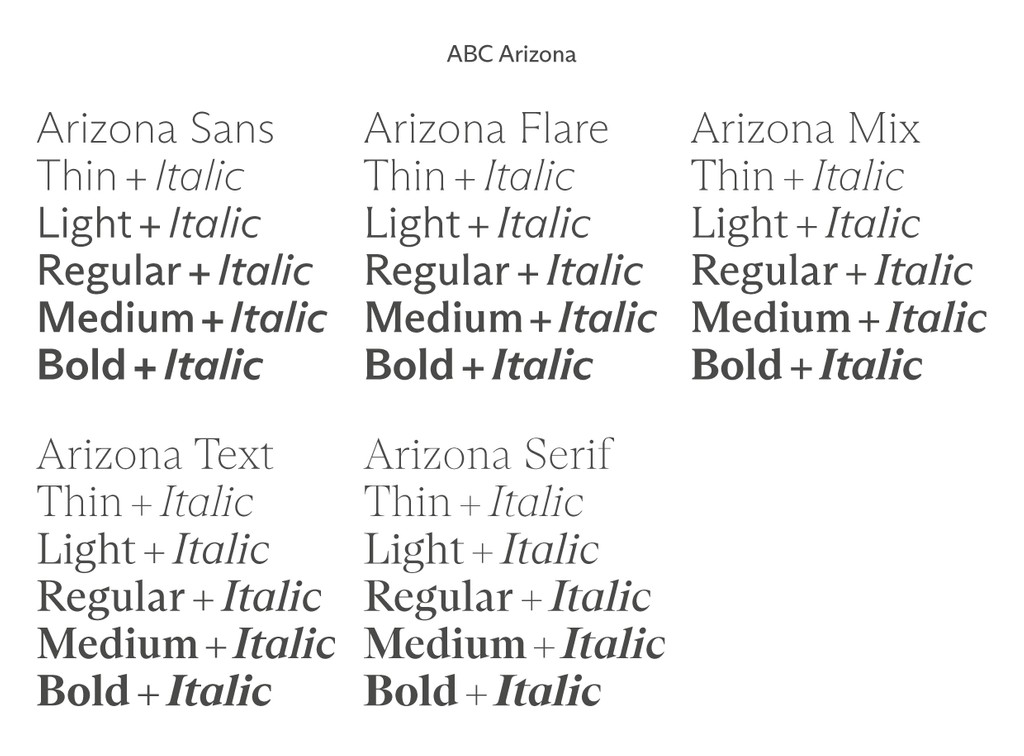
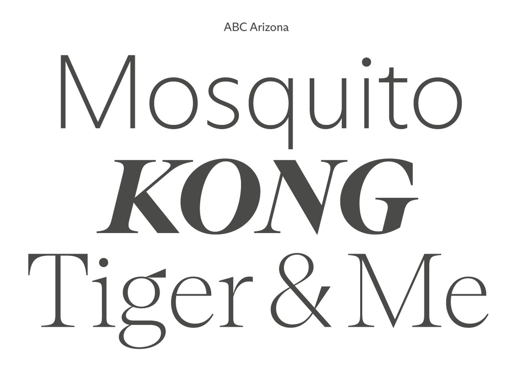
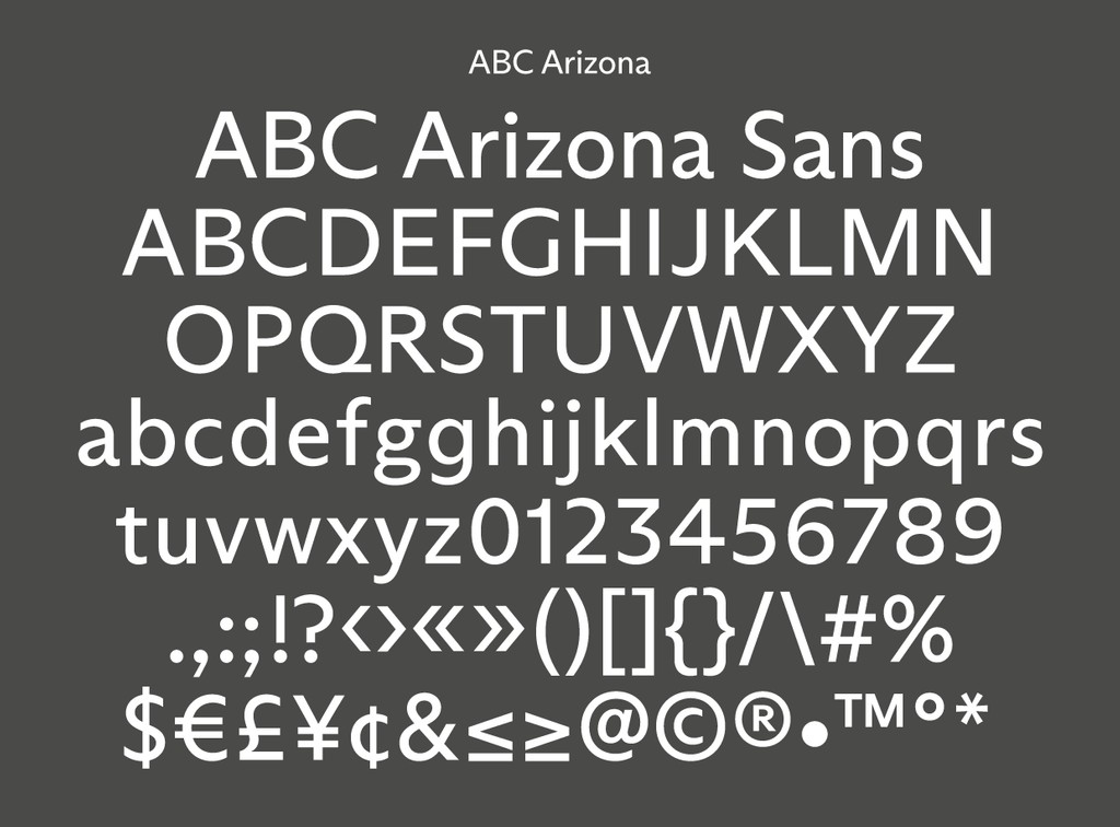
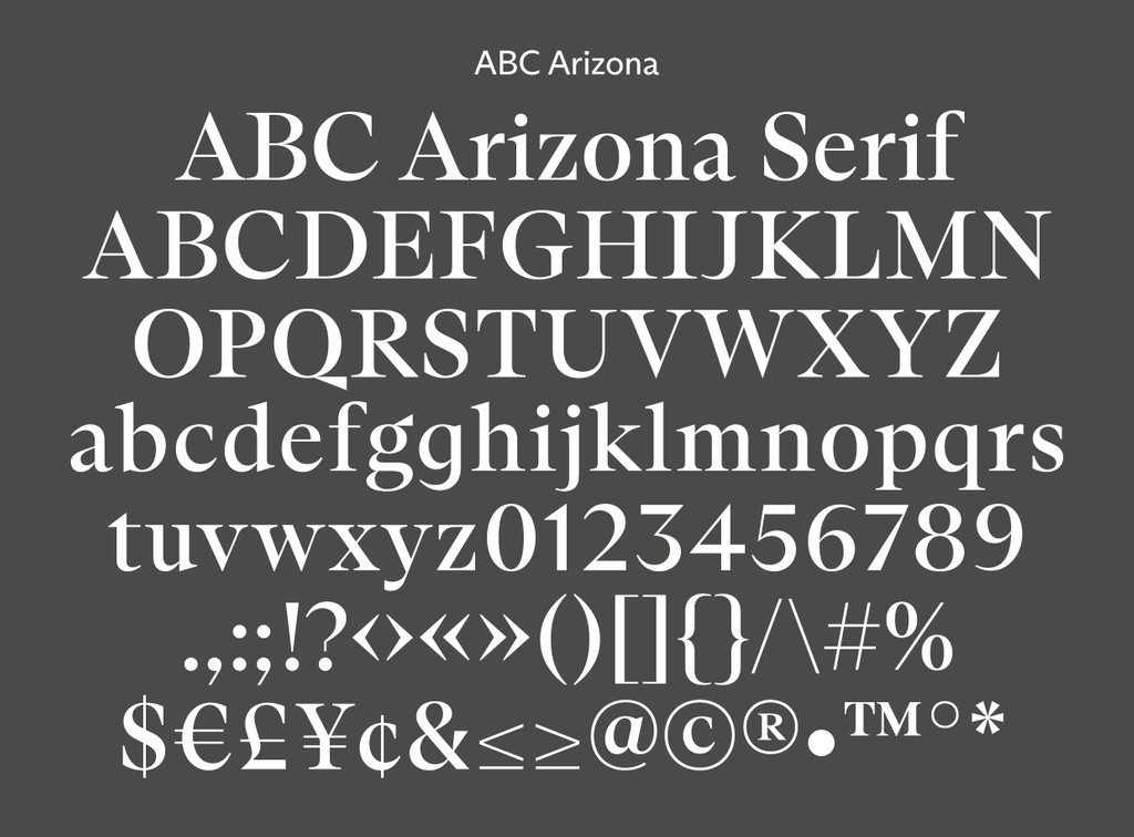
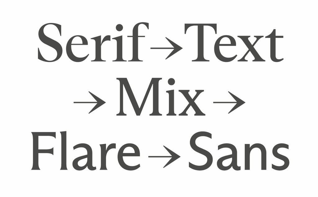
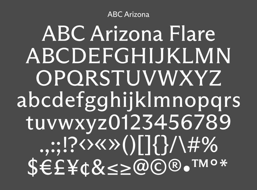
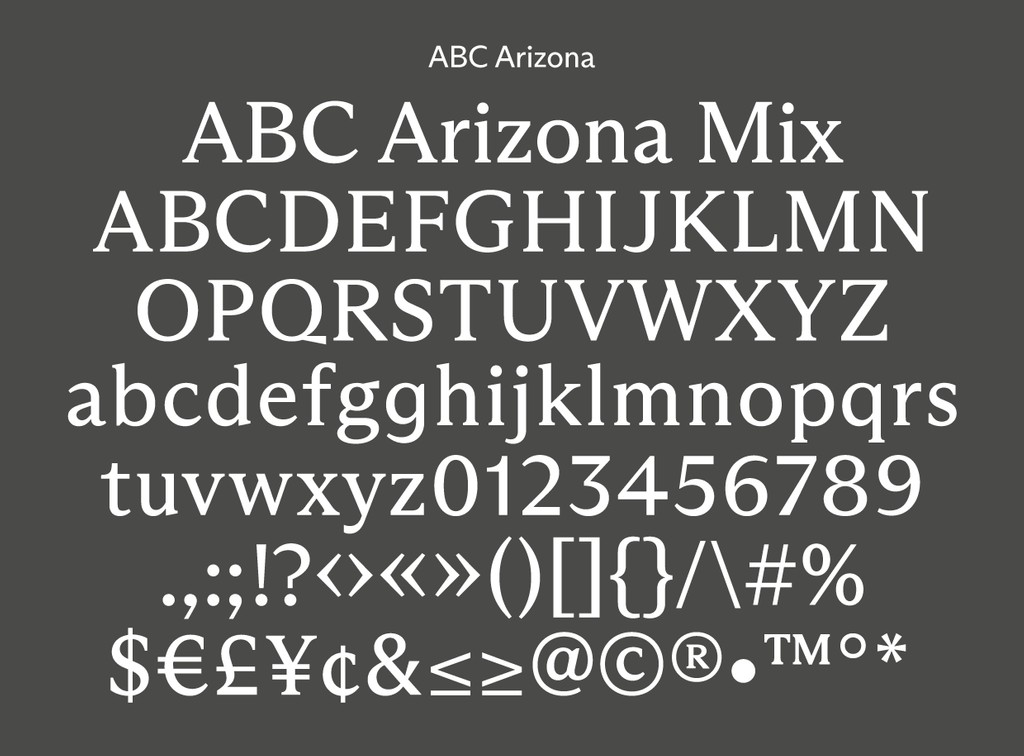
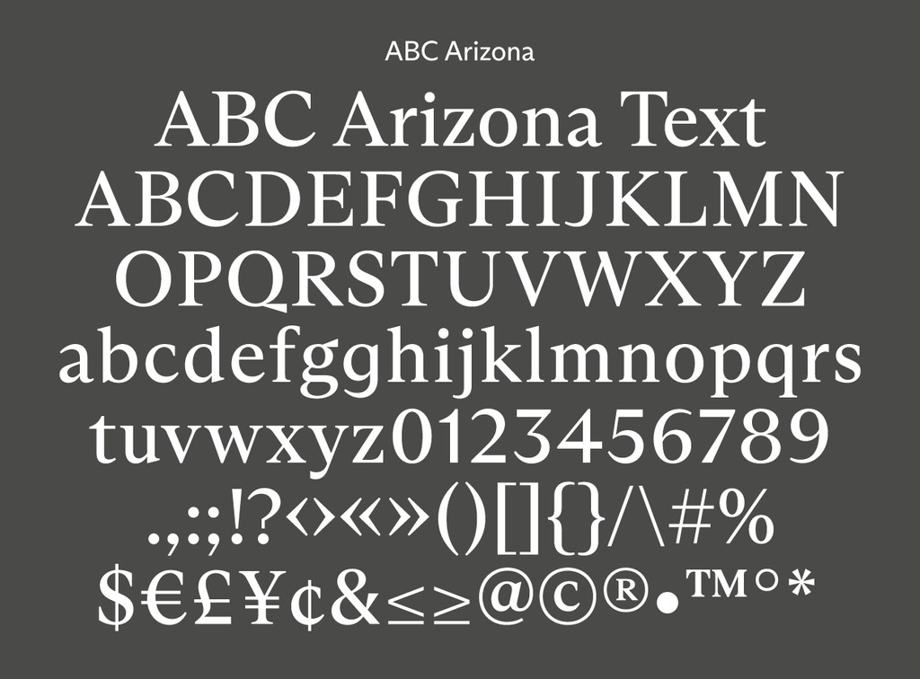
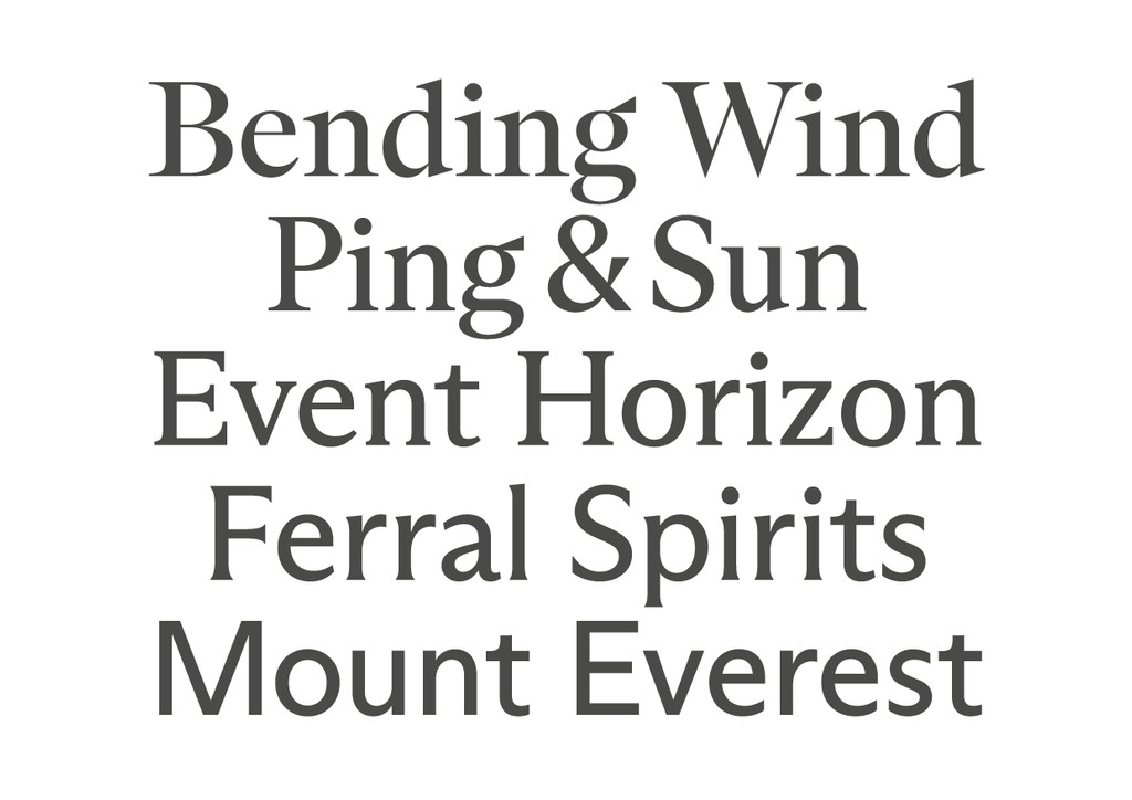
ABC Arizona has five distinctive yet connected subfamilies: Serif, Text, Mix, Flare, and Sans. ABC Arizona Serif is a high contrast, pointy serif with a modern-meets-Renaissance freshness, and on the other side of the spectrum, ABC Arizona Sans is a straight-forward grotesque with a humanistic touch. In-between lie other species, such as the nearly-but-not sans ABC Arizona Flare. ABC Arizona Mix is chunkier and low-contrast, sitting exactly midway between the two extremes. Lastly ABC Arizona Text is a classic text serif typeface that’s well-suited for reading. Stretching from its headline to small text possibilities, an entire library could be typeset with just the one font. Each subfamily of ABC Arizona comes with Thin, Light, Regular, Medium, Bold, and Italics, or the typeface can be used as a Variable Font, which includes the entire family and all its styles, as well as all its nearby and distant relatives.
ABC Arizona made its first appearances as the only typeface used in the variable identity for font design software Glyphs. This was followed by guest appearances by ABC Arizona Sans and ABC Arizona Serif across the new Fashion Research Library platform, founded by Elise By Olsen and with graphic design by Eric Hu. We also used ABC Arizona as the basis for our custom font for the SF Symphony designed with Collins.
After nearly three years of working on five families all at the same time, which are all bound together by an overarching aesthetic and technical concept, we can only guess how tiny and meticulous Elias’s next project will be! 💕
Credits
Design: Elias Hanzer
Spacing + Kerning: Igino Marini
Production: Dinamo (Robert Janes)

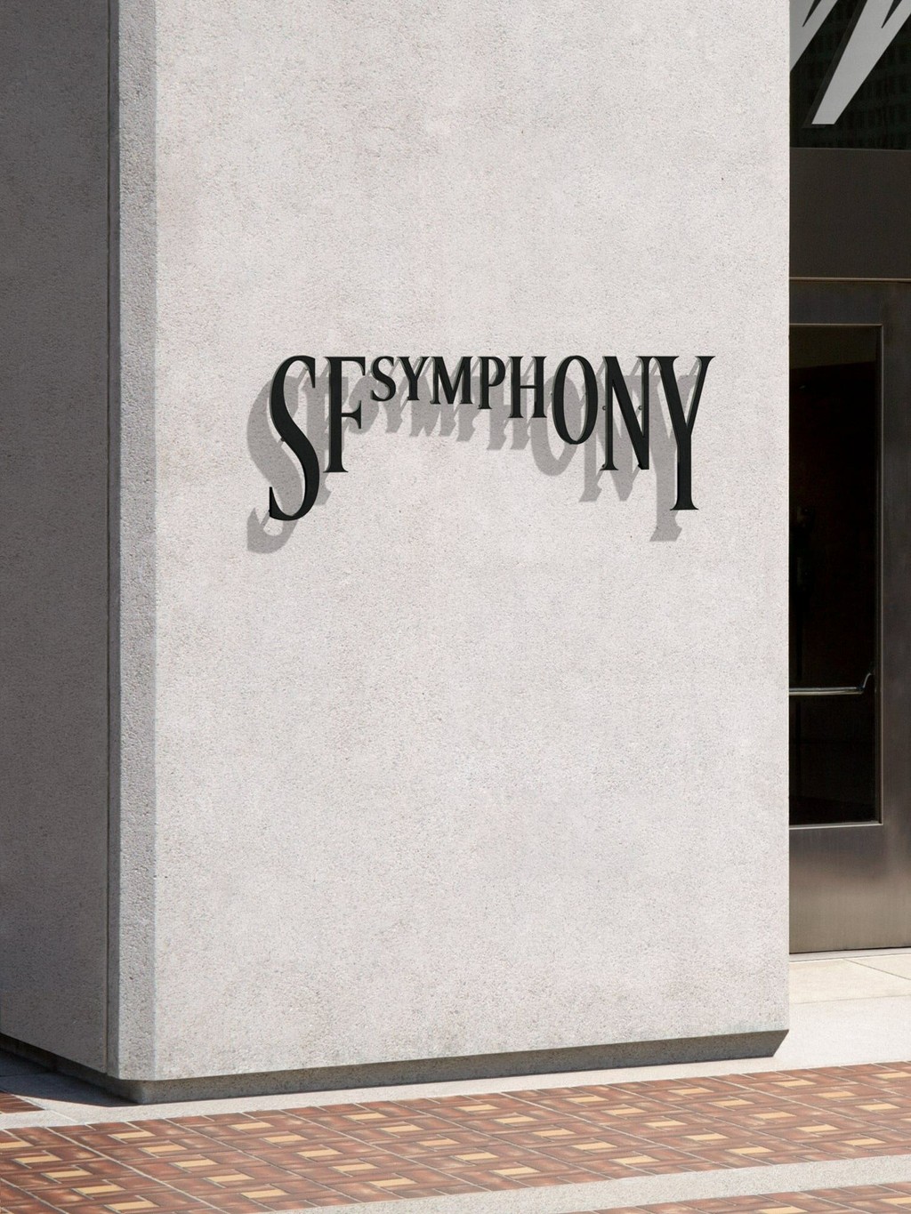
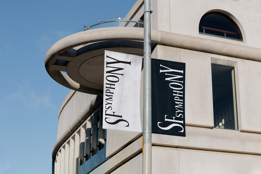
A custom version of Arizona in use by the SF Symphony.
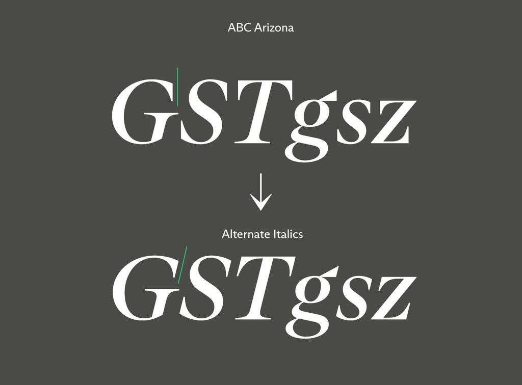
Distinctive design feature: In Arizona’s Italics, the end strokes remain vertically upright 🥵
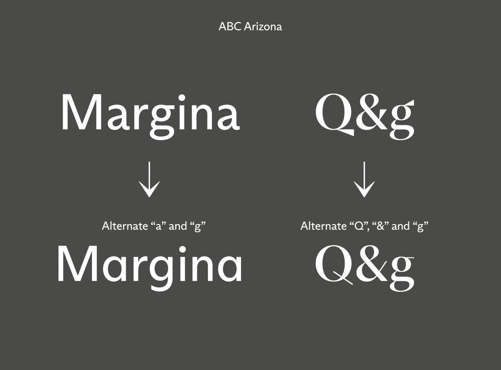
Stylistic Alternates for a, Q, g, &
