Behind the Scenes: On Walter Käch’s Lettering Manual
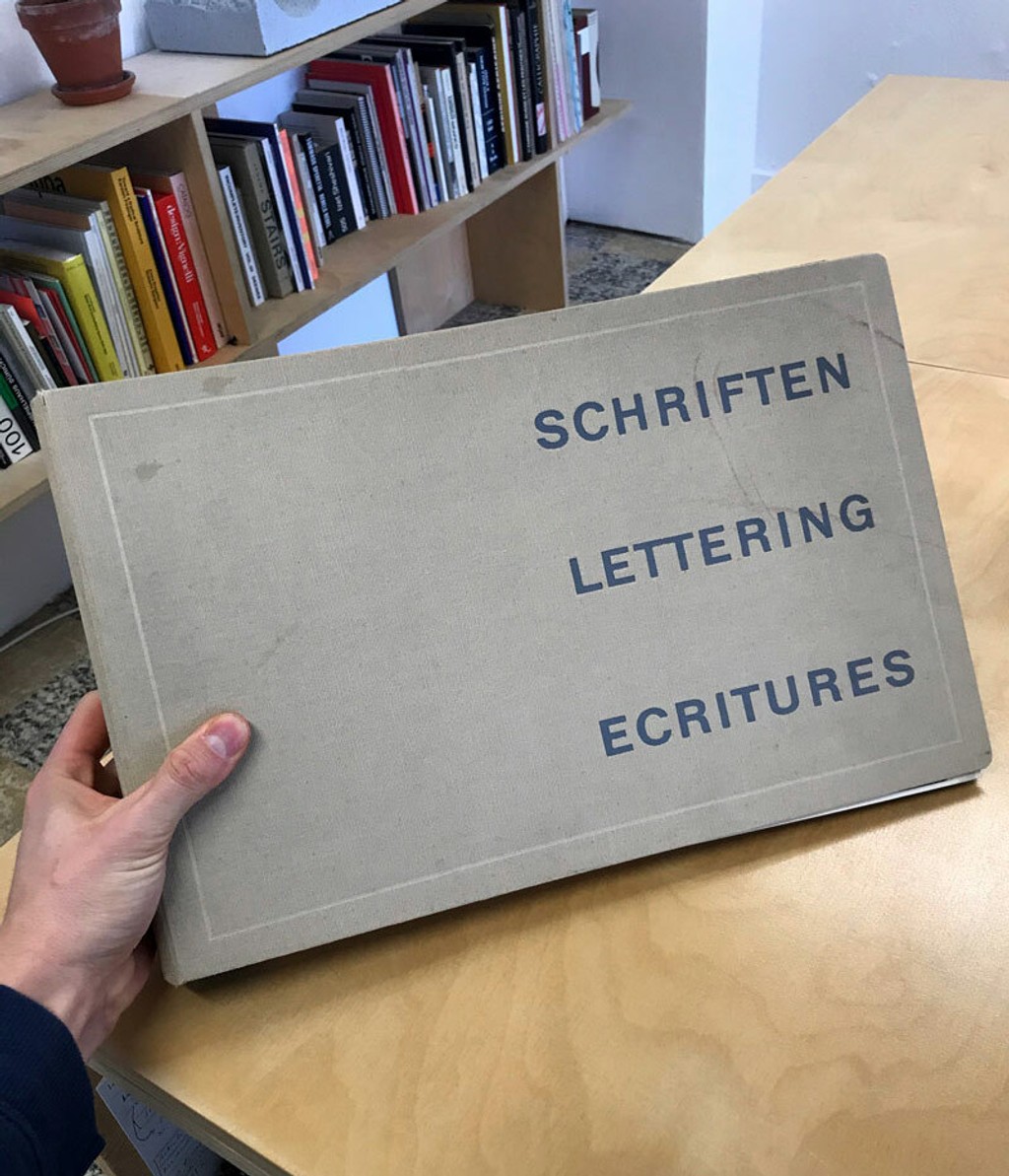
We can’t quite believe that today is the day we release our reprint of Walter Käch’s Lettering manual into the world, co-published with the Museum für Gestaltung in Zürich. The journey has been a long, humbling, and occasionally uphill one; unimaginable without the design and production know-how of our longstanding collaborators, Simon and Leo from Omnigroup <3
Below, Maddy wrote about the binder’s history — just a ‘lil context for why wanted to re-release this type manual and make it accessible again to a wider audience.
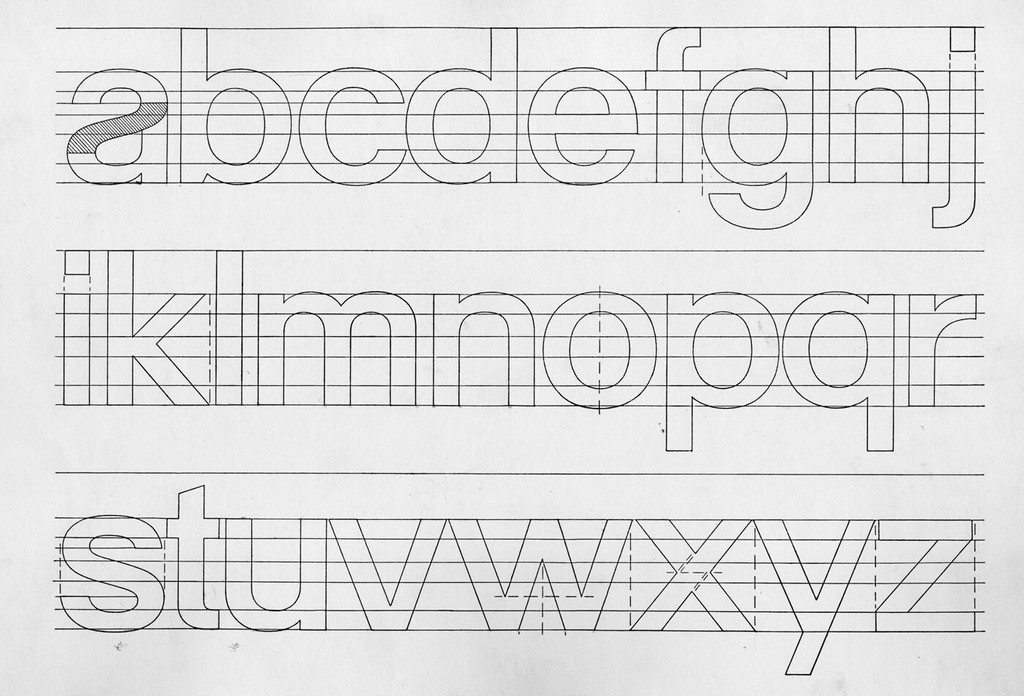
In 1948, an oversized ring binder featuring 77 loose leaf pages would help shape mid-century letterform design in Switzerland and beyond. With its sturdy, cloth cover, the cumbersome portfolio featured examples of alphabets in a variety of styles – from contemporaneous sans serifs and slab serifs to traditional European calligraphy drawn with a broad-edged pen. It also featured a break-down of rules, including what its author perceived as the right – and wrong – ways of drawing letters.
Using this manual, simply titled Lettering, and written by Swiss educator and designer Walter Käch, a reader could trace, copy, or reinterpret, learning about letter construction through making and mimicking. Students of lettering in Switzerland bought the book, and it quickly found its way to the libraries at Cooper Union Art School and Parsons School of Design in New York. Many sign makers in Switzerland also found use for it, imitating its bold capitals for storefront signage. And fine art painters also took interest, laying its plates beside their canvases when painting words. The title was popular enough that publisher Otto Walter Verlag in Olten seemed to have released a second print run in 1956.
Over 75 years since its first release, Lettering has become a collector’s item for many type designers and historians of Latin letterforms, an object of serious reverence. It’s not rare to hear of colleagues scouring pages of eBay Kleinanzeigen, AbeBooks, or Ricardo for a listing, outbidding one another in the process. In 2014, our team at Dinamo got hold of the book, having learned of it from teachers at the Basel School of Design in 2008. Following in the footsteps of decades of type students before them, we traced its forms — this time, thinking about their shapes in the context of new design software. Over time, friends at other studios have similarly found new lessons in the book’s contents. Which begs the question: What makes this post-war education tool a revered object of study for many type designers today?
When Käch first released his binder, he was teaching at the Kunstgewerbeschule Zürich. An educator since 1925, he also worked as a freelance advertising designer; traces of letterforms from this activity, particularly from his series of modernist posters in the 1930s for the Kunstgewerbmuseum in Zurich, would later resurface in Lettering. While Käch never became a household name, his students became influential figures in the annals of Swiss design history, among them Adrian Frutiger, Jost Hochuli, and Emil Ruder. As Peter Bain wrote in Eye in 2016, Käch’s teachings would profoundly set “the stage for postwar innovation in letterform design.”
Röntgen Therapie source
Rauchwaren source
Normalgrotesk source
Käch published his tome as an extension of his pedagogy. His writing appeared in three columns of German, English and French, attesting to the book’s desired reach. One bound section offers his take on the ‘right’ and ‘wrong’ methods of letter construction; another 24 page section features a series of calligraphic styles; and a third section of 52 plates delineates various lettering categories. It’s these latter alphabets in particular that has provoked wider interest. One group of sans serif capitals especially “seems to foreshadow Neue Haas Grotesk, now better known as Helvetica,” wrote Bain in Eye, noting its elimination of angled terminals and rationalisation of stroke endings into horizontals and verticals.
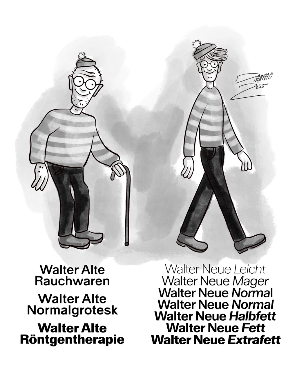
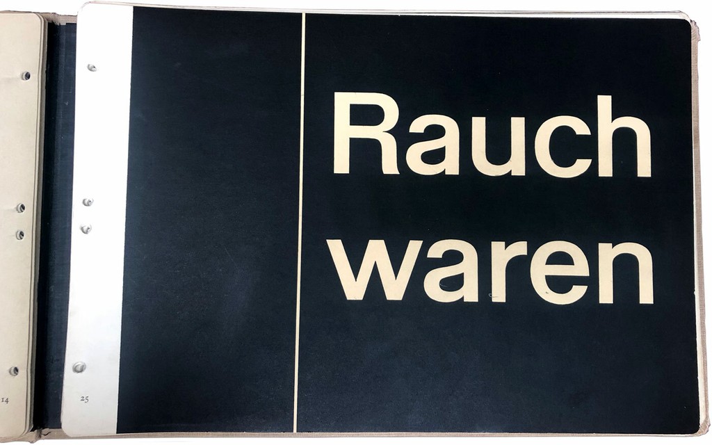
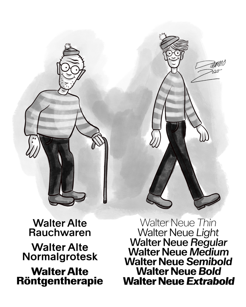
The first alphabet in Käch’s Lettering chapter is introduced by the title “Rauchwaren,” meaning tobacconist’s shop in German. Its rationalised sans letters are outlined, and lines across the page emphasise how terminals for similar letters end in similar ways. A later alphabet introduced by the words “Röntgen Therapie” (meaning “X-ray therapy”) carries traces of “Rauchwaren,” but its frame is bolder. “Rauchwaren” as a skeleton is visible in many letter sets in the book; a variation of it appears on the publications’ cover, and elsewhere, you’ll find a “Röntgen Therapie” with slab serifs.
Leo capturing alter in the wild: Walter lettering is still visible across Switzerland’s signage today!
For Frutiger, Käch inspired a new kind of systematic thinking, one that would eventually lead to the now familiar concept of a typeface family — a system following a defined rule that can be stretched to a range of widths and weights. In his 2005 Nachdenken über Zeichen und Schriften, Frutiger describes a particularly strong memory of his teacher: “One Saturday morning I sat hunched over the execution of a grotesk (medium). Käch explained to us how he designed the ends of the curves. This solution contained the possibility of all grotesk cuts, from thin to bold, from narrow to wide. And like a lightbulb, I saw a whole grotesk family in front of me.” This exercise evolved into none other than Univers.
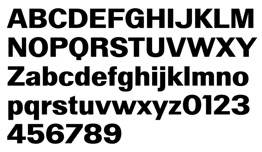
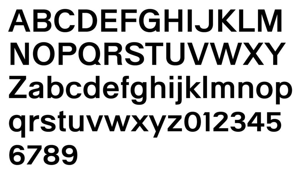
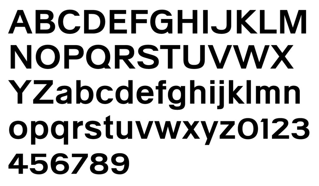
For Dinamo, Käch helped evolve a central interest of ours: Creating a set of rules and then following them faithfully, especially if it takes you to absurd places. Around 2014, when Fabian was first tracing Käch’s characters and learning these lessons, Leonardo and Simon of Omnigroup were separately studying and digitising individual Käch characters for their own projects. After getting to know each other during a workshop at ECAL, we joined forces to publish two twin families in 2022, a pair informed by the sans serifs found in Käch’s folder. The first, Walter Alte, is a faithful study of Käch’s lessons, extended to form a full family, and available in three styles named after titles found in the folder: Rauchwaren, Röntegen Therapie, and Normalgrotesk. Walter Neue, our second family, is our digitally-minded reinterpretation of the educator’s teachings.
A version of this article first appeared in issue E of Footnotes, the periodical bulletin of applied research in type design. You can purchase the issue here.