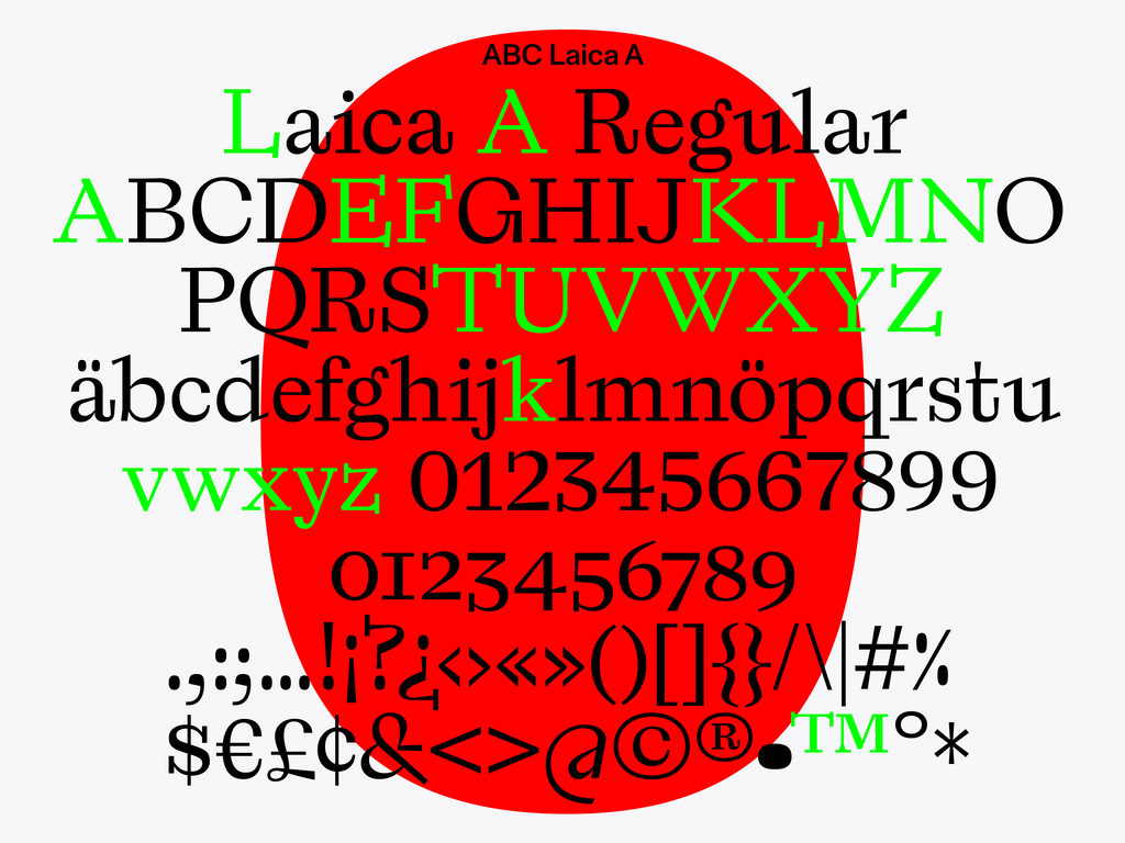
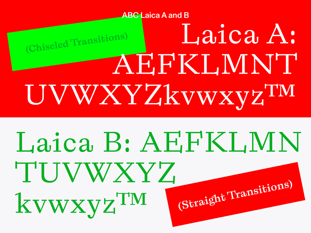
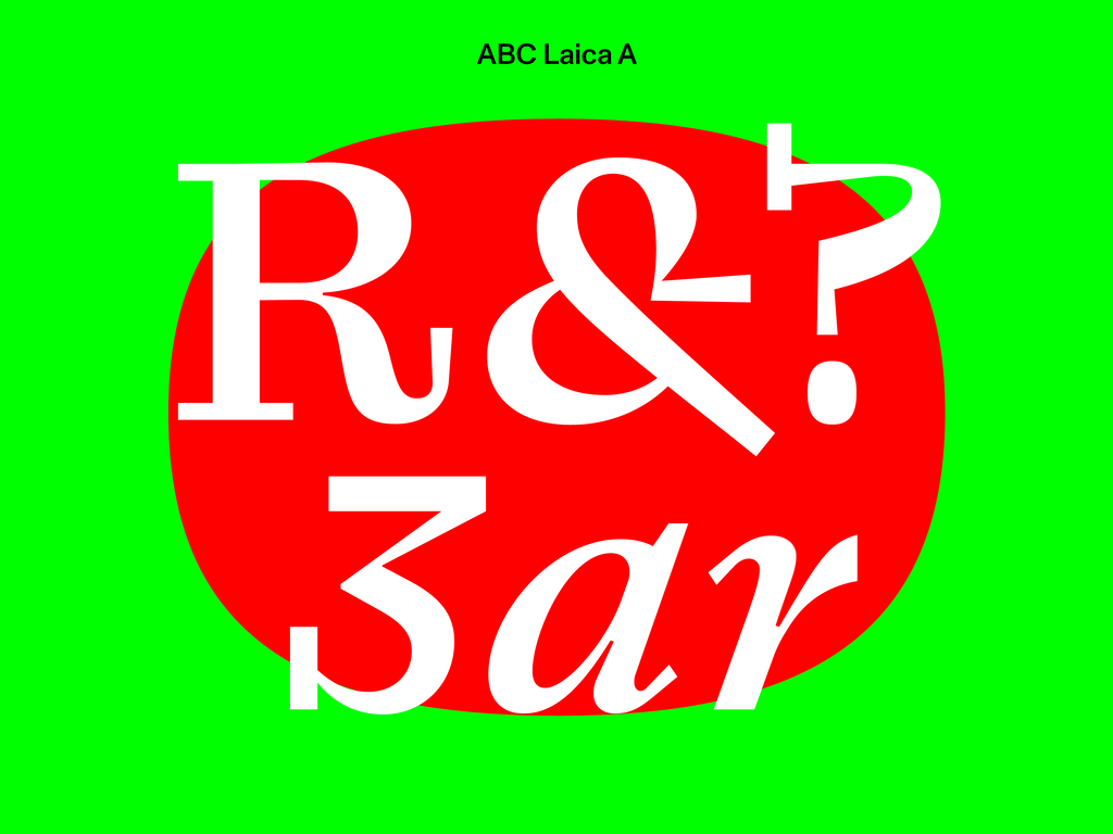
Typeface Release: ABC Laica
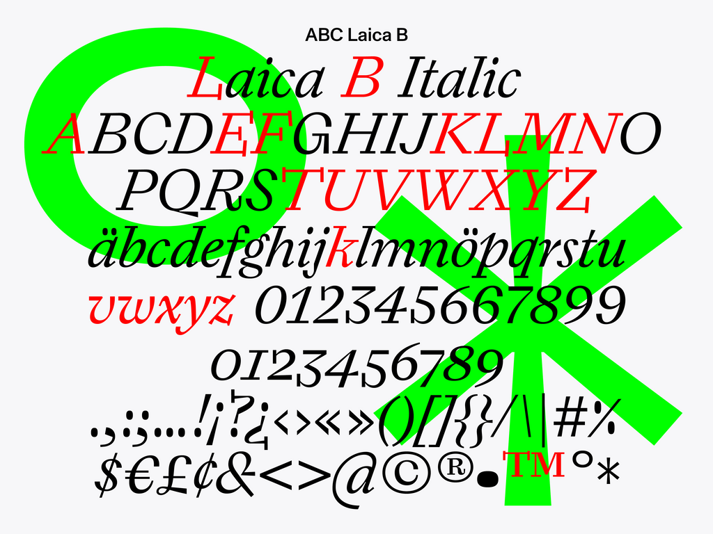
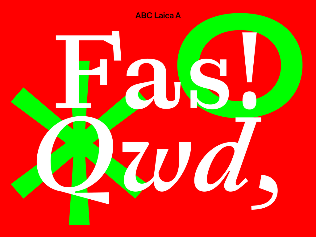
ABC Laica is the result of a cruel methodology: A forced collaboration between the broad nib pen and the pointed nib pen, two common but very different drawing tools. It responds to the heritage of pen exercises in Dutch type design education, while also reflecting today’s reality of cheap flights, constant hustle, and remote work.
Designer Alessio D’Ellena sketched early versions of ABC Laica by hand during his spare time, which usually meant while slouching in uncomfortable armchairs at the airport or on rickety trams winding through the streets of Rome. Poor or entirely unsuitable sketching surfaces— such as receipts, boarding passes, and envelopes—proved especially challenging for the broad nib pen.
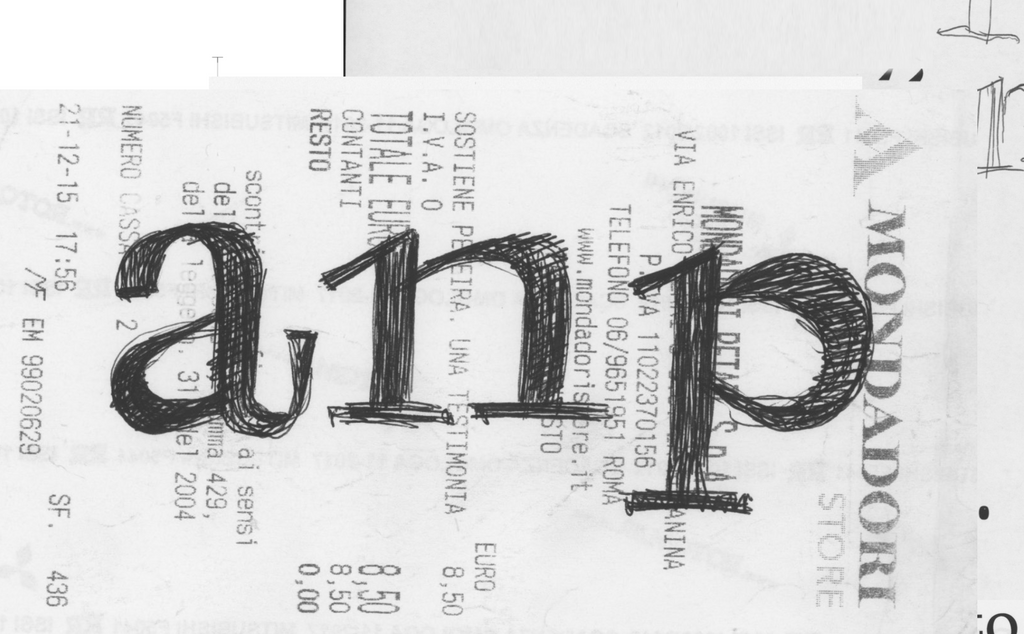
An entirely unsuitable sketching surface
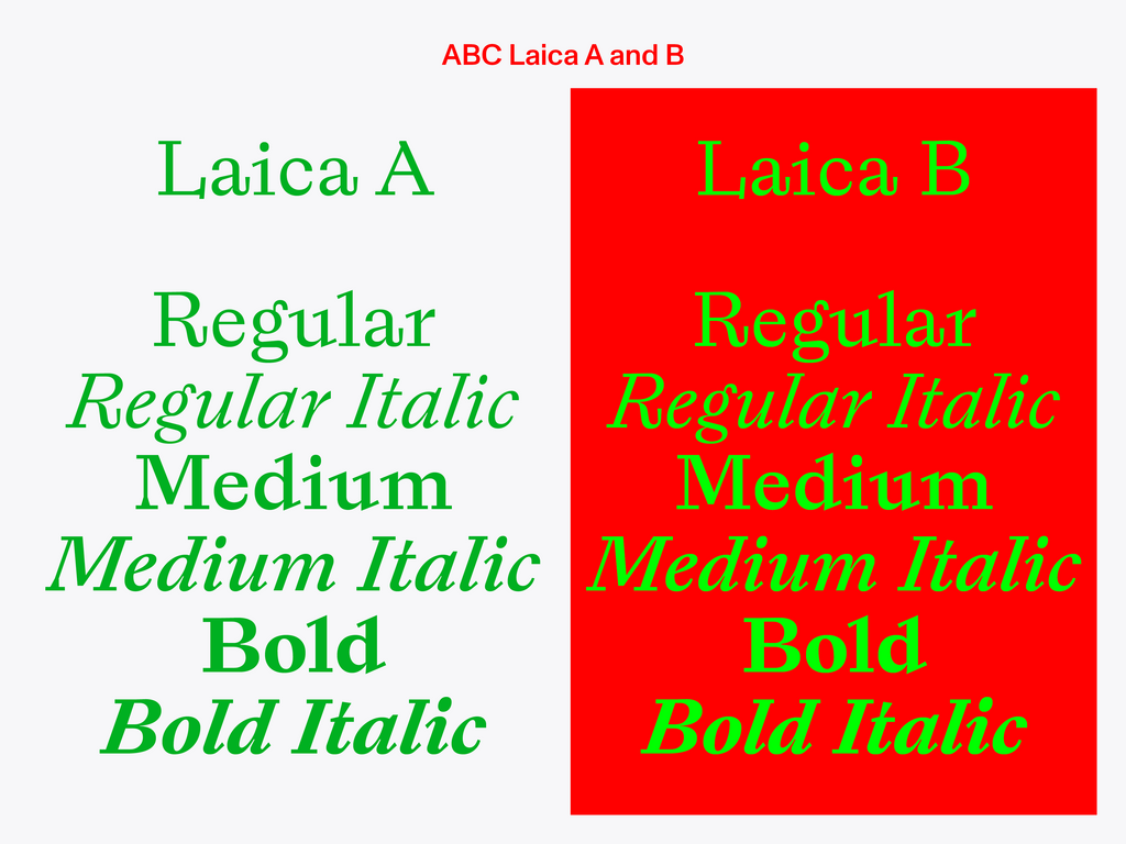
It’s safe to say that ABC Laica’s earliest reviewers were intrigued by the effort. These included none other than famed typeface designers Tobias Frere-Jones, Lucas de Groot, and Fred Smeijers, Alessio’s professors at the TypeMedia course at the Royal Academy of Art in The Hague. Under their guidance—which Alessio very much appreciated but mostly ignored—the designer worked hard to retain ABC Laica’s jaunty gait in digitized form, while also making sure it was suitable for long and short texts. The resulting patchwork of shapes might hurt the traditionalist’s eye, but it’ll certainly please those with an open, roaming mind.

ABC Laica in the wild

Credits
Design: Alessio D’Ellena
Design Assistance: Franziska Weitgruber
Spacing and Kerning: Igino Marini
Production: Chi-Long Trieu