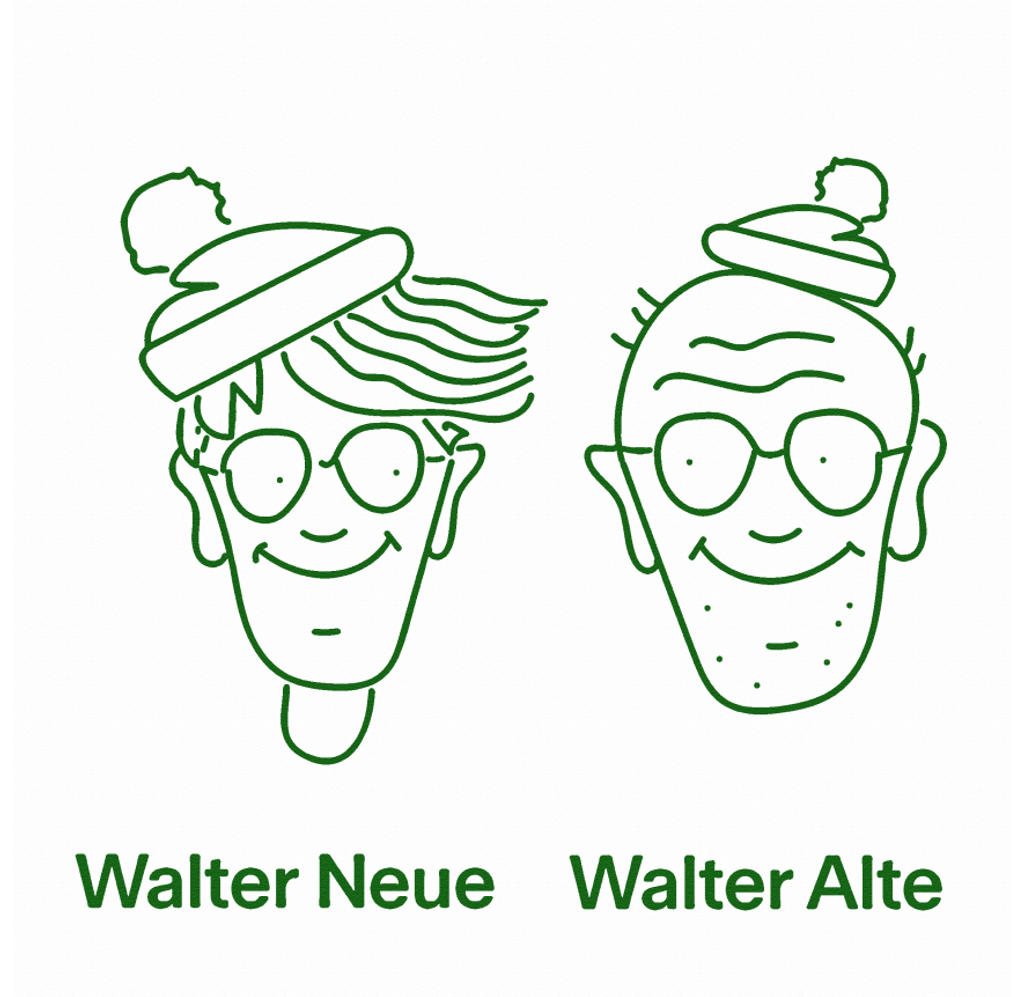
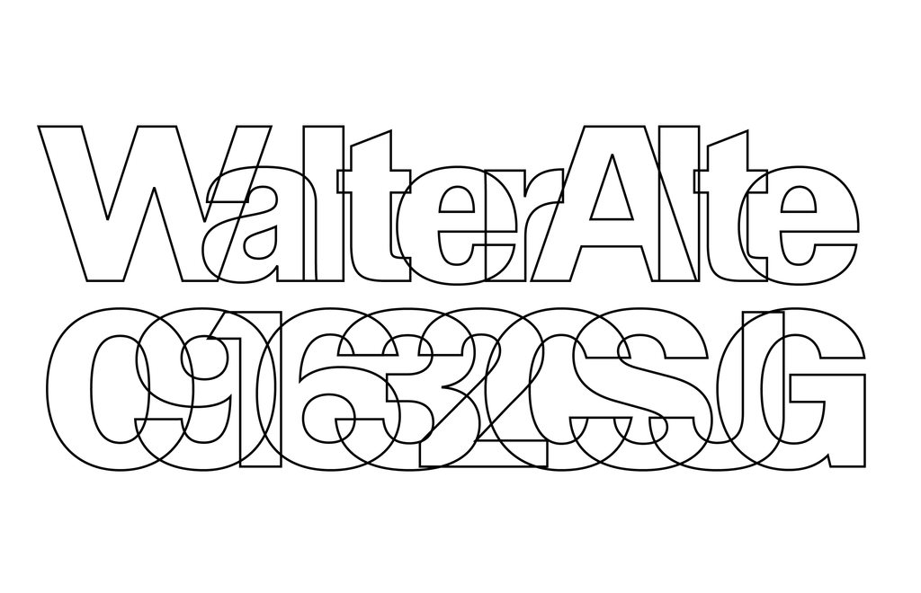
A NEW, MULTI-GENERATIONAL RELEASE: WALTER
ABC Walter is a long-standing, joint scholarly effort by Dinamo and Omnigroup: It comprises of Walter Alte and Walter Neue, two related yet ideologically opposed families celebrating an author and design educator with fingerprints all over Switzerland’s most famous fonts.
This has been a new kind of revival project for us, one that’s not based on a pre-existing typeface. Instead, our point of departure has been a tool used to teach students how to draw letterforms, designed by type educator Walter Käch in the mid-twentieth century.
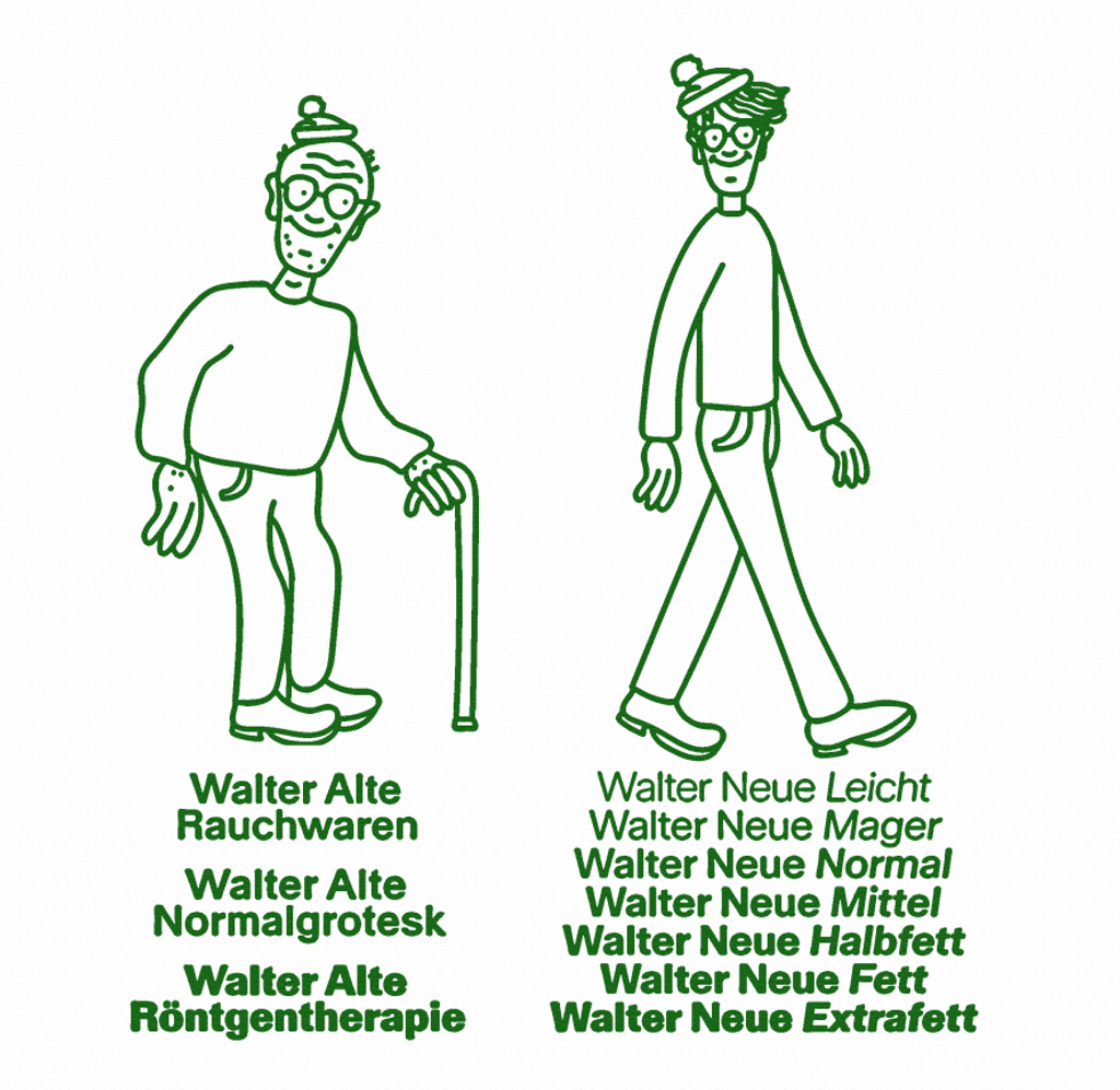
The triple styles of Walter Alte are a faithful study of Käch’s lessons, while Walter Neue is an extension, update, and digitally-minded interpretation.
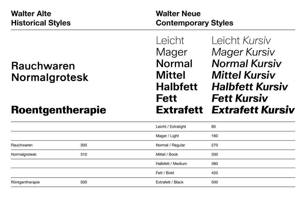
Walter Alte: 3 styles
Walter Neue: 14 styles
Backstory
Our former teachers first showed us Walter Käch’s 1949 manual-like folder Schriften, Lettering, Ecritures: The Principle Types of Running Hand and Drawn Characters during class; inside, you’ll find instructions on how to draw various type classifications. Käch was Adrian Frutiger’s own teacher and many of his ideas about type are clear ancestors of Univers (and other familiar giants like Helvetica).
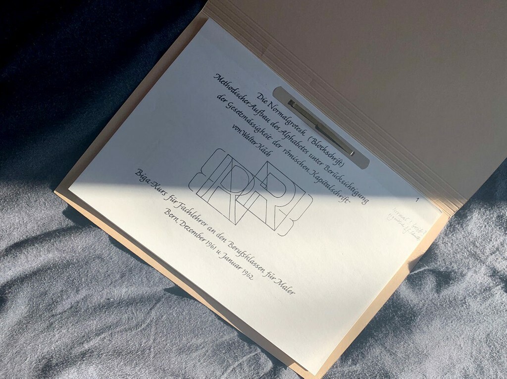
Walter Käch, Die Normalgrotesk (Blockschrift) Methodischer Aufbau des Alphabets unter der Berücksichtigung der Gesetzmässigkeit der römischen Kapitalschrift, 1962.
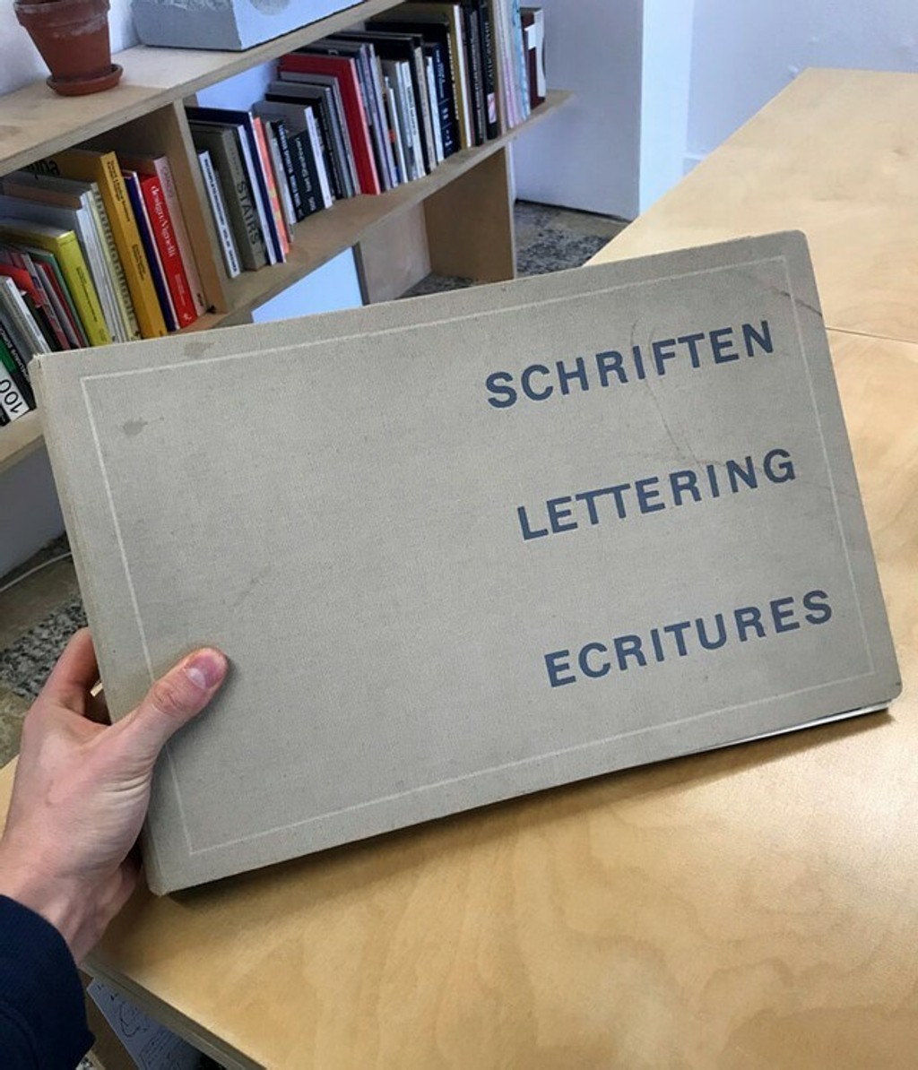
Walter Käch, Schriften, Lettering, Ecritures: The Principle Types of Running Hand and Drawn Characters, 1949
Hey Walter 🥰
After taking the educational folder as a starting point, Fabian found a second, more personal folder in the Basel antique bookstore Libelle mit H&B at Spalenberg, filled with Christmas cards from “Familie Käch” along with handwritten annotations. Tucked between its pages was a photocopy of unknown educational letterforms, which Fabian took home. These letters, along with others from Schriften, Lettering, Ecritures, became our primary source material.

OLD WALTER IN THE (SWISS) WILD
In Switzerland, students of type often learn about Käch in school, as was the case for Fabian and Johannes at Dinamo as well as Leonardo Azzolini and Simon Mager at Omnigroup.
In many ways, Käch’s educational letterforms are a kind of Swiss proto-grotesque; his lessons have not only left their fingerprints on modern type history but also on various corners of every day Switzerland.
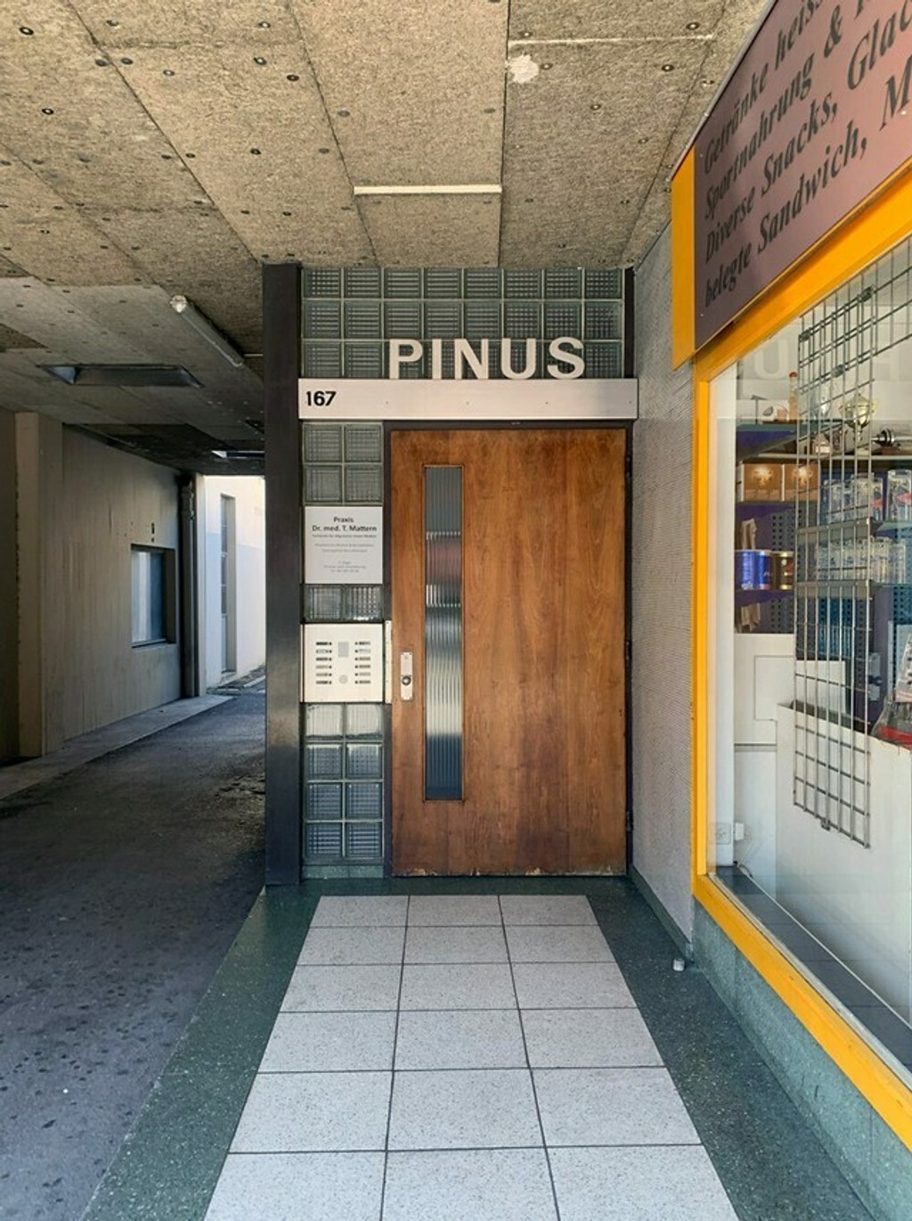
Spotted in Basel
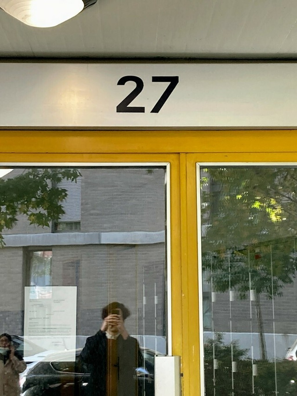
Spotted in Lausanne
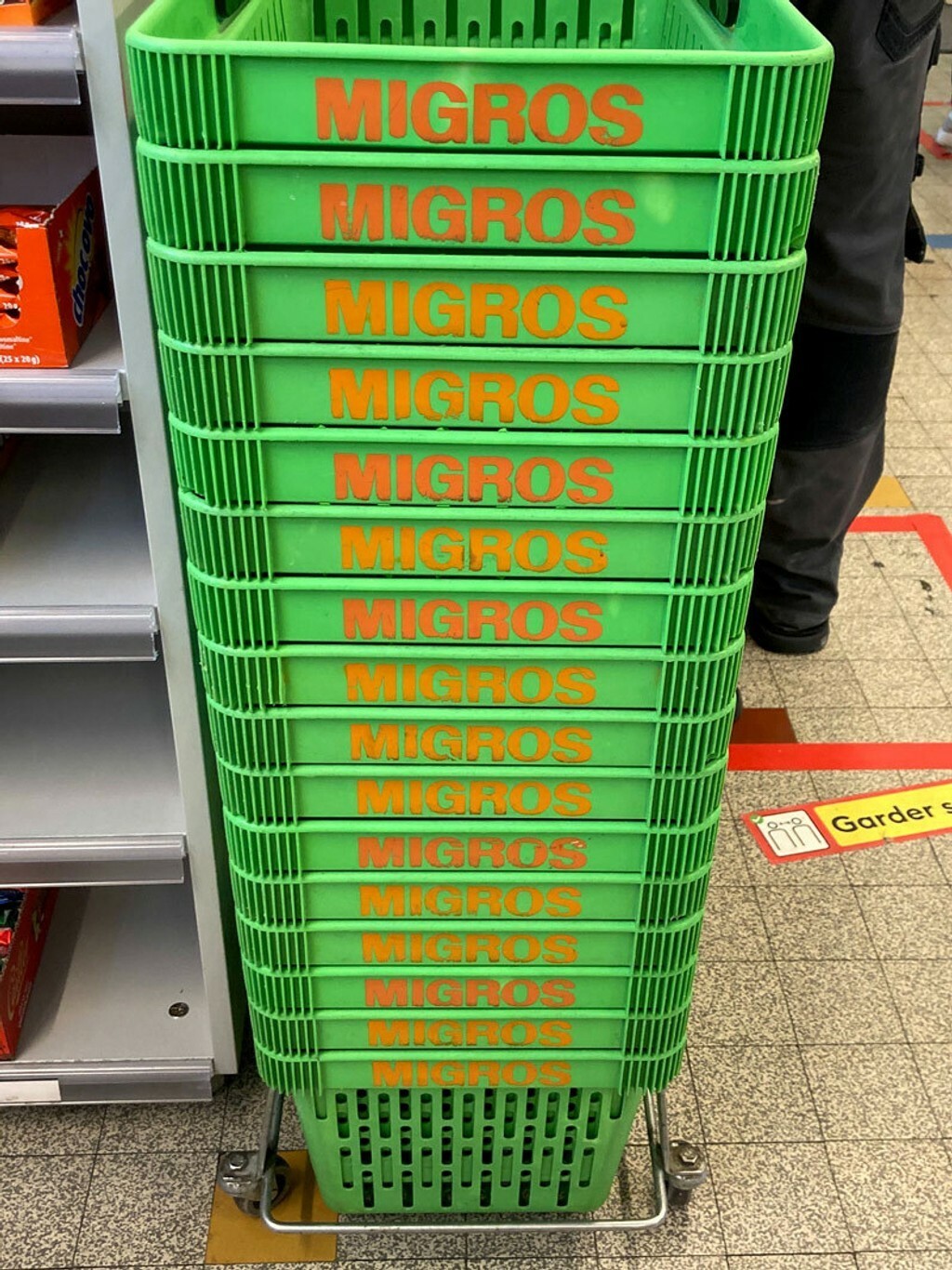
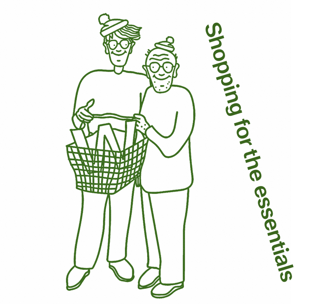
Ever scrolled down a shopping basket before?
MERGING PARALLEL EFFORTS
Back in 2013, Fabian as well as Leo and Simon at Omnigroup had separately been studying and digitizing individual Käch characters for their own projects. Dan Solbach then used an early version of Fabian’s Walter Alte Rauchwaren as the custom typeface for Kunsthalle Zürich’s 2015 redesign (more on that here), while at the same time, Omnigroup used their digitization for the identity of Museum Brot und Kunst in Ulm, Germany.
After finally meeting Leo and Simon during a workshop at ECAL in Lausanne in 2016, we decided to join forces and bring our parallel efforts together. Once we shared our vows, we split the tasks: Leo was the heavy lifter behind Alte Walter, taking over where Fabian had left, while Simon steered Neue all the way to the finish line.
First recorded meeting between Dinamo and Simon Mager, Frederik Mahler-Andersen, Unknown, Thibault Brevet, Joel Vacheron, and Leo Azzolini. October 2016, Café du Simplon, Lausanne.
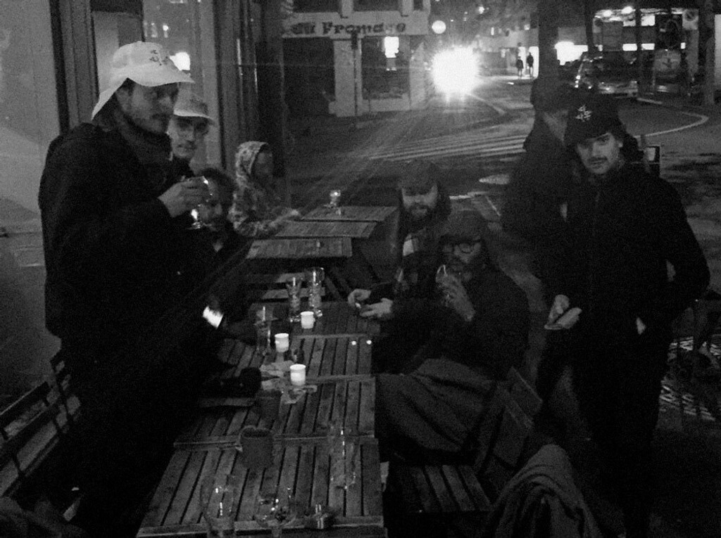
Fabian, Leo, Simon & Maddy preparing this story
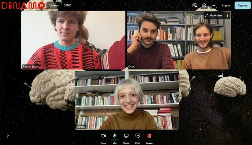
Johannes & Simon (& Fabian 😬)
THE RESEARCH: 3 SOURCES 🎒
From our gathered sources, we located three distinct styles that seemed to belong to the same idea of how to draw letterforms.
To be clear: these letters weren’t conceptualized by Käch as part of a single, functional family. Rather, they were intended as examples of letter construction for study. What we found only covered A-Z, a-z, and numbers, and featured slightly different character shapes while being close to each other in weight.
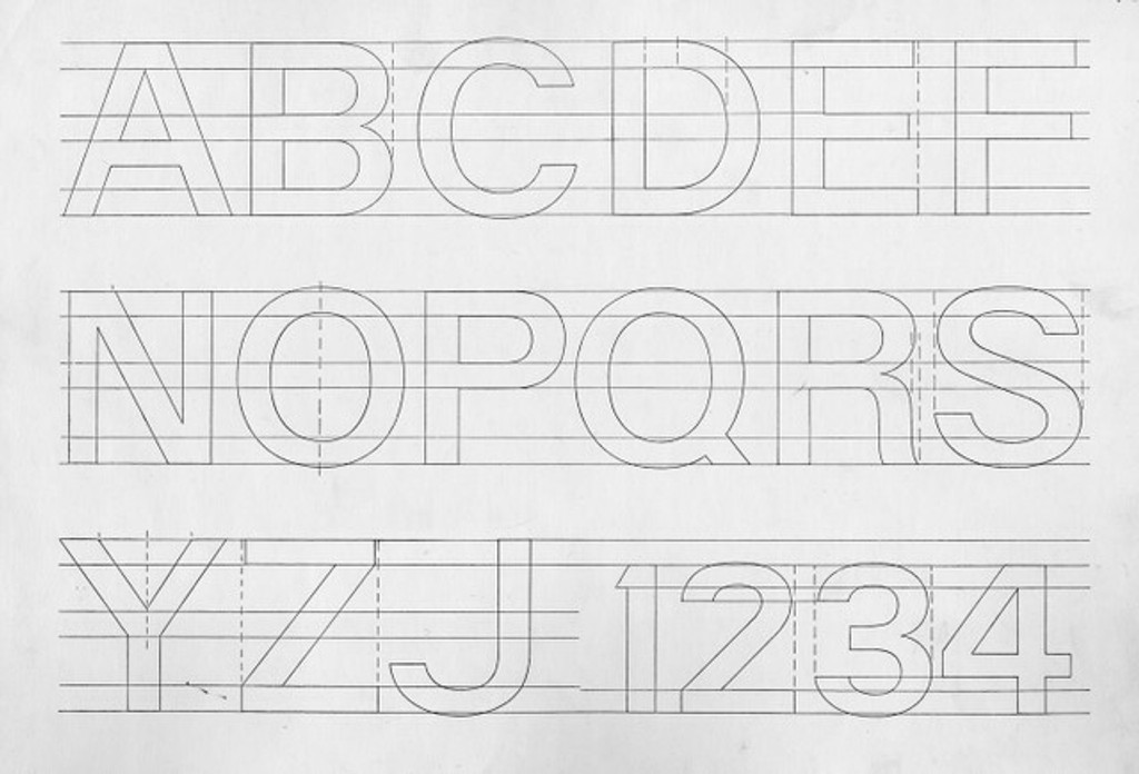
Source 1, Rauchwaren: Uppercase letter samples in a slightly lighter regular weight
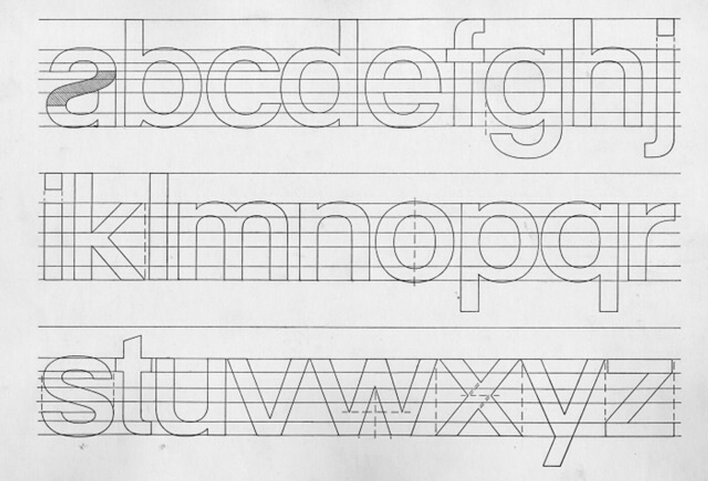
Source 1, Rauchwaren: Lowercase characters
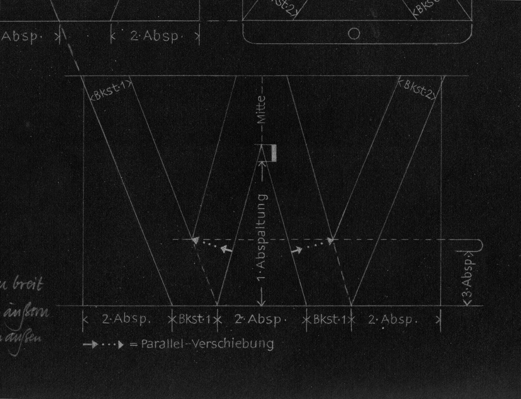
Source 2, Normalgrotesk: Letter construction deep-dive
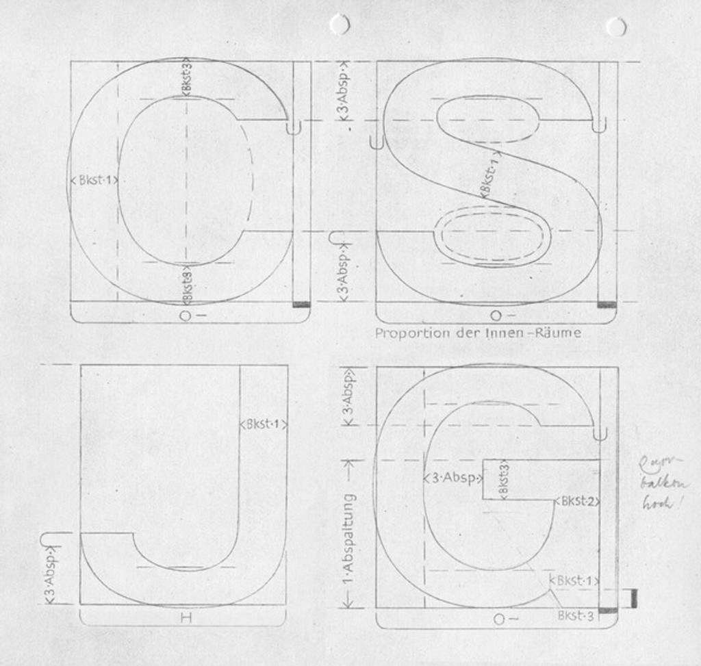
Source 2, Normalgrotesk: Letter constructions we identified in a slightly heavier Regular weight
Source 2, Normalgrotesk: Note the horizontally aligned open end strokes!
THE RELEASE: TWIN FAMILIES
Typically, there are two ways to go about revival projects: we’ll either select the “best collection” of letterforms and attempt to capture their spirit while growing the character set OR, we’ll take the source material lightly, letting it inform a loose, digital-native interpretation.
This time around, we realized that starting with a collection of letters instead of a complete and coherent typeface was a huge opportunity. Why not produce two separate-yet-spiritually-connected families?
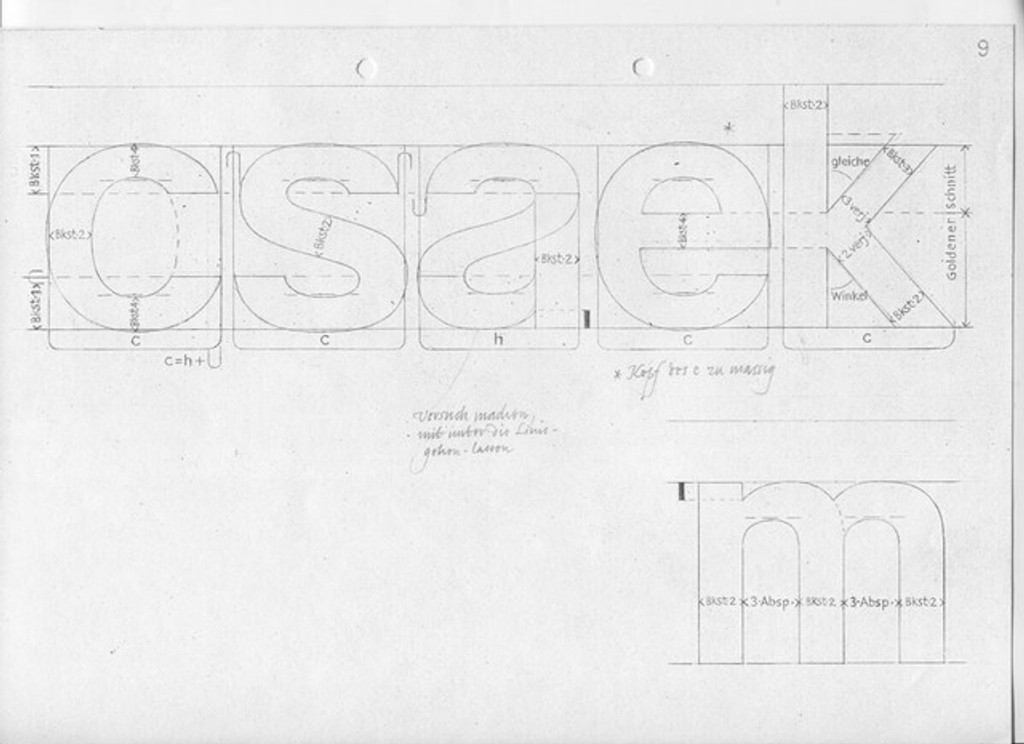
Stem and style analysis, for the mathematician’s eager eyes only
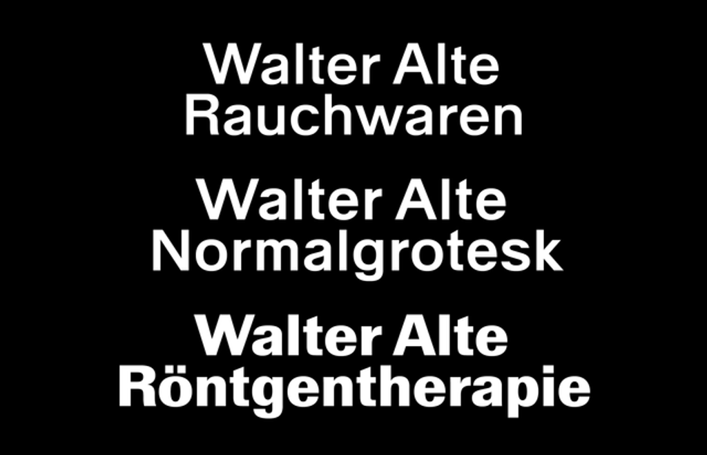
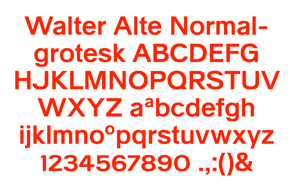
Walter Alte is true to the three styles we were able to pinpoint in our research—it’s not so much a “typeface family” as a documentation based on three different sample words.
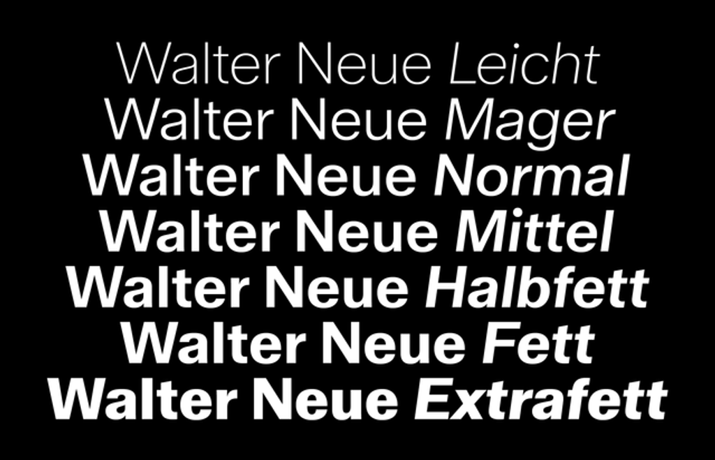
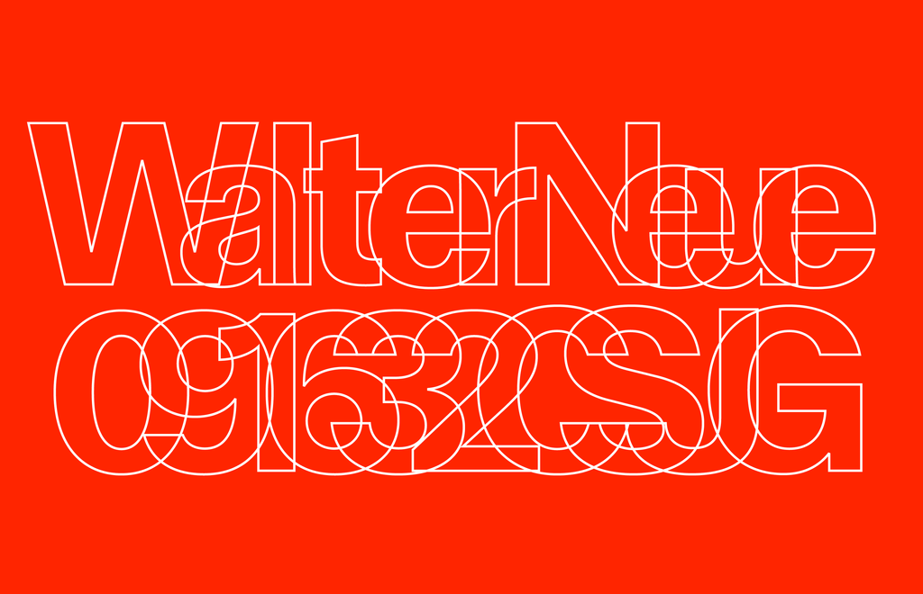
Walter Neue is our extension and interpretation of Alte—it’s not so much the “idea of a typeface” as a typeface itself, with fourteen styles, seven weights, Italics, stylistic alternates, and more.
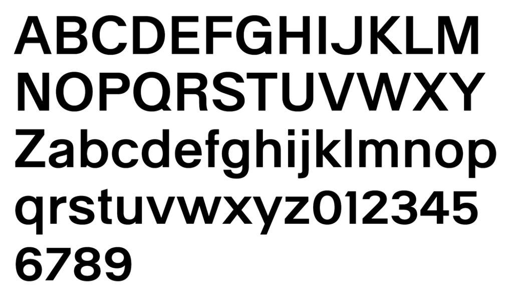
ABC Walter Alte
Out of the three faithfully revived cuts, Walter Alte Röntgentherapie has the highest contrast, while Walter Alte Normalgrotesk is the most constructed and mono-linear. Walter Alte Rauchwaren is smoother and slimmer, sitting in-between the first two stylistically, recalling the way it once became a fertilizer of the Helvetica empire.
Normalgrotesk and Rauchwaren both occupy a classic regular weight class, whereas Röntgentherapie is bold. Each style embodies Käch’s obsessions with aligning stroke endings perfectly, strictly defining a single stem thickness, and meticulously considering the formation of circles and triangles.
Rauchwaren
Normalgrotesk
Roentgentherapie
Core characters

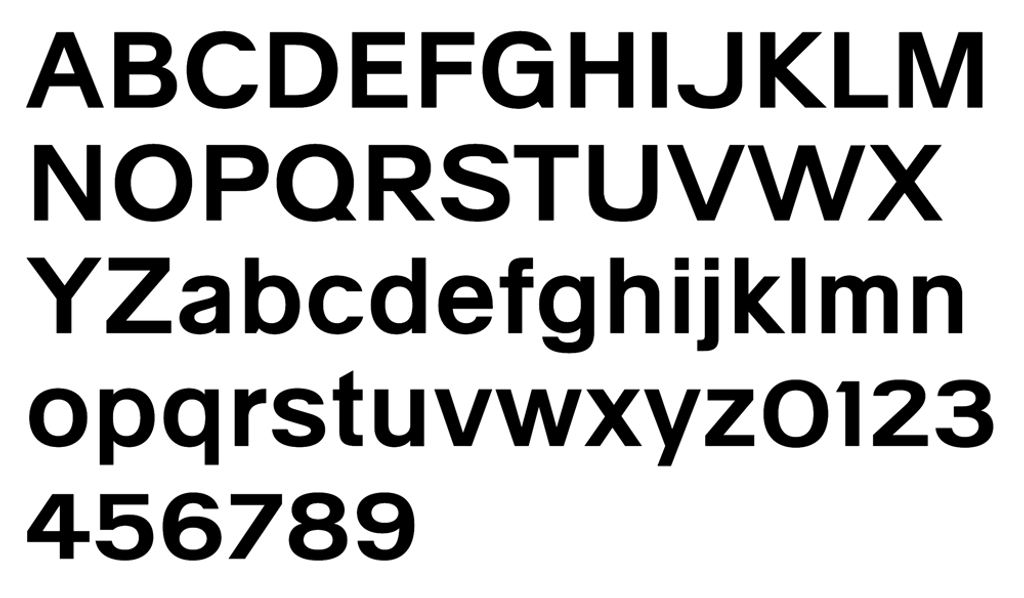
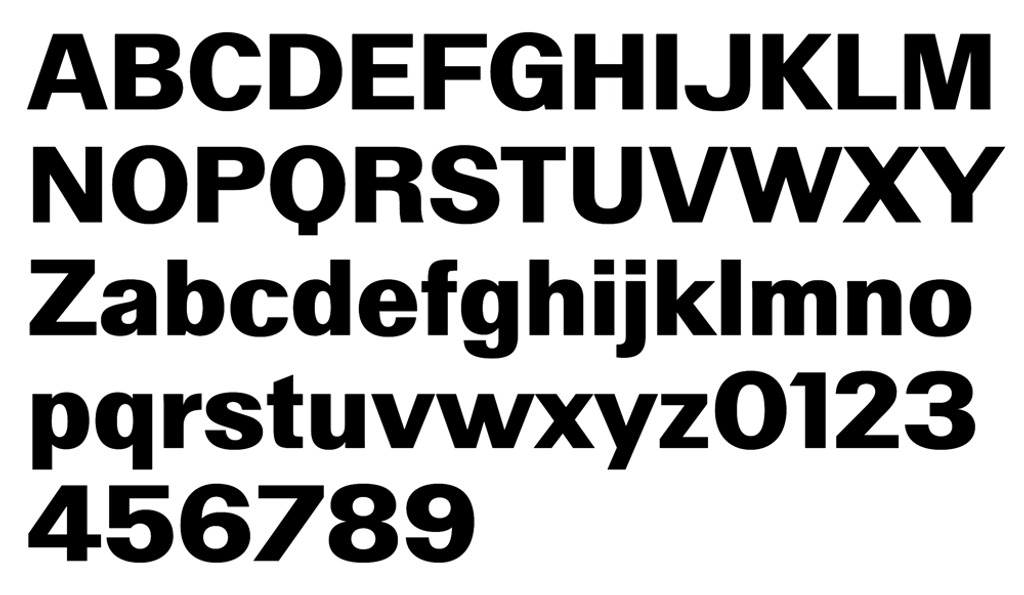
ABC Walter Neue
If Walter Alte is what perfect students in the first row produce, Walter Neue belongs to the students in the back. We kept the feeling of the font’s original in place but allowed for exceptions when it came to contrast and alignment. Walter Neue is readable and functional, with high contrast only in its heaviest weights. It’s altogether softer and less rigid than its studious older brother, featuring rounded dots (i, j, ä, ö, ü) and punctuation marks that lend it a friendlier edge.
The trick why this looks so cool my friend is the negative tracking
Instead of aiming for an A+, most of the decisions behind Neue were made in favor of digital, real world comfort, with fourteen styles, several weights, italics, and more providing flexibility for a variety of applications.
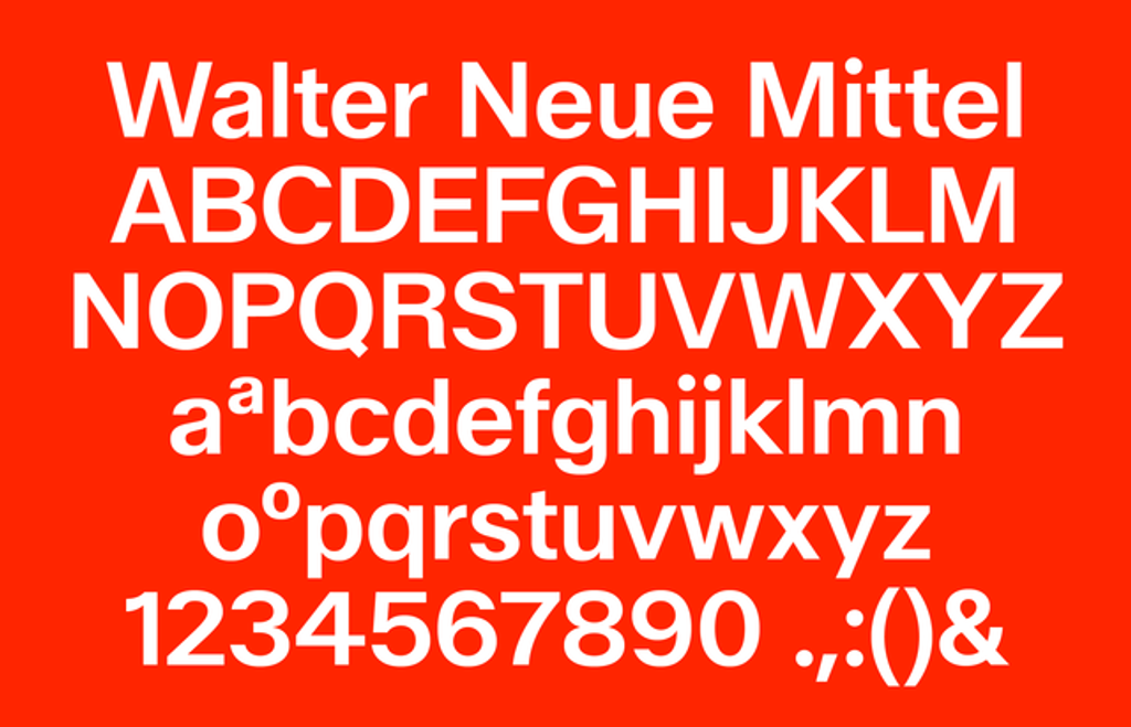
Walter Neue core characters, shown in the mittel weight
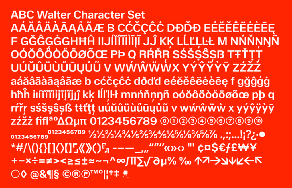
Full character set including circled numbers, math operators, symbols, etc.
WALTER: THE EARLY YEARS
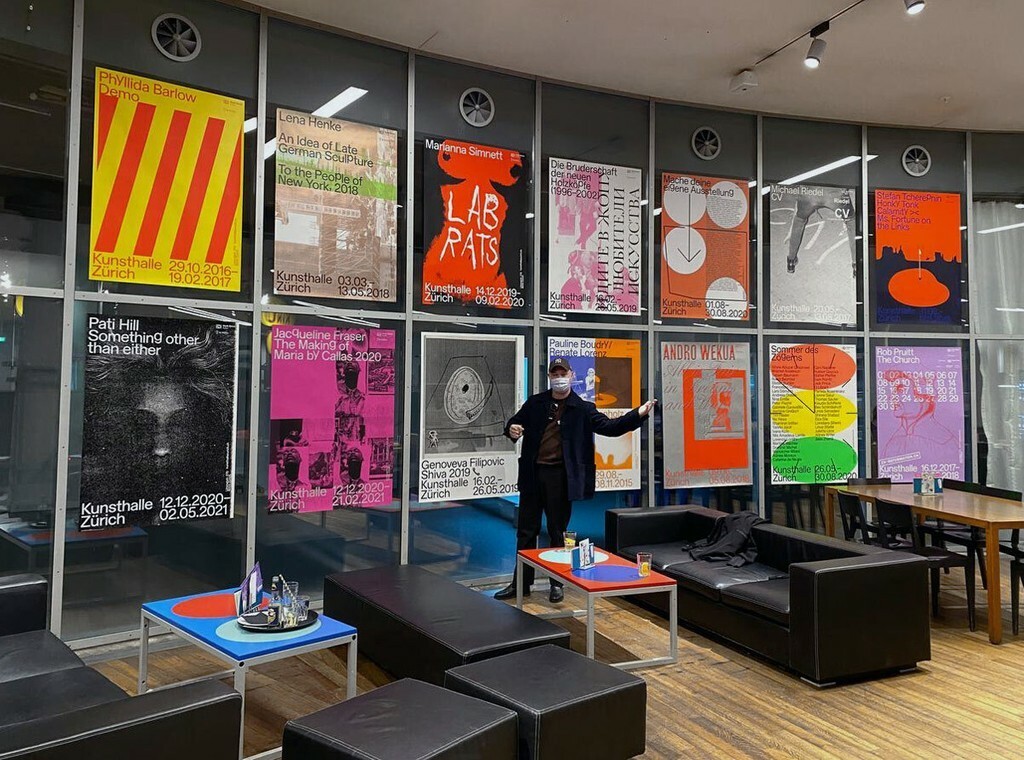
Dan Solbach’s redesigned Kunsthalle Zürich in 2015, and continues working with the institution to this day. His exhibition posters, more than 20 to date, were shown this year at Weltformat festival in Lucerne. We love Dan (and I hope it’s mutual).
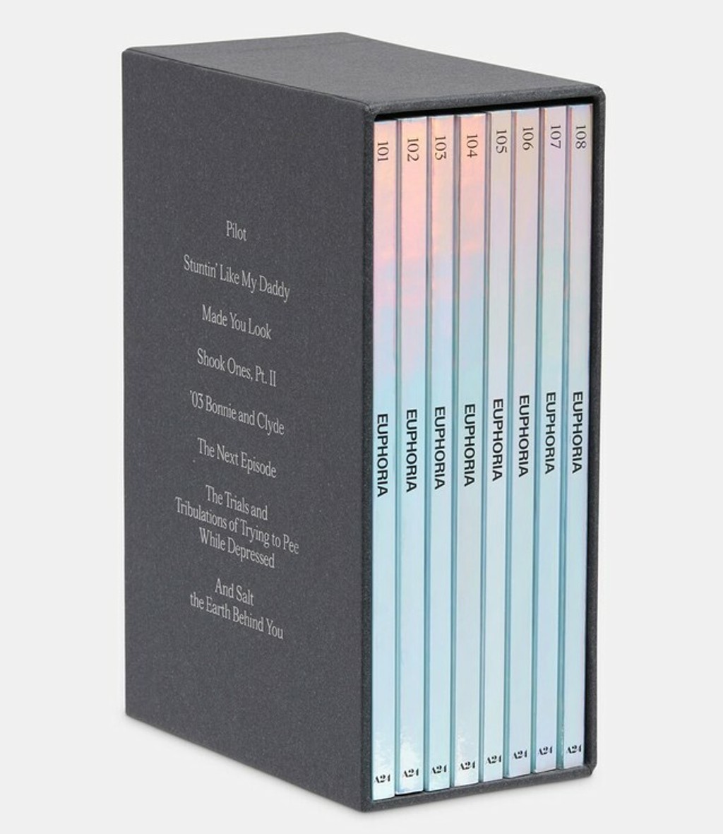
Actual Source used Walter Neue for the publication accompanying the award-winning HBO series Euphoria, published by the young, New York-based arthouse movie powerhouse A24
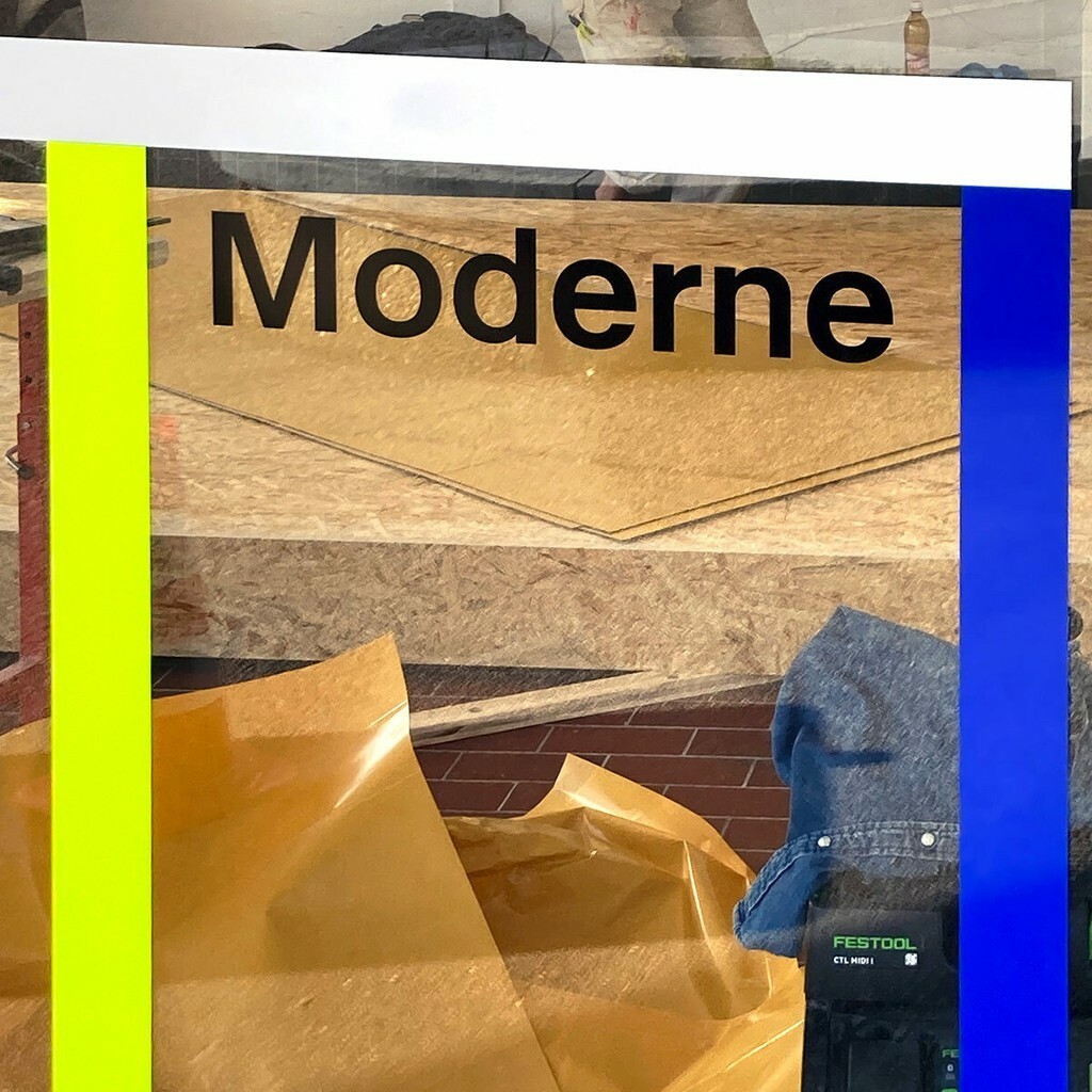
Omnigroup used Walter Alte for the “Maladière Moderne” in Lausanne, located in the Maladière bus stop. Originally built for the Expo 64, the site was used to host a series of events, exhibitions, and interventions. With Bruno Aeberli, EMI Architekten, and Sub architects Piovenefabi.
Now, the Walters continue their travels
We’re excited to release these twin families today, one with three styles and the other with fourteen. Head to our Early Access area and slide the lock to request Walters young and old.
With just one current listing on AbeBooks.com and a dusty, collector’s item reverence surrounding it, Schriften, Lettering, Ecritures is far from reach for many. We hope that our digital Walters will reach newer, fresher eyes—beginning with you 💗!