Erik Carter on the Future of Type
Having just hit 100k newsletter subscribers, we’re launching a new guest takeover series today. I always hoped that NY-based graphic designer and art director Erik Carter would write the first one. Lucky for me, he said yes <3

Erik with Norman
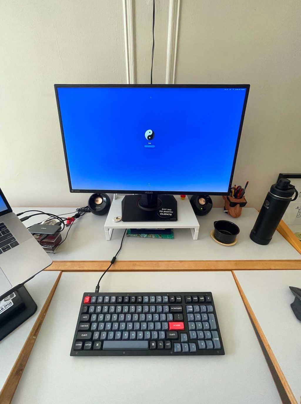
Erik's MacTable 👆🏻
Erik is a breath of fresh air; in his own words, his Design Harder substack covers “Typography. Color. Capitalism. Chaos” and, in the words of David Chathas, his social media presence is a “strange blueprint” for what “contemporary Discourse on Design and Culture looks and sounds like on the internet.” Below, Erik shares his perspective on what’s happening in the type world right now — plus some thoughts on where things might be heading next. Over to Erik.
The Future of Type

If you were born with the gene that allows you to draw lettershapes, I salute you.
I am not a type designer. I find the work difficult, repetitive and tedious, and the required skills above my pay grade. I am, however, someone that uses typefaces for a living. As a graphic designer, I’m often tasked with choosing a font for a book cover, layout, or animation. And as a person who doesn’t draw the typefaces themselves, I act more as a typographic art director, picking and choosing the best font for the format, taste with appropriateness, balancing legibility with form. I am also someone who uses the terms font and typeface interchangeably, because we are now in the year 2024, and the distinction holds far less meaning than it did in the days of metal type.
So, from my completely subjective perspective, what’s the state of type design as someone who gets paid to use fonts? Let’s take a survey of the landscape of the scene by looking at what fonts are being drawn and why. What problems are infecting typography, and where should type design go next?
PT. 1: COMIC SANS
Most professional type foundries these days stick to the standard categories of fonts: the sans, the serifs, the monospaces.
Designers will spend years of their lives honing in on the details of a single family, hoping for a hit like Helvetica, and end up drawing something that just looks like… Helvetica. I find the differences between Arial and Helvetica minimal, Univers to be barely different, and Neue Haas Grotesk to be kissing cousins to Neue Haas Unica.
In the type design world the narcissism of small differences runs deep, and if I had a quarter for every time a typeface designer drew a neo-grotesque, I would be a rich man. The market loves milquetoast (just look at the best-selling fonts on MyFonts) and you can’t fault type foundries for playing this game, but enough is enough, and the sans serif well has run dry. However, it is a two way street, as graphic designers love our simple sans minimalism (and our clients do too!) but rarely do you see type foundries pushing forth new aesthetic futures in place of basic fonts for basic people.
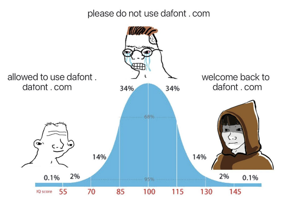
If you are looking for the true avant-garde of typography, I would not recommend traveling to your favorite foundry, or to the portfolio site of a recent graduate from KABK, but instead to a little website called Dafont.com. The most expressive typographical excursions can be discovered here, a place where legibility is pushed to the brink and corporate logo bootlegs run free.
This isn’t to say that there aren’t hideous crimes lurking on the website — most notably on the offensive “Foreign Look” section, which includes fonts such as “Chinese Dragon” and “Arabic Magic” as well as the highly regrettable “Sexy” section — but there are real moments of beauty and expression that exist well outside the boundaries of rules and taste. It arguably has the best collection of free pixel fonts on the net, a glorious collection of poorly drawn corporate logo bootleg fonts, groovy fonts, fire fonts, and ice fonts. There’s something for everyone over at Dafont.com and it’s low bar for entry has allowed for typographic expression to flourish on the web.
Elizabeth Goodspeed @domesticetch (with idea by @noahbakerstudio)
Pt. 2: Bank Gothic
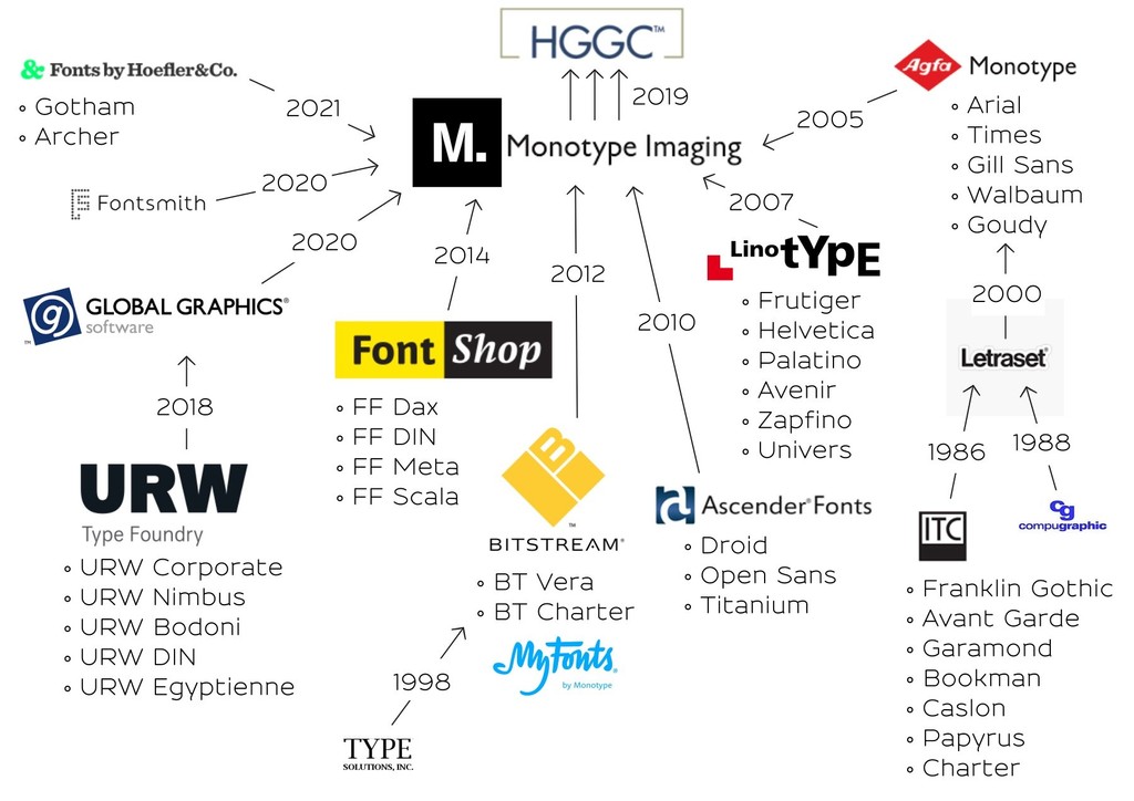
There is no greater threat to the typography industry than Monotype Imaging Holdings Inc, or Monotype for short.
Despite its name, Monotype is a type foundry only in brand and exists more as an investment company owned by private equity firm HGGC. Its modus operandi in recent years has become buying up smaller type foundries in order to seemingly increase profits and future investment opportunities, and less so to draw letters and push design forward.
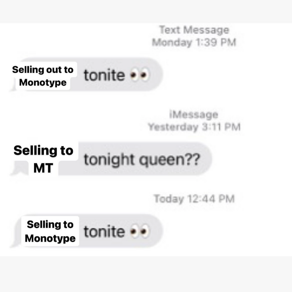
The fact that Monotype itself is a monopoly by name is certainly a bit on the nose. Every few months it feels like we see a new headline that yet another and another beloved independent foundry has sold its stock in fonts, shutting down its operations and cashing in.
Each time it is heartbreaking. A sale to Monotype usually means that there will be no new typefaces produced, as another branch of the tree of typography is cut off, with the foundry’s typefaces joining up with the biggest corporation in the business.
The real danger here with Monotype devouring all these foundries is that if HGGC ever finds Monotype to be unprofitable, they could simply sell it to a lesser venture capital company, or even worse, discard it all, erasing a whole era of typographic history. In fact, as recently as late last year HGGC explored selling Monotype for a whopping $4 billion, a comically large sum that would dwarf the valuation of any other type foundry in existence. Once Monotype is sold (and it likely will) the future of the biggest library of typefaces in existence hangs in the balance, as acquisitions rarely ever end well for the companies that get traded like commerce instead of art.
@glukfonts via @typographica
Increasingly, it feels like there are few type foundries left that haven’t been bought and sold for parts and scraps to Monotype’s font-eating mega-machine. Other recent examples of its acquisitions include Jonathan Hoefler’s selling of Hoefler & Co., home to numerous typefaces drawn by Tobias Frere-Jones, which he did allegedly without even informing his employees beforehand. In 2014, Monotype purchased FontShop, one of the last large independent digital font retailers (they already owned MyFonts), from Erik Spiekermann in another huge blow to the online typographic ecosystem.
That isn’t to say there isn’t resistance against this threat. As the specter of Monotype has grown over the type design community, there are those who have tried to shine the light of typographic resistance.
“I’m sure as fuck not letting Monotype anywhere near our fonts,” stated Kris Sowersby of Klim Type Foundry, home to some of the best typefaces of recent years. One way of viewing the state of things was stated by luminary designer Tobias Frere-Jones who said: “Imagine if 70% of movie studios and TV production companies were owned by the same parent company. What do you think we would be watching?”. More bluntly, Frere-Jones Type’s Nina Stössinger described Monotype as a “kraken eating this industry”.
Monotype’s former UK type director and celebrated Lebanese type designer Nadine Chahine laid it out plainly: “It’s the future of our industry at stake and it’s never been this bad. With every new acquisition, it gets worse for the rest of us.” I salute these rebels, and hope that they stand strong. I pray the day never comes when Dinamo, Commercial Type, Grilli Type, or any other of the remaining typographic luminaries fall victim to Monotype’s alluring offer of cash for fonts.
@abcdinamo
Pt. 3: The Mr. Shrimp Font
Beyond the monopolies and the monotony, the future of typography is not all doom and gloom, and there is boundless beauty being produced beneath the surface.
The best type foundries do not rely on the basic sans serifs to lay the foundation of their business but also stretch the limits of aesthetics with dazzling display type rooted in a strong understanding of form. Think the bravery of DaFont’s aesthetics married to the skills of Hermann Zapf.
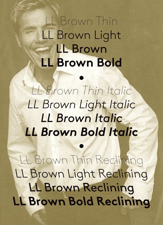
Swiss foundries like Lineto are the masters of this, releasing typefaces that speak both to the past and the future, such as Norm’s LL Replica with its cut corners, or the original LL Brown by Aurèle Sack with its backward slant. Dinamo’s typefaces also come to mind with examples such as ABC Favorit Lining, a straightforward sans with a twist — an underline marking the bottom of the entire typeface. And My-Lan Thuong’s Carta Upward designed for Sharp Type breaks the rules of baseline typography, asking its users to set its forms upward and downward, not just right and left, calling to languages outside of basic Western forms.
Overall, I’m less excited about variable typography technology, as I think designers should be confident in their choices of weight, rather than twiddling the nobs with uncertainty. I’m not saying that there aren't interesting excursions happening with these variables, such as seen with Andy Clymer’s Tilt, a variable font that allows its users to rotate the orientation of the glyphs, bending in ways that letters have rarely bent before. The Vectro Type Foundry is also leading the charge in experimental variable typography, with brave fonts such as the three dimensional WHOA or the gloriously groovy Kablammo — a wonderful variable update of 1995’s misunderstood Jokerman.
On the business side of things, there are also exciting developments that aim to upend the traditional model of hoping for a hit typeface or a big licensing deal to support a foundry. Future Fonts has a brilliant model of selling typefaces in progress that allows for type designers to try out new weird things without the heavy time investment involved in drawing an entire font family, all while letting us graphic designers get in on the ground floor for cheap. My favorite typefaces from one of my favorite foundries, Commercial Type, are not found on its main site, but in its Vault, a repository of unreleased typefaces and experimental flights of fancy, all in various states of completeness. Dinamo also has an Early Access program where typefaces are available before publishing as well as hugely discounted font packs for students.
I urge type foundries to take this route, as we ignorant designers can rarely see the flaws that type designers see with an uncompleted font (and kerning is one of the rare tangible skills that we actually have). So type foundries, please, open the gates to all your unloved typographic children, and let the graphic designers run wild with your letterforms.
Erik Carter is a graphic designer and art director running an independent practice based in New York City. He's previously worked as an art director at Google developing communicative AR experiences, a senior designer at MTV building on on-air animation, an art director for The New York Times, and as a designer at the Office of Paul Sahre. Clients include The New Yorker, The New York Times, Verso Books, and New Directions. Sign up to his Design Harder newsletter.