Synt: A Rhythmic Reimagining of Modern Faces for Today’s Streaming World 🦇
We’re excited to release the complete package of Synt today, a unitized reimagining of 19th Century “modern” faces for today’s fast-paced world of screens and streaming.
This beautiful font takes its logic and shapes from a typeface used in a 1900 book by influential commercial printer Theodore Low De Vinne and turbo charges them into the future.
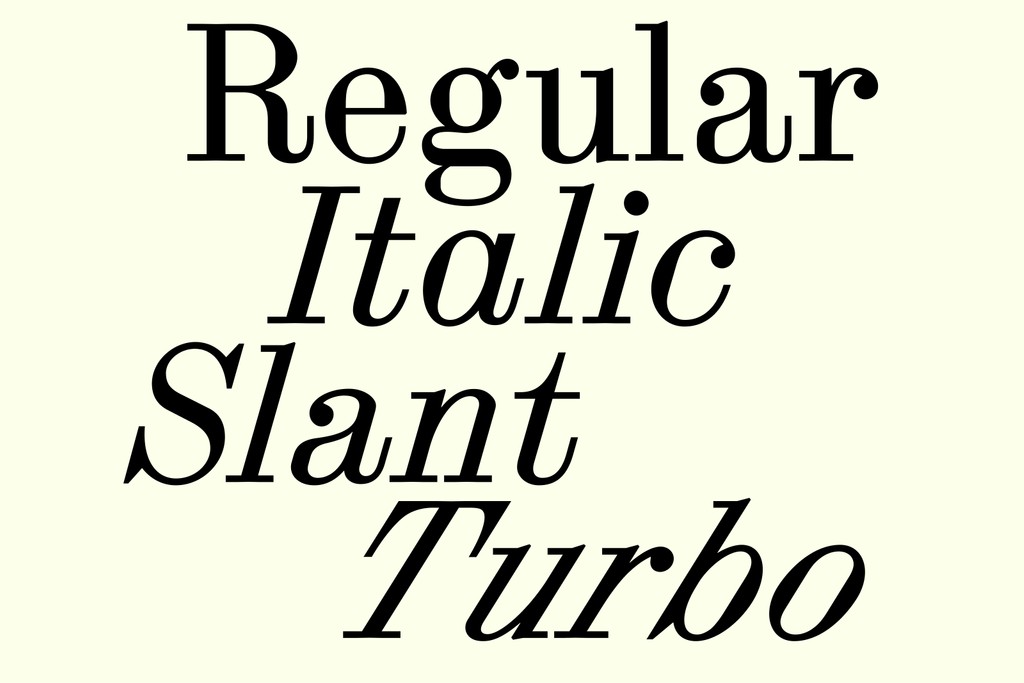
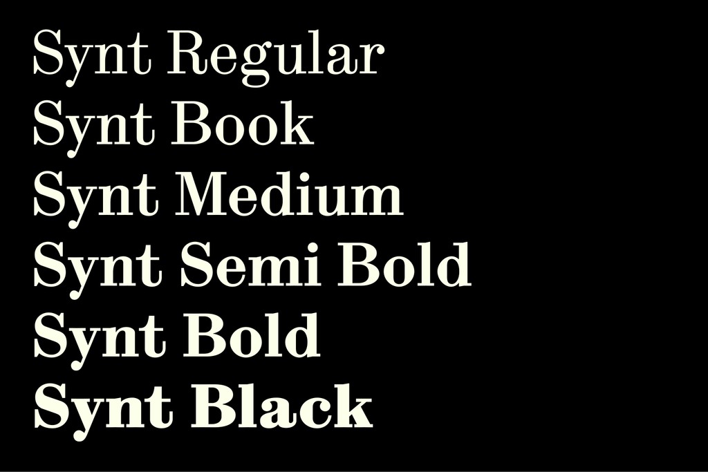
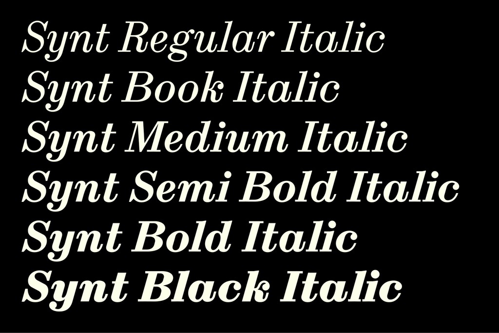
The full family comes complete with six weights, a mono cut, and not one but three styles of italics: a True Italics, a Slanted variation, and a Turbo Slant for whenever you need to really emphasize something.
It’s also packed with special glyphs and alternates ideal for apps, podcasting, and all spheres of audio culture. Let’s dive in!
Regular (0° angle)
Italic (16°)
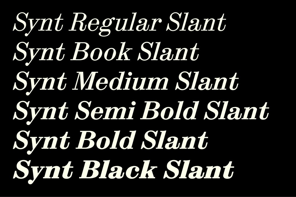
Slant (also 16° — but differs in shape)
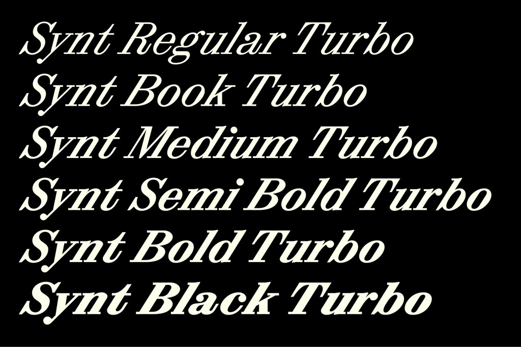
Turbo (32°). Catch me if you can Leo 😘💨
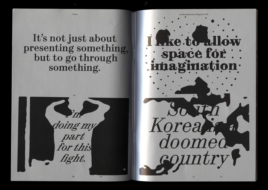
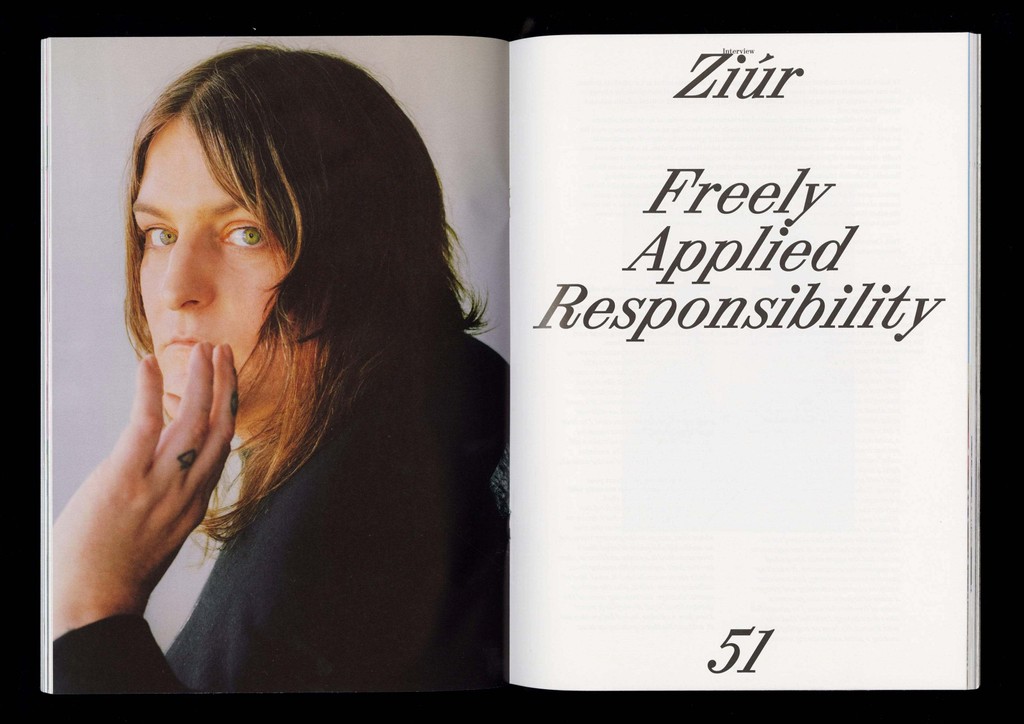
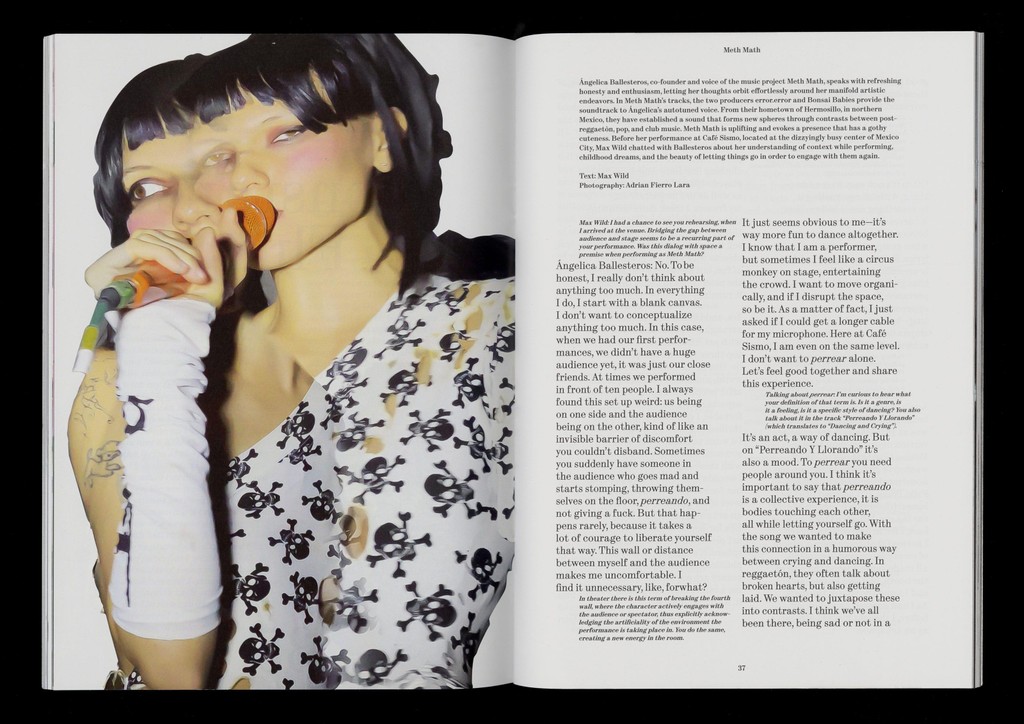
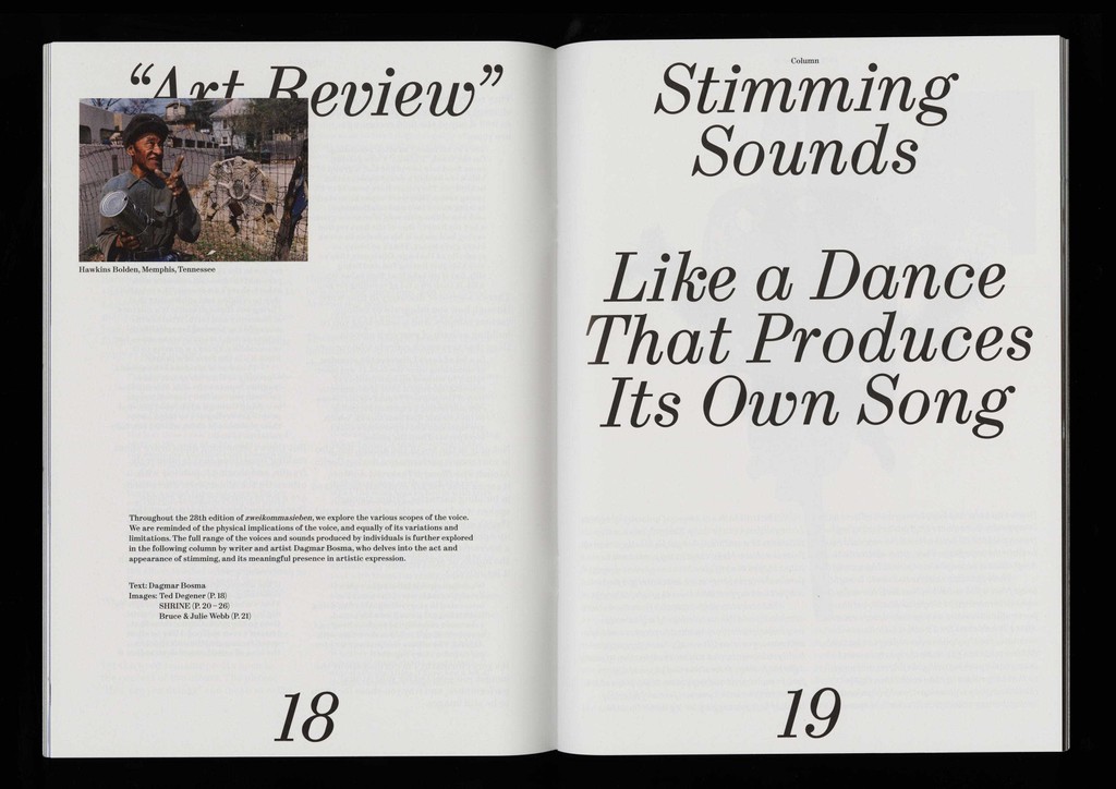
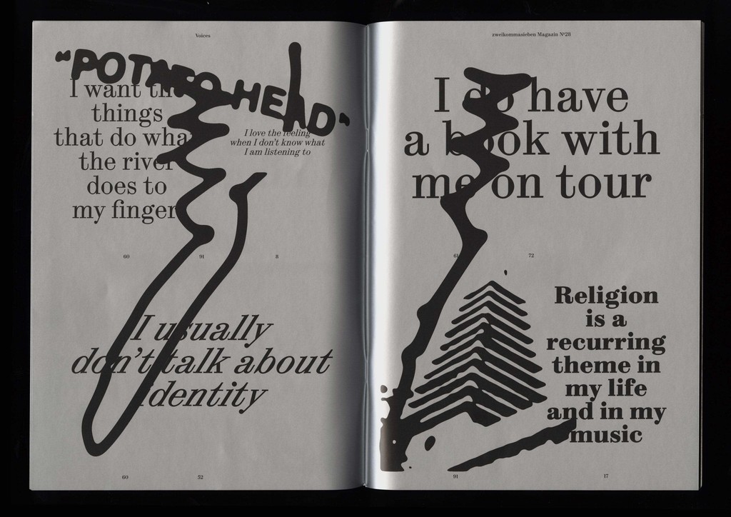
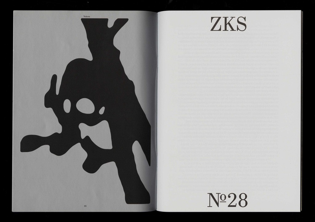
Synt has been with us for many years, developed and fine tuned by the eyes and mind of team member Kaj Lehmann. We’re proud to release his full family today on the occasion of the launch of the new issue of music magazine zweikommasieben, the pages of which Synt found its first home many moons ago 🥺
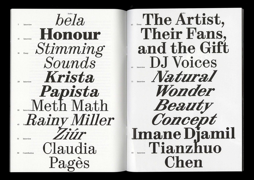
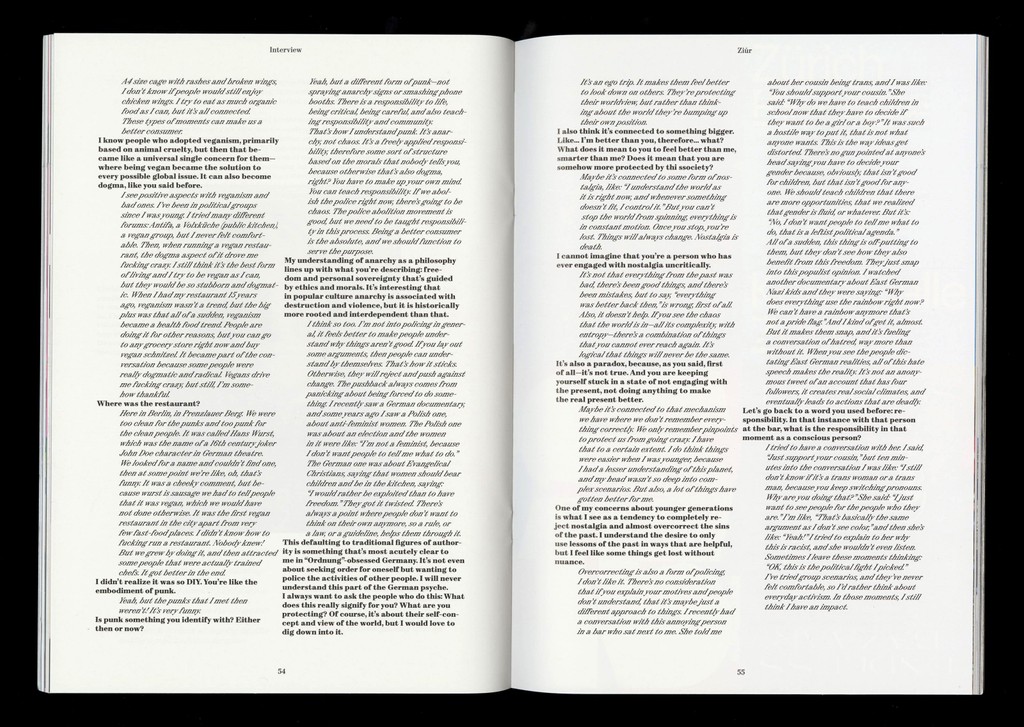
The latest issue of zweikommasieben, themed voices, features interviewee quotes in a different cut of Synt. It’s possibly the last issue designed by Kaj using this font 🥺
Origins
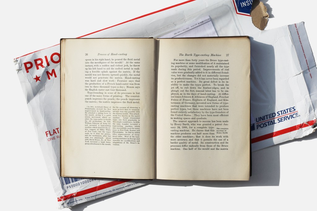
In 1900, printer Theodore Low De Vinne classified typefaces with large ball terminals, horizontal serifs, sharply vertical axis, and high stroke contrast as “modern” in his book, The Practice of Typography: Plain Printing Types. Think of other early 20th Century faces ATF Bodoni and the Didone genre at large.
When young Kaj was a student in 2017 reading De Vinne’s words in the ECAL library, he noticed that they were set in a neat “modern” typeface of their own. This unnamed body copy became the starting point for an exploration of modern faces, eventually leading Kaj to Synt’s base structure.
De Vinne ran one of the leading printers in late 19th Century New York, and commissioned the typefaces used in the books he produced, including the one that Synt echoes.
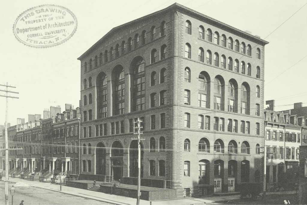
Meet me in the Astor lounge 🍸 The De Vinne Press Building on 393-399 Lafayette Street in lower Manhattan (you’ll see why that’s important later)
🥵
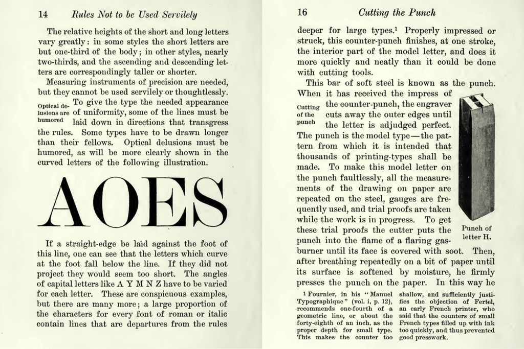
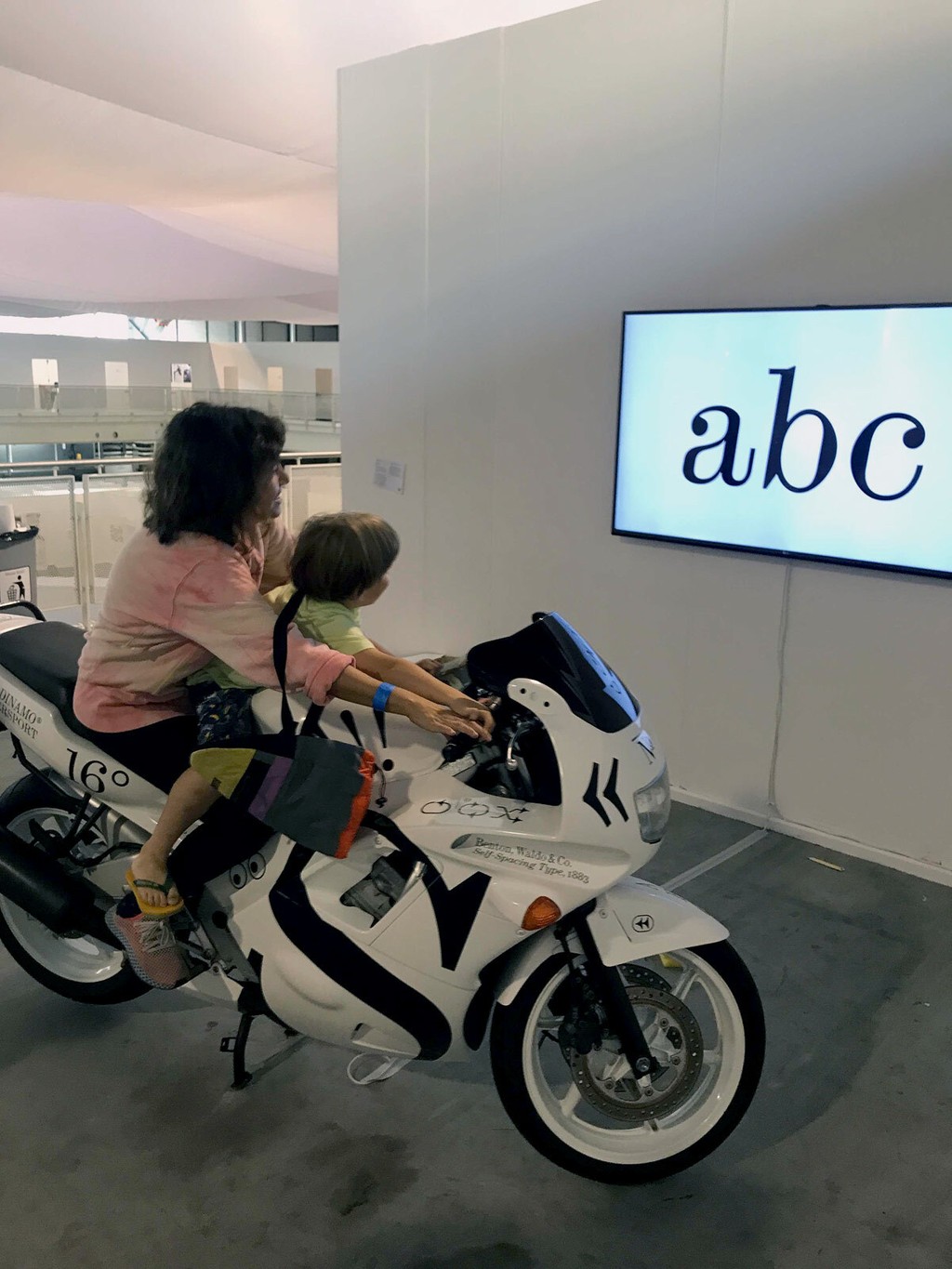
You’ll notice Synt has a particular rhythm. Its unique flow comes from the fact its reference material was a form of unitized type: De Vinne often used metal-cast letters with specified widths to speed up the typesetting process, allowing typesetters to compose justified text by hand quickly.
Synt takes the functional logic of these systems into digital space, celebrating the unitized rhythm as a beautiful design feature in its own right (with the added bonus of translating seamlessly to pixels and for hinting).

After co-founding zweikommasieben in 2011, Kaj used an early version of Synt when designing 2018’s issue 17. It’s in these pages that our team first spotted the design. I think the hard, constructed vertical lines of the font, as well as the exaggerated slants, suit the club culture publication’s context ;)
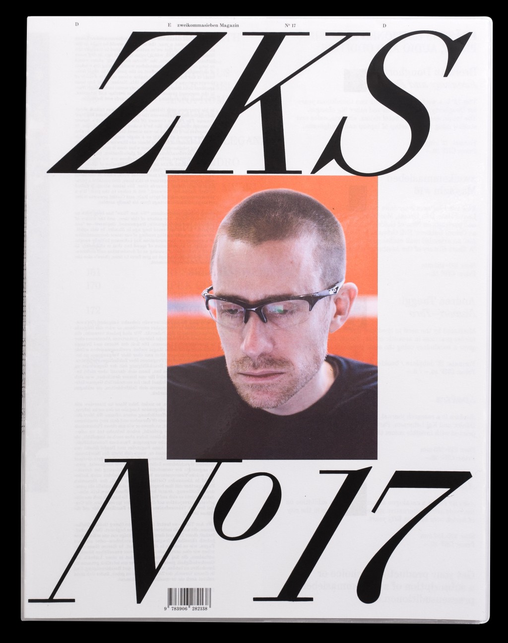
2018, Synt first use
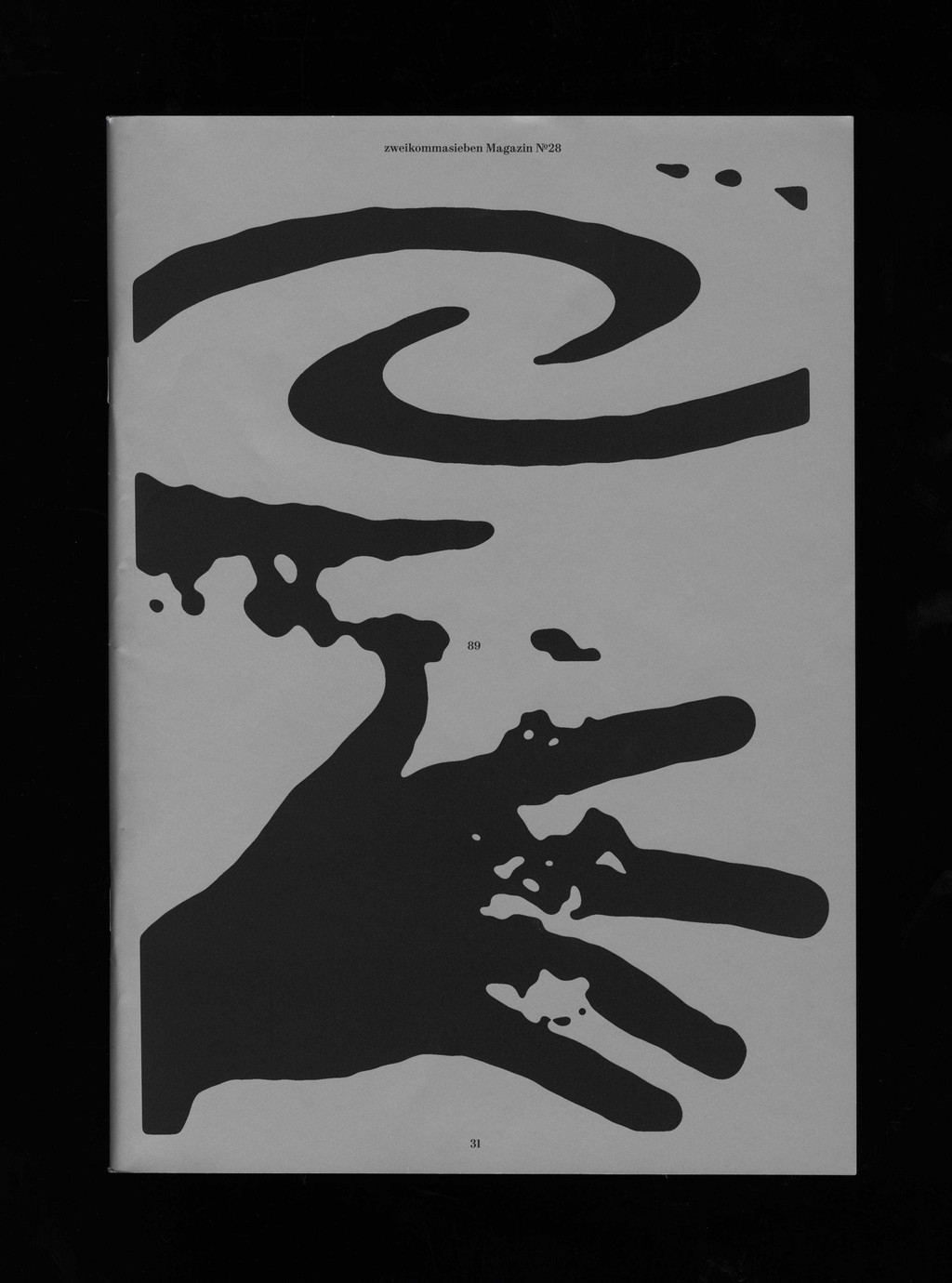
2023, Synt today
Special Features
Rhythm
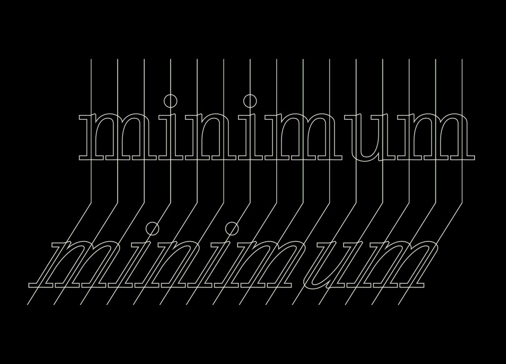
Synt has a “parametric” rhythm, meaning there’s an identical distance between and within every vertical stem. Its strict unitization plays a huge part of why the typeface feels so, ehem, staccato 🙄
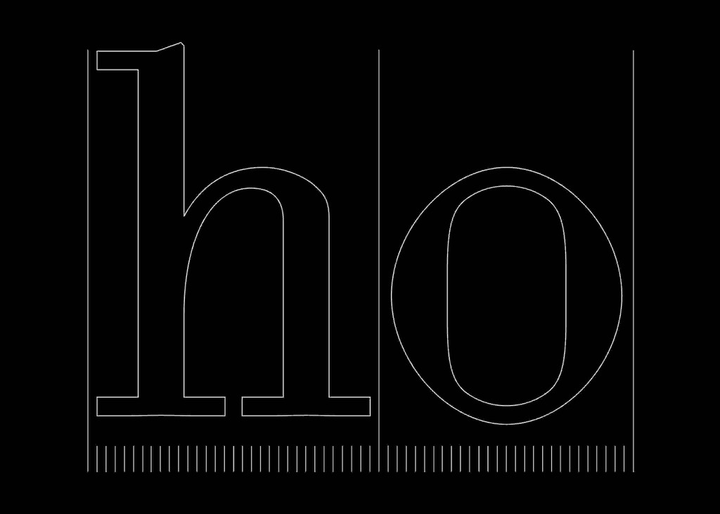
Each letter is part of the same grid system
Speed
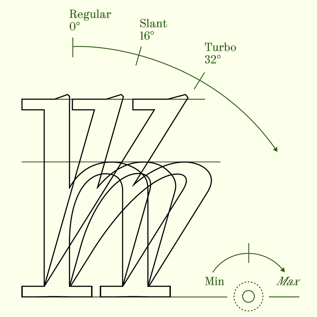
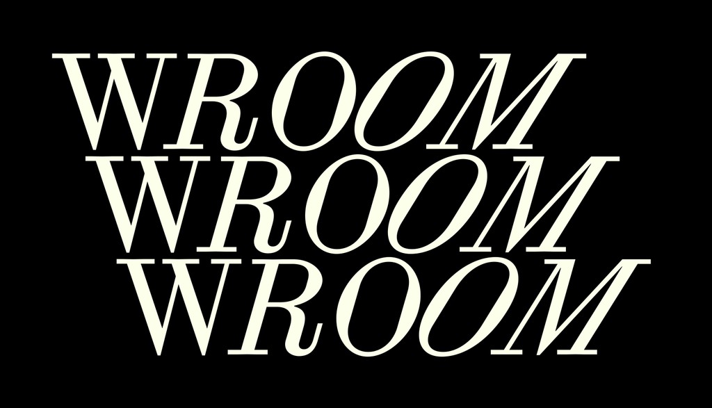
Turn up the speed of Synt with our slant modulator, moving between an exaggerated slanted cut of 32° and a still 0°. With the Variable Font file, users can control the angle with the variable axis. Like revving the handle of a motorbike. Kaj tested this theory himself at the Swiss Design Awards in 2021:

I want you in my room 🤐
See Otto, just like fortnite

Stylistic Sets
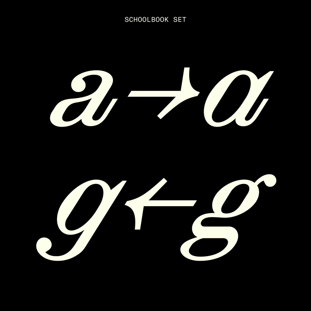
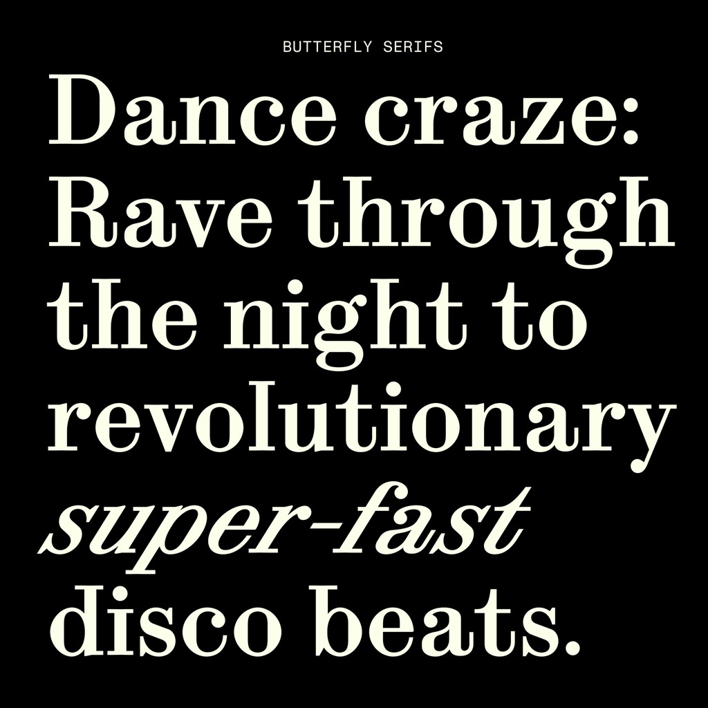
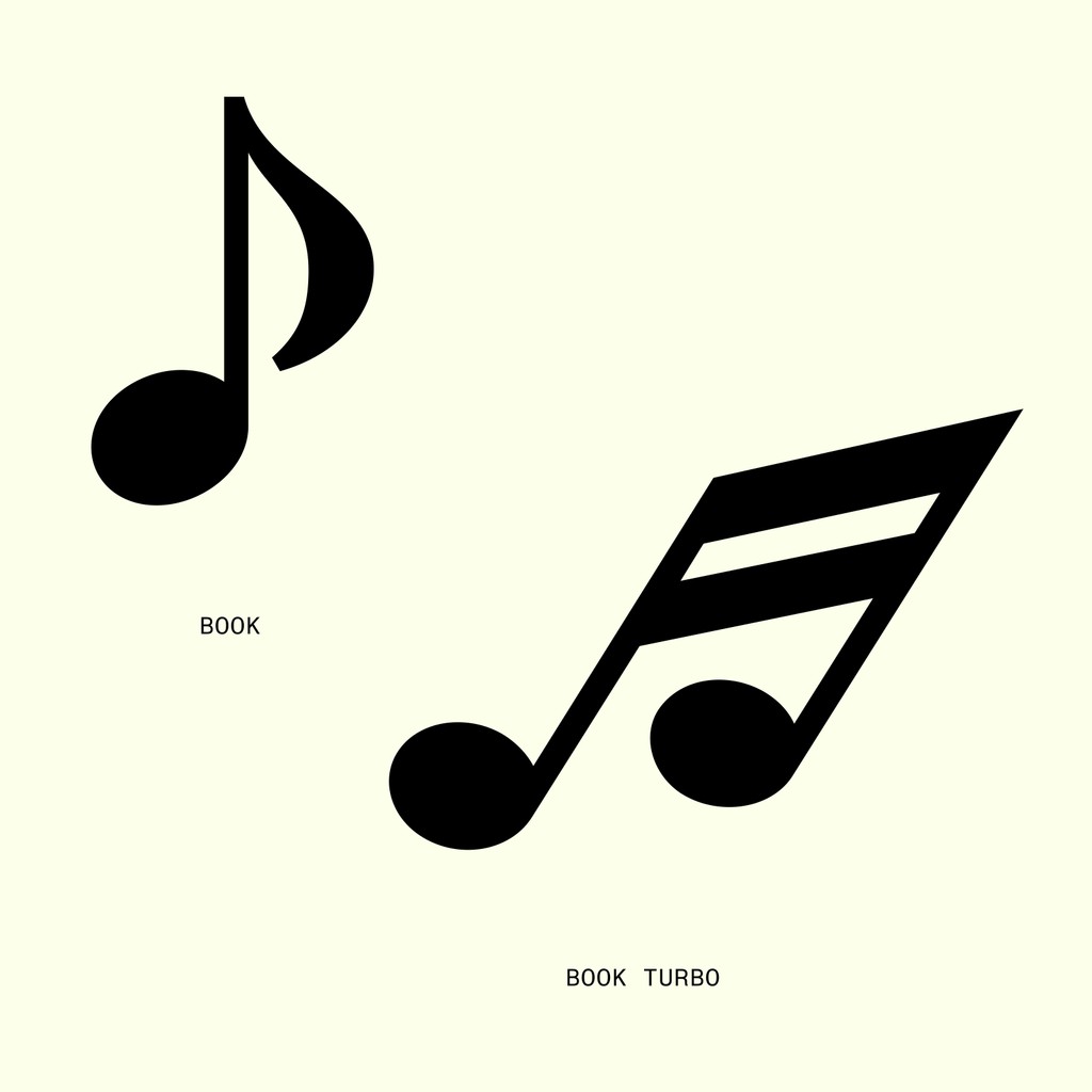
Synt features a wide range of stylistic sets for modulating its look. Alternate dieresis lets a user typeset with narrower leading. And Beethoven alternates let you seamlessly toggle to musical notation. There’s also a schoolbook set and Dinamo house-style Butterfly Serifs to choose from.
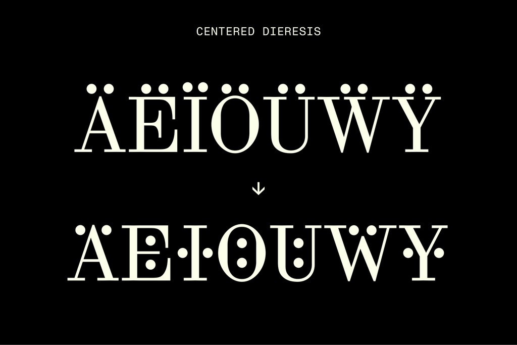
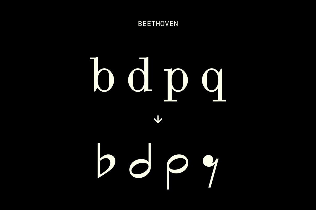
Mit 🐣

Ohne 🐥
Alternates
Flip between alternative versions of characters for a different feel — and set your defaults using The Dinamo Font Customizer tool before check-out.
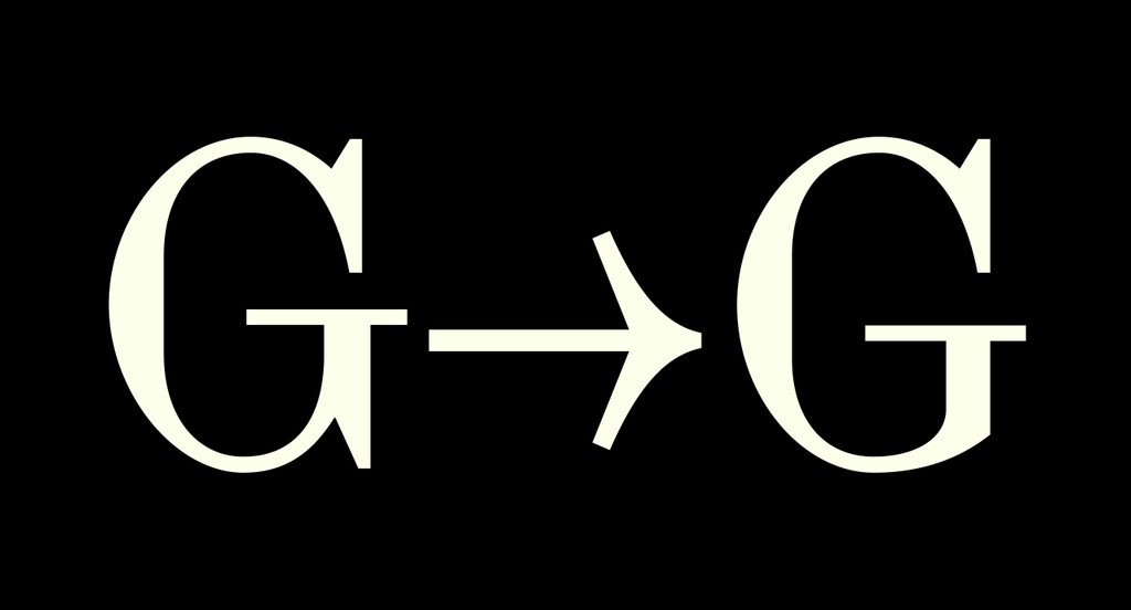
Scotch G vs. Bodoni G 🥊
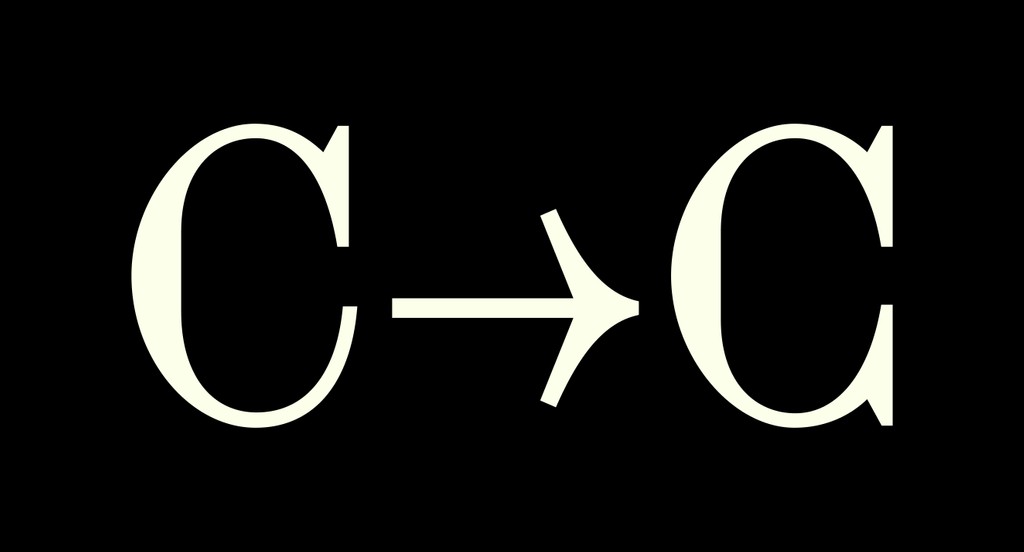
Scotch C vs. Bodoni C 💥
Fresh or elaborate
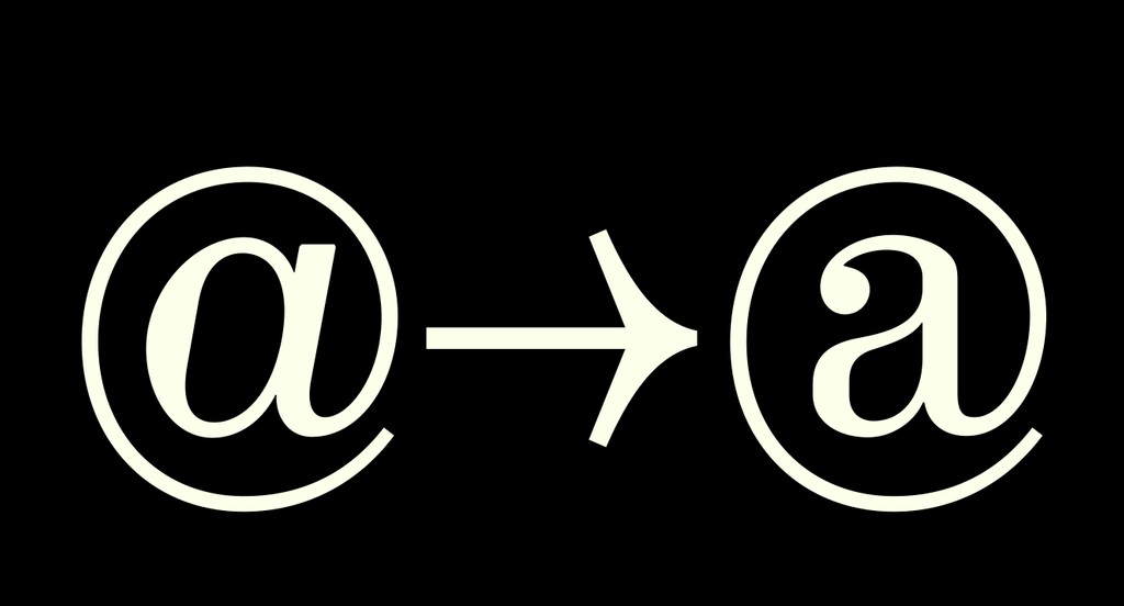
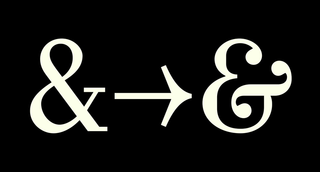
Double-storey @ or single
Special Glyphs
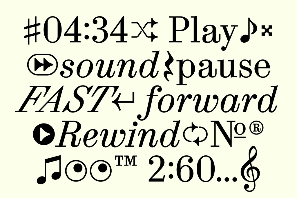
Synt comes with a set of musical glyphs and streaming symbols that have been designed to suit the font’s vibe. There’s also a many angled eye roll and “smashed beet” (naming c/o Tina) for other occasions.
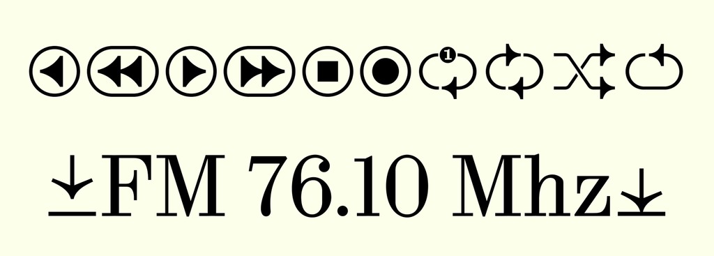
Live stream in Full Synt🤭
Notes come with variable slant too

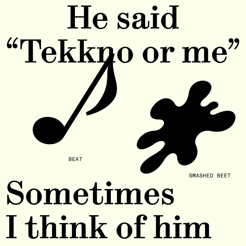
Don't ask me what the smashed beet is for
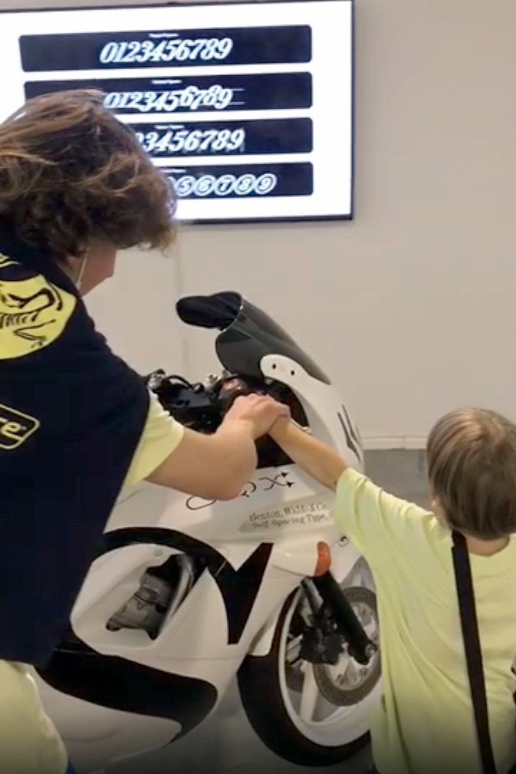
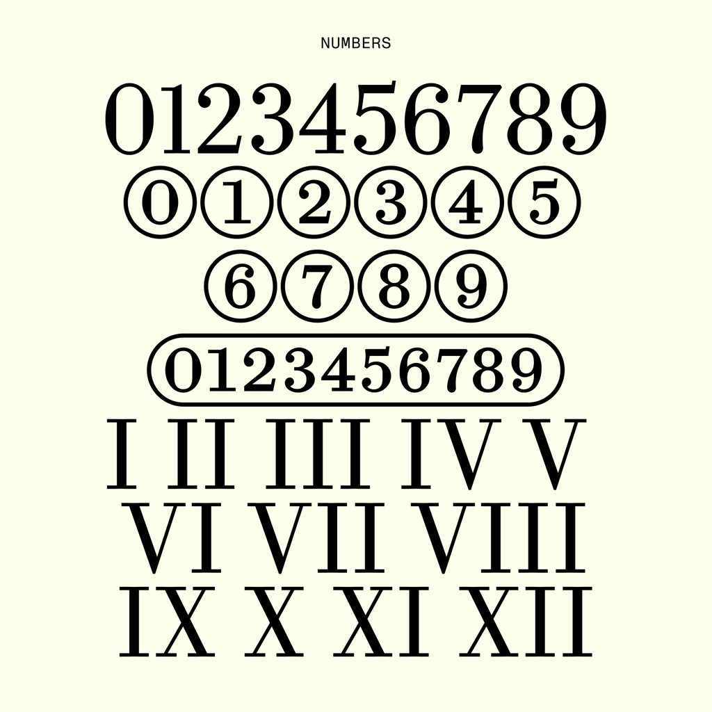
Special Numbers
As a font with its roots in music, Synt also contains a variety of number styles, including regular, tabular, oldstyle, circled, and superscript figures.
Synt in Use
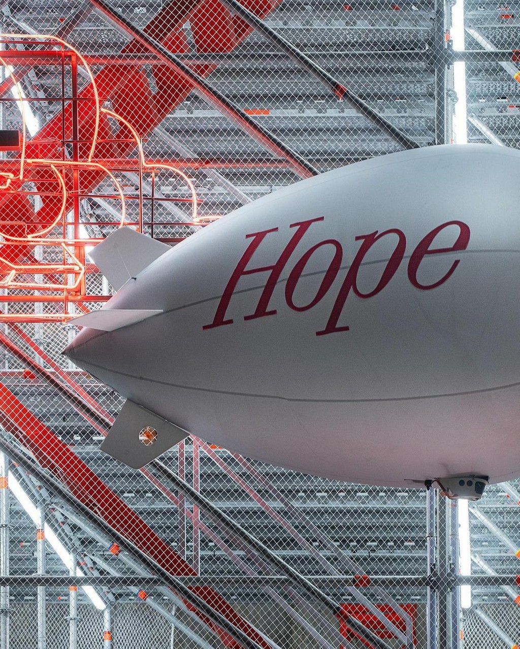
Sitting in our Early Access drawers for some time, Synt has already found itself in a variety of gorgeous in use situations beyond the pages of zweikommasieben — including for the Manhattan’s 52 Walker gallery identity (forming an unbeknownst 100 year geographical loop), and on the stage of a Louis Vuitton show in Seoul with all members of BTS.

Synt’s origin was born on Lafayette Street in the 1900s. Here is Synt over a century later, a 10 minute walk away from its metal cast ancestor, used in the identity of 52 Walker.
F/W with BTS. Film by Virgil Abloh 💕 Visual Direction by BeGood Studios
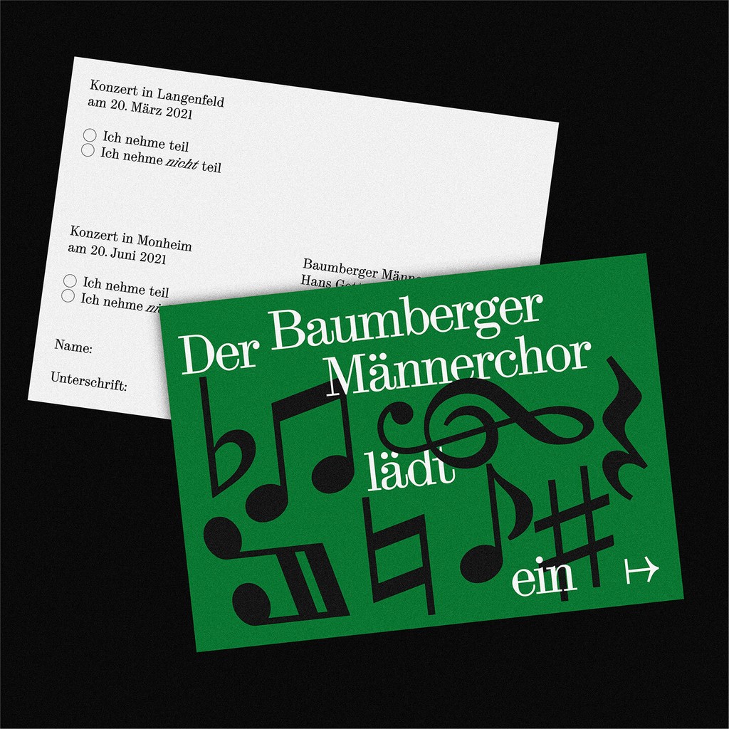
Bamberger Männerchor. Design by Raoul Gottschling