Pelikan: All Letters, Same Height
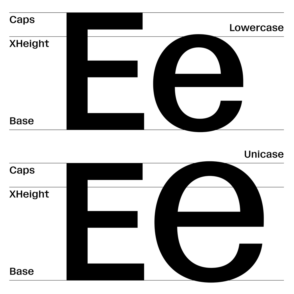
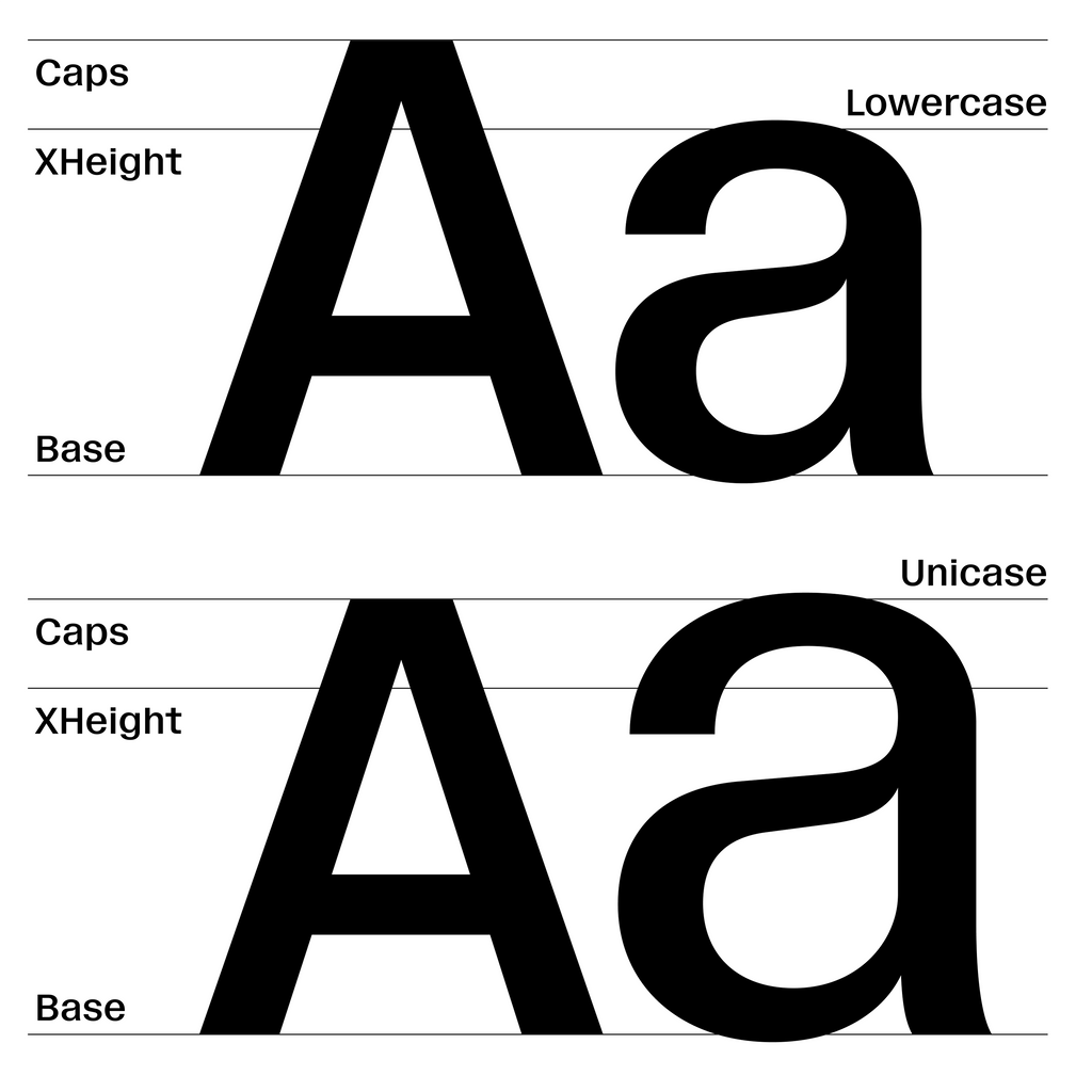
We’re releasing Pelikan today, an unpolished sans with a special unicase feature baked inside, which lets you extend all letters—big or small— to the same height.
Modernists in the 1920s waged a “fight against capital letters,” writing all their messages strictly in lowercase characters. In the 70s, the search for an “egalitarian” type treatment continued, leading designers to the short-lived concept of the unicase.
Today, we're releasing ABC Pelikan by throwing our very own same height party. You’re invited. Height = the same, vibe = insane.
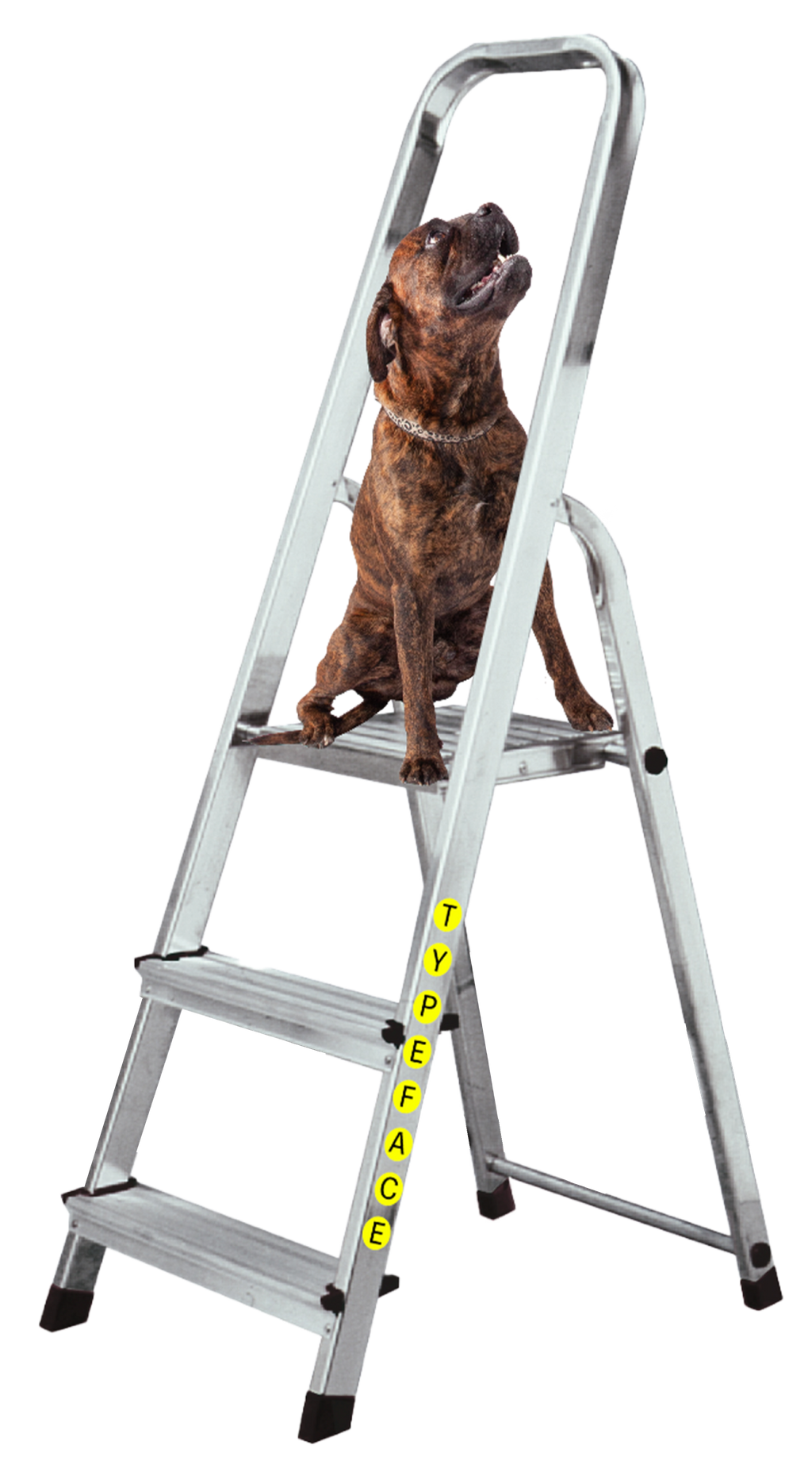

VIBE
In its default form, Pelikan is a low contrast Neo-grotesque that’s both raw and approachable. The font has an unpolished, blunt feel. It’s unusually large x-height gives it a confident stance and presence.
Pelikan has two unicase features available via Stylistic Sets, letting you jump between the default look and our same height variations. The unicase versions are playful, wild, and dynamic—I like to think of them as Kurt Schwitters-meets-a ransom-note.

Styles & Families
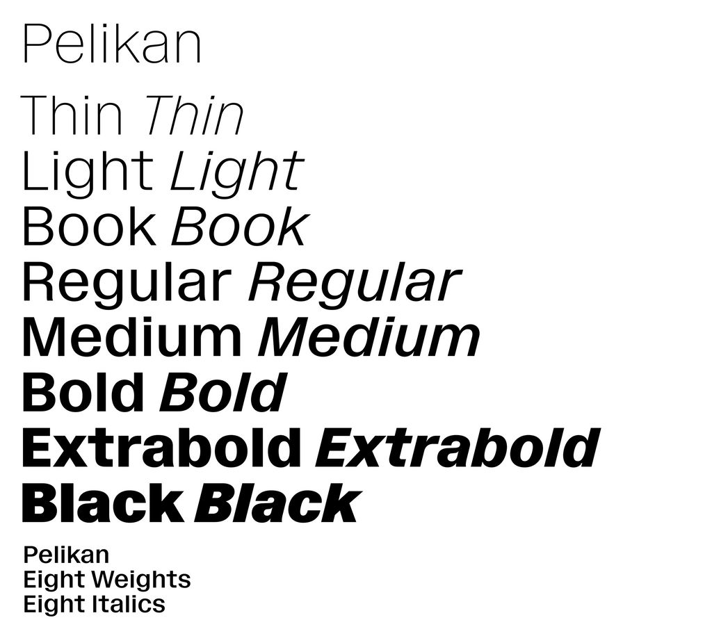
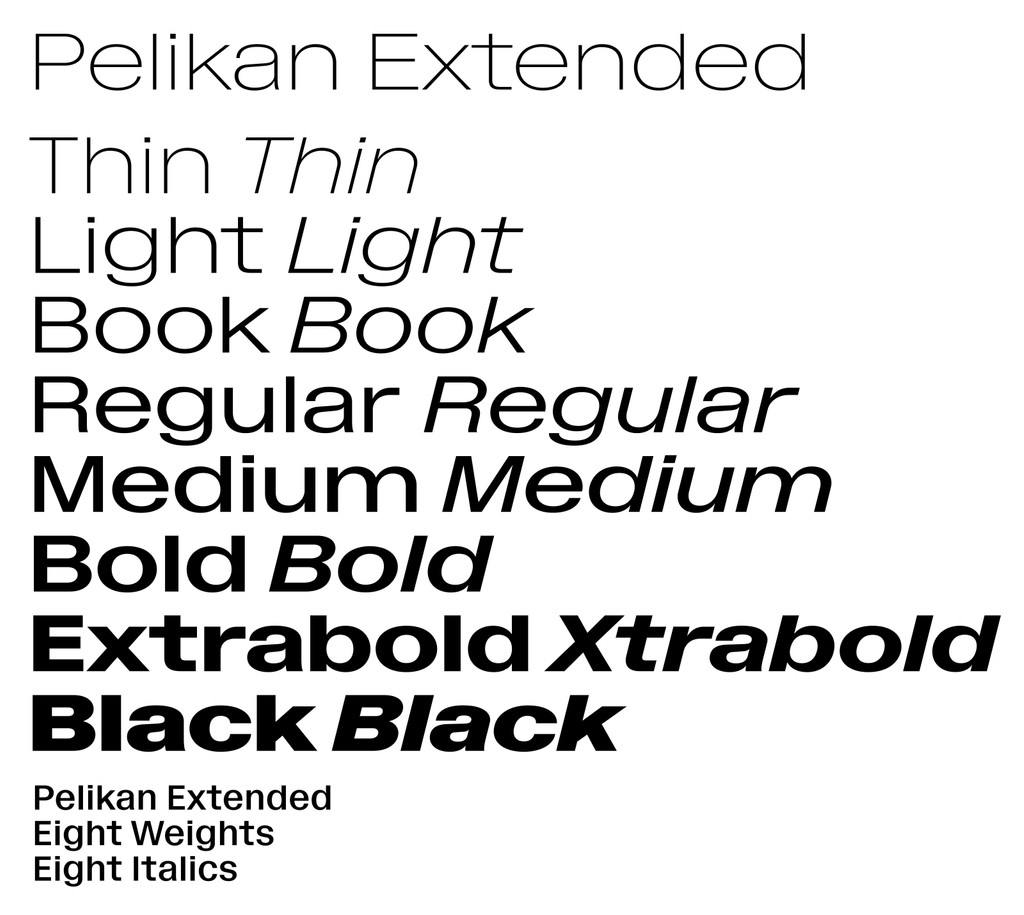
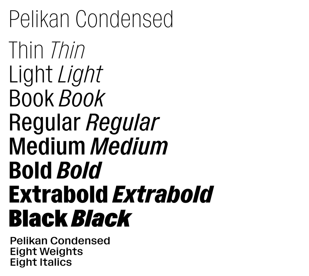
Pelikan is available in Condensed, Normal, and Expanded widths, plus eight weights from Thin to Black. As a variable font, you can explore the entire width and weight range. A brutal slant is also available for each style.

UNICASE FEATURE
Pelikan has two unicase settings. Unicase 1 is uppercase heavy, with only a few lowercase letterforms sprinkled in. This setting feels solid and sturdy in text blocks. Unicase 2, on the other hand, is jumbled and playful, a happy mismatch of uppercase and lowercase forms of the same height.
I like to imagine how the default Pelikan and unicase Pelikans could pair together for branding projects.


Triangular Dots
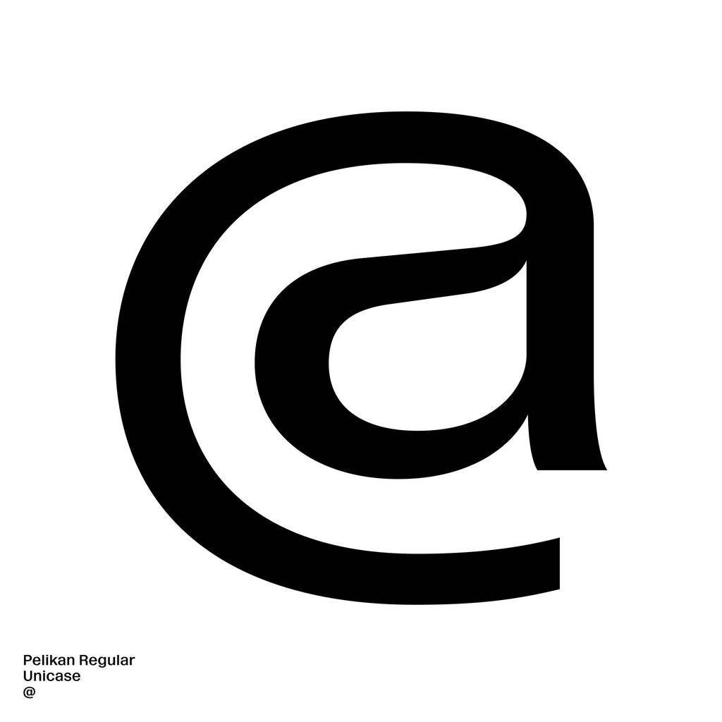
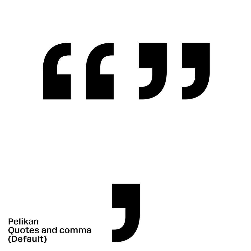
If you want to add a dash more personality to this workhorse, triangular dots are also available as an alternate to Pelikan’s otherwise boxy dots. These flourishes feel iconic to me, especially when paired with the mono slab i alternate.


KEY CHARACTERS
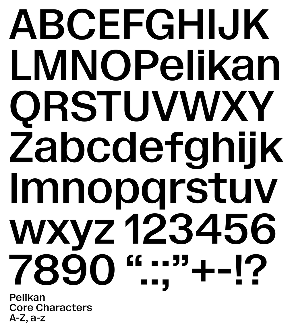
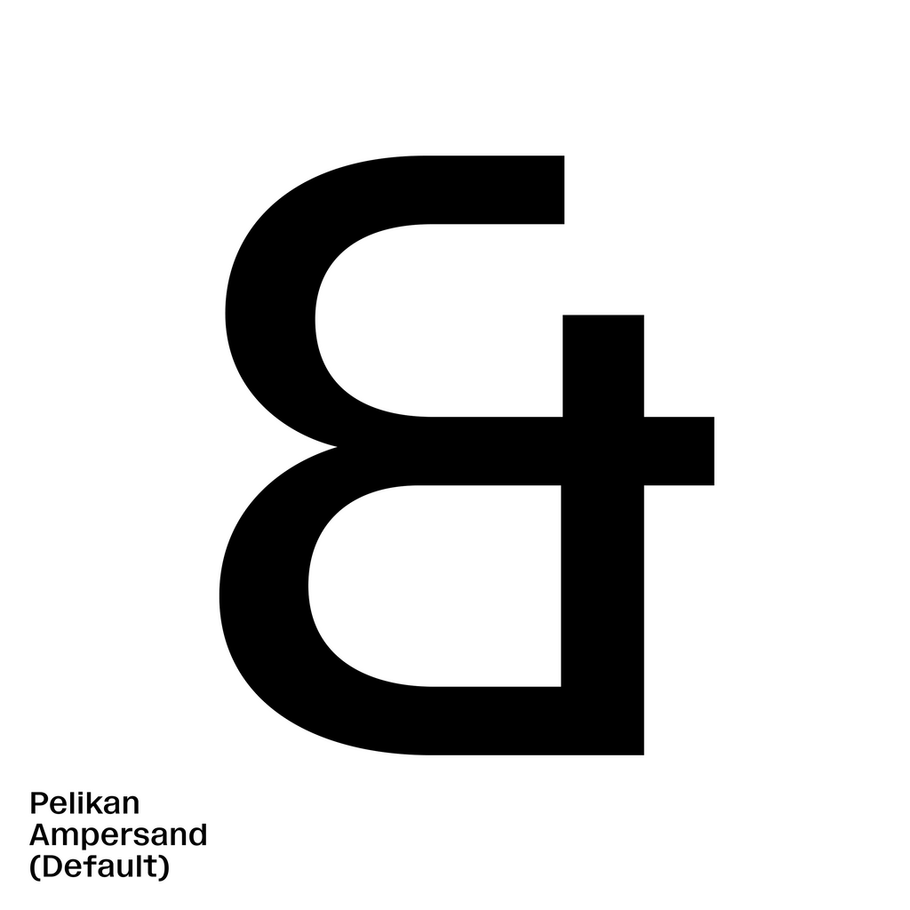
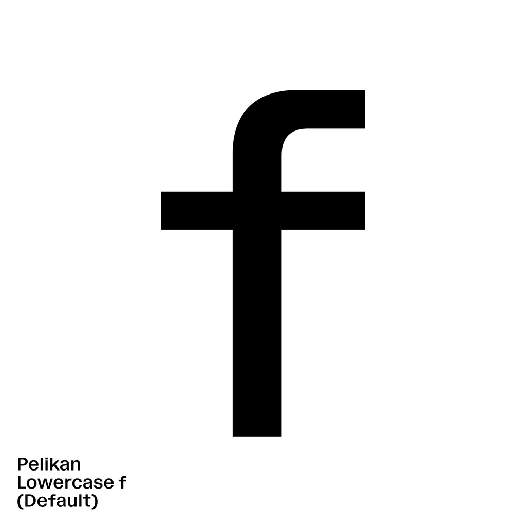
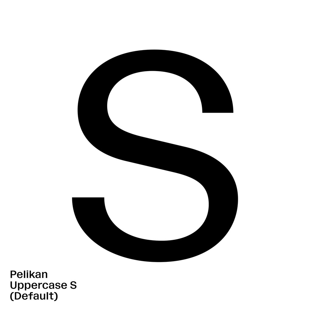
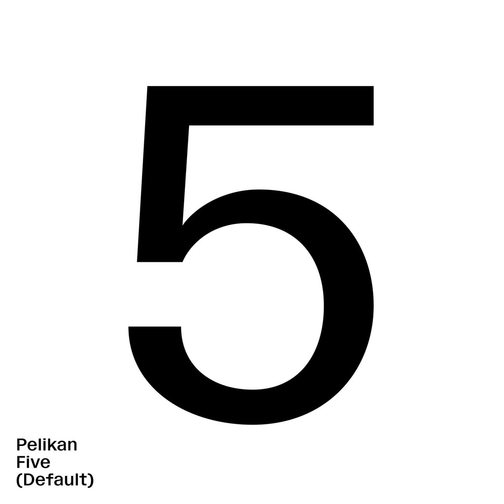
There are a few particular characters that give Pelikan it’s authentic flair. I’m particularly fond of the lowercase f, with its elongated cross bar and tubular hood. The numbers also feature special quirks, like the overhanging roof of the 5.

BTS
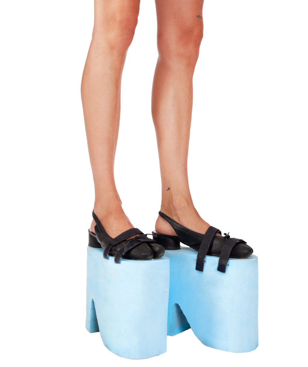
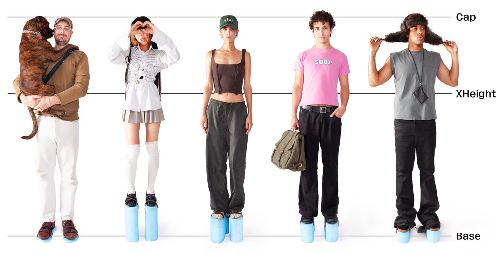
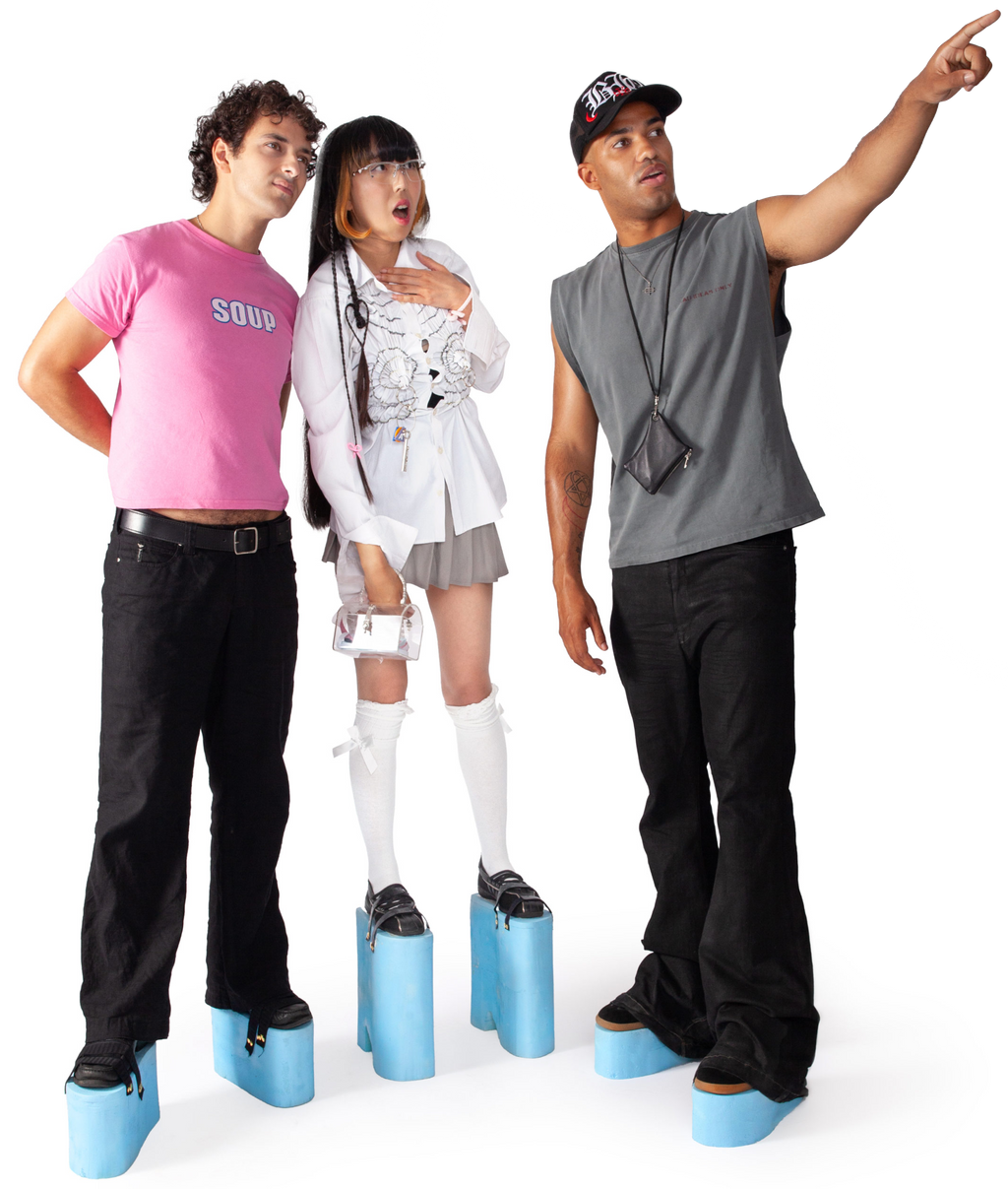
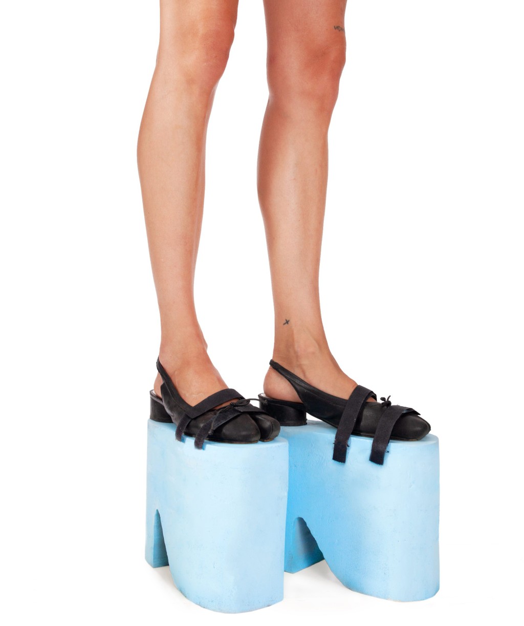
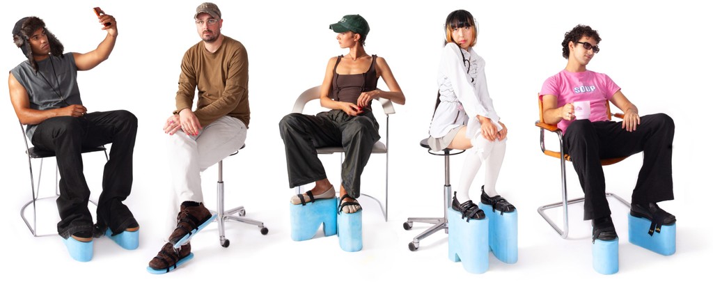
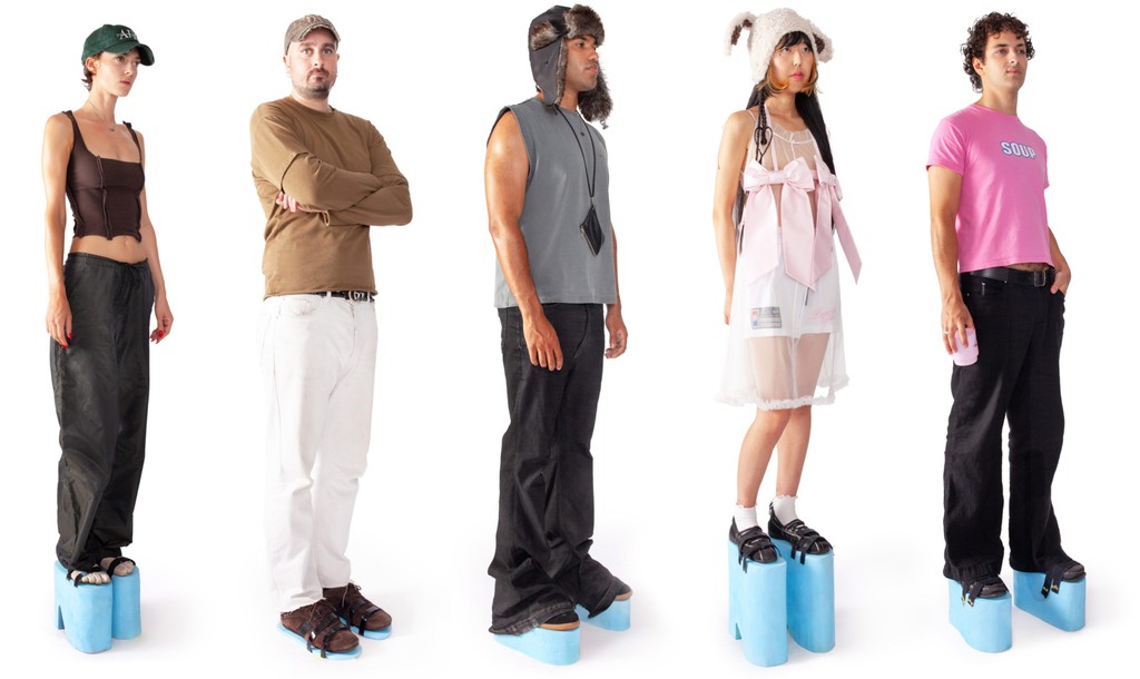
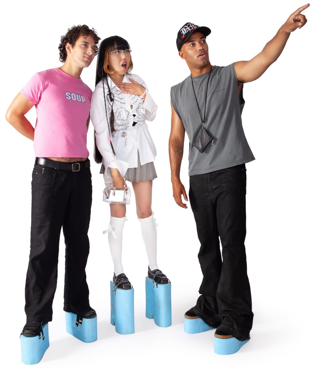
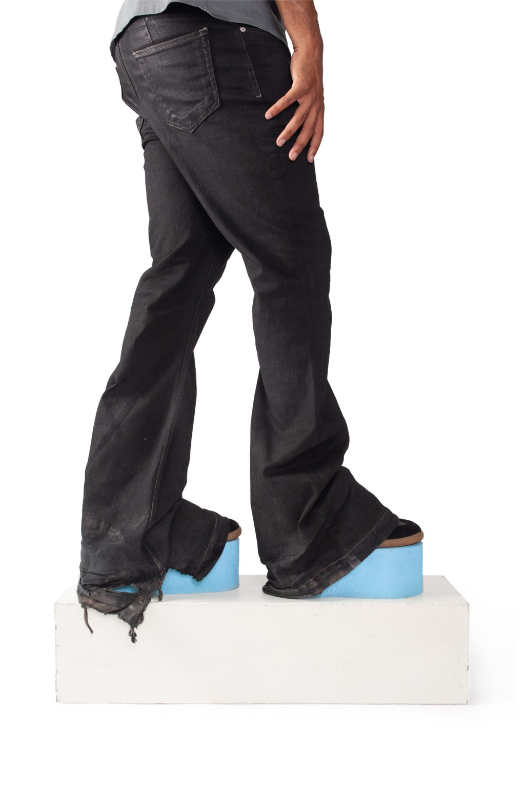
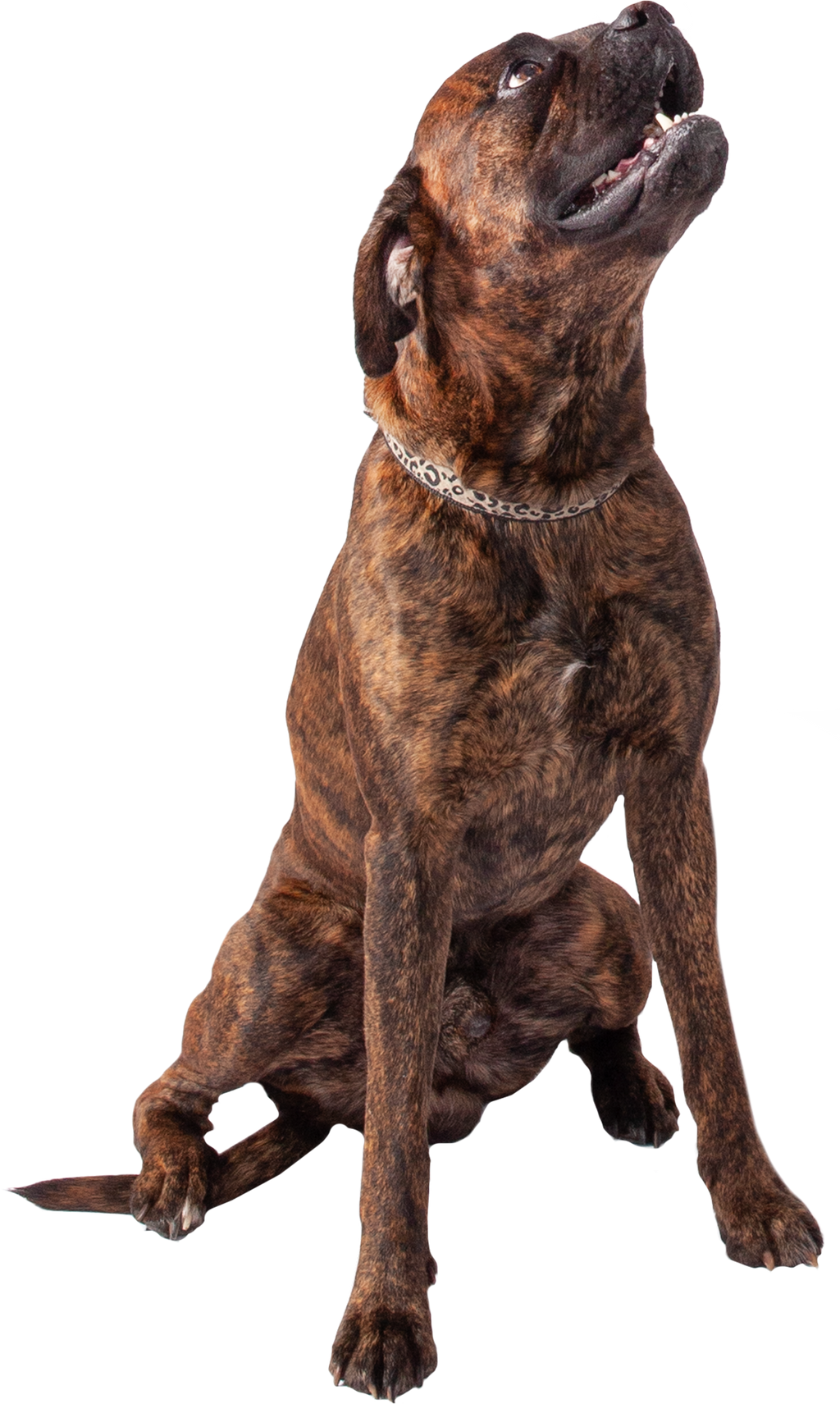
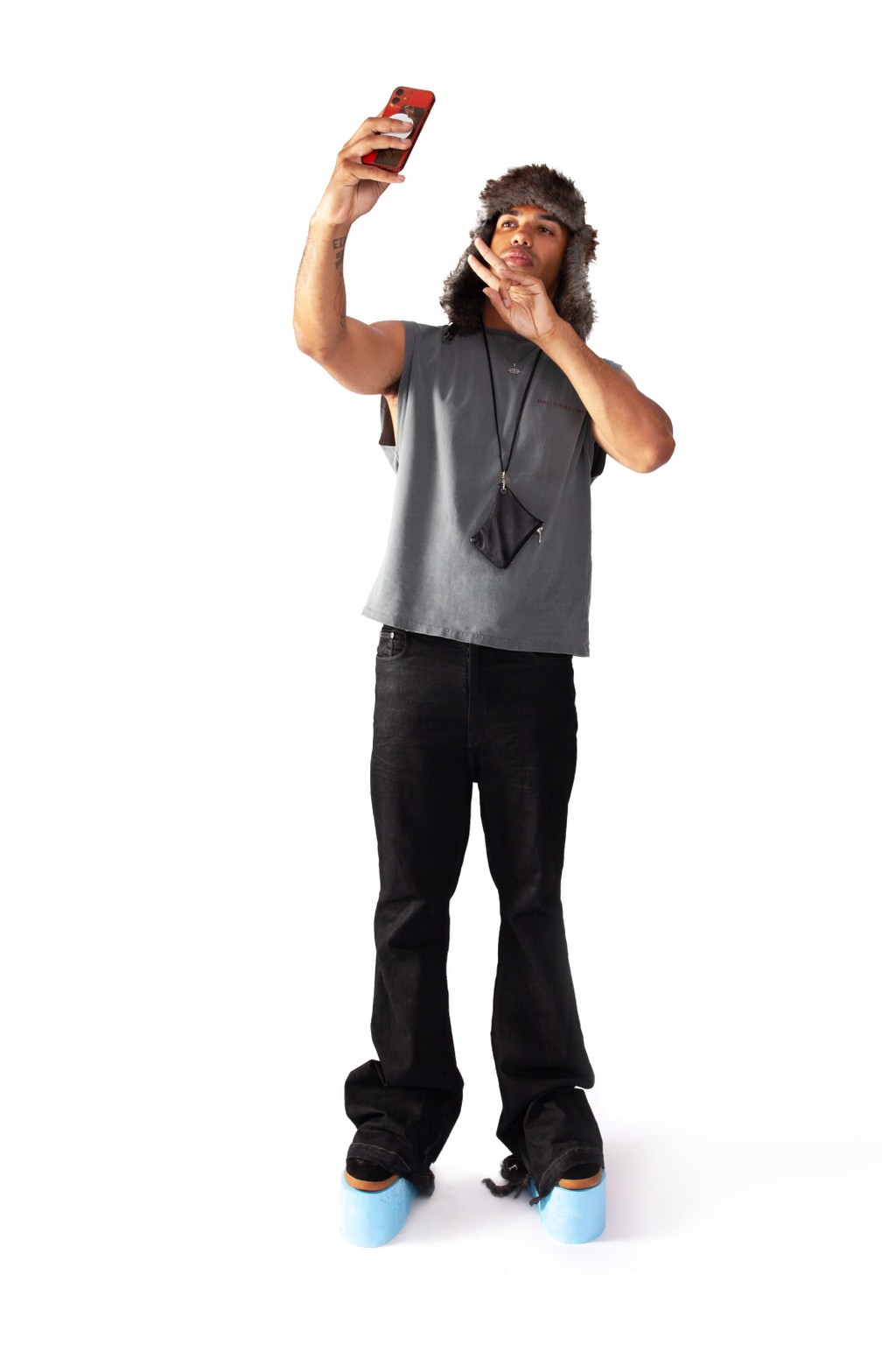
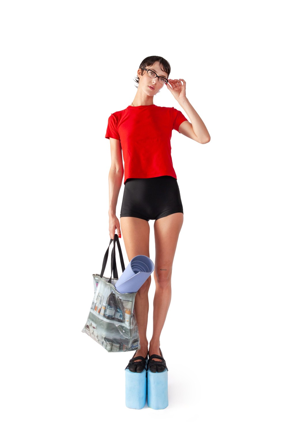
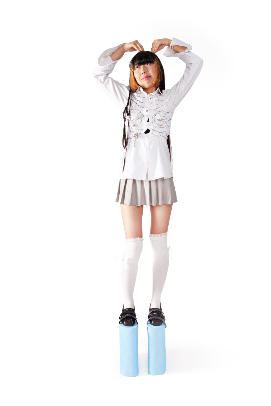
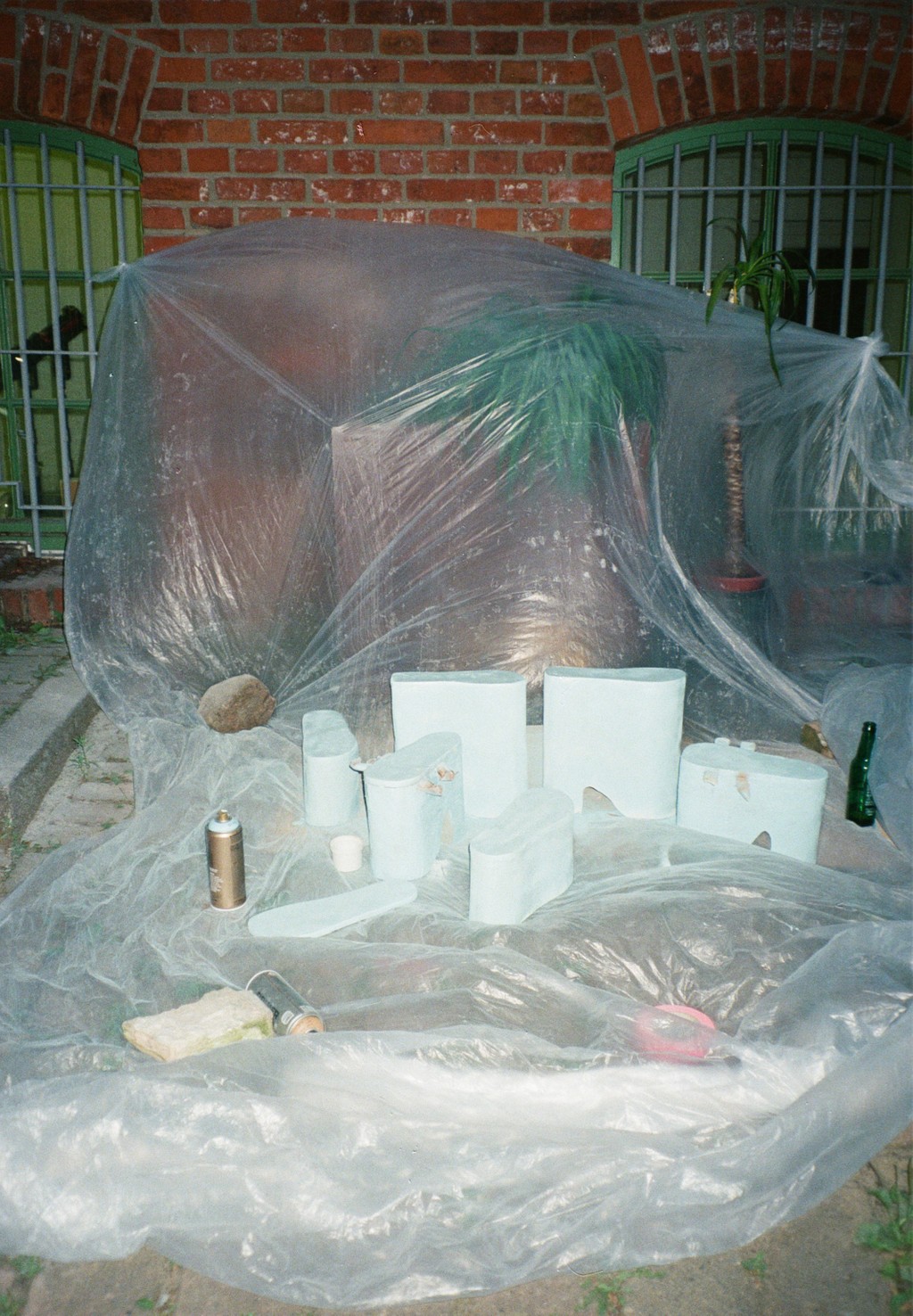
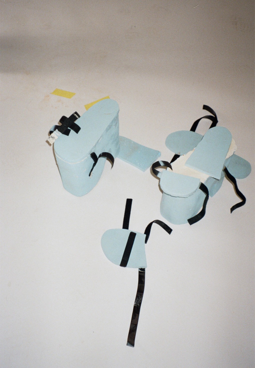
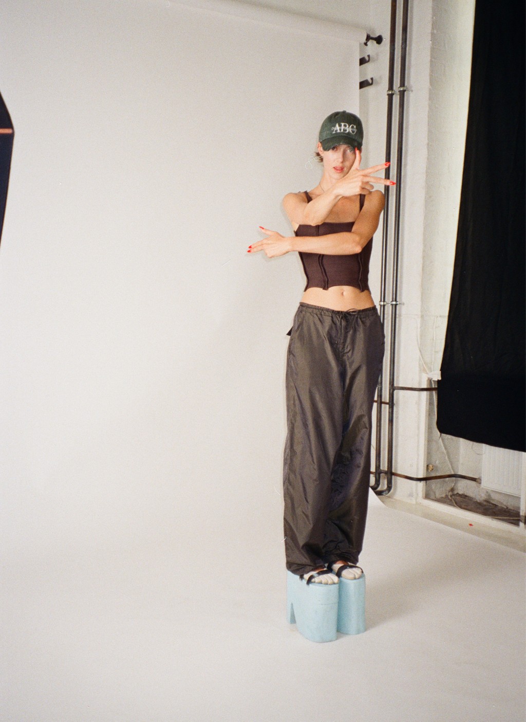
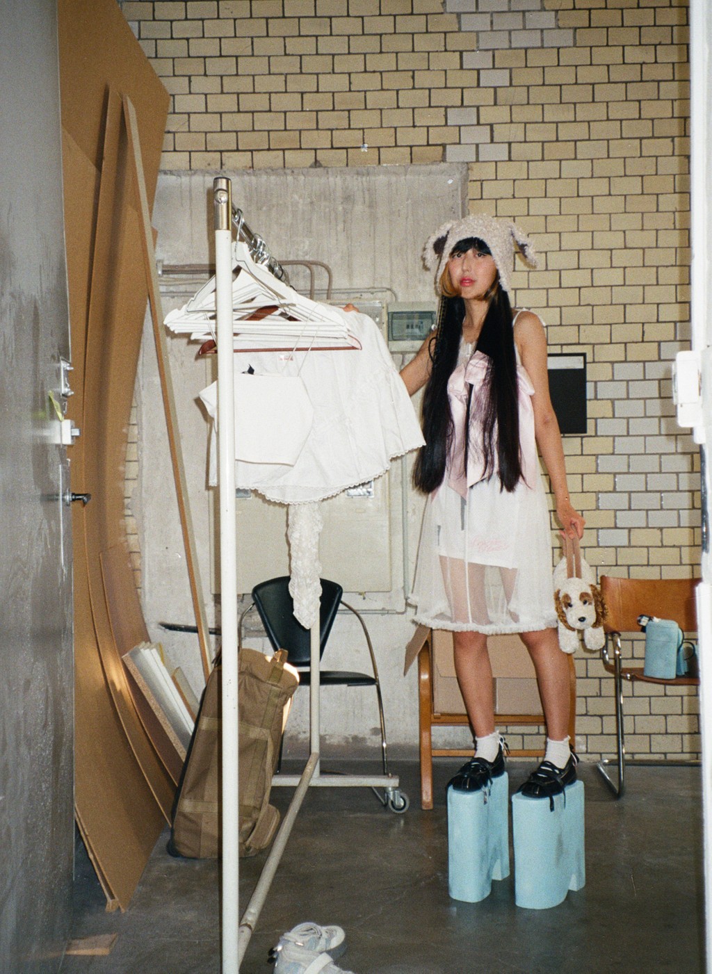
Masterminded by Berlin’s finest design gang Veryes, Pelikan’s campaign plays homage to artist Hans Hemmert’s Level (1997), an artwork originally produced for the Personal Absurdies show at Galerie Gebauer in Berlin. For the event, Hemmert hosted a party where all guests wore blue shoe-extenders to bring them all to the same two metre height. The idea was to literally put everyone on eye level.
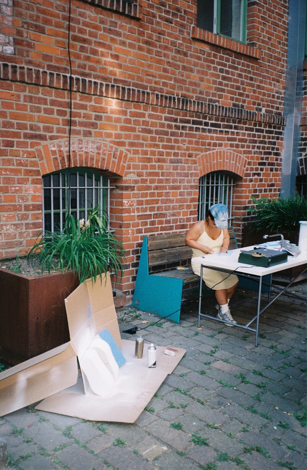
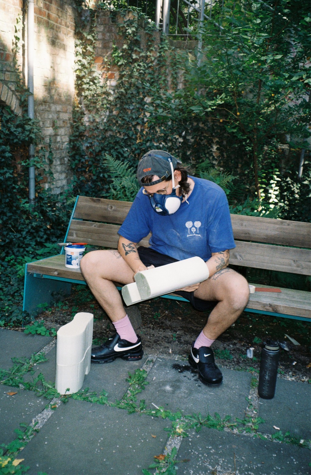
Fast forward to 2024: Simone Cihlar, Tim Lindacher, Moritz Lösel, Jannis Maroscheck, and Johannes Schreiner at Veryes built, spray-painted, velcroed all of the platforms you see here in their Kreuzberg Hinterhof—and then photographed and styled the shoot. Thank you to our Berlin-based models: Jessica Hauff, Benni Kakert, kkoki, Sean Brown, Kean Farrer. Hair and make-up by Lili Zawierucha.
That’s all for today. We can’t wait to see what you do with Pelikan.
Love,
Dinamo
