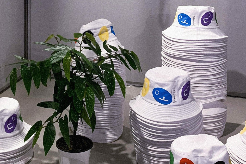
Typeface Release: ABC Favorit Hangul
The typeface ABC Favorit is as old as Dinamo itself, and it’s still our most popular release to date. Between 2013-2017, we developed the main ABC Favorit family as well as Mono, Extended, Expanded, and Lining versions—sticking to familiar Latin grounds. After that, it felt like it was time for ABC Favorit to embrace new scripts, and so in collaboration with native speakers and designers, we developed Greek and Cyrillic character sets. These were published in early 2019—it was exciting on so many levels.
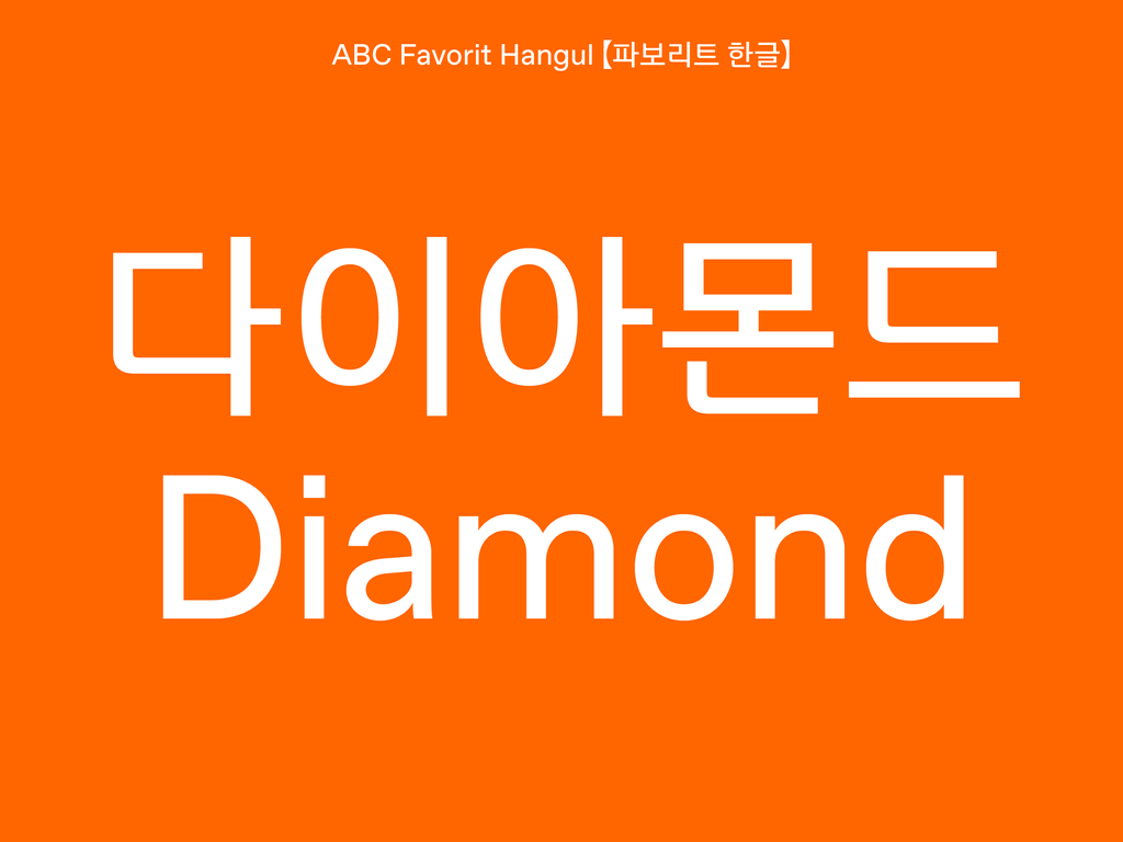
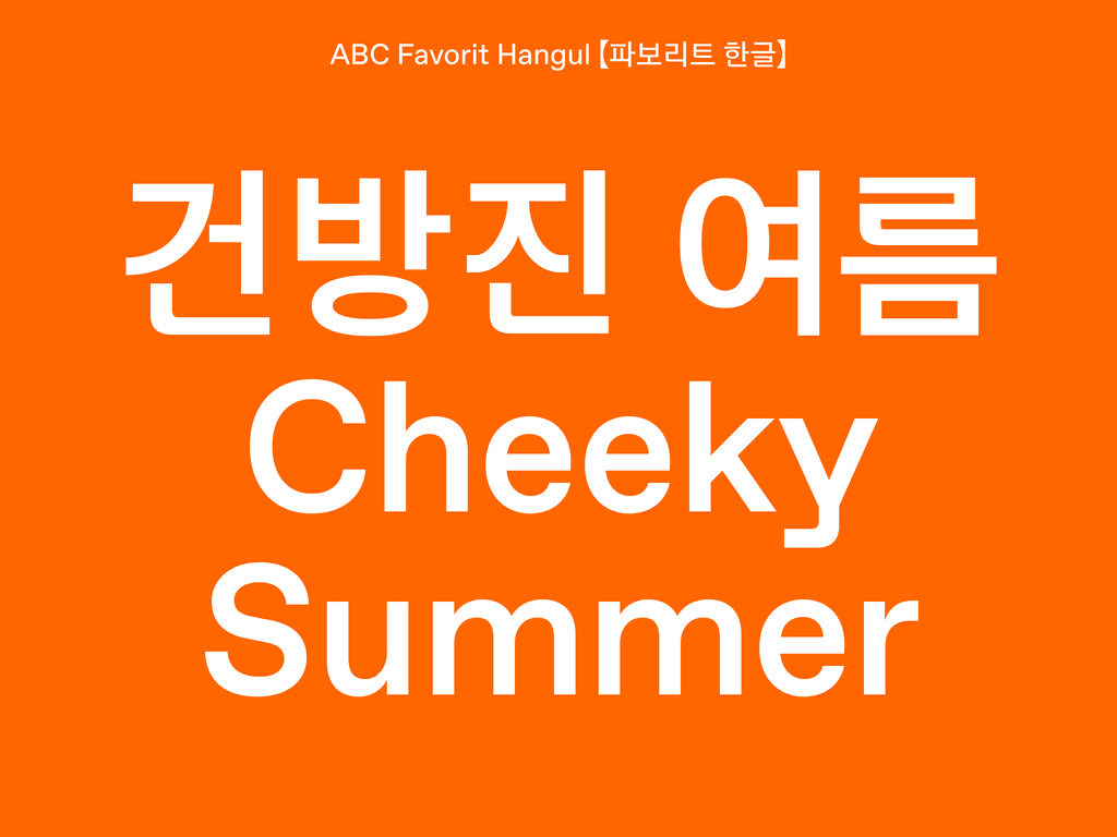
With Greek and Cyrillic versions out in the world, we honestly thought it was time to take a break from ABC Favorit… But a certain memory of the Hangul alphabet catching our gaze during a research trip to Seoul in 2016 kept replaying in our minds. We’d already met with the South Korean type designer Mingoo Yoon, who had suggested ways to translate Favorit’s special DNA—its low contrast, tubular shapes, geometric construction, and subtle quirks—into a Hangul script. How could we resist? From 2018 onwards, we began the deeply collaborative process of transforming ABC Favorit into a script for sentences and letterforms very distinct from the Latin constructions we’d be taught—a rewarding learning experience for sure.
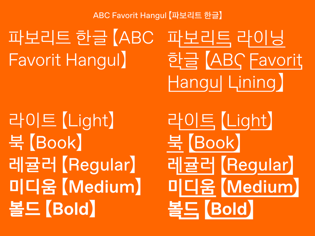
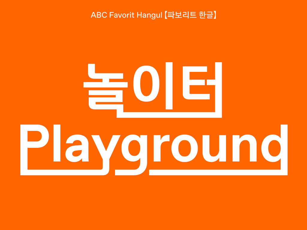
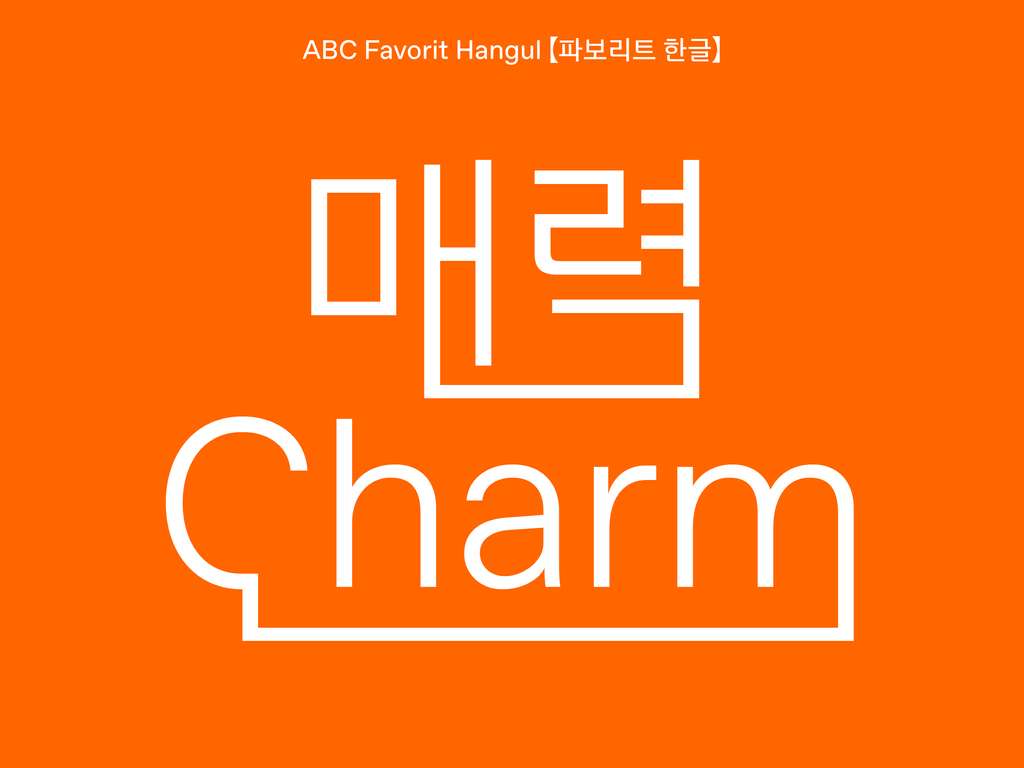
It felt integral to create a Lining version of ABC Favorit Hangul—ABC Favorit Lining is, after all, a staple of the font. We originally developed ABC Favorit Lining as we were tired of using design software’s underline function, which is thin by default and sits awkwardly close to characters: Our Lining style has its own unique underline built straight into it. For our Latin ABC Favorit Lining, all descending characters merge—creating unconventional letter shapes and encouraging a distinctive way of reading.
Korean letters are written in syllabic blocks that fit within a square system, and modern Hangul consists of 4 consonants and 10 vowels, which combine to create 11,172 glyphs. To create a ABC Favorit Lining Hangul, character sets had to triple, because of all the additional “initial” and “final” letterforms that our Lining logic requires. We ultimately needed to rewire our OpenType code to accommodate everything. Last time we counted, we had over 36,000 glyphs…
Credits
Favorit and Favorit Lining: Dinamo (Johannes Breyer and Fabian Harb)
Hangul type design: Mingoo Yoon
Production: Mingoo Yoon, Daekwon Kim, and Jieun Kim
