Gaisyr: A Beautiful Typeface with Butterfly Serifs ⛲️
Gaisyr is, well, a beautiful typeface with Dinamo house-style Butterfly Serifs. It takes its point de départ from sketches by the early 18th Century royal typographer for King Louis XIV, Jacques Jaugeon, and reimagines them through the lens of a TikTok content neighborhood.

We’ve long thought of adding a new serif to our library as a less represented genre in our catalog. Gaisyr, with its wide proportions and pronounced detailing, felt like the natural fit. It’s suitable for longer texts but loud enough that it’s not just another Times.
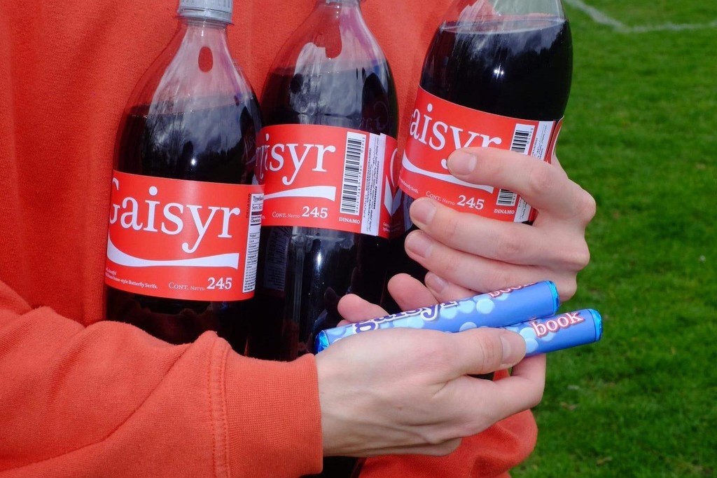
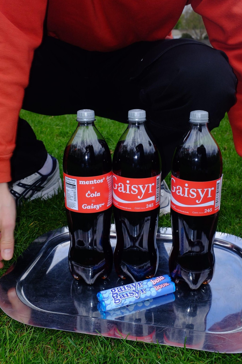
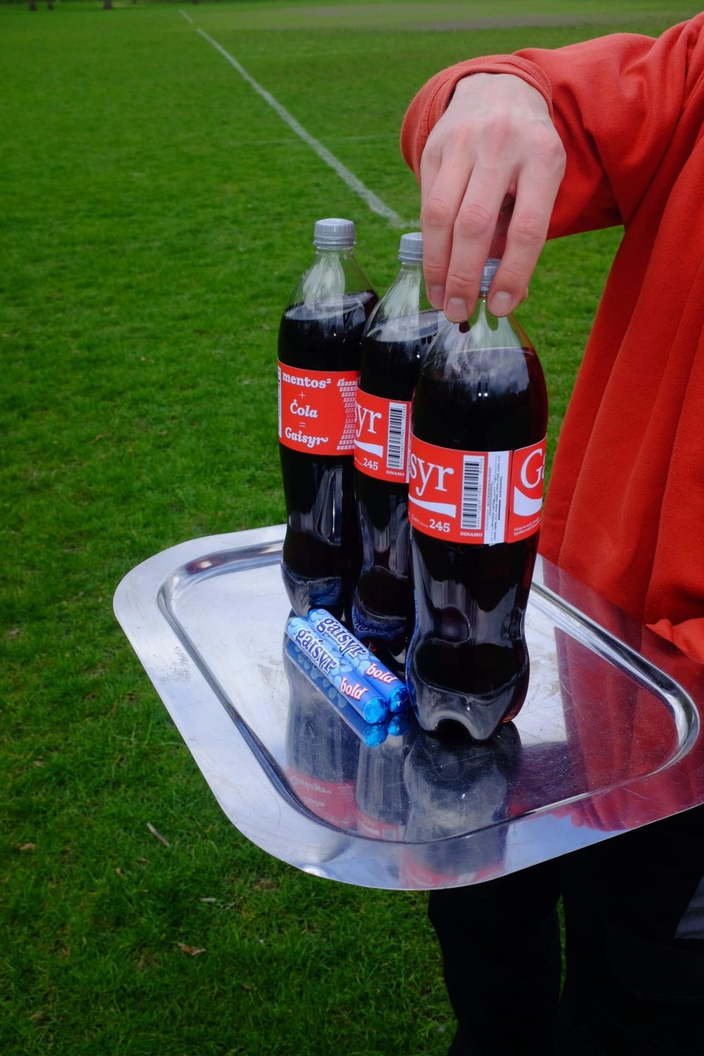
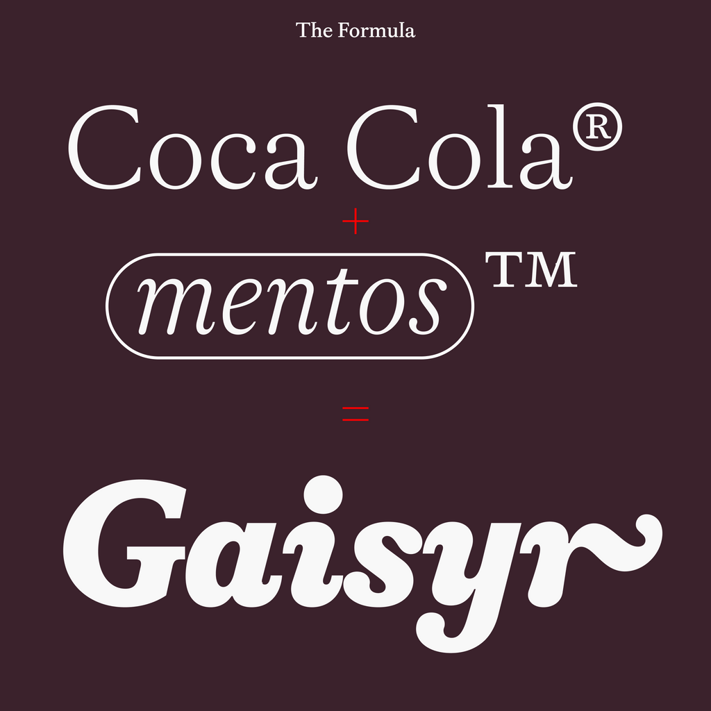
Close your eyes and imagine the King sitting in his garden, maybe a bit sunburned, surrounded by butterflies and low-hanging citrus fruit, sipping on a (glass bottle) of Coke®. You’ve successfully entered the world of Gaisyr.
Origins
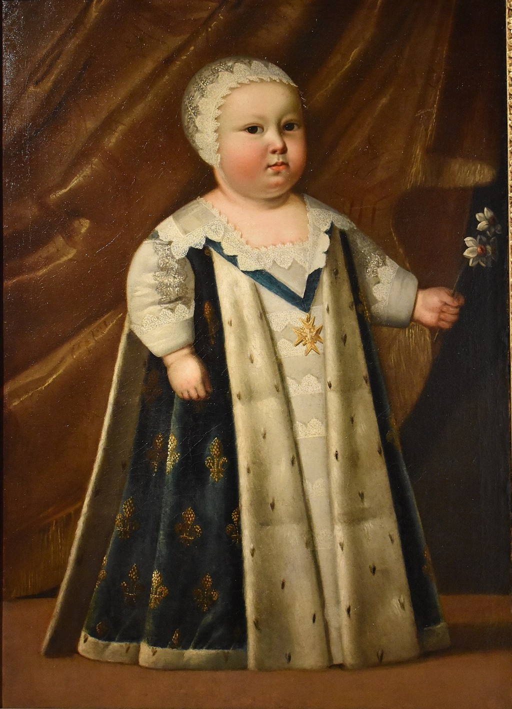
King Louis XIV, the Sun King himself, ever the baby
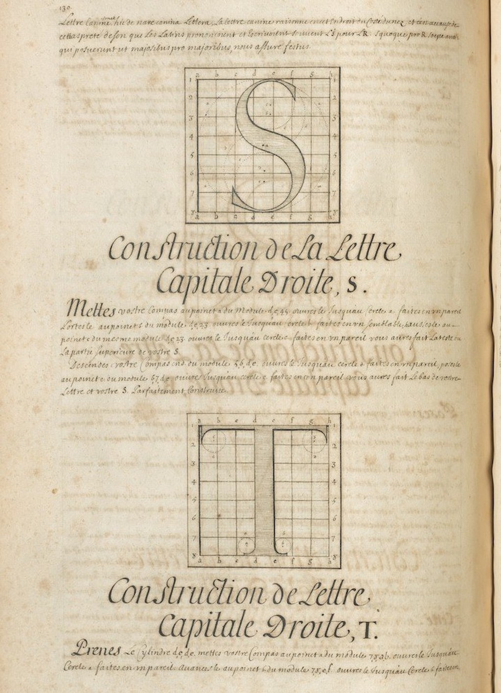
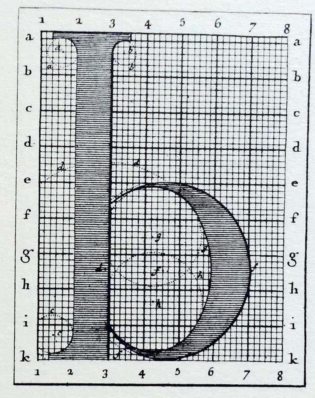
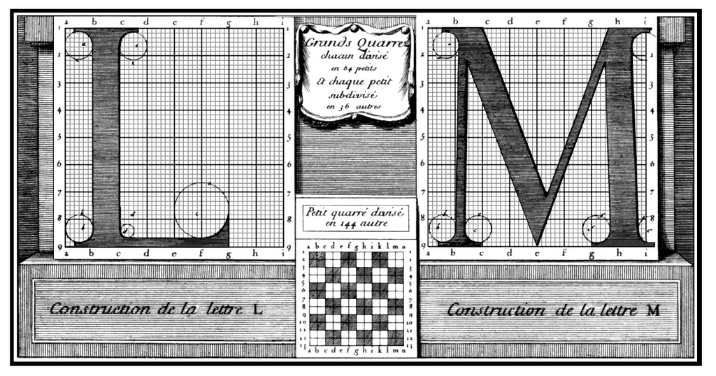
Gaisyr resides in the neighbourhood of Romain Du Roi, the typeface of King Louis XIV — or the King’s own 'lil custom font, one might say. The heavily rational design was drawn by four scientists (including Jaugeon) in 1692 and based on a grid of 2,304 tiny squares per letter.
My teacher once told me that Romain Du Roi was the first “transitional” typeface. A bridge from the Old Style designs modelled on handwritten letters to typefaces created specifically for the printing press.
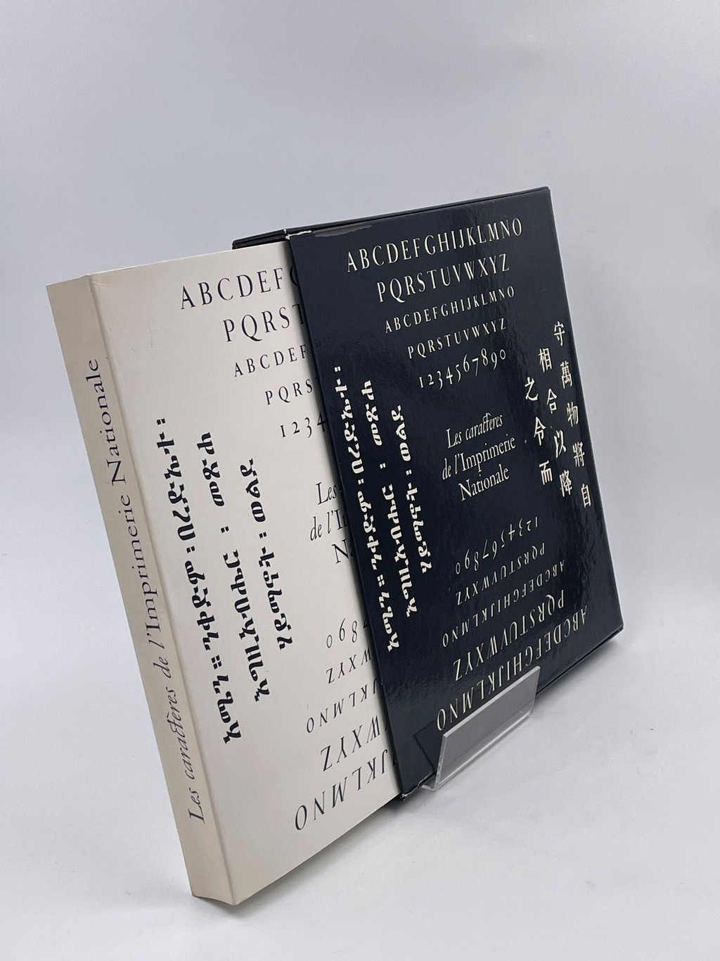
From “Caracteres De L'imprimerie Nationale”...
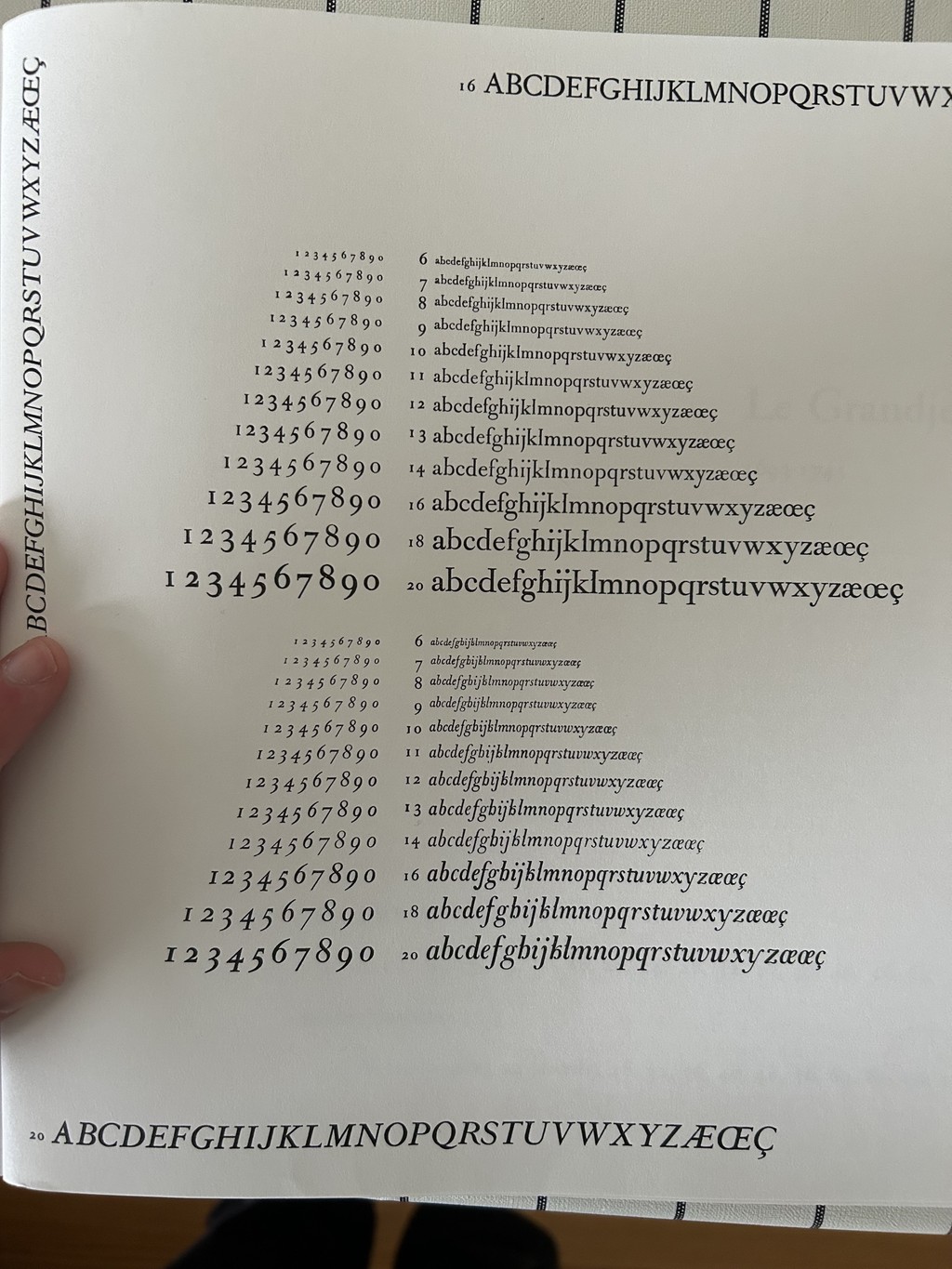
...A book of historical French typefaces used by France's national printing office
FontLab 5
While the artists behind Romain Du Roi created a strictly geometric face, the punch cutters who produced it were still in the mindset of freestyling. They translated the sketches onto metal by eye and with rudimentary measuring, becoming the ones truly deserving of a crown.
It’s this tension between strict geometry and a loopy, hand-held interpretation (think of the King after an evening inspecting his distillery) that informed the lines of our own Gaisyr.
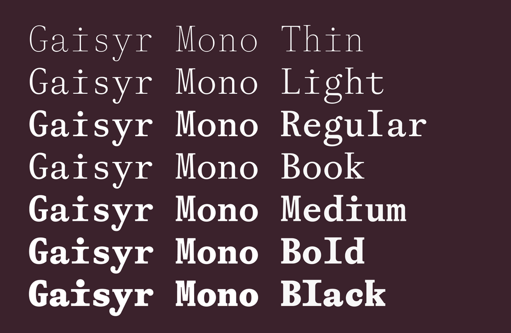
Features
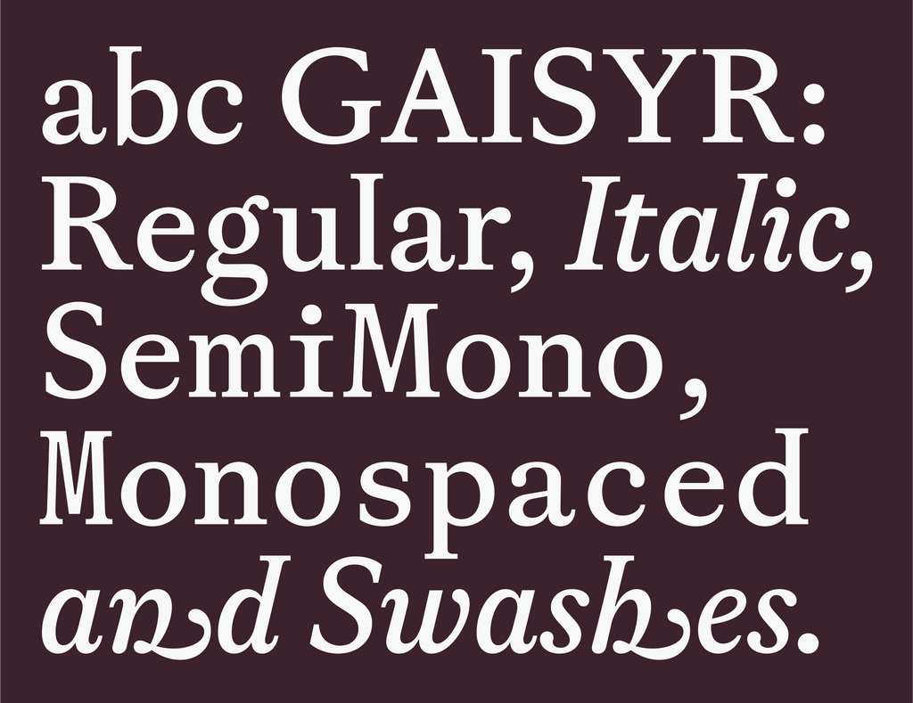
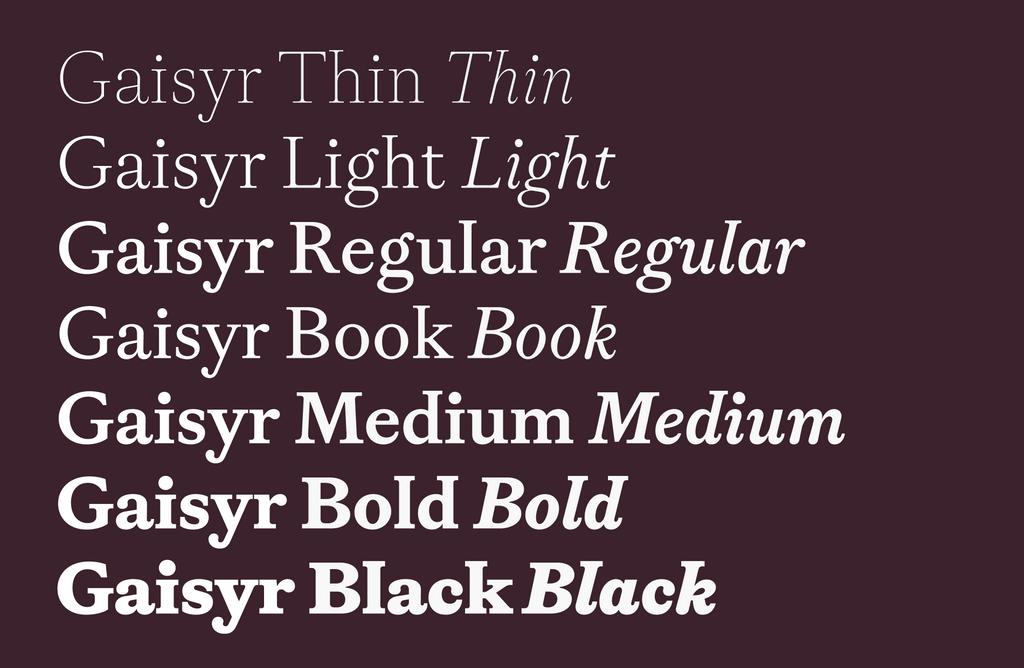
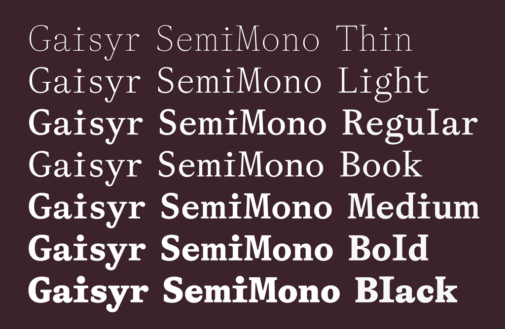
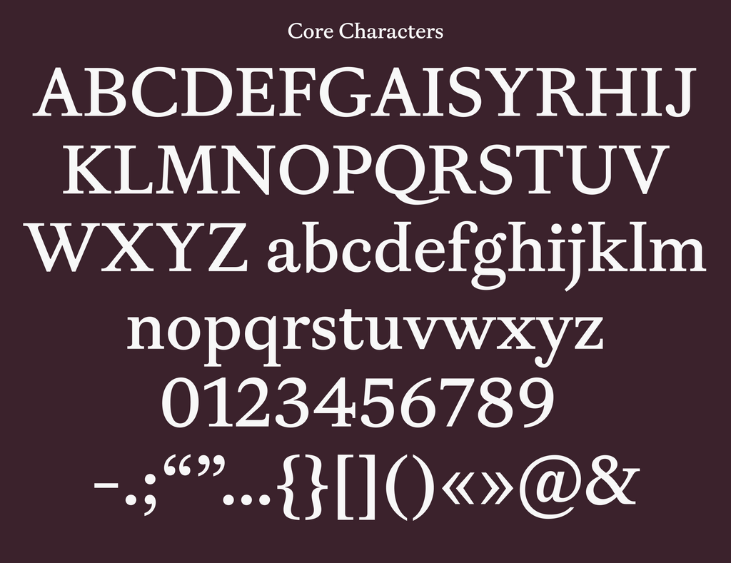
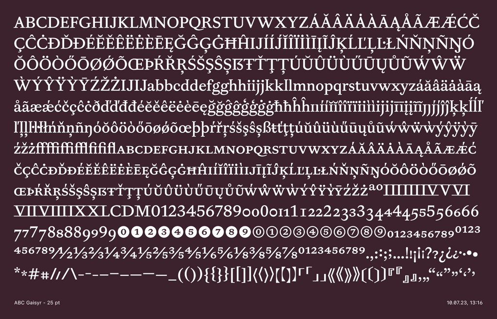
Gaisyr has a total of 42 styles. It’s available in Regular, Mono, and Semi-Mono cuts all with corresponding Italics. Pumps up from Thin to Black.
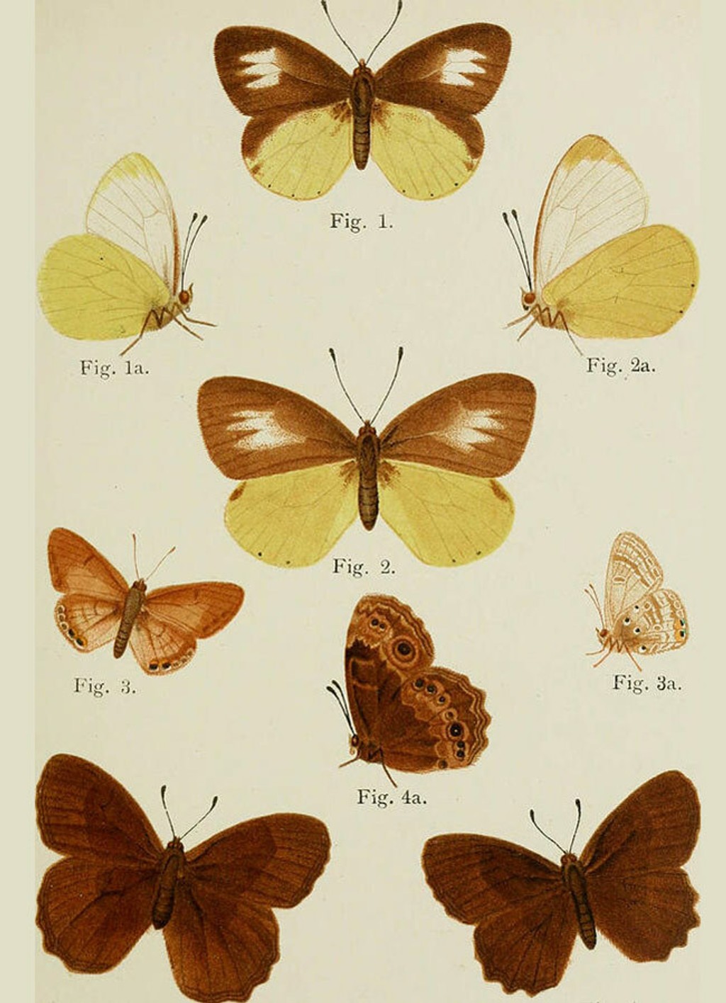
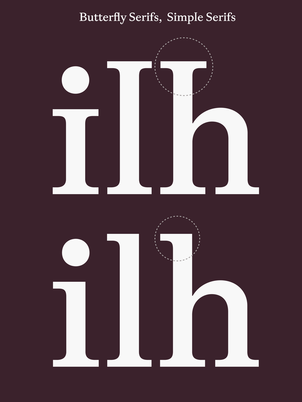
Butterfly Serifs 👸🏼
Gaisyr is ready-to-not-disturb-you while reading but also has a bunch of less toned down moments up its sleeve. Its Butterfly Serifs are one of its highlights, seen in typically overlooked characters like the lowercase i and l.
The serifs sprout out like a fountain, or, ehem, a geyser (but “gaisyr” is spelled prettier). We’ve started implementing the mirrored serifs in all Dinamo serifs. Fabian dubbed the style Butterfly.
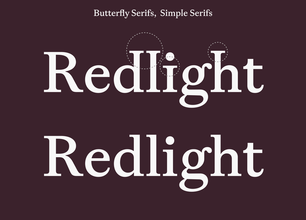
Alternatives for Gaisyr without the butterfly wings are available in stylistic sets. Using the Dinamo Font Customizer, you can also select wingless alts as your default.
Tired (but beautiful): Butterflies
Wired: Butterfly Serifs
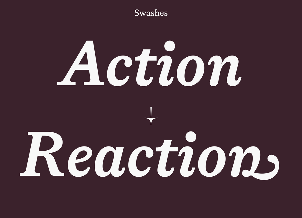
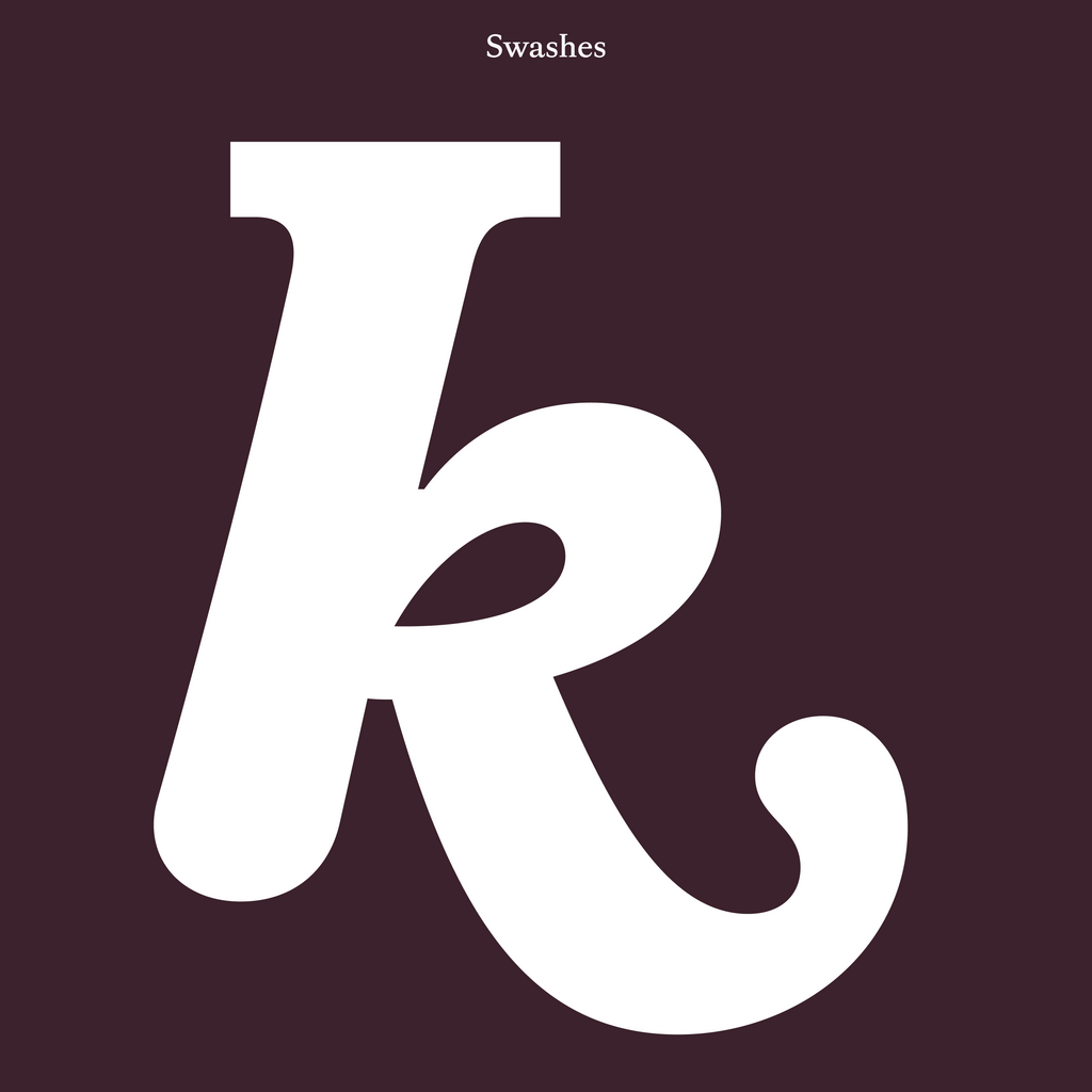
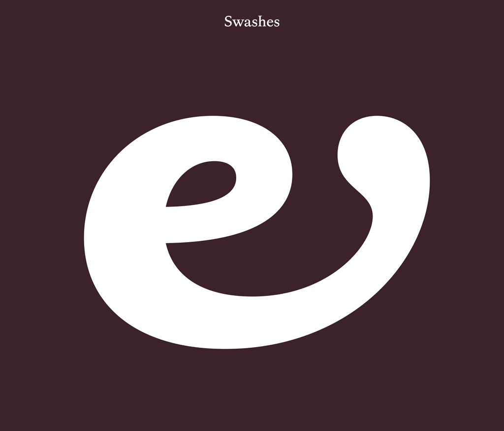
Swashes
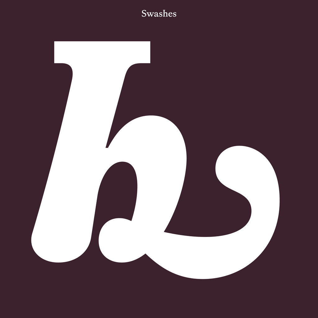
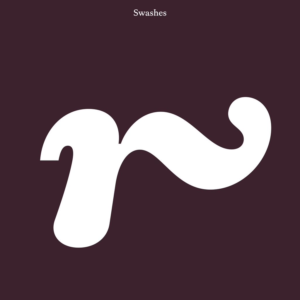
Royal swashes are available as alternates for when you need to make an entrance. Find them in the stylistic sets for e, h, k, m, n, r, and z.
Yoooo, coming in here like that
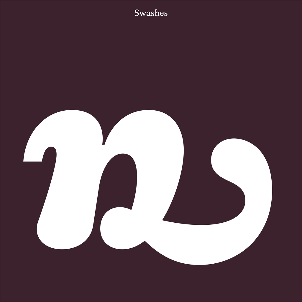
n and m are neighbors in the Latin alphabet and both deserve a swash ☝🏻
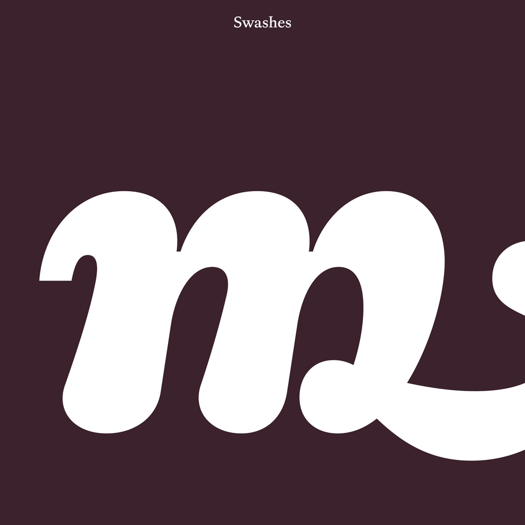
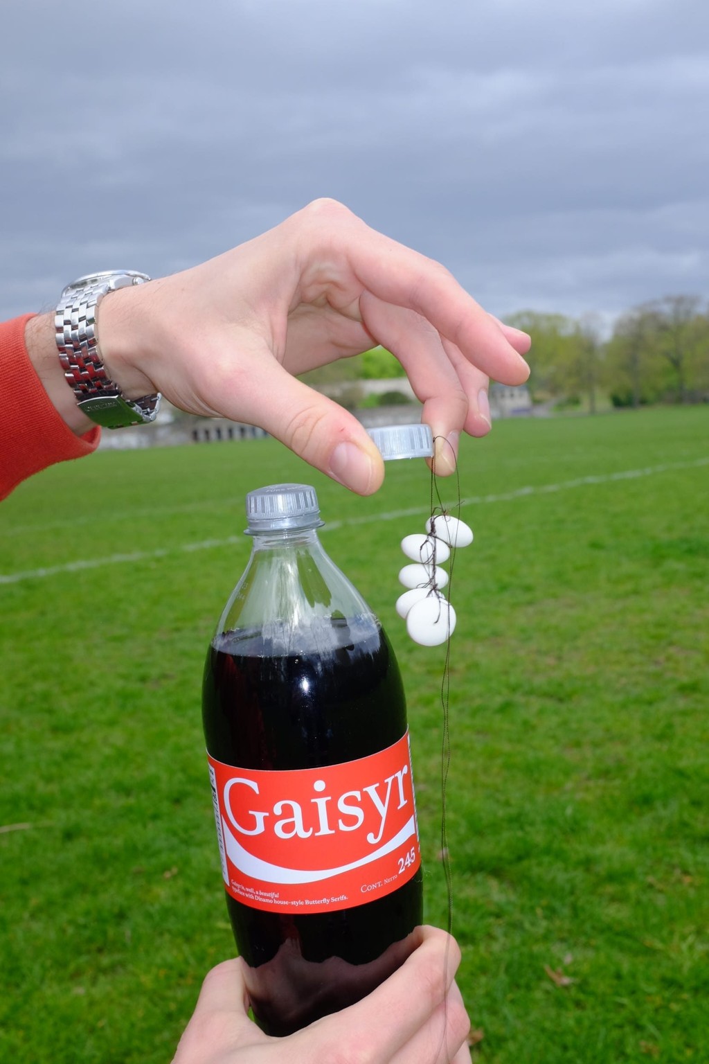
Swash so big it doesn’t even fit in this image!!
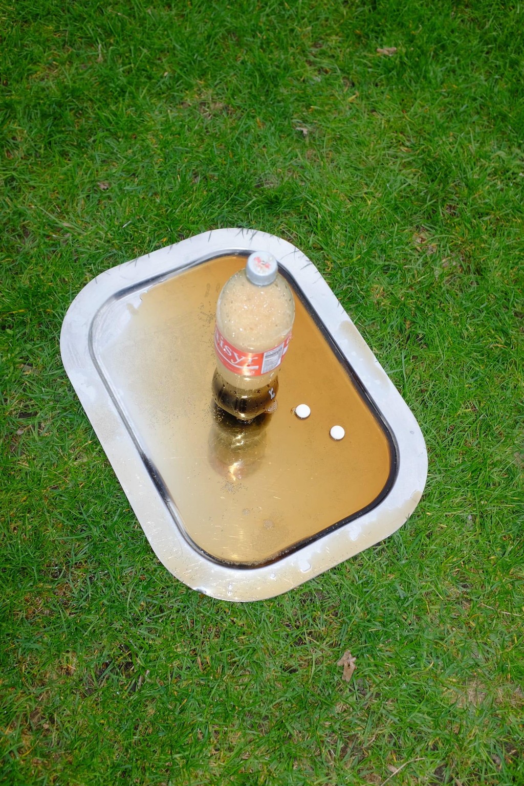
The whole spectacle seen from inside the bottle, from the perspective of one happy mentos ⚪️
COMMON AND RARE LIGATURES
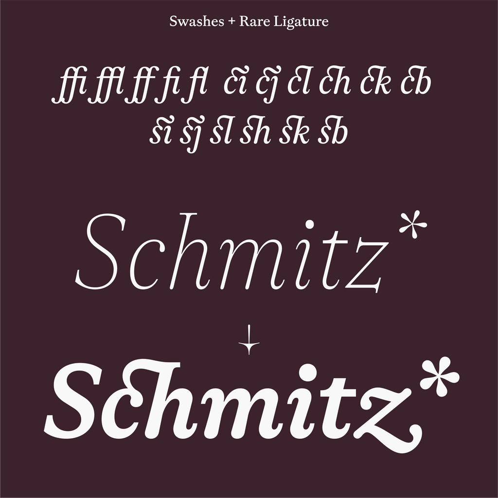
Herr Schmitz, angenehm 🤝 💼 (rare ligatures and Swashes combined)
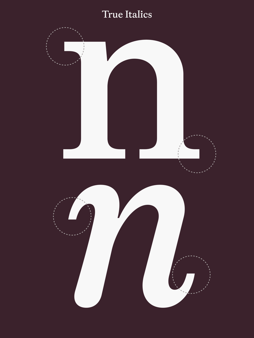
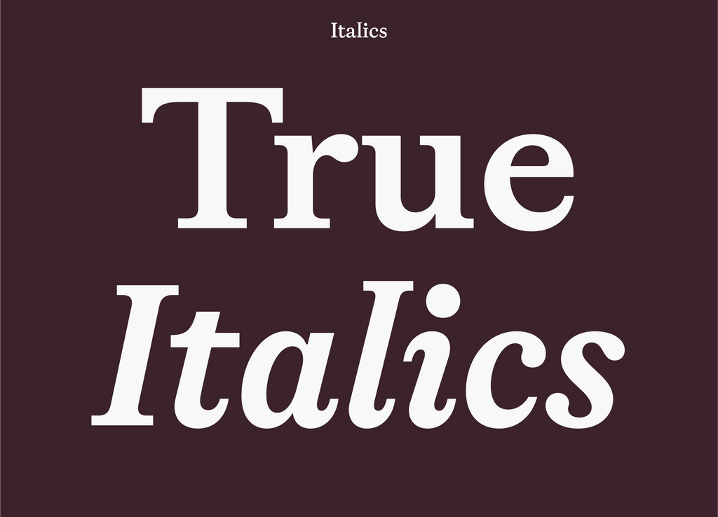
True Italics, Small Caps, and Oldstyle Figures
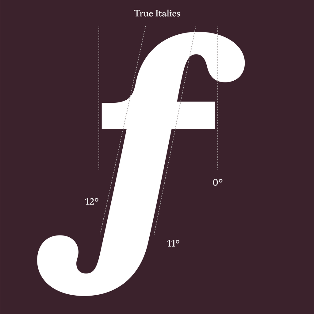
Italic angle festival. Italics skew rightwards while serifs stay upright 👆🏻
I promise.
The end. Thanks for coming to my party!
Team
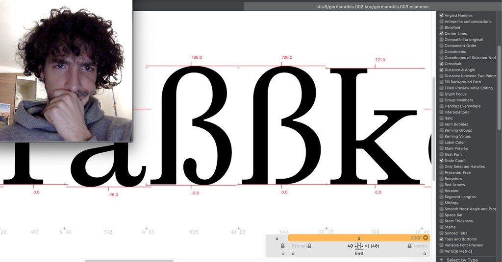
Together with our France-stemming intern Louis Brousseaud, Fabian spent some time stalking the archives of the Musee de L'Imprimerie Lyon and the Imprimerie National in Paris, sourcing documents and beginning to draw Gaisyr’s first digital shape.
In the year that followed, both Risto Kujanpää and Fabiola Mejía occasionally sketched on top of the interpretation, before Michelangelo Nigra grabbed the spatula and unearthed Gaisyr once and for all from our drawers. Over numerous years, he extended the typeface into the full family retail spectacle that it is today. Thank you Mike. Johannes, Maddy, Sascia, Mathias, and Tina then worked on the communication and campaign.
Thoughtful Mike 👑
Font in Use
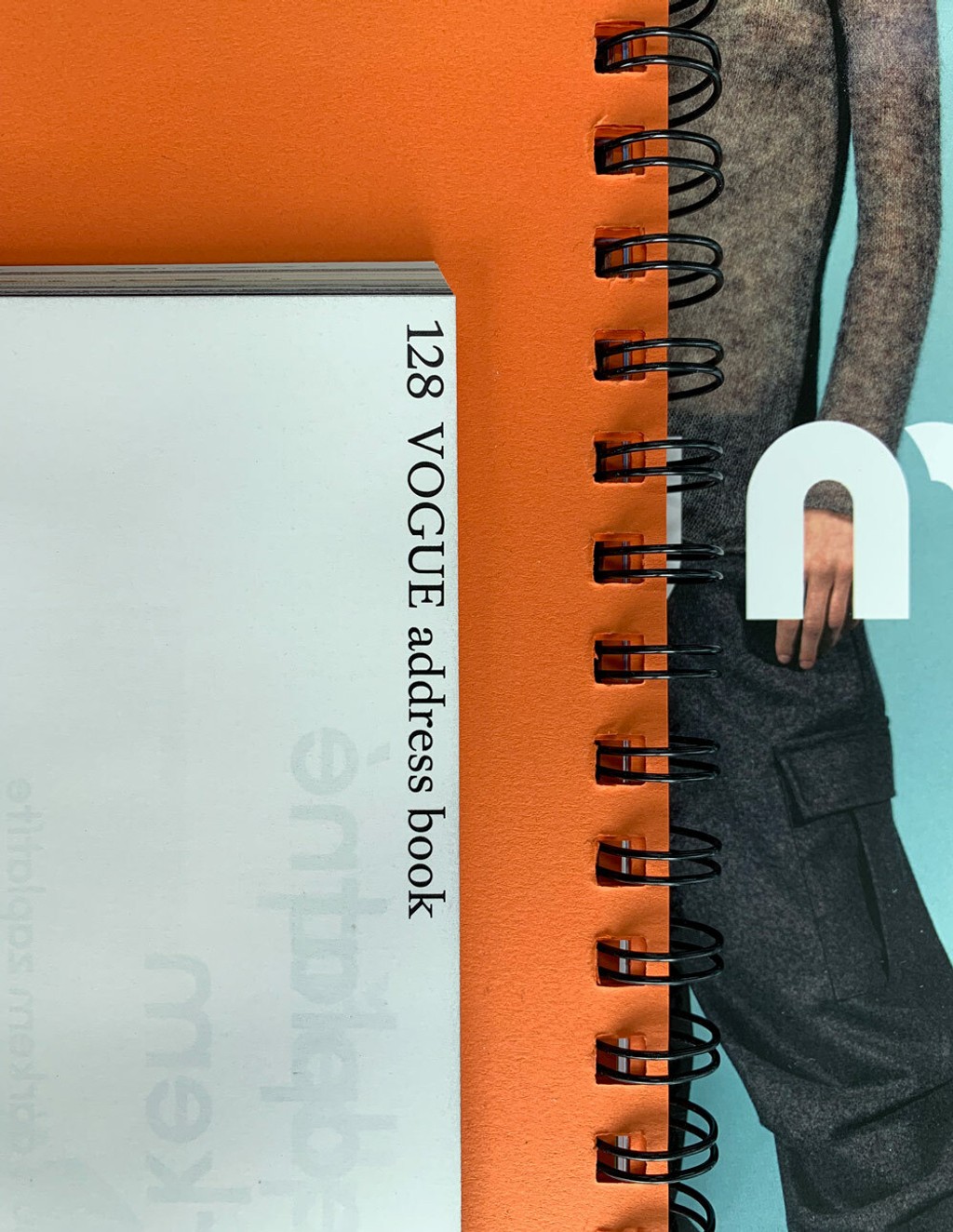
Gaisyr has appeared on the cover and pages of *Vogue Czechoslovakia*, courtesy of Jakub Straka.
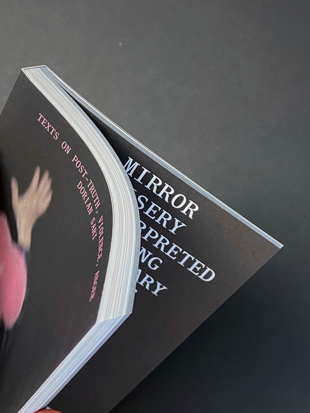
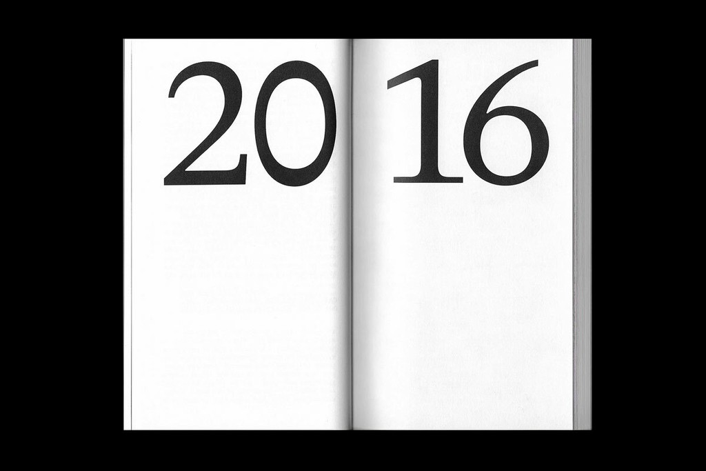
On the occasion of the exhibition *Dorian Sari. Post-Truth* at Kunstmuseum Basel, Philippe Karrer recently set the show’s accompanying publication in both Regular and Mono.
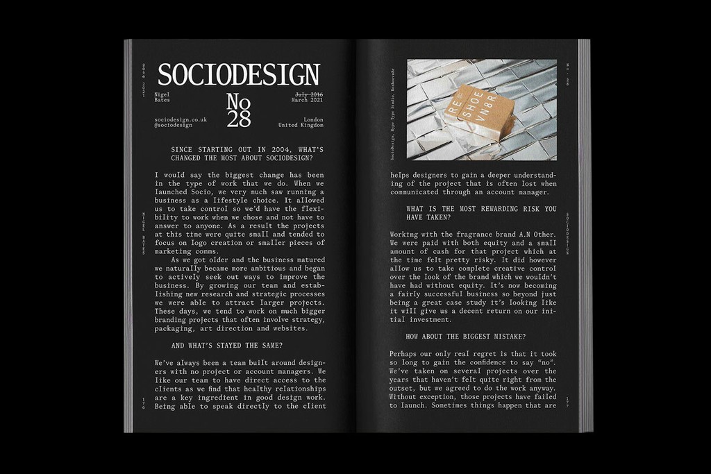
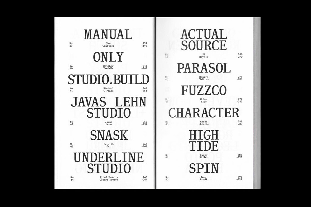
Harry Bennett used Gaisyr across a publication released by *The Brand Identity* blog. Interviews by Studio Ground Floor.