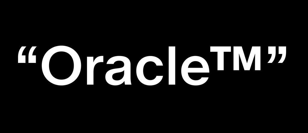
Oracle: Battling an Ancient System of Triples 🧝♀️🔮🪄
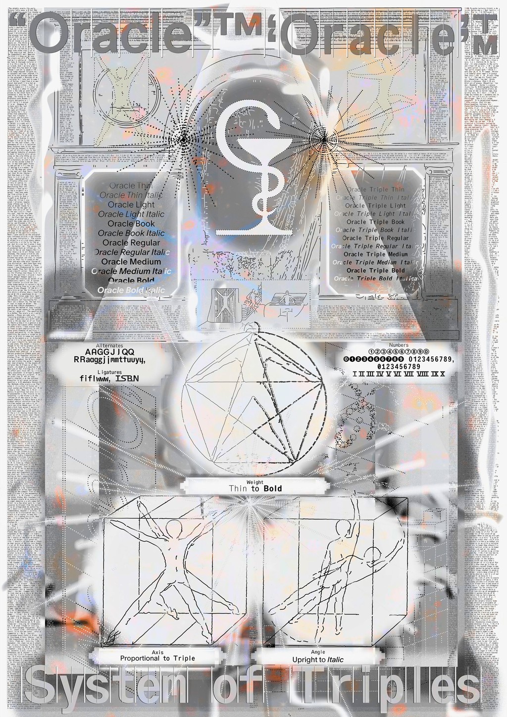
Oracle is one of the first, and perhaps the last, typefaces designed by our co-founder Johannes Breyer, and we’re super excited to finally share it with you. The typeface consists of two families that began in the same place but wandered off in entirely different directions...
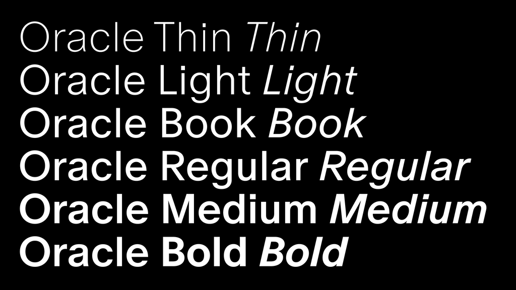
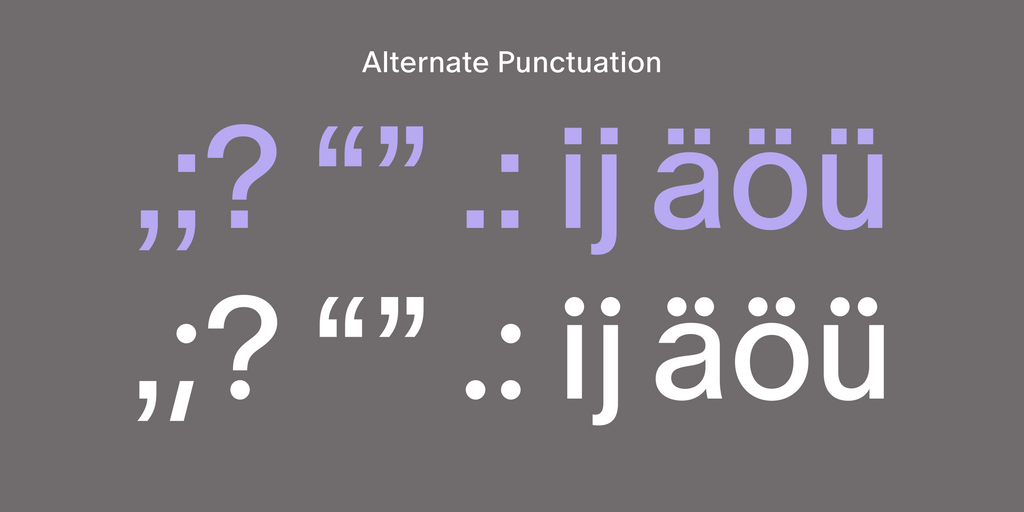
Oracle’s first family is an elegant san serif with friendly, smooth contours and subtle contrast, available in six weights plus italics. It’s a highly customizable font with a range of alternates and stylistic sets that let you dress it up in a variety of ways.
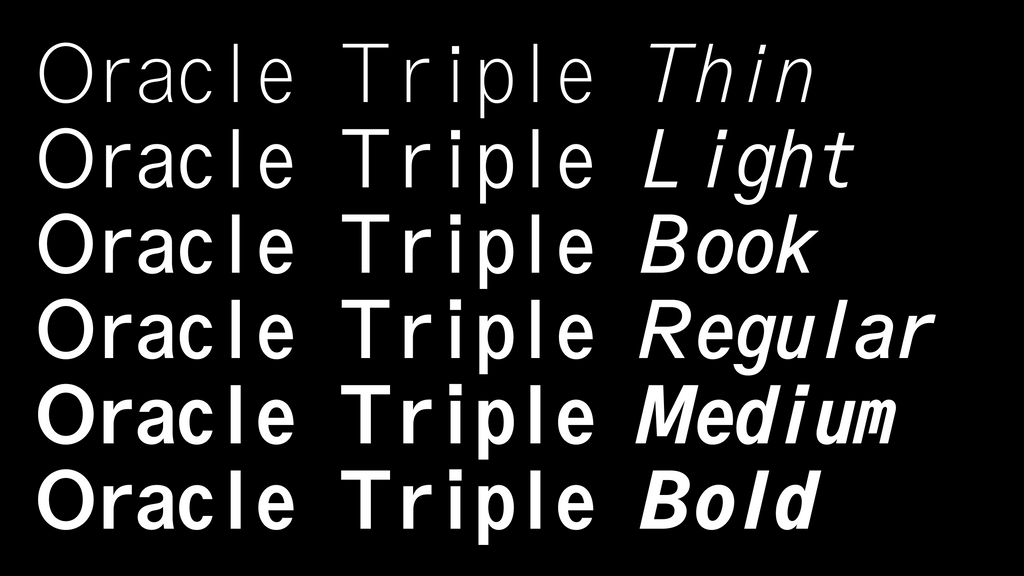
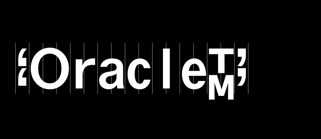
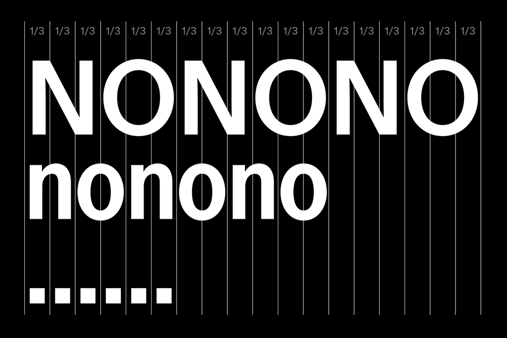
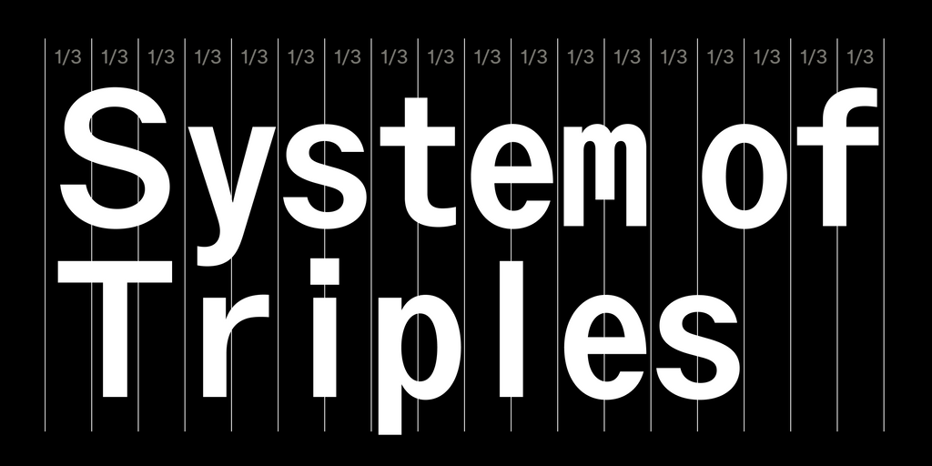
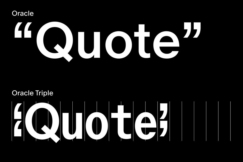
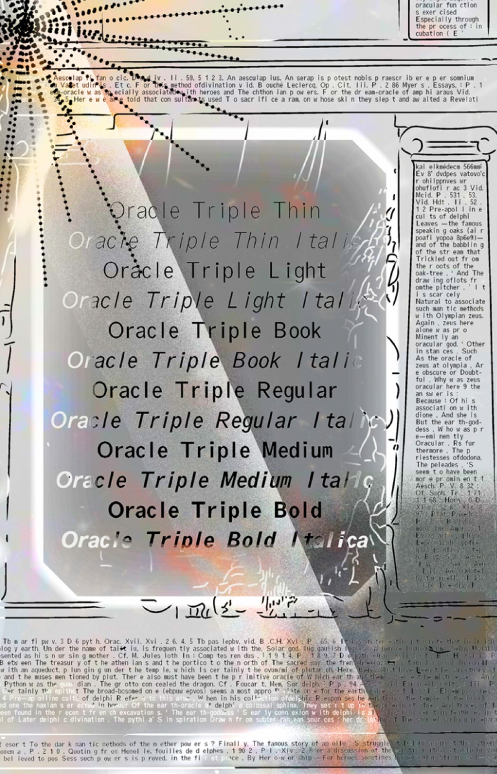
Oracle Triple, on the other hand, is an exploration of a strict rhythm with silly results. Taking the logic of monospaced letterforms to an extreme, its bounding box has been segmented into units of thirds—with different characters taking up differing numbers of units.
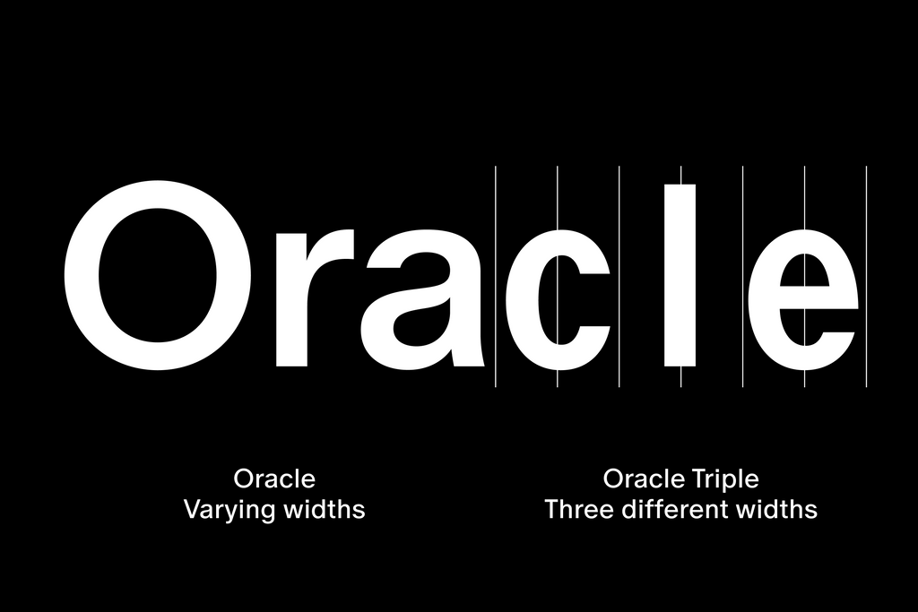
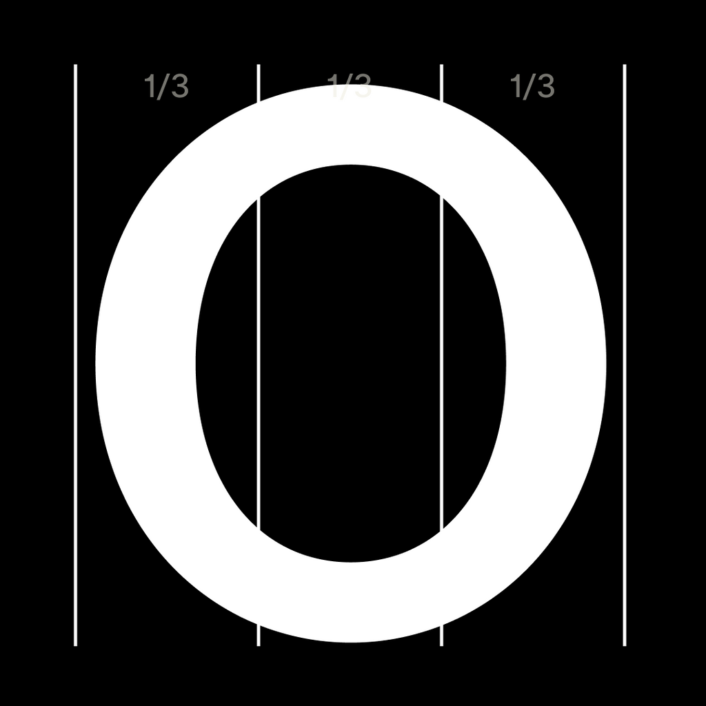
Uppercase take up
3/3
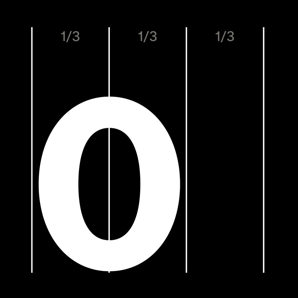
Lowercase take up
2/3

Punctuation takes up
1/3
Battling with a self-imposed system of triples has allowed us to arrive at new and unexpected character solutions and an intriguing rhythm that we haven’t seen before in our catalog. The entire making process—i.e. sticking to a design decision and allowing it to take us in strange and playful directions—feels like a very Dinamo way of working to us.
Oracle: The Release
Vibe Check
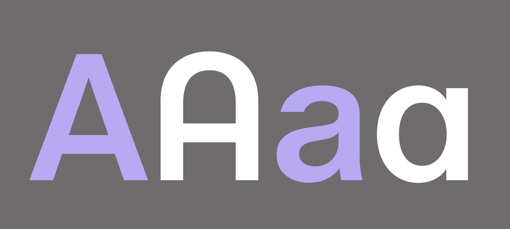
Let’s take a look at Oracle’s general atmosphere and key characters. It’s overall tone is generous and smooth, with its full O, G, C and curling y, t, f. Compared to Favorit, I’d say we’re looking at a friendlier and less constructed design.
Not winning the line breaking contest with this one, am I?

Aspirational

Haiku

Double exclam and interrobangCore character set
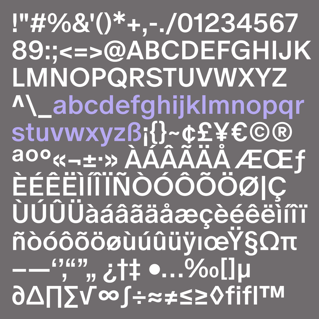
Not not having more than one A in this font!
Oracle Triple
In Oracle’s earliest days, Johannes began by playing around with monospace ideas, wondering what would happen if we segmented the design space into units of thirds. If mono (1), why not triple (3)? Could it be a nice problem to have (to quote Fabian), with surprising and rewarding results?
Oracle
Oracle Triple
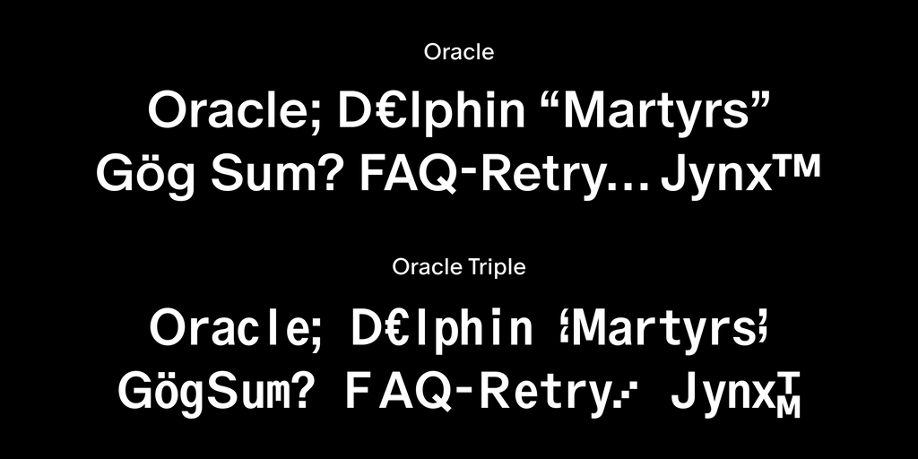
The two fams share DNA but are built from different bones
YES to 1/3 + 2/3 + 3/3
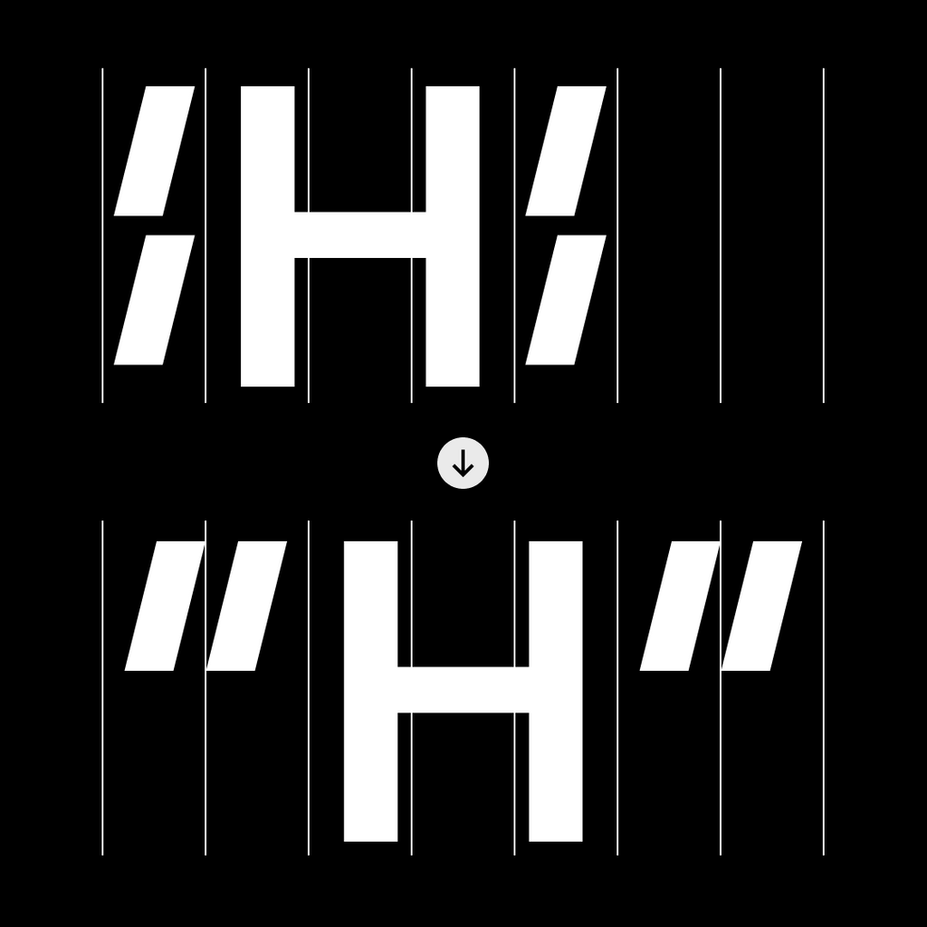
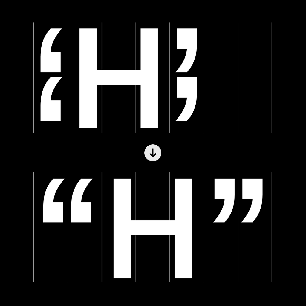
With our rule of thirds, certain characters of Oracle Triple have to be adjusted to fit the 2/3 space—for example, the lowercase m has a shortened middle stem so that it prints cleanly on paper. We believe that this unexpected, beautiful form can live on in its own right.

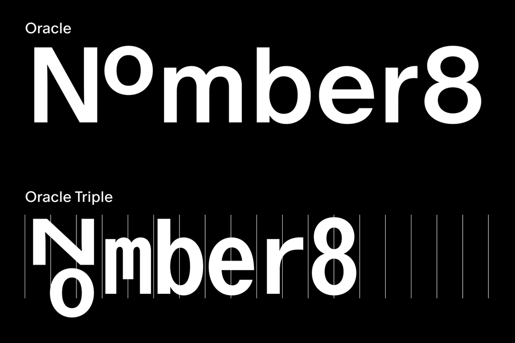
N jumping on top of the o...
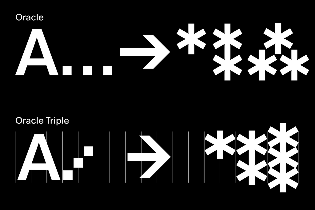
...and the ellipsis reaching new heights!
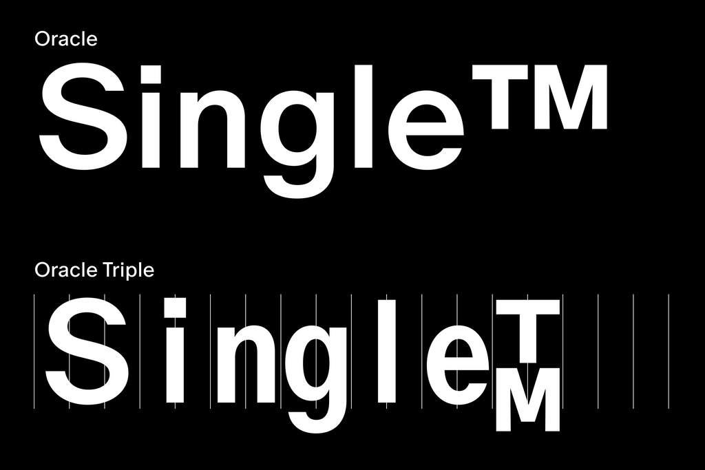
T and M had to climb on top of each other...
...and our double quotation marks had to rethink their sitch (situation)
Other characters, like the lowercase l and i, sit within a lot of space when placed into units of 2/3, which newly justifies—and celebrates—the gaps between letters. But no worries, we also added versions of those glyphs with gap-filling feet attached to the stems ;-).
Double quotes simple
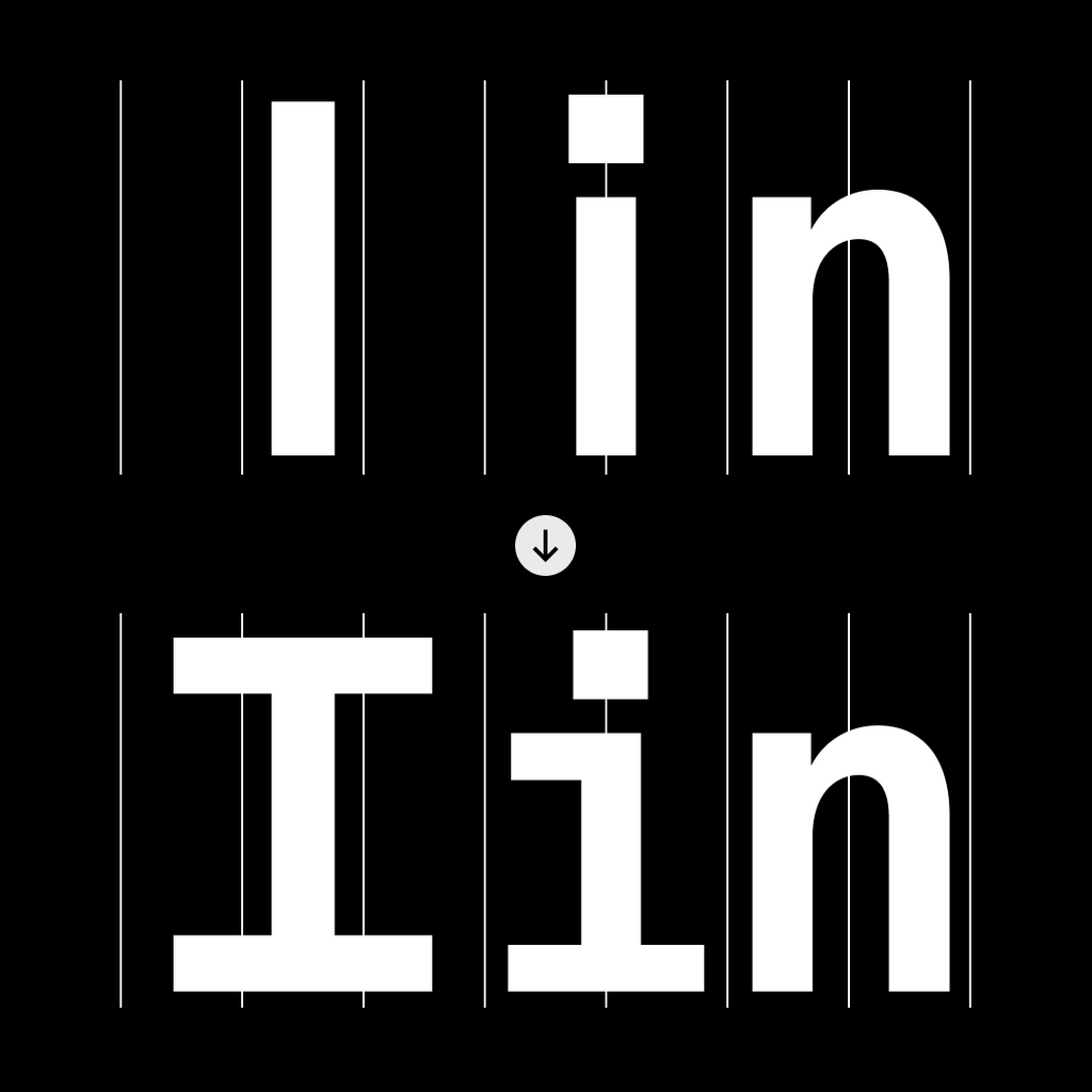
Gap filling feet
Double quotes curly
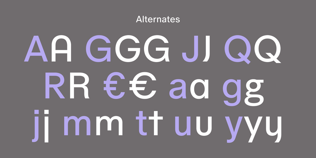
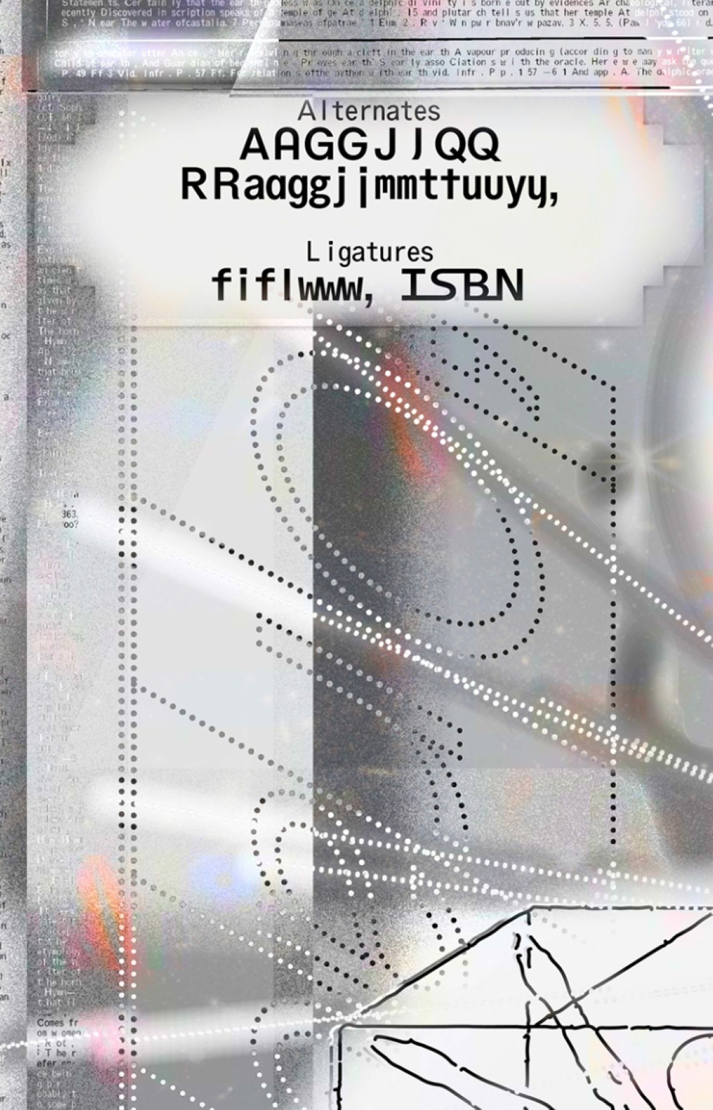
Alternates
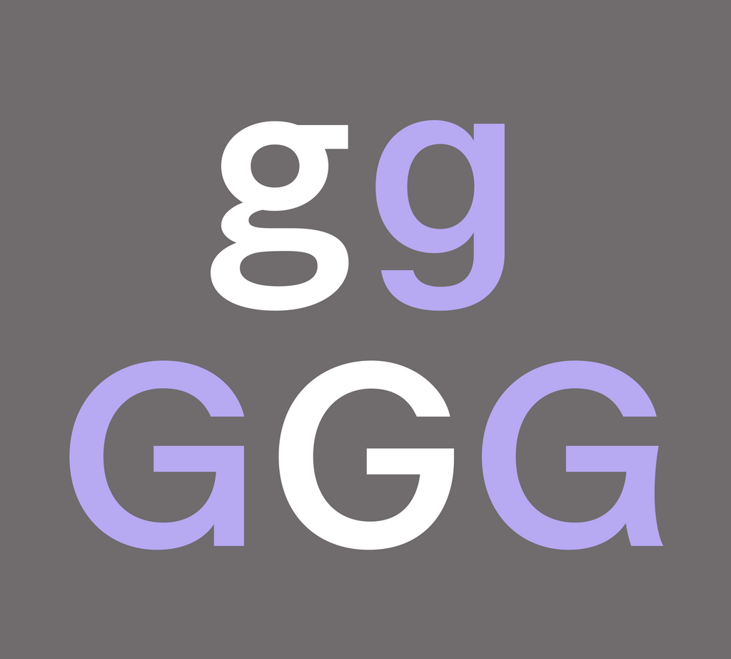
We’ve packed this typeface with a number of individual alternates, which you can swap around using our Dinamo Font Customizer.
Change right at your fingertips

Alt G

Alt R
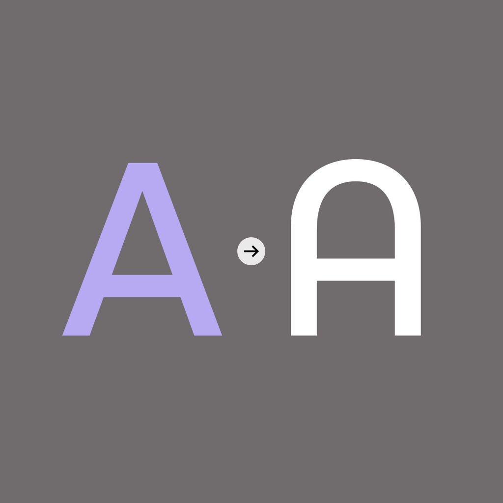
Alt A
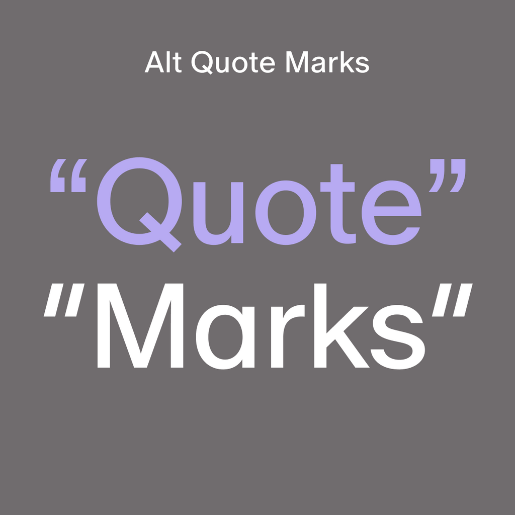
Curly or straight
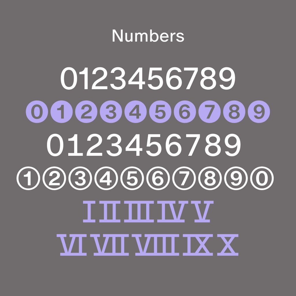
Various types of numbers
Choose between Helvetica-like squareness or round elegance
Alternates: Flavor Sets
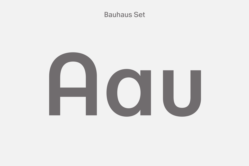
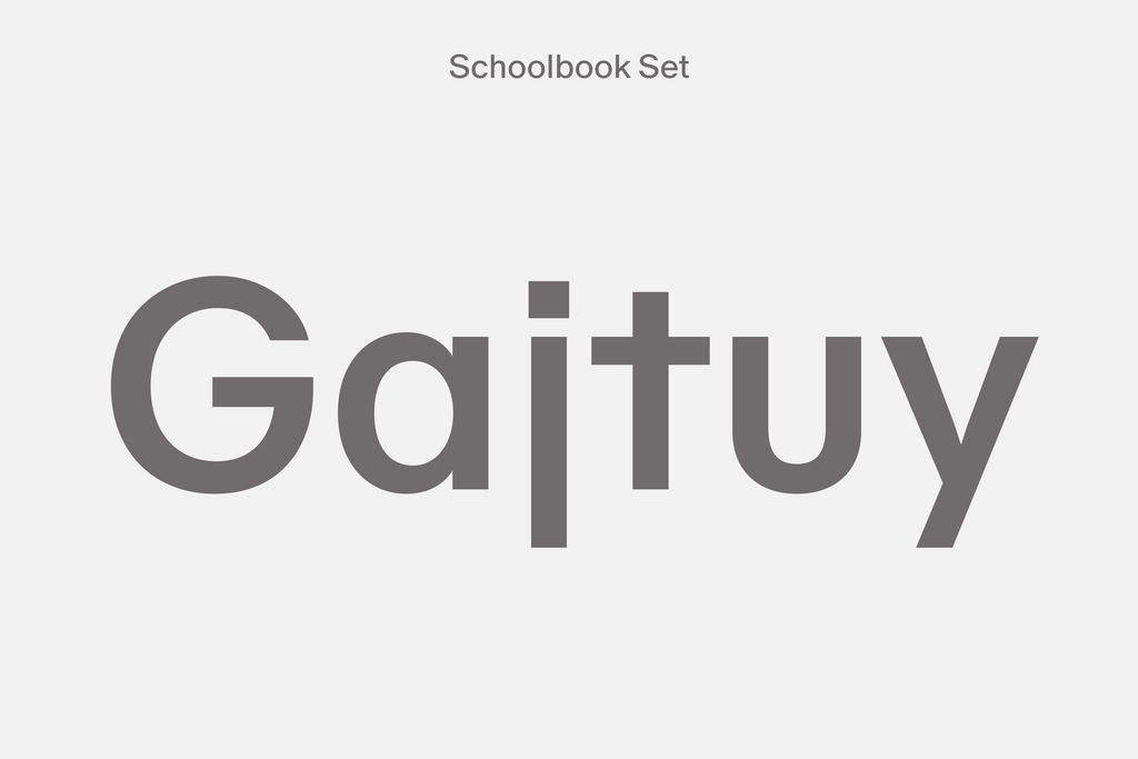
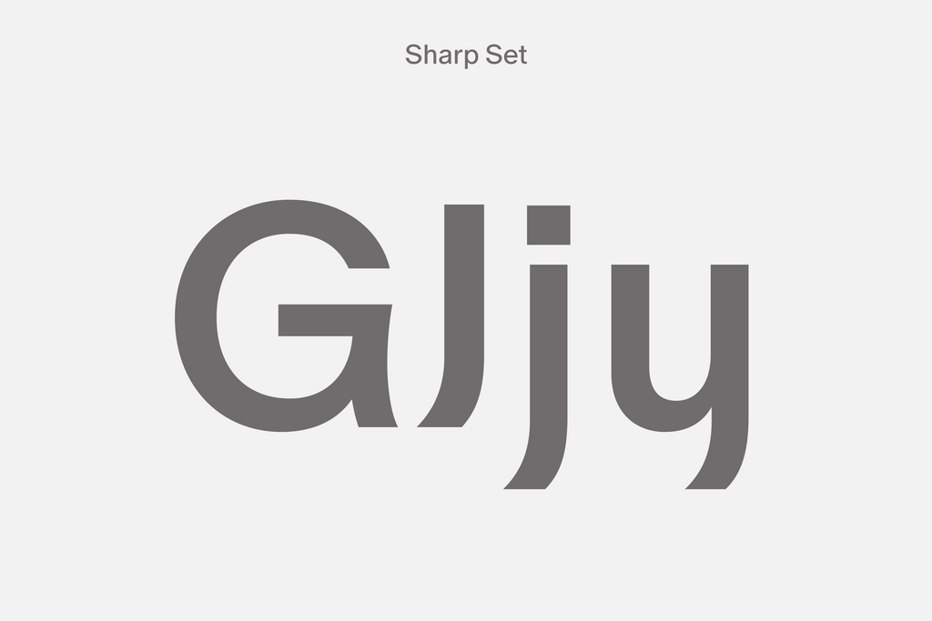
Oracle comes with three stylistic sets that you can switch on or off for three distinctive moods. A bit like the lighting in your smart home!
The Bauhaus set removes stems from characters like the single story a and u, mirroring the rounded, modern feel of something like the Braun logo. Our Vampyr set has sharp, distinctive tails and a witchy vibe with its elongated broom stems. Or there’s the Schoolbook set if you’re looking for something a little bit more classic and simplified.
Bauhaus
Schoolbook
Vampyr
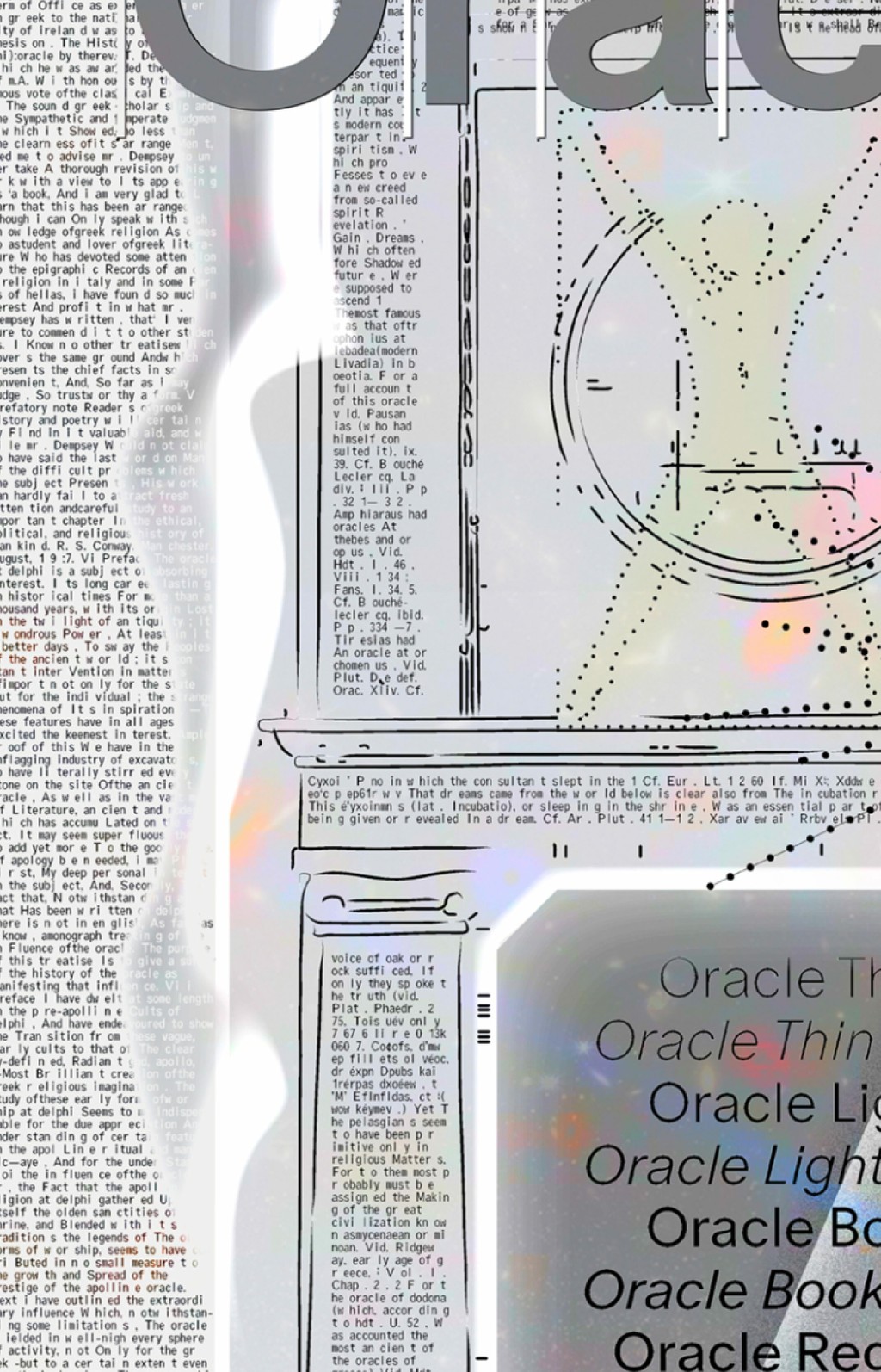
Origins
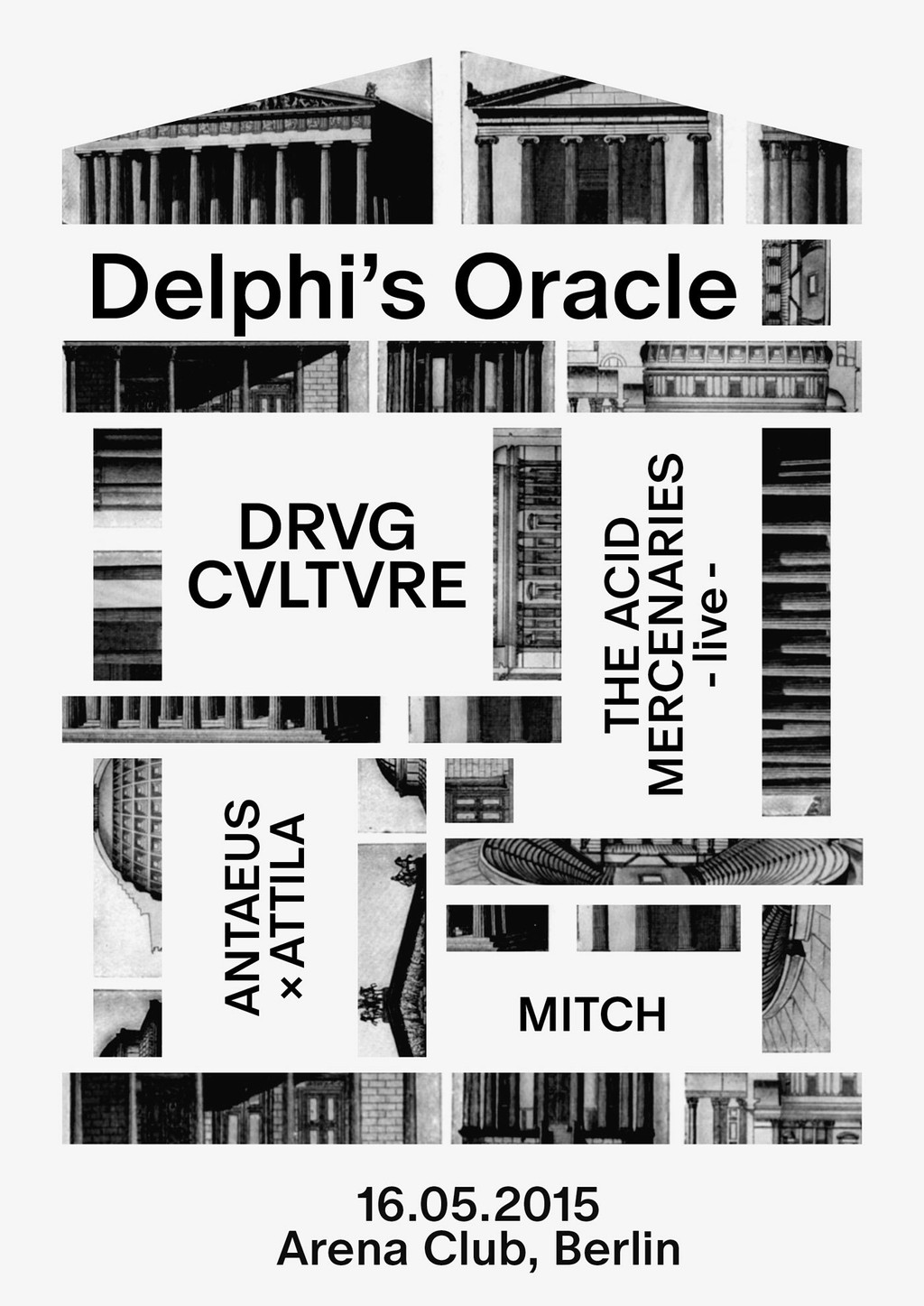
Back in 2015, Johannes was trying to come up for a name for a techno party he was helping to organize in Berlin. His parents had subjected him to Latin and Greek classes during high school, which he came to enjoy but only in secret, and now these lessons would finally prove themselves useful!
He remembered that in Ancient Greece, Pythia, the high priestess of Apollo, a.k.a. the Oracle of Delphi, would breathe in hallucinogenic vapors to inspire her predictions. So, tapping into the ideas of getting high, fumes, and entering a different state of mind, the team settled on calling the party “Delphi’s Oracle”
Johannes drew some first letterforms of Oracle to design the party’s poster—and both the name and the font originated from there.
In 2016, fully recovered from the party and still in love with the font, Johannes’s work continued—now with the help of the growing Dinamo team. From 2017 onwards, Andree Paat assisted in completing the two families and developed Oracle’s normal variation, with Chi-Long Trieu adding his hand along the way to draw the hairline weights. The Vietnamese type designer Thy Hà then drew characters to support the font in Vietnamese (with Rob aiding the process)—this language extension is a Dinamo first that we’re very excited about.
Oracle continued to slowly grow over the next years, patiently letting other fonts jump ahead of it in the pipeline queue. This being a foundry-made release, we felt we should give other artists the release space first, and so we’ve been holding this project back for a while.
Oracle in (Early) Use:
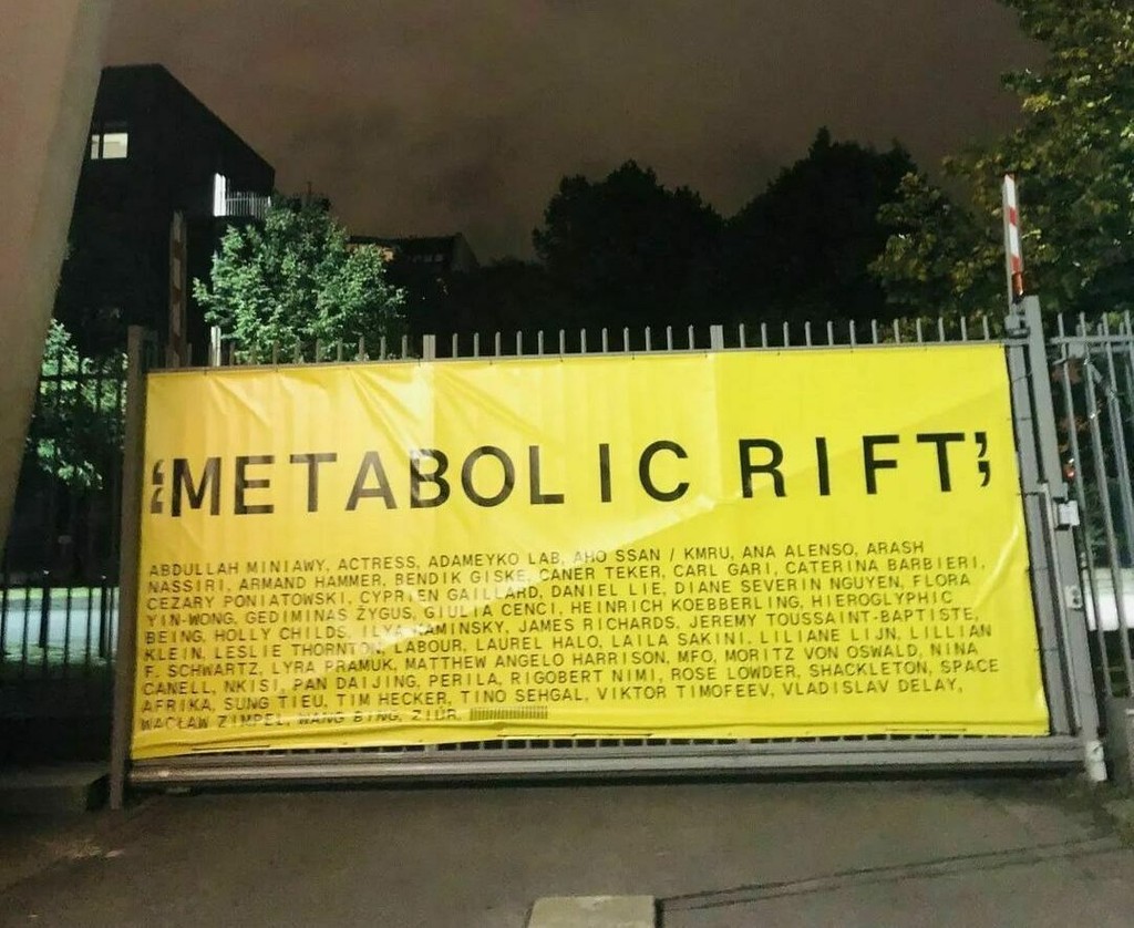
Berlin Atonal 2022 — the Metabolic Rift. Design by ZAK Group
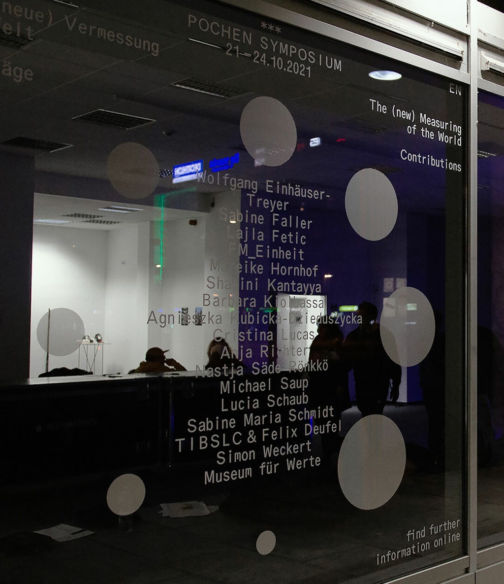
Pochen Biennale. Design by Hannes Drißner & Simon Merz
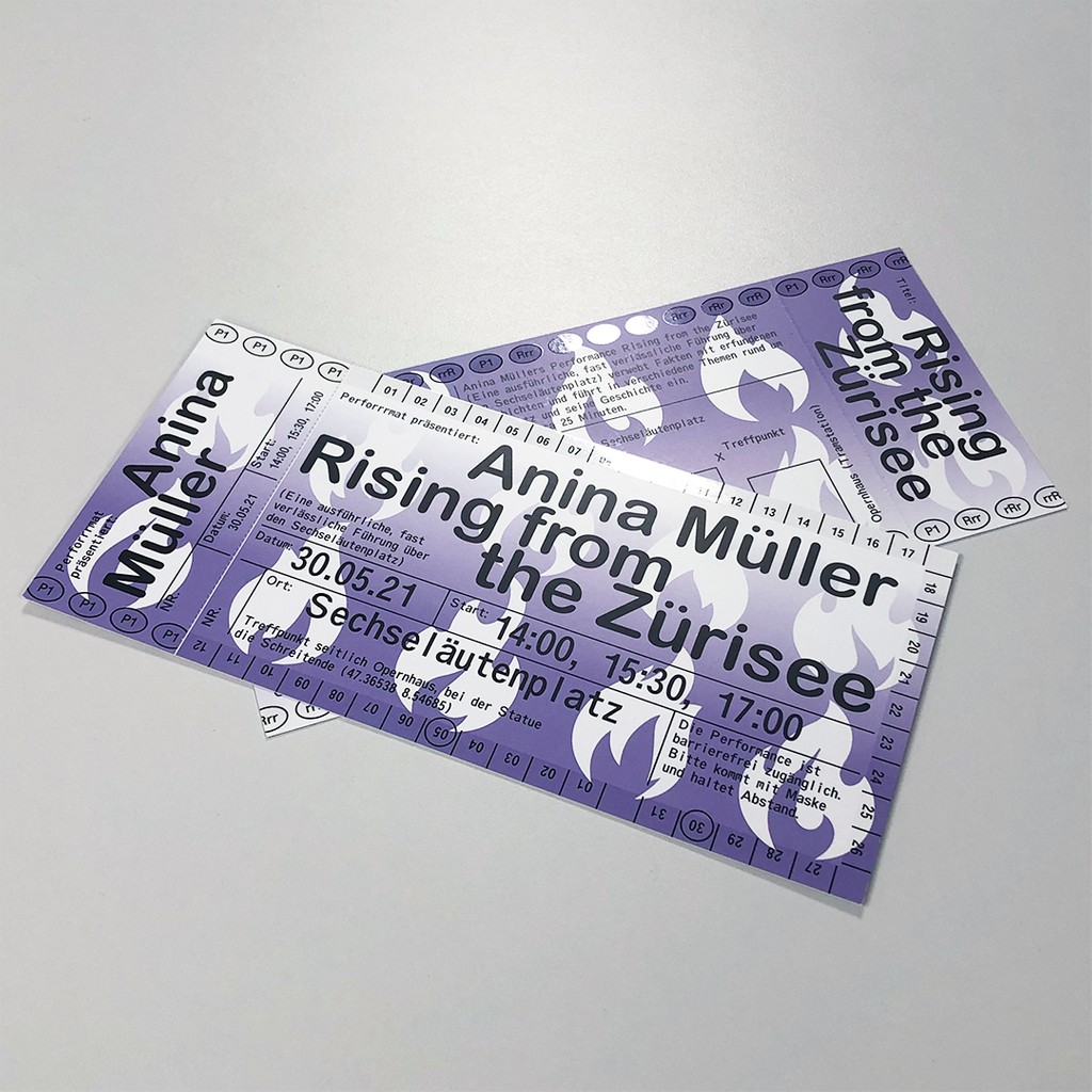
Perrrformat. Design by HOMI & Silvan Possa
Campaign
Seven years after laying Oracle’s first strokes onto the page, we feel ready to release the typeface into the wild, brought to life through a mesmerizing campaign designed by Sascia and Mathias. Let's take a look at a couple of the details!
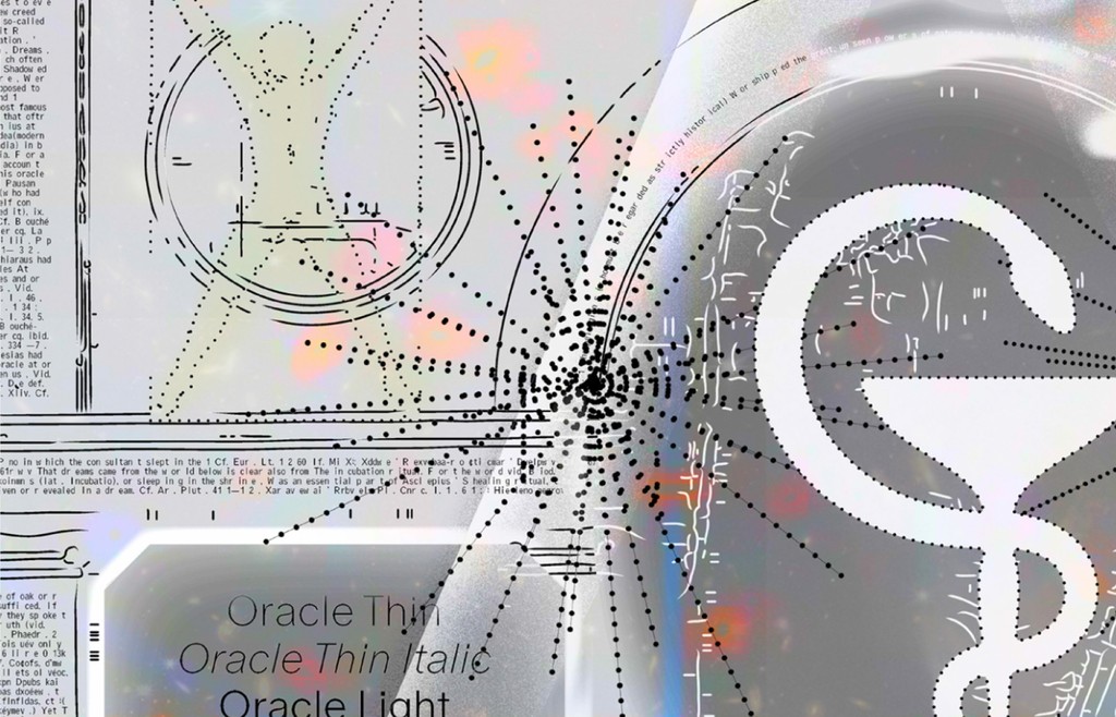
“Our Oracle mascot is an distillation of different movement studies; key here was the early 20th Century Labanotation method of visualizing dance movements” — Sascia
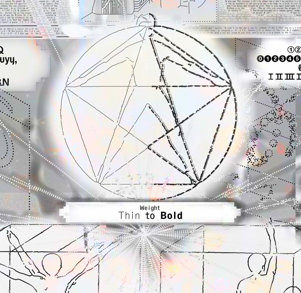
“The mascot moves in units of thirds from upright to italic…
...proportionate to triple, and thin to bold” — Mathias
“Die Kinesphäre ist der persönliche Umraum” — Rudolf von Laban 😌
Their patience with Johannes during the campaign design process will secure Sascia and Mathias a seat up on Mount Olympus (-: And thanks to Fabian who always believed in and supported Oracle 💜