Gramercy
- Thin & Italic
- Light & Italic
- Book & Italic
- Regular & Italic
- Medium & Italic
- Bold & Italic
- Black & Italic
- Super & Italic
Gramercy Fine
- Thin & Italic
- Light & Italic
- Book & Italic
- Regular & Italic
- Medium & Italic
- Bold & Italic
- Black & Italic
- Super & Italic
Gramercy Display
- Thin & Italic
- Light & Italic
- Book & Italic
- Regular & Italic
- Medium & Italic
- Bold & Italic
- Black & Italic
- Super & Italic
Gramercy Global
Gramercy
Gramercy
- Thin & Italic
- Light & Italic
- Book & Italic
- Regular & Italic
- Medium & Italic
- Bold & Italic
- Black & Italic
- Super & Italic
Gramercy Fine
Gramercy Fine
- Thin & Italic
- Light & Italic
- Book & Italic
- Regular & Italic
- Medium & Italic
- Bold & Italic
- Black & Italic
- Super & Italic
Gramercy Display
Gramercy Display
- Thin & Italic
- Light & Italic
- Book & Italic
- Regular & Italic
- Medium & Italic
- Bold & Italic
- Black & Italic
- Super & Italic
Gramercy Global
About Gramercy
About this typeface
Info
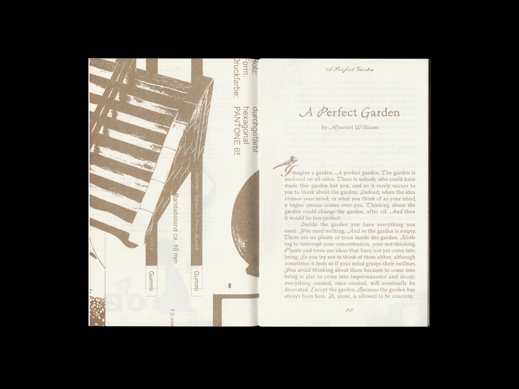
Gramercy is an elegant, contemporary serif that balances slightly painterly and whimsical forms with functionality and sturdiness. With 48 styles in total, its three subfamilies — Standard, Fine, and Display — each come with uppercase swashes. All in all, Gramercy is a font that invites extreme editorial flexibility. A true winner.
Designed by our longterm collaborator Robert Janes, a recurring theme is Gramercy’s overhanging, misproportioned details. Where another typeface might have ball terminals, Gramercy has flared strokes. That’s what makes it feel painterly. Hearts beat faster when Gramercy’s swashes appear, a series of uppercase flourishes that cover all weights and subfamilies.
The font was initially heavily informed by F.H. Ernst Schneidler’s Amalthea (1956), a typeface that served as the Italic companion to his eponymous Schneidler-Mediäval (1938). Gramercy, Gramercy Fine, and Gramercy Display all cover eight weights with corresponding Italics. The variable font files allow you to elegantly sashay from high to low contrast. Using its second variable axis, you can wax and wane from Thin to Super.
Credits
Design: Robert Janes
Spacing and Kerning: Igino Marini
Production: Dinamo (Hugo Jourdan)
Gramercy Global
Supported Languages
Afrikaans, Albanian, Basque, Bemba, Bosnian, Breton, Catalan, Croatian, Czech, Danish, Dutch, English, Esperanto, Estonian, Faroese, Filipino, Finnish, French, Frisian, Friulian, Gaelic, Galician, German, Greenlandic, Hungarian, Icelandic, Indonesian, Irish, Italian, Kinyarwanda, Latin, Latvian, Lithuanian, Luxembourgish, Malay, Maltese, Montenegrin, Māori, Norwegian, Occitan, Polish, Portuguese, Romanian, Romansh, Inari Sami, Lule Sami, Northern Sami, Southern Sami, Serbian (Latin), Slovak, Slovenian, Spanish, Swahili, Swedish, Turkish, Welsh and more

