ABC Schengen. An xxlarge, unwieldy, vibes-based, collection of fonts.
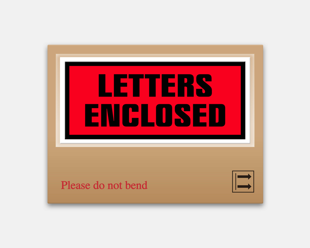
🚨 Beep Beep! Special Delivery 🚨
Seb, who’s already published Ginto, Marist, and ROM on the Dinamo label, returns with not just one typeface, but an entire collection. Please welcome ABC Schengen.
What began as a mixed revival of some of Seb’s favourite typefaces has evolved into an investigation-stroke-celebration of the Eurozone’s visual language, through its logistics, manufacturing, and construction industries. Over the course of 6 years, together with the steady and very talented hands of Luke Charsley, Schengen has developed into a large, extra-large, really-quite-big project spanning weights, widths and genres.
So, as fitting for a project of this scale, this newsletter is hefty. Comfy? Let’s begin.
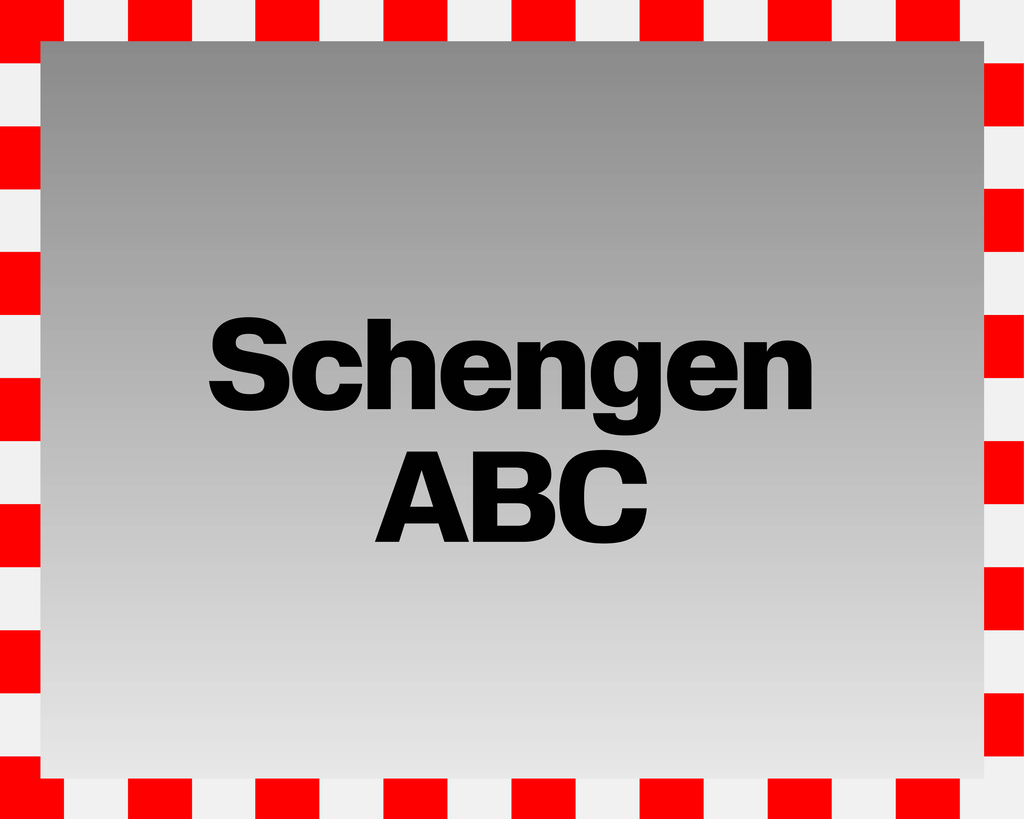
ABC Schengen & Schengen ABC
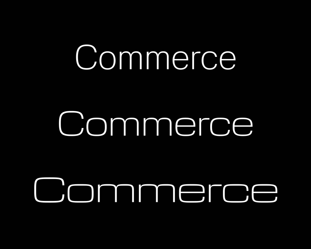
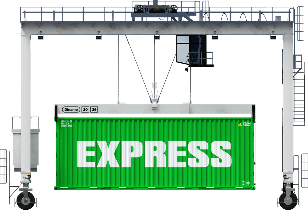
At the heart of Schengen is a love for two of Europe’s most influential and genre-defining typefaces. Helvetica: the (type)face that launched a thousand shipping containers, and Eurostile: font but make it TV.
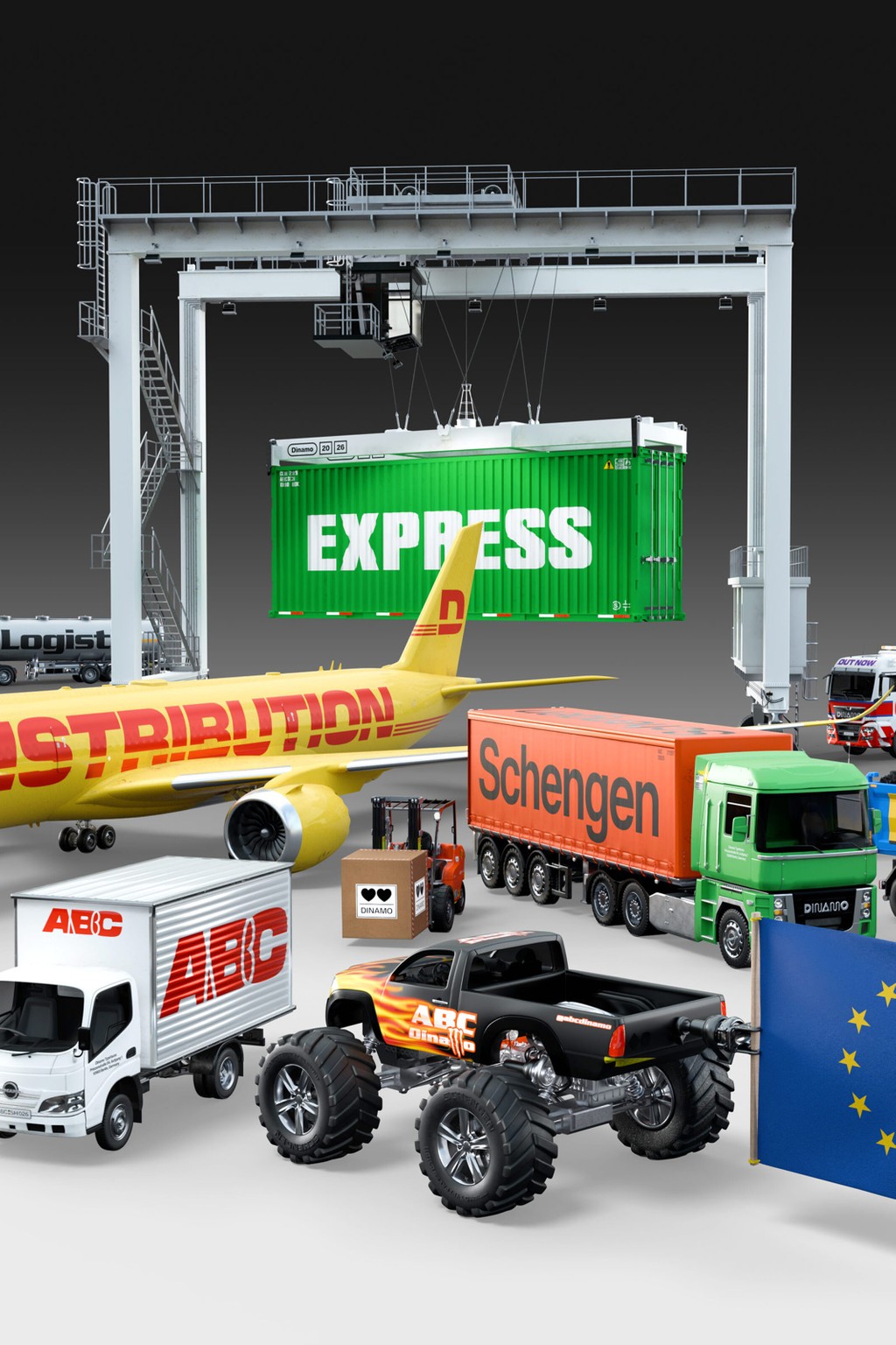
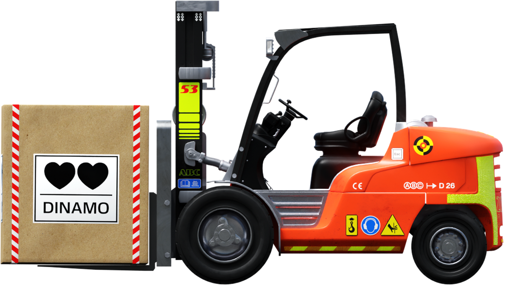
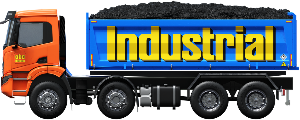
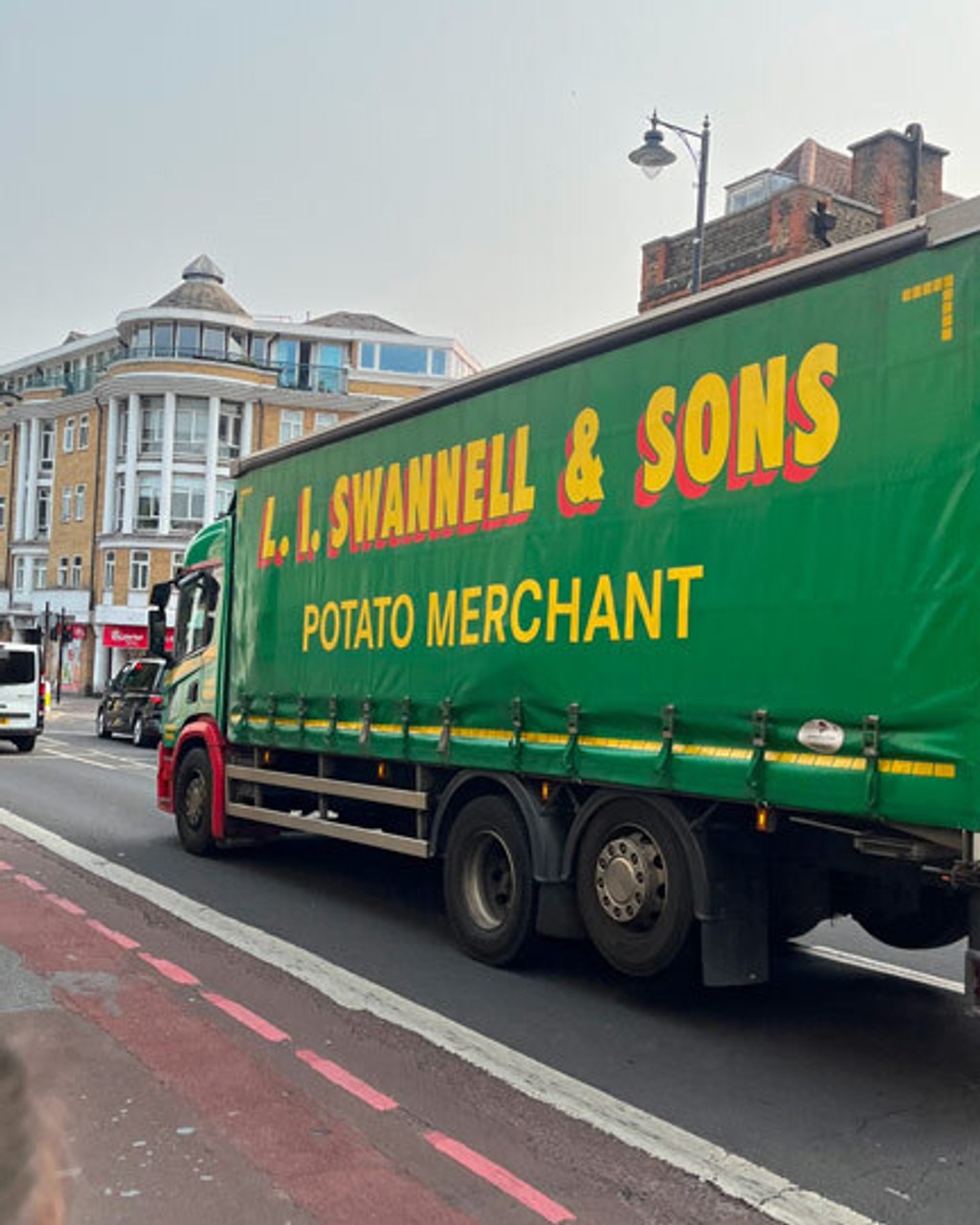
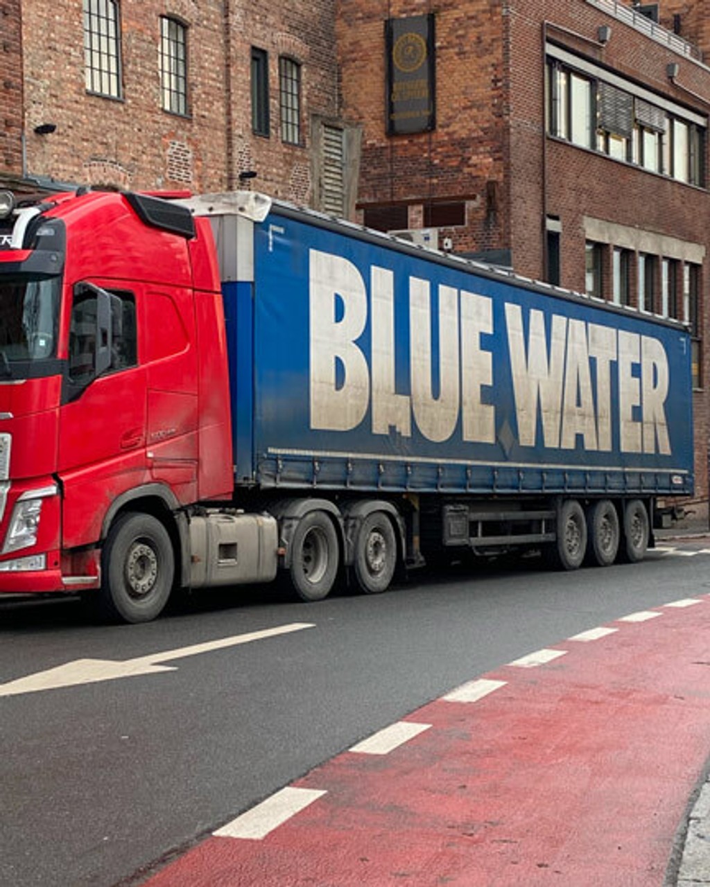
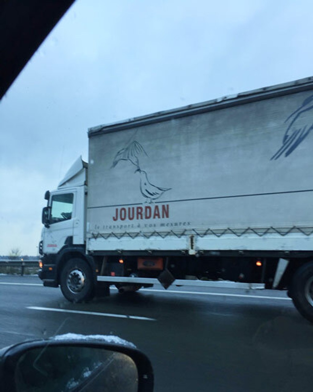
And they make a really great team. Eurostile cuts down the pine in the Landes forest and Helvetica hauls the planks to the Port of Rotterdam. Helvetica bottles the water in Bergamo and Eurostile ships it same-day to a LIDL outside of Beveren. Goods and services, production and distribution.
.jpg)
These titans of industry are thrown into a mixer and out pours liquid Schengen.
This probably isn’t ok, they’re not meant to be together, right? Schengen’s square capital shapes and more circular lowercase forms sit together with a palpable will-they-won’t-they tension. But it turns out yes, the chief financial officer is dating the warehouse manager – and yes, they’re very much in love.
Map to the fonts
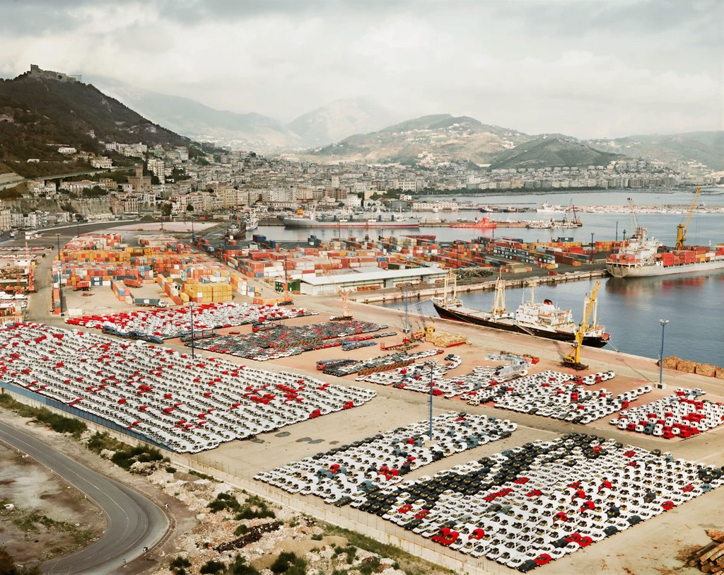
Andreas Gursky, Salerno I, 1990. Courtesy Sprüth Magers Gallery
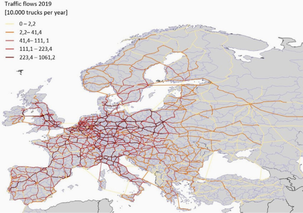
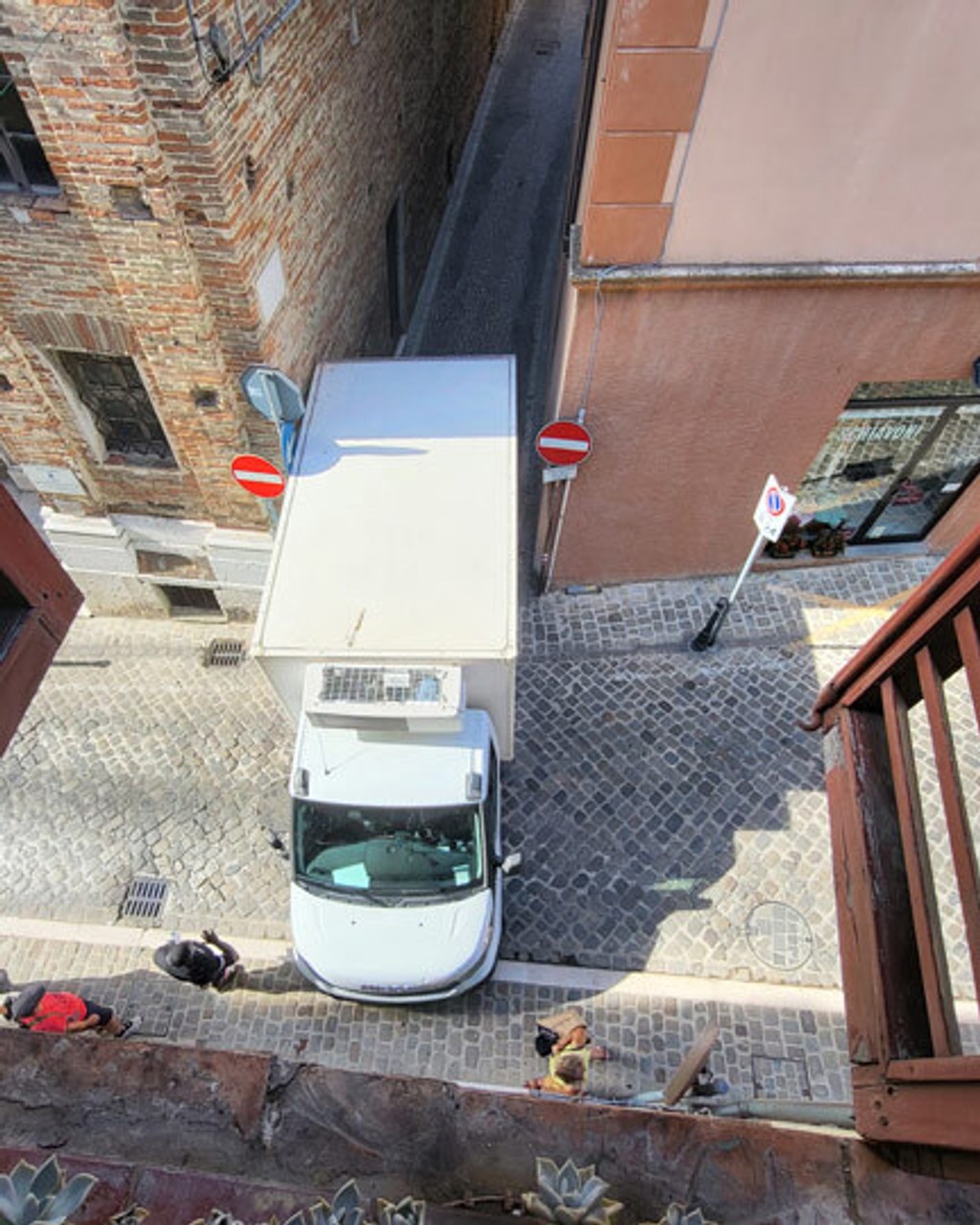
Traffic flows through Europe
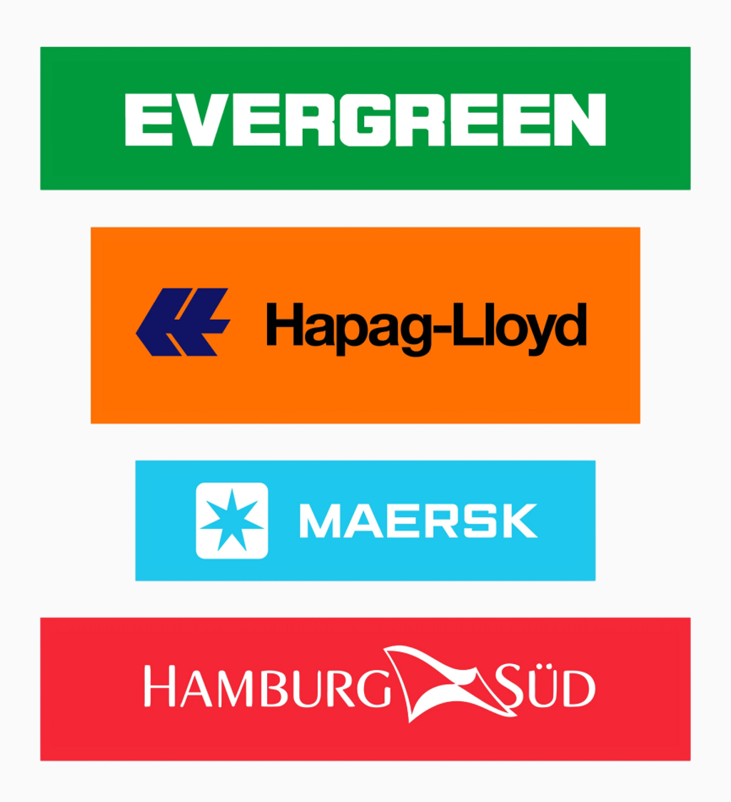
Transport’s “Big Four”
The Schengen Area comprises 29 European countries — 25 EU states plus Iceland, Liechtenstein, Norway, and Switzerland — that have abolished internal border controls, allowing free movement.
⬇️ ⬇️ ⬇️
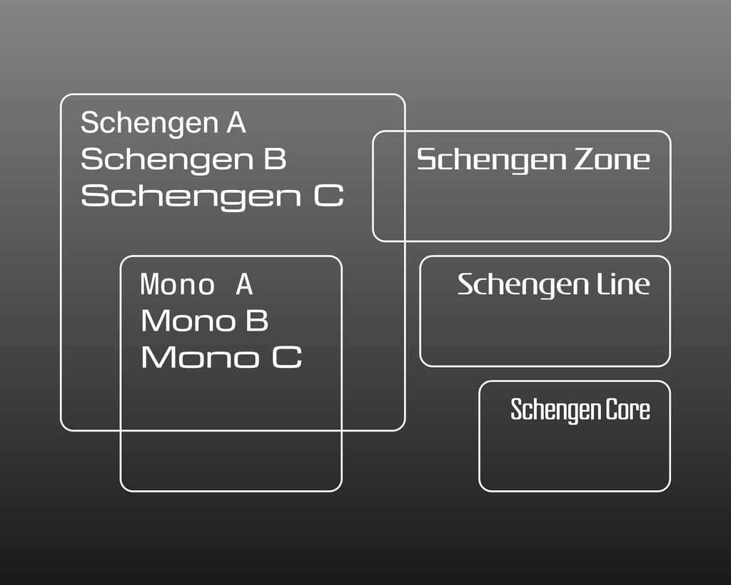
ABC Schengen’s free-moving, free-trading family members.
The 3 families Schengen A, Schengen B, and Schengen C are tied within one design space (and of course there’s a Variable Font). Put simply, this introduces a width axis to the project that allows you to slide along and fine-tune the output as you desire: as the characters become wider, the aesthetic shifts and the Eurostile influence gets heavier, stretching Schengen A’s bubblewrap envelope around C’s steel shipping container, with B nestled comfortably in the middle (inside a cardboard box?).
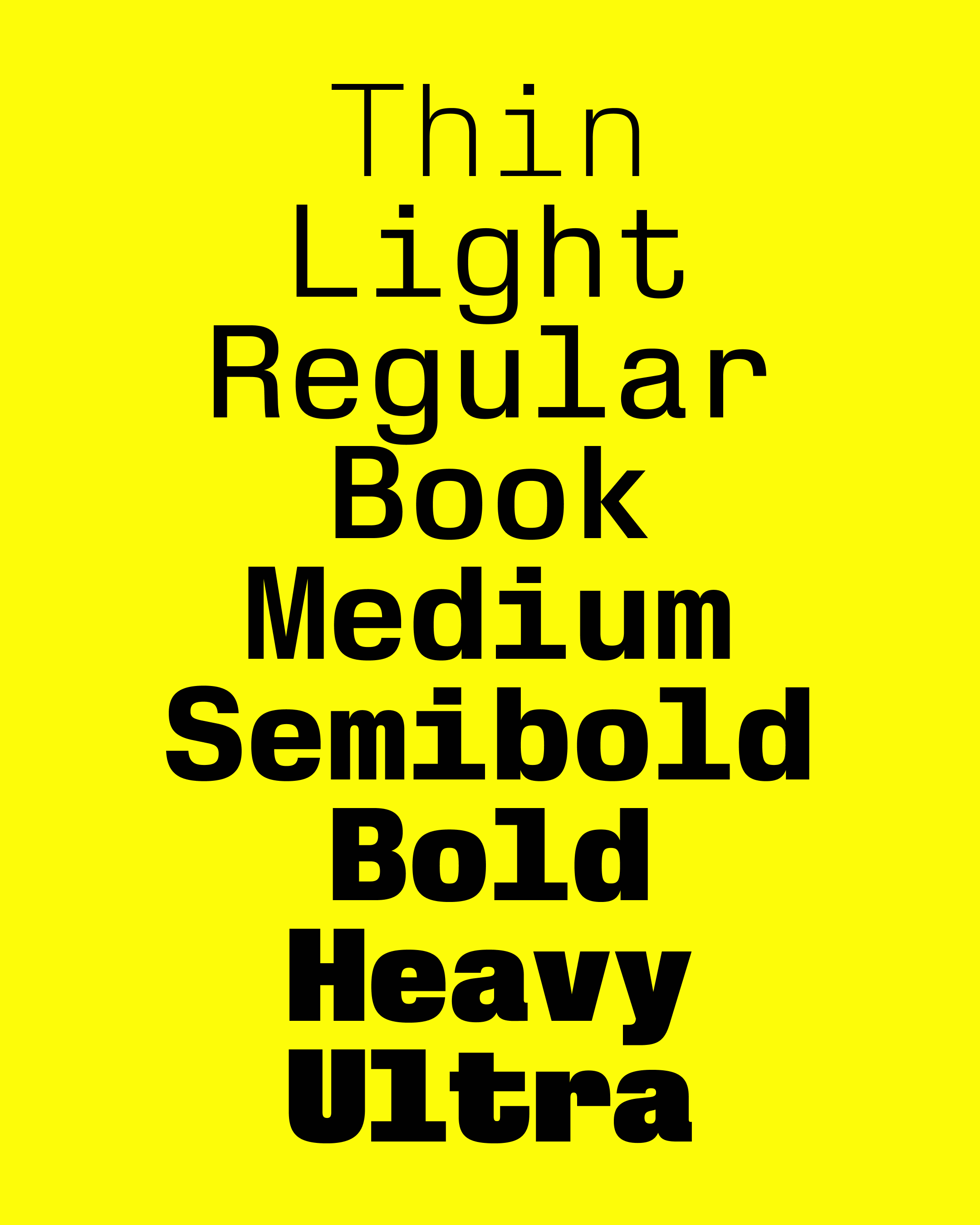
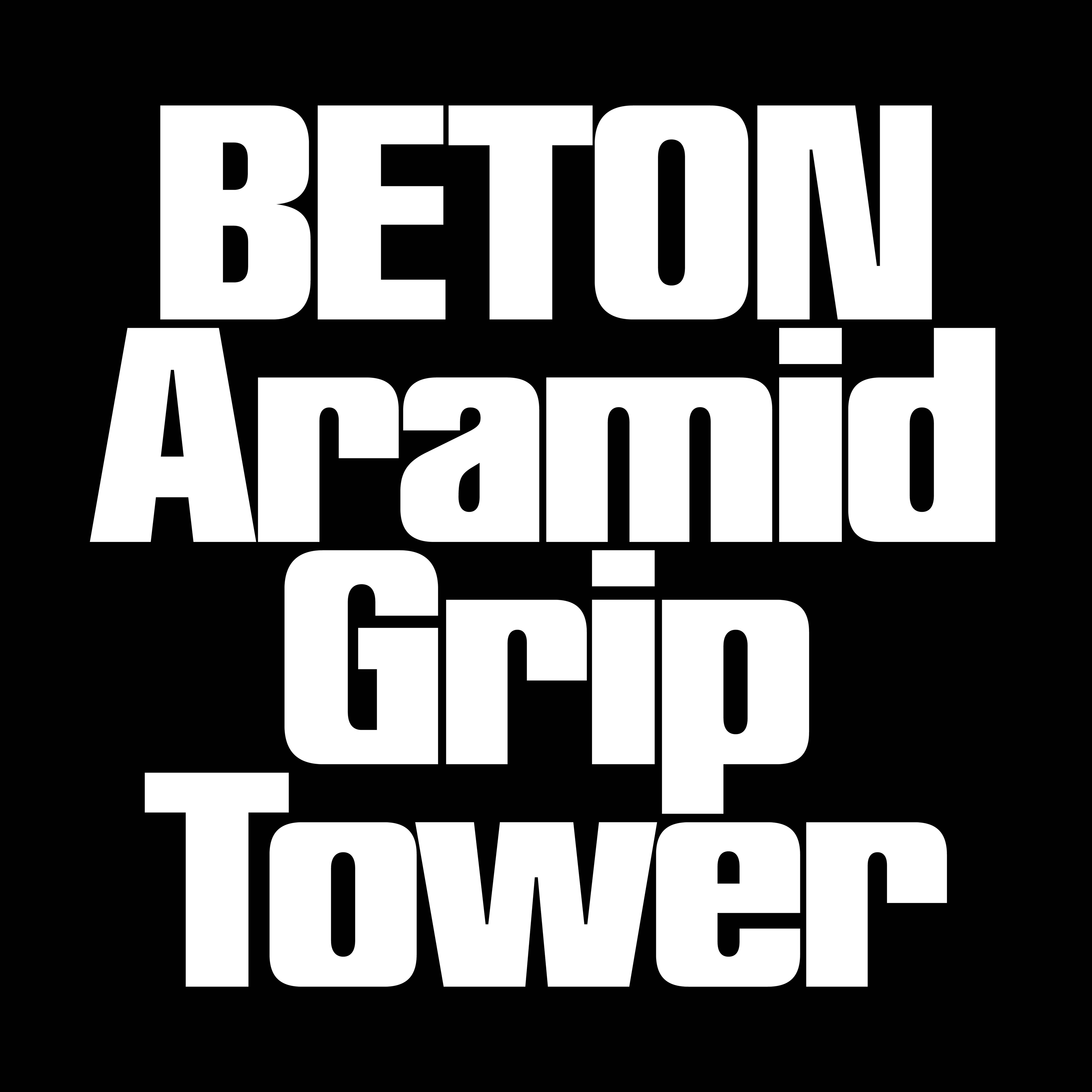
Not satisfied dealing only in letters of varied widths, all three families of Schengen have monospaced equivalents (also variably linked). Boxier than the proportional families, these weights are closer to vibey Signor Novarese than straight-talking Herr Miedinger, with alternate Eurostile “r” and “t” glyphs embracing his sci-fi fantasy.
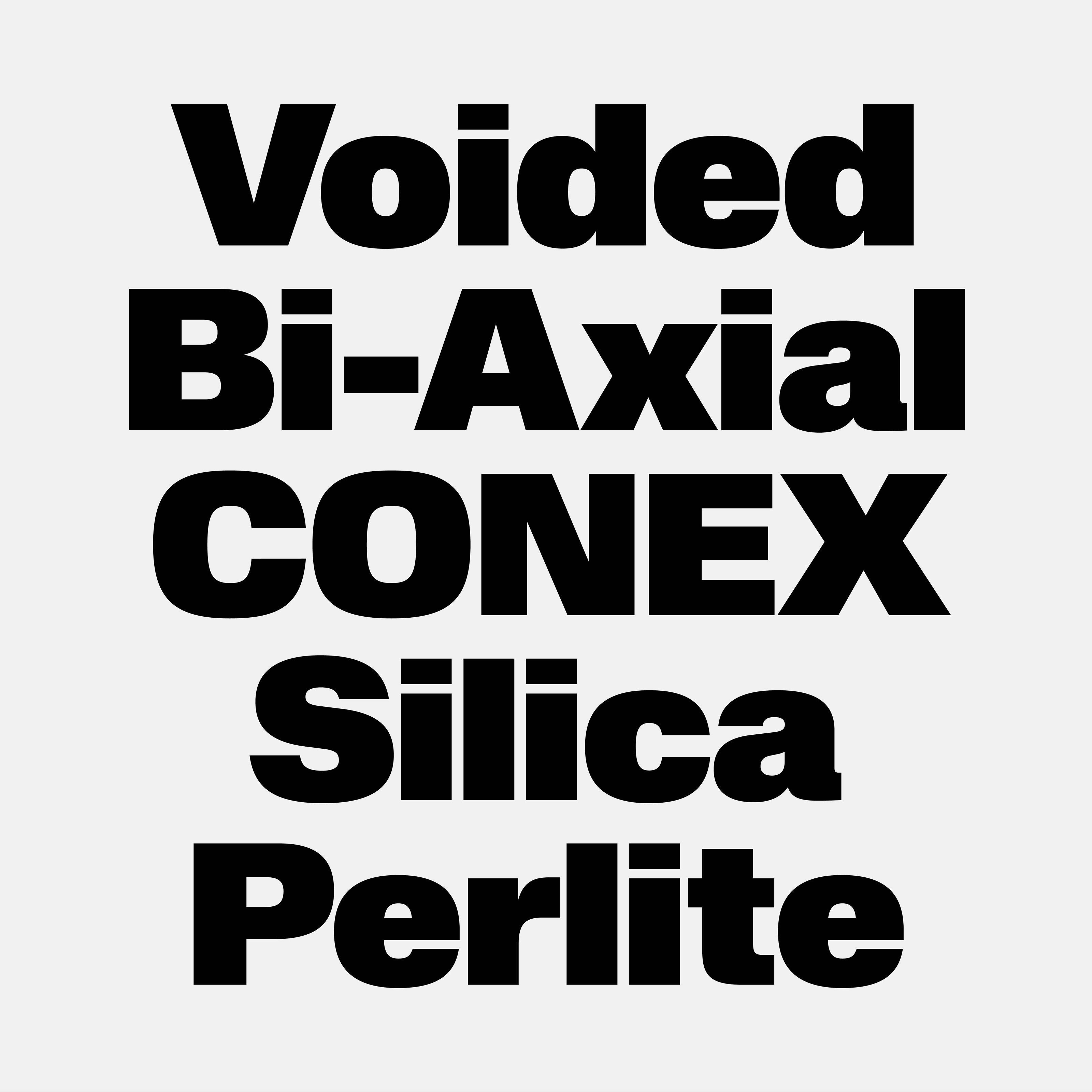
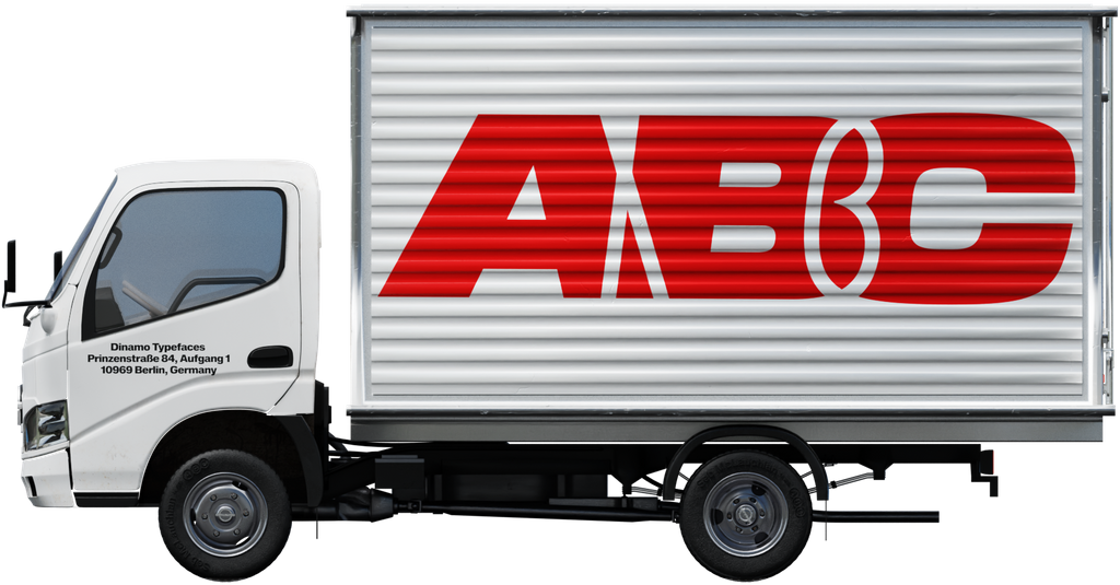
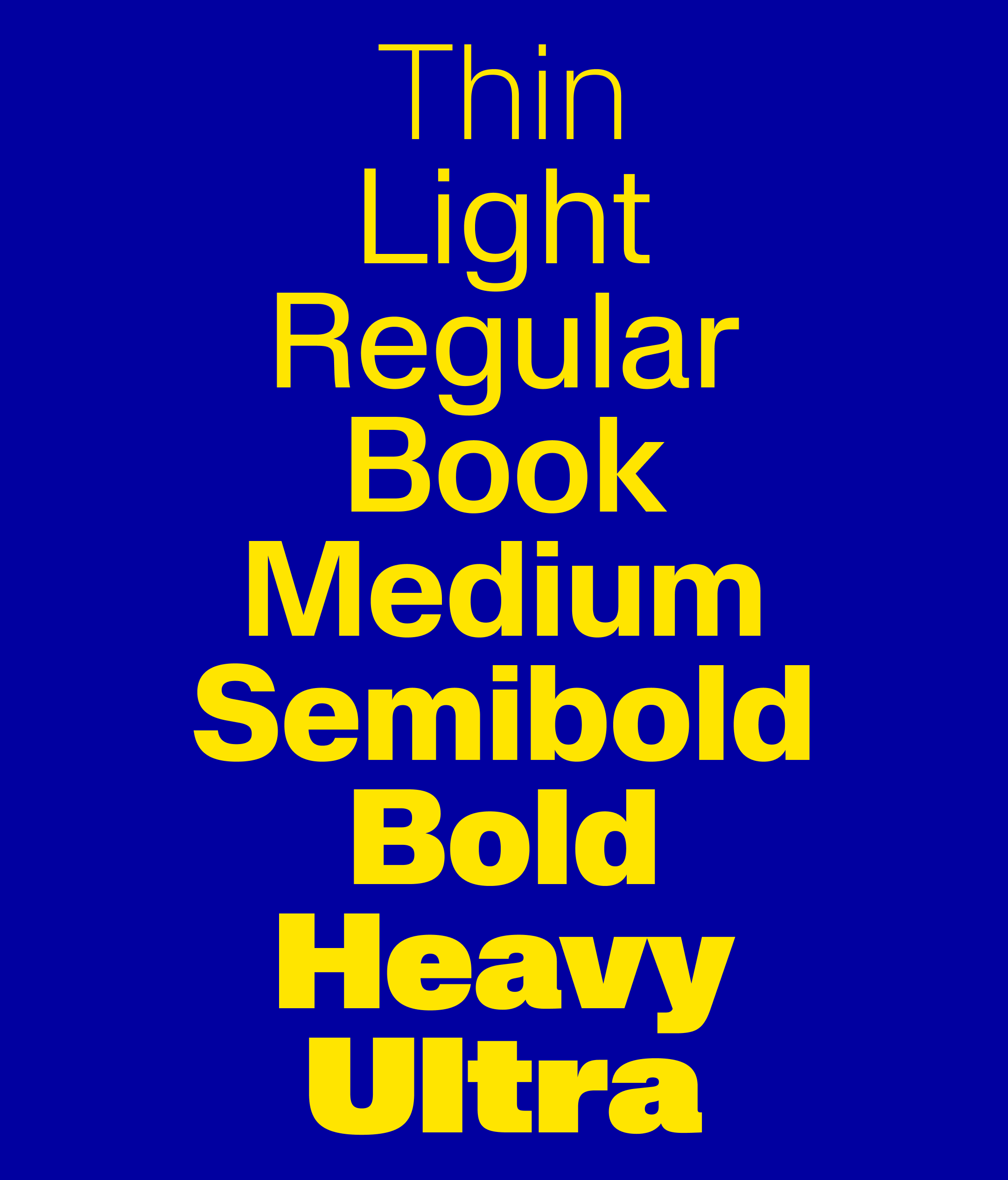
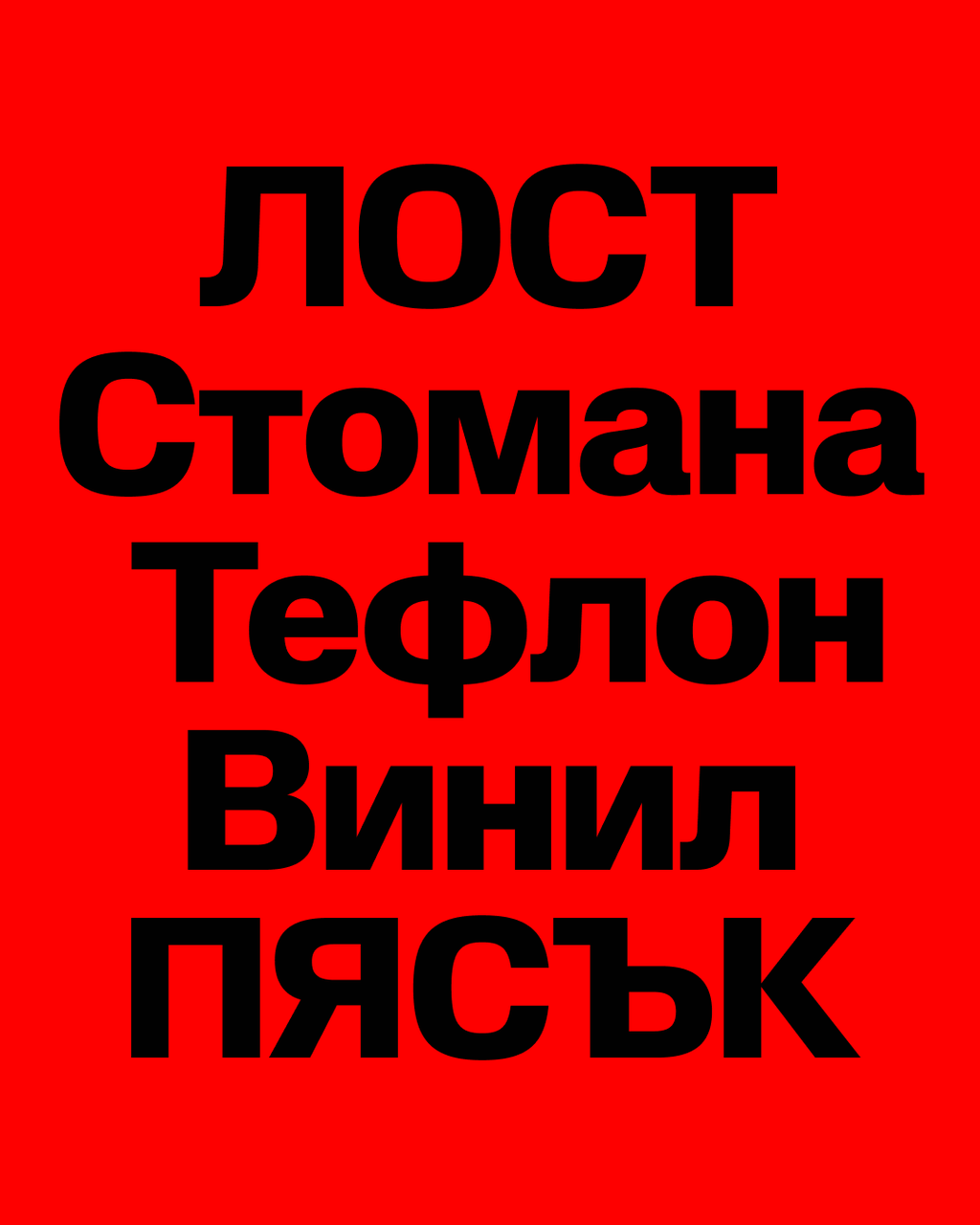
Each family has 9 weights: Thin, Light, Regular, Book(!), Medium, Semibold(!!!), Bold, Heavy, and Ultra(!!!!!!). Along with italics, Schengen ABC + Schengen ABC Mono forms a hefty package of 108 total weights, covering the Latin, Greek and Cyrillic scripts that make up the Eurozone, ensuring no family business, plucky startup or faceless multinational will be short of ways to deliver for key stakeholders, willing audiences and slightly concerned shareholders. Schengen works inside a flatpack furniture assembly manual, Schengen works outside a vape kiosk shop window, Schengen (probably) works on the side of a cargo ship.
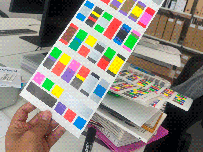
Carrying wide chunks of monospaced Schengen
The Schengen Cinematic Universe
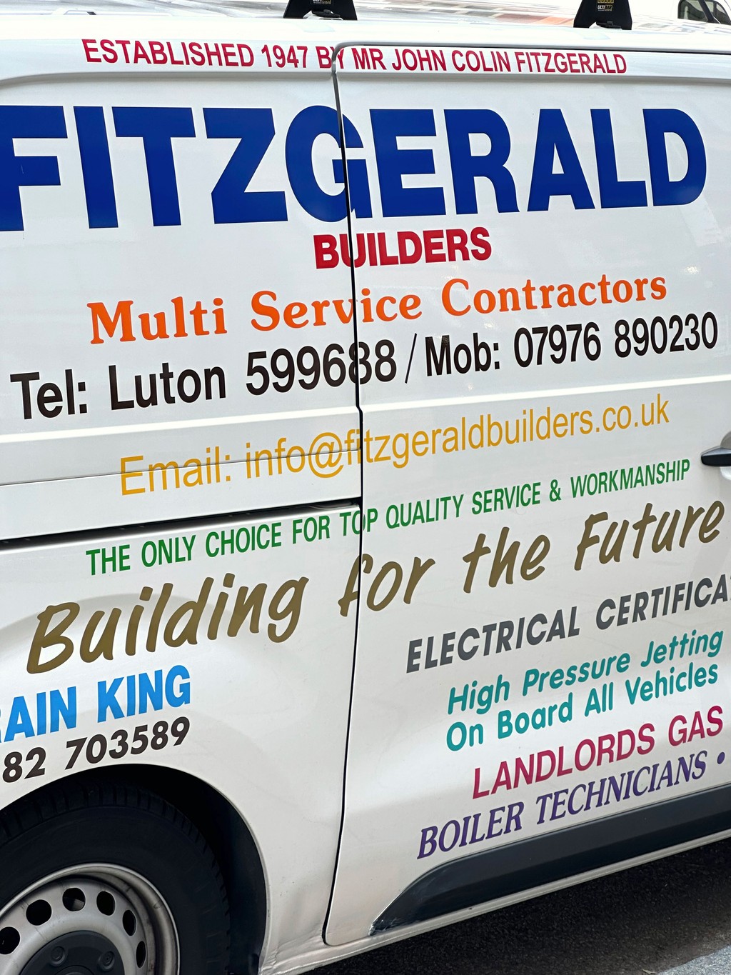
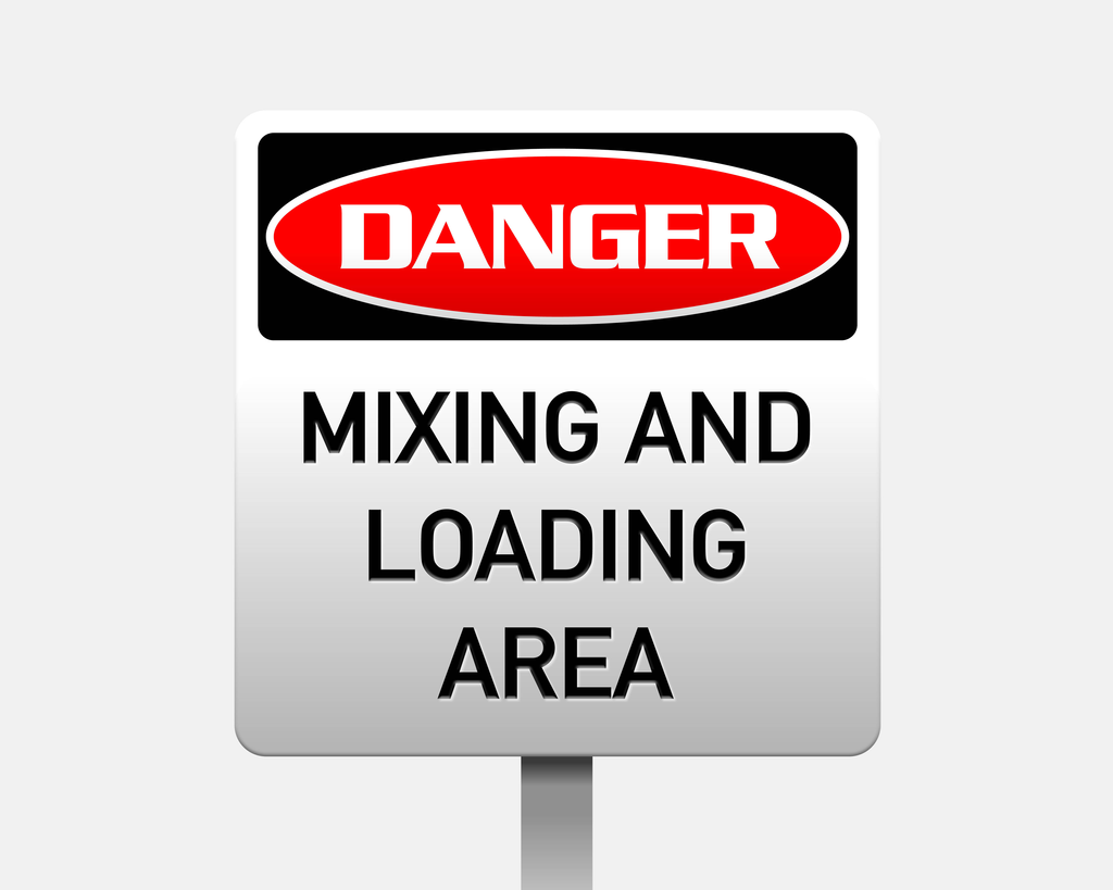
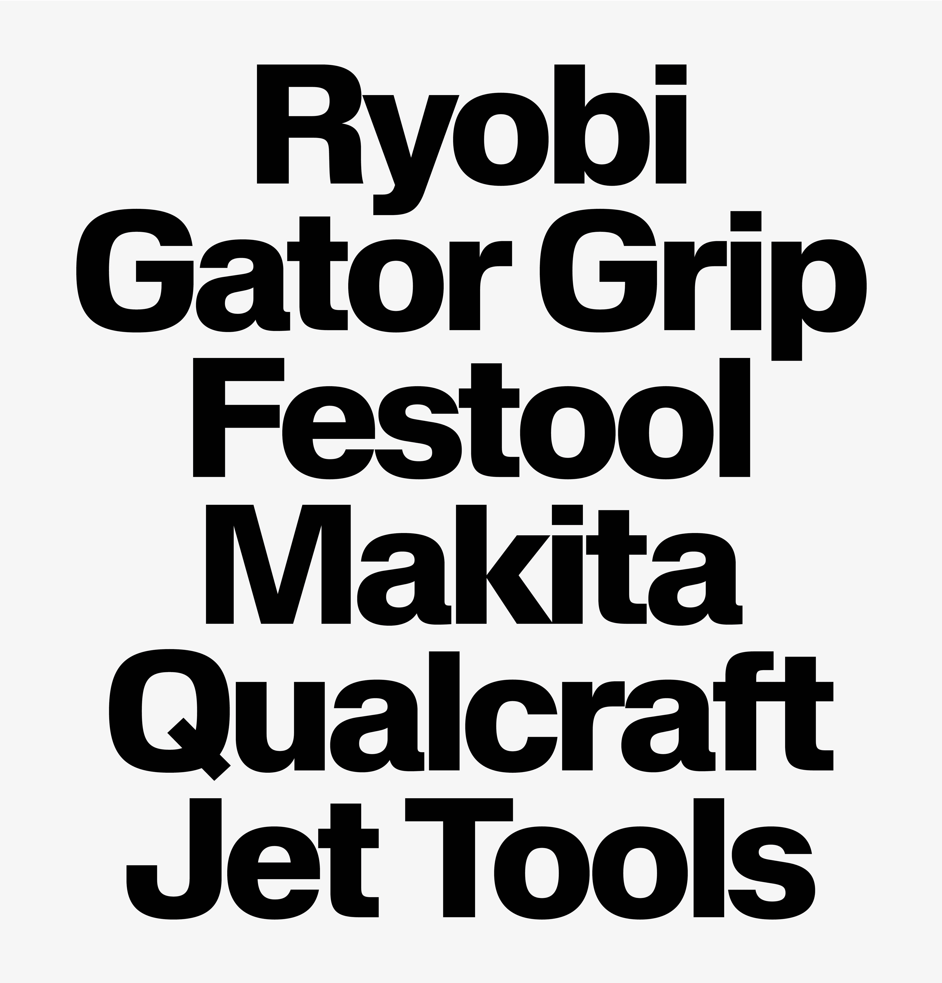
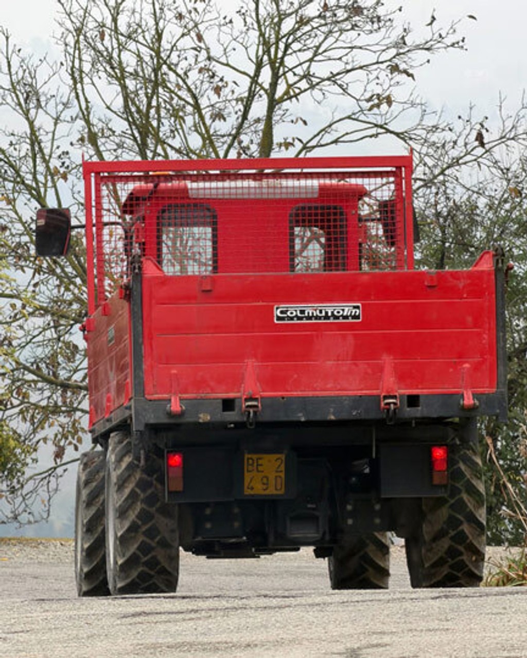
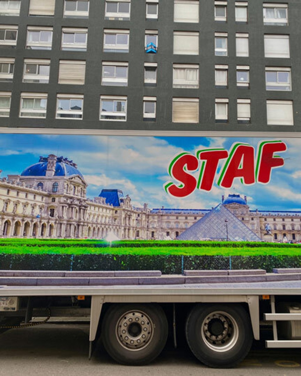
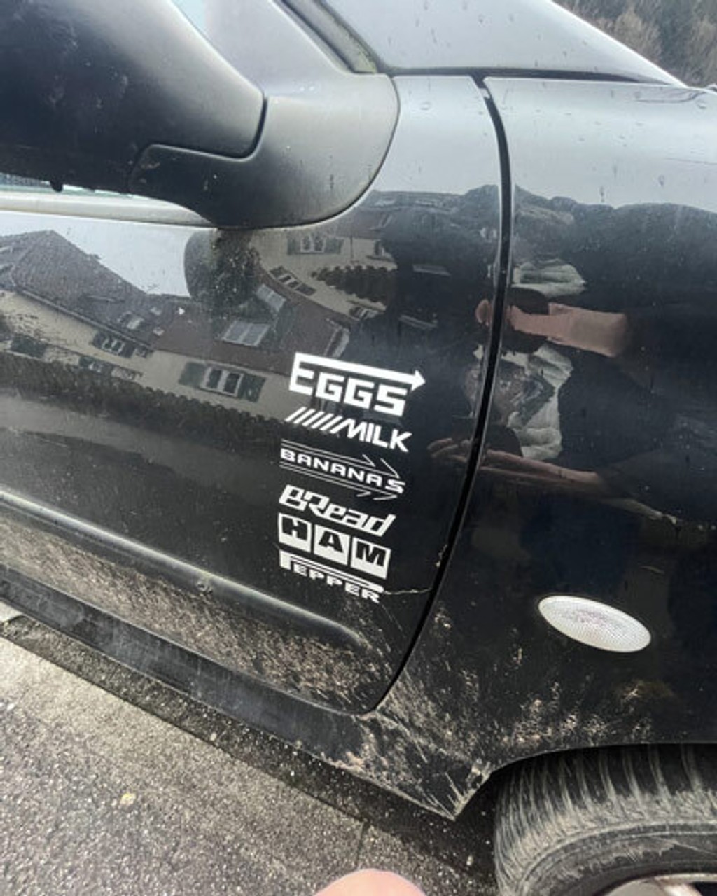
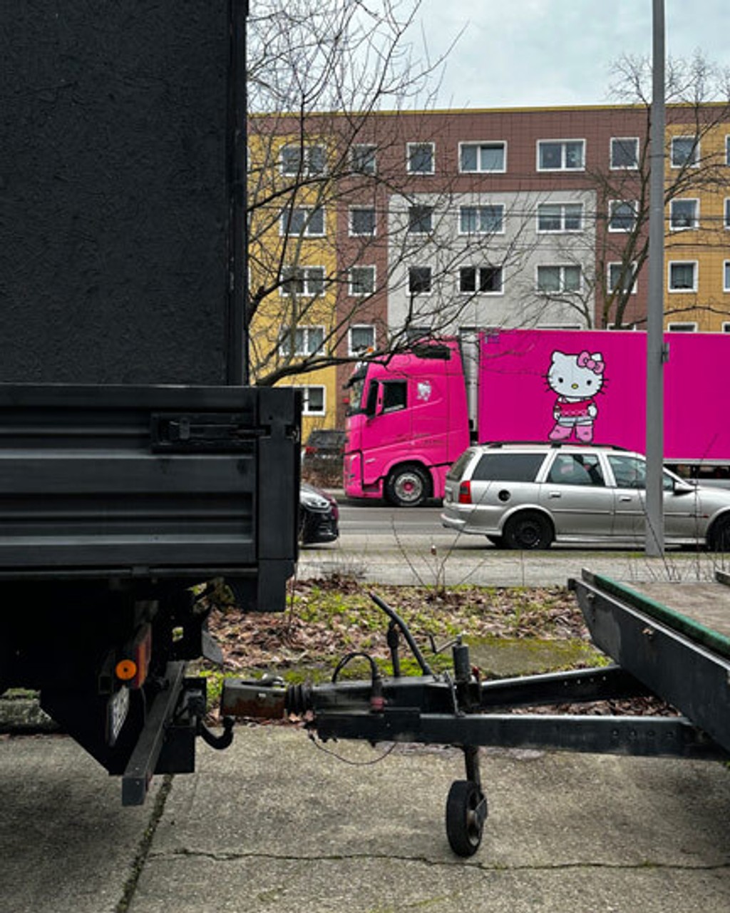
One of the core inspirations for Schengen is the great work of people considered outsiders by those “in” design, and the typefaces they use. We’re talking what’s in the sketchy “Font$” folder of every “vinyl signage, promotions, web design, logo design, large format printing and bespoke solutions” company in every town in Europe. These people don’t have Most Beautiful Books, their TDC is Targeted Data Collection, and they certainly don’t have time to waste reading newsletters about fonts – because they’re busy using them.
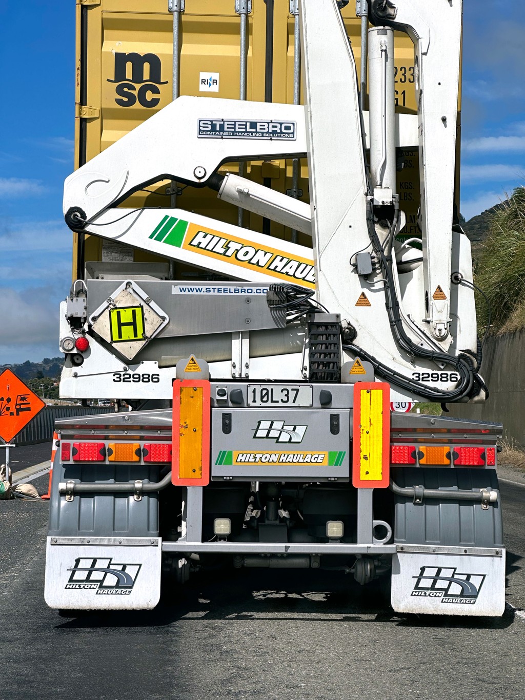
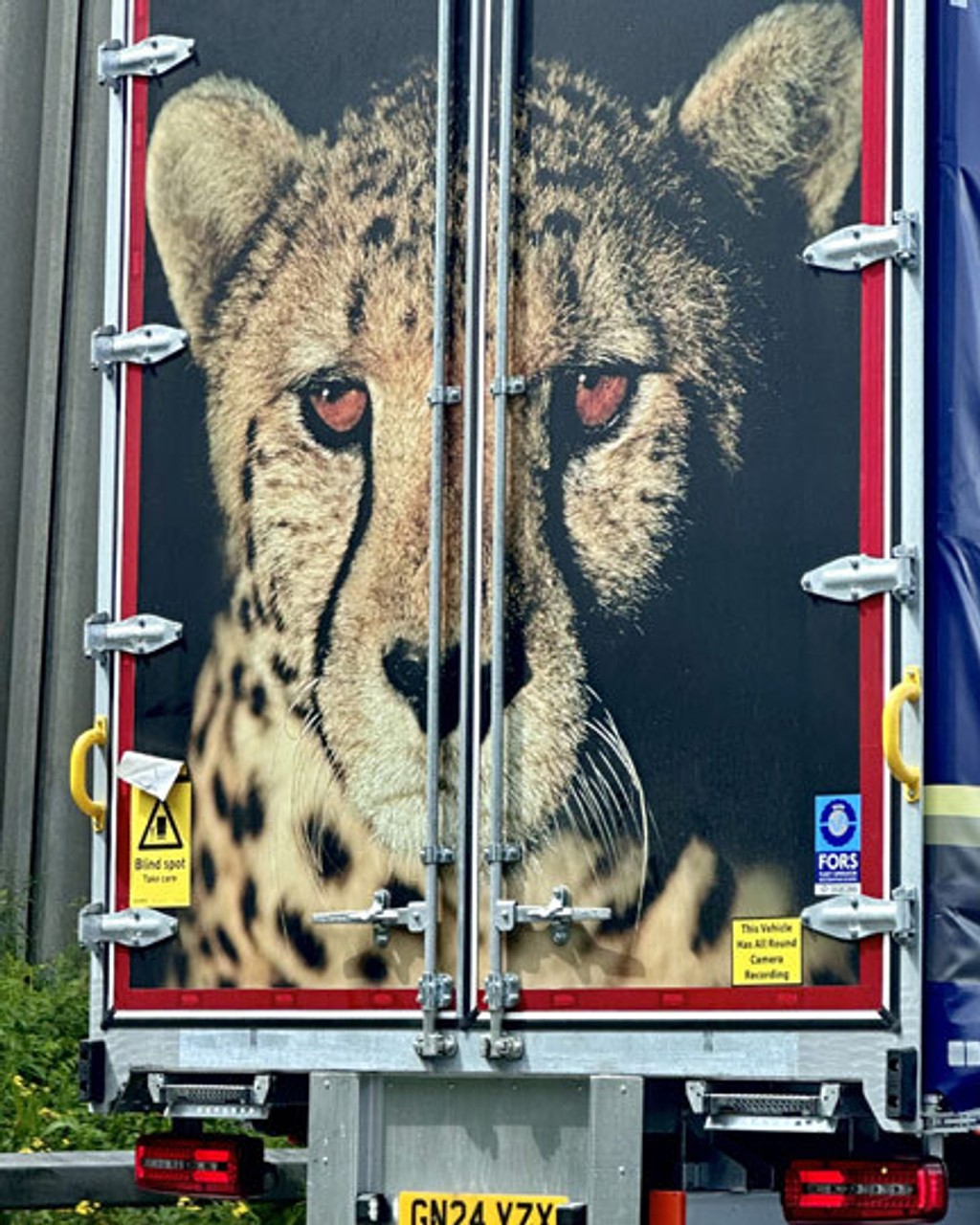
They’re hard at work making a logo for a concrete pipe importer incorporating the letters XJM, a cheetah’s head, 3 gold stars, and the Polish flag, it needs to look good moving between 70 to 100 kilometres per hour and, most importantly, it needs to be delivered by 9am tomorrow. These masterworks are made inside a sunless office, in a light industrial park, off a ring-road just outside Dresden. This is WhereDesignHappens™. The project is managed, the priorities are aligned, the clients are satisfied, and there’s no need to circle back. It’s cool because it’s real, and it’s real because it’s cool. It’s folk typography, jobbing typography, with fonts chosen by the people, for the people.
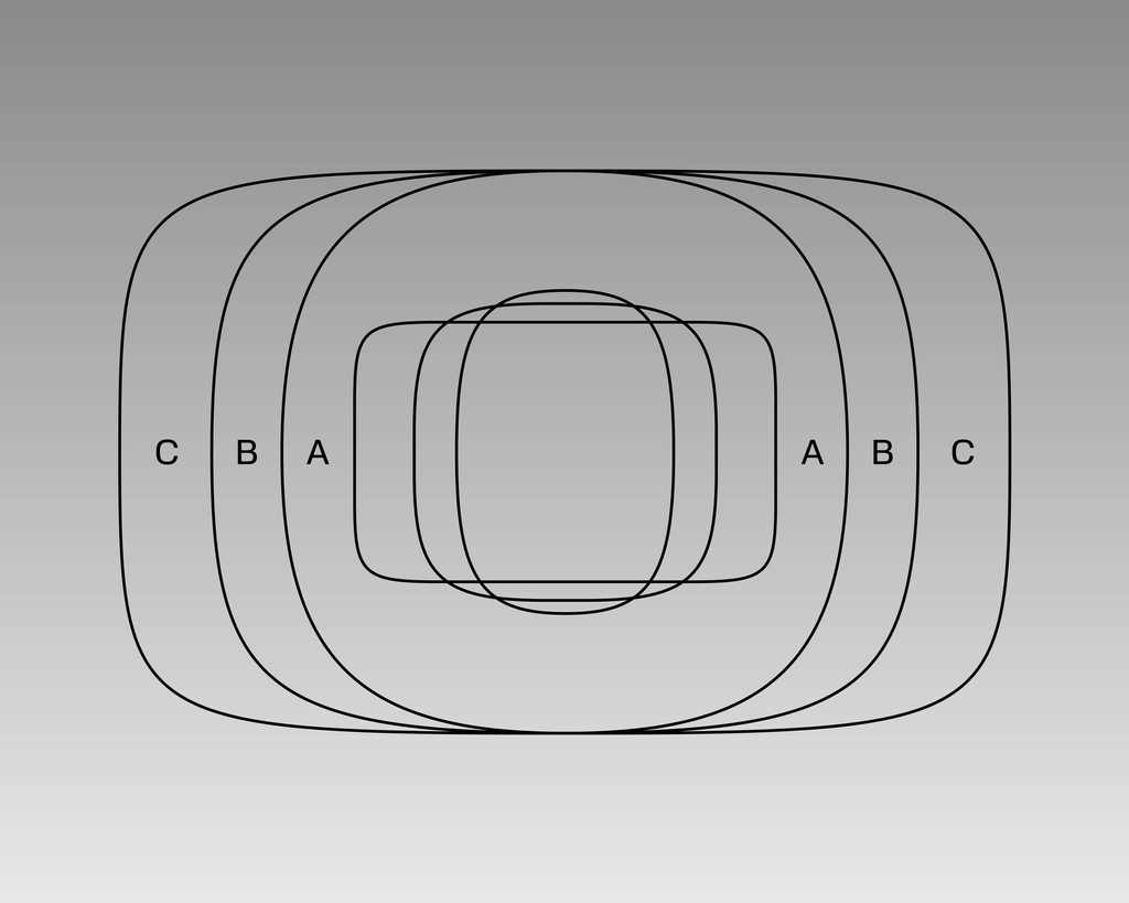
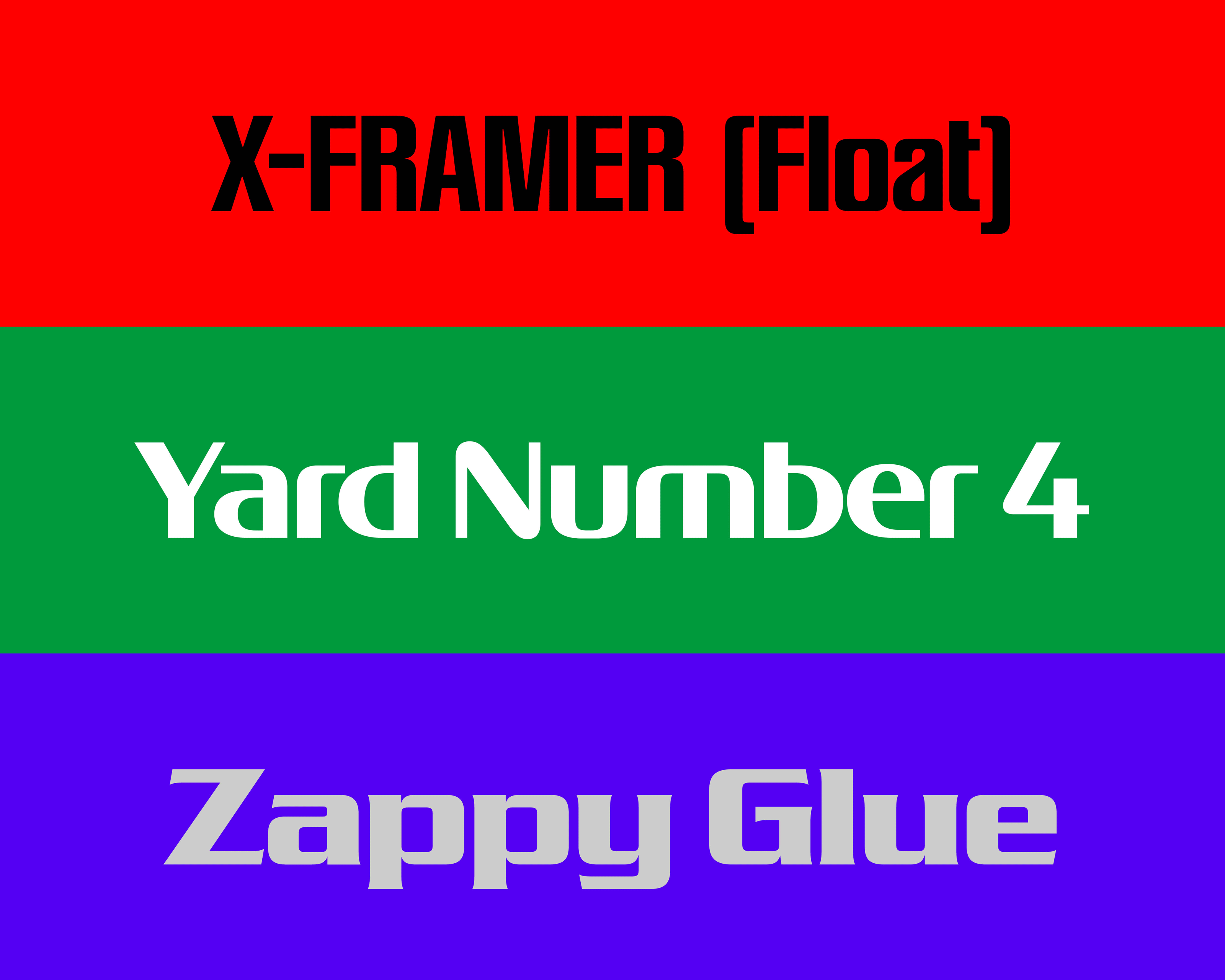
Zone, Line, Core
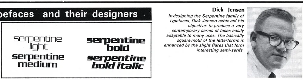
Serpentine, the 1972 underrated masterpiece by Dick Jensen, or Peignot, the smashmouth-hit by A. M. Cassandre, or Walter Haettenschweiler’s ... Haettenschweiler – all these typefaces you’ve seen, loved and probably forgotten about have been reassembled, reinforced, remodelled, reconfigured, reconstructed, rebuilt, reworked and revived into three families that are simultaneously their own thing and still very much part of der Schengen-Raum.
Zone takes the boxy attitude of ABC, chisels out some contrast and slaps on a set of no-nonsense serifs. Line sweeps up the debris, smooths out the geometry and carefully applies tension with soft and sharp moments. Core takes a sledgehammer to the base and builds a new housing development on half the footprint. These are designs chosen for thematic and aesthetic reasons, as with most things in the mid-2020s: it’s about the vibes. They are compatible, and we aren’t talking beziers here.
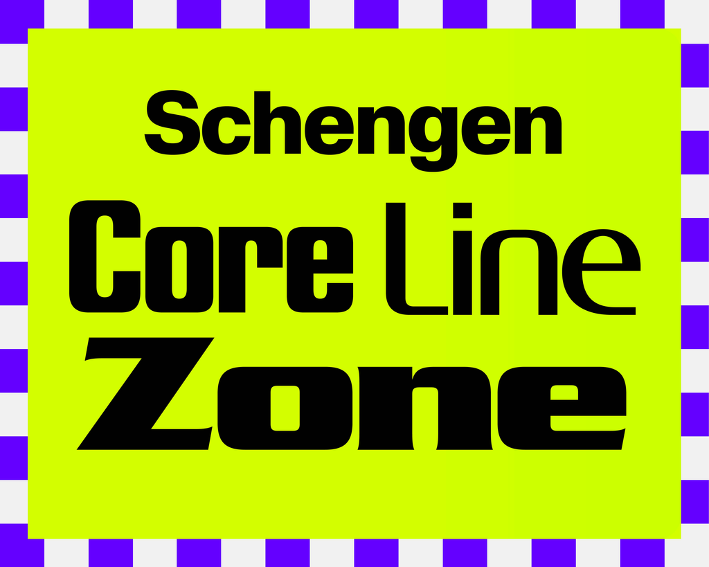
Zone, Line, and Core feature the same 9 weights (plus italics) that exist within Schengen ABC, and these have been drawn – along with common x-heights and vertical metrics – to work together across the collection. This is all in the wild hope that some mavericks might take the Autobahn to the danger zone and mix the different families together within the same design, somebody please prove us right!

Alternates, Many
ABC Schengen comes packed with a whole bunch of alternates, that allow you to change the color of the font like a regional flavour.
As with all our fonts, you can use our free Font Customizer tool to create your own, custom version.
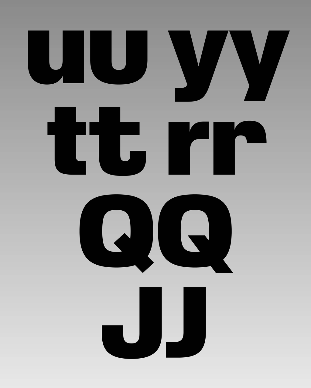
The three main families have multiple a versions hidden inside, next to the classic alternates for y, G, and R. The oldschool Q will make some hearts jump, as will the shorter-than-usual J. For those who think that’s boring, backwards, not enough, or all of that, the umbrella-stick-shaped t and elephant-nose-shaped r might make you think otherwise!
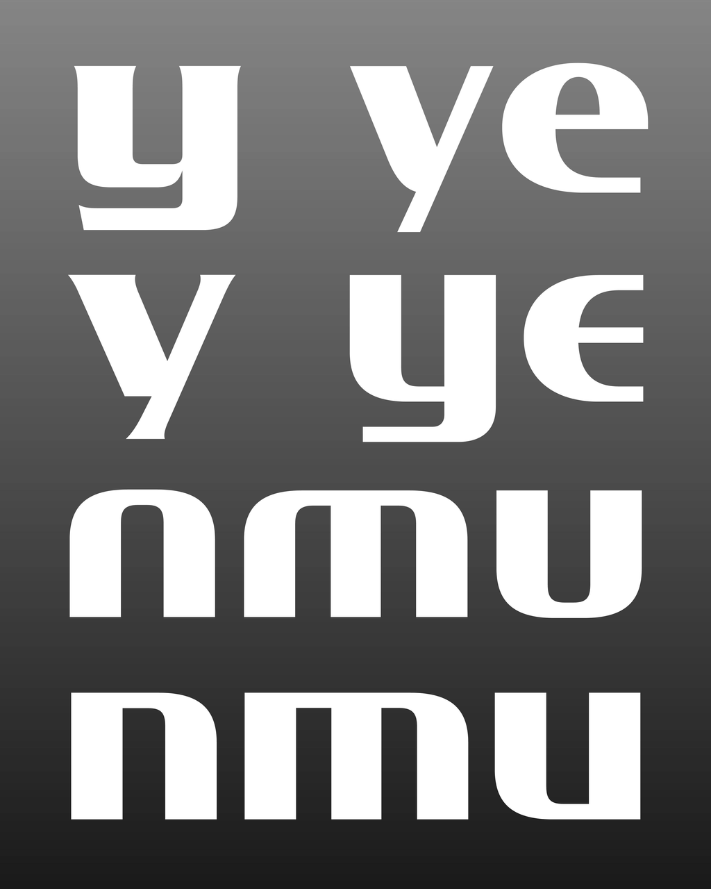
Zone, Line, and Core come with options for a, e, y and a group of sharp versions for n, m, u. There’s a closed-top 4 and also an entire assembly line of both positive and negative circled numbers.
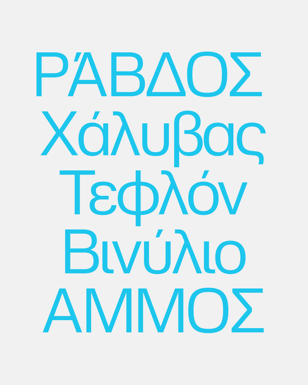
EUROPE + EYP'QH + ЕВРОПА
It felt important that ABC Schengen can speak and write all European languages that make communication between the people along the many-tongued chain of transport possible. We’re excited that all variations – okay, not exactly: all but the Mono! – of ABC Schengen cover not only Latin, but also Cyrillic and Greek. In case you come across border control and need to switch up the script, these fonts got you covered.
XLProject = XLTeam
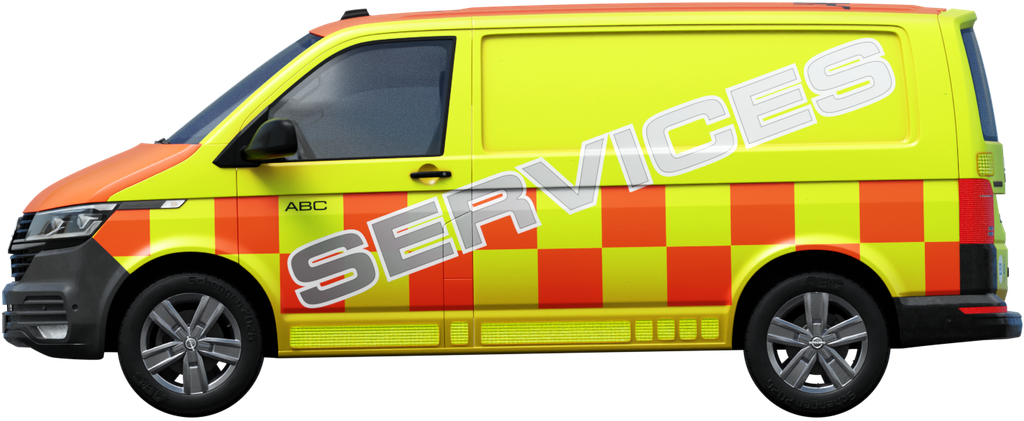
Under Seb’s direction and development, Luke Charsley headed up the production of Schengen, and without his dedication and hard graft over many years this project simply would not have happened. Under the hood, Schengen’s engine has been masterfully tuned by Roberto Arista and Hugo Jourdan, with Greek and Cyrillic expansions handled by Fabian Harb and Jovana Jocić. Alongside this text, a multi-dimensional campaign has been developed, led by Johannes Breyer and Seb, with 3D renders by Mimi Schmidl and 2D vehicle livery by Asel Tambay and Barnaby Mills.
Asel Tambay
Barnaby Mills
Christopher Lawson
Emma Aars
Emma Capps
Fabian Harb
Hugo Jourdan
Igino Marini
Johannes Breyer
Jovana Jocić
Luke Charsley
Marton Perlaki
Mimi Schmidl
Philip Maughan
Seb McLauchlan
Schengen on the road
It’s also a good time to announce a very special Schengen publication is on its way. Designed by Christopher Lawson and edited by Emma Capps, the publication features commissioned photography by Marton Perlaki and writing by Philip Maughan and Emma Aars. This is to be released by Dinamo Editions later this year with much more to share – watch this space.
Our thanks to all involved, it’s been a real one ❤
Love,
Dinamo
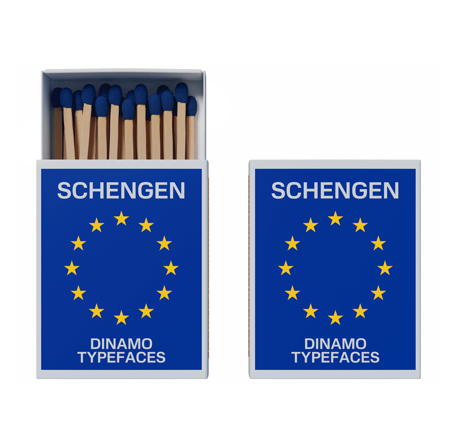
Logistic worker’s favourite matches brand