- Publisher Rounded Mix12
- Publisher Rounded Mix Condensed12
- Publisher Rounded Sans12
- Publisher Rounded Sans Condensed12
- Publisher Rounded Slab12
- Publisher Rounded Slab Condensed12
Publisher Rounded Mix
- Thin & Italic
- Light & Italic
- Regular & Italic
- Medium & Italic
- Bold & Italic
- Black & Italic
Publisher Rounded Mix Condensed
- Thin & Italic
- Light & Italic
- Regular & Italic
- Medium & Italic
- Bold & Italic
- Black & Italic
Publisher Rounded Sans
- Thin & Italic
- Light & Italic
- Regular & Italic
- Medium & Italic
- Bold & Italic
- Black & Italic
Publisher Rounded Sans Condensed
- Thin & Italic
- Light & Italic
- Regular & Italic
- Medium & Italic
- Bold & Italic
- Black & Italic
Publisher Rounded Slab
- Thin & Italic
- Light & Italic
- Regular & Italic
- Medium & Italic
- Bold & Italic
- Black & Italic
Publisher Rounded Slab Condensed
- Thin & Italic
- Light & Italic
- Regular & Italic
- Medium & Italic
- Bold & Italic
- Black & Italic
Publisher Rounded Mix
Publisher Rounded Mix
- Thin & Italic
- Light & Italic
- Regular & Italic
- Medium & Italic
- Bold & Italic
- Black & Italic
Publisher Rounded Mix Condensed
Publisher Rounded Mix Condensed
- Thin & Italic
- Light & Italic
- Regular & Italic
- Medium & Italic
- Bold & Italic
- Black & Italic
Publisher Rounded Sans
Publisher Rounded Sans
- Thin & Italic
- Light & Italic
- Regular & Italic
- Medium & Italic
- Bold & Italic
- Black & Italic
Publisher Rounded Sans Condensed
Publisher Rounded Sans Condensed
- Thin & Italic
- Light & Italic
- Regular & Italic
- Medium & Italic
- Bold & Italic
- Black & Italic
Publisher Rounded Slab
Publisher Rounded Slab
- Thin & Italic
- Light & Italic
- Regular & Italic
- Medium & Italic
- Bold & Italic
- Black & Italic
Publisher Rounded Slab Condensed
Publisher Rounded Slab Condensed
- Thin & Italic
- Light & Italic
- Regular & Italic
- Medium & Italic
- Bold & Italic
- Black & Italic
About Publisher
About this typeface
Info
Publisher is a typewriter-inspired design, re-upholstered for modern print and screen use. While embracing the genre’s mechanical honesty and authorial voice, Publisher’s letters are proportionally spaced to ensure beautiful moments of long, untiring reading.
The typewriter genre traces its roots to early monospaced designs such as Courier, defined by mechanical constraints and functional clarity. Later came proportional interpretations like ITC American Typewriter, which introduced a warmer, more expressive tone.
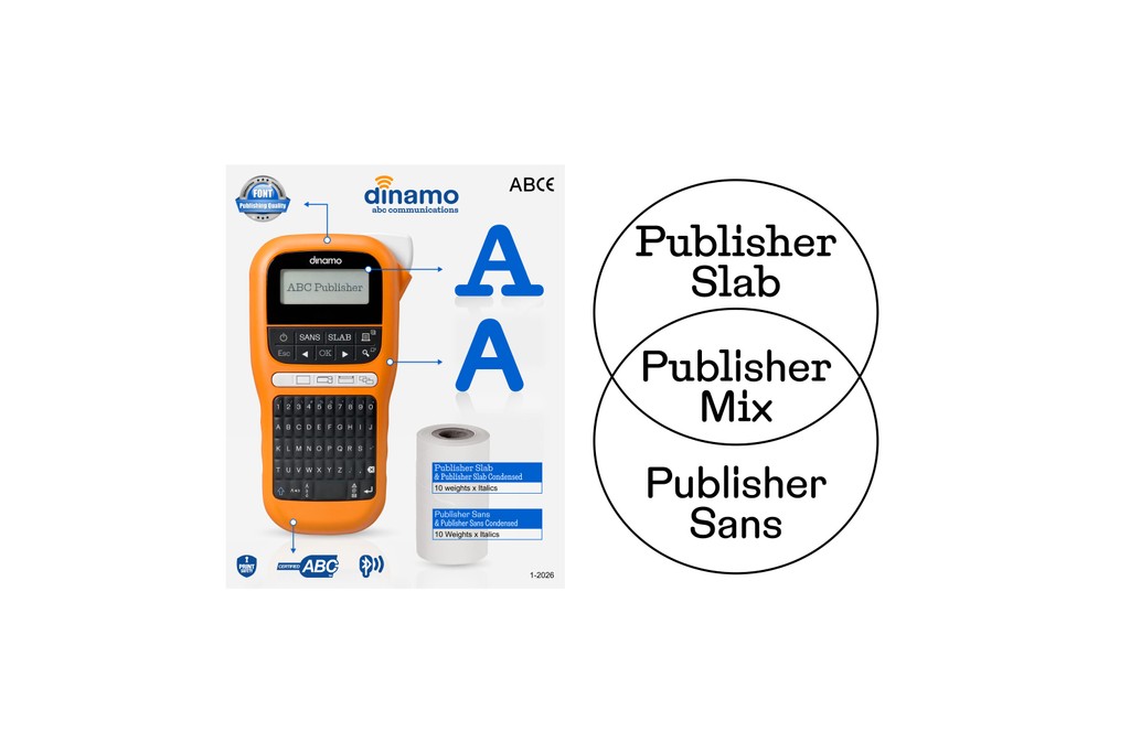
Next to the classic typewriter-style Slab, we have the clean and elegant Sans companion. And between those, we have the playful Mix, a hybrid style that combines the best of both worlds. All three subfamilies share the same underlying skeleton and design DNA, which means that you can mix and match them effortlessly across your work without tumbling into design-chaos.
Spanning a broad design space from Condensed to Normal, across six weights with corresponding italics, the family offers exceptional flexibility for various types of text (body, compact, headline, etc), a capability rarely found in typewriter-inspired designs. Everything is packaged into pocket-size variable fonts, allowing for fine-grained control of weights and widths.
Credits
Design: Dinamo (Michelangelo Nigra, Fabian Harb, Marc Rouault)
Engineering: Dinamo (Hugo Jourdan, Roberto Arista)
Campaign: Dinamo (Johannes Breyer, Melanie Schmidt)
Supported Languages
Latin: Spanish, English, Portuguese, Swahili (individual language), German, Italian, Javanese, Malay (individual language), French, Turkish, Polish, Filipino, Indonesian, Yoruba, Standard Malay, Sundanese, Igbo, Northern Uzbek, Romanian, West Central Oromo, Amahuaca, Malagasy, Dutch, Tagalog, Cebuano, Somali, Northern Kurdish, Haitian, Hungarian, Zulu, Nyanja, Shona, Czech, Quechua, Swedish, Kikuyu, Kinyarwanda, Umbundu, Hiligaynon, Iloko, Rundi, Kalenjin, Ganda, Xhosa, Central Kurdish, Afrikaans, Turkmen, Madurese, Low German, Luba-Lulua, Kongo, Danish, Neapolitan, Croatian, Southern Sotho, Minangkabau, Wolof, Finnish, Kituba (Democratic Republic of Congo), Slovak, Swiss German, Pedi, Sicilian, Eastern Oromo, Norwegian, Luo (Kenya and Tanzania), Catalan, Bemba (Zambia), Buginese, Venetian, Borana-Arsi-Guji Oromo, Kamba (Kenya), Lombard, Banjar, Soga, Achinese, Gheg Albanian, Nyankole, Balinese, Jamaican Creole English, Yao, Lithuanian, Bosnian, Waray (Philippines), Slovenian, K'iche', Gusii, Kimbundu, Southern Qiandong Miao, Northern Qiandong Miao, Soninke, Meru, Afar, Pampanga, Hani, Tosk Albanian, Standard Latvian, Central Aymara, Southern Aymara, Batak Toba, Toba, North Ndebele, Chiga, Sena, Bini, Galician, Tumbuka, Scots, Tonga (Zambia), Dimli (individual language), Kirmanjki (individual language), Acholi, Anaang, Makonde, Sardinian, Mandinka, Guadeloupean Creole French, Batak Simalungun, Batak Dairi, Batak Mandailing, South Ndebele, Standard Estonian, Ngazidja Comorian, Morisyen, Khasi, Upper Guinea Crioulo, Chokwe, Gourmanchéma, Kabuverdianu, Lushai, Ndonga, Uab Meto, Kekchí, Occitan (post 1500), Yucateco, Bari, Basque, Picard, Piemontese, Welsh, Chavacano, Bena (Tanzania), Nobiin, Konzo, Walloon, Friulian, Kara-Kalpak, Balkan Romani, Crimean Tatar, Vlax Romani, Maltese, Samoan, Silesian, Batak Karo, Mam, Western Frisian, Sango, Zapotec, Tzeltal, Jola-Fonyi, Tzotzil, Ladino, Efik, Tetun Dili, Tetum, Luxembourgish, Asturian, Papiamento, Tedim Chin, Fijian, Icelandic, Wayuu, Mandjak, Mapudungun, Kölsch, Macedo-Romanian, Kaonde, Montenegrin, Breton, Latgalian, Garifuna, Tonga (Tonga Islands), Amis, Caribbean Hindustani, Huastec, Maore Comorian, Mískito, Irish, Gagauz, Sranan Tongo, Corsican, Purepecha, Tok Pisin, Gilbertese, Kashubian, Mwani, Arbëreshë Albanian, Saramaccan, Võro, Atayal, Papantla Totonac, Bikol, Mankanya, Sangu (Tanzania), Seselwa Creole French, Faroese, Andaandi, Tahitian, Orma, Páez, Chamorro, Kalaallisut, Scottish Gaelic, Marshallese, Aguaruna, Chuukese, Maori, Mattokki, Romansh, Ladin, Central Nahuatl, Ojitlán Chinantec, Karelian, Asháninka, Naga Pidgin, Pohnpeian, Shipibo-Conibo, Northern Sami, Shuar, Alekano, Pijin, Walser, Rarotongan, Acheron, Kaingang, Palauan, Mirandese, Upper Sorbian, Dehu, Tuvalu, Aragonese, Bislama, Chachi, Pichis Ashéninka, Ashéninka Perené, Yanesha', Ixcatlán Mazatec, Kven Finnish, Niuean, Achuar-Shiwiar, Lower Sorbian, Hopi, Nomatsiguenga, Eastern Arrernte, Creek, Rotokas, Mohawk, Tokelau, Algonquin, Cofán, Warlpiri, Matsés, Murrinh-Patha, Chiltepec Chinantec, Veps, Amarakaeri, Interlingua (International Auxiliary Language Association), Oroqen, Cashinahua, Cashibo-Cacataibo, Candoshi-Shapra, Esperanto, Kala Lagaw Ya, Seri, Lule Sami, Southern Sami, Pipil, Caquinte, Inari Sami, Cimbrian, Istro Romanian, Anuta, Meriam Mir, Shawnee, Ido, Aleut, Pintupi-Luritja, Gooniyandi, Ume Sami, Wiradjuri, Volapük, Han, Western Abnaki, Záparo, Munsee, Lojban, Interlingue, Potawatomi, Minang, Manx, Interglossa, Latin, Klingon, Cornish, Novial and Eastern Abnaki