- Whyte20
- Whyte Inktrap20
- Whyte Mono20
- Whyte Mono Inktrap20
- Whyte Semi-Mono20
- Whyte Semi-Mono Inktrap20
Whyte
- Thin & Italic
- Extralight & Italic
- Light & Italic
- Book & Italic
- Regular & Italic
- Medium & Italic
- Bold & Italic
- Heavy & Italic
- Black & Italic
- Super & Italic
Whyte Inktrap
- Thin & Italic
- Extralight & Italic
- Light & Italic
- Book & Italic
- Regular & Italic
- Medium & Italic
- Bold & Italic
- Heavy & Italic
- Black & Italic
- Super & Italic
Whyte Mono
- Thin & Italic
- Extralight & Italic
- Light & Italic
- Book & Italic
- Regular & Italic
- Medium & Italic
- Bold & Italic
- Heavy & Italic
- Black & Italic
- Super & Italic
Whyte Mono Inktrap
- Thin & Italic
- Extralight & Italic
- Light & Italic
- Book & Italic
- Regular & Italic
- Medium & Italic
- Bold & Italic
- Heavy & Italic
- Black & Italic
- Super & Italic
Whyte Semi-Mono
- Thin & Italic
- Extralight & Italic
- Light & Italic
- Book & Italic
- Regular & Italic
- Medium & Italic
- Bold & Italic
- Heavy & Italic
- Black & Italic
- Super & Italic
Whyte Semi-Mono Inktrap
- Thin & Italic
- Extralight & Italic
- Light & Italic
- Book & Italic
- Regular & Italic
- Medium & Italic
- Bold & Italic
- Heavy & Italic
- Black & Italic
- Super & Italic
Whyte
Whyte
- Thin & Italic
- Extralight & Italic
- Light & Italic
- Book & Italic
- Regular & Italic
- Medium & Italic
- Bold & Italic
- Heavy & Italic
- Black & Italic
- Super & Italic
Whyte Inktrap
Whyte Inktrap
- Thin & Italic
- Extralight & Italic
- Light & Italic
- Book & Italic
- Regular & Italic
- Medium & Italic
- Bold & Italic
- Heavy & Italic
- Black & Italic
- Super & Italic
Whyte Mono
Whyte Mono
- Thin & Italic
- Extralight & Italic
- Light & Italic
- Book & Italic
- Regular & Italic
- Medium & Italic
- Bold & Italic
- Heavy & Italic
- Black & Italic
- Super & Italic
Whyte Mono Inktrap
Whyte Mono Inktrap
- Thin & Italic
- Extralight & Italic
- Light & Italic
- Book & Italic
- Regular & Italic
- Medium & Italic
- Bold & Italic
- Heavy & Italic
- Black & Italic
- Super & Italic
Whyte Semi-Mono
Whyte Semi-Mono
- Thin & Italic
- Extralight & Italic
- Light & Italic
- Book & Italic
- Regular & Italic
- Medium & Italic
- Bold & Italic
- Heavy & Italic
- Black & Italic
- Super & Italic
Whyte Semi-Mono Inktrap
Whyte Semi-Mono Inktrap
- Thin & Italic
- Extralight & Italic
- Light & Italic
- Book & Italic
- Regular & Italic
- Medium & Italic
- Bold & Italic
- Heavy & Italic
- Black & Italic
- Super & Italic
Features
Alternate a
a
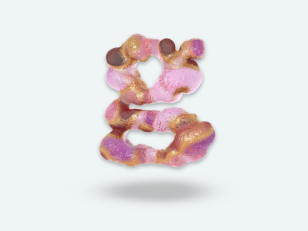
Alternate g
g → g
Alternate G
G
Additional Inktraps
“Don’t @ me, man.”
About Whyte
About this typeface
Info
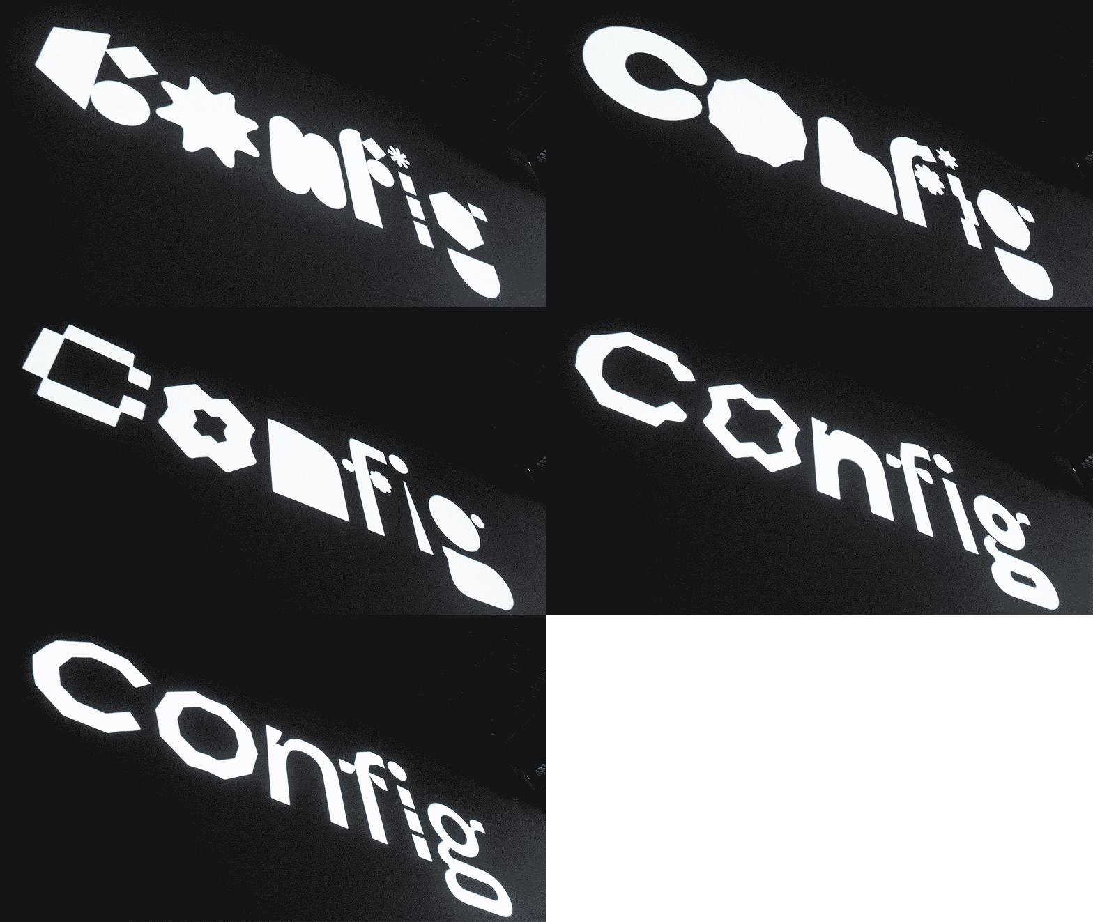
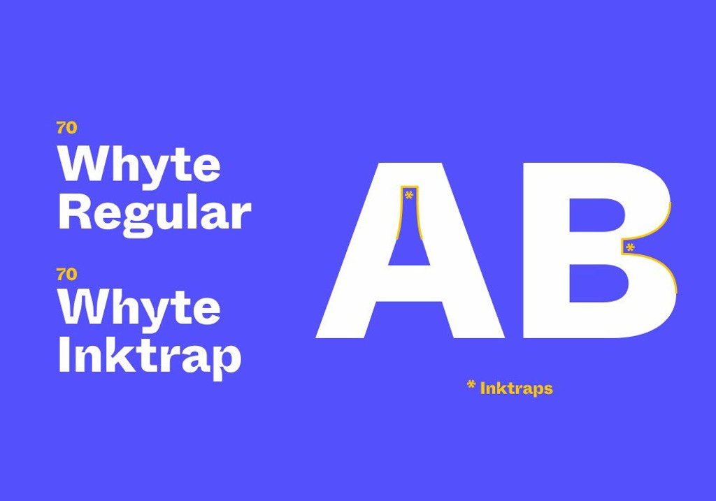
ABC Whyte is a contemporary grotesque typeface filled with idiosyncrasies and character, and it’s available as two distinctive subfamilies. ABC Whyte has smooth and sharp transitions, while ABC Whyte Inktrap has ink traps at its joints. Ink traps were necessary during the hot metal type printing era, in order to improve the quality of printed text. Using variable font technology, users are able to deepen or shorten the ink traps of this typeface for the first time, sliding from deep wells to shorter cuts. In doing so, Whyte transforms something once functional into a beautiful design detail in its own right.
Credits
Design by Dinamo (Fabian Harb & Johannes Breyer, with Erkin Karamemet & Fabiola Mejía)
Spacing and Kerning: Igino Marini
Production: Dinamo (Robert Janes) and Chi Long Trieu
Whyte Global
Hangul Font Pairing
Japanese Font Pairing
Chinese Font Pairing
Supported Languages
Afrikaans, Albanian, Basque, Bemba, Bosnian, Breton, Catalan, Croatian, Czech, Danish, Dutch, English, Esperanto, Estonian, Faroese, Filipino, Finnish, French, Frisian, Friulian, Gaelic, Galician, German, Greenlandic, Hungarian, Icelandic, Indonesian, Irish, Italian, Kinyarwanda, Latin, Latvian, Lithuanian, Luxembourgish, Malay, Maltese, Montenegrin, Māori, Norwegian, Occitan, Polish, Portuguese, Romanian, Romansh, Inari Sami, Lule Sami, Northern Sami, Southern Sami, Serbian (Latin), Slovak, Slovenian, Spanish, Swahili, Swedish, Turkish, Welsh and more
Character Overview
Whyte In Use
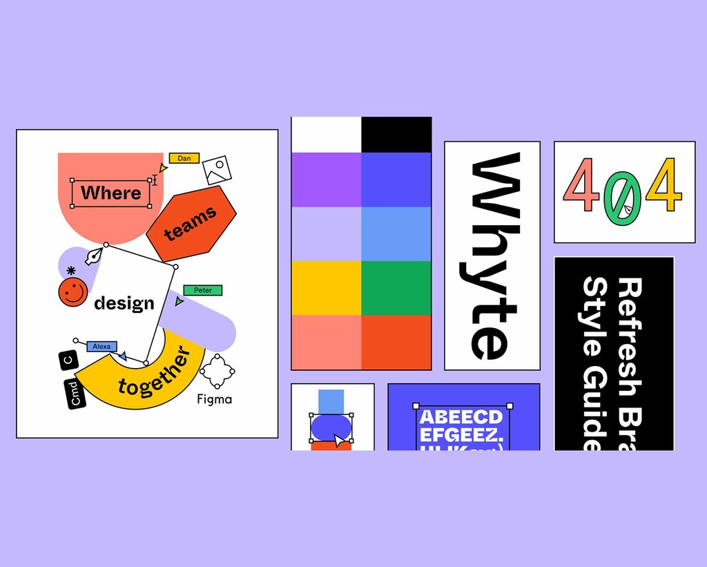
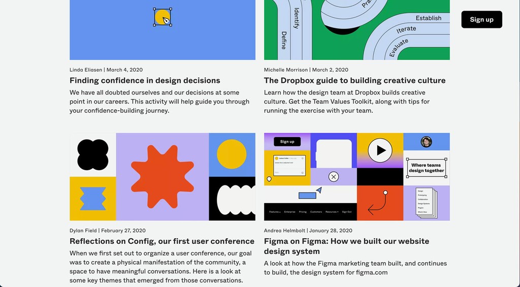
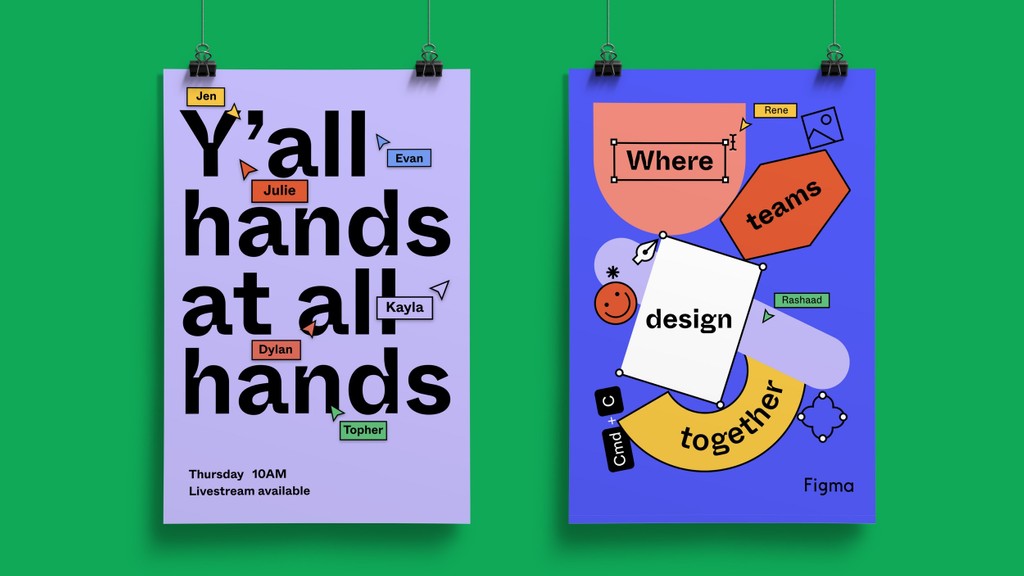
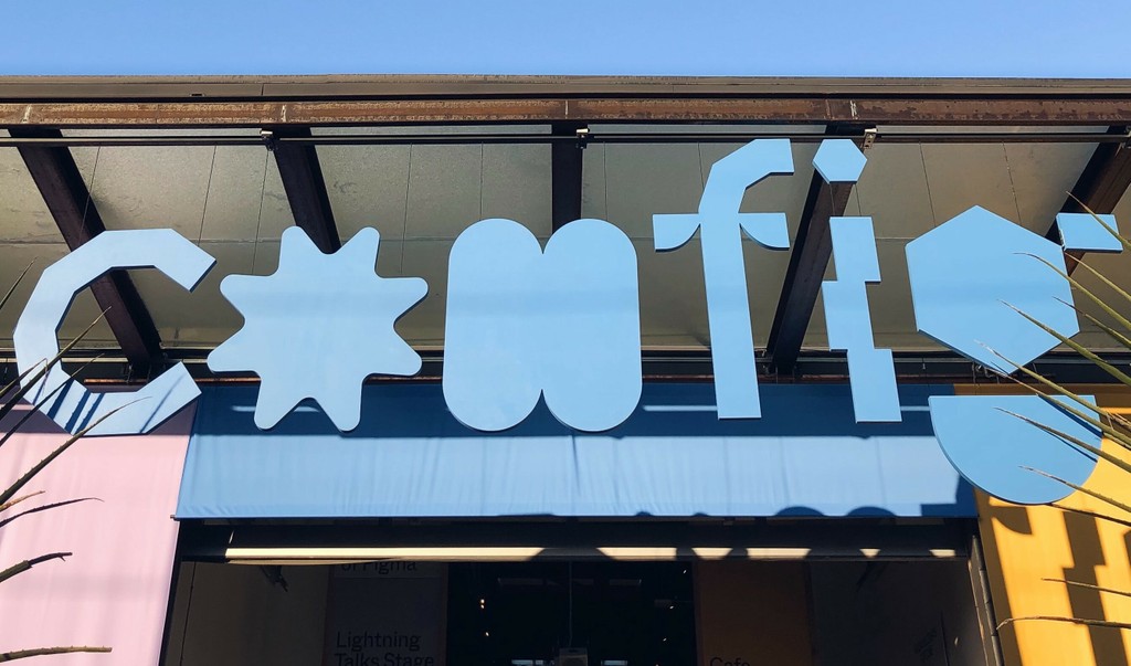
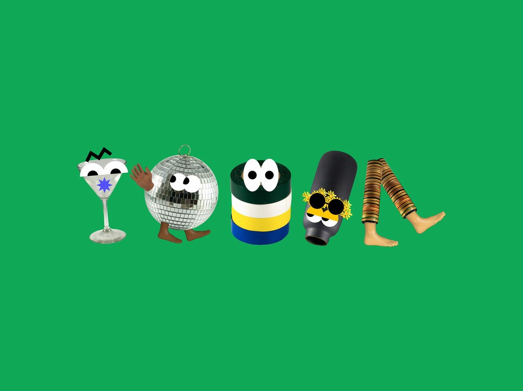
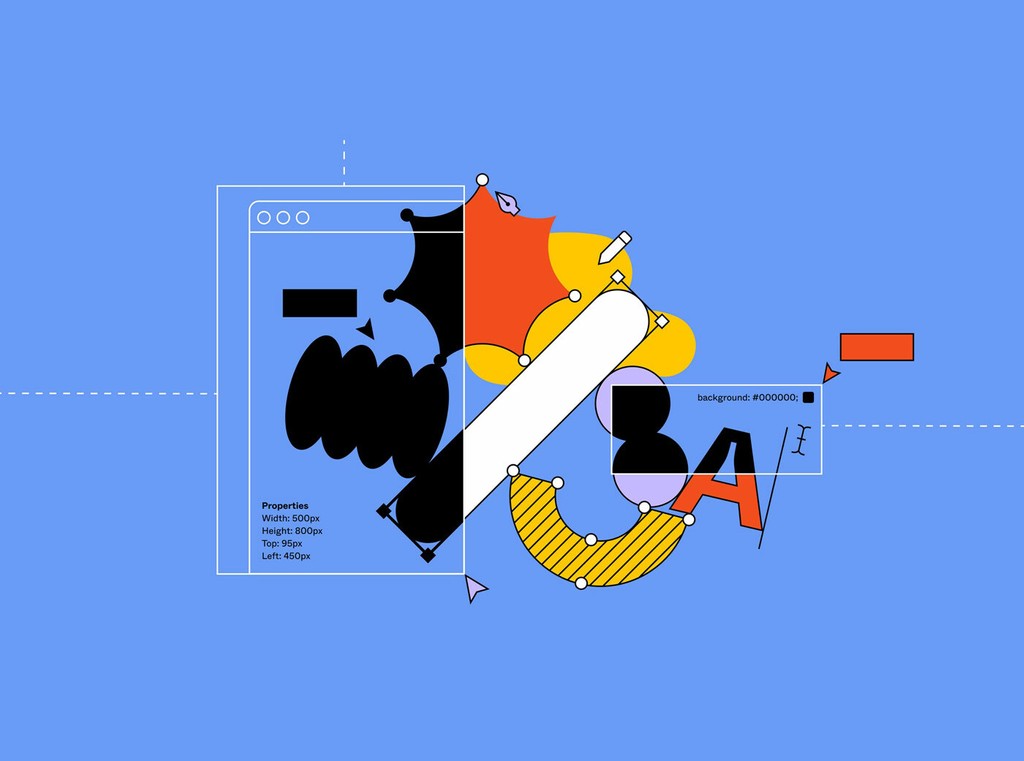
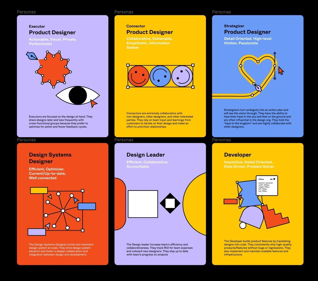
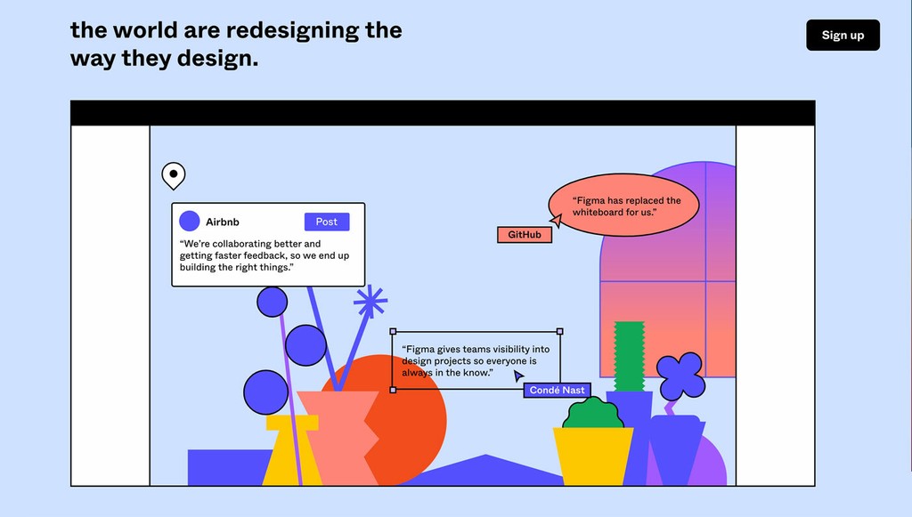
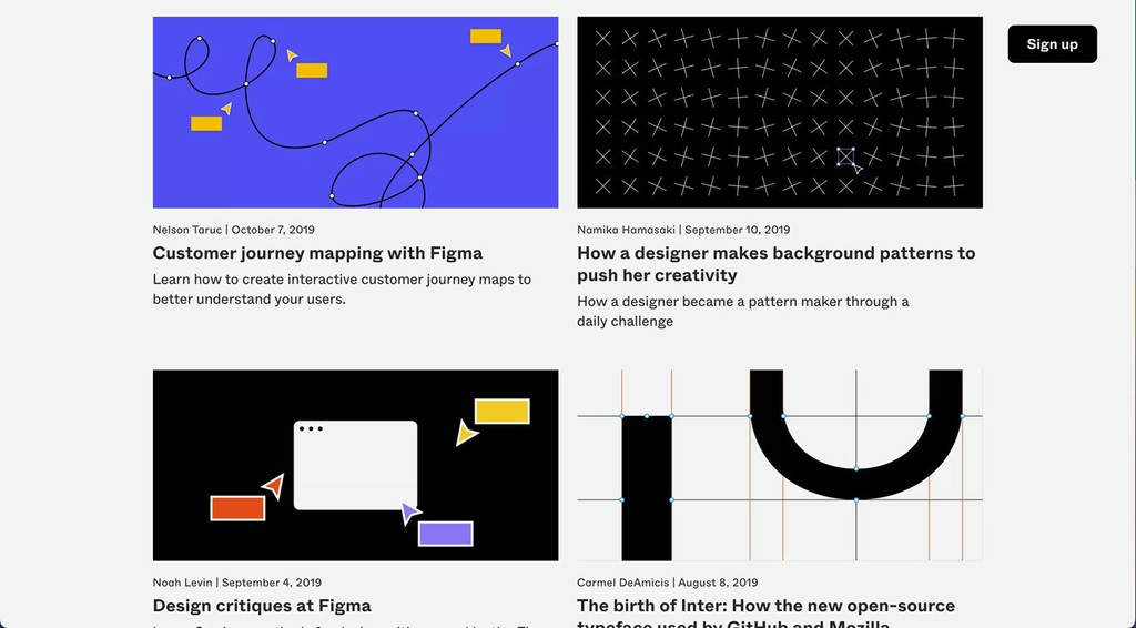
Figma. Design & photos by Figma
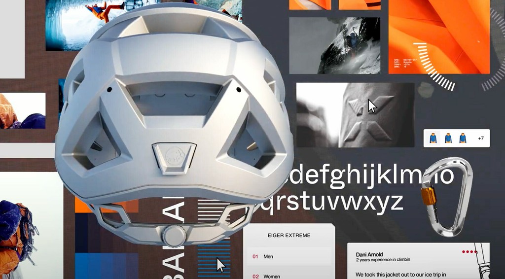
Mammut Eiger Extreme. Design by Build in Amsterdam
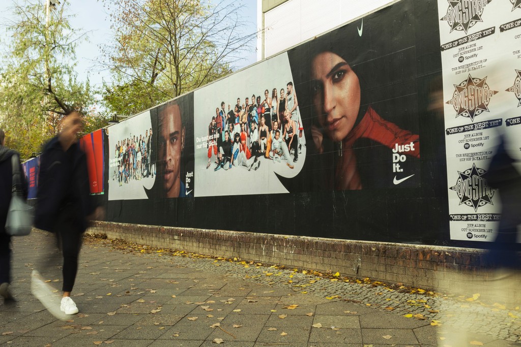
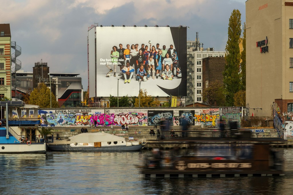
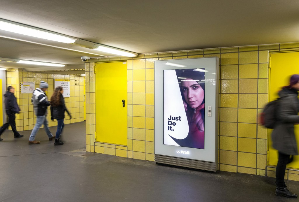
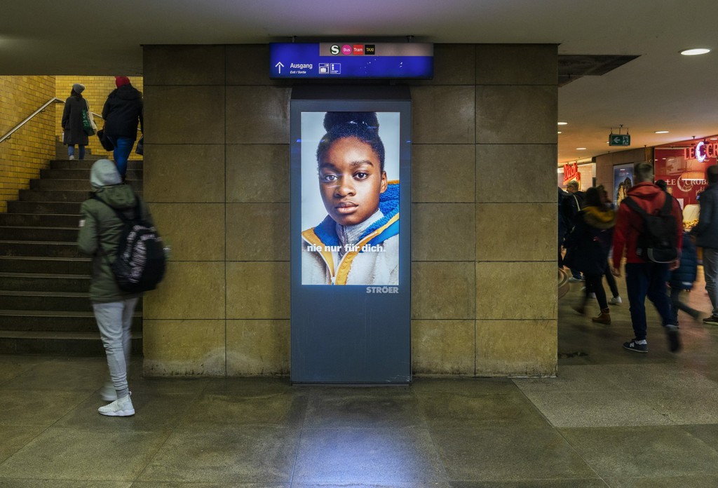
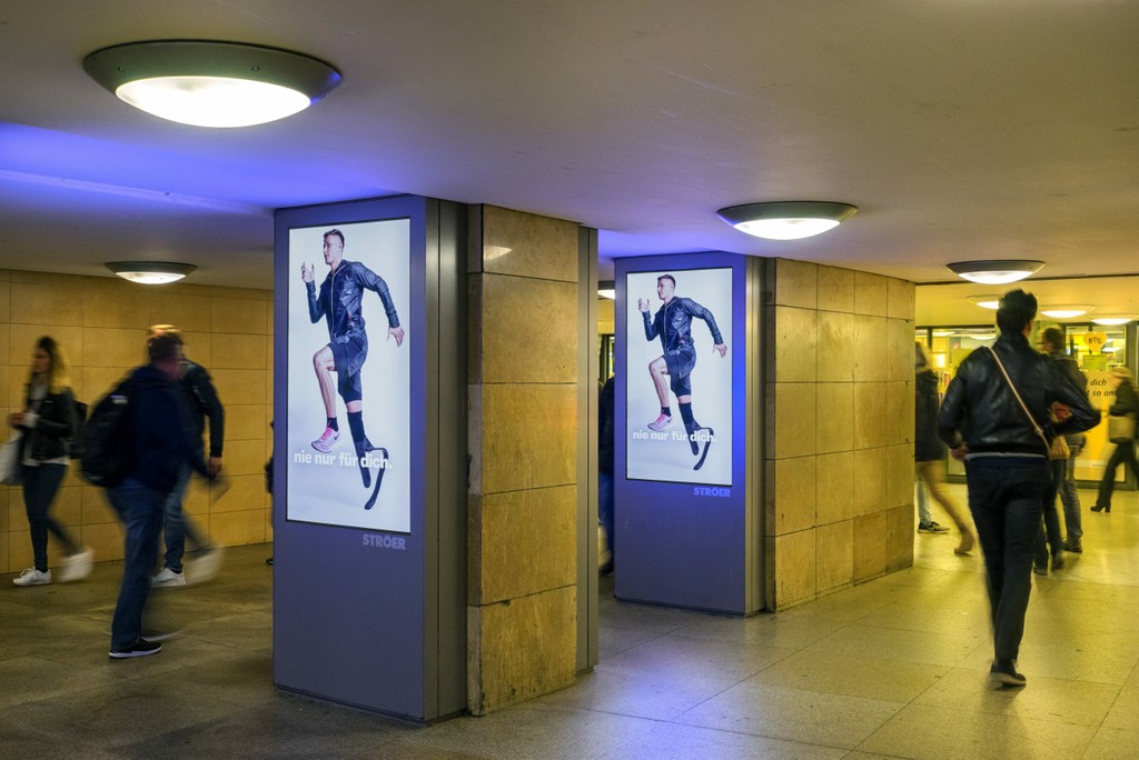
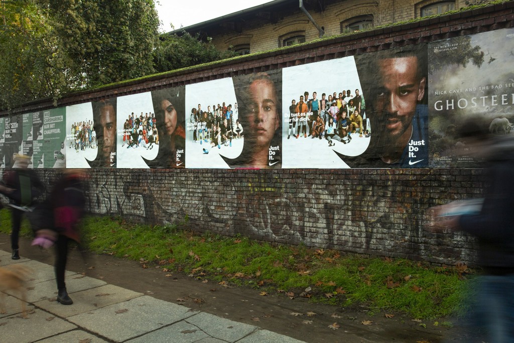
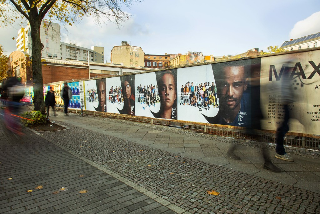
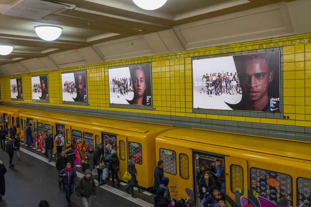
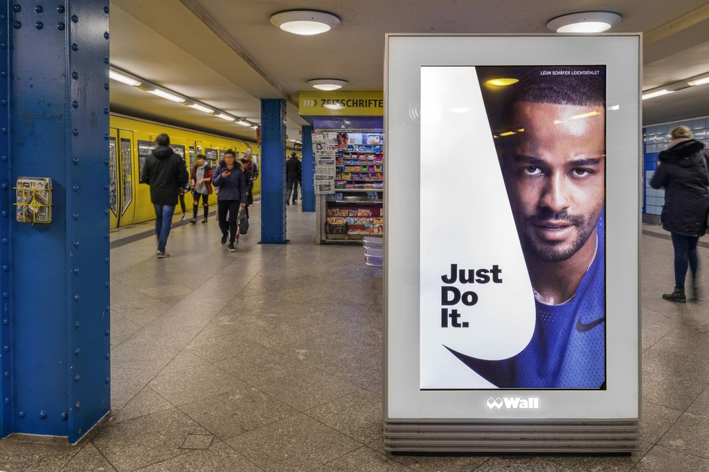
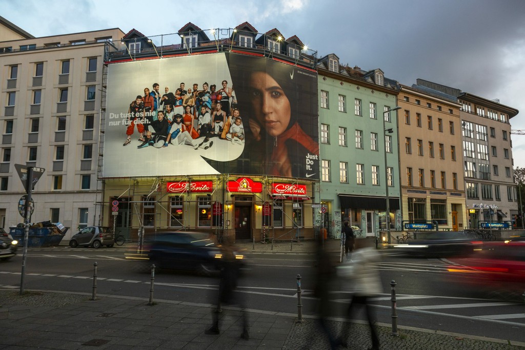
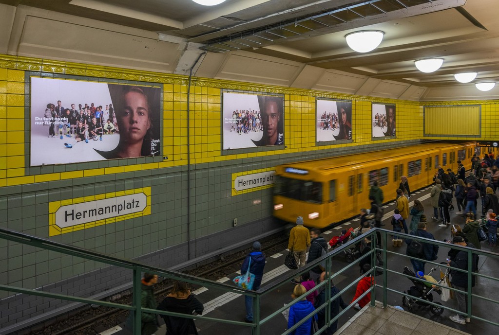
Nike Helden – Heroes. Design by w+k, photo by Media Photo Company
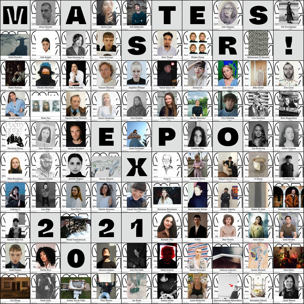
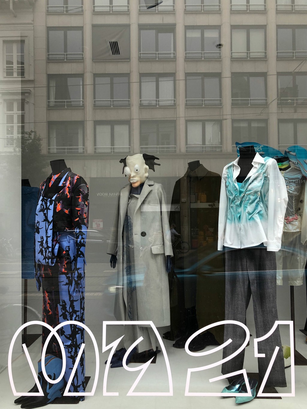
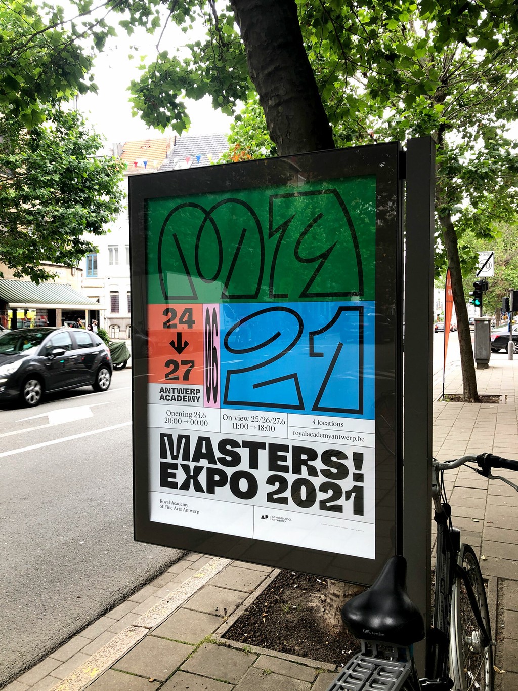
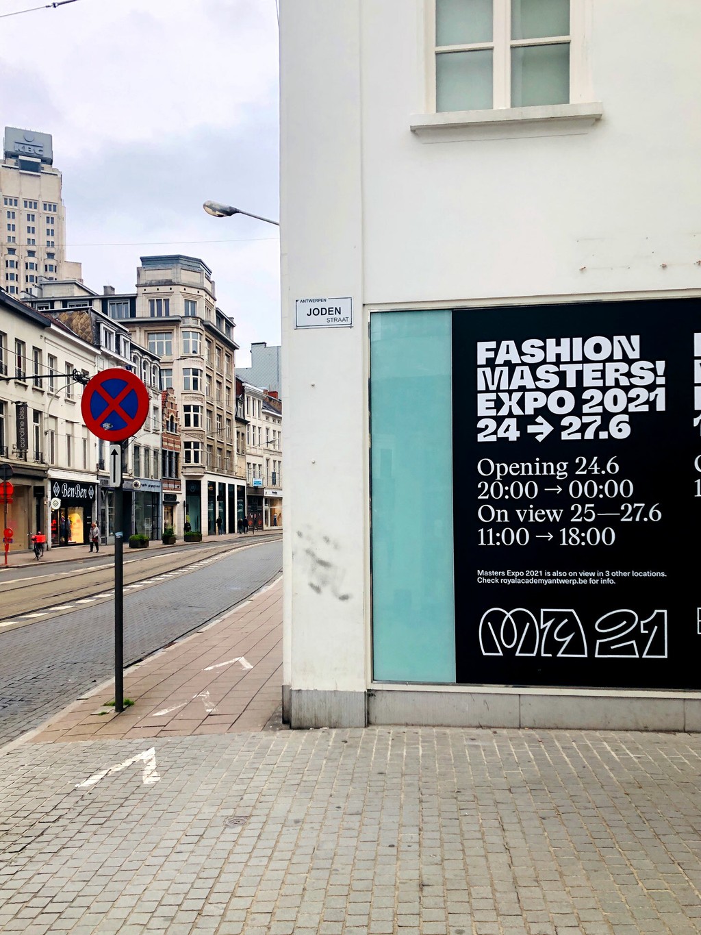
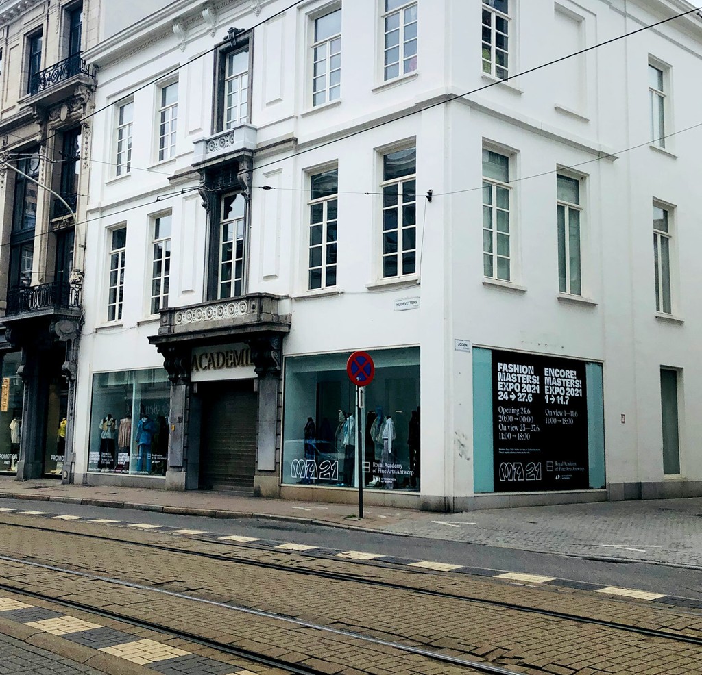
Royal Academy of Fine Arts Antwerp. Design by Specht Studio
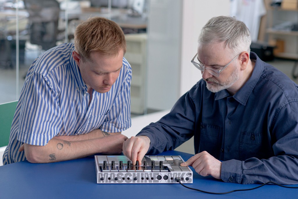
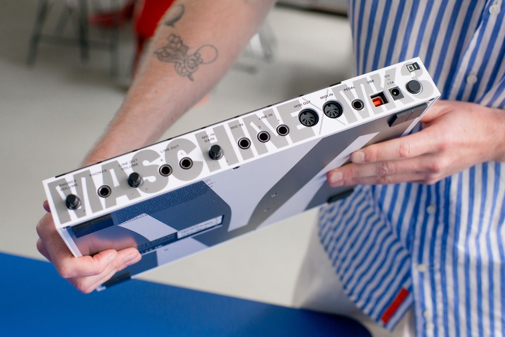
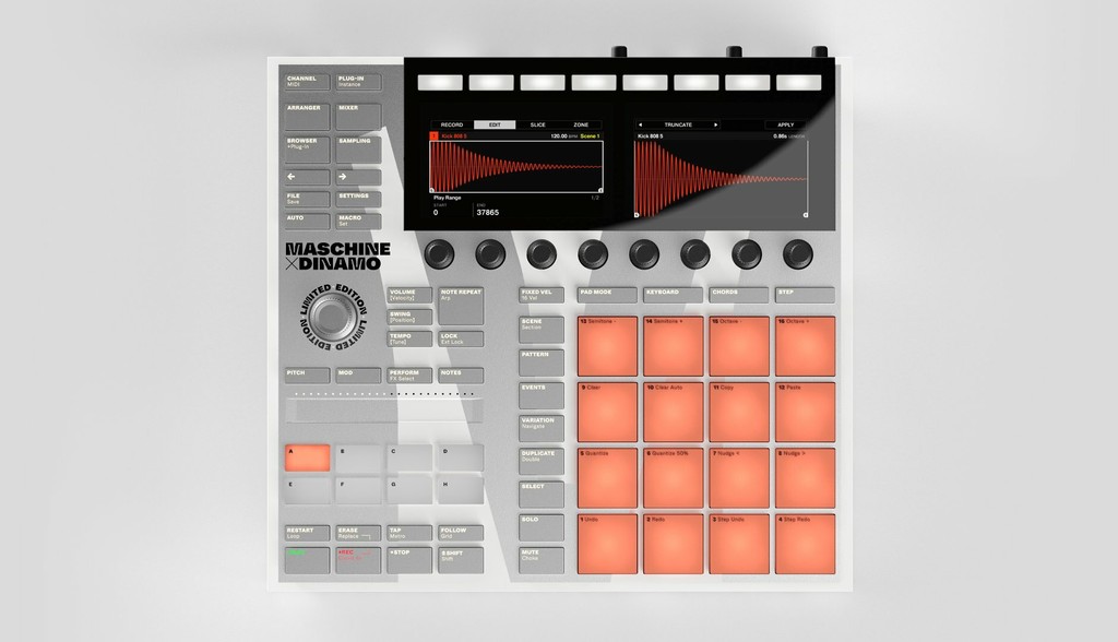
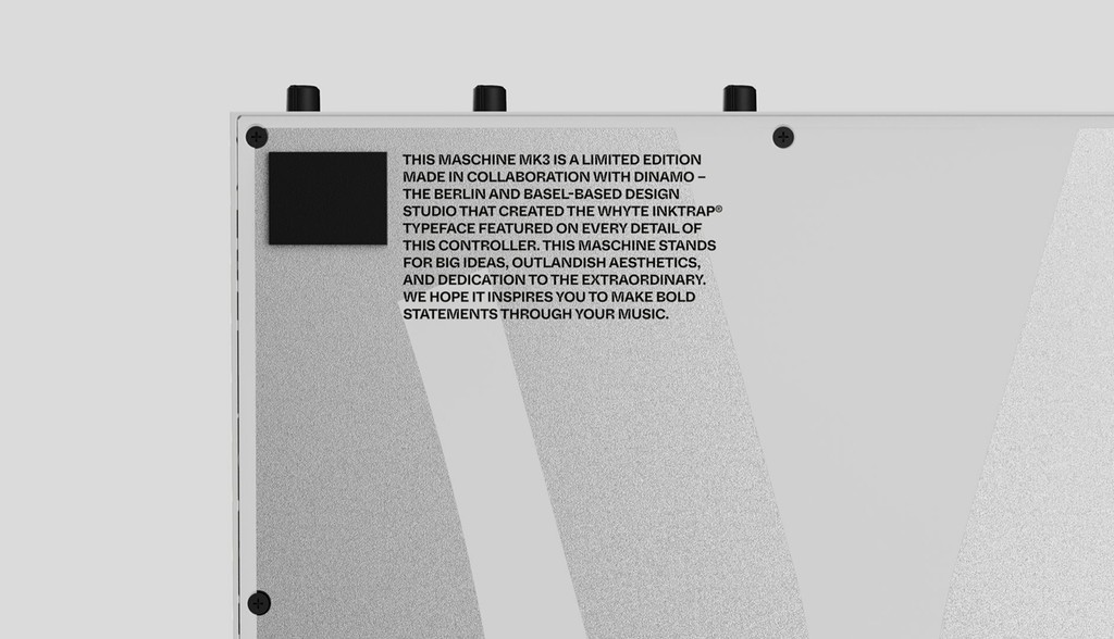
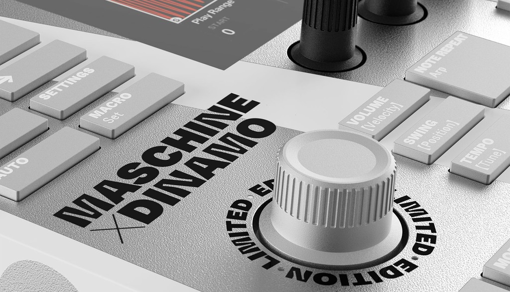
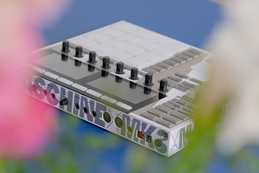
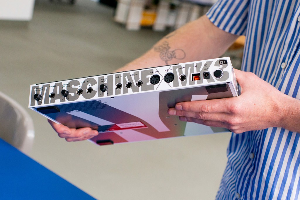
MASCHINE MK3 DINAMO. Dinamo X Native Instruments
