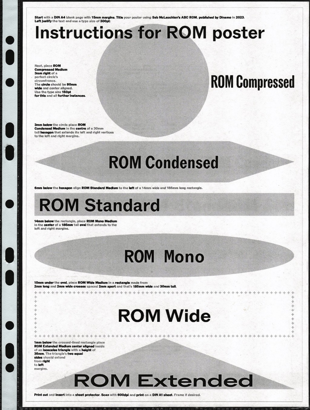
ROM
- Light & Italic
- Book & Italic
- Regular & Italic
- Medium & Italic
- Bold & Italic
- Heavy & Italic
- Black & Italic
ROM Mono
- Light & Italic
- Book & Italic
- Regular & Italic
- Medium & Italic
- Bold & Italic
- Heavy & Italic
- Black & Italic
ROM Compressed
- Light & Italic
- Book & Italic
- Regular & Italic
- Medium & Italic
- Bold & Italic
- Heavy & Italic
- Black & Italic
ROM Condensed
- Light & Italic
- Book & Italic
- Regular & Italic
- Medium & Italic
- Bold & Italic
- Heavy & Italic
- Black & Italic
ROM Wide
- Light & Italic
- Book & Italic
- Regular & Italic
- Medium & Italic
- Bold & Italic
- Heavy & Italic
- Black & Italic
ROM Extended
- Light & Italic
- Book & Italic
- Regular & Italic
- Medium & Italic
- Bold & Italic
- Heavy & Italic
- Black & Italic
ROM
ROM
- Light & Italic
- Book & Italic
- Regular & Italic
- Medium & Italic
- Bold & Italic
- Heavy & Italic
- Black & Italic
ROM Mono
ROM Mono
- Light & Italic
- Book & Italic
- Regular & Italic
- Medium & Italic
- Bold & Italic
- Heavy & Italic
- Black & Italic
ROM Compressed
ROM Compressed
- Light & Italic
- Book & Italic
- Regular & Italic
- Medium & Italic
- Bold & Italic
- Heavy & Italic
- Black & Italic
ROM Condensed
ROM Condensed
- Light & Italic
- Book & Italic
- Regular & Italic
- Medium & Italic
- Bold & Italic
- Heavy & Italic
- Black & Italic
ROM Wide
ROM Wide
- Light & Italic
- Book & Italic
- Regular & Italic
- Medium & Italic
- Bold & Italic
- Heavy & Italic
- Black & Italic
ROM Extended
ROM Extended
- Light & Italic
- Book & Italic
- Regular & Italic
- Medium & Italic
- Bold & Italic
- Heavy & Italic
- Black & Italic
About ROM
About this typeface
Info
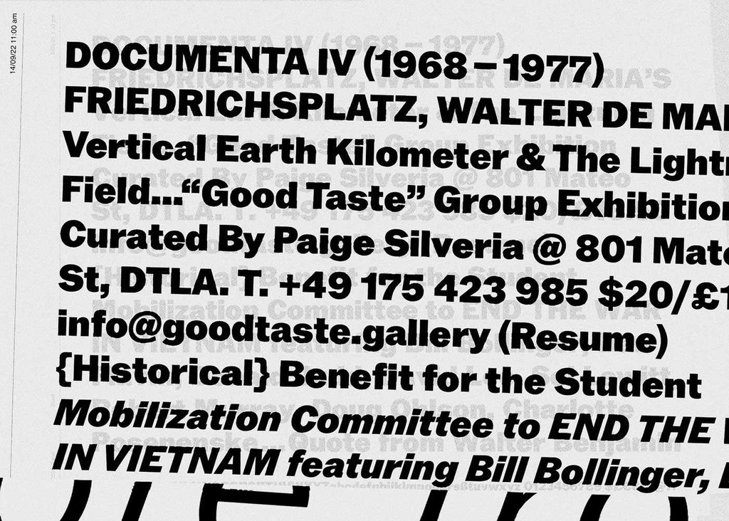
Designed by our longstanding collaborator and dear friend Seb McLauchlan, ROM is a sturdy, confident fusion of classic Grotesk and Gothic typeface styles. It combines the rationalized lines of the former with raw details from the latter, resulting in moments both beautiful and dissonant. Taking inspiration from typeface applications in conceptual art catalogs from the ’60s and ’70s, ROM’s proportions are wide and generous in caps, and narrow and elegant in lowercase.
In true Dinamo style, Seb is a graphic designer first who makes fonts second. In search of a mature typeface in the spirit of Franklin Gothic, Bell Gothic, or Akzidenz-Grotesk for his own publishing projects — one with a complete weight range that he could use sparingly — Seb took to a blank page and started constructing ROM. ROM features six subfamilies that flow gracefully from Compressed to Extended. Notice what happens to the O’s counter as it grows — shifting from diamond to rectangle to circle. It’s in these details that you can see ROM’s various influences and how they’ve been brought together under one variable roof.
Credits
Design: Seb McLauchlan
Spacing and Kerning: Igino Marini
Production: Dinamo
Supported Languages
Afrikaans, Albanian, Basque, Bemba, Bosnian, Breton, Catalan, Croatian, Czech, Danish, Dutch, English, Esperanto, Estonian, Faroese, Filipino, Finnish, French, Frisian, Friulian, Gaelic, Galician, German, Greenlandic, Hungarian, Icelandic, Indonesian, Irish, Italian, Kinyarwanda, Latin, Latvian, Lithuanian, Luxembourgish, Malay, Maltese, Montenegrin, Māori, Norwegian, Occitan, Polish, Portuguese, Romanian, Romansh, Inari Sami, Lule Sami, Northern Sami, Southern Sami, Serbian (Latin), Slovak, Slovenian, Spanish, Swahili, Swedish, Turkish, Welsh and more
Character Overview
ROM In Use
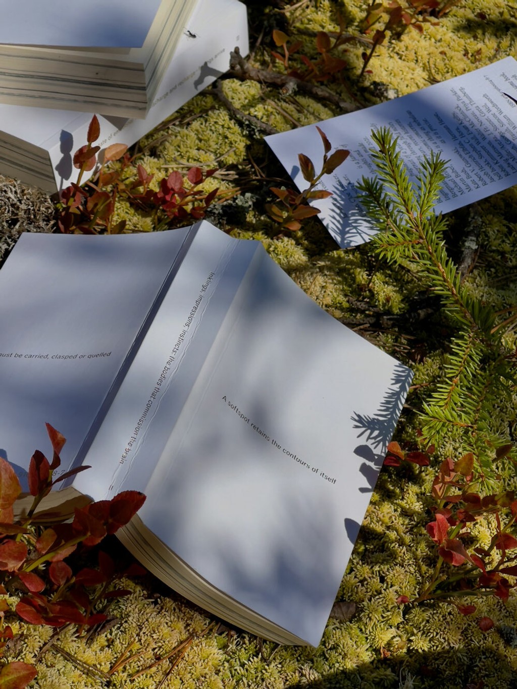
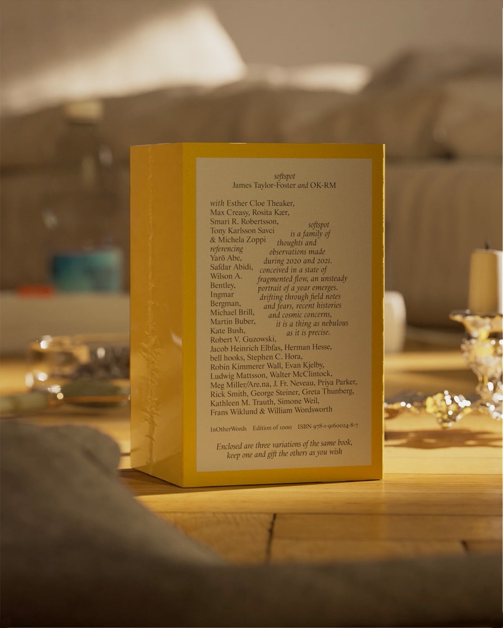
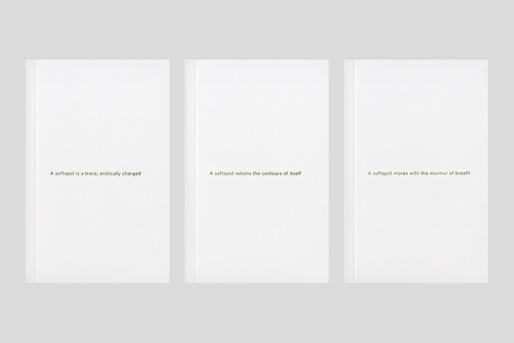
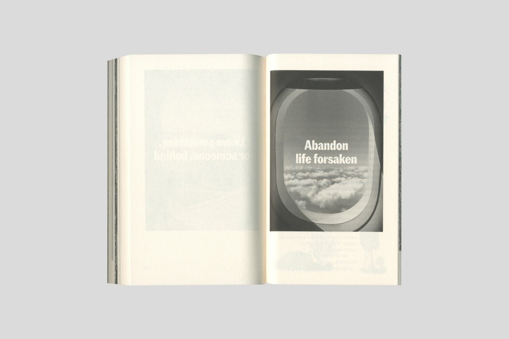
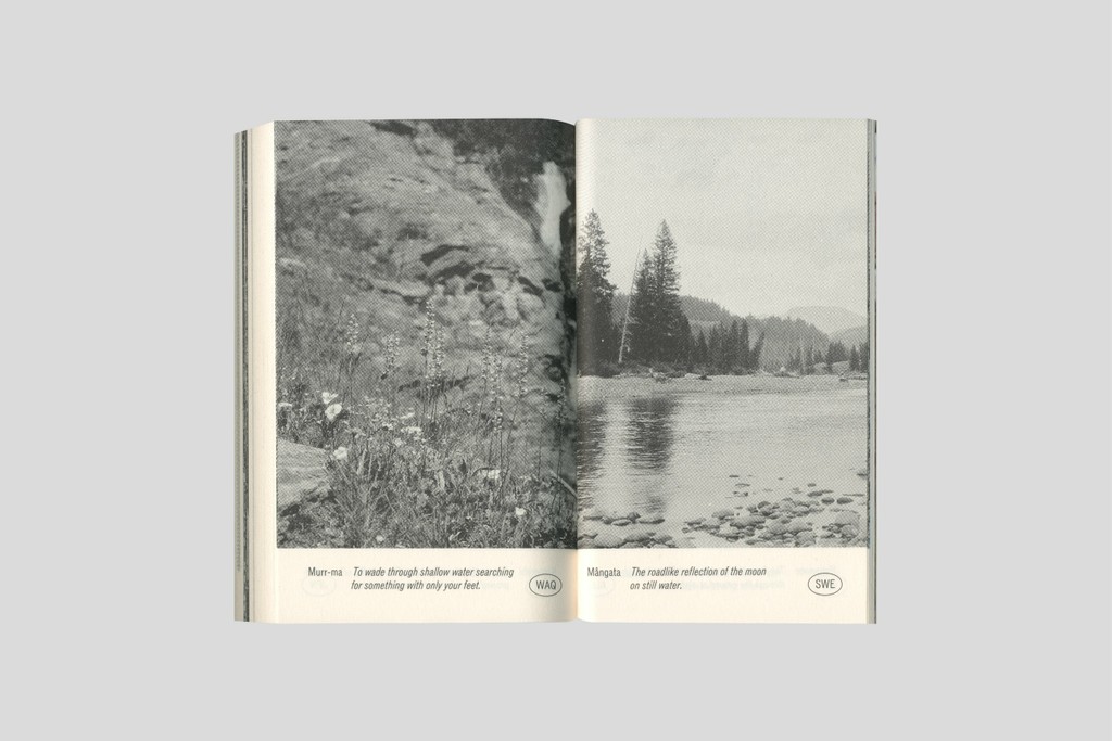
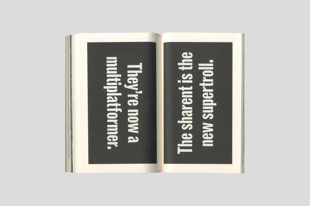
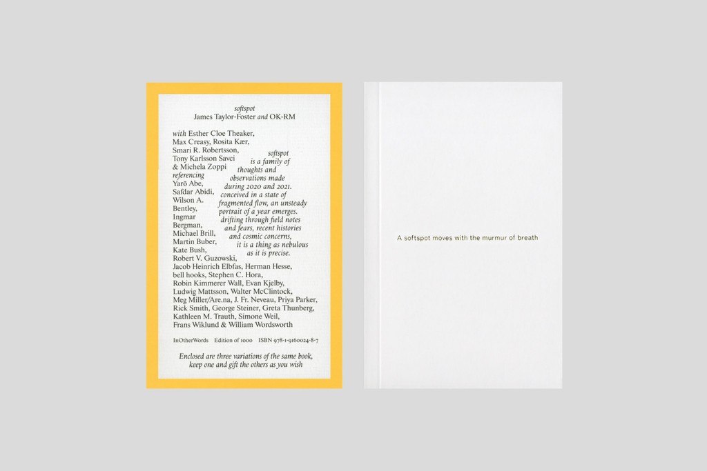
Softspot.
Peckham Audio Ad. Design by Modern Activity
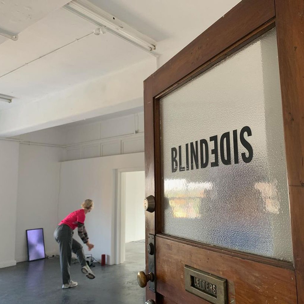
Blindside. Branding by Base Design
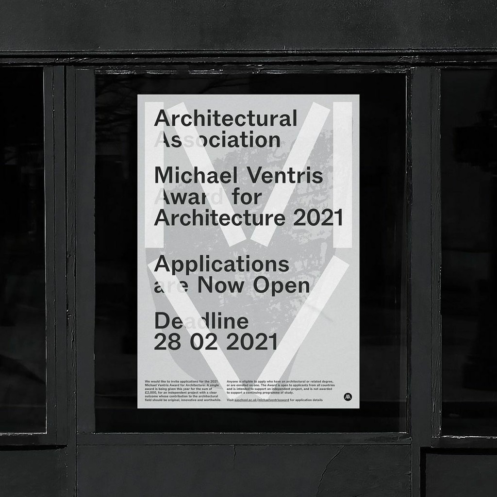
Architectural Association. Design by George Haughton
