Walter Alte
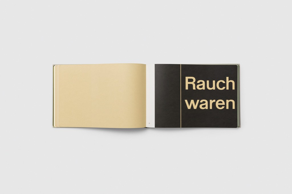
- Rauchwaren
- Normalgrotesk
- Roentgentherapie
- Stahlbau
- Plakat
Walter Neue
- Thin & Italic
- Light & Italic
- Regular & Italic
- Medium & Italic
- Semibold & Italic
- Bold & Italic
- Extrabold & Italic
Walter Neue Mono
- Thin & Italic
- Light & Italic
- Regular & Italic
- Medium & Italic
- Semibold & Italic
- Bold & Italic
- Extrabold & Italic
Walter Alte
Walter Alte
- Rauchwaren
- Normalgrotesk
- Roentgentherapie
- Stahlbau
- Plakat
Walter Neue
Walter Neue
- Thin & Italic
- Light & Italic
- Regular & Italic
- Medium & Italic
- Semibold & Italic
- Bold & Italic
- Extrabold & Italic
Walter Neue Mono
Walter Neue Mono
- Thin & Italic
- Light & Italic
- Regular & Italic
- Medium & Italic
- Semibold & Italic
- Bold & Italic
- Extrabold & Italic
About Walter
About this typeface
Info
ABC Walter is a long-standing, joint scholarly effort by Dinamo and Omnigroup: It comprises of Walter Alte and Walter Neue, two related yet ideologically opposed families celebrating an author and design educator with fingerprints all over Switzerland’s most famous fonts.
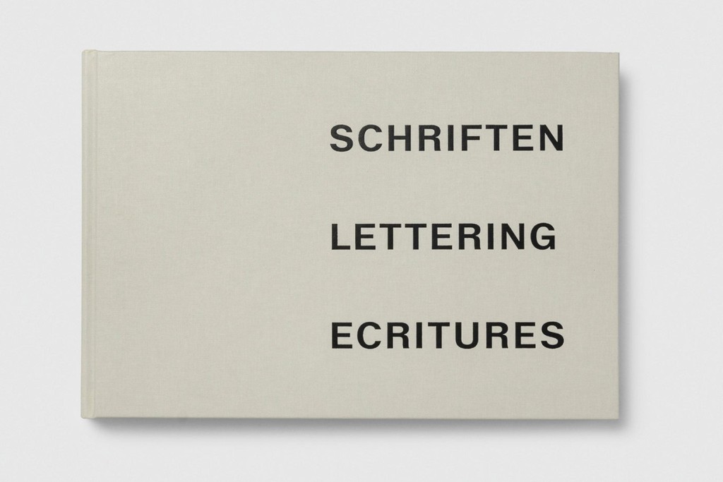
This has been a new kind of revival project for us, one that’s not based on a pre-existing typeface. Instead, our point of departure has been a tool used to teach students how to draw letterforms, designed by type educator Walter Käch in the mid-twentieth century. The triple styles of Walter Alte are a faithful study of Käch’s lessons, while Walter Neue is an extension, update, and digitally-minded interpretation.
Walter Alte consists of three faithfully revived cuts: Walter Alte Röntgentherapie has the highest contrast, while Walter Alte Normalgrotesk is the most constructed and mono-linear. Walter Alte Rauchwaren is smoother and slimmer, sitting in-between the first two stylistically, and recalling the way it once became a fertilizer to the Helvetica empire.
Walter Neue, on the other hand, is our extension and interpretation of Käch’s teachings — it’s not so much the “idea of a typeface” as a typeface itself, with fourteen styles, seven weights, Italics, stylistic alternates, and more. The feeling of the font’s original remains but we allowed for exceptions when it came to contrast and alignment. Walter Neue is readable and functional, with high contrast only in its heaviest weights. It’s altogether softer and less rigid than its studious older brother, featuring rounded dots (i, j, ä, ö, ü) and punctuation marks that lend it a friendlier edge.
Credits
Design: Dinamo (Renan Rosatti, Arnaud Chemin) & Omnigroup (Simon Mager & Leonardo Azzolini)
Spacing and Kerning: Igino Marini
Production: Dinamo
Supported Languages
Afrikaans, Albanian, Basque, Bemba, Bosnian, Breton, Catalan, Croatian, Czech, Danish, Dutch, English, Esperanto, Estonian, Faroese, Filipino, Finnish, French, Frisian, Friulian, Gaelic, Galician, German, Greenlandic, Hungarian, Icelandic, Indonesian, Irish, Italian, Kinyarwanda, Latin, Latvian, Lithuanian, Luxembourgish, Malay, Maltese, Montenegrin, Māori, Norwegian, Occitan, Polish, Portuguese, Romanian, Romansh, Inari Sami, Lule Sami, Northern Sami, Southern Sami, Serbian (Latin), Slovak, Slovenian, Spanish, Swahili, Swedish, Turkish, Welsh and more
Character Overview
Walter In Use
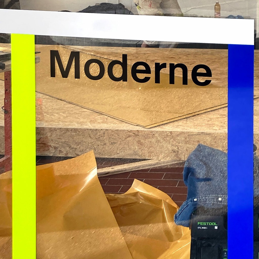
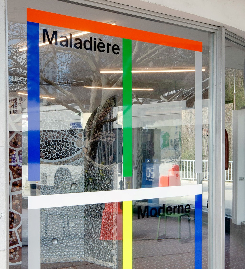
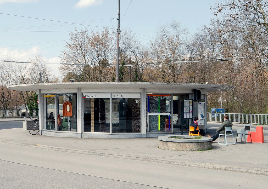
Maladière Moderne. Design by Omni Group
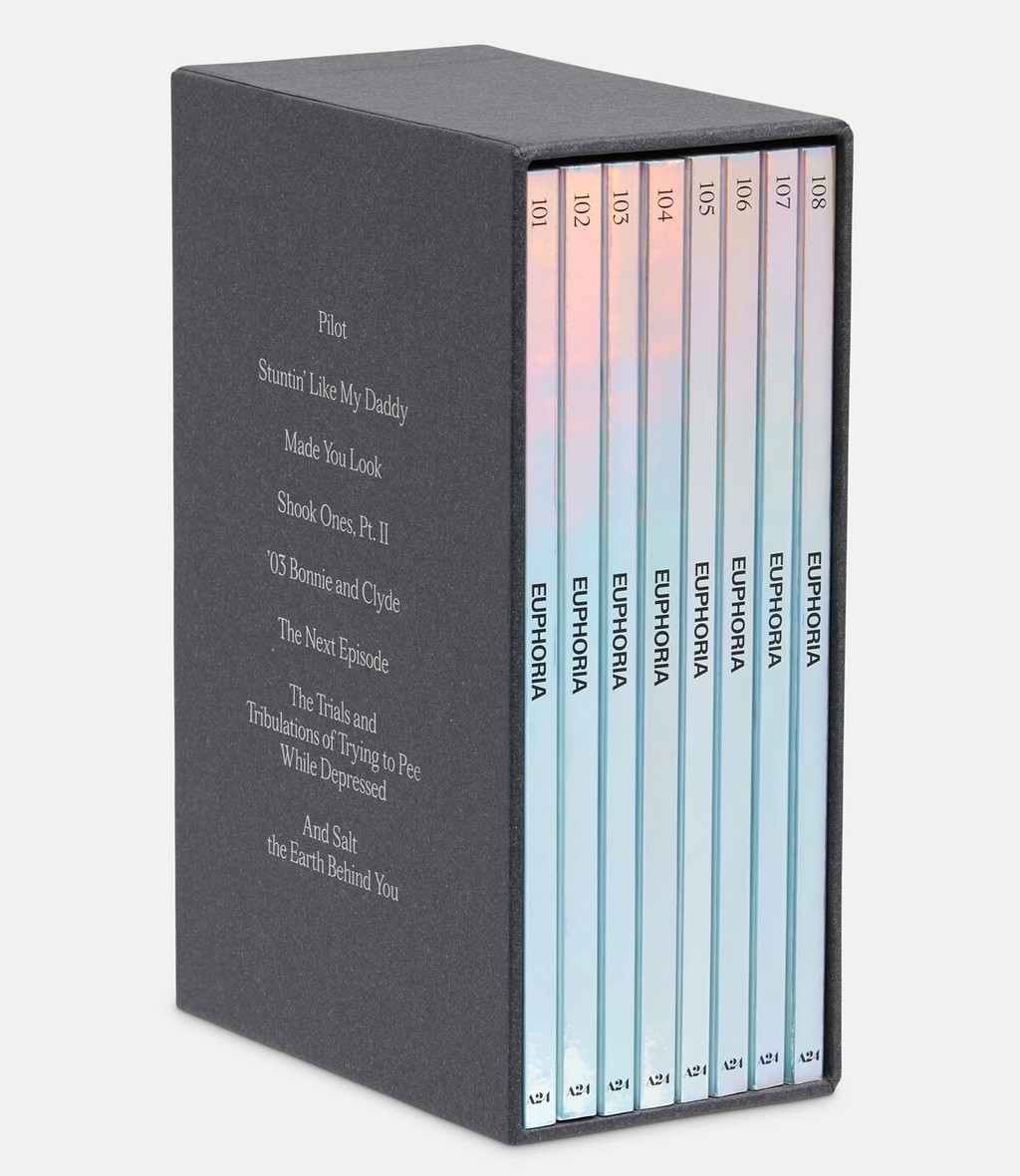
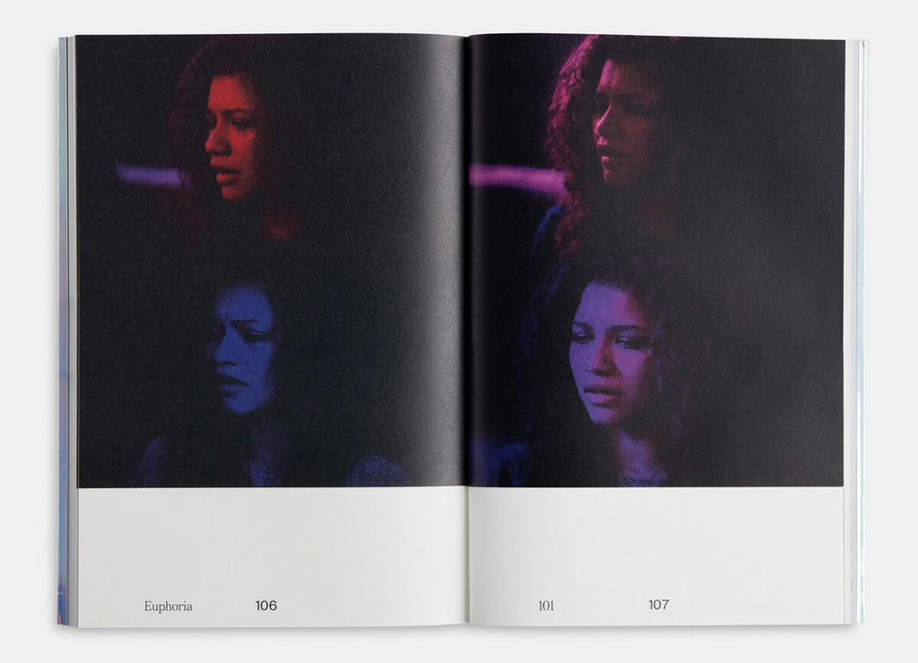
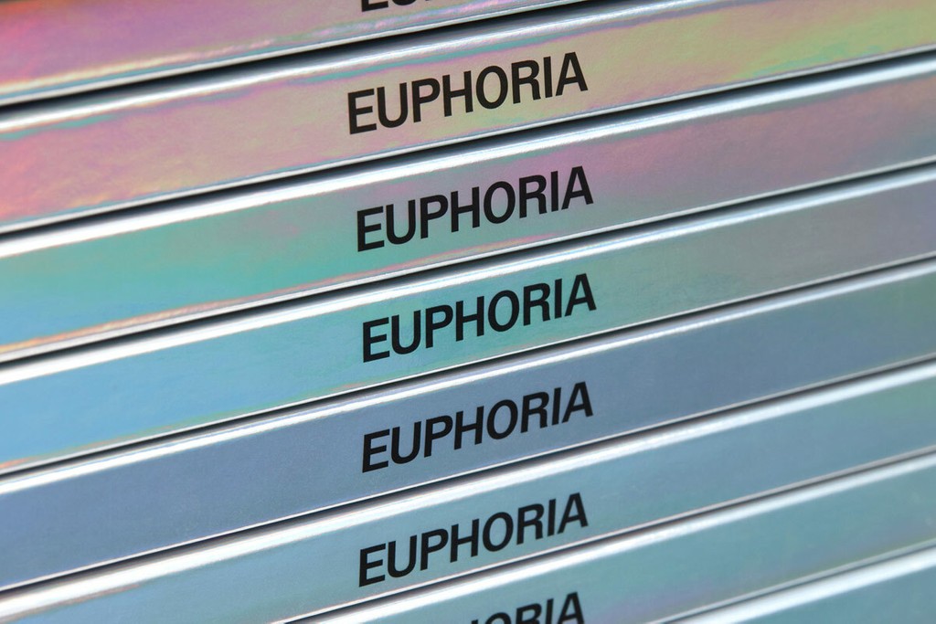
Euphoria (A24/HBO). Design by Actual Source
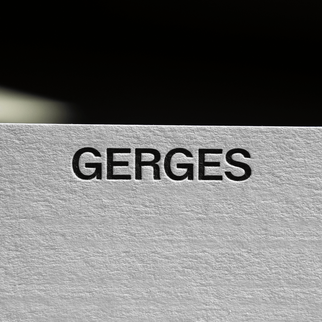
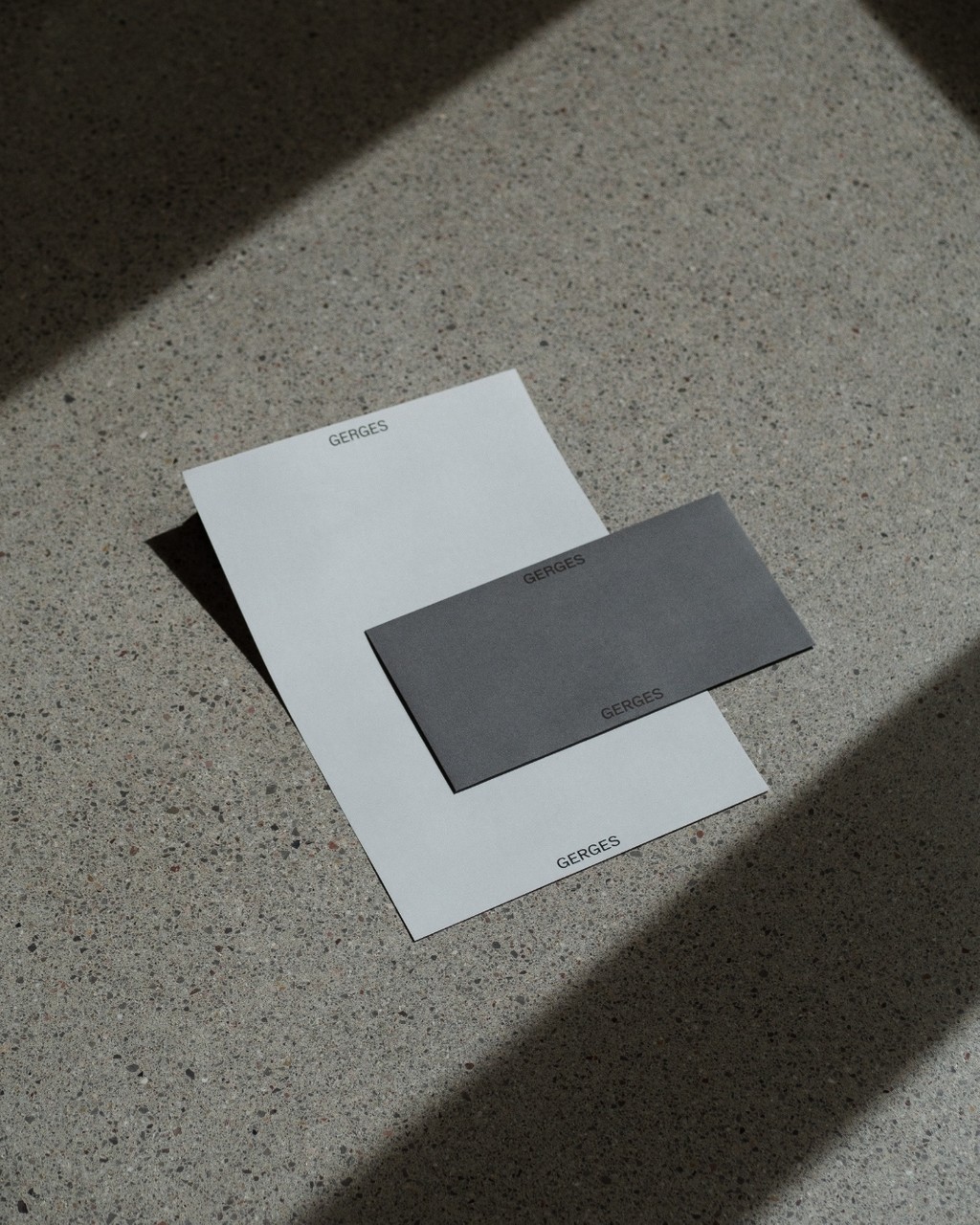
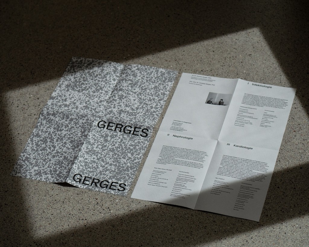
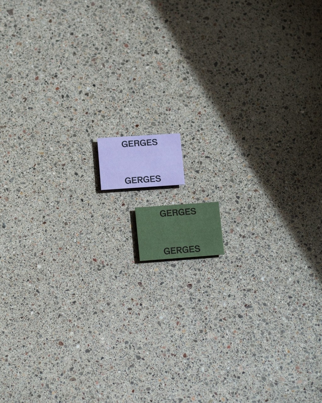
GERGES GERGES identity. Design by Cin Cin
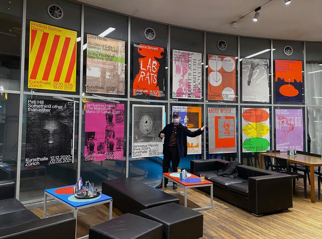
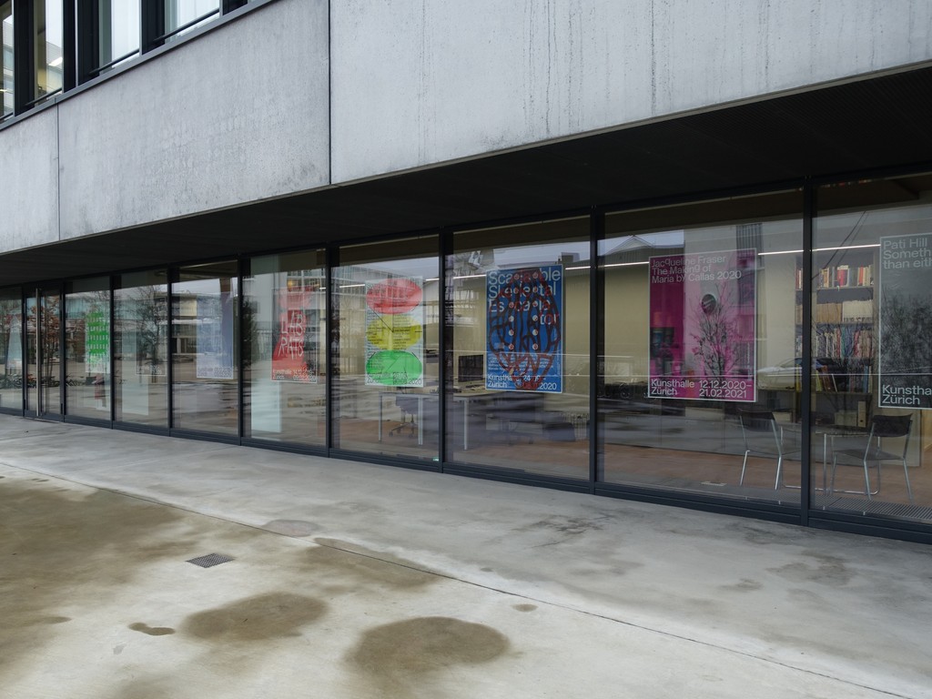
Kunsthalle Zurich. Design by Dan Solbach
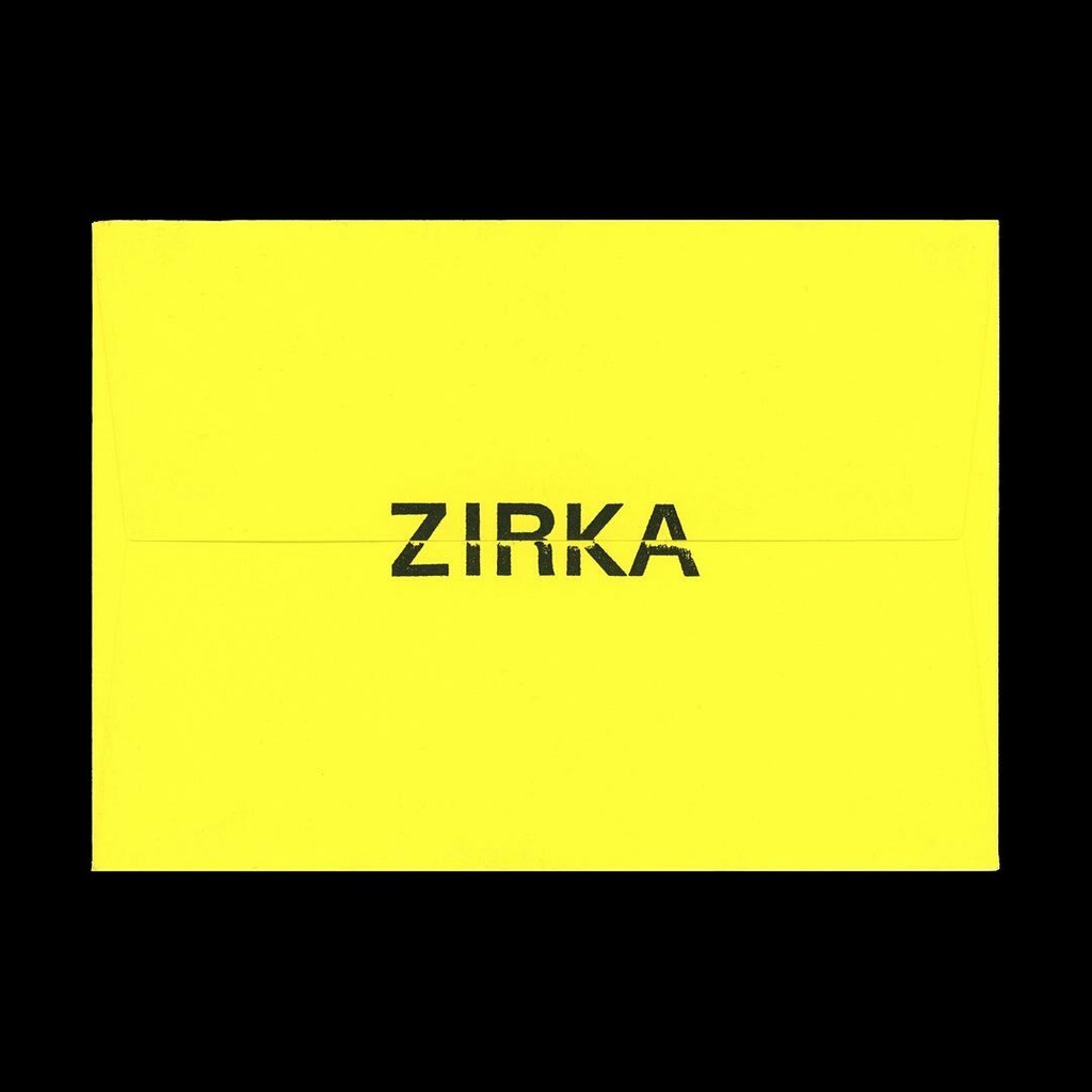
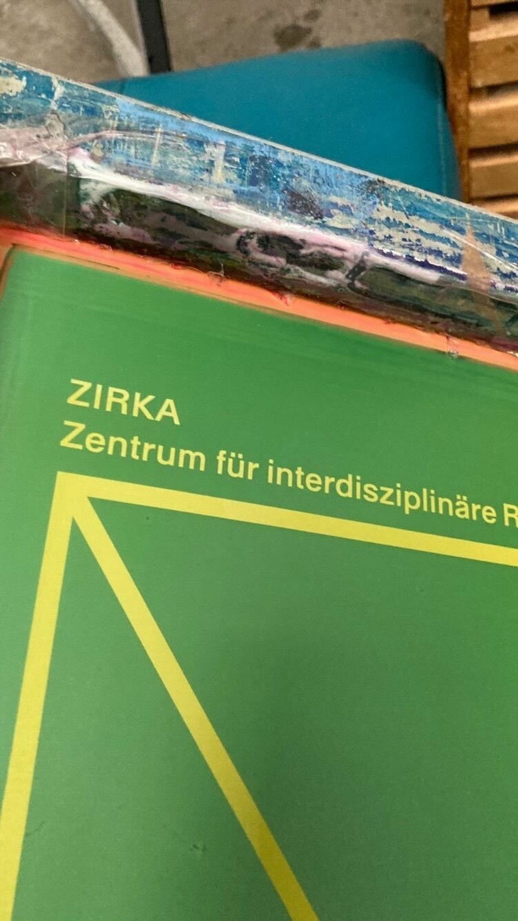
Zirka. Design by Daily Dialogue
