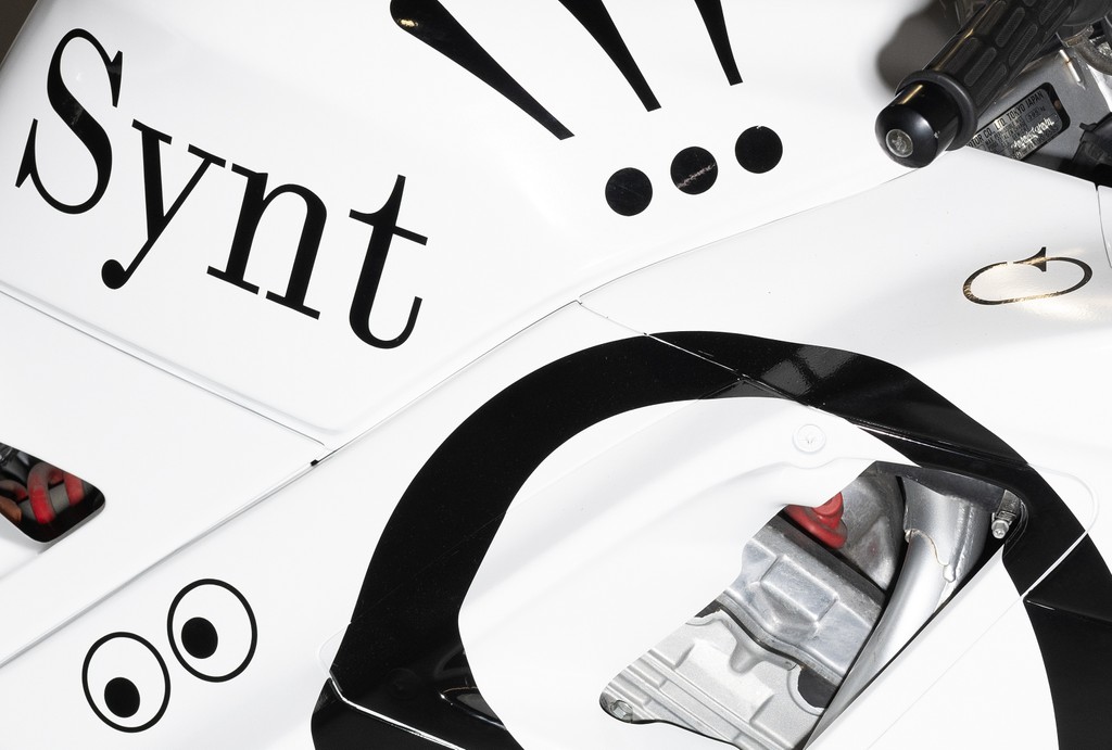
Synt
Synt
- Book & Italic
- Regular & Italic
- Medium & Italic
- Semibold & Italic
- Bold & Italic
- Black & Italic
- Regular Slant
- Regular Turbo
- Book Slant
- Book Turbo
- Medium Slant
- Medium Turbo
- Semibold Slant
- Semibold Turbo
- Bold Slant
- Bold Turbo
- Black Slant
- Black Turbo
Synt Mono
Synt Mono
- Regular
Features
Schoolbook Alternates
ag → ag
Alternate &
& → &
Centered Dieresis
ÄËÜŸ
Alternate @
Don’t @ me
Beethoven Alternates
b → b d → d
q → q p → p
Alternate C & G
Chopin
or Gaga?
Circled Numbers
1827 → 1827
About Synt
About this typeface
Info
Synt is a unitized reimagining of 19th Century modern faces complete with variable slant modulation and an emphatic rhythm. It takes its logic and shapes from a typeface used in a 1900 book by influential commercial printer Theodore Low De Vinne and remixes them with special glyphs and musical alternates ideal for apps, podcasting, and all spheres of streaming.
The beautiful font has a “parametric” rhythm, meaning there’s an identical distance between and within every stem. Its strict unitization plays a huge part of why the typeface feels so even.
The full family comes complete with six weights, a mono cut, and not one but three styles of italics: a True Italics (16°), a Slanted variation (16°), and a Turbo Slant (32°) for whenever you need to really emphasize something. Use the Variable Font file to slide between the whole slanted range.
Credits
Design: Kaj Lehmann
Production: Dinamo (Renan Rosatti)
Supported Languages
Latin: Spanish, English, Portuguese, Swahili (individual language), German, Italian, Javanese, Malay (individual language), French, Turkish, Polish, Filipino, Indonesian, Yoruba, Standard Malay, Sundanese, Igbo, Northern Uzbek, Romanian, West Central Oromo, Amahuaca, Malagasy, Dutch, Tagalog, Cebuano, Somali, Northern Kurdish, Haitian, Hungarian, Zulu, Nyanja, Shona, Czech, Quechua, Swedish, Kikuyu, Kinyarwanda, Umbundu, Hiligaynon, Iloko, Rundi, Kalenjin, Ganda, Xhosa, Central Kurdish, Afrikaans, Turkmen, Madurese, Low German, Luba-Lulua, Kongo, Danish, Neapolitan, Croatian, Southern Sotho, Minangkabau, Wolof, Finnish, Kituba (Democratic Republic of Congo), Slovak, Swiss German, Pedi, Sicilian, Eastern Oromo, Norwegian, Luo (Kenya and Tanzania), Catalan, Bemba (Zambia), Buginese, Venetian, Borana-Arsi-Guji Oromo, Kamba (Kenya), Lombard, Banjar, Soga, Achinese, Gheg Albanian, Nyankole, Balinese, Jamaican Creole English, Yao, Lithuanian, Bosnian, Waray (Philippines), Slovenian, K'iche', Gusii, Kimbundu, Southern Qiandong Miao, Northern Qiandong Miao, Soninke, Meru, Afar, Pampanga, Hani, Tosk Albanian, Standard Latvian, Central Aymara, Southern Aymara, Batak Toba, Toba, North Ndebele, Chiga, Sena, Bini, Galician, Tumbuka, Scots, Tonga (Zambia), Dimli (individual language), Kirmanjki (individual language), Acholi, Anaang, Makonde, Sardinian, Mandinka, Guadeloupean Creole French, Batak Simalungun, Batak Dairi, Batak Mandailing, South Ndebele, Standard Estonian, Ngazidja Comorian, Morisyen, Khasi, Upper Guinea Crioulo, Chokwe, Gourmanchéma, Kabuverdianu, Lushai, Ndonga, Uab Meto, Kekchí, Occitan (post 1500), Yucateco, Bari, Basque, Picard, Piemontese, Welsh, Chavacano, Bena (Tanzania), Nobiin, Konzo, Walloon, Friulian, Kara-Kalpak, Balkan Romani, Crimean Tatar, Vlax Romani, Maltese, Samoan, Silesian, Batak Karo, Mam, Western Frisian, Sango, Zapotec, Tzeltal, Jola-Fonyi, Tzotzil, Ladino, Efik, Tetun Dili, Tetum, Luxembourgish, Asturian, Papiamento, Tedim Chin, Fijian, Icelandic, Wayuu, Mandjak, Mapudungun, Kölsch, Macedo-Romanian, Kaonde, Montenegrin, Breton, Latgalian, Garifuna, Tonga (Tonga Islands), Amis, Caribbean Hindustani, Huastec, Maore Comorian, Mískito, Irish, Gagauz, Sranan Tongo, Corsican, Purepecha, Tok Pisin, Gilbertese, Kashubian, Mwani, Arbëreshë Albanian, Saramaccan, Võro, Papantla Totonac, Bikol, Mankanya, Sangu (Tanzania), Seselwa Creole French, Faroese, Andaandi, Tahitian, Orma, Páez, Chamorro, Kalaallisut, Scottish Gaelic, Aguaruna, Chuukese, Maori, Mattokki, Romansh, Ladin, Central Nahuatl, Ojitlán Chinantec, Karelian, Asháninka, Naga Pidgin, Pohnpeian, Shipibo-Conibo, Northern Sami, Shuar, Alekano, Pijin, Walser, Rarotongan, Acheron, Kaingang, Palauan, Mirandese, Upper Sorbian, Dehu, Tuvalu, Aragonese, Bislama, Chachi, Pichis Ashéninka, Ashéninka Perené, Yanesha', Ixcatlán Mazatec, Kven Finnish, Niuean, Achuar-Shiwiar, Lower Sorbian, Hopi, Nomatsiguenga, Eastern Arrernte, Creek, Rotokas, Mohawk, Tokelau, Algonquin, Cofán, Warlpiri, Matsés, Murrinh-Patha, Chiltepec Chinantec, Veps, Amarakaeri, Interlingua (International Auxiliary Language Association), Oroqen, Cashinahua, Cashibo-Cacataibo, Candoshi-Shapra, Esperanto, Kala Lagaw Ya, Seri, Lule Sami, Southern Sami, Pipil, Caquinte, Inari Sami, Cimbrian, Istro Romanian, Anuta, Meriam Mir, Shawnee, Ido, Aleut, Pintupi-Luritja, Gooniyandi, Ume Sami, Wiradjuri, Volapük, Han, Western Abnaki, Záparo, Munsee, Lojban, Interlingue, Potawatomi, Minang, Manx, Interglossa, Latin, Klingon, Cornish, Novial and Eastern Abnaki
Character Overview
Synt In Use
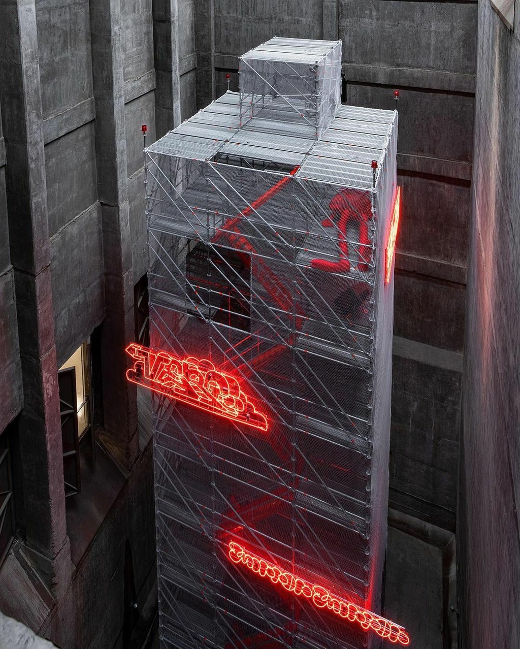
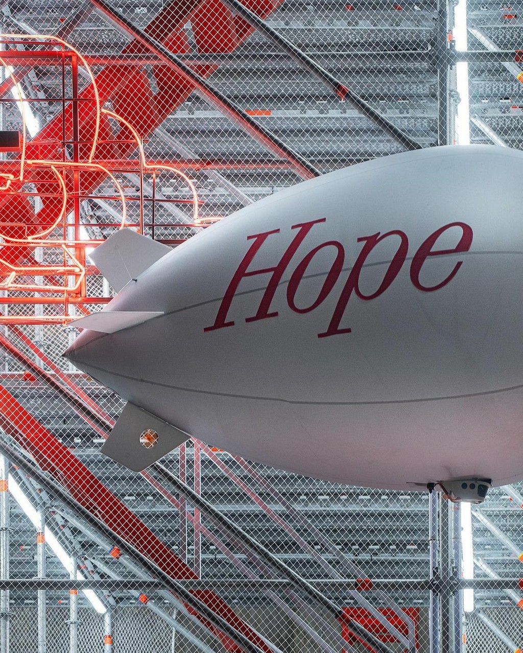
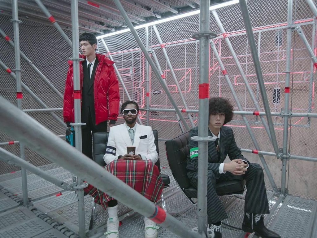
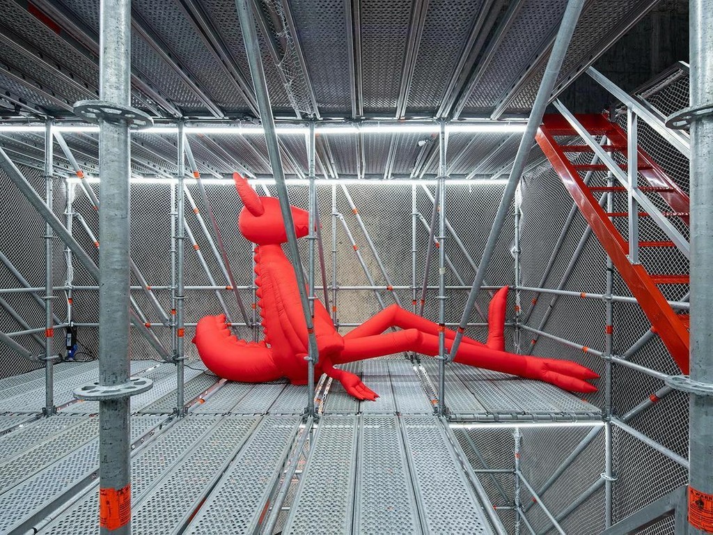
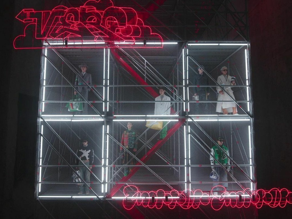
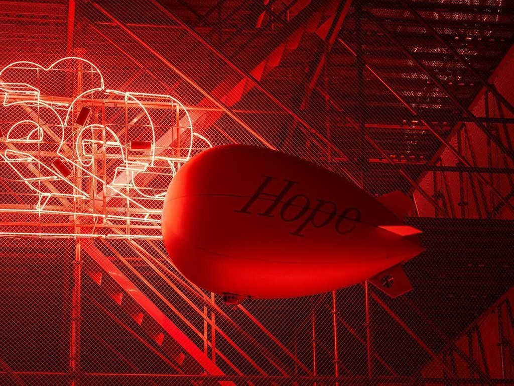
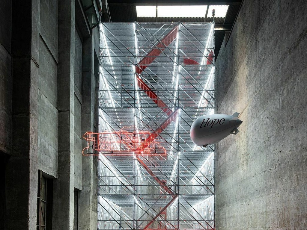
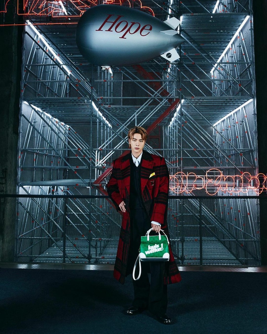
Louis Vuitton, FW 21. Seoul, Korea. Film by Virgil Abloh, Visual Direction by BeGood Studios
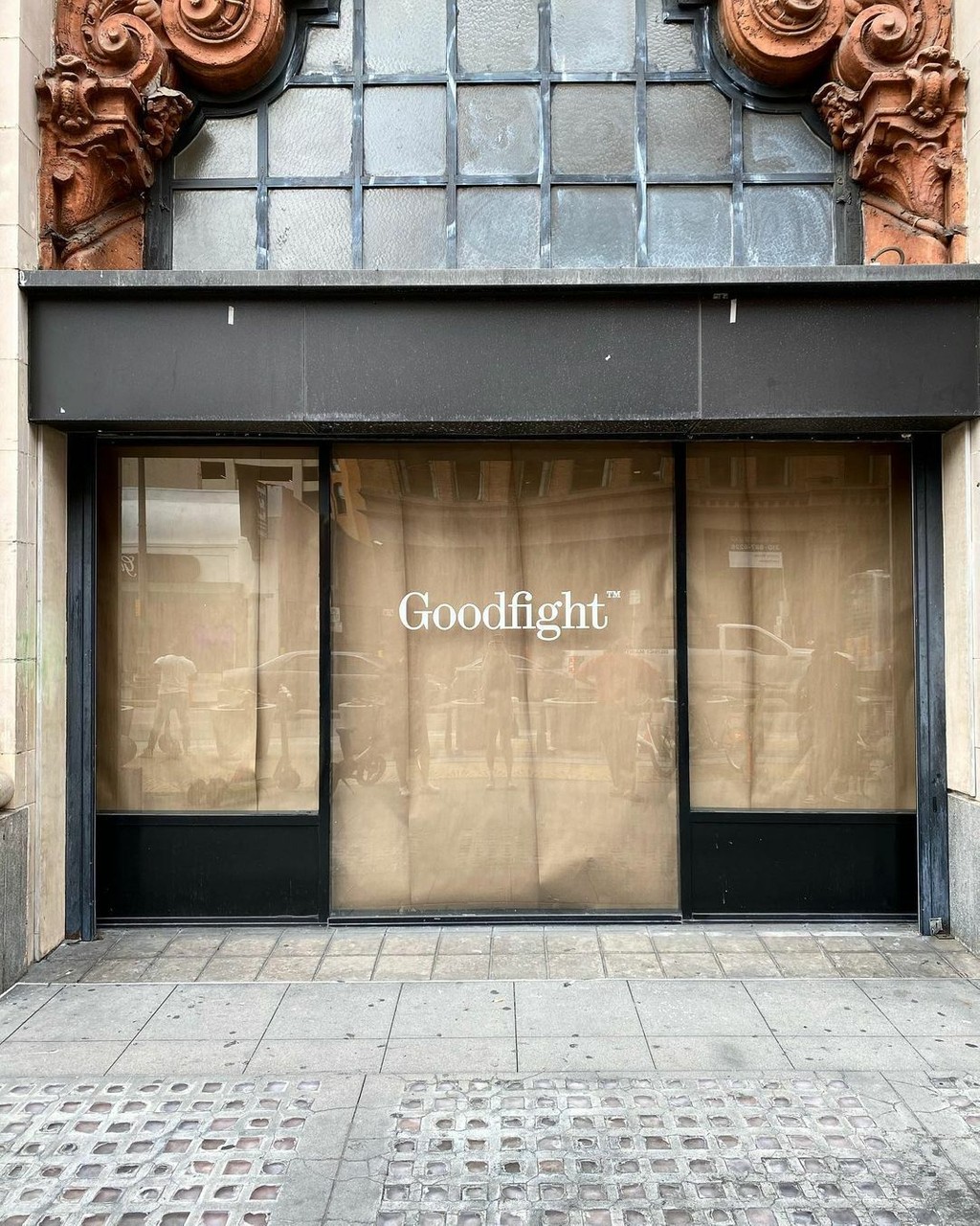
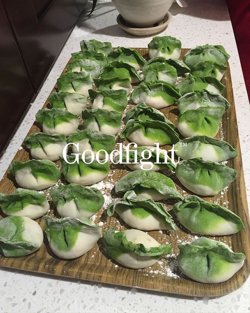
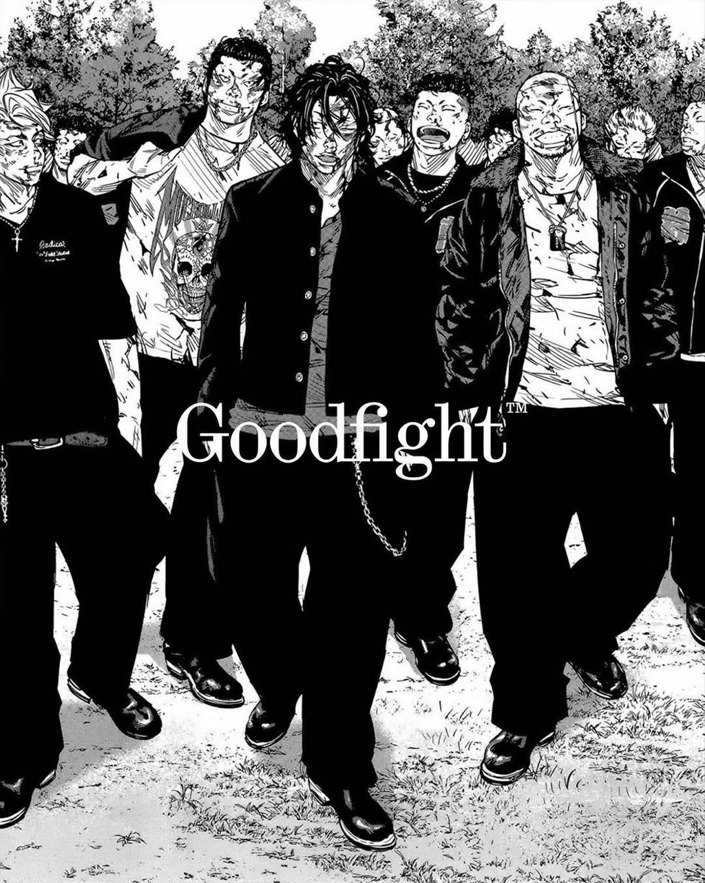
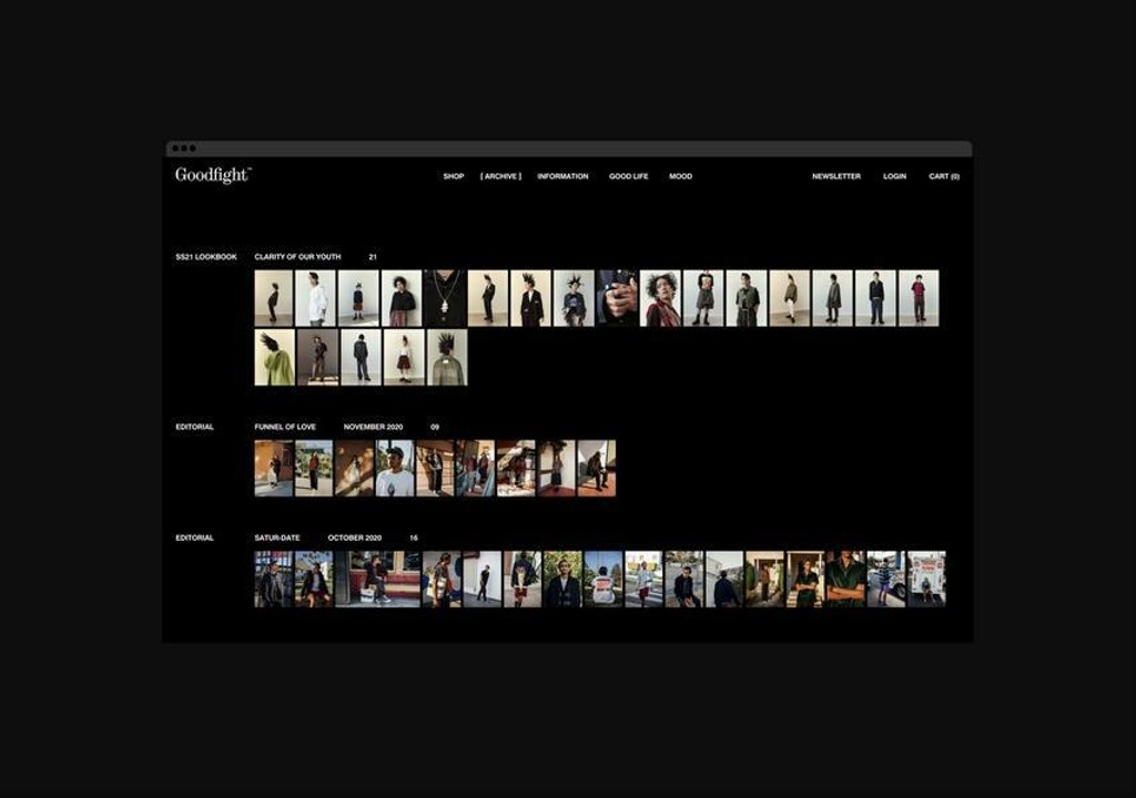
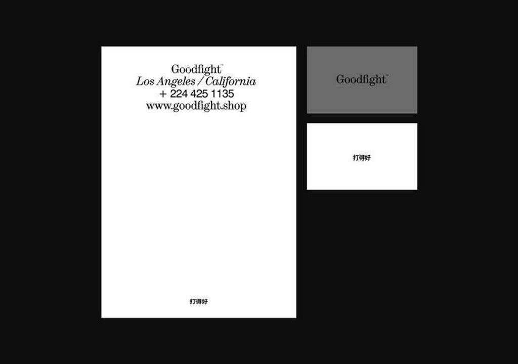
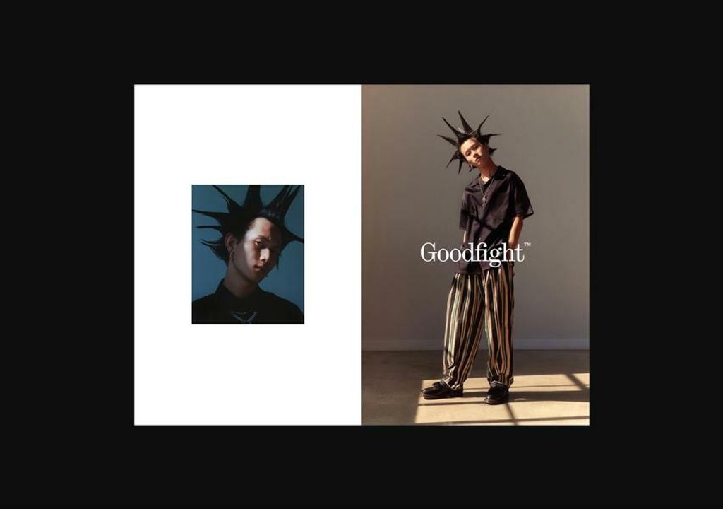
Goodfight. Design by Mouthwash. Development by AP Studio
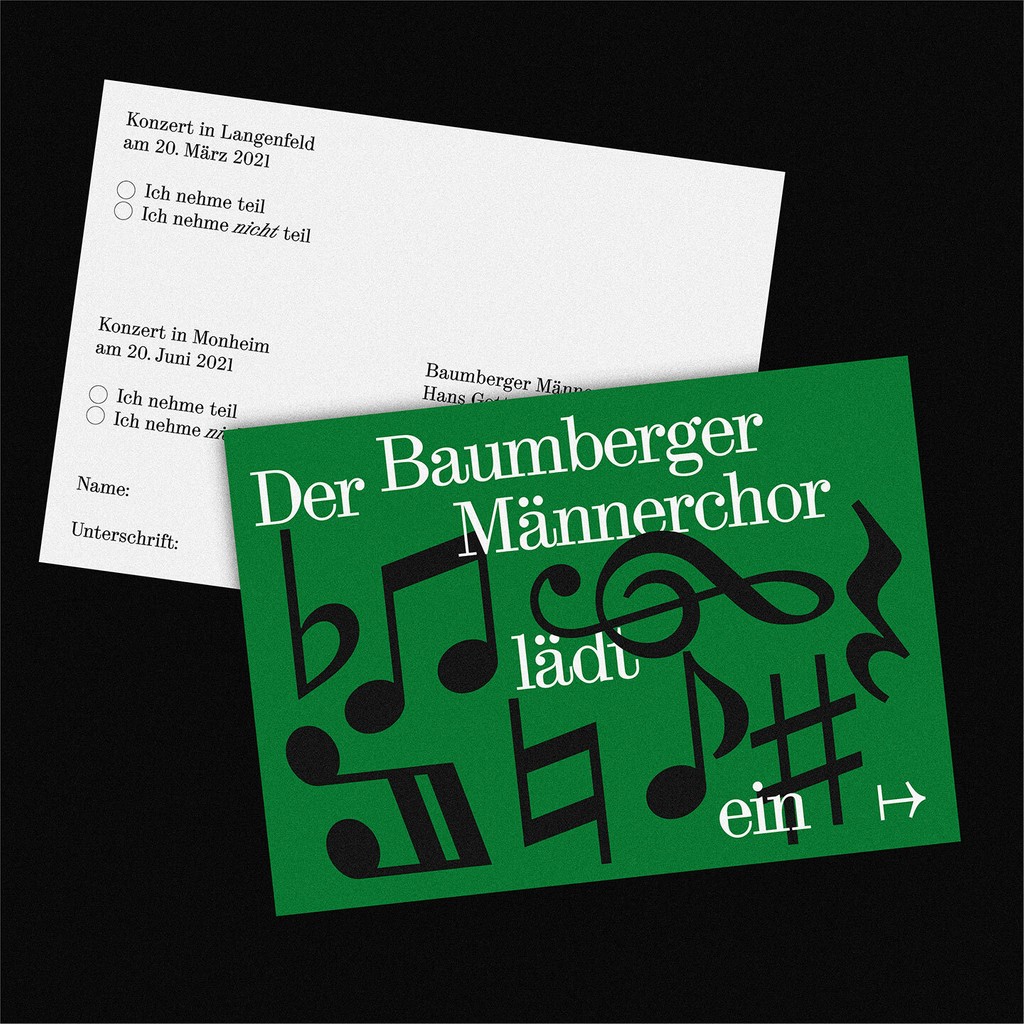
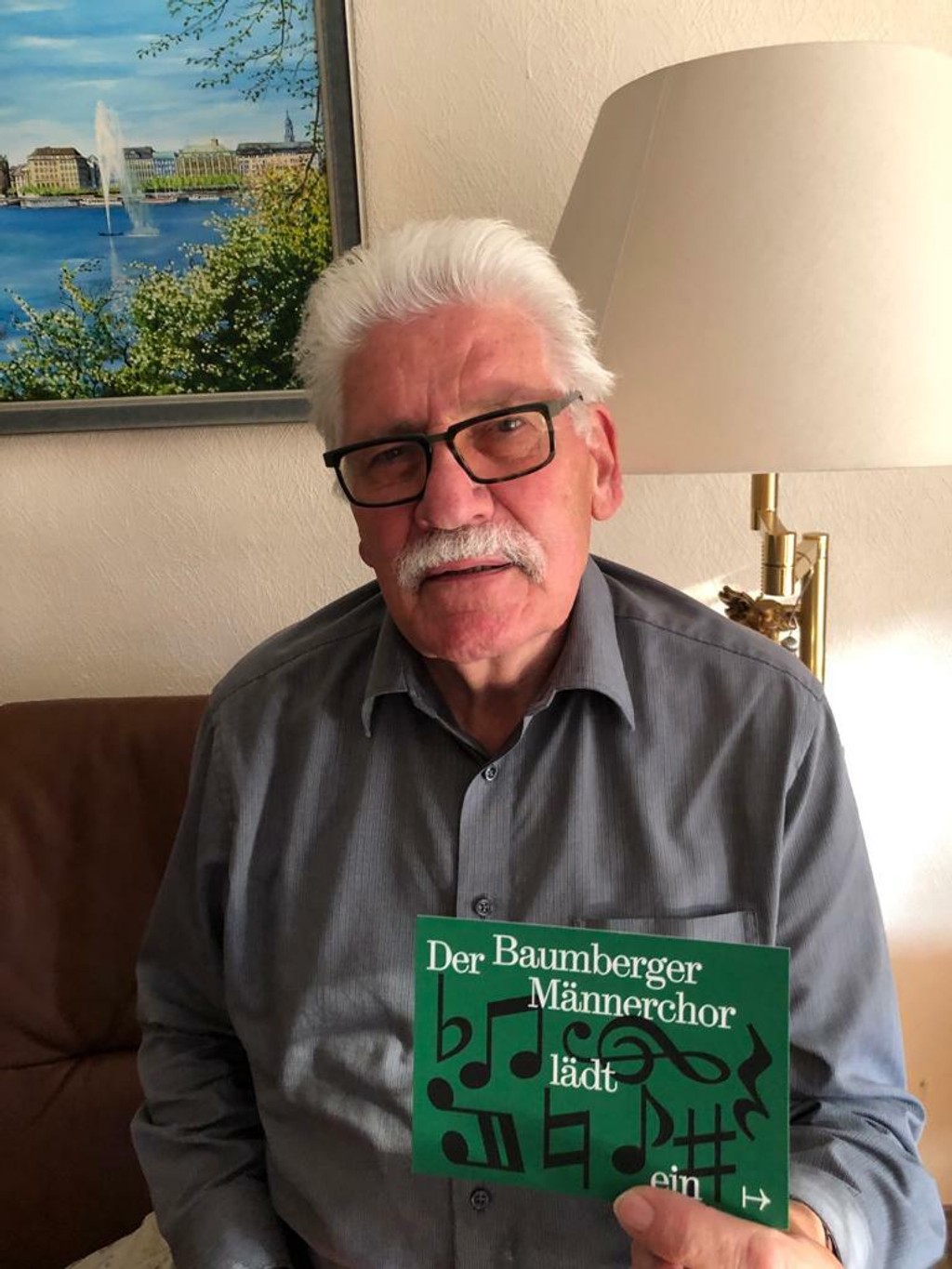
Bamberger Männerchor. Design by Raoul Gottschling
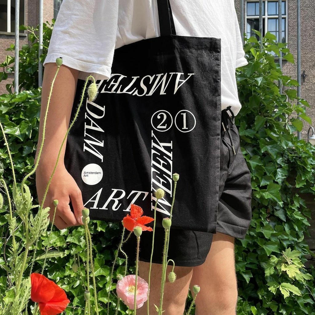
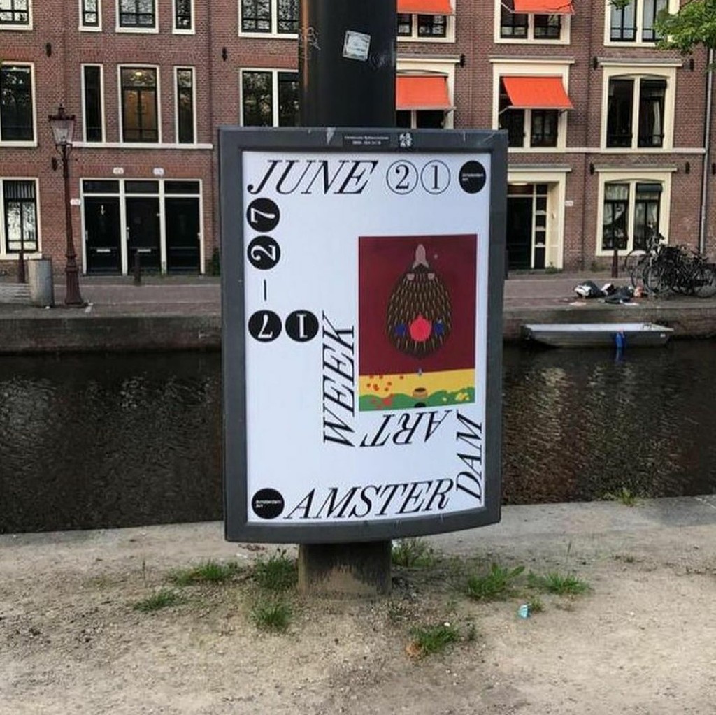
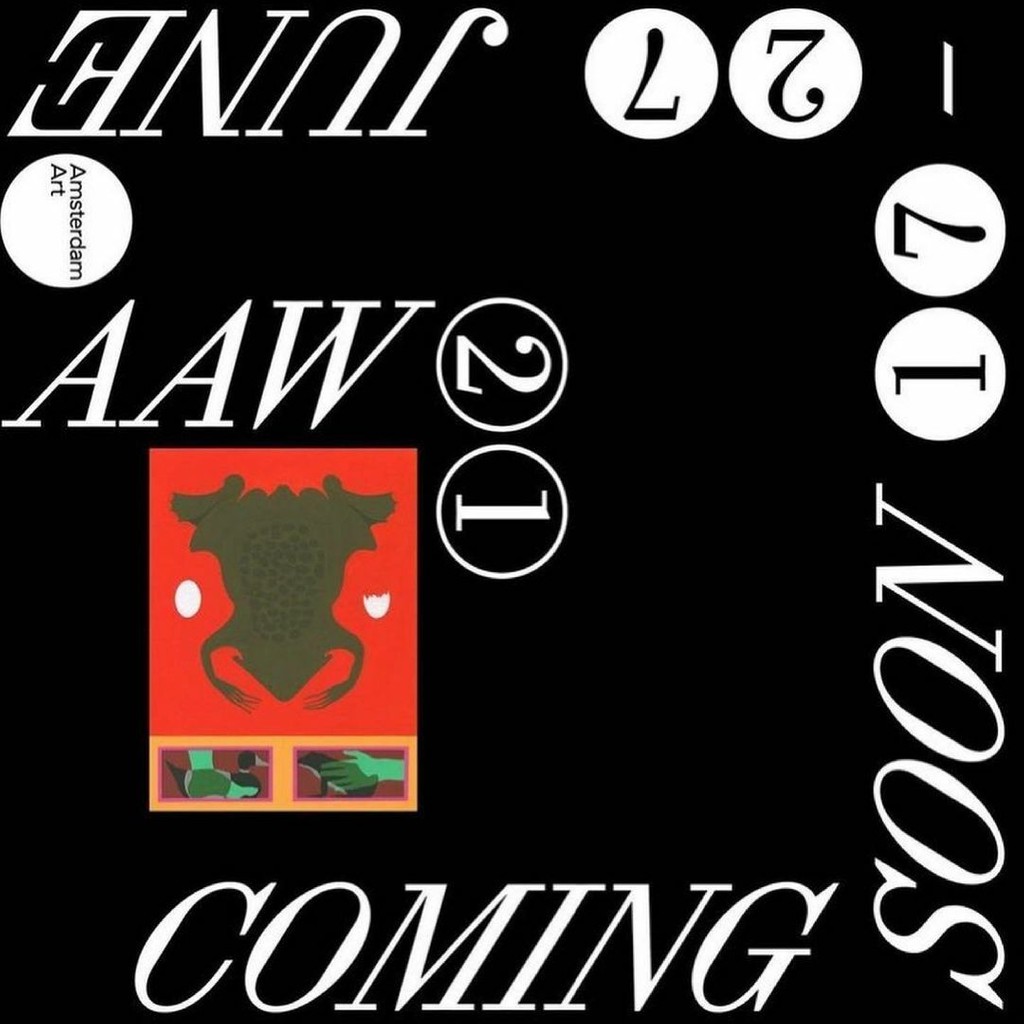
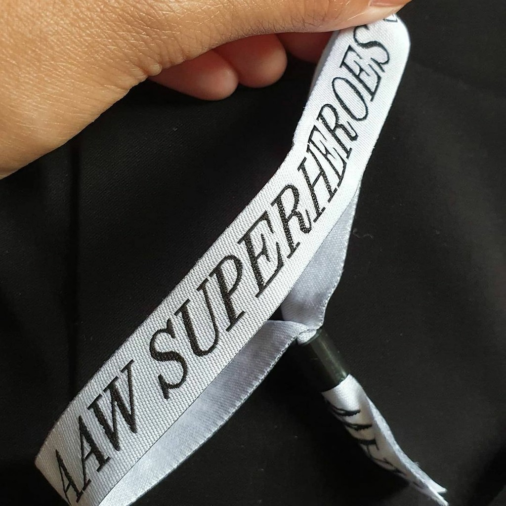
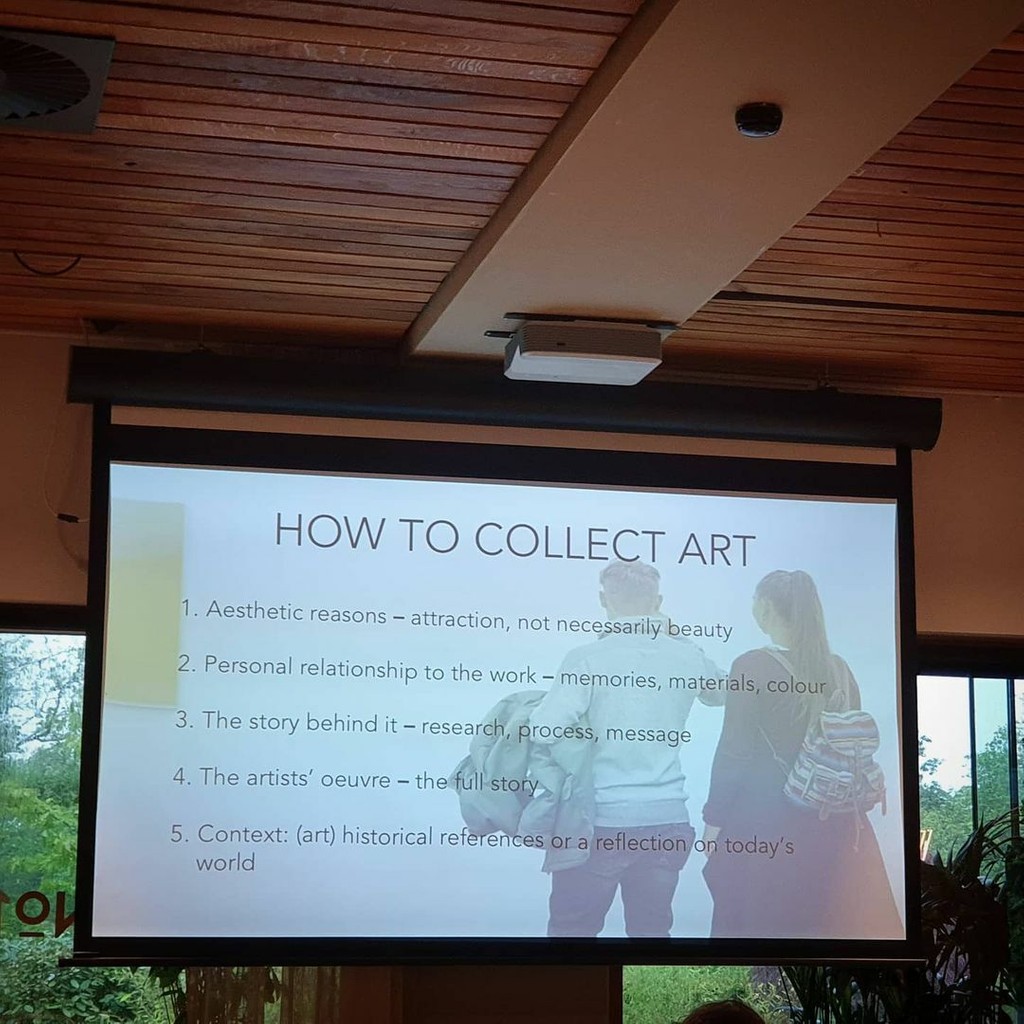
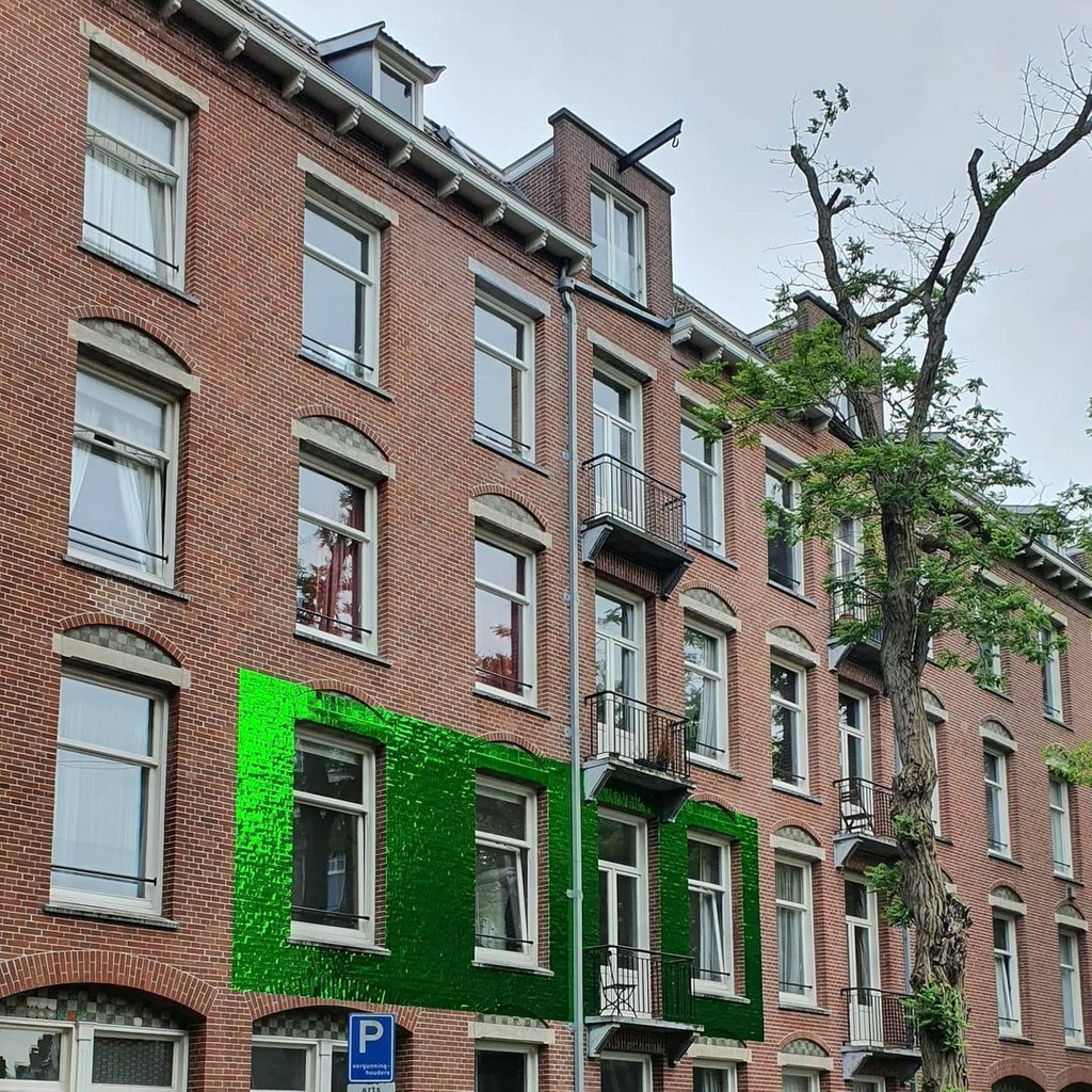
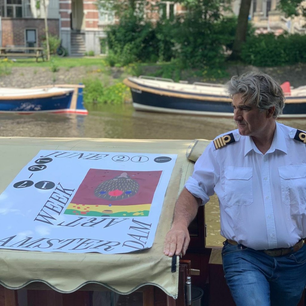
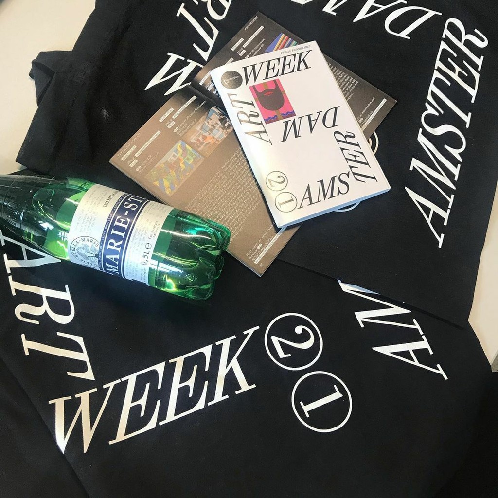
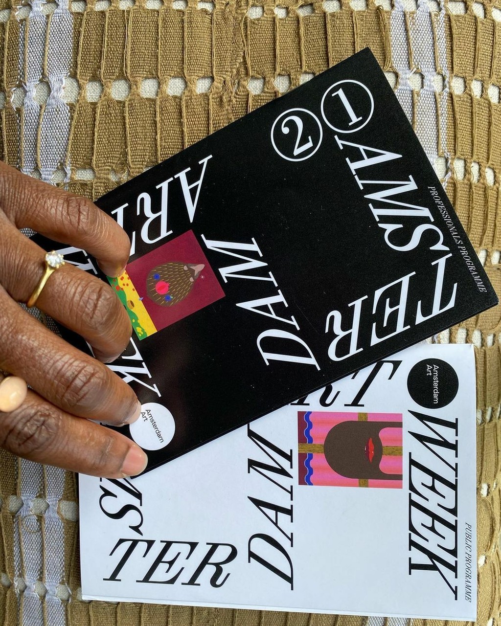
Amsterdam Art Week. Design by mainstudio
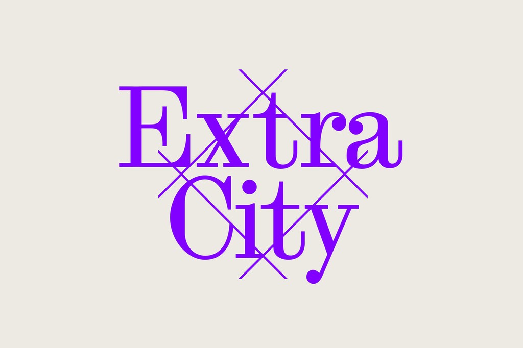
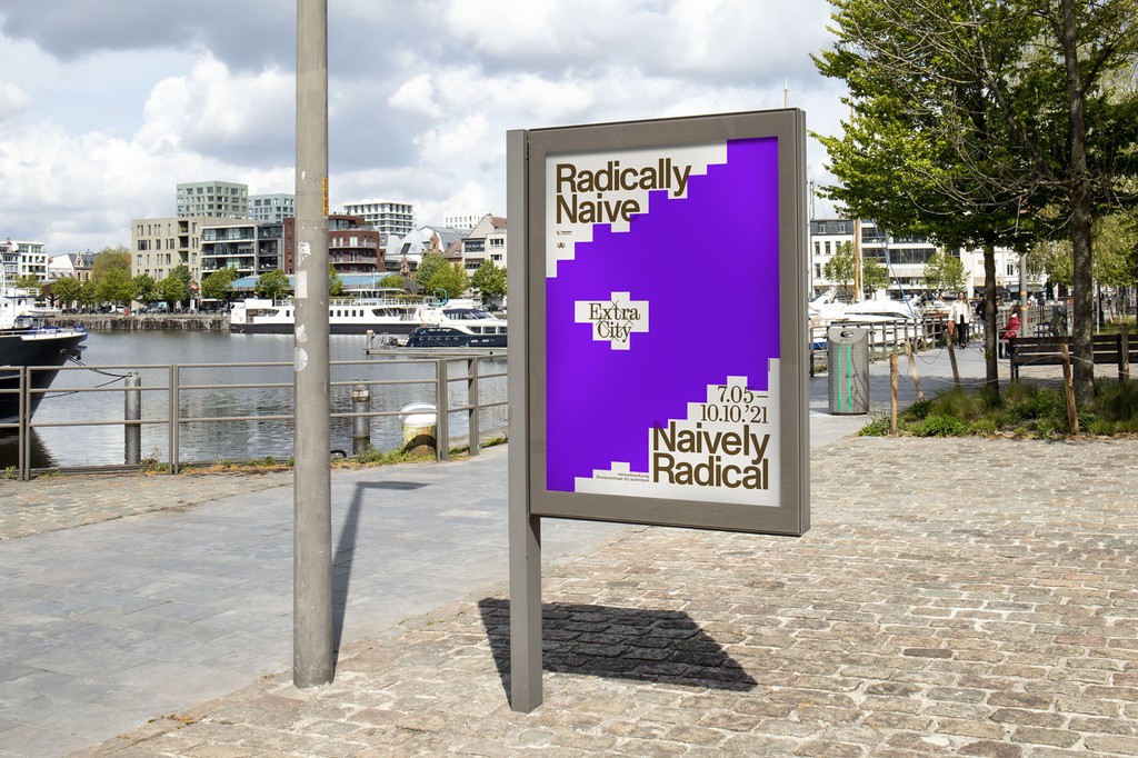
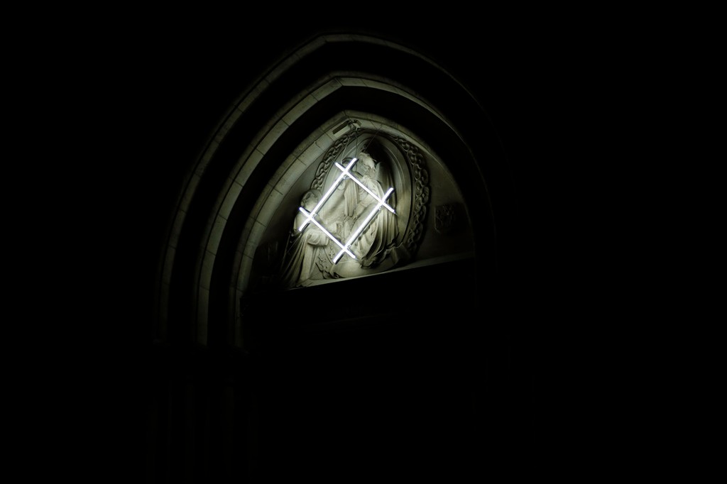
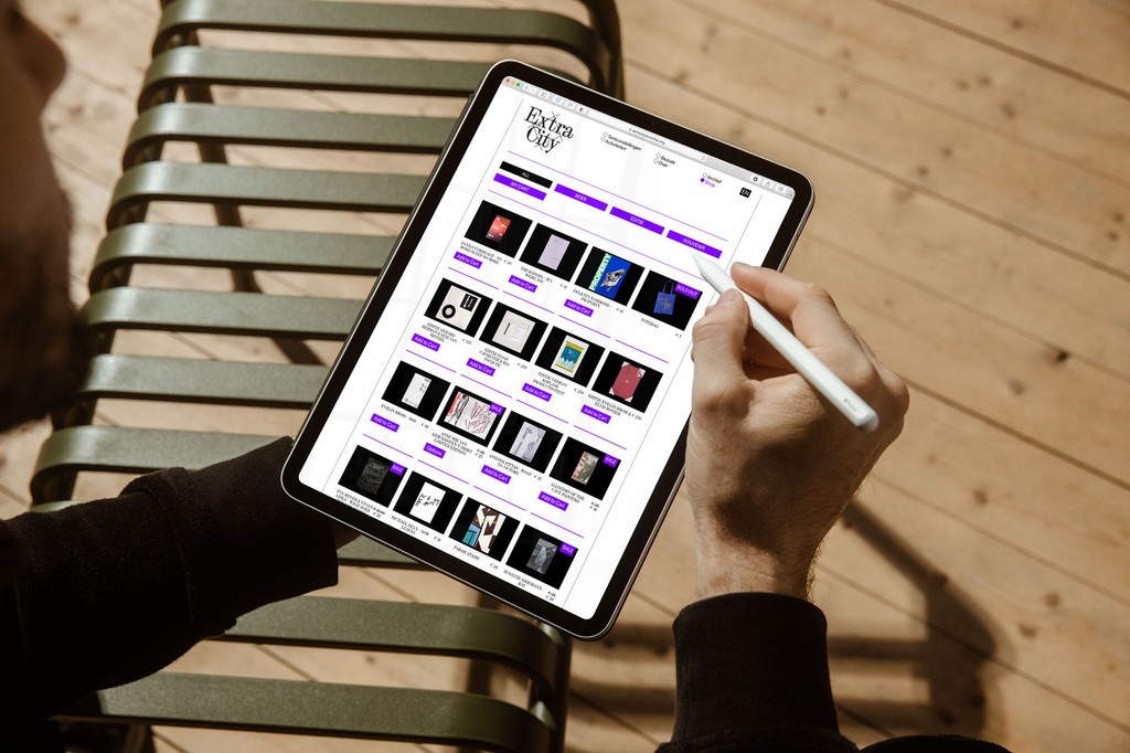
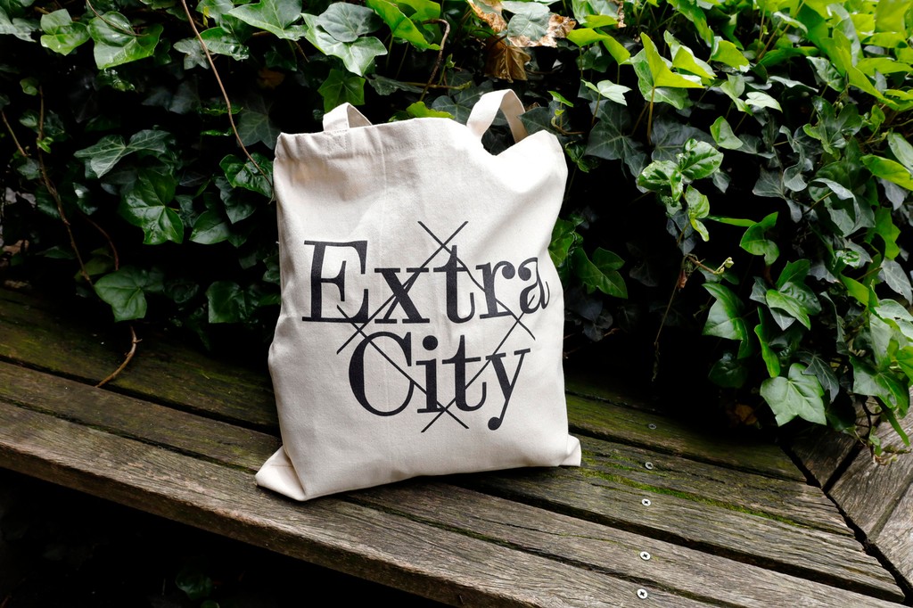
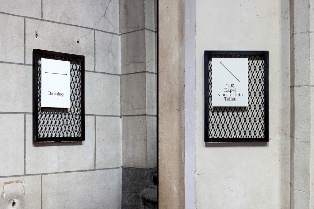
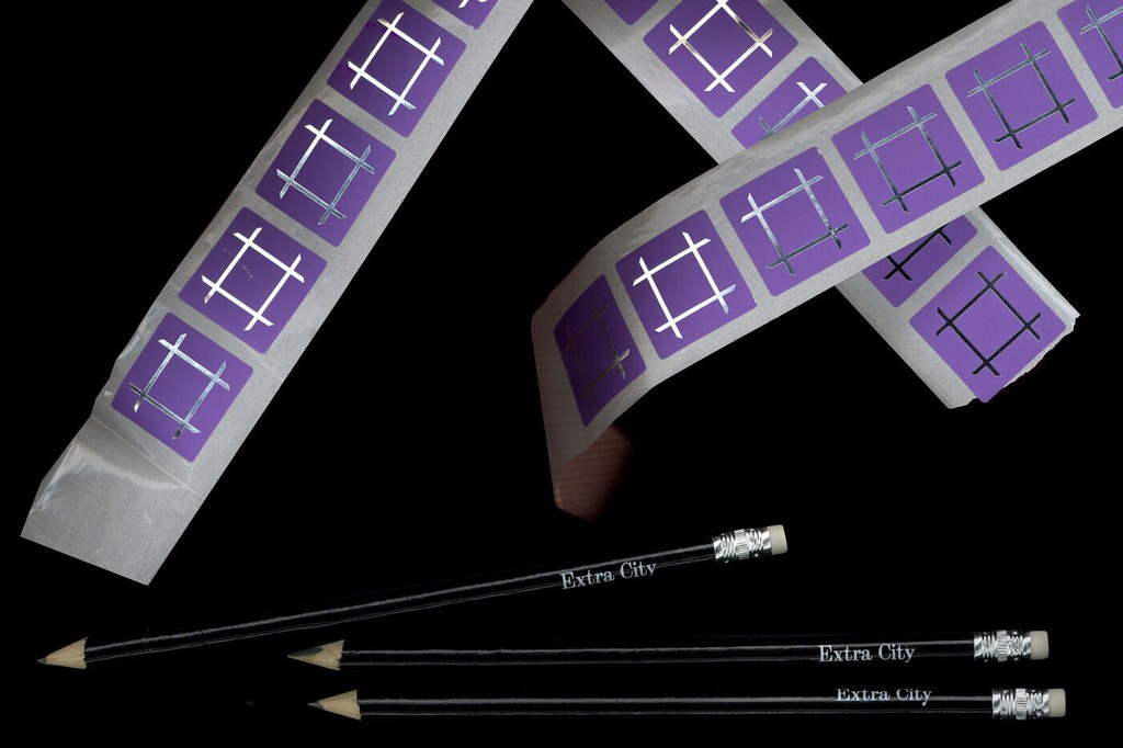
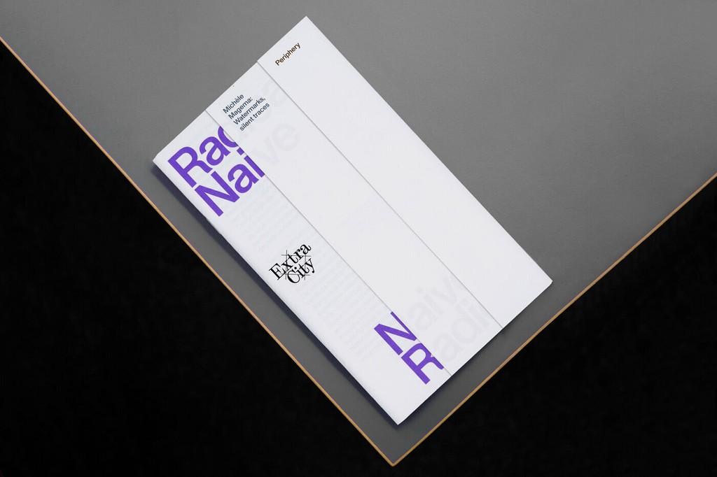
Kunsthal Extra City. Identity by Ward Heirwegh

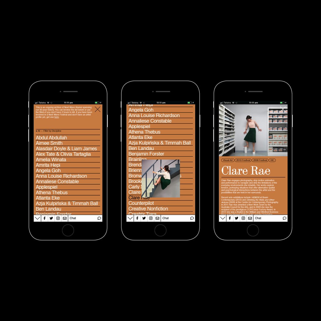
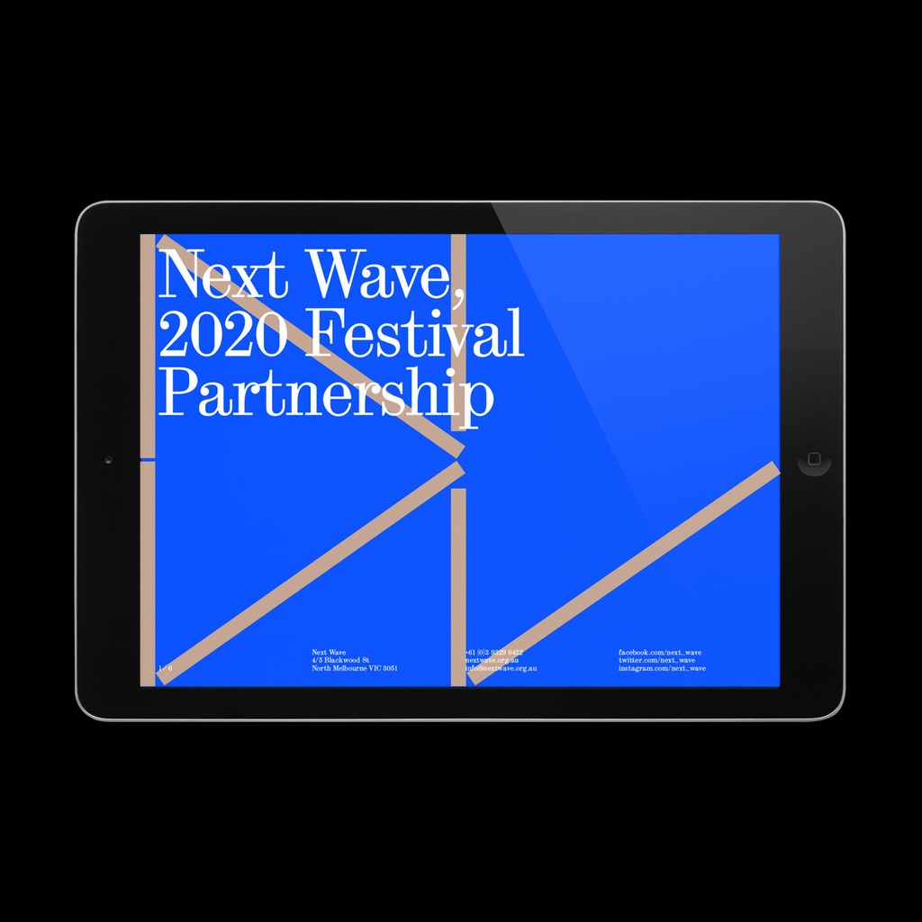
Next Wave Festival 2020. Design by M.Giesser
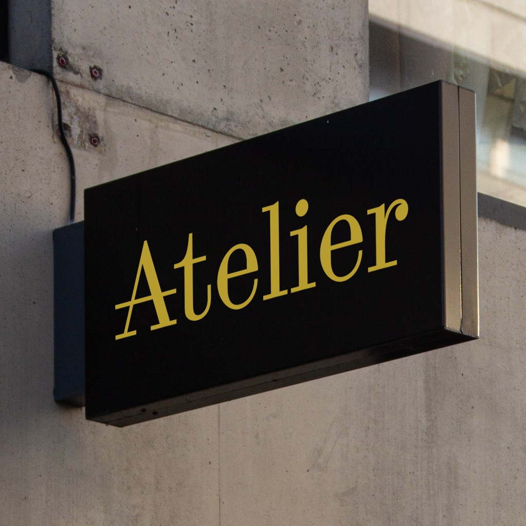
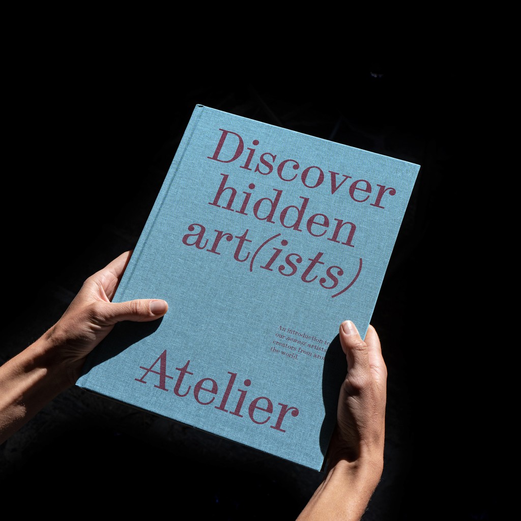
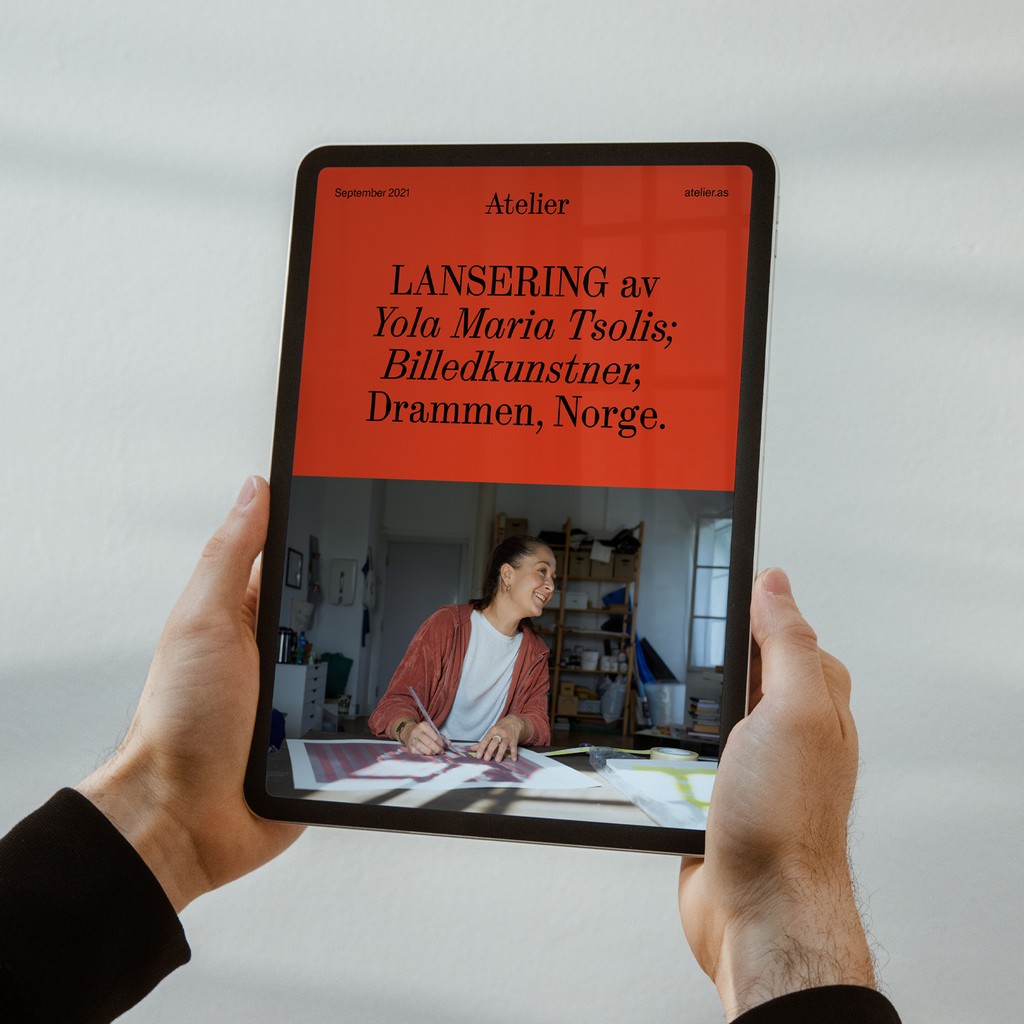
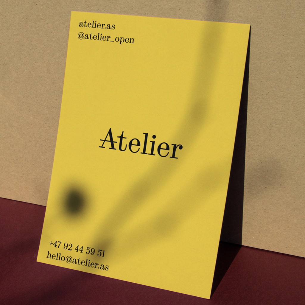
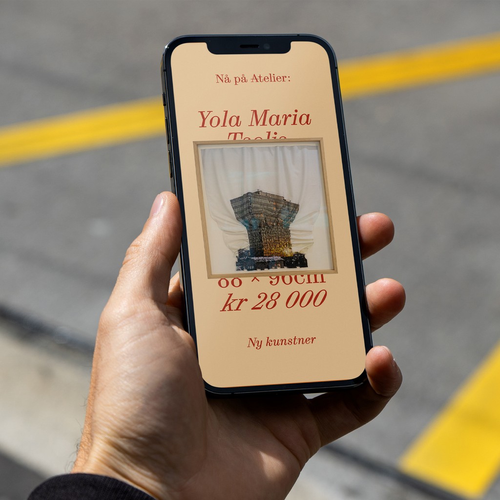
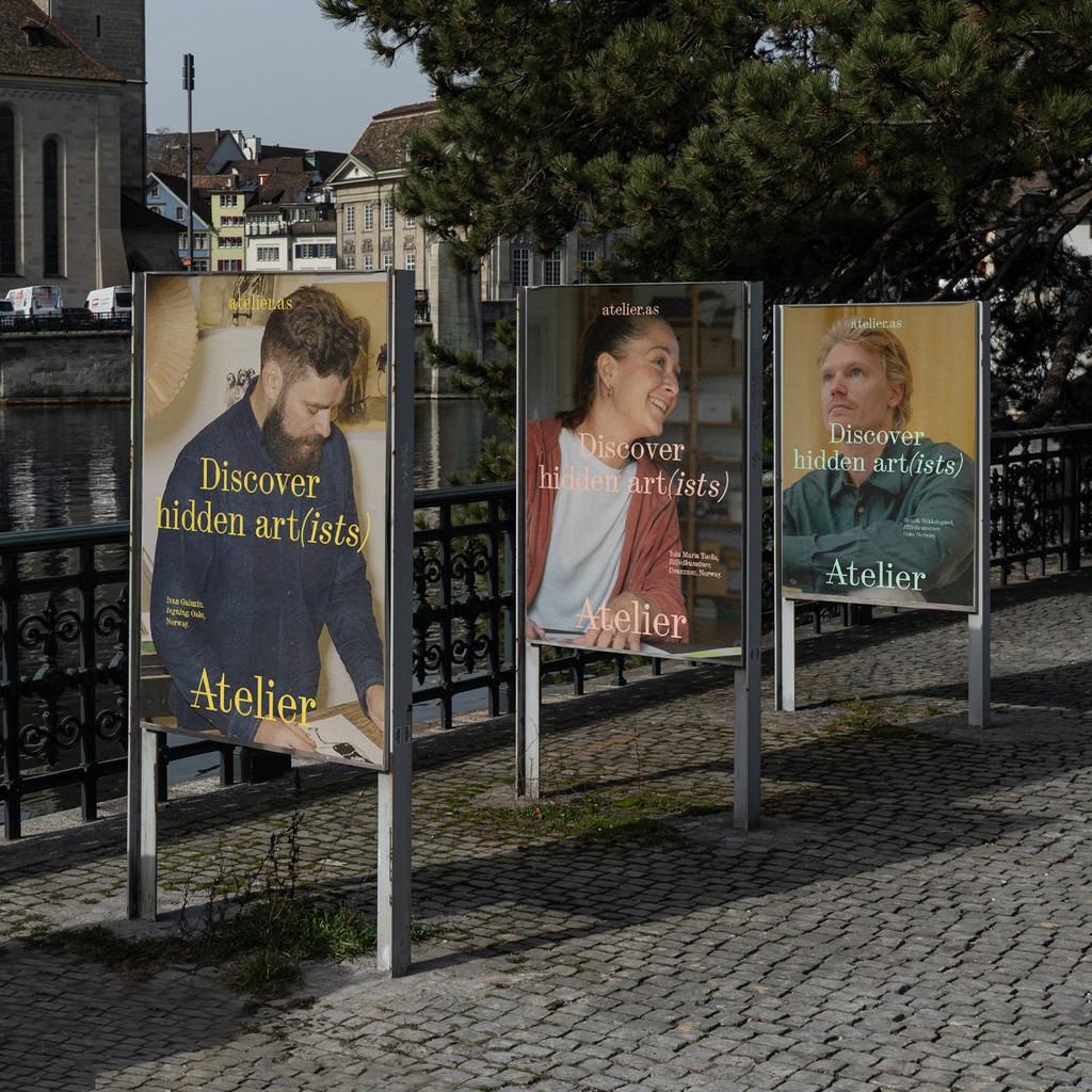
Atelier. Design by Bielke&Yang
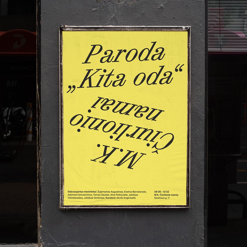
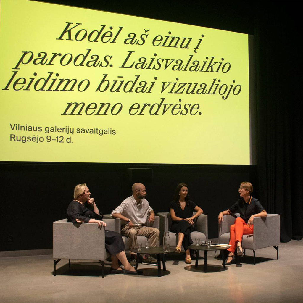
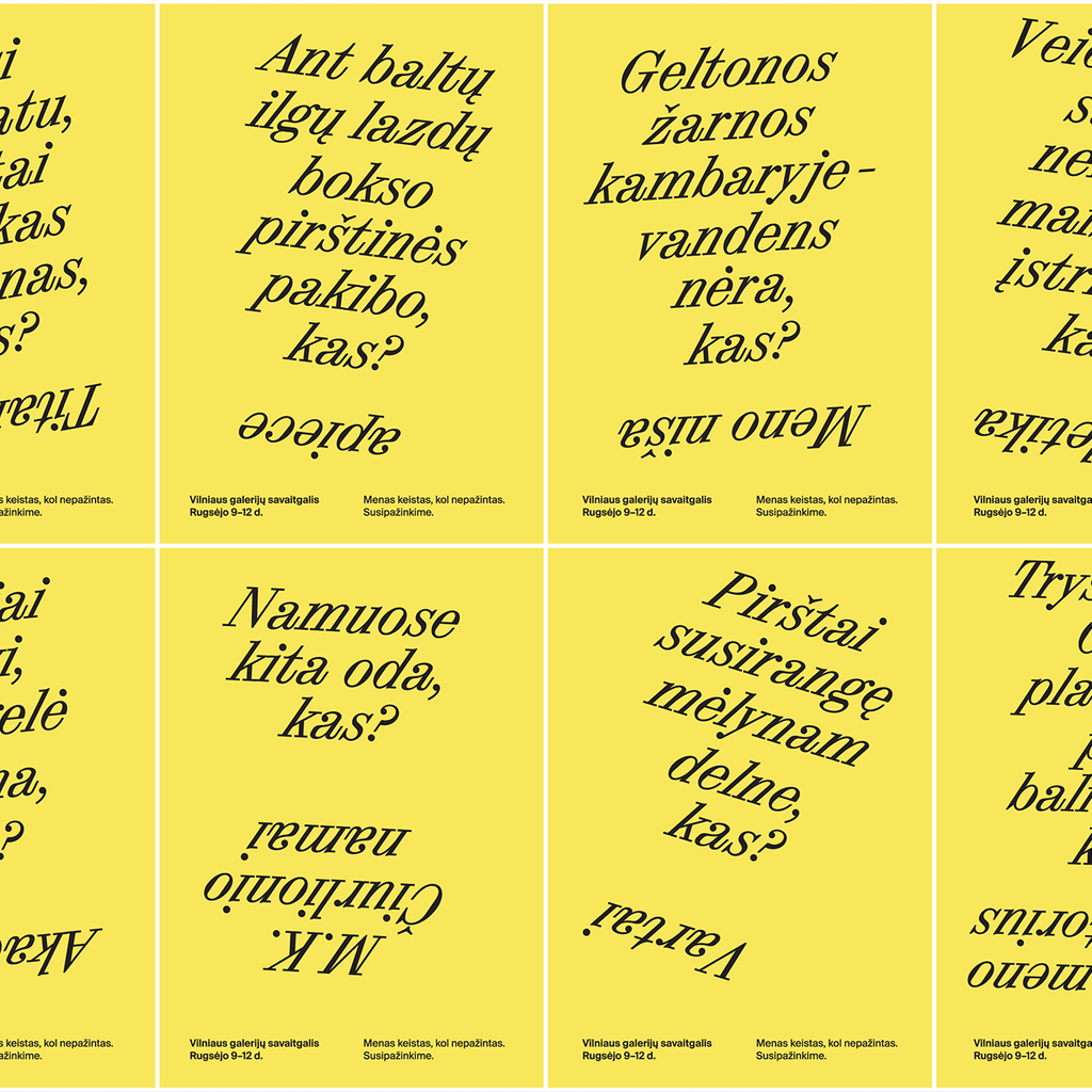
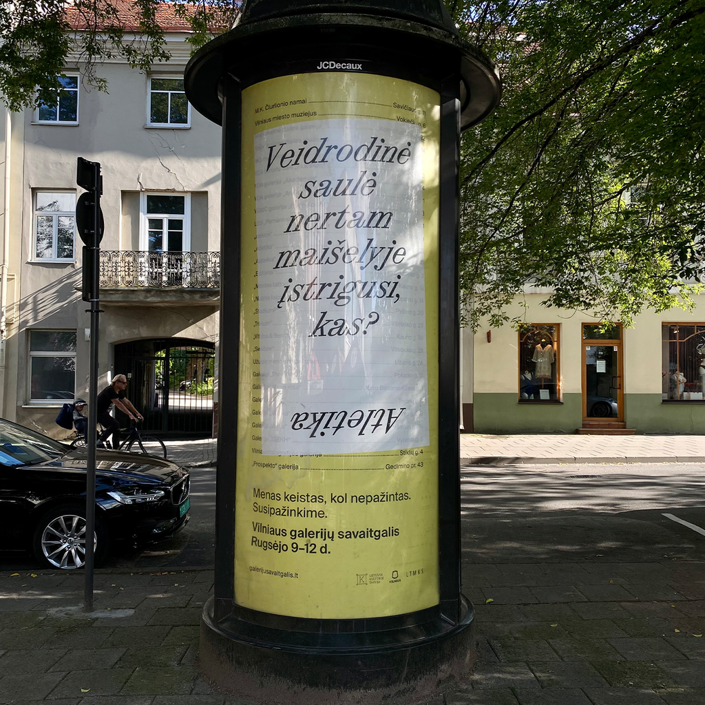
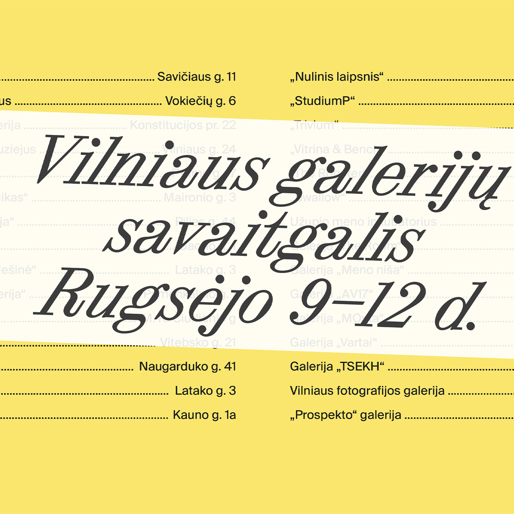
Vilnius Gallery Weekend 2021. Design by Taktika Studio