Ginto Condensed
- Hairline & Italic
- Thin & Italic
- Light & Italic
- Regular & Italic
- Medium & Italic
- Bold & Italic
- Black & Italic
- Ultra & Italic
Ginto
- Hairline & Italic
- Thin & Italic
- Light & Italic
- Regular & Italic
- Medium & Italic
- Bold & Italic
- Black & Italic
- Ultra & Italic
Ginto Nord Condensed
- Hairline & Italic
- Thin & Italic
- Light & Italic
- Regular & Italic
- Medium & Italic
- Bold & Italic
- Black & Italic
- Ultra & Italic
Ginto Nord
- Hairline & Italic
- Thin & Italic
- Light & Italic
- Regular & Italic
- Medium & Italic
- Bold & Italic
- Black & Italic
- Ultra & Italic
Ginto Global
Ginto Condensed
Ginto Condensed
- Hairline & Italic
- Thin & Italic
- Light & Italic
- Regular & Italic
- Medium & Italic
- Bold & Italic
- Black & Italic
- Ultra & Italic
Ginto
Ginto
- Hairline & Italic
- Thin & Italic
- Light & Italic
- Regular & Italic
- Medium & Italic
- Bold & Italic
- Black & Italic
- Ultra & Italic
Ginto Nord Condensed
Ginto Nord Condensed
- Hairline & Italic
- Thin & Italic
- Light & Italic
- Regular & Italic
- Medium & Italic
- Bold & Italic
- Black & Italic
- Ultra & Italic
Ginto Nord
Ginto Nord
- Hairline & Italic
- Thin & Italic
- Light & Italic
- Regular & Italic
- Medium & Italic
- Bold & Italic
- Black & Italic
- Ultra & Italic
Ginto Global
Features
Alternate a
a → a
Alternate M
M
Alternate t
t → t
Flex the alternate u this summer
Sun's
out
guns
out
Alternate Ampersand
&
Black Circled Numbers
⓪①②③④⑤⑥⑦⑧⑨⑩
About Ginto
About this typeface
Info
ABC Ginto is an exuberant geometric-humanist typeface that delights in tension, especially the tension between circular and rectangular forms. London-based graphic designer Seb McLauchlan developed the font while researching sans-serif typefaces from the twentieth century, focusing on the shift from strict Modernist “purity” to the more baroque, animated styles that emerged during the phototypesetting period of the ’50s and ’60s. These two historic impulses have been remixed to create a dynamic and charismatic set of forms.
ABC Ginto consists of the two sister-families, ABC Ginto and ABC Ginto Nord. ABC Ginto is compact and poised, and encompasses a sensible set of weights ranging from Thin to Ultra, allowing the typeface to perform well in a variety of sizes and environments. Nord, on the other hand, takes the tone and timbre of Normal and amps up the volume to 11. It borrows from the former's structure but expands the x-height and character width, and also includes more weights, stretching from a fine Hairline to a monolithic Ultra Bold.
Credits
Design: Seb McLauchlan
Spacing and Kerning: Igino Marini
Engineering: Dinamo (Hugo Jourdan)
Ginto Global
Hangul Font Pairing
Japanese Font Pairing
Supported Languages
Afrikaans, Albanian, Basque, Bemba, Bosnian, Breton, Catalan, Croatian, Czech, Danish, Dutch, English, Esperanto, Estonian, Faroese, Filipino, Finnish, French, Frisian, Friulian, Gaelic, Galician, German, Greenlandic, Hungarian, Icelandic, Indonesian, Irish, Italian, Kinyarwanda, Latin, Latvian, Lithuanian, Luxembourgish, Malay, Maltese, Montenegrin, Māori, Norwegian, Occitan, Polish, Portuguese, Romanian, Romansh, Inari Sami, Lule Sami, Northern Sami, Southern Sami, Serbian (Latin), Slovak, Slovenian, Spanish, Swahili, Swedish, Turkish, Welsh and more
Character Overview
Ginto In Use
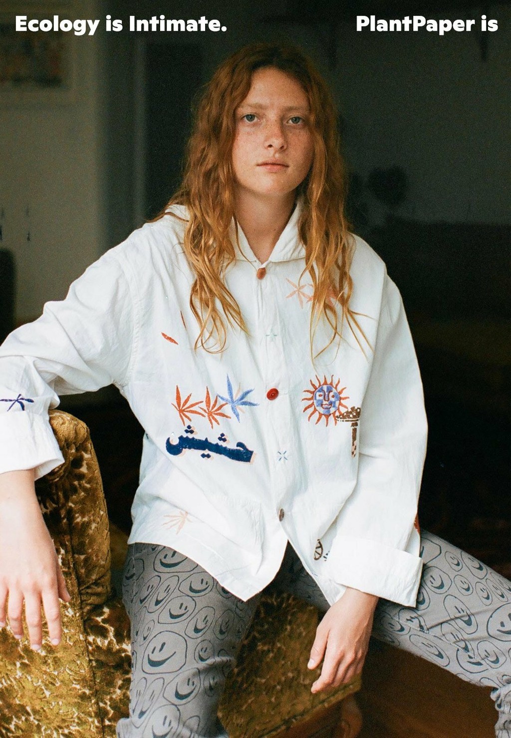
Plant Paper, Los Angeles
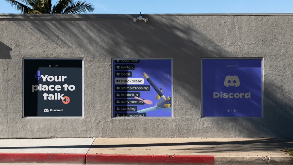
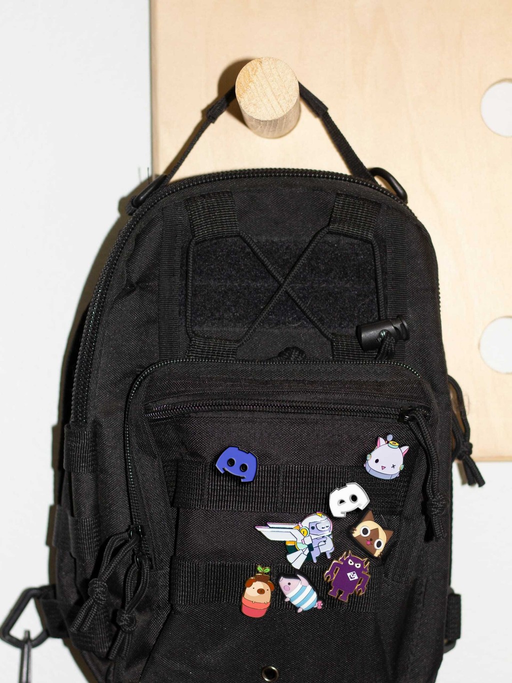
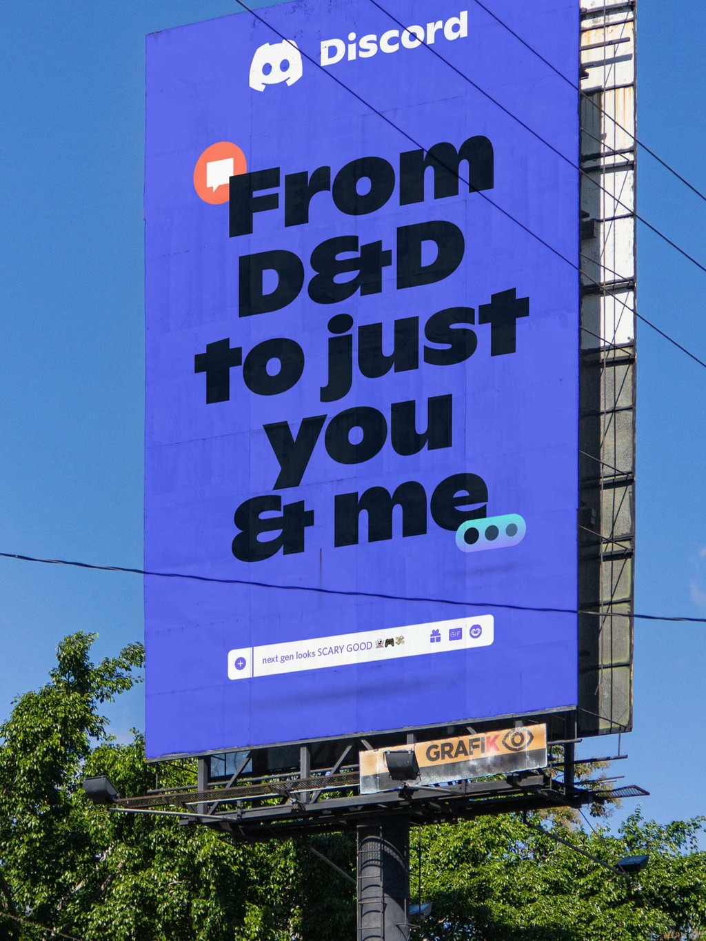
Discord Rebranding. Design by Koto
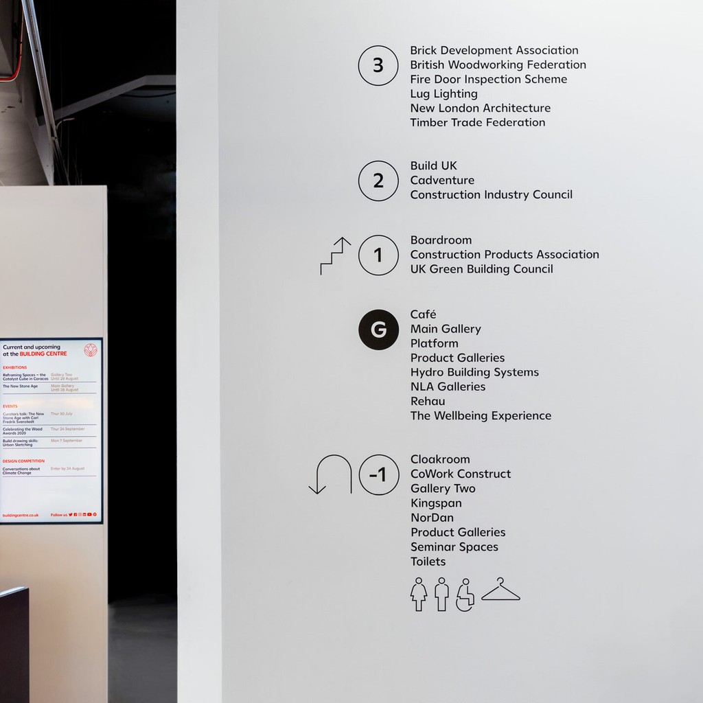
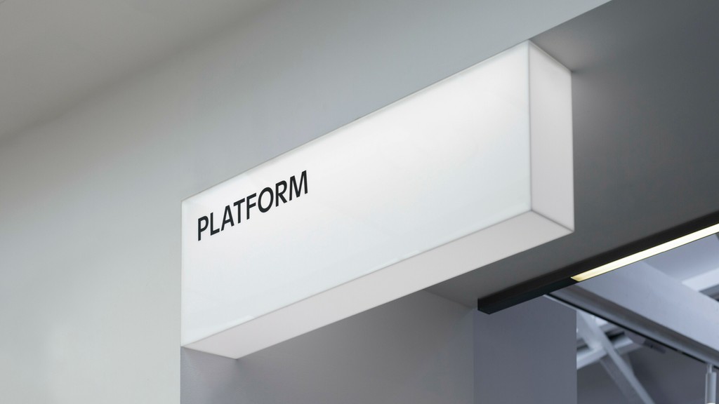
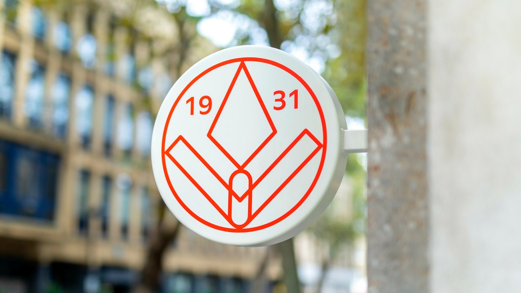
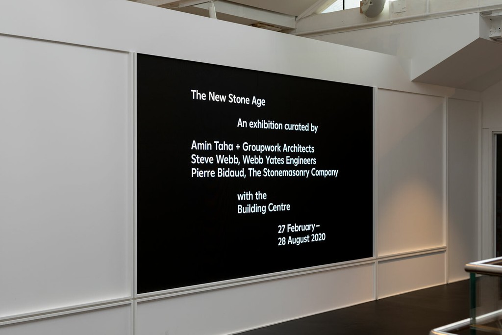
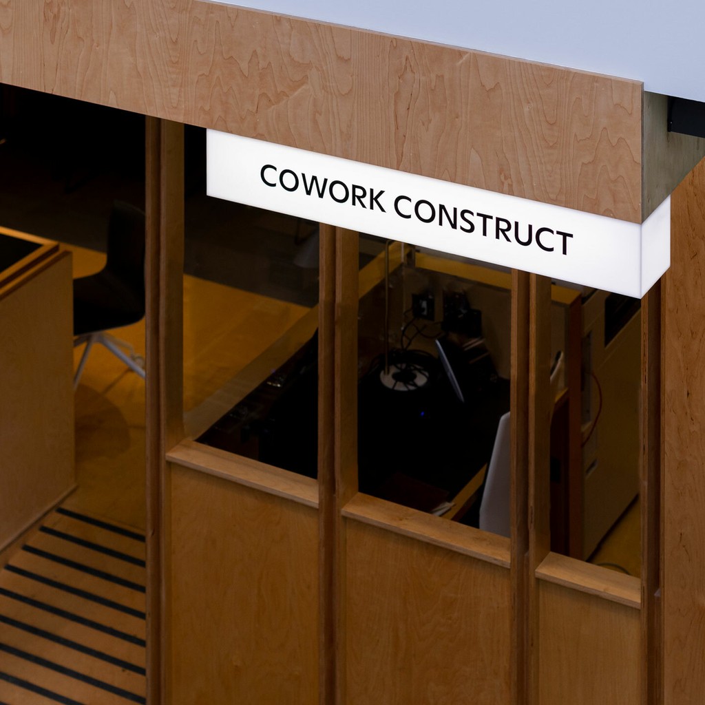
Building Centre, London. Design by Daly & Lyon
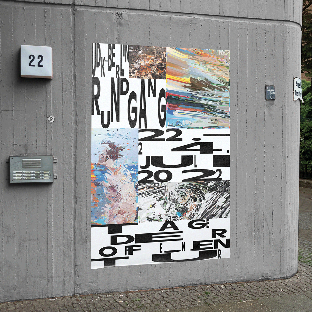
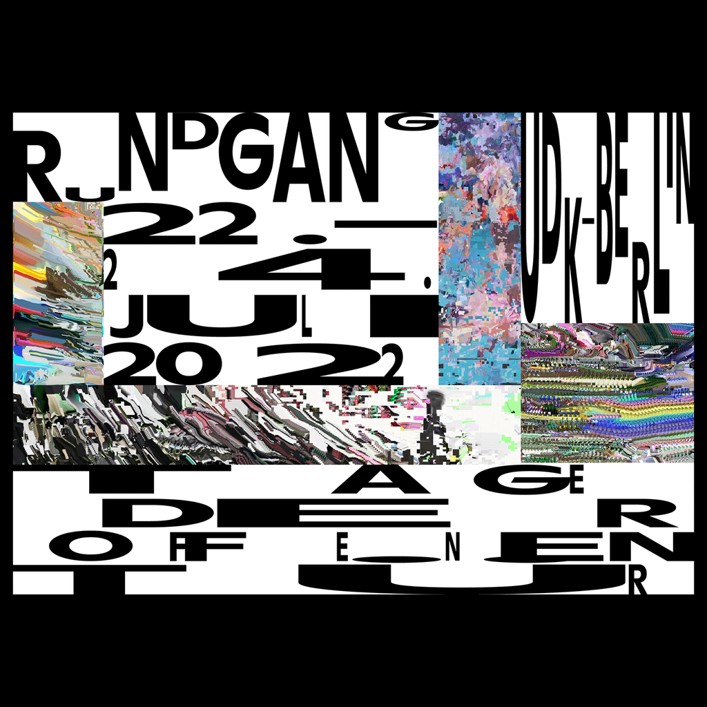
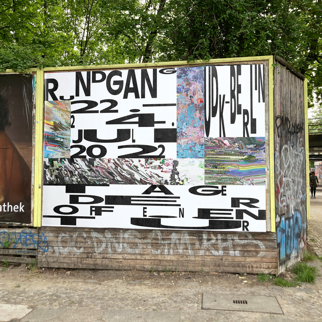
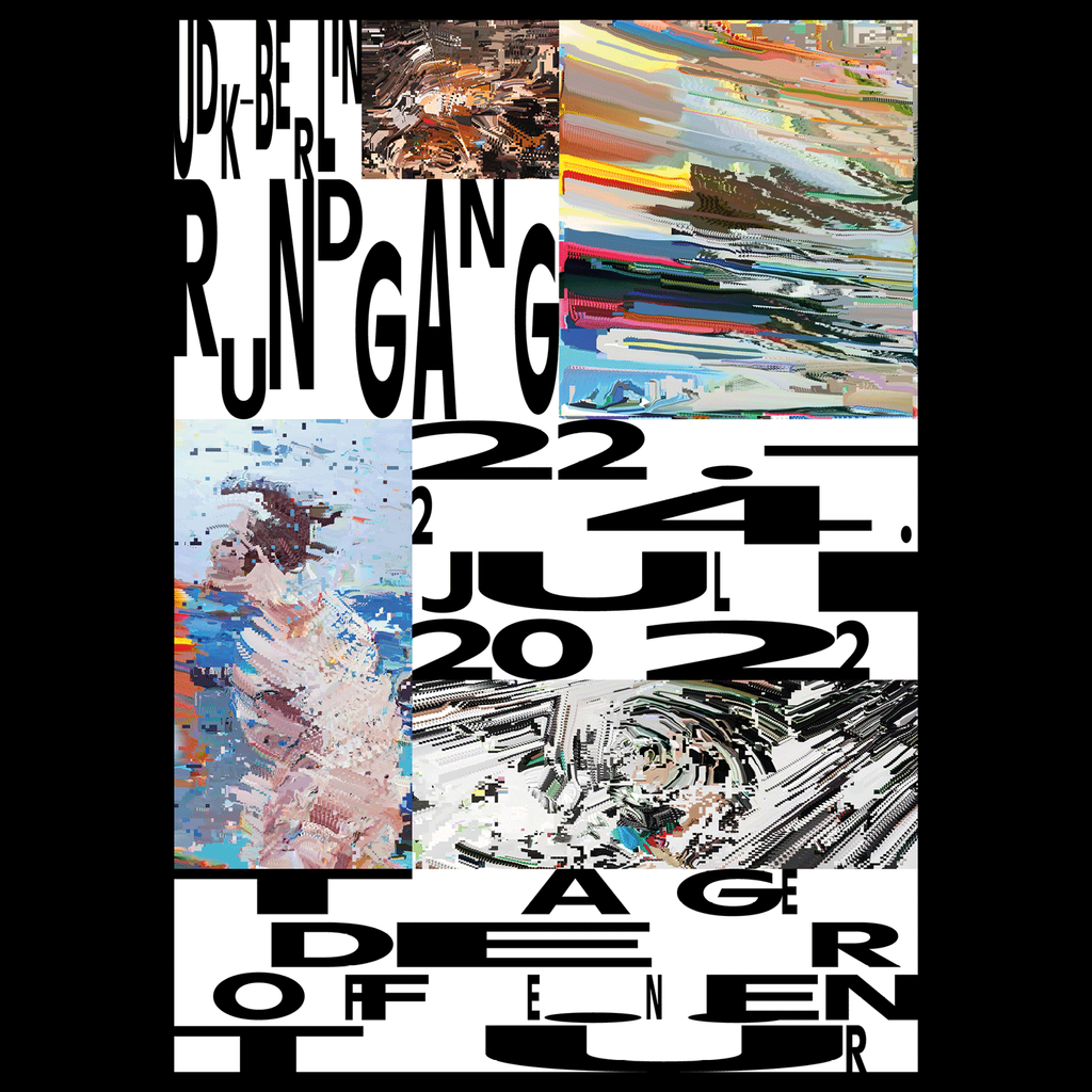
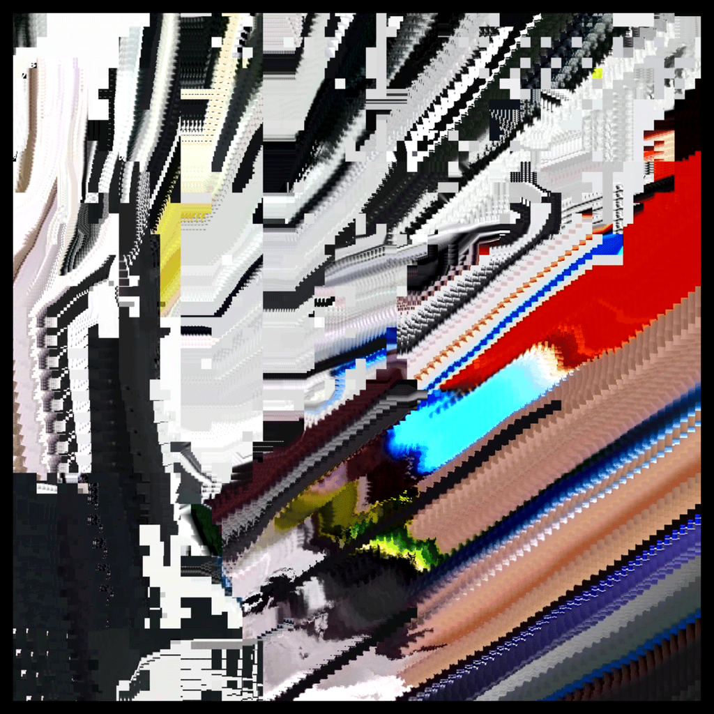
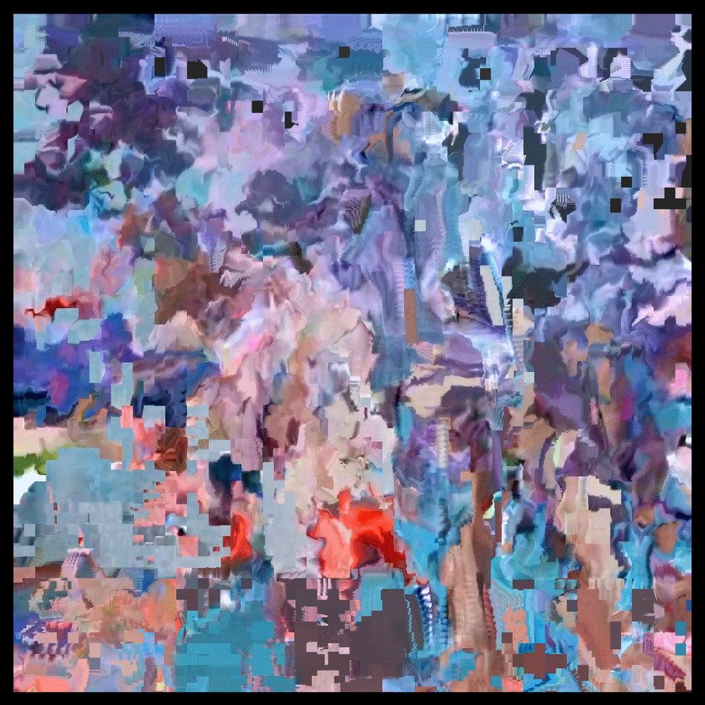
UDK Rundgang, Berlin. Design by Niklas Apfel
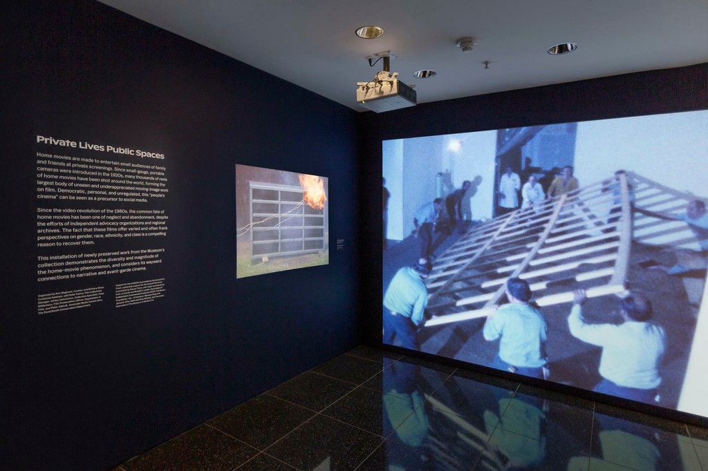
Private Lives Public Spaces, MoMA New York
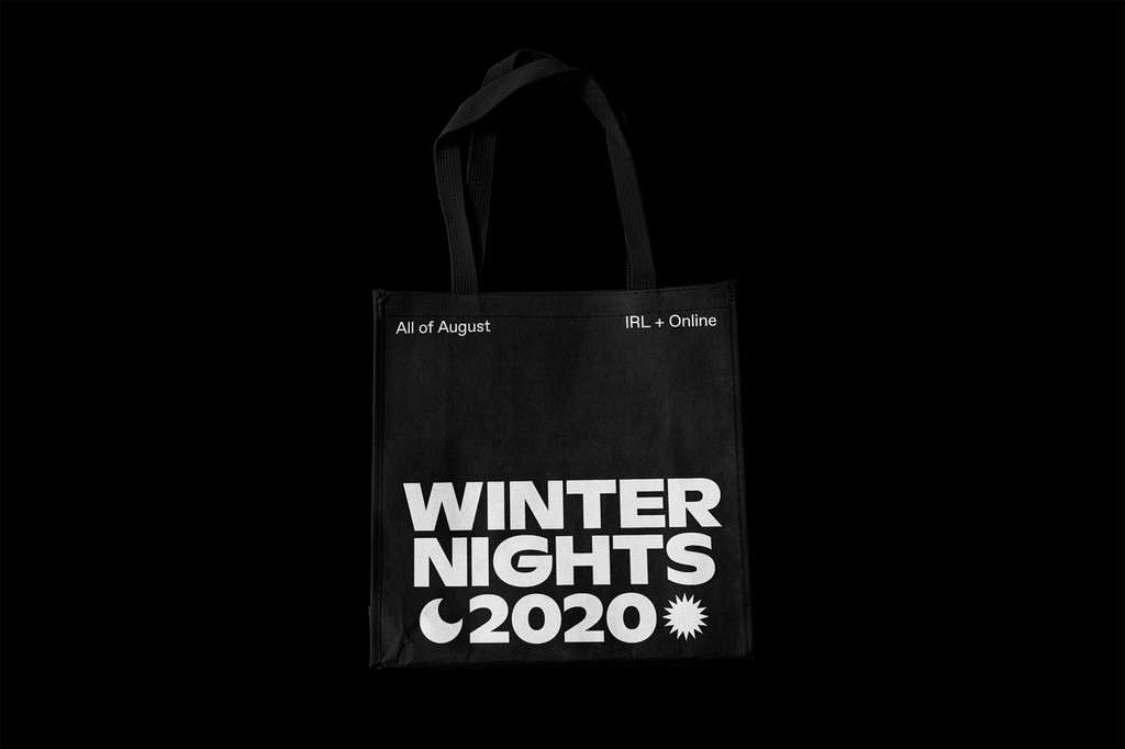
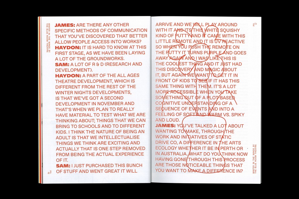
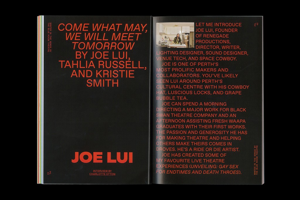
Winter Nights Festival. Design by Termsofservice
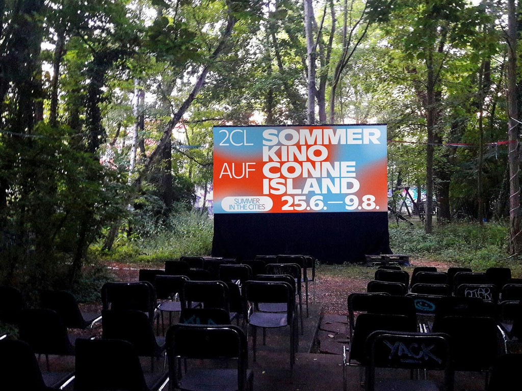
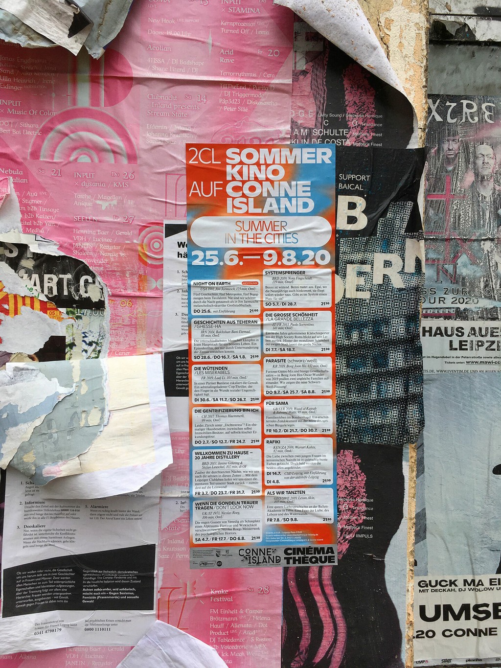
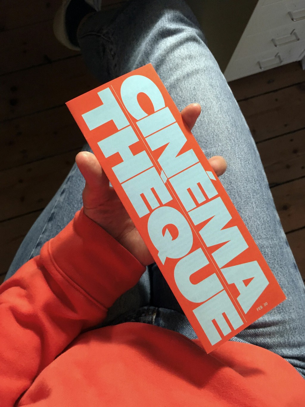
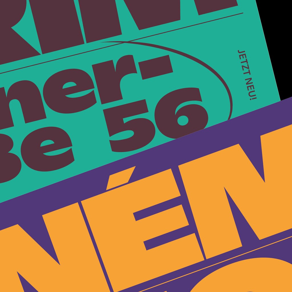
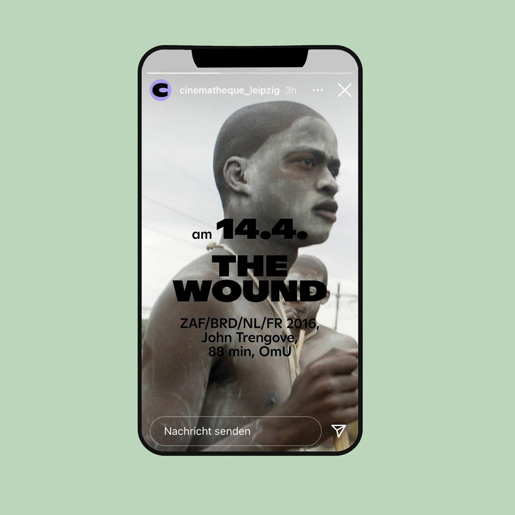
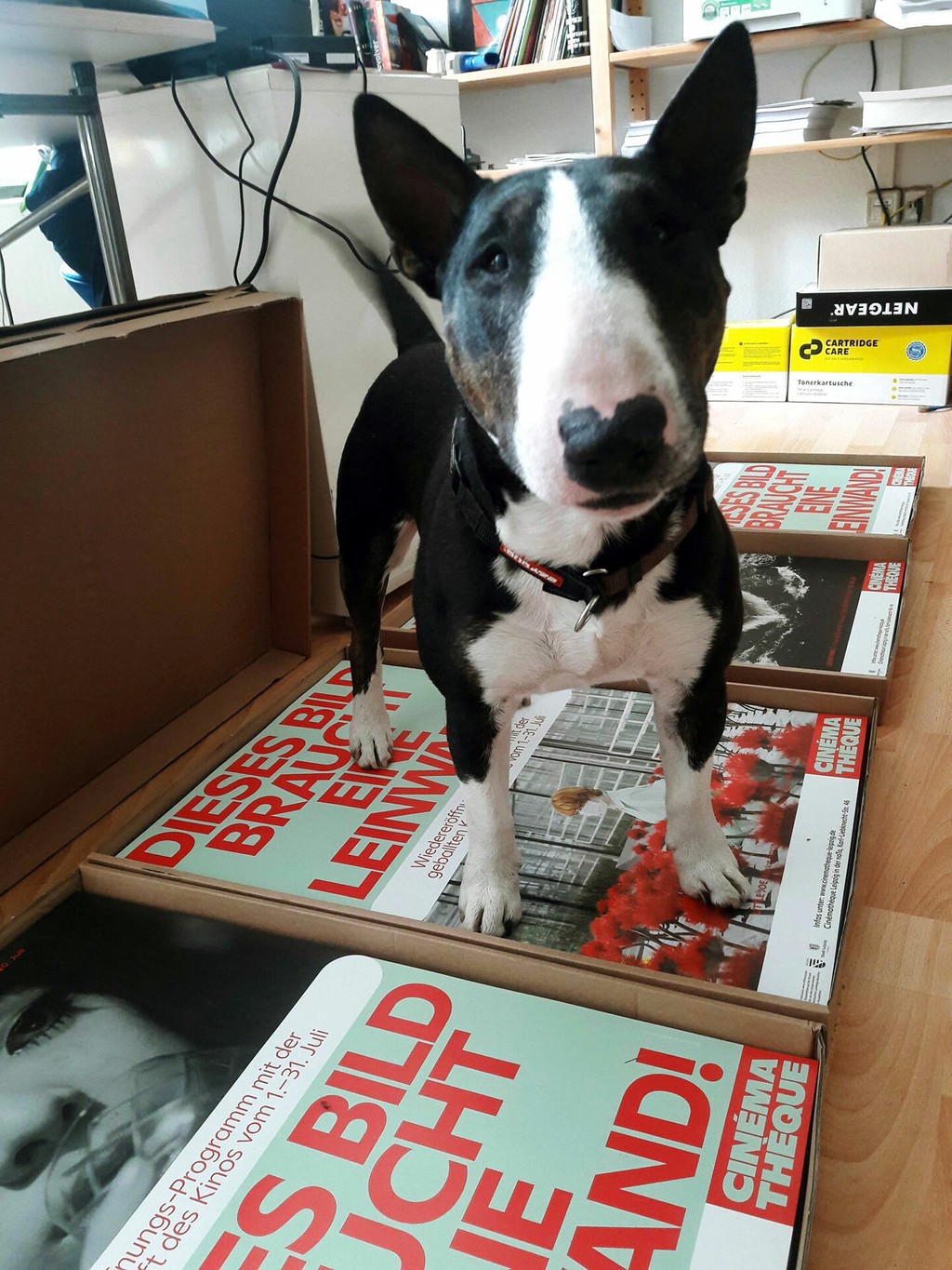
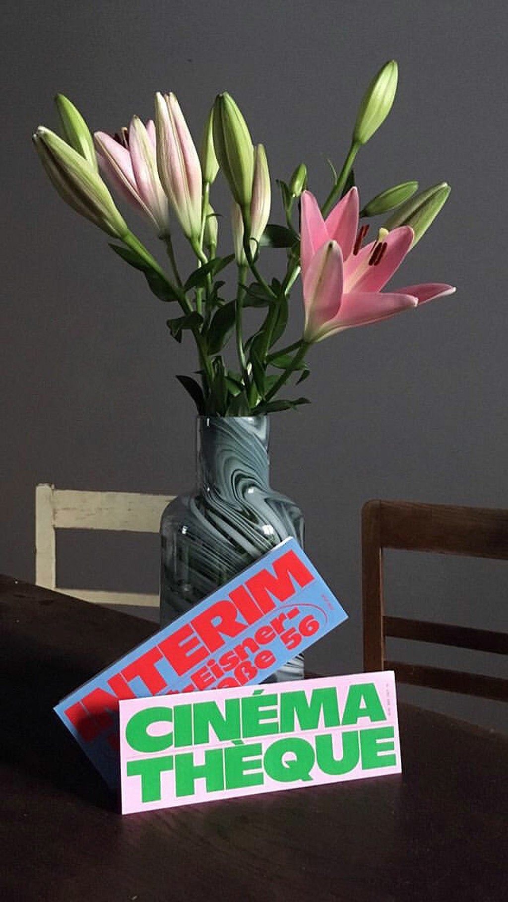
Cinémathèque. Design by Bureau Est
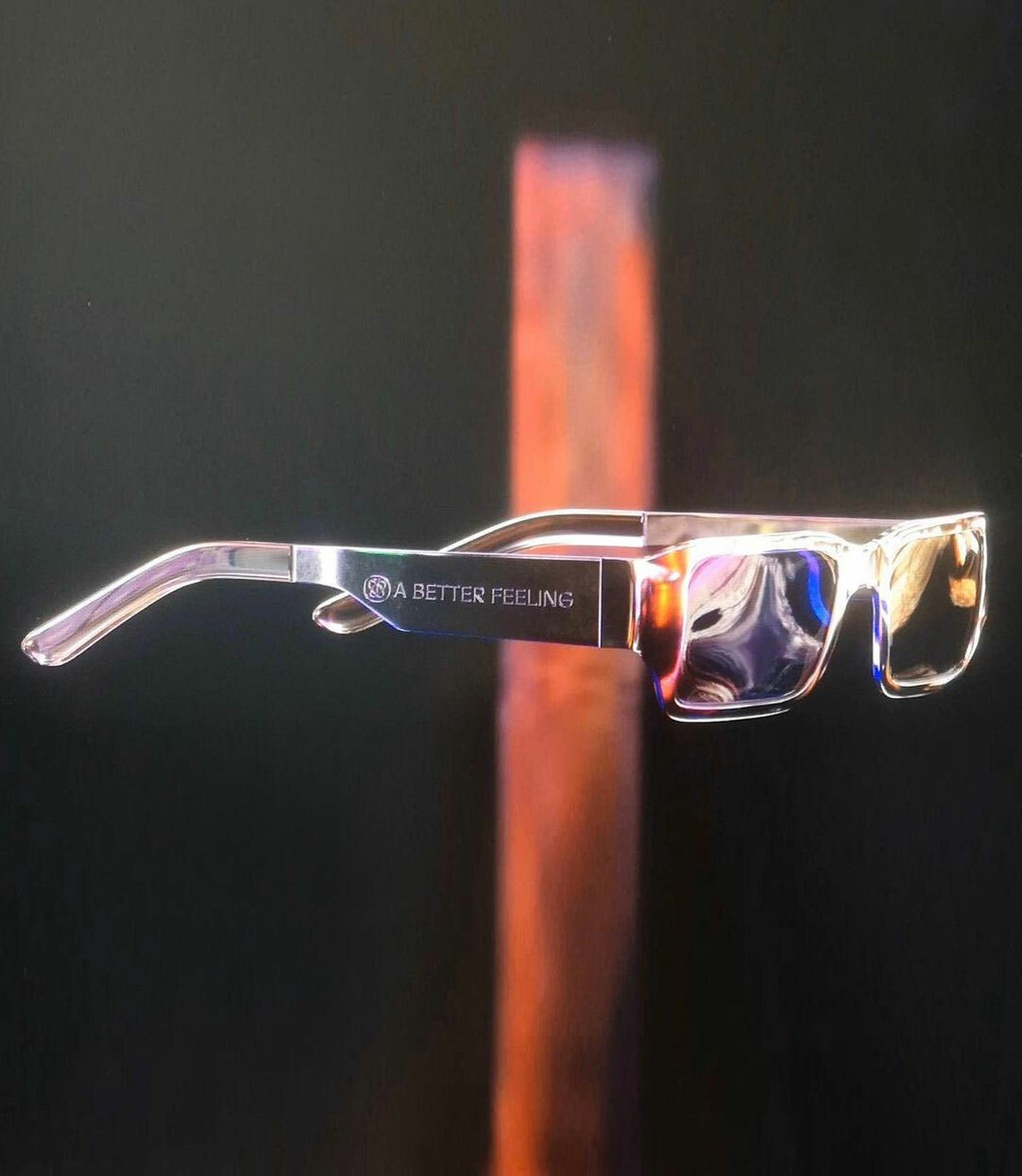
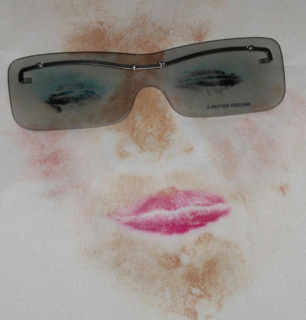
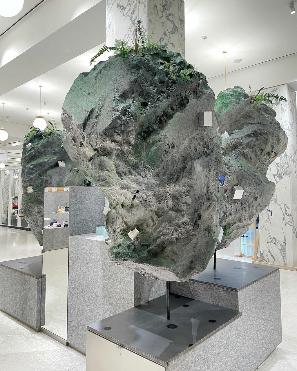
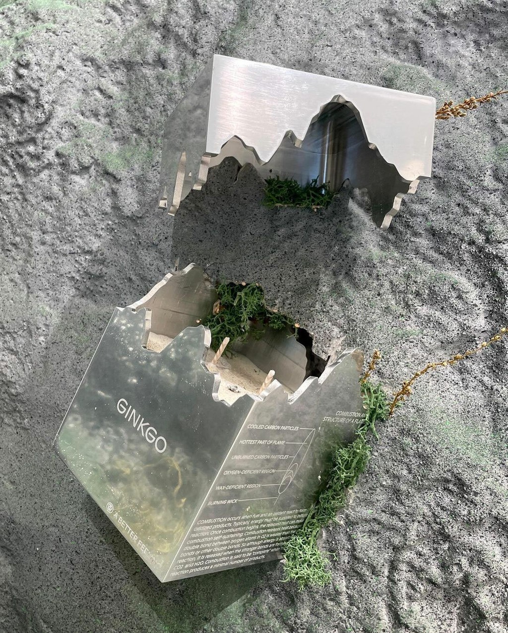
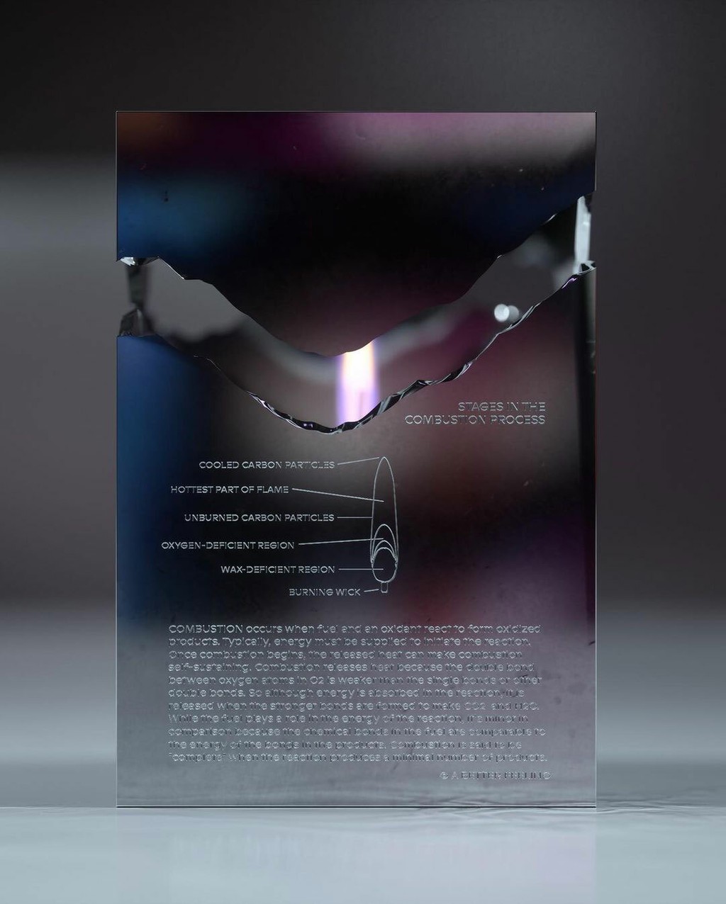
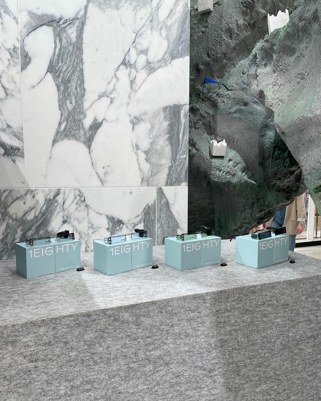
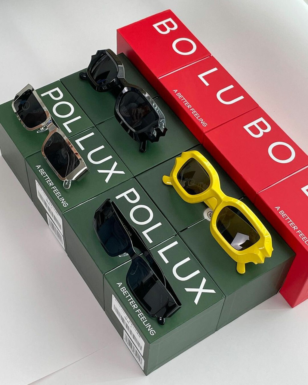
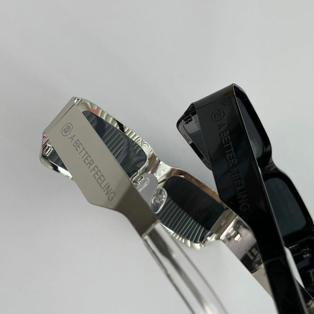
A Better Feeling. Design by Xander Ghost, A Better Feeling
