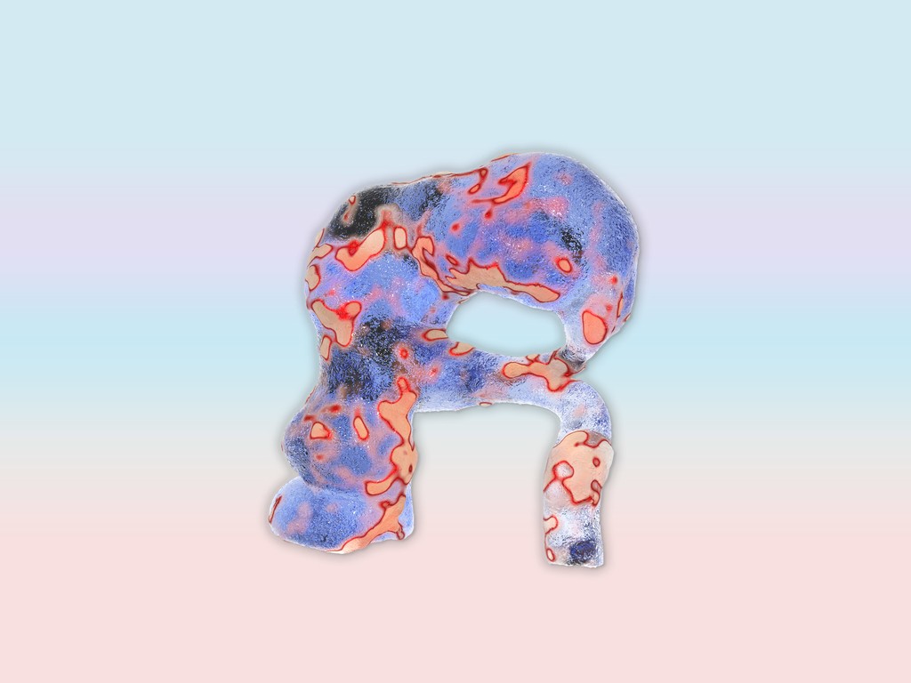
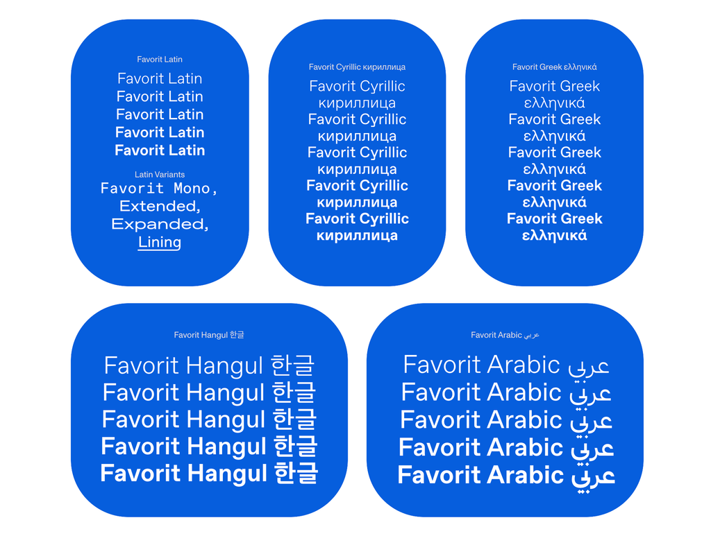
Favorit Hebrew
Favorit Hebrew
- Light
- Book
- Regular
- Medium
- Bold
- Uppercase Light
- Uppercase Book
- Uppercase
- Uppercase Medium
- Bold
Favorit Global
Features
Hebrew Display Size
TONIGHT הלילה
LIVE בהופעה
IN NYC אמפי שוני
12TH JUNE ה-12 ביוני
Alternate Aleph
א → א
Alt Gimel
ג → ג
Alt Ayin
ע → ע
Alt Nun
נ → נ
Alt Gershayim
שב״צ → שב״צ
Hebrew Display Size
BULKY קפיטלס
BULKY קפיטלס
Alternate a & y
Variety
Alternate Ampersand
&
Alternate at
@ → @
Alternate ?
?
Alternate Capital R
RR
Alternate Ampersand
&
You Go Girl!
Go,
Girl!
Slashed Zero, Tabular Figures, Alt &
Coffee 01
Ibupro & Ice
Oldstyle Figures
0123456789
0123456789
About Favorit Hebrew
About this typeface
Info
ABC Favorit is a straightforward, low-contrast grotesque that combines geometric rigidity with subtle oddities and a humorous touch. It’s available in five weights with corresponding italics, as well as a few special cuts and an underlined version, Favorit Lining. Additionally, there are the sub-families ABC Favorit Extended, ABC Favorit Expanded and the mono-spaced version ABC Favorit Mono.
The Hebrew alphabet is unicase and usually its letter height lies somewhere in-between Latin uppercase and lowercase letterforms. This means designers working on international projects often have to find a compromise when it comes to letter height, something that works next to both Latin uppercase and lowercase letters.
We believe that it’s highly valuable to have two versions of the font: the common “mid-height” version, and another that matches the height of Latin uppercase letters. We’ve therefore produced a package of both versions: ABC Favorit Hebrew Standard and ABC Favorit Hebrew Display.
Favorit Hebrew Standard has a mid letter height as its default. Favorit Hebrew Display has all its characters—both Hebrew and Latin—at full-scale height as its default. Both versions are packaged into one variable font with an axis that allows users to scale the letters up to match the Latin uppercase height if desired. Surprisingly, we don’t think that’s been done before.
Credits
Design: Dinamo (Johannes Breyer & Fabian Harb, with Erkin Karamemet and Immo Schneider)
Hebrew: Fontef (Yanek Iontef & Daniel Grumer)
Spacing and Kerning: Igino Marini
Production: Dinamo
Supported Languages
Hebrew, Yiddish, Afrikaans, Albanian, Basque, Bemba, Bosnian, Breton, Catalan, Croatian, Czech, Danish, Dutch, English, Esperanto, Estonian, Faroese, Filipino, Finnish, French, Frisian, Friulian, Gaelic, Galician, German, Greenlandic, Hungarian, Icelandic, Indonesian, Irish, Italian, Kinyarwanda, Latin, Latvian, Lithuanian, Luxembourgish, Malay, Maltese, Montenegrin, Māori, Norwegian, Occitan, Polish, Portuguese, Romanian, Romansh, Inari Sami, Lule Sami, Northern Sami, Southern Sami, Serbian (Latin), Slovak, Slovenian, Spanish, Swahili, Swedish, Turkish, Welsh and more
Afrikaans, Albanian, Basque, Bemba, Bosnian, Breton, Catalan, Croatian, Czech, Danish, Dutch, English, Esperanto, Estonian, Faroese, Filipino, Finnish, French, Frisian, Friulian, Gaelic, Galician, German, Greenlandic, Hungarian, Icelandic, Indonesian, Irish, Italian, Kinyarwanda, Latin, Latvian, Lithuanian, Luxembourgish, Malay, Maltese, Montenegrin, Māori, Norwegian, Occitan, Polish, Portuguese, Romanian, Romansh, Inari Sami, Lule Sami, Northern Sami, Southern Sami, Serbian (Latin), Slovak, Slovenian, Spanish, Swahili, Swedish, Turkish, Welsh and more

