Tumblr
- Year:
- 2018
- Timing:
- 18 months
- Team:
- Johannes Breyer
- Fabian Harb
- Robert Janes
- Domain:
- Arts & Culture
- Technology
- Medium:
- Typeface
- Type Consulting
- Technology
As part of the most recent redesign of Tumblr, we updated its logo and developed a custom typeface for the platform.
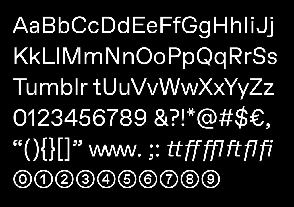
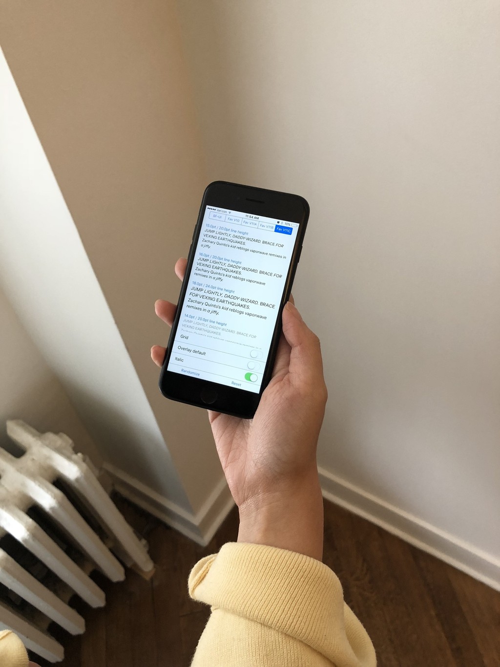
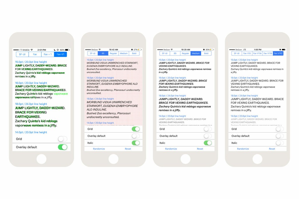
For this new typeface, we partnered with Tumblr’s in-house creative studio to customize our own font, ABC Favorit. This involved cutting new characters, interpolating new weights, introducing rounded punctuation, and scaling the typeface’s overall appearance. Tumblr’s team built a standalone iOS tool to support the testing of various iterations and optimizations of the design.
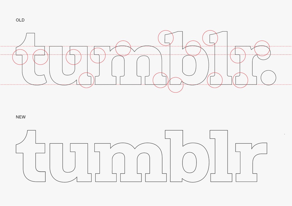
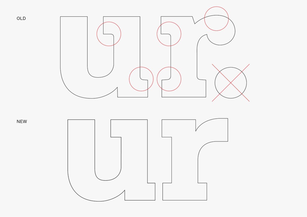
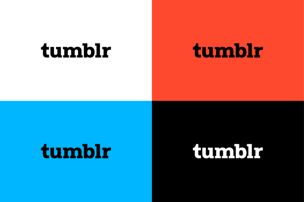
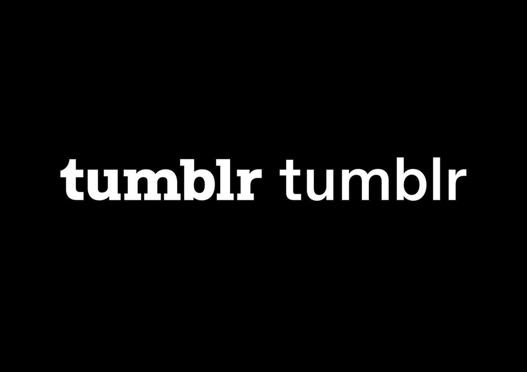
In order to stylistically align with the custom typeface, we recut the t and r characters of Tumblr’s logo. Other letters received smaller updates: We cleaned up overly subtle features and imbued the forms with a crisper, more architectural feel. Eliminating curved intersections helps optimize the logo for small screens—no matter what size, it doesn’t lose its essence. Most notably, we strategically removed the logo’s period, so that the new logo and typeface can integrate in an open-ended way across all platforms and contexts.
We were looking for a font that could account for all of our brand and product design needs. We needed something that would be purely functional for UI, with a flexible personality. We chose ABC Favorit for its friendly yet commanding presence, which successfully balances foundational sans serif attributes with assertive, contemporary geometry. It was a tall order, but Favorit-Tumblr delivered.Doug Richard
Creative Director, Tumblr
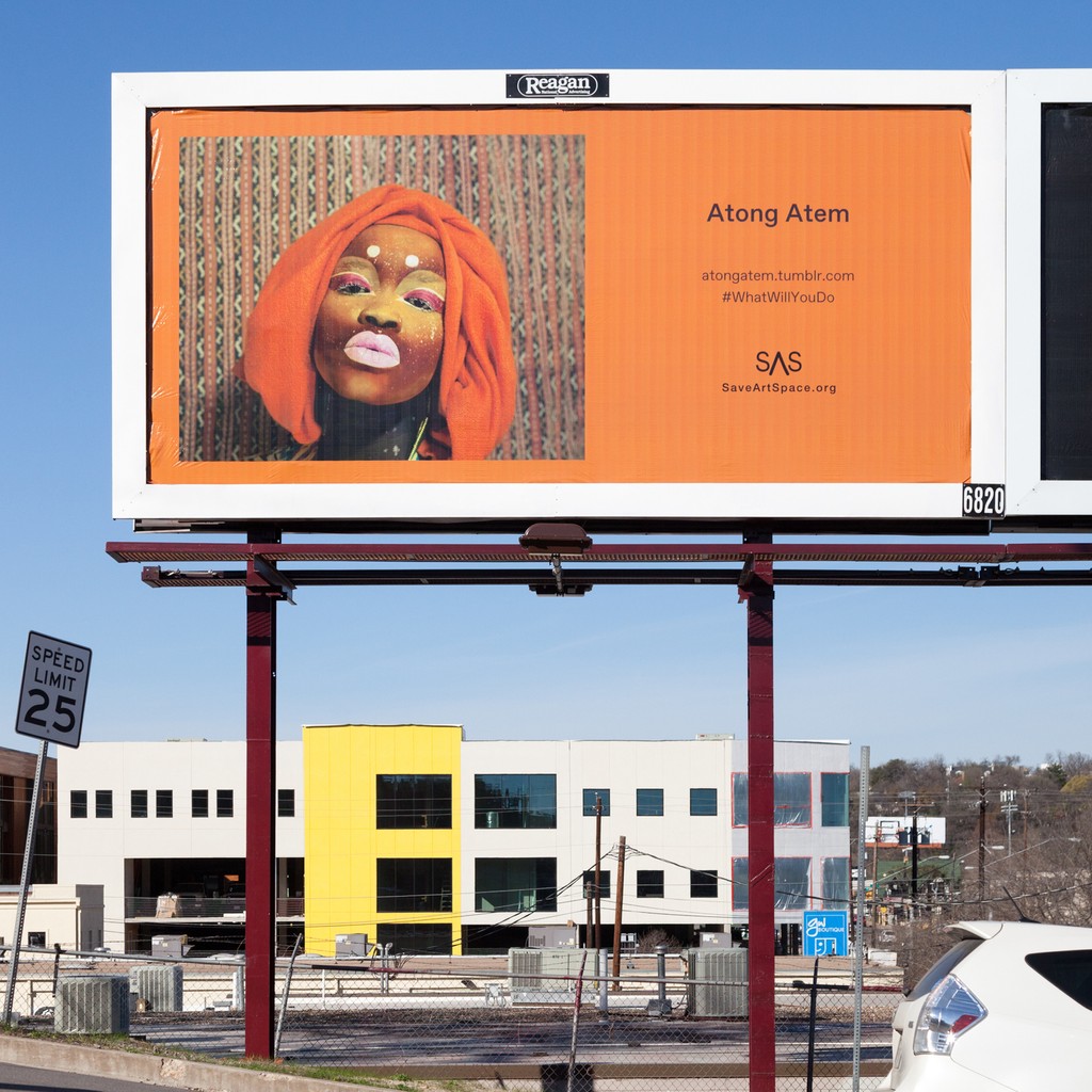
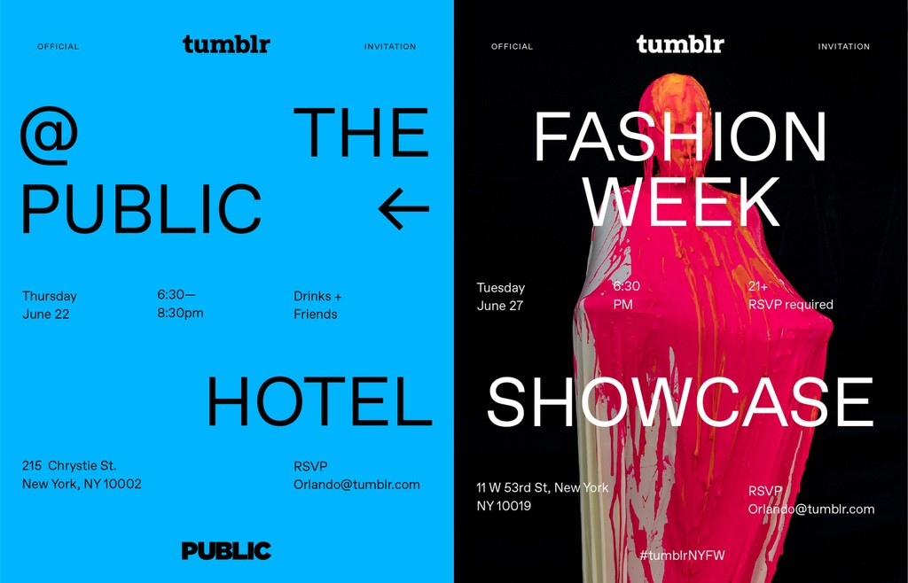
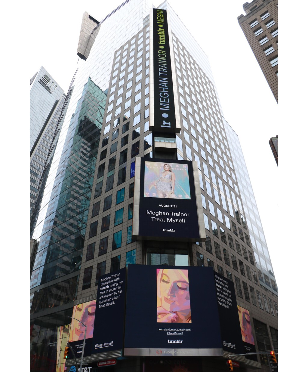
Tumblr began quietly implementing the first cuts of Favorit-Tumblr across its platform in June 2017. A year later, Tumblr rolled out the new logo and fully implemented Favorit-Tumblr across all of its web and app products.

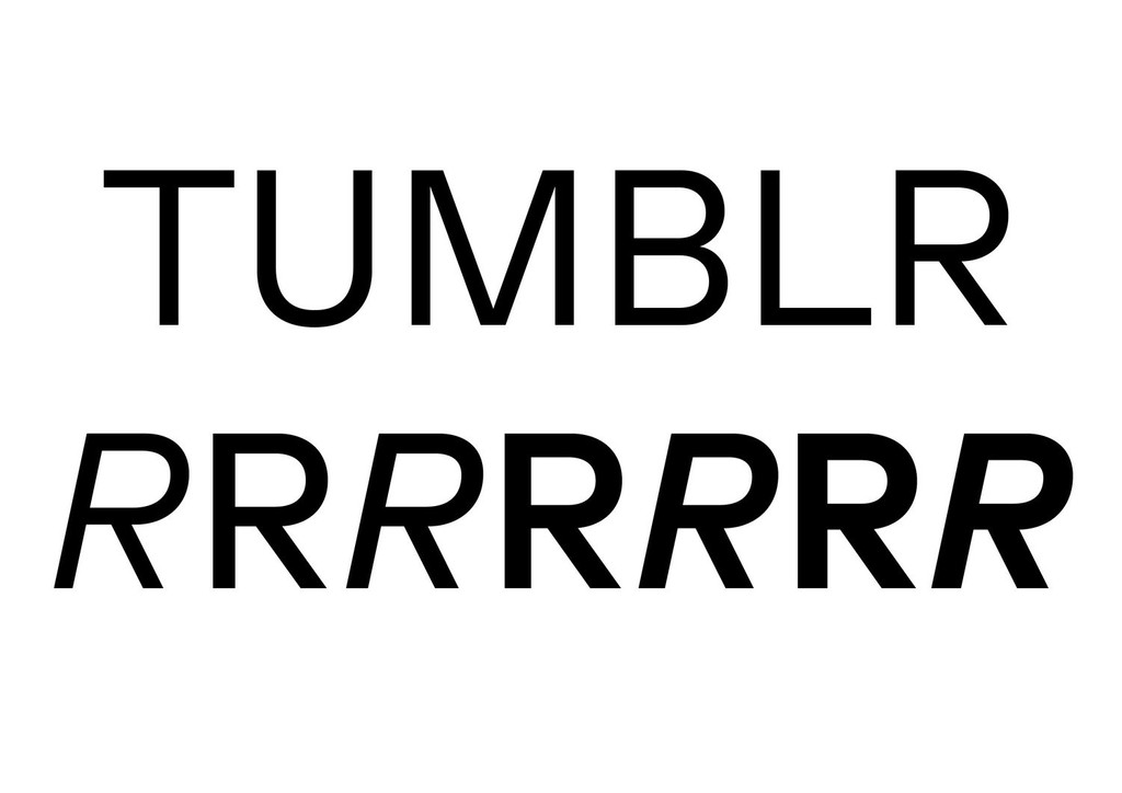


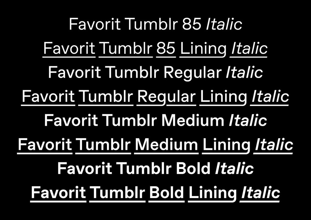
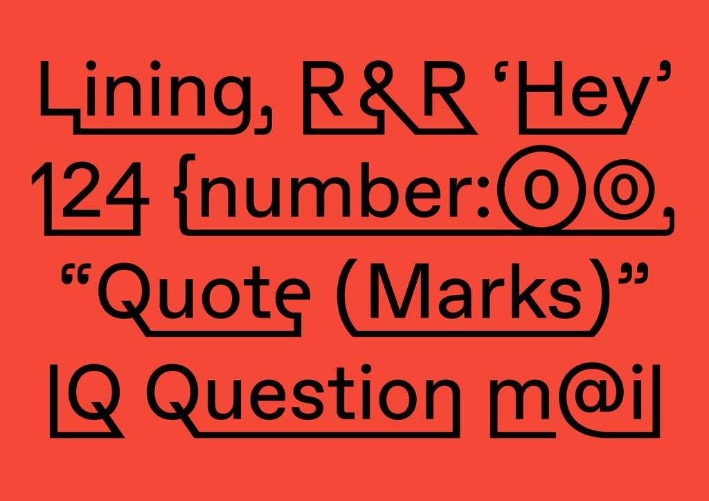
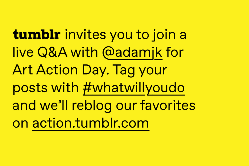
The Lining style of Favorit-Tumblr links characters with descenders into an underline to create new shapes. In its default, it’s ideal for simple text highlighting. But unleash the wild and carefree Connected mode (previously known as Rock’n’Roll mode), and the initial and final characters of individual words are conjoined by an extreme underline.
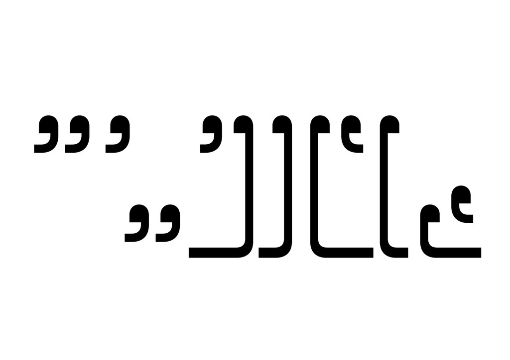
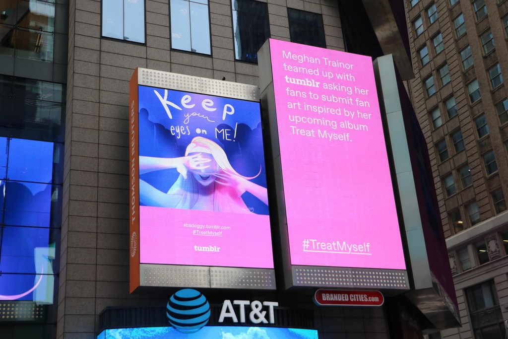
The Favorit-Tumblr styles also feature distinctive glyph amendments, including custom cut characters, two sets of encircled numbers optimized for in-app use, in-line logos, expressive alternative quotation marks, and redesigned ligatures.

Typeface
Design: Dinamo
(Johannes Breyer & Fabian Harb, with Robert Janes)
Mastering: Chi-Long Trieu
Logo
Design: Dinamo (Johannes Breyer & Fabian Harb)
Creative Direction: Doug Richard
Art Direction: Alessandra Bautista
Brand Identity
Creative Direction: Doug Richard
Art Direction: Erik Blad, Alessandra Bautista
Design: Julianne Waber
Photography: Tumblr
Images: Dinamo, Tumblr