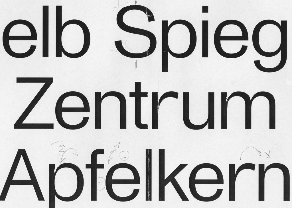
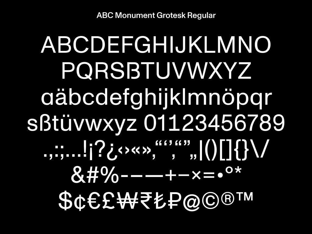
Typeface Release: ABC Monument Grotesk

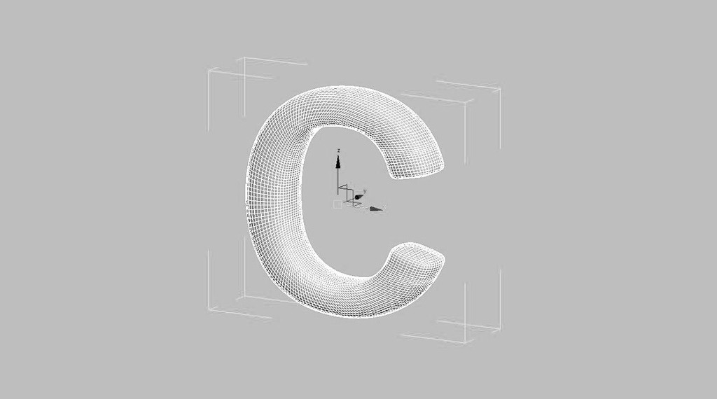
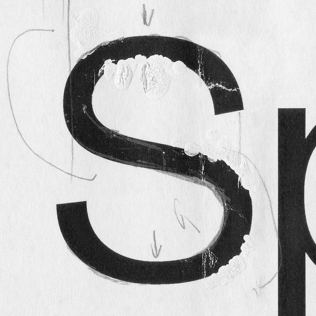
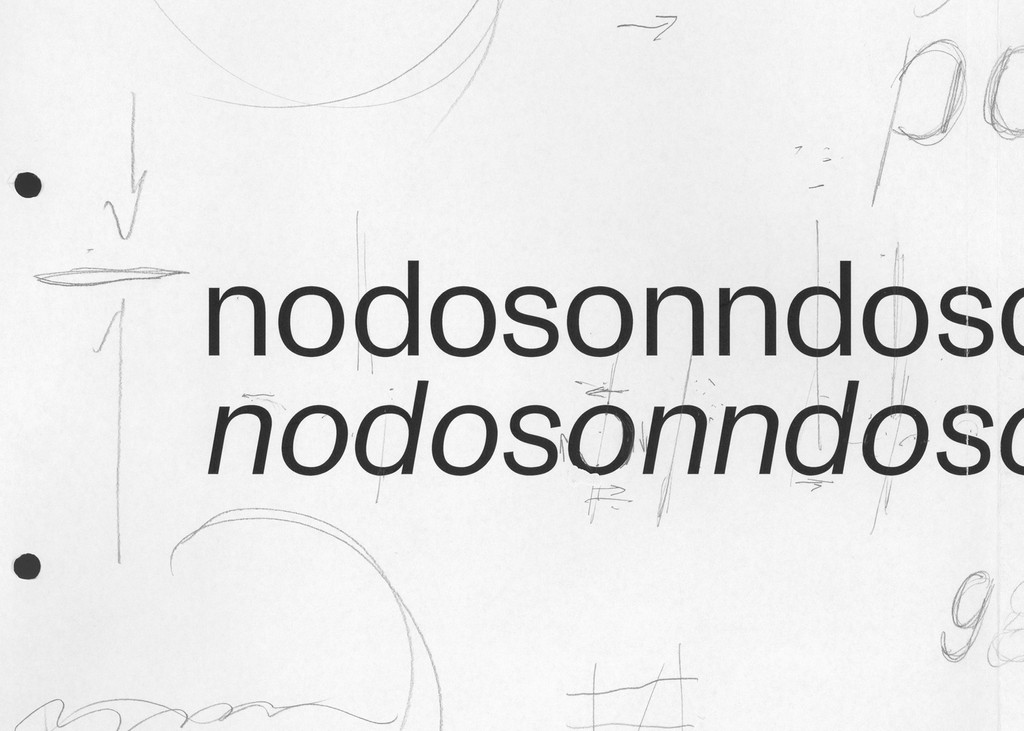
ABC Monument Grotesk owes its point de départ to a few intriguing contours that the Swiss design studio Kasper-Florio stumbled across in an online scan of the foundry Palmer & Rey’s 1884 'New Specimen Book' (on page 81, for those that need to know). Specifically, the squarish inner counters of an o, c, and e, which pressed against their own outer parts, prompted a few screenshots—as did the elongated shoulder of an r. Compelled by the letterforms’ compact skeleton, high vertical contrast, and surprisingly sharp end strokes, Kasper-Florio set forth with the task of digitization and reinterpretation.
Kasper-Florio is renowned for its masterful designs for the Swiss cultural landscape, and it’s been awarded the prestigious Most Beautiful Swiss Books prize eight times to date. Meticulous consistency, conceptual rigour, and a deep devotion to print defines the studio’s practice. ABC Monument Grotesk sits at the heart of these three impulses, figuring as the studio’s house typeface and appearing regularly across its varied output.
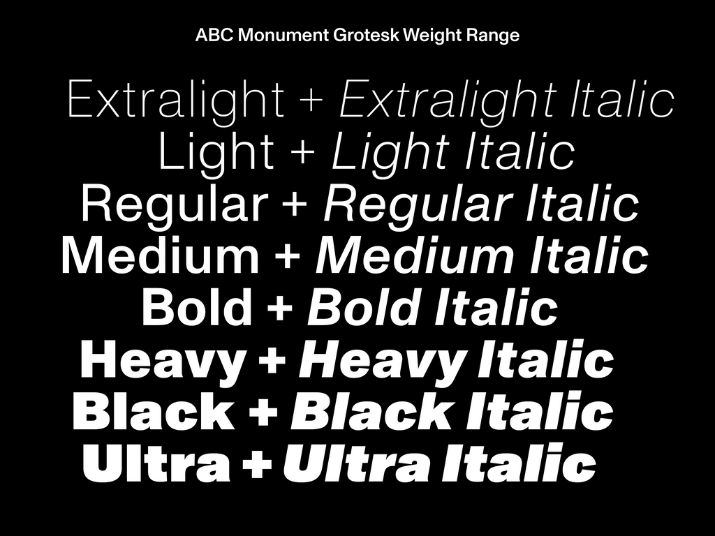
You asked, we listened. In 2018, ABC Monument Grotesk was released to the public via Dinamo. We first extended it into a full family, and then five months later, we added Mono and Semi-Mono cuts.
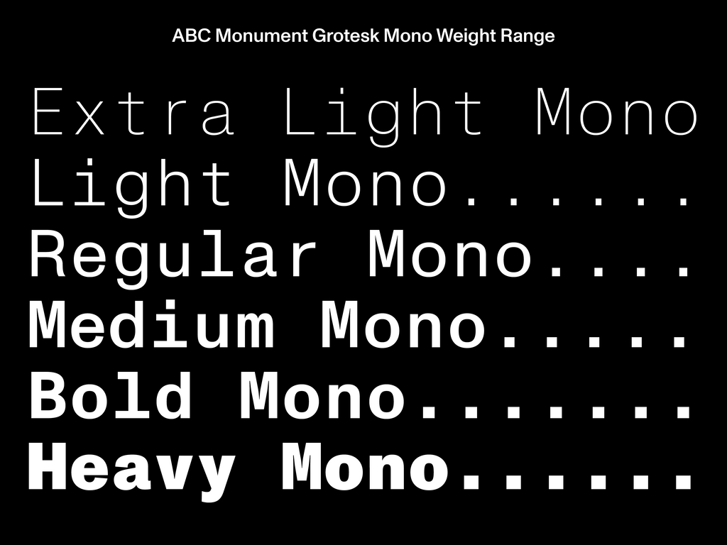
ABC Monument Grotesk Mono doesn’t need many words; it best serves those looking for a more technical and functional mood. ABC Monument Grotesk Semi-Mono serves the indecisive and is best explained with an infographic. It sits between the Regular and Mono cuts, borrowing a little from both worlds: half the kerning and proportions of the former, and half of the widths and promotions of the latter.
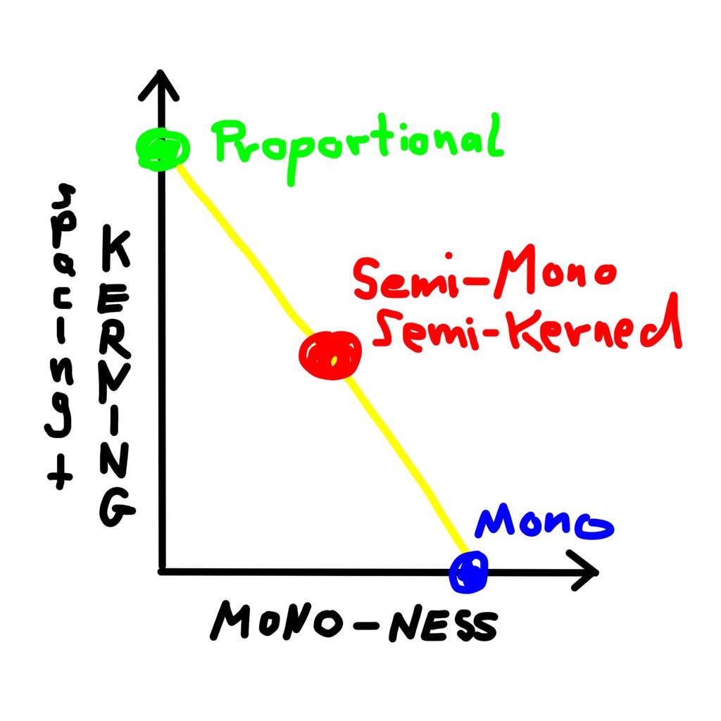
ABC Monument Grotesk Semi-Mono borrowing a little from the best of both worlds
A variable font file of ABC Monument Grotesk is available. When dropped into Dinamo Font Gauntlet or embedded in your website, you can seamlessly slide from the font’s Regular variation to its Mono one. Stop halfway on the slider, and you’re at ABC Monument Grotesk Semi-Mono—our half-proportional, half-mono, half-kerned variation. Keep sliding up and down to discover the entire spectrum.
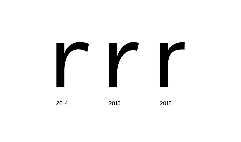
Before its public release, ABC Monument Grotesk was continually revised by Kasper-Florio to meet the needs of new commissions and production techniques. First, it was updated for screen printing and foil embossing, and in later years for digital print on textile, offset printing, and the electronic screen. The font now carries this chronology within itself: Two stages of the r glyph—r.1, designed in 2014, and r.2 from 2015—are available in the character set, allowing you to travel back in time with the typeface’s OpenType features.
In 2019, Heavy and Black with corresponding Italics were added to the family. Four more styles—Thin, Thin Italic, Light, and Light Italic—are currently being added, a range designed for finer, more elegant contexts.
The VF traveling from a proportional to Semi-Mono to Monospaced end of the spectrum
Credits
Design: Kasper-Florio (Larissa Kasper and Rosario Florio)
Family Extension: Dinamo (Robert Janes and Fabiola Mejía)
Spacing and Kerning: Igino Marini
Mastering: Chi Long Trieu and Dinamo (Robert Janes)