Plus Caroline Calloway talks Prophet, our first train, new Walter Caption Contest + more —

Welcome to the latest issue of our newsletter, where I’ll continue to share the latest ongoings at the studio. Take a look at our our archive.

Was this forwarded to you? Sign up now! (*◠‿◠)

Hey Friend,

We’ve been busy working on our client work page and have uploaded 1 ton of new case studies. Sharing a few below ♡

Next, we’ve got some thoughts from Fabian about his chair collection. Guy can’t stop sourcing, buying, and transporting chairs, even though it gets him into storage problems (strange shapes can rarely be stacked easily). Plus, we asked Caroline Calloway to share her feelings on one of our fonts.

3 CUSTOM PROJECTS

We love working on custom type and font customizations and have documented recent projects in a way that hopefully lets you follow our thinking and making process! Includes our bespoke designs for Discord, the Olympic International Committee, & Pharrel Williams’ JOOPITER.

I hope that you enjoy these stories and reach out to us if you want a similar thing. All pages patiently designed by Tina Lehmkuhl 💅

We created two custom typefaces for the International Olympic Committee — a matching sans and serif ideal for streaming. Commissioned by Hulse & Durrell as part of its digital-focused brand refresh.

See more.

We created a bespoke wordmark and font customization of Ginto for Discord — the number one communication platform for gamers. Identity by Studio Koto.

See more.

Alaska Alaska called us to create a bespoke wordmark and Monument Grotesk customization for Pharrell Williams’ digital-first auction house JOOPITER. Combines the luxury of old school auctions with the bluntness of digital marketplaces.

See more.

Caroline Calloway Loves (Our) Fonts 😭

My mockup feat. book cover design by Sam West. Interview with Sam coming to our blog hopefully soon!

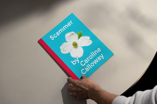
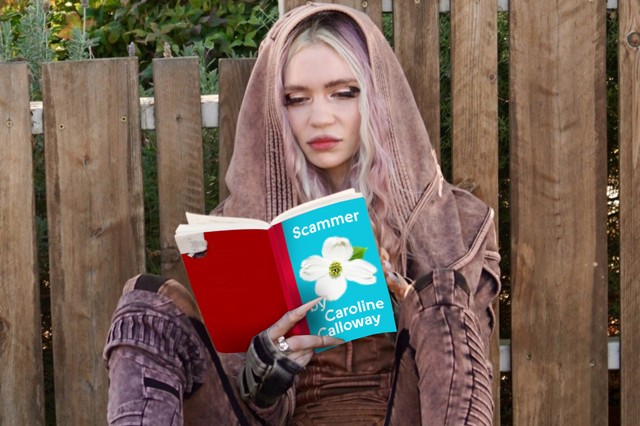
This young entrepreneur achieved early fame for writing those long long captions, then for tricking people into her creativity workshops. Then, it was her OnlyFans (as I heard from a friend). Yep, we’re talking about (and with) internet legend and self-proclaimed scammer Caroline Calloway.

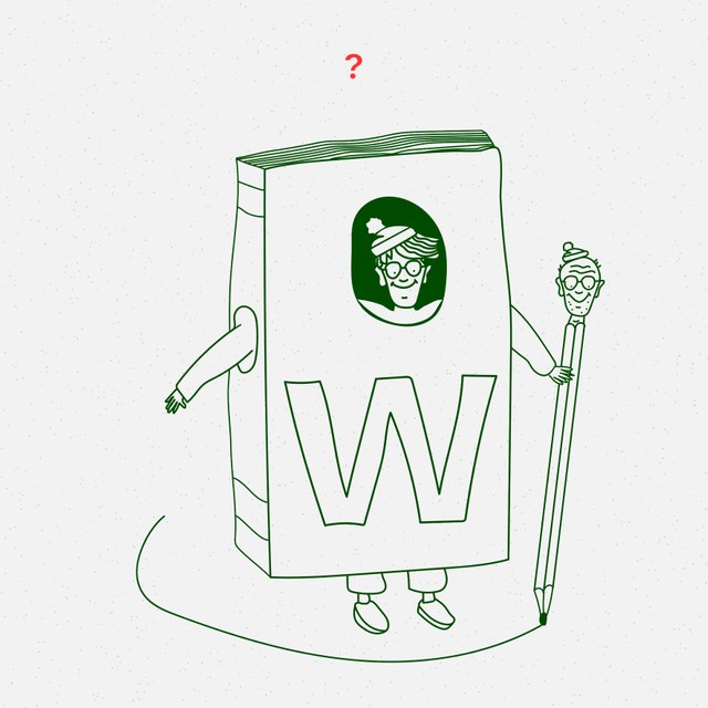
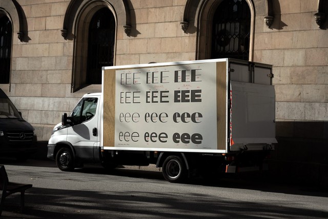
Like many others, we’re fascinated by Caroline’s many activities, and so when I saw that she released a memoir using (jaw drop) our own ABC Prophet on the cover, I reached out to her. The Queen of scamming herself was kind enough to reply and said the following about the typeface. Thank you Caroline ♥️

I fell in love with Prophet after seeing it on the covers of the English translations of Tove Ditlevsen, who’s like the Sylvia Plath of Copenhagen and a real hero of mine. What I like about Prophet (besides reminding me of one of my favorite female memoirists!) is the way that it looks both machine-made and hand-written all at once. The crisp-edged, sans serif, Helvetica-like letters bring to mind the fonts of emails, Tweets, and Instagram captions. While the carved-out, sliced-off, more calligraphic characters remind me of penmanship, first drafts, and the Lydian craze of every book cover in America in the 1950s.

CC 🌺🐍

Friend of the foundry doing some holiday reading

Storage Problems (Chairs)

Fabian collects a lot of things and has storage problems not only on his computer but also in his studio. Storage problems everywhere. So I spoke to him about what he calls his “chair mess.” Fabian speaking below:

I rarely sit on the same chair for more than a week. My home doesn’t have a lot of space, so I keep most of the chairs at my studio in Porto where we have more chairs than we do people (I’d say it’s a ratio of 4:1).

Accumulating chairs is like an investigation. It’s similar to when I first got excited about typeface design and collected books and specimens so that I could compare different genres. Chairs are also more functional than type specimens. But I might have a few too many of them right now. I’ll share a few with you today :)

1. Box Chair by Enzo Mari

This is the chair that I sit on the most. It’s Enzo Mari’s “Box” chair from the 1970s. The idea was that when you bought it, it would come folded together as a box in a plastic bag. Everything can be unscrewed and put together again. I got mine from the Italian version of ebay — someone was using a few of them as garden furniture. When the set arrived, I spent a long time cleaning them. I gave one to Johannes. And then I sold another one of them, which paid for all the rest of my chairs.

2. Stuhl by Susi and Ueli Berger

When you unscrew the parts of this chair by Susi and Ueli Berger, each of its elements makes up the letters for the word “stuhl.” That’s “chair” in German. The designers actually wanted to make another version that spelled out “chair” in English, but it was never realized. And they made a table from the letters “tisch” (which means “table”). I got this one from the carpenter who used to produce furniture for the couple, and he still had some pieces left. I was really lucky!

3. Landi-Stuhl by Hans Coray

I keep these chairs by Hans Coray outside in the garden. They were made in 1938 for the Swiss "Landi" expo, and one of the first chairs to be made from a single, bent sheet of material. It was the same time as Eames and Saarinen were making chairs from one piece of plywood. This one, though, was made from aluminum, a material that Switzerland used a lot during that time. The only problem with it is that it cracks very easily, which is why Coray redesigned his own chair later on and made the seat from two individual pieces.

4. Experiment lounge chair by Yrjö Kukkapuro

This chair on the left is by Finnish designer Yrjö Kukkapuro. Years ago, when Johannes and I were teaching at the art academy in Tallinn for a month, we took a trip to Helsinki and I saw a Kukkapuro chair there. I started to search for his pieces and eventually found one on the Swiss ebay, ricardo.ch. I was living in Berlin at the time so I had to send it to my mom’s house. And then a few years ago, I actually visited him in his studio in Helsinki.

5. The YOYO² stroller by Babyzen

Actually, this is the chair I use the most right now. It’s a collapsible pram called the Yoyo. We got it before a recent trip because you can fold it down into one piece, which is amazing when you travel. Especially when you’re alone with the pram. It also has a great rain cover. This is actually my son’s second pram already.

Walter Caption Contest

In each issue of The Dinamo Update, we provide a new Walter cartoon in need of a caption. You, the reader, can submit your caption by responding to this email or by commenting on our caption contest IG post. The best three responses win the complete Walter Alte.

Scroll on for the last round’s winners — as well as the new contest.

New: Round 7

What are the Walters doing this time? Send us your caption to win.

Round 6 Finalists

🏆🏆🏆

Congrats to our winners. Your files of Alte Walter are on their way!

And 1 More Custom Typeface

Dinamo’s first whole train! Our friends at Studio VEH invited us to roll with, I mean, customize Whyte a little for Vossloh Rolling Stock, a 150-year-old cargo train company. Here for the full case study.

Strategy and identity by Franziska, Mark, Jens, Lind, Aditi, Felicia ☀️

Studio Updates

Newest team member Naïma talking Whyte Tifinagh with Fabian ❣️

Studio crisis averted. Thank you Maxi tape 🥵

Johannes, Maddy, Tina, and Mathi at the monthly communication breakfast

Incoming unnamed delivery from Erkin

Sun’s out, tongue's out. Basket finally found her spot 😘

Simon has been feeling healthy making his Hardware labels

Renan has been cooking up ABC Solar accents

Maddy is planning a multisensory launch with Oli and Lukas at BNAG

PS

Photography magazine Der Greif uses Diatype across its new online identity by our good friends at NODE. I wrote a small text introducing the font to readers.

Thank you for checking in with the latest issue of The Dinamo Update. You can read all of the back issues in our archive.

Love,
Dinamo 🦋

Dinamo Typefaces GmbH, Glasower Str 44-47, 12051 Berlin
Copyright ©2024, All Rights Reserved