Wordmark & Bespoke Customization for Discord
LOGO · DESIGN · CUSTOM · FONT · WORDMARK · GINTO · STUDIO KOTO · 2021
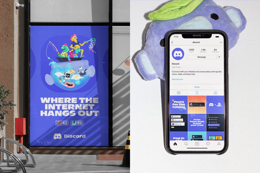
We created a bespoke wordmark and font customization of Ginto for Discord — the number one communication platform for gamers (and so many other communities, too). It’s estimated that the platform receives 20 million visitors. Every day.
For Studio Koto & AKQA, the design teams behind Discord’s new identity: “Playful and sophisticated Ginto brings a bold energy that doesn’t take itself too seriously.”
The Vibe
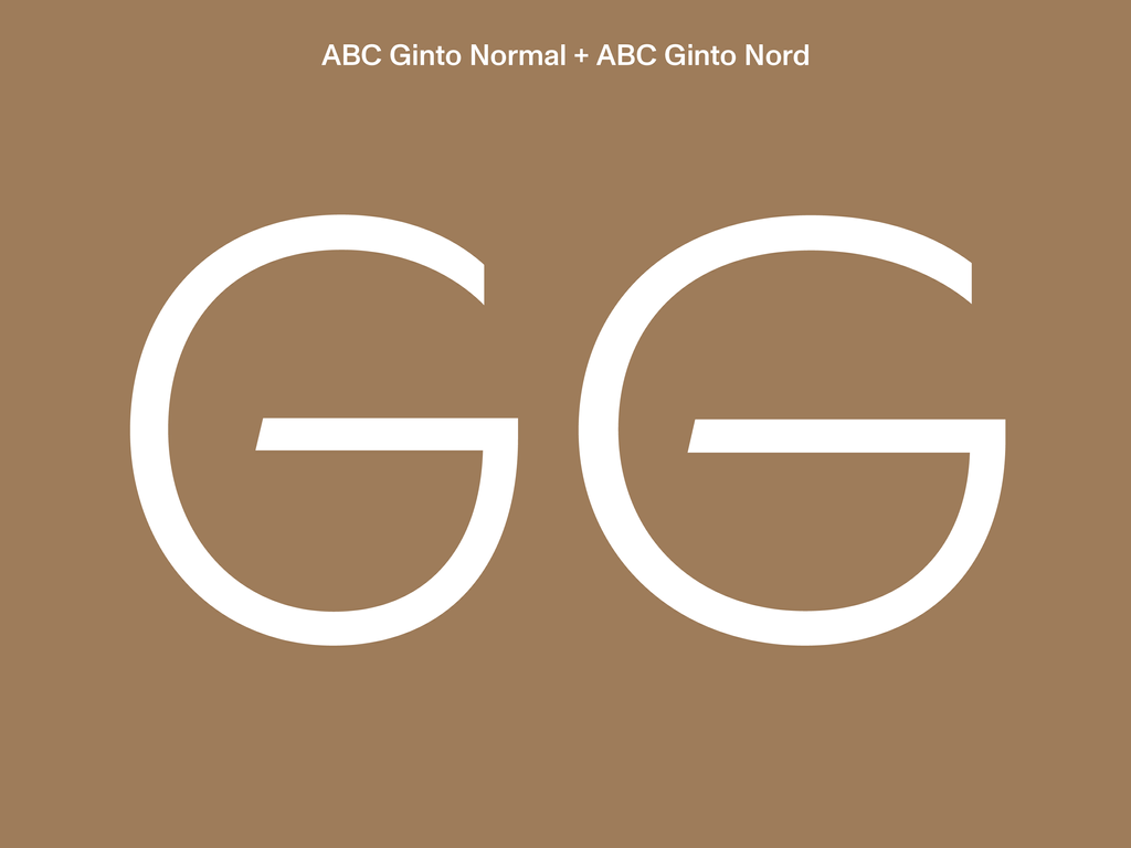
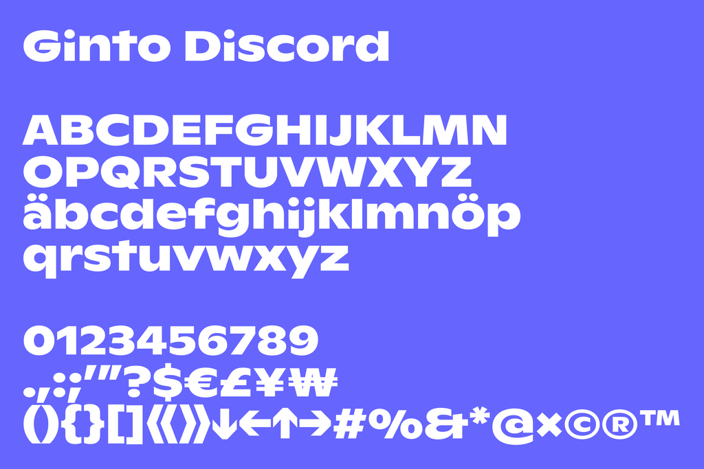
Ginto is an exuberant, geometric-humanist typeface that delights in tension. Especially the tension between circular and rectangular forms. It has two subfamilies, and Studio Koto selected extra loud Ginto Nord for the identity. This family’s unique remix of historical references feels dynamic, fresh, and playful.
As a contemporary humanist font, we think it makes a strong partner for the platform. You could even say its chunky forms and round edges look like the shapes of gaming consoles.

Some inspiration from our customization archive.
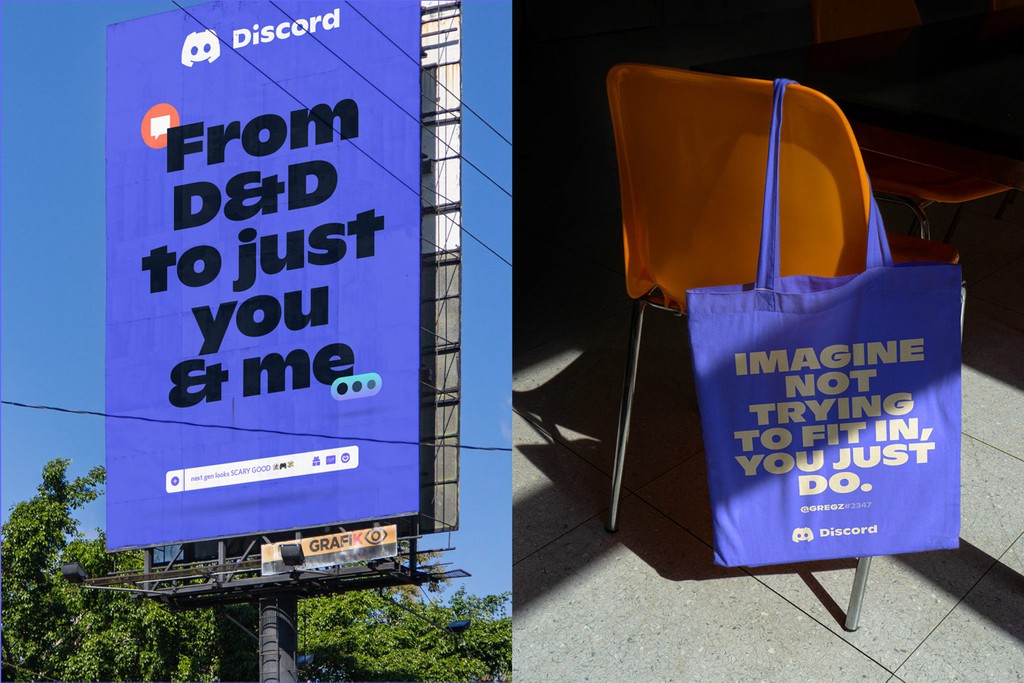
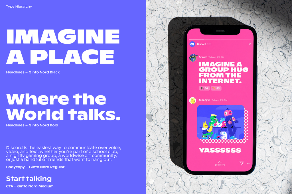
Discord’s overall identity is playful and bold. Icons and illustrations communicate both the world-building of gaming and a sense of human connection.
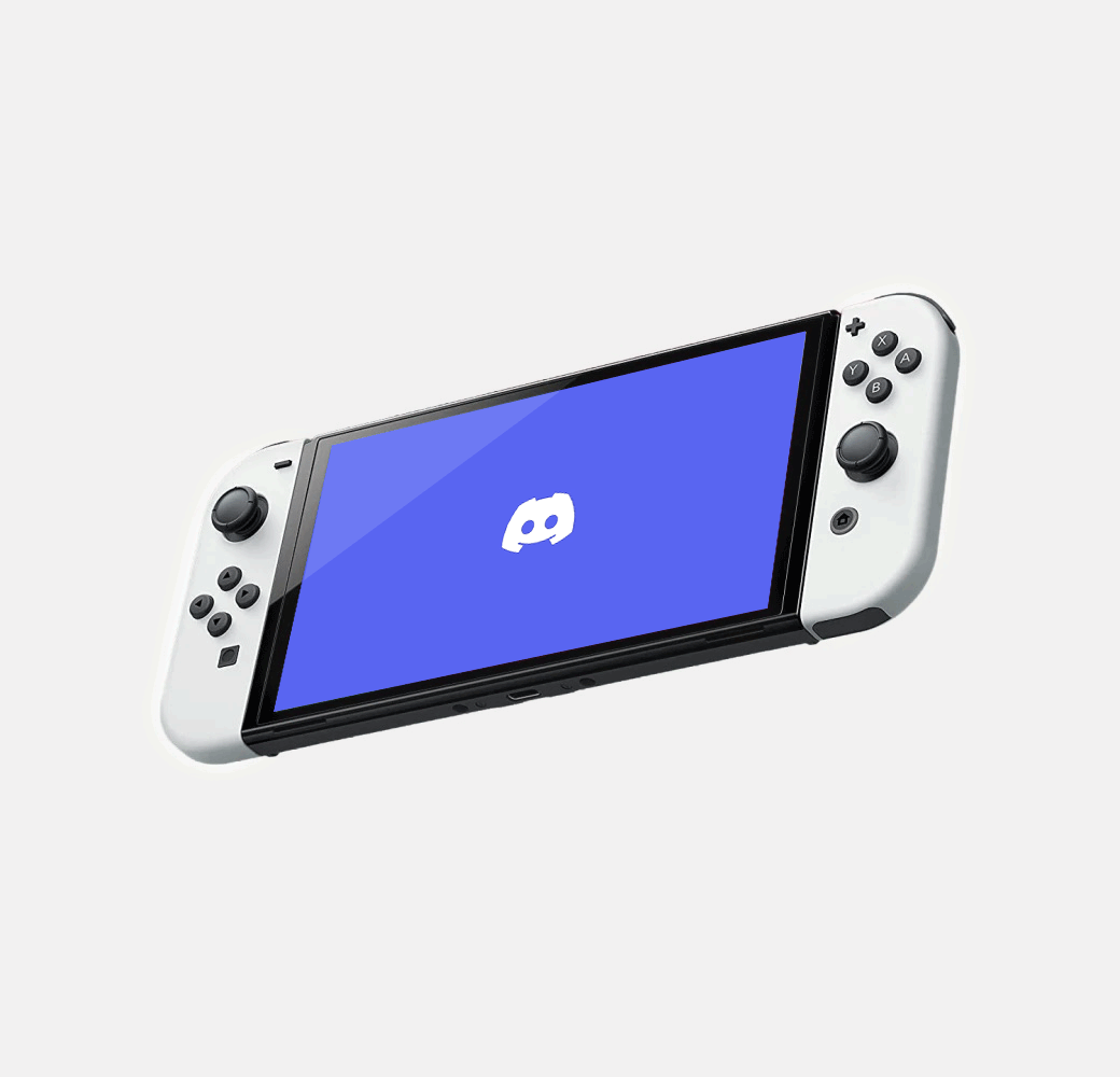
You can see this in Studio Koto’s Clyde mascot: He’s both a game controller and a face ;) Ginto Nord combines humanist strokes with geometric shapes, so like Clyde, it feels both human and technical. We find the sharp angles and smooth curves of the font mirror Clyde’s own shapes, too.
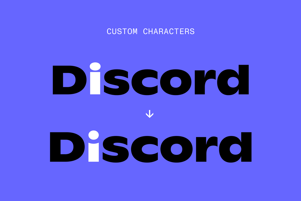
Our Wordmark
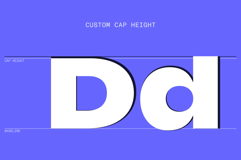
We matched the ascender height of Ginto Nord’s lowercase d with the uppercase D’s cap height. Creating a sandwich of letters in-between. This nicely balances out the typeface. And it creates a solid and contained wordmark.
To create an ownable moment, we dipped the horizontal bar of the lower case i to form a valley. We like to think of it as the game toggle. It also creates a smoothness that matches the immerse environment and characters Koto developed for the brand’s storytelling.
The Customization
With the bespoke lowercase i, we needed to create a similar treatment for the lowercase j for brand cohension. Brought together, these star characters create a voice that feels unique to Discord.
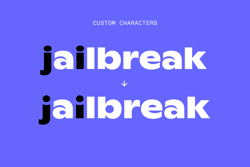
Circle attack that j and i like Usagi
The Branding
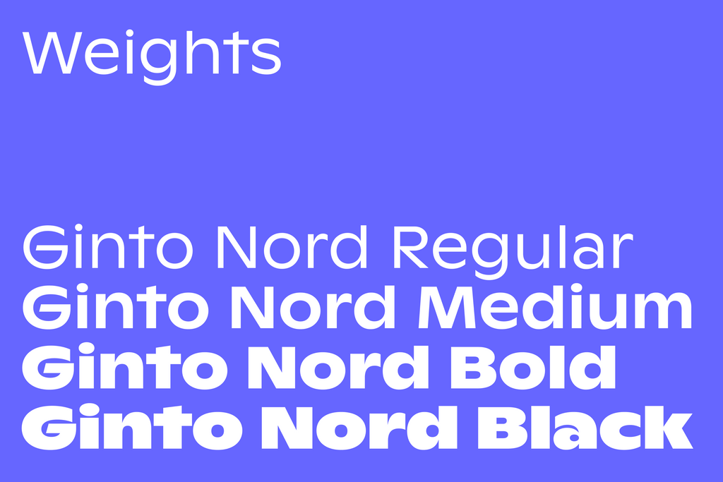
Discord Ginto Nord appears across Discord’s marketing material and in its product in four weights. Stretching from functional yet characterful Regular to chunky Black.
The Release
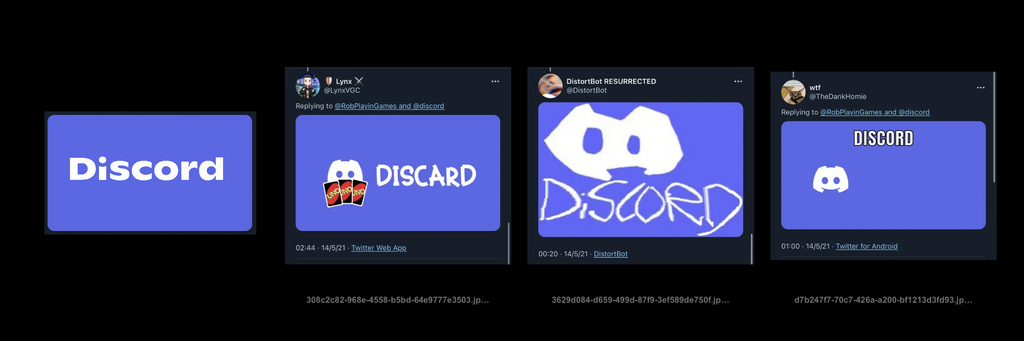
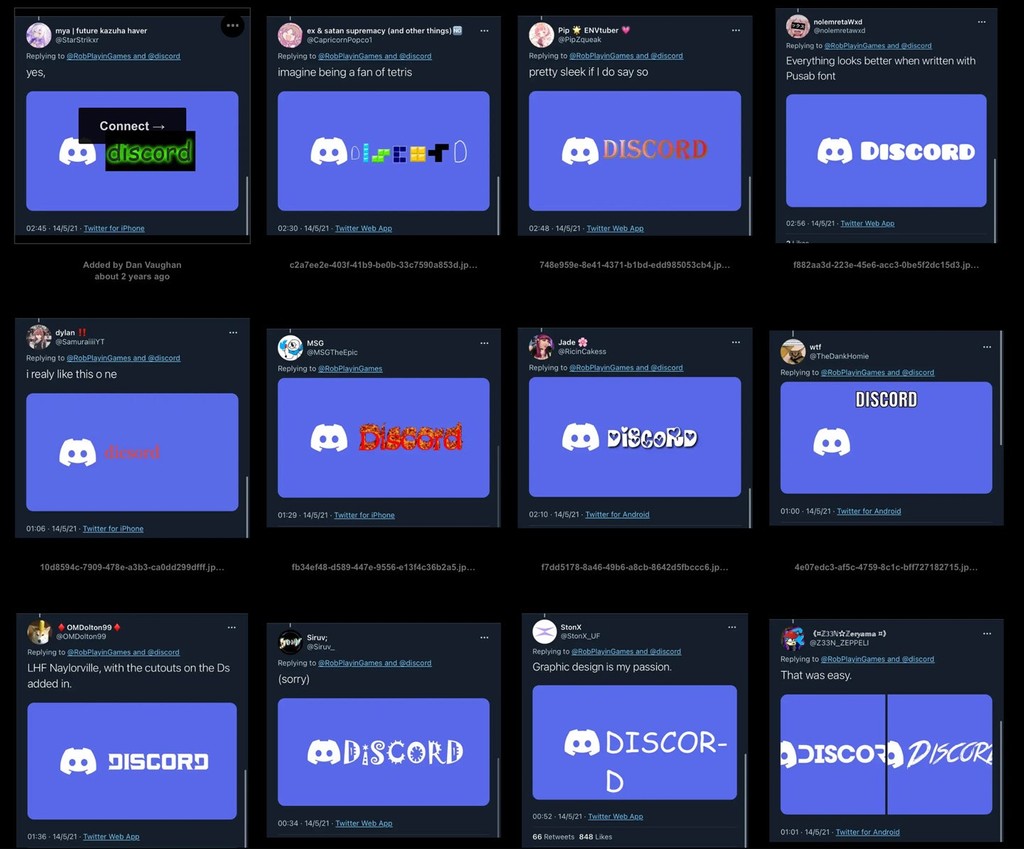
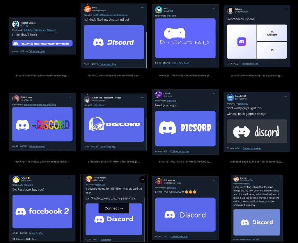
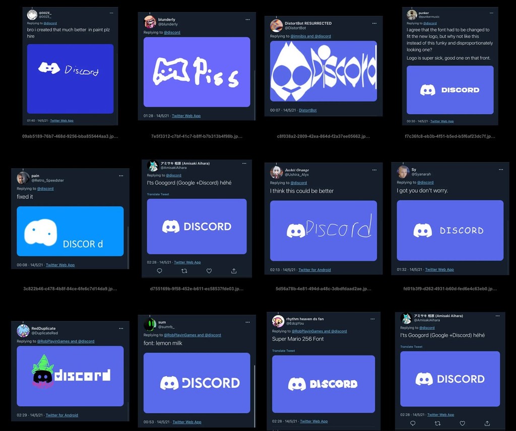
Not everybody in the love-sharing space called the internet loves Ginto as much as we do. Below are the best comments we’ve seen. Plus the suggested redesigns that came after the typeface reveal.
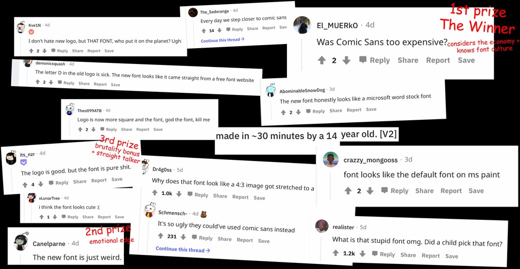
Reddit 💕

That's it!
Thank you to the team at Koto, including Jowey Roden, Michelle Ha, Dave Raxworthy, and Monica Malatesta. It’s an honor to see Ginto used across the home of today’s gamers.
Credits
Art Direction and Design: Studio Koto + AKQA
Type Customization: Dinamo (Fabian Harb with Renan Rosatti)
Ginto Design: Seb McLauchlan
Mastering: Dinamo (Renan Rosatti)
Campaign & Photography: Discord & Studio Koto