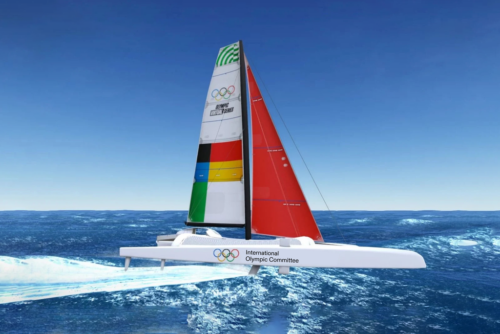
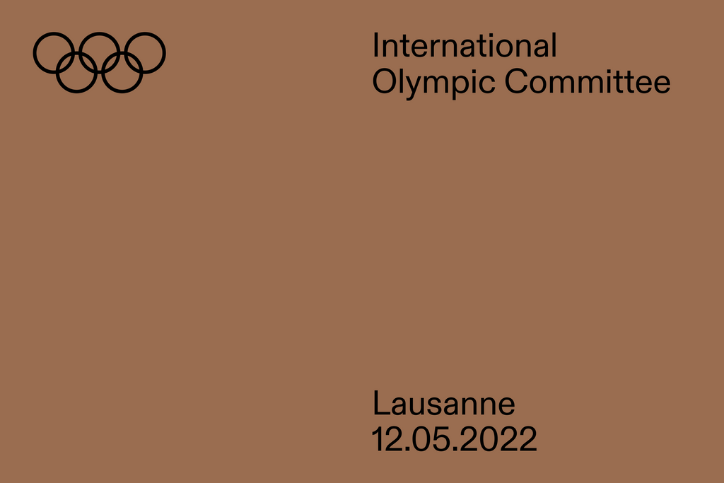
International Olympic Committee
CUSTOM · FONT · SANS · SANS SERIF · WORDMARK · HULSE & DURRELL · 2020 ·
We designed two typefaces for the International Olympic Committee — a matching sans and serif ideal for streaming. Commissioned by Hulse & Durrell as part of its digital-focused brand refresh, the typefaces balance the old and the new. Helping bring the Olympic Games into the future via online channels.
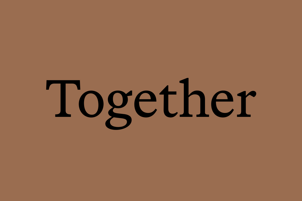
Olympic Sans is a classic workhorse. Used across most of the Committee’s communications. Olympic Serif, on the other hand, is like its classy sidekick. Appearing during moments when a more elevated tone is needed.
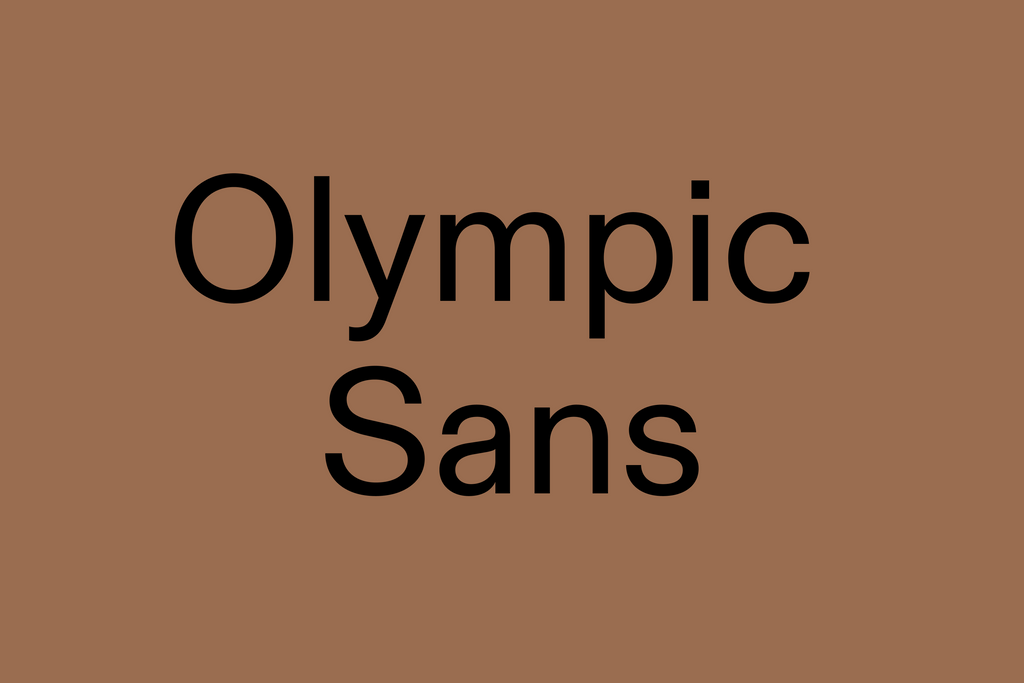
Olympic Sans
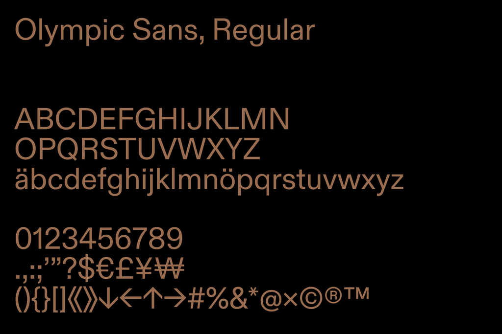
Olympic Sans is a contemporary interpretation of Akzidenz-Grotesk, a typeface designed in 1896. The same year that the Olympic Games were first founded. Warm yet sharp, its forms are ideal for reading on screen.
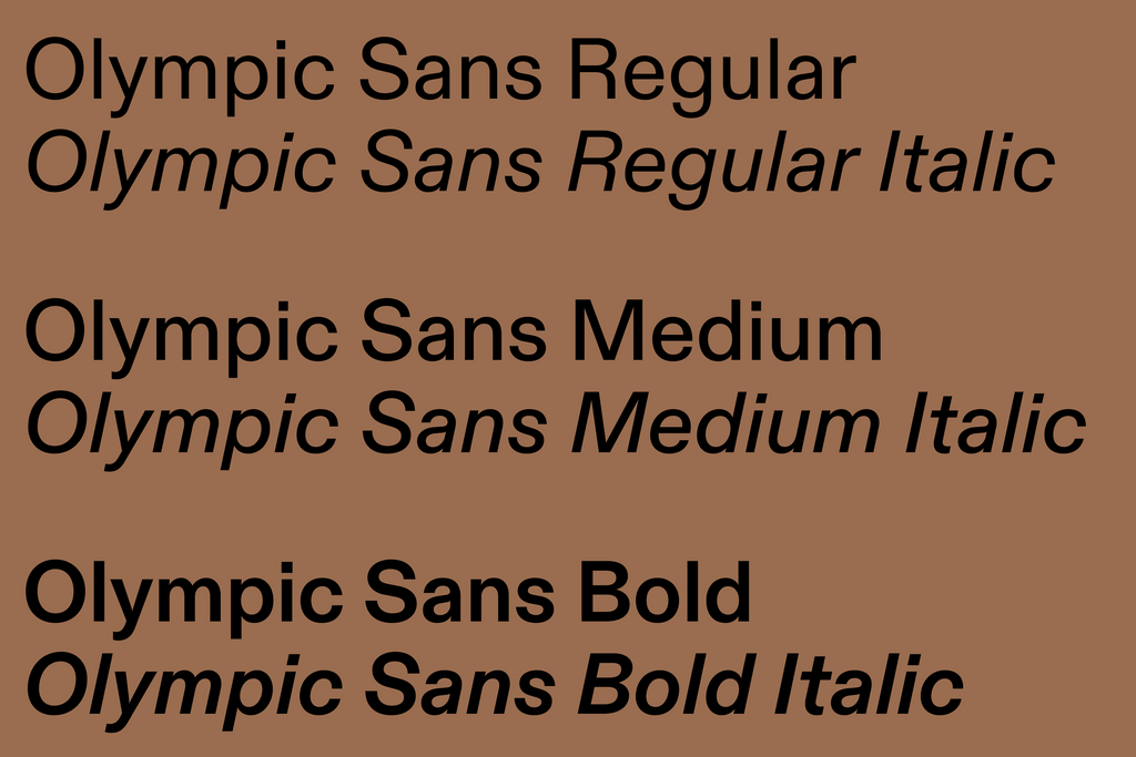
With three weights and corresponding italics, Olympic Sans is the main voice of the Olympic brand and used for most of its written material. While Regular is favored in most cases, Medium and Bold allow for more tonal flexibility.
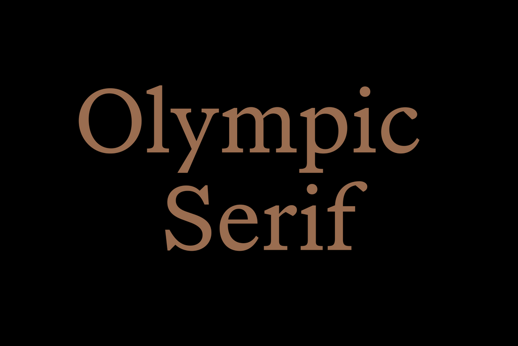
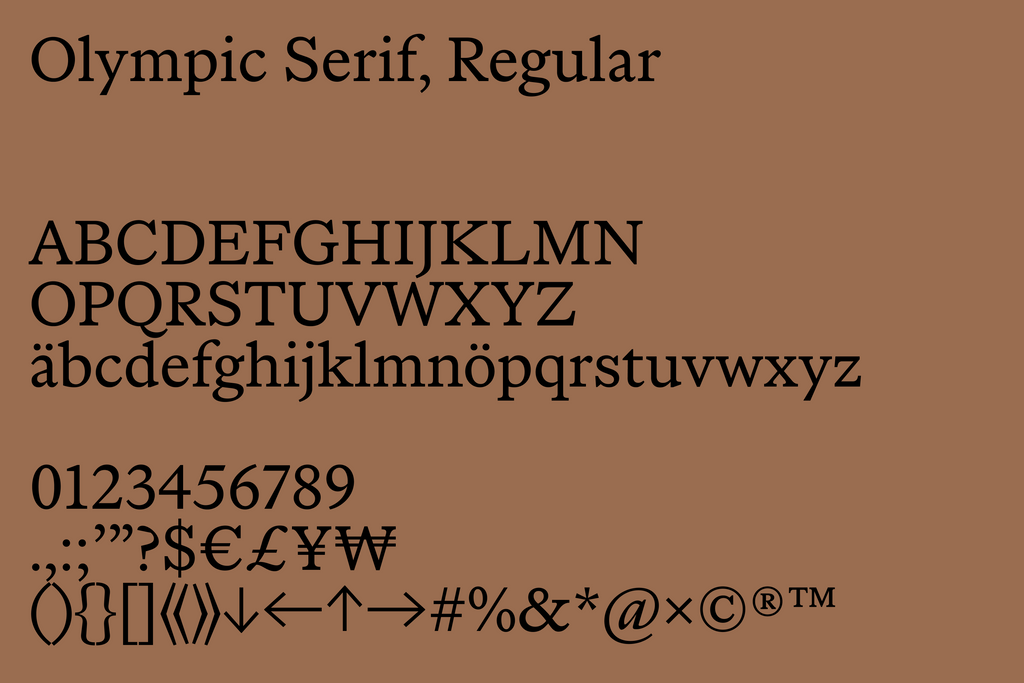
Olympic Serif
Informed by the Oldstyle Roman type genre, Olympic Serif feels subtly connected to the rich history of the Olympic Games. Designed by our own Seb McLauchlan, it brings a sophisticated edge to the brand whenever an elevated tone is needed.
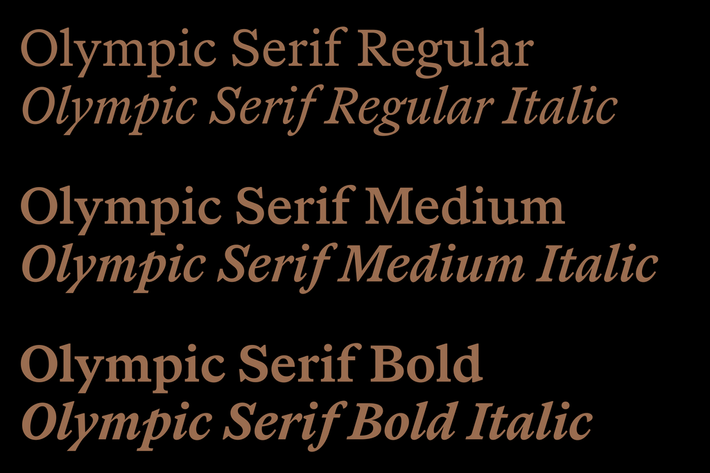
In most cases, Olympic Serif is used as a complimentary family. Appearing as pull quotes or elegant titles. We optimized the font for reading, so it can also be used for longer texts. Alongside Regular and corresponding italics, Olympic Serif comes in Medium and Bold.
Wordmark & Logo
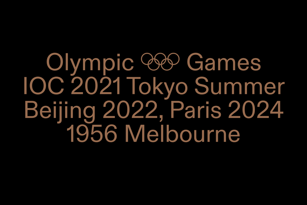
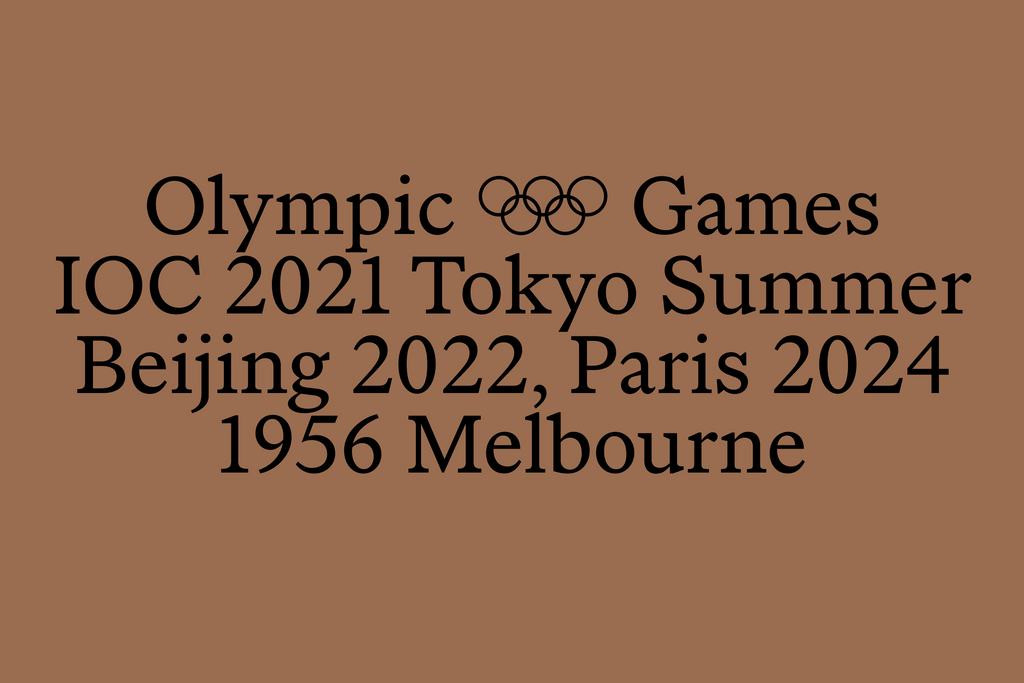
We tweaked the Olympic Sans cap height for the flexible lockup system developed by Hulse & Durrell. Our special ring glyph, used as a logo, matches the font’s sizing, too.
Opentype Features
We implemented a series of unique OpenType features into the two fonts. To help streamline the design process for the Committee’s in-house team. Alternates, ligatures, symbols, and small caps can be added using quick, memorable shortcuts.
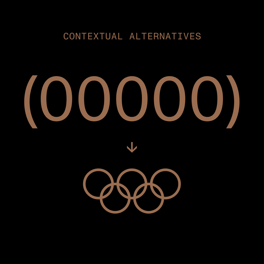
Type five zeros between brackets and our ring lockup will appear.
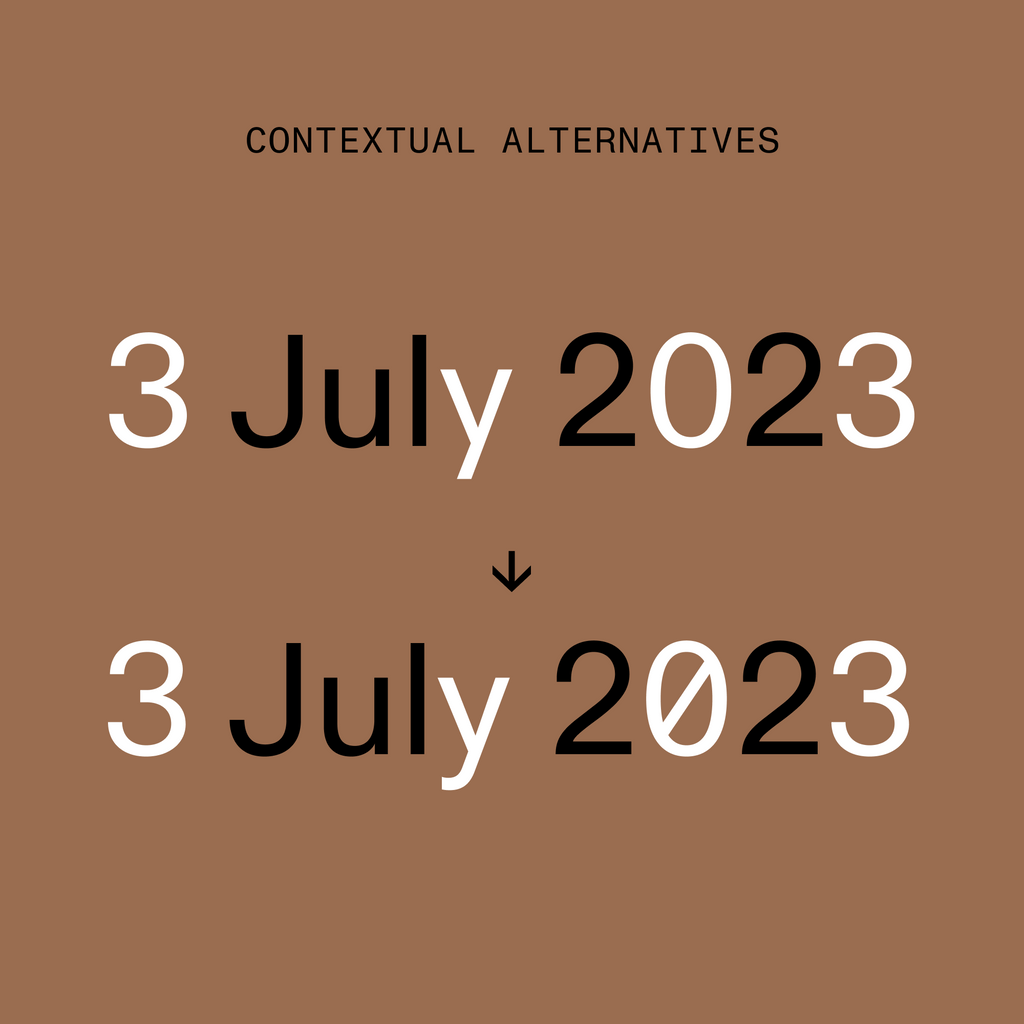
A slashed 0 and curling y for the Sans are accessible via alternates.
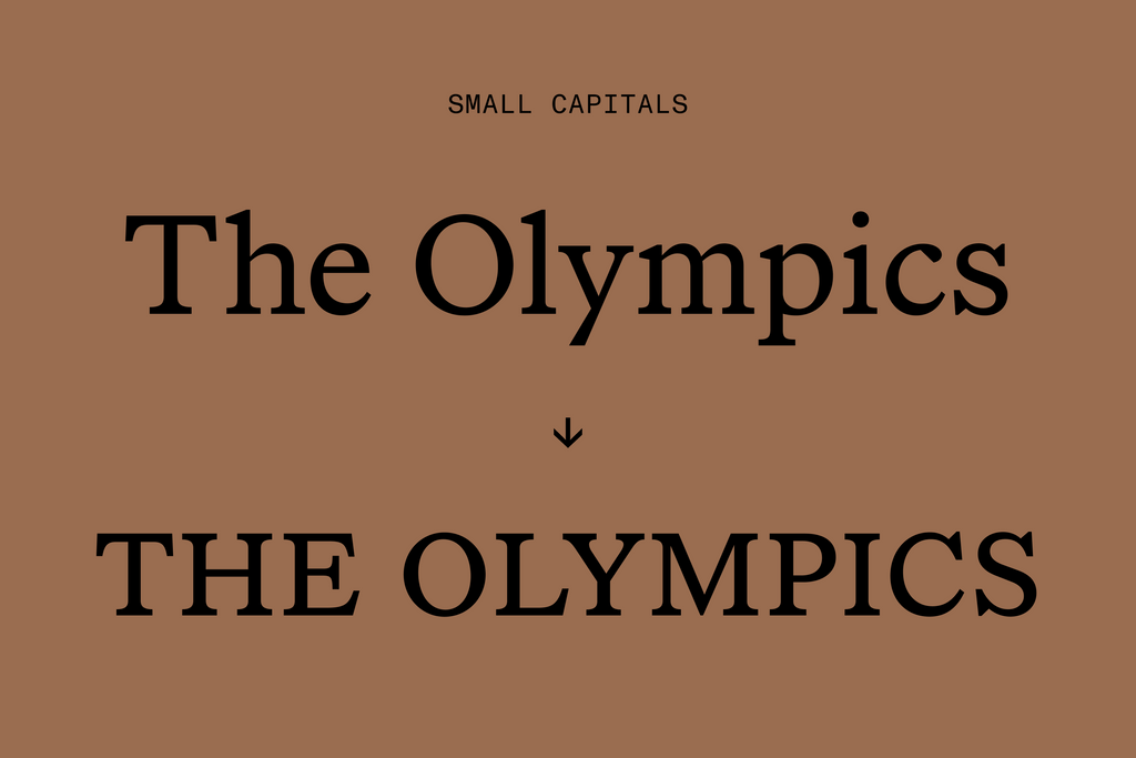
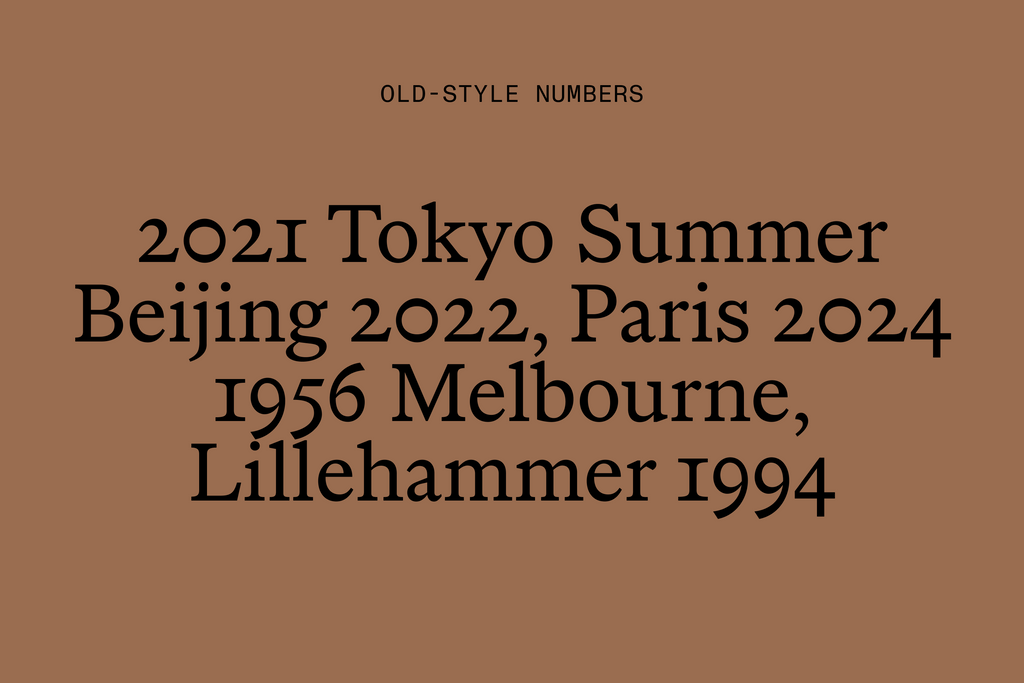
Old-style numbers and small capitals are embedded into the Serif, often used in the brand for acronyms or situations where text needs to be delinated.
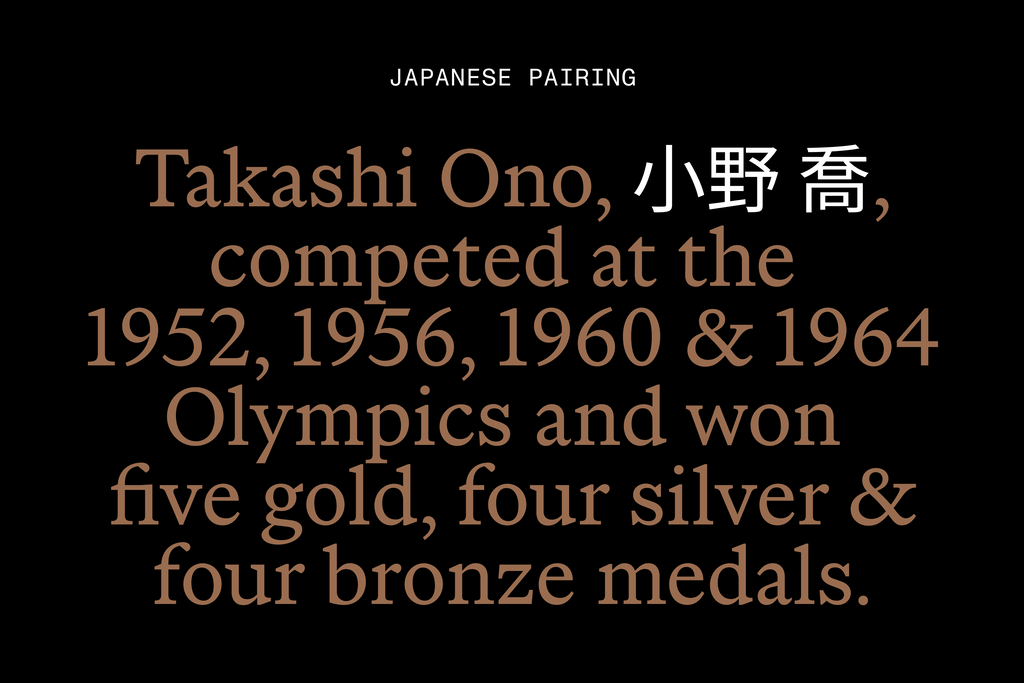
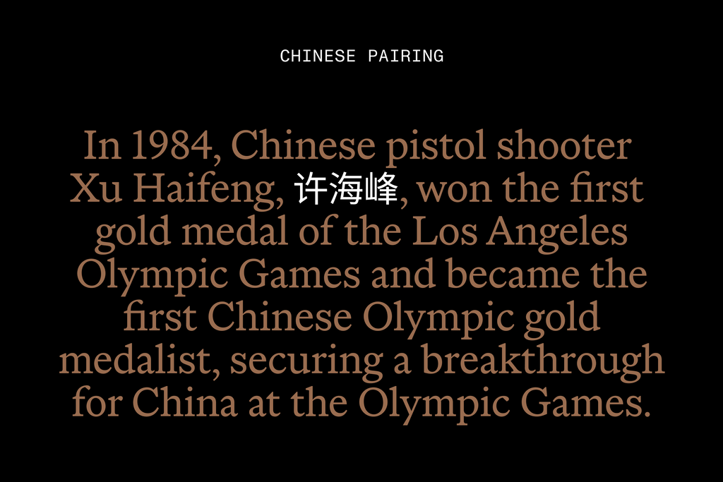
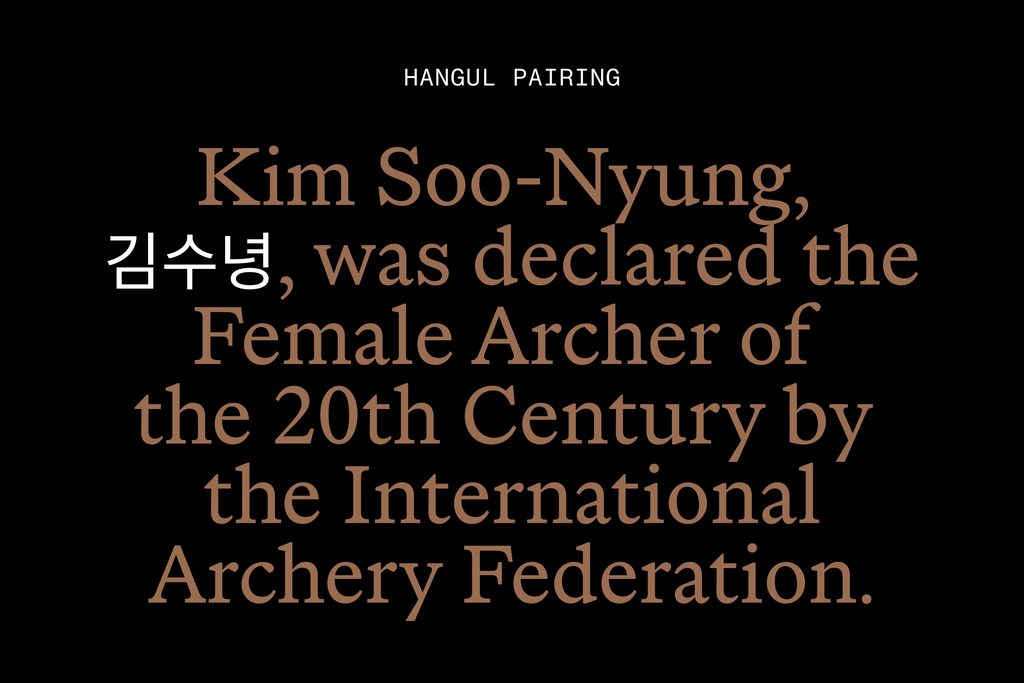
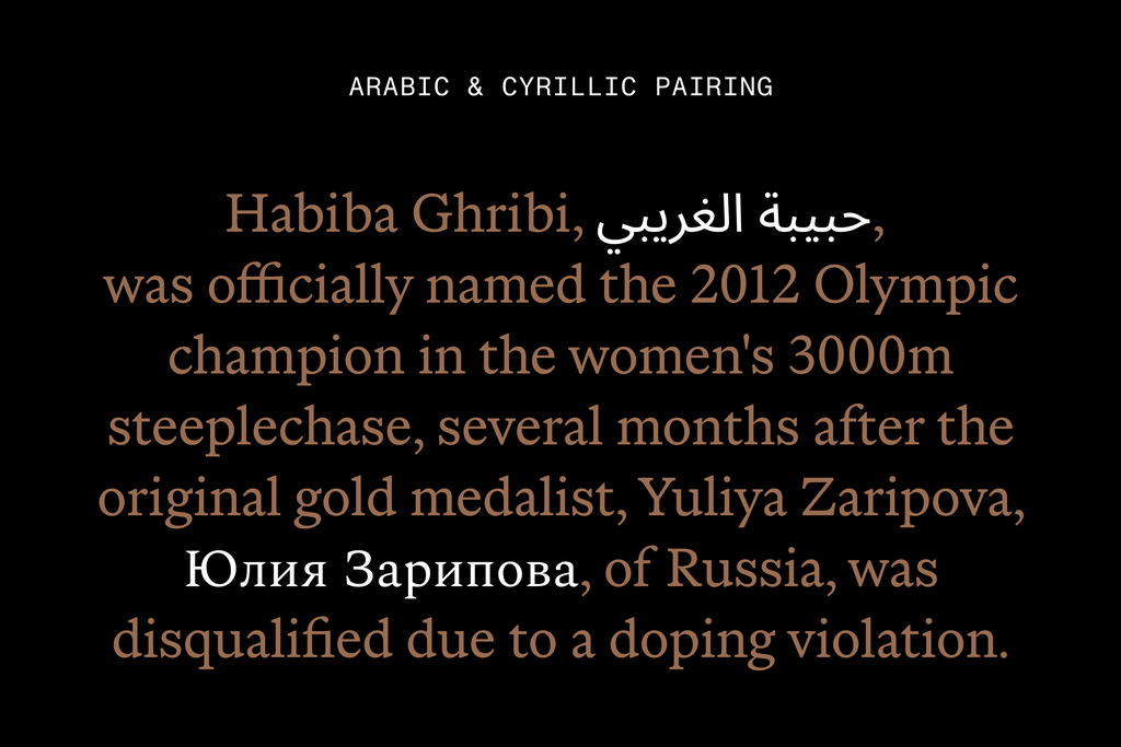
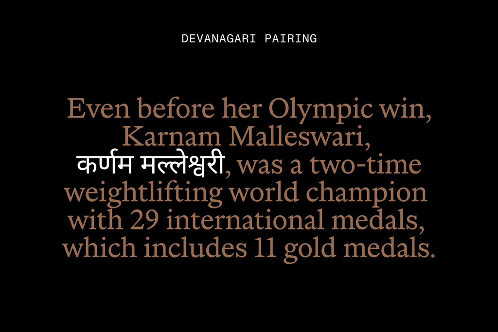
Multi-Script Pairings
As a global institution, the International Olympic Committee speaks many languages. We advised the design team on suitable pairings for multiple writing systems that fit the tone and vibe of our Sans and Serif.
Credits
Client: International Olympic Committee
Agency: Hulse & Durrell
Creative Direction & Design: Ben Hulse, Greg Durrell
Art Direction & Design: Julien Hébert, Bryan-K. Lamonde (Principal)
Sans and Serif typefaces: Fabian Harb (Dinamo), Seb McLauchlan (Dinamo) with Johannes Breyer, Robert Janes (Dinamo)
Headline typeface: Julien Hébert (Principal)
Case Study Images: Tina Lehmkuhl