Wordmark and Bespoke Customization for JOOPITER
Logo · Design · Custom · Font · Bespoke · Pharrel Williams · Alaska Alaska · 2022
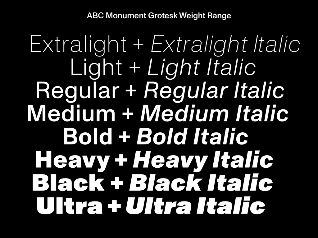
Alaska Alaska called us to create a bespoke wordmark and font customization for Pharrell Williams’ digital-first auction house JOOPITER. The team’s identity combines the luxury of old school auctions with the bluntness of digital marketplaces. And Monument Grotesk helps set the tone. Our classic workhorse brings a fresh, bold vibe to the platform. Clean functionality meets diamond embossed Billionaire Boys Club.
Videos by Colin Doerffler
The Vibe
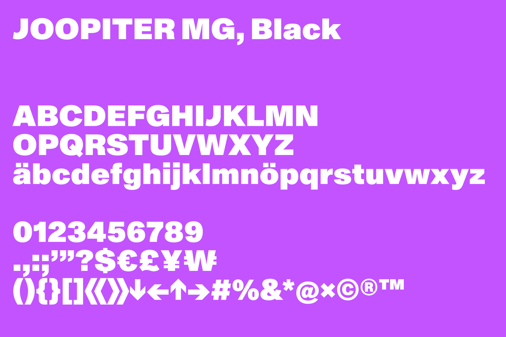
Featuring honest, idiosyncratic shapes, Monument Grotesk is a confident font with a raw and nicely unpolished feel.
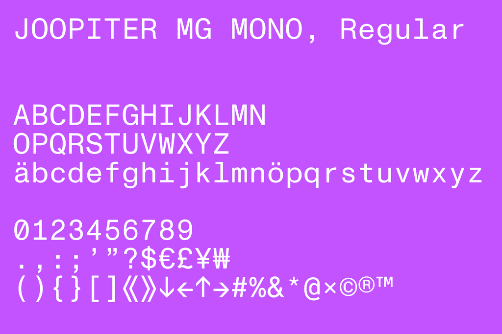
JOOPITER uses its Mono subfamily for everything related to its webstore and a Bold weight for its stories. Jan Tschichold’s Sabon, a delicate serif, is then used for descriptions and titles of products. It’s the vibes of these two typefaces — the fresh and the ornamental — that meet across the brand.
Monument Grotesk Mono for webstore functionality
Monument Grotesk Bold for editorial impact
Our Wordmark
JOOPITER is both a luxury brand and a contemporary, digital-first one. So it has two wordmarks orbiting in its universe. Our version sharpens the forms of Monument Grotesk. Balancing with the brand’s second, ornamental logo — and iconic winged lion.
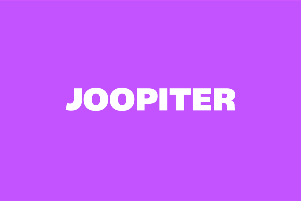
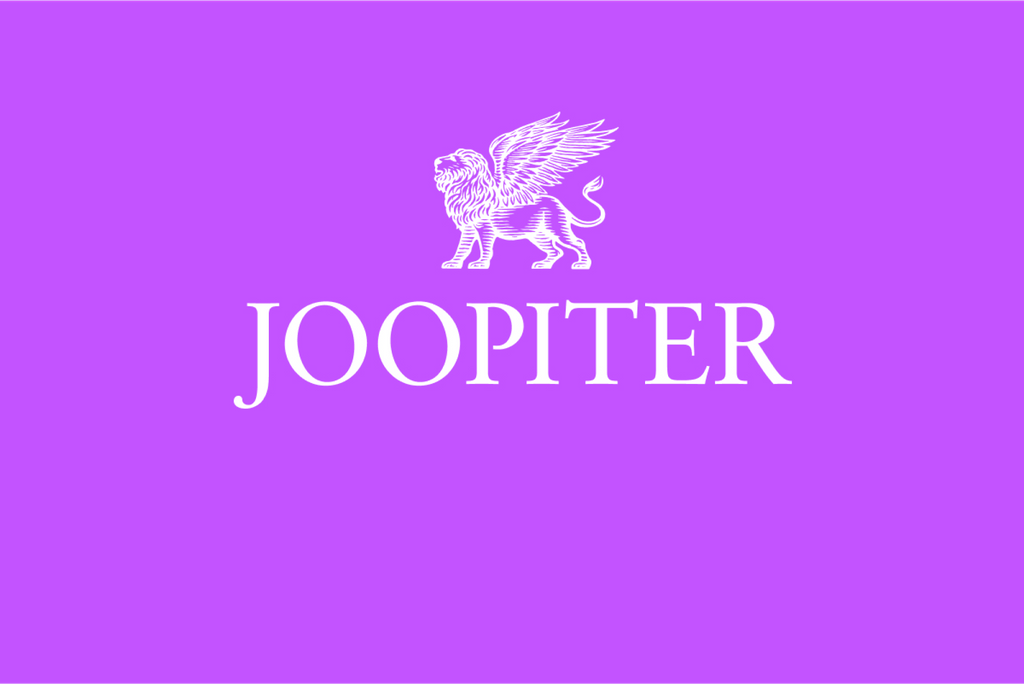
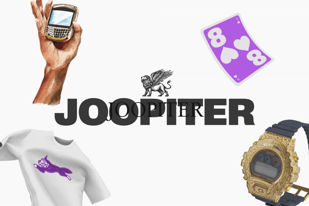
To mirror the classic serif logotype, we cut and extended the swoop of Monument Grotesk’s uppercase J and tweaked the leg of the uppercase R. This creates a solid frame around the letters. The swerving J is also a distinctive brand moment. Taking up space and looking upwards. Kind of like the lion.

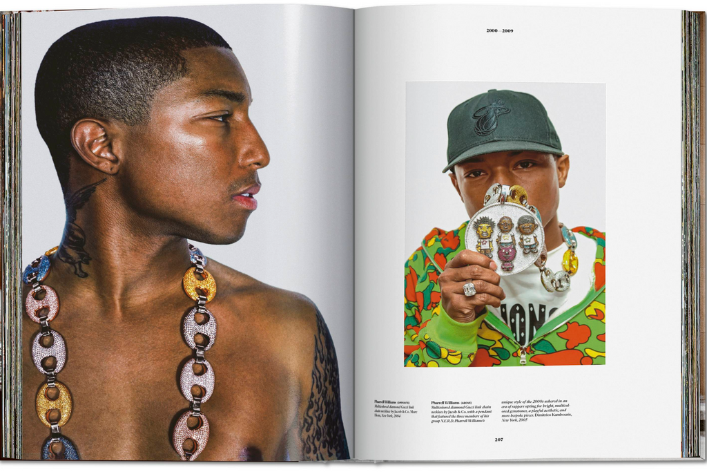
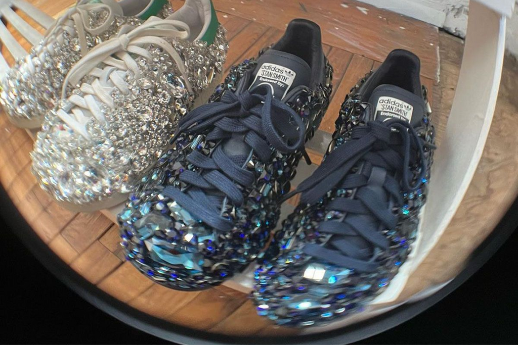
Mood Archive
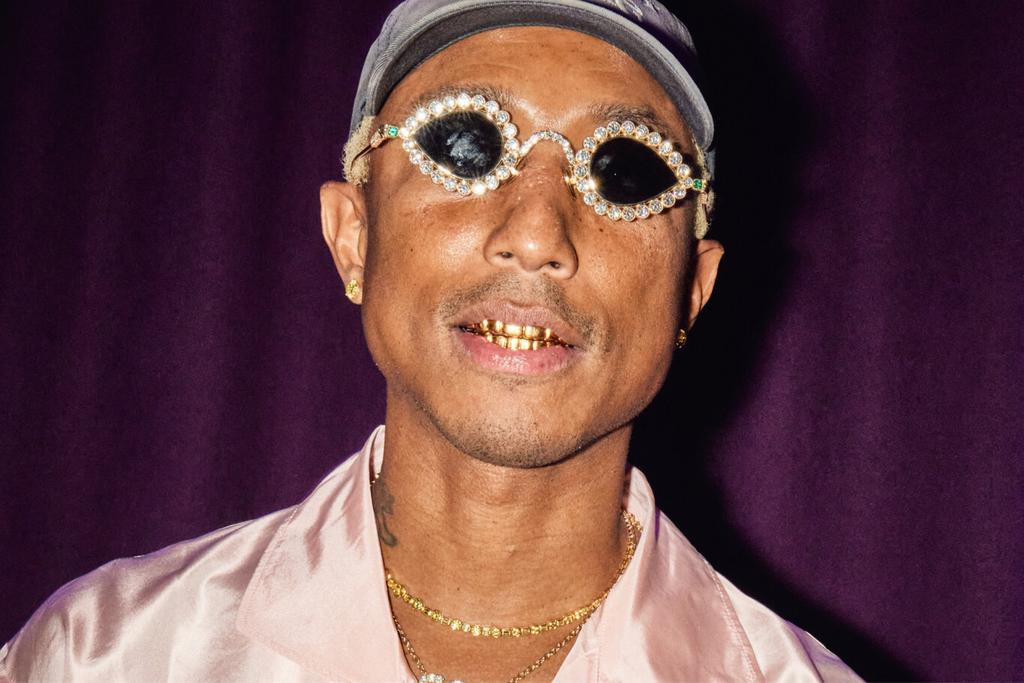
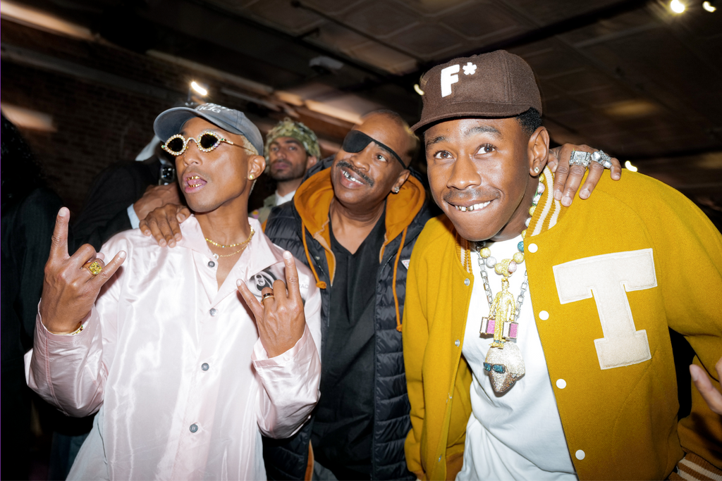
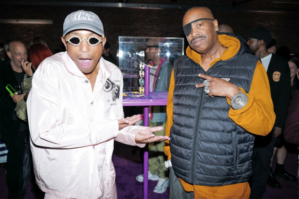

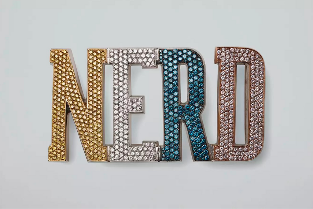
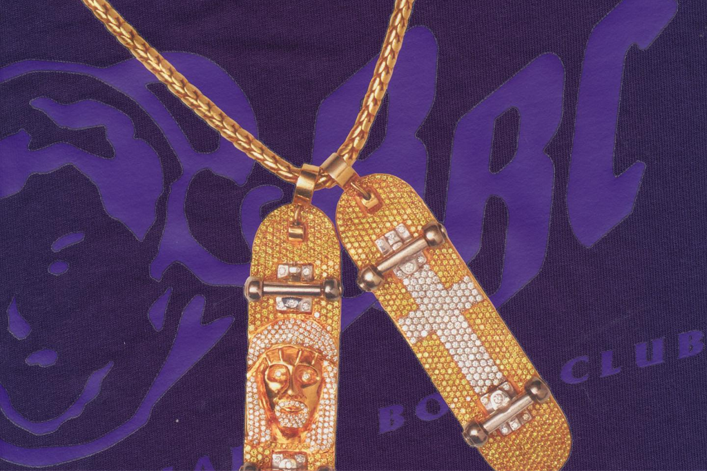
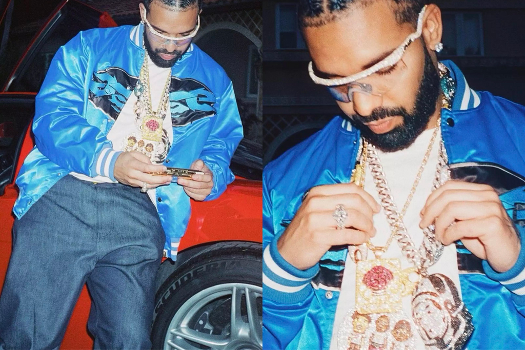
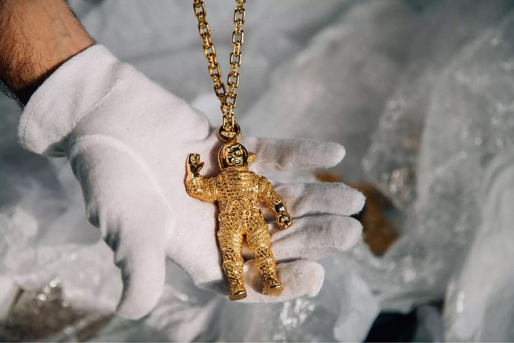
$3M worth of jewelry? Damn, Drake's "JUMBOTRON SHIT POPPIN"
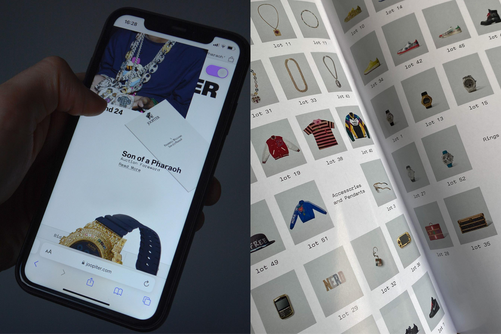
A Final Note
Thank you to the whole team at JOOPITER, including Francisco Gaspar, Colin Dörffler, Tawanda Chiweshe, Kellen Roland, Stephen Greenwood, and Sanam Abbas. It’s been a real pleasure being part of your world.
Credits
Art Direction and Design: Alaska Alaska
Type Design: Dinamo (Fabian Harb with Renan Rosatti)
Mastering: Dinamo (Renan Rosatti)
Campaign & Photography: JOOPITER & Alaska Alaska
