Important statistics and the best and worst of 2021 🐛 —

Welcome to issue #12 of The Dinamo Update, our birthday issue.

Was this forwarded to you? Sign up now!

20-21 in Review

In 2021, we worked on many things that we didn’t know anything about. Many thanks to all of you—for using our fonts, for enjoying our Hardware, for trusting our new licensing model, and for sending us feedback in various ways. It really helped.

To celebrate what we’ve achieved together—as well as the first birthday of The Dinamo Update (🎂)—we’ve collected our annual highlights and low moments alongside a few important numerical facts and the usual low-resolution images.☝️

👩‍💻 50% growth 
in The Dinamo Update’s newsletter subscribers.
Way more than our Instagram.                     

TYPEFACE RELEASES

We released five very different fonts in 2021—different in style and also involving far more people than in previous years.

  • ABC Arizona: Our slim, all-genres-in-one happy meal went public in March, the first-ever sans to serif “Superfamily” that packages five looks—Serif, Text, Mix, Flare, and Sans—into one single font file. One thing is for sure: Arizona’s designer Elias Hanzer won’t touch such an extensive typeface project anytime soon. Actually, him and Lucas Liccini are currently working on a printed Arizona specimen.

Press cross-examined us about the typeface, and Arizona was selected by Wael Morcos as one of the best fonts of 2021 for Eye on Design.

🥕 Arizona Text 
is the most popular style, followed by Arizona Flare.                     
💔 11,200 kerning pairs
in Arizona—and 896 glyphs for each of the 50 styles.                     
💡 10,200 invisible interpolation points
in Arizona, which enable Sans-to-Serif modulation.                     
  • ABC Social: To fill a gap in our library, we released this friendly, smooth grotesque with Variable Font capabilities in October. A multi-people, multi-width mega collaboration made by many eyes and players, Social has a sense of humor, with its freely designed forms and happy, rounded shapes. A total of seven different designers worked on this typeface over a period of seven years.
  • ABC Marfa: While stylistically born in the hot metal typesetting period, Marfa was designed in our high-speed era of no time to lose. We were lucky enough to get Seb McLauchlan from our London satellite on board in the years leading up to its completion. Seb will release two typefaces with us this year: Marist and ROM.
  • ABC Asfalt: The elongated letters of Asfalt are based on road letters, which are stretched along highways to compensate for the low perspective of an approaching car. Released in March last year, Asfalt is entirely uppercase with just one sturdy weight.

ABC Social (used by Public-Office)

ABC Marfa (used by Raoul Gottschling)

ABC Asfalt (used by FlashArt)

ABC Gravity

We want to give special space today to ABC Gravity. Not only is it a typeface that went through the three stages of a release journey all in one year (where we: 1. Send a font to close friends → 2. Place it in Early Access → 3. Release it to the public), but it was also the first Dinamo font by our own Rob Janes. Rob joined us four years ago to help us with all things tech, and not only did he introduce us to the world of dark, harsh metal music but also the delight that is forgetting about time over a game of chess. We love you Rob.

Rob had long been working on Gravity and it developed into a—quite relaxed—multi-width variable monster. Its many stylistic alternates allow for playful settings and super-compact title arrangements, and special features let you arrange and modify the position of characters. Eye on Design gave it a nice review.

Probably Nothing. Also, our most liked and shared Instagram post in 2021 😭

Gravity is available as a Variable Font that can be modulated from XXXX Compressed to Wide.

Partnerships

Cargo

We were hugely excited to unite services with Cargo last year. All the platform’s users now receive full access to three of our sans’, namely Diatype, Favorit, and Monument Grotesk. And big news for the new year: We’ll be adding Arizona and Gravity to our offering very soon!

Five complete Dinamo typeface families are free for Cargo users to use.

Backstory: after three years of talking with and admiring Cargo from afar—followed by one memorable trip to LA featuring a Tesla and some clay pottery—it’s exciting to now see our typefaces appear across numerous personal websites throughout the digital cosmos. And not to forget the partnership’s identity, either—another good excuse for collaborations, this time with Tim Lindacher, Lucas Hesse, and Julia Kobel. Head this way to see the entire ecosystem—coin, tech bro hellscape, and all.

Creative Direction: Dinamo + Tim Lindacher. Graphic Design: Tim Lindacher. Animation: Lucas Hesse. 3D: Julia Kobel.

Tim (semi-voluntarily) chose ABC Diatype as the identity’s font 👆🏻

Tim

Julia

Lucas

MOUTHWASH

Teaming up with the Los Angeles-based collective to reimagine the original Difficult Times t-shirt was like uniting with kindred spirits. Their crew is similar to ours in many ways, and it was nice to watch them build up over time and then even pass us from the right lane. Every time we Skyped, they seemed to have tripled in size.

Our black Difficult Times t-shirt with a folded, oversized label sold out within minutes. Plus, we interviewed MOUTHWASH here—as Alex, Ben, Abraham, and Mackenzie say, “it’s important to us to prioritize our own curiosity.” Sending suitcases of rose water across the Atlantic.

Produced and photographed in LA.

MWS...

...doing their...

...thing.

🌎 20 countries
received shipments of our MWS collab.                     
📦 34 countries
reached across all our Hardware drops.                     

CUSTOM & Bespoke FONTS

San Francisco Symphony

Collins commissioned us to create a bespoke font for the logo and identity of the San Francisco Symphony, which dropped in a whirlwind early last year. Our dynamic Variable Font responds to sound, moving up and down like the notes of a score, and our special font modulator also lets the company generate moving assets entirely in-house. The Brand Identity wrote all about it here.

Alicia Keys

We created the typeface for the one and only Alicia Keys—an unmatched force in entertainment, entrepreneurship, and activism. For her custom font, we placed a selection of heavily stylized star characters into an otherwise sturdy and laid-back typographic structure, creating a powerful rhythm fit for the multifaceted artist. Identity design by MOUTHWASH, web dev by Antinomy Studio.

RIMOWA

We spent many mornings looking at the curved corners of RIMOWA aluminium suitcases for the design of the iconic luggage brand’s custom typeface. Inspired by early 20th Century workhorse grotesques with warmth, our typeface fuses the industrial with the humanistic. Thanks to design studio Commission for bringing us in!

San Francisco Symphony (pic by COLLINS)

Alicia Keys (pic by MWS)

RIMOWA (pic by Commission)

Type Production TOOLS

Instead of solving a continual problem each time it reoccurs, we tried to invest time into producing tools, or scripts, that help us forever. Toolmaking can be tedious and its rewards aren’t immediately apparent—but they become clear in the future.

-> fontgauntlet.com
-> dinamo-namecrawler.com
-> abcdinamo.com/darkroom

Tools 4 Everybody

The Font Gauntlet 2.0

In 2021, our Gauntlet got its biggest update yet. When we first developed our Gauntlet four years ago—a free testing tool for generating and animating Variable Fonts—it was impossible to take a quick look at the in-between moments of a VFs-in-progress.

This year’s massive update—masterminded by the skilled hands of Rob—was an important new chapter in the tool’s lifespan, as it became more of a mature, every day software companion. It’s been a joy to see the Gauntlet travel and become a toolbox staple for so many!

Our shy steps towards a beautiful, easy to use interface.

fontgauntlet.com

🙋‍♀️ 1 new visitor
to the Gauntlet every hour.                     
🐛 9.2k unique visitors
to the Gauntlet—with 32K page views.                     

The Proof Generator

To simplify our font-proofing workflow, Renan and Rob developed an in-house tool that allows us to speedily generate on-the-fly pdf proofing sheets. We’ve long been tired of creating proofs by hand, it’s tedious manual work. We can now make a huge array of proofs—including the specimens users download from our website—with just a few quick clicks. We then share those sheets with the team for everybody to draw comments on (using iPads).

We’ll officially be inviting people to test the tool and send us feedback soon—send rob@abcdinamo.com an email if you’d like to take part!

🦉 3,116 minutes
pdf-export waiting time saved by our Proof Generator.                     

1) Select preset

2) Generate pages

3) Create various proofing layouts

Quick Scripts and Tiny Helpers

Flip Script

Noise Script

Style Shuffle Script

The Name Crawler

Knowing that a name is the most important part of a typeface, we released our Name Crawler to the public in January of last year. Developed with New York-based Taichi Aritomo! Our tool quickly generates names based on a user’s favorite choice of characters—and lets them save the best results. Many typefaces and other objects adopted new namesakes in 2021 because of our mystery crystal ball. 🔮🔤

LOGOS

We’re not so good at making logos but here are two that we managed to carve into digital stone:

RTL. Home of quality TV. Also home of many, long Zoom calls.

ZEIT CAMPUS, based on ABC Repro. Thanks to Jan Lichte!

HARDWARE COLLABS

3300 Dietiker Chair with Maximage

Last year began with the unveiling of our limited, special version of Bruno Rey's classic chair, the Dietiker Modell 3300. A frameless wooden seat, four cast aluminium connectors, straight plywood legs on all sides, and a simple curved wooden—plus four colors specially chosen by color alchemists Maximage. We’ve been sitting like the clown version of a Swiss knight ever since.

Dinamo TheraBand with Matter Of

We released our easy-to-use resistance band in May to celebrate the launch of ABC Gravity, giving those in need of analogue means a simple way to stretch our latest variable drop. It was designed and conceptualized by our new friends at Matter Of studio in Stuttgart. <3

With Dietiker, Maximage, & Haw-Lin.

With Native Instruments & Johannes Schroth.

With TheraBand & Matter Of.

MASCHINE Mk3 DINAMO with Native Instruments

We were very proud to launch the MASCHINE DINAMO with Native Instruments in June, a controller two years in the making that features ABC Whyte Inktrap across all its surfaces. It was a huge pleasure to work with hardware designer Johannes Schroth on this intricate piece of technology—sending him a thousand thank yous for dreaming it all up and inviting us in.

Hardware Stats

Font reach compared to Hardware reach. Conclusion: In 2022, we’ll lower our shipping fees to make our Hardware more globally accessible.

🐢 19 emails
exchanged while searching for a lost parcel.                     
🦷 1376 sparkling white teeth thanks to our toothbrushes.                     
✂️ 18,174 km (or 11,292 miles)
was the furthest a Difficult Times t-shirt traveled.                     
💌 1 patient customer 
waited 5 months for their Favorit Hangul bucket hat.
Sorry Brad!                     

EARLY ACCESS

We offer a small selection of complete but unpublished typefaces, which people can request to “unlock” before their official release. Last year, we streamlined the UX of our requesting process so that it’s easier for customers to gain access to Early Access fonts—and we also released four new typefaces into the arena:

  • ABC Synt: Designed by Kaj Lehmann and available for request in January, Synt is in the Scotch Roman style but with a parametric stem rhythm inspired by the sounds of a four-to-the-floor beat.
  • ABC Estragon: In February we welcomed Estragon to the table, the “Schwitters-meets-Wildstyle” (quote by Sam de Groot) headline font with Free-form, Arrow, and Bubble styles that take their cues from an 1890 wood-letter specimen.
  • ABC Helveesti: With the help of Andree Paat, we finished spike-proofing this tarantula in the early weeks of September, a font that reimagines light traps that once helped compensate for blurring during the phototypesetting era.
  • ABC Camera: ABC Camera made its long-anticipated debut in Autumn, a reinterpretation of light traps used in the 60s and 70s to make text more readable on TV screens—and available both with and without the holes.

ABC Synt

ABC Estragon

(*) ABC Helveesti

ABC Camera

🛼 Wednesday 
is the day people are most likely to request Early Access.
Sunday is the least.                     
🐩 6 requests
are the most Early Access that two individuals have made.
Thanks T. and B. (:                     
🦞 21.01.2021 
had the most requests—55.
It was the same day freshwater crayfish was named Animal of 
the Year in Switzerland.                     

LECTURES

One of our highlight invitations this year came from the Strelka Institute in Moscow, which asked us to be visiting teachers and lecturers. The journey was hugely memorable, not least because we hadn’t traveled together for over 18 months.

And afterwards, it was nice to see a spike in interest in our work in Russia, as well as more Favorit Cyrillic sales.

Sales of Favorit Cyrillic.

Hardware & Software orders from Russia.

Team Updates

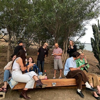
Our team expanded threefold: Renan joined full time, Fabiola became our part time Mono expert (and much more), and Ethan came on board to guide us on the legal side of selling fonts. Our editor Madeleine gave form to our new, monthly installments of digital ramblings. We also finally wooed Erkin back, while Tina is sharing her expertise with us for three years already.

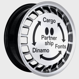
In many ways, we don’t do things too differently from our early years, but with a stronger, bigger team, the more professional we feel we’ve become. It’s a huge privilege to be on the receiving end of so many great ideas and minds, and we are humbled to be working with collaborators with specialized backgrounds who have taken Dinamo to heights we could never have imagined.

As many times as it didn’t happen, we’ve become especially fond of our newly established weekly team call. Covid didn’t allow us to take on interns this year, so we focused even more on strengthening our existing team so it can hopefully run together for many years to come. 🙏💞
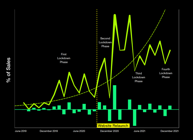
💰 14 people on Dinamo’s monthly payroll.                     
⚖️ Male: 8. Female: 6
Goal: 50/50                     
🌍 8 time zones managed.                     

Our Team’s Best + Worst 2021 Moments

Let’s see what they say…

TINA: “Amongst various other things, I do Customer Support at Dinamo, which sounds average on paper, but I believe I might have the best job here. If we had an email exchange, this ‘best one’ is for you! The worst: Not having met everyone IRL or spending as much time with the Berlin Crew as usual.”

ETHAN: “The best thing was writing the new Dinamo EULA. The worst thing was accidentally bring a sample of my sick cat’s vomit to the studio. Johannes touched it. I believe Johannes is unaware that this happened. Sorry Johannes.”

ROB: “Best & worst moment: Ran a font mastering marathon between Camera, Social, Gaisyr, Marist, Gravity, Arizona, Diatype, Favorit Hebrew, Favorit Arabic, Helveesti, Marfa, and Walter.”

SEB: “Best: Getting Marist and ROM to an (almost) complete state, and introducing Dinamo to my students at Kingston School of Art. Worst: Being stuck in London for so much of the year, so not being able to hang with the whole Dinamo family. Looks like that’s set to continue thanks to Omicron.”

MADELEINE: “I loved hearing all the stories of archival digging behind various font digitizations (both released and upcoming ones!). I hated that I forgot to wear my Dinamo ring at the team dinner.”

HUMANS & MACHINES: “We loved realizing that every personal exchange with Basel and Berlin ends with a hodgepodge of vanguard ideas and concepts. We were sad that we weren’t able to keep up the pace to implement all the measures we were inspired to make.”

SASCHA: “The worst thing I had to do was optically correct perfect circles (the holes in ABC Camera). And the best thing (apart from Dan’s zucchini pasta and discovering Potsdamer Stange) was discovering digital proofing and profiting from Rob’s tech magic.”

FABIOLA: “Joining the team on a regular basis has been the best. <3 Waking up at 6am for our call comes to mind as the ‘worst,’ but it was worth it!”

ERKIN: “The greatest moment was seeing Repro finally finished after 5 years. The worst was dealing with the seemingly never ending problems of Repro that needed to be cracked.”

MIKE: “The best part was being part of this open and lovely team, and exchanging ideas with design critics in a very constructive way. I wish all the clients I come across were like Dinamo. The worst thing? I would have loved to put my hands on some grotesk fonts!”

REA: “The best moment was translating sales analytics into a special Dinamo Update Newsletter and then writing the Renewal of Royalties Report. The worst was not being able to attend the Berlin meet-up.”

IMMO: “The best thing was going to Mainz, teaching a 3 day long Variable Typeface Workshop, and being trusted to give a public lecture on Dinamo’s work and approach to business. The worst thing was that that was the only collaboration between us this year. Hoping for more moments soon!”

FABIAN: “Every 2021 thing felt like the best we could make it. It’s easy to award ‘best’ with the biggest thing, though, which was the Rey chair! The ‘worst’ was that we only phoned or video called with some team members. So, dream for 2022: Make the whole team meet in real life again!”

VANESSA: “Setting up the Banana software and the cooperation with Buchhaltungsfabrik AG (shout out to Stéphane & Raphael!) was great. Ogam declining our lunch order because we were too many people was not.”

RENAN: “Having new ideas and drawing things without knowing where it leads is always the best (what if we made a disintegrating variable font? Heart-shaped serifs? Letters drawn by robots arms? Tried it all). Actually having to finish stuff is hard though—I’m not good at accepting when the experiment is over.”

JOHANNES: “The best: Seeing our team take lots of initiative and responsibility whenever we couldn’t. Worst: Figuring out Dinamo’s VAT situation with 3 different, handsomely paid yet unavailable lawyers.”

ANDREE: “So, the nicest thing was finishing the ABC Helveesti family. The worst was cleaning up Helveesti's hashtag...” (*)

IGINO: “There wasn’t a worst moment. Only constant good ones. The typefaces I received, the kindness of the guys... I did my best to respect all of that. And that’s it.”

BUSINESS

Together with our data analyst Rea of all-star Nea-Kosma, we compiled a series of business insights for our sales-dedicated August newsletter. Now, we’ve updated our insights to cover the entire year.

Sales

In 2020, we adapted to a new, streamlined sales model based on value-based pricing—you can read all about it here. We’re glad it’s been working out so far for us—as we spoke about with Type01 in July and lately in an in-depth interview with Developments (amongst many other things).

Below, Rea has charted the development of our revenue from 2019 to 2021—illustrating how our sales have been impacted by our new licensing model, covid, and seasonal trends. You can see our sales per month (the spiking line), our exponential trend (the dotted line), and the change of sales relative to the previous observation period (the neon green bars).

“Changing our licensing model not only simplified how we work and communicate but also increased our font sales—which helped us navigate the pandemic-related crashes. The lockdown phases in the US and Europe coincided with our biggest sales drops. The strongest recovery from a Covid-related drop took place in January 2021.”

Revenue

“Our revenue consists of mostly font license sales (87%), followed by special projects, services, Hardware, teaching and lecturing.”

Global Community

We’re very happy that our community grew in 2021 and reached areas of this world that are outside of our main areas:

Dinamo Community 2020.

Dinamo Community 2021.

Typefaces

Our licensing model wasn’t the only thing that defined how we ran in 2021. It was also our first year we offered bundles, student discounts, and sales add-ons to our customers.

Below, you can see how our typefaces settle after hitting the market, and also how they age (we hope gracefully)!

“Dinamo’s revenue is driven by a couple of popular fonts—the ones we published in our early days. After the early days, we published many “commercially less successful fonts,” and we promise we’ll keep doing that also in the future 😀.”

“This chart looks at the connections between different medias types and three age groups of our typefaces. Like all products, Dinamo fonts have a life cycle. Mature fonts have a higher adoption rate from bigger companies (around 12%). These are also used more often for print and web. Newer fonts attract the attention of pioneers (The Dinamo Ultras), and are currently used for smaller projects.”

New licensing model

Our biggest mission in 2021 was to live with, educate about, and, sometimes, defend our value-based pricing model, which strongly differs from the traditional use-based model of most foundries. In the graph below, we looked at what kind of licenses big and small studios were buying throughout the year—and how our model has made an impact.

“What’s nice to see is that since the switch to a value-based model, small companies are purchasing more of our fonts: It suggests that they now feel more confident buying from us because the process is more transparent and fairer on them financially.”

TYPE IN USE

Last year, we started featuring font in use stories on our website. We feel it’s an exciting way to express gratitude to the people who use our fonts. Studio Koto’s redesign of Discord based on Ginto has a particularly special place in our memory.

We helped a little with the custom logo…

…but not everybody on Reddit loved it. 😅

Discord redesign by Koto.

Surely this is no mockup?

Maybe this one is.

And we’ve got exciting news: Seb McLauchlan, together with Kasper Pyndt, is currently working on Ginto Condensed, Ginto Rounded, & Ginto Rounded Condensed. Watch out for them in 2022!

Condensed & Rounded to join the family.

The Beauty of house keeping

We’ve been carefully developing tools for a long time, but keeping them up to date is something we learned a lot about this last year. Sometimes you forget about the plants you planted a few years ago—but it’s important to keep giving them renewed attention.

Typeface Extensions

In 2021, it was the first time we found ourselves in the situation where our team was big enough that some members had extra availability—so we got to ask ourselves, what would be nice to extend? We’re also increasingly in mindset of completion, adding Italics to the fonts that don’t have them for example, all while producing new, incomplete work. So while we were busy planting young roots, in the background, the following families grew new branches:

Monospaced versions

Monospace queen Fabi added Mono and Semi-Mono to ABC Whyte, ABC Social…

…as well as to ABC Monument Grotesk.

Please, keep walking, nothing proportional to see here!!

widths & Italics

In the hands of Renan and Erkin, ABC Diatype is growing into Compressed, Condensed, Extended, and Expanded.

And because of Fabi, Italics for ABC Camera are forming.

additional languages

As part of our goal to make Favorit a truly global font, we also released a number of language extensions to live alongside our Latin, Hangul, Cyrillic, and Greek families.

The minds and eyes of Khajag Apelian and Wael Morcos gave form to Favorit Arabic, which now supports Arabic, Farsi, and Urdu. Yanek Iontef and Daniel Grumer of Fontef Type Foundry developed Favorit Hebrew—featuring two versions that differ in character height. Bundled into one Variable Font with an heigh-axis, of course.

Favorit’s distinctive DNA translated into the beautiful Arabic script.

The typical “mid-height” variation—and another which uniquely matches the height of Latin uppercase letters.

“So far, Favorit Greek + Cyrillic are the most purchased language extensions. In 2021, there has also been a significant increase in Favorit Hangul sales (especially after the use of our fonts in GQ Korea).”

Website Updates

Since our redesign in 2020, improving our website has been an ongoing task. And we couldn’t do it without the consistency and brain power of our development team at Humans & Machines. It’s super rare to work directly with founders, on eye level—and that’s one of the many great things about them. 2021 was also a special year in our relationship because it marked the first time that Johannes met Rafael in real life while taking a pilgrimage to Cologne. <3

Early Access

Community Online Status

Trial Download

Type Menu Filters

Multi-Column Typeface Waterfall

Type in Use Section

How do Early Access requests, newsletter subscribers and font trial downloads behave? Our data shows that improving particular website sections leads to our community using them more frequently:

CUSTOMER SUPPORT

Responding to people’s emails used to be 50% of what Fabian and Johannes spent their time doing. But they kind of (🥴) stopped this year and our beloved Tina took over. (You can still get F & J on the phone if you press the force-the-line button).

⏰ 15 second
The fastest Tina responded to a customer inquiry.
Facts ☝🏻                     

It’s been particularly hard to let go of customer support for us, because being in touch with our community is at the heart of Dinamo and something we’ve always prided ourselves on. But it’s been beautiful to see emails thanking Tina for her quick responses and for finding solutions to problems we hadn’t yet even noticed needed to be solved. We feel blessed to work with her and to watch how her ideas for better customer support transform into other team collaborations—like tutorials written by Tina and Rob.

THINGS WE DIDN’T PULL OFF

  • Design doormats and beach towels
  • RTL custom typeface (a job that is not meant to be handled by people like us)
  • Artist edition toothbrushes
  • Publishing Favorit Tifinagh (sorry Naïma, we’ll do better!)
  • Candles with LA’s Salt & Stone
  • Celebrate a book launch with OKRM, James Taylor-Foster & Seb
  • Balance out our retail library with more serif typefaces
  • Metal connectors and custom typeface with BNAG
  • Deliver the Rey chair to Maximage in Geneva
  • record an album using the Native x Dinamo Machine Mk3
  • Licensing upgrades functionality for the website
  • sell the Favorit Hangul poster designed by Moonsick Gang
  • Helly Hansen x Dinamo Studio Polar Fleece Jacket
  • Christmas Team Meeting

… and IN 2022:

  • More time offline and outside of Dinamo will be spent.
  • Two more Dinamo branches will open, in Portugal and Spain.
  • Our gallery in Berlin will re-open and host regular lectures, (non-design) exhibitions, and dinners.
  • Our team will restructure, defining clear roles for the first time since our founding in 2014. Chief Marketing Assistant Officer in Training here I come.
  • A mysterious typeface begun 7 years ago—and almost buried by two lawsuits—will surface.
  • A month will be set aside to improve the website.
  • A baby will be born.
  • A dog will move countries.
  • A new language will be learned.
  • A book will be written.
  • More fonts will be made.
  • The first Dinamo Sabbatical will be taken.
  • Slack will not be upgraded to Slack Pro.

Thank you for reading all the way. This was the anniversary issue of The Dinamo Update—you can take a look through last year’s editions here.

Talk soon,
Team Dinamo 🍊

Dinamo Typefaces GmbH, Glasower Str 44-47, 12051 Berlin
Copyright ©2024, All Rights Reserved