New Dietiker Chair Collab + Pricing Fonts Based on Value + SF Symphony —

Welcome to issue #3 of The Dinamo Update! In this relatively new monthly mailer, we’ll be continuing to share the latest ongoings at the studio in six or seven parts.

Was this forwarded to you? Sign up now! ٩(˘◡˘)۶

Dinamo x Dietiker 3300

We’re very excited for the release of our multi-colored 3300 Dietiker chairs, made together with color alchemists Maximage!  💚💜💙 Our collaboration began after an accidental discovery made during a guided tour of the collection of the Museum für Gestaltung in Zurich, when we spotted a multi-colored version of Dietiker’s classic 3300 chair made in their “Schaulager” collection. Totally mesmerized, we tried to source this colorful original for ourselves, discovering that they’re long gone from the market…

Production by Dietiker

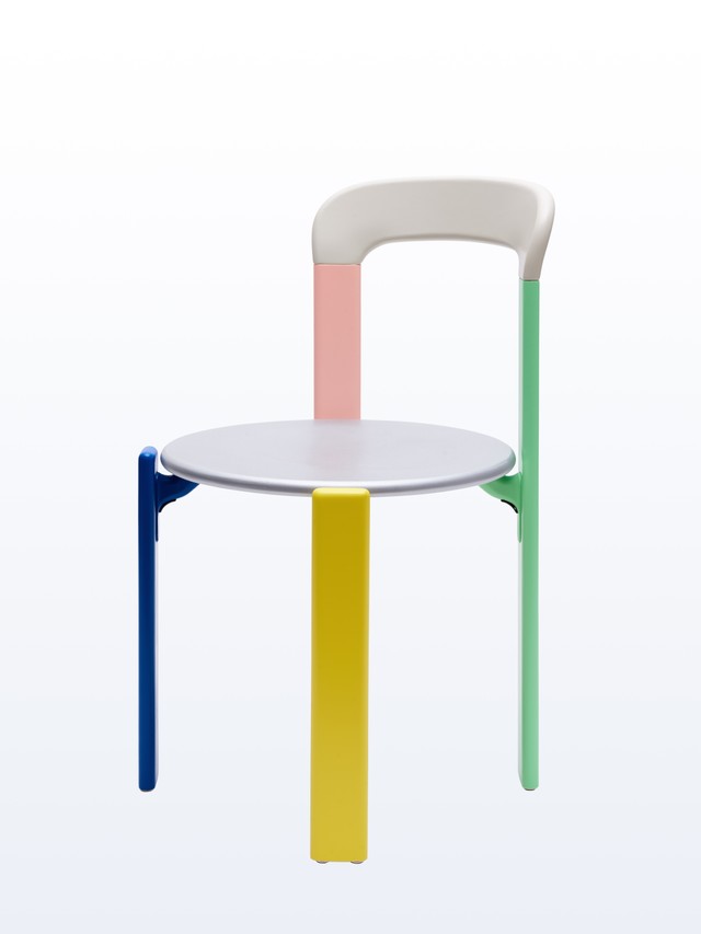
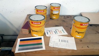
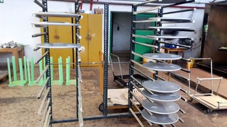
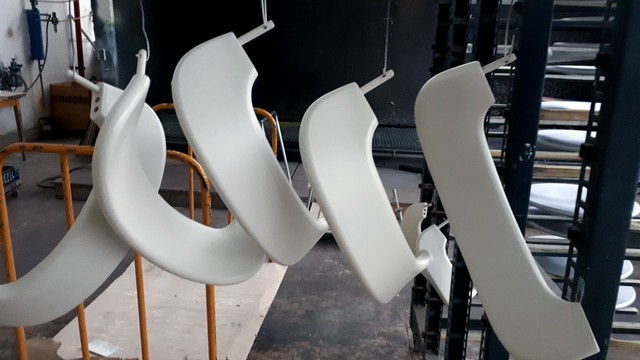
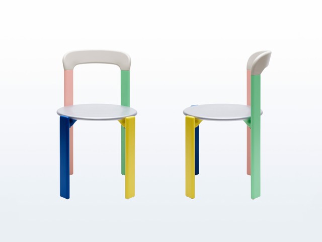
After several phone calls and flower deliveries to Dietiker’s design director, somewhat miraculously we received a response, and in the following conversations Dietiker agreed to produce a limited, special version of the 3300 for Dinamo. That’s when we invited Maximage to select the palette, with Haw-lin Services joining the team to make us a signature-style video to crown the launch. Below’s an excerpt of a text about Bruno Rey’s Modell 3300 chair written especially for the occasion by our friend and curator Damian Fopp:

“For the Swiss, the Modell 3300 chair is a design we have known and grown up with, as it’s been a staple of public interiors for the last fifty years. Since its release in 1971 with Dietiker, it’s been a bestseller, with more than a million units sold—a substantial number considering we’re a nation of 8.5 million residents. Every care home, community center, governmental bureau, and probably every second high school canteen has been equipped with the sturdy, practical design by Bruno Rey at one time or another. Until now, the 3300 has mostly gone under the radar though, unnoticed by design aficionados...”

It’s Damian’s birthday today. Happy birthday dear friend 👀 😚

Take a spin through Haw-lin’s video and read more about the history of Rey’s 3300

Office test center

Mobile showroom

Photography & video by Haw-lin Services

Pricing Fonts Based on Value, Not Use

Last year with the launch of our new website, we introduced a new pricing model that works differently from most publishers. Most type foundries follow a use-based pricing model, where a font is priced based on how many people access the font files. But we believe that individuals, small companies, and institutions should not have to pay the same price for typefaces as large companies. In other words: Companies should pay relative to their revenue potential.

Relationship Triangle

Value Bubble

Imagine a large car company with many departments, where only a small number of employees actually work on computers (a.k.a. the dedicated marketing or accounting departments). Now compare this to a small institution, where a variety of tasks need to be handled by the same few people on the same few computers. See the difference? The small institution ends up paying far more than the big company. We’ve priced this way in the past, but it never felt right. We reckon that the bigger the size and reach of a company, the bigger the commercial value extracted from a typeface.

With this in mind, we developed a new pricing model. Our fonts are now priced based on the company size of the font’s license owner—the client commissioning the design work—rather than the number of people who use the fonts. We call this value-based pricing.

👉🏻 Here’s a detailed look into our move away from use-based pricing to value-based pricing 💸

Different Times, New Split Fountain Gradient

Dinamo loyalists will know that with any new change comes a new Different Times t-shirt, our ongoing series that’s regularly re-edited to reflect what’s going on at a particular moment. This time—and to celebrate good riddance to 2020—we put the question of the next version’s design to our community on Instagram.

Winning color, designed by Tina Lehmkuhl

2nd place

3rd place

550 people voted 🌅 and now the eighth iteration of Different Times comes with multiple colors on the front and a split foundation gradient on the back finally making its debut! While our monochrome gradient and fire versions didn’t make it this time, they’ll be making their way to the finish line soon. That is, if the printer doesn’t fire us after this current print run.

Shout-out to the six prize winners William Stormdal, Lina Schwarzenberg, Sarah Wong, Anaïs Marti, Imran Matin Khan, and David Stieffenhofer: Your free t-shirts are on their way.

The limited print run is now available in our Hardware store 🚗💨

Diagram of the Month

It’s been a seven year journey for Dinamo—who knows which way the path will slope next. 🧐 Drawing means knowning.

New Custom Projects + Releases

Collins commissioned us to create a bespoke Variable Font for the logo and identity of the San Francisco Symphony, which dropped in a whirlwind this month. The design and strategy company was brought in to reposition classical music for the 21st Century, given the symphony’s new leadership and its own experiments with new technologies. They called on us to create dynamic Variable Font for the identity that responds to sound, moving up and down like notes on a score.

Photography by Collins

As well as the fluctuating serif, we created a special font modulator for the company, which lets them generate moving posters or other assets entirely in-house. Collins are the kind of people that it’s nice to work and have tarot card readings with. These two activities don’t always fall together (we’ll make a diagram). Thank you Louis, Erik, Sidney, Karin, Christine, Ben, Tomas, Michael, Yeun, Mackenzie, Eric, Neil, and Ivan for letting us play a part in the project.

Check out the Symphosizer: It animates the typeface type in real time to sound and music.

Other videos showing the Variable Type system in use can be watched here, here and here.

Also: Armin at UnderConsideration’s Brand New has written an in-depth review of the new logo and identity.

Font Modulator tool by Dinamo

  • Elsewhere at the studio, we’ve made another global addition to ABC Favorit’s extended family. Over the years, we’ve felt like it was time for ABC Favorit to embrace new scripts, and so in collaboration with native speakers and designers we’ve developed Greek, Cyrillic, and Hangul character sets. This month, we’ll be finally launching ABC Favorit Arabic—the outcome of a long-term collaboration with designers Khajag Apelian and Wael Morcos. This latest release captures the original ABC Favorit’s formal idiosyncrasies, including its low contrast, tubular shapes, geometric construction, and other subtle quirks, and it supports Arabic, Farsi, and Urdu. Thanks to Khajag and Wael for their care with all the details! 🔬 More material around this project will surface in the coming weeks.
  • “Kurt Schwitters-meets-Wildstyle” ABC Estragon is available to unlock in our Early Access section, commencing with its Retail countdown!
  • We also just released ABC Monument Grotesk Mono into our Retail library.
  • ABC Marfa has less than two weeks on its clock until it becomes a full blown unpredictable retail disaster.

Work + Travel

The length of the spikes can be controlled via a “hair axis”

  • The Early Access release of ABC Helvessti is approaching, thanks the help of Andree Paat, who designs with his baby daughter Luna supervising. The inspiration for the font was originally found in a a second hand book store in Tallinn, Estonia, where a children’s book caught our eye featuring what appeared to be a Soviet-era clone of Helvetica. The typeface’s peculiar light traps were designed to help compensate for blurring during the phototypesetting era. Hairy and scary! In Early Access this autumn.
  • Landscape artist Maude Léonard-Contant, in collaboration with design team Philippe Karrer Studio, has hammered ABC Favorit into Haiko-style poems adorning nine tones of red moulding sand for her current exhibition, No Edit Can Fail Tint, at the Kunstmuseum Lucerne.
  • And across the mountains, artist Dorian Sari has used an early version of ABC Gaisyr (working title) for a book accompanying his solo exhibition at the Kunstmuseum Basel—a work-in-progress font made in collaboration with Michelangelo Nigra and based on designs by Jacques Jaugeon, an 18th Century mathematician and royal typographer for King Louis XIV.
  • Robert Janes’ and Renan Rosatti’s PDF Specimen generator for the Darkroom is still on its way, but the wait will soon be over. It’s of great help already during the bootcamp of ABC Gravity. Bootcamp means work is 90% completed, so we look forward to its debut in spring.
  • ABC Social, ABC Repo, ABC Walter, ABC Arizona, ABC Favorit Tifinagh, ABC CCTV, ABC Rom are all in the works and will be for a while, though ABC Whyte Mono made with Fabiola Mejía is in the finishing touches stage!

Get Me the Zoom Out of Here

Earlier this month, we gave a lecture for the amazing people at 2x4 in New York. We talked about Variable Fonts, our Font Gauntlet, and also our new licensing model. The whole experience made us want to work in a large, connected team like theirs! Who organises educational lunch break lectures for me? One can dream. Many thanks to Ben Fehrman-Lee for the introduction and Ian Beckman Reagan for the organizing!

As Seen on TV

  • ABC Mayra, an incoming release designed by Margot Levenque, made a beautiful guest appearance in the titles and credits of Ariana Grande’s remix of 34+35 (feat. Doja Cat and Megan Thee Stallion). Title design is by Ryan Hamilton, and congrats to Margot! With 25,032,304 streams and counting, ABC Marya might be the first typeface ever to reach platinum.
  • The new Studio Culture Now from United Editions features ABC Oracle throughout the whole book. In an interview with the book’s design team Julia, Valerio Di Lucente explains why—with a quote from our own Johannes Breyer.
  • We’ve been finding the CleanShot X screenshooting tool super helpful for workflow lately, with its scrolling capture and pinning features.
  • Our editor Madeleine Morley is moderating a panel for the Printed Matter’s Virtual Art Book Fair at the end of this month, on the “messy” histories of BIPOC, womxn, and laborers in print and design history.
  • Berlin-based jewellery designer MIGLĖ has just released a new collection that melds classic curb chains with typography to form names and words on necklaces, bracelets, or earrings. The font itself was designed for the project by our friends Hanzer Liccini, and after buying the neckless, you’ll receive the letterchain typeface too.
  • Creative financial consultant firm Nea-Kosma launched its website recently, along with a first artist coin created by garb. Living with and learning from Vanessa & Rea’s accounting, analysis, and strategy advice has been hugely valuable to Dinamo in many ways. We feel lucky to have them as friends. Their identity is designed by Eloise Harris, who just turned a year older yesterday. Happy birthday, Eloise! 💚

Outlook

Our friends at Munich-based Radio 80000 hosted a 24-hour online broadcasting weekend from Favorit Bar in Munich. Believe it or not, it’s the very place that gave us the idea for the name for ABC Favorit. Favorit letters were then carefully hand-painted onto the bar’s windows—making a full circle. Thanks to André Schauer (WavoCC) & Carina Güttler for Radio 80000 & Favorit Bar!

Thank you for reading all the way. This was the third issue of The Dinamo Update—you can also take a look through edition’s one and two.

See you soon,
Team Dinamo 🦉

Dinamo Typefaces GmbH, Glasower Str 44-47, 12051 Berlin
Copyright ©2024, All Rights Reserved