ABC Gravity, New Font Gauntlet, Matter Of X TheraBand Collab, Dietiker Face Filter + More —

Welcome to issue #6 of The Dinamo Update! In this monthly newsletter, we’ll be continuing to share the latest ongoings at the studio in a few parts.

Was this forwarded to you? Sign up now! ( ͡° ͜ʖ ͡°)

New Release: ABC Gravity ✨

How wide can you go? Next to jump off the cliff and into our Early Access section is ABC Gravity, designed by Dinamo’s own Rob Janes. We’ve long been working on this typeface and it’s developed into a—quite relaxed—multi-width variable monster, one that shares a community garden with the likes of Compacta, Information, and, dare we say, Impact.

Gravity’s initial skeleton was inspired by heavy grotesk typefaces from the ‘60s and ‘70s, which we worked to compress and stretch out into extreme widths. Drawing only in Black weight helped us to focus on width-specific requirements, but more weights will come. As a special addition to the font, we also implemented features that allow you to arrange and shift the characters: You can make them jump over the baseline or hang from the top.

A word on the author: Rob joined the Dinamo team in Berlin three years ago and quickly took control of all tech and production work (lucky for us), as well as the chess board (humiliating for me). Truly committed, Rob moved here all the way from Melbourne and even—if only very, very briefly—attended German classes. 😳🤔

All of Gravity is packaged as one Variable Font file. That means the output can be modulated seamlessly from XXXX Compressed to Wide. As a fall back, we’ve also defined 12 separate font styles that can be used separately.

Variable Font

WIP design proofing workflow

Where my Gs at 🥴

Positioning features

Several styles mixed

XXXX the most adult style 🔞

→ Gravity is now available in Early Access & will be released publicly in 6-12 months. Request access to the font. We’ll get back to you!
Test Gravity with the Font Gauntlet

To celebrate this step in Gravity’s release-journey, we also launched a new piece of Hardware! For those in need of more analogue means to stretch, our Dinamo x Matter Of x TheraBand collab packages Gravity as one easy to use resistance band, proven to increase range of motion and add tension to common house hold exercises. Designed and conceptualized by our new friends at Matter Of studio in Stuttgart. Athlete Immo Schneider tested and reviewed the band and gave it an unbiased 5 stars ⭐️⭐️⭐️⭐️⭐️

By Immo Schneider

Dinamo HQ test center

Final Hardware product

→ Visit our friends Matter Of
→ Head over to our Hardware store to buy the collab 🏋️

New Font Gauntlet Update

When we first released the Font Gauntlet three years ago, it was difficult to take a quick look at the in-between moments of a Variable-Font-in-progress, and so the Gauntlet became an important tool for us during proofing. Taking into account how we and others use the tool, we’ve now spent the last months giving it a serious update. We think this represents a new chapter, as the Gauntlet becomes more of a mature, every day software companion.

Core functions

Essentially, the Font Gauntlet lets you proof, generate, and animate Variable Fonts, and it’s free to use for everyone. New updates include:

  • Audio mode: Using your microphone input, you can animate your VF axis—the higher the volume is, the higher the axis goes 🌊
  • Downloadable app and offline mode: The Gauntlet caches locally in your browser for offline use, or you can download the program from Chrome and anchor it to your dock ⚓
  • Auto font size: Text will resize automatically to fit your screen 🏌️
  • Presentation view: Your font full-screen without the UI clutter 🧹
  • Glyphs view: Browse all your individual glyphs in one table 👓
  • Waterfall mode: Watch your font’s letters diminish in size 🍿
  • Screenshot feature: Grab a shot of your window, saved straight to your Desktop 💥

Run your fonts through the new Font Gauntlet!

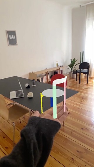
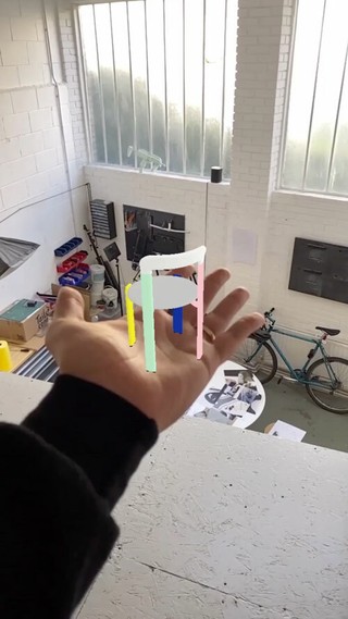
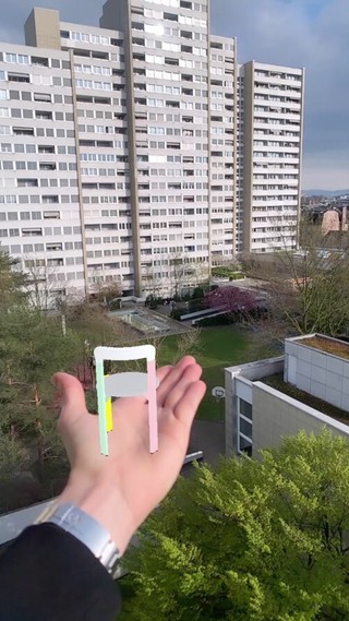
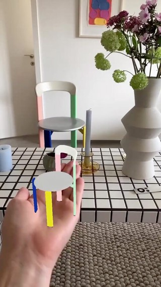
Thanks to all our Beta testers who sent us feedback over the last couple of weeks. That's Raffael, Ori, Raoul, Abdu, Wei, Andrew, Abody, Matteo, Leonardo, Mark, Stephen, David, Otis, Federico, Martin, Daniel, David, Farah, Lova, Mike, Ingo, Tom, Muhammed, Ravid, Rainer, Daniel, Pablo, Leon, Viktor, Christian, Luke, Daniel, Oliver, Samresh, and Thomas.

New Release: ABC Marfa

After one year in Early Access, ABC Marfa has now made it over the finish line and is officially available in our Retail Library!

While stylistically born in the hot metal typesetting period, Marfa was designed in a high-speed era of no time to lose: Its uprights were drawn in under 1,000 hours and its hot-headed Italics in less than half of that. Initially, Marfa was a sturdy, utilitarian typeface of three modest weights known as Gothic No. 6, drawn by Fabian Harb in homage to early American gothic typefaces. It made its first appearances in projects by early adopters like Other Means, Studio Pandan, Dan Solbach, Folder Studio, Eloise Harris & Nea-Kosma, and NODE. 🙏

Small Capitals

Monospaced Small Capitals 🙄

In the years since, we were lucky enough to get designer Seb McLauchlan from our London satellite on board, who helped us to extend the font into a full family with corresponding Italics and a Mono counterpart.

The family now consists of 28 styles, and as another nod to history, Seb also included small caps and old style figures (just how printers and designers in the late 19th Century liked it). This time, the Dinamo pig was designed by NYC’s finest OtherMeans (thanks Gary, Ryan, and Phil).

→ Explore the many styles of ABC Marfa
→ Or download free trials of the font

Stylistic Alternates + html code snippets

Some say that adding a bunch of alternative options to a typeface is a sign of poor character. But we don’t think that’s true today. To better display the potential of our fonts’ various stylistic alternatives, we’ve begun implementing new overview pages for each of our fonts, as well as an easy way to copy & paste the required html code right from our website.

Pro tip 🐛

You can copy the html/css code on these pages to activate the variation on your website! Just click the bubble of your desired alternative on the page, and our site will generate the required snippet for you. Paste this snippet into your code and voilá!

The CSS code has been copied to your clipboard
my-text { font-feature-settings: "ss03";}                     

New Language Extension:

Over the last few years, we’ve been working with various collaborators on extending ABC Favorit to cover as many languages as possible: Our ultimate goal for Favorit is for it to become a truly global font. And our latest language addition, ABC Favorit Arabic, officially launches today!

Favorit Arabic supports Arabic, Farsi, and Urdu, and it’s the outcome of a collaboration between Khajag Apelian and Wael Morcos. The design captures the formal idiosyncrasies of its Latin original, including its low contrast, tubular shapes, geometric construction, and other subtle quirks. Working with Khajag and Wael has been amazing and we hope we get the chance to do repeat it again soon.

The first application of Favorit Arabic is already under way, too! The font is currently being used for all the Arabic texts in the newly rebranded Qatar Children’s Museum. The project was spearheaded by 2x4 in New York with Wael as an Arabic specialist and designer. Latin texts are set in Tenon Latin by Max Phillips at Signal.

Test ABC Favorit Arabic online
→ Or download free trials for the font

Cargo and Dinamo Join Services

Independent Type Foundry 👆🏻💗👇🏻 Independent Site Builder

In case you missed the announcement in our last issue, all Cargo users have full access to a selection of our favorit (😉🙄) Dinamo fonts. The offering includes: Diatype, Diatype Mono, Diatype Semi-Mono, Favorit, Favorit Mono, Monument Grotesk, Monument Grotesk Mono, and Monument Grotesk Semi-Mono. At no additional cost!

Try them out yourself on Cargo

Tim Lindacher + Dinamo

Team Updates

Renan

Erkin

Mystery player tba

  • We’re also excited to add a new playing card to the stack by welcoming Renan Rosatti to the Basel team! Renan is a type designer from São Paulo, Brazil who crossed the Atlantic in 2019 to study at the TypeMedia master program in the Netherlands, after which he moved to Switzerland to work with us. He’s currently expanding our library and working on custom typefaces, spending the rest of his time experimenting with code and stretching at the realm of variable possibilities. One day a week, he’s off the screen and outdoors, resting the mind.
  • The all stars team wouldn’t be complete without the comeback of a legendary Dinamo player: Erkin Karamemet. Erkin famously is, and will always be, our first ever intern, having joined us in 2013. Even while working on his own projects (like the upcoming ABC Repro) he hasn’t stopped supporting us on a project-basis. With a couple of big projects looming in 2021 and 2022—and since k1ng erk0 was dearly missed—we begged him to come home in a more permanent way. In maybe his worst career move ever, he agreed to support us for two days a week. We hope he’ll stay forever! Erkin jumped right in an is currently working on the expansion of Diatype Extended and Diatype Expanded.
  • And one more very valuable addition to our team will be announced soon :)

Work in Progress

After releasing our multi-coloured 3300 Dietiker chair in February, designer Mohamed Chajid of Digitatio studio hit us up on Instagram with a mock-up and concept for an accompanying AR chair filter. Since launching our Face Filters collection in 2019, we’ve been exploring the medium as a way to get to know AR and VR artists working in the field, and so we were excited when Mohamed got in touch. We said yes 🥺

Quick backstory: After designing the 3D model chair and inputting it into SparkAR, Mohamed actually made a spinning version by mistake. It stuck around though, as did the accompanying animations and “virtual sit-down” film we made that features the 3300 flying through space. 🪑☄️ Thanks to Mohamed for the idea and enthusiasm—he’s a rising AR star, you should work with him too!

Open the filter to hold the 3300 in your palm

Digitatio

  • ABC CCTV—as seen in issue five of Actual Source’s Shoplifters magazine—is in its finishing stages. Designer Sascha Bente has completed the drawing and the font files are now being produced by Robert Janes. There will be several weights, from Regular to Heavy, and a “plain version” without the bullets. 🕳
  • Seb McLauchlan is in the high focus phase of completing ABC Rom, and we’ve been working with London-based OK-RM and James Taylor-Foster on a special, printed, soft thing to go with it.
  • Fabiola Mejía is almost done with adding monospace styles to ABC Social, a typeface we’ve kept in the dark but not for much longer!

Fonts in Use

Discord—the number one communication platform for gamers—has just rebranded using ABC Ginto. Congratulations to its designer Seb McLauchlan, and our friends at the Berlin/London/LA-based Studio Koto! As the team behind Discord’s new identity write: “Playful and sophisticated Ginto brings a bold energy that doesn’t take itself too seriously.” Take a look at Koto’s project page to see Ginto alongside Clyde. Good job.

Pictures by Koto

Not everybody in the love-filled space called the internet cares for Ginto as much as we do. Below are the best comments we’ve seen so far.

Fact

Reddit 💙

P.S.

  • “A sign of the future, which already feels like a thing of the past”—For Harpers, Barrett Swanson dives deep into the TikTok mansions of twentysomethings trying to achieve viral fame, and how a clubhouse is a bit like a university 🧐
  • We’re finishing up a collaboration with Native Instruments on a custom Hardware piece, initiated by Johannes Schroth. The limited edition will drop in June. It has silver on it.
  • At the beginning of June, we’re giving a lecture about our work in Barcelona, thanks to the kind invitation of Marc Panero and ELISAVA (the Barcelona School of Design and Engineering). Sangria bucket challenge here we come.
  • We’re looking forward to streaming the free typography conference Ultrafett from home—its identity uses the variable ABC Arizona.
  • Good friend and collaborator, the photographer Marina Hoppmann, has just released a beautiful new zine about love and grief, featuring photos of daughters who have lost their mothers. With design tying it all together by Eloise Harris. Read the interview with Marina on Refinery29.
  • One of us spent the weekend queuing up outside of She Said Books, Berlin’s new bookstore for female and queer authors. Its colorful identity is by Studio Amanda Haas and uses ABC Monument Grotesk.

Thank you for checking in with our latest issue of The Dinamo Update. You can read all of the back issues in our archive.

Speak soon,
Team Dinamo 🐝

Dinamo Typefaces GmbH, Glasower Str 44-47, 12051 Berlin
Copyright ©2024, All Rights Reserved