All the data, all the love —

Welcome to the latest issue of the The Dinamo Update. In this semi-regular newsletter, we’ll be continuing to share the latest ongoings at the studio.

Was this forwarded to you? Sign up now!

A Look Back & At the Year Ahead

I’m not a sentimental person, but I like to look back before getting into a new year. And last year, a lot changed at Dinamo. We celebrated our 10th bday. We doubled in size and founded an imprint. Too many fonts, a toothbrush pack, and a website tool were released.

Change can be hard to measure (I mostly notice it in my lower back). So I spoke with our own Business Analyst Rea Stamatoulakis, who helped crunch our 2022 numbers. She also highlighted some special moments, which were turned into infographics by Sascia and Mathias using a mysterious mix of 1D and 3D tools.

(typographic doomscroll)

Sales distribution

In 2022, typeface sales were evenly distributed amongst our library. Favorit (🙄) no longer took up the biggest slice anymore (kicked off the throne after seven strong years! Call that aging gracefully). Rea told me: “Now, no typeface holds a split higher than 15%.” That’s good, I guess – in these times, you don’t want to bet on just the one horse.

Also, I learned that: “Most Dinamo clients buy typefaces on Tuesdays and Wednesdays.”

2020: Uneven sales distribution

2021: More fonts, more even distribution

Compared to 2021, in 2022…

– Our oldie typefaces went from 12% share of total sales to 6.87%.

– Teens are growing into young adulthood, rising from 16.82% share of total sales to 27.13%.

– Newbies graduated from Kindergarten, going from 5.66% share of total sales to 15.91%.

Dinamo Data Center

New Releases

Marist: Prominent serifs and wide uppercase proportions characterize this warm, reader-friendly typeface by my good friend Seb McLauchlan. Its forms are inspired by afternoons spent in archives investigating the history of the overlooked Old Style. Seb’s back home in NZ right now. Enjoy buddy!

Repro: A friendly, flexible sans serif inspired by and optimized for signage and operating systems. Merging clean design with complex font engineering. We had big system functionality and digital interfaces in mind for this one. Designed by our oldest family member and proud owner of a fishing license, Erkin Karamemet. (He nearly got a boat license, too).

Walter: A scholarly effort made in collaboration with Omnigroup. The two related yet ideologically opposed families celebrate author and educator Walter Käch, who has his fingerprints all over Switzerland’s most famous typefaces. You can submit to the ongoing caption contest!

Camera: A reinterpretation of light traps, originally used in the ’60s and ’70s to make text more readable on TV screens. Available with or without the “holes” and perhaps the best infographic the milk industry has seen.

Diatype Rounded: Diatype’s friendlier cousin with rounded terminals in both standard and mono styles. Got a yogurt bottle to design? Smash Rounded on it.

Early Access: Alongside Marist, Oracle and Gaisyr were made available on a request basis. Soon, they’ll be available without needing to apply!

Those lines up there show how our fonts are used across different types of media. Generally, print and web are what most people buy, but video, social, app, and logo are growing. Curious to see if they play a larger role in 2023!

In 2021, customers were purchasing several licenses — but in smaller numbers than this year

And in 2020, most customers bought one or two licenses

Do people purchase one, two, three, or more licenses at once? I learned something from this donut stack. Seems like designers are using our fonts for everything from a 25 copy printed zine to a multi-screen, multi-platform branding project. Compared to previous years, I guess projects these days are getting bigger, spanning multiple media types.

Rea, whispering: “Despite the current economic circumstances, the growth in Dinamo sales is steadily going upwards.” 😬 Thank you to the designers out there who keep using our fonts! She also noted that ongoing pressure on the global economy could explain the sales dip in this year’s Q3/Q4.

We want our typefaces to speak as many languages as possible. Above you can see what non-Latin versions of Favorit were used in the last years. I know all our typefaces will expand into new scripts, but Cyrillic extra-fast thanks to our in-house specialist Olga. We already published her Gravity Cyrillic and Whyte Cyrillic is next.

***

The Dinamo Font Customizer

We launched The Dinamo Font Customizer™, letting you customize our fonts as you purchase them — for free.

Before checkout, our Customizer lets you choose the alternate characters you’d like to make your font’s default. You can always log back into your user area to recustomize them (even fonts you bought back in the day). Since launching the tool, I learned the most popular alternates are single story a and Repro’s beautiful Space Odyssey S.

The big reveal

We reworked our typeface overview as well! Take a look. Fonts are now easier to browse and compare. Thank you Raffael for the extra wide columns. (Quote: “I won’t stop until these columns are as wide as html-humanly possible!”) <3

Another thing. After expanding our trial fonts to include all available glyphs and accented characters, downloads have continued to go up. No surprise here. It’s simply more fun being able to test fonts without a single character missing. Try them out.

Since switching from a usage-based licensing model to a size-based one in 2020, small and medium sized companies have become a larger customer base for us. It’s because the licensing terms are fairer on them. Last year, we added a couple more tier options to help differentiate company size even more. It’s already having an impact, said Rea.

Rea told me: “Updates to the website have helped raise online sales.” This means our customers are increasingly buying through our web portal instead of emailing us. That lets us concentrate on what we do best. Making memes.

***

New international friends!

We had our first customers in Afghanistan, Andorra, Bahamas, Cayman Islands, Costa Rica, Georgia, Lebanon, Moldova, Pakistan, Timor-Leste, Uzbekistan, and Venezuela last year. Also: Our Dinamo Update readership grew by 339%. 🚌 Twice, we’ve reached out to our community to conduct special surveys.

Student Font Packs 1 + 2

Obviously, we all know that design is best learned outside of school, and you shouldn’t believe anything a teacher ever says. All that said, it’s important to us that students can access our fonts easily. So we spoke with 70 students around the globe to hear what they had to say about buying and using fonts in design school today.

Following our conversation and in a (fleeting) moment of wanting to do the right thing, we decided to lower the cost of our Student Font Packs to €55 (previously €123). Read the full report here.

Rea mentioned that our cheaper price made an impact: “Interest in the Student Font Packs is going up”. In fact, we’ll release a third Student Font Pack packed with new fonts soon — many of you’ve been emailing asking for it.

Type Foundry Survey

I spent a lot of time last year wondering about the life cycles of our typefaces. And what it means for foundries to be bought up by giants — because that’s what we’ve seen happening a lot this past year. For a special issue of the Dinamo Update, I spoke with 15 friend-competitors at foundries big and small, to hear how they’ve been thinking about their legacy and the future of the products they’ve released into the world. Scroll through our rainbow waterfall yourself.

***

We’ve got a clean slate planned for Hardware this year, a total reboot. What you could call dust catchers at the moment (and I wouldn’t take offence) will rise from the ashes of our east Berlin warehouse. While I can’t reveal too much about our upcoming plan yet, what I can tell you is that this reboot is so voluminous that Simon can’t move his chair because of all the boxes stacked around his desk (one of them is from Japan, and cost us a handsome sum in import tax).

While our store went on pause in preparation, we did publish a couple special items:

Artist Edition Toothbrush 10 Pack: To celebrate 10 years of Dinamo, we invited a group of friends we met along the way to design toothbrushes for us. Generous as we are, we gave them 75 x 6mm to express themselves.

Designed by Sascia and Mathias, the box contains: 10 artist-designed Curaprox toothbrushes with 5,460 ultra-fine, 01.mm Curen® filaments. Compact brush head, straight angle, 18.2 x 1.2 cm. Switzerland’s finest.

The Arizona Type Specimen: A five color, split-page, spiral-bound showcase of ABC Arizona. Released by our new imprint Dinamo Editions.

Arizona is the first ever sans-to-serif Variable Font that packages its five looks — Serif, Text, Mix, Flare, and Sans — into one single font file. This specimen, designed by Elias Hanzer and Lucas Liccini, celebrates Arizona’s countless combinations through its split structure. You can mix and match the half pages to discover the typeface family’s vast system.

***

Last year was packed with custom design projects, some of which will launch this year. As we’re mostly developing our own things with not too much real world contact — scientist-style, mumbling to ourselves — it’s a welcomed change to open the window of our Babylon tower and let things from the outside fly in, to have conversations about making something new, together, with non-Dinamo people and institutions.

In 2022, we were blessed to be able to work on typefaces for GOAT, Snøhetta, Harvard GSD, MCM, ICA London, On Running, Marine Snow, Xatar (the rapper – jep!), and Pharrell Williams’ Joopiter. Plus a few more I’m sure but my Dropbox stopped synching at some point and I’ve no clue what the team has been doing.

…And we also won an exciting and scary project that’ll keep us drawing and trembling throughout this and next year. I’d love to tell you about it, but if I did, I’m pretty certain my body would be found floating somewhere in the Thames, with the NDA document (9.5pt, Verdana, fully justified text) I breached clipped to my loose tongue.
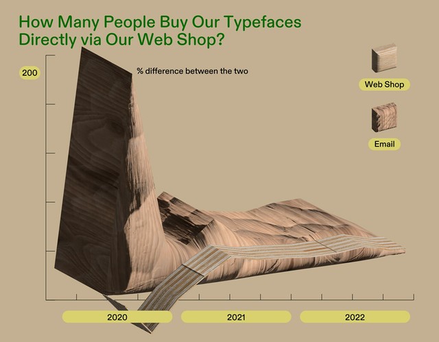
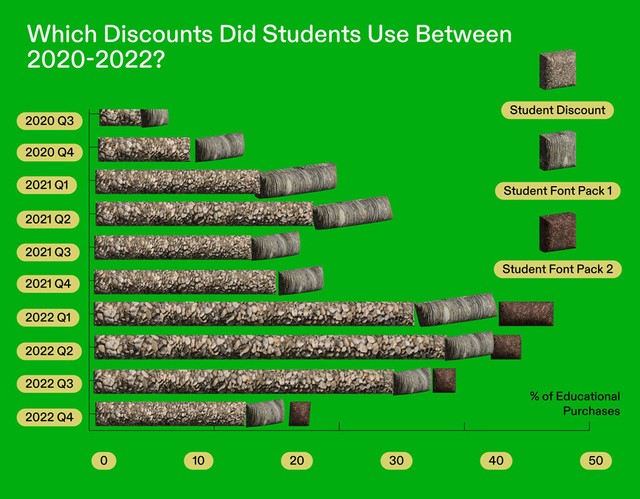
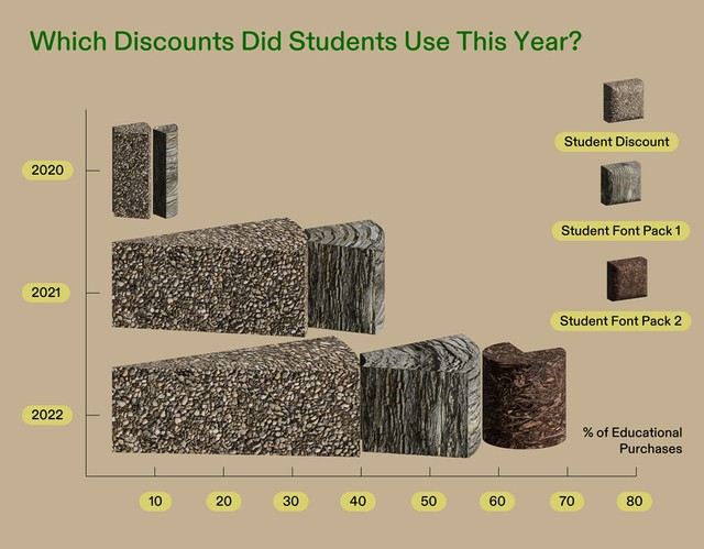
***

Apple Store, Berlin: In his first departure from Neukölln in over six months, Johannes gave a type design lecture and “first steps” workshop at the newly opened Apple store in Mitte. Amongst other things, it explored how to develop fonts using the Apple Pencil and iPad. Good times.

Fontstand International Typography Conference, The Hague: Our long-time collaborator and sk8er heartthrob Elias talked about the possibilities of variable font technology and presented ABC Arizona to the crowd. The whole team flew in for the occasion.

Sumo, Porto: Fabian battled it out live on stage with Kai Bernau for this graphic design and visual culture podcast. Listen to the whole thing here.

International Assembly, Glasgow: Johannes went to Scotland (and returned). With 800+ in the crowd, this might have been the largest audience we’ve ever presented to. The energy in the room was beautiful. Someone on social media described the lecture by “the german font guy” as “comedic gold”. <3

***

For the year ahead, this is what feels important to us:

  • Own, and grow, our news platforms
  • Own, and grow, our distribution
  • Ask for help and favors, directly and often
  • Consider collective vs. dedicated team
  • Give full access to everybody we work with
  • Learn to love the engine room
  • Create a simple, modular value structure
  • Document and share knowledge
  • Protect against gatekeepers (often former heroes)
  • Stay independent. Collaborate with each other
  • Read (substacks, newsletters, books)
  • Don’t mind piracy (focus on creating new work)

These typefaces will see the light of type-day next:

  • ABC ROM
  • ABC Gramercy
  • ABC Solar

***

That’s it for now! See you next time.

Love,
Dinamo

Dinamo Typefaces GmbH, Glasower Str 44-47, 12051 Berlin
Copyright ©2024, All Rights Reserved