+ Talking to students about using fonts in design school 🍎 —

Welcome to issue #13 of The Dinamo Update! In this monthly newsletter, we’ll be continuing to share the latest ongoings at the studio in five parts.

Was this forwarded to you? Sign up now! (◠‿◠)

NEW STUDENT FONT PACK + SURVEY

We’re excited to release our brand new Dinamo Student Font Pack 2, which bundles together another 11 complete typeface families for €55. 🎒

Our first Student Font pack cost €123, but we’ve reduced our price by more than 50% after sitting down and speaking with 70 students across the globe, and hearing what they had to say about buying and using fonts in design school today. We learned so much from them all 💞 and so we’re sharing our main takeaways with you.

Do students buy fonts?

A large majority of our respondents (68%), said that typefaces are too expensive—and they would LOVE to buy more if they were more accessible.

Out of all the students we surveyed, half purchase a couple of new typefaces a year. 17% only use freely available typefaces, and 26% never buy new typefaces at all—though they still use them.

Most of the students make a small amount of money from design work, though only 11% said they’re earning a lot from these side gigs. Unsurprisingly, 88% of those making a good profit purchase fonts regularly. 2/3 of the students who don’t work design side jobs—and are focusing on their studies or have non-design related work—use fonts that are freely available to them.

Despite the fact that students don’t buy many typefaces, 87% of respondents agreed that using “fresh fonts” is very important to them.

Where do students get fonts?

Over 3/4 of the students (secretly) trade font files with one another—and 1/4 confirmed that there’s a lot of “shady dealings and font trading” amongst their peers (we once engaged heavily in this market ourselves). One said: “You wouldn’t believe how many typefaces I’ve archived in ‘unofficial ways.’” Congratulations, we guess. 😁

It also turns out that 76% of students prefer to buy from independent type foundries vs. mega retailers like Google (though these findings might be a bit skewed, as we surveyed our own followers, and they’re a bit ahead of the mainstream 😉).

And we’ve always felt more institutions should provide students with free font files—so we were interested to learn that 59% of respondents have not been given fonts by their schools. 19% have been given a selection, but they don’t like the fonts available to them.

If you’re an educator and would like to offer Dinamo fonts in class, please reach out to us!

Updates to our student Font Offering

How can fonts be more accessible to students? 70% of the students we spoke with said they have not purchased the first Dinamo Font Pack—because they felt it isn’t affordable enough.

For us, this was very revealing: It seems like we needed to work a little harder to find a $weet $pot that works for everyone. And that’s what we did:

→ We’ve reduced the price down to €55 (previously €123)
Student font packs now include Desktop + Web + Variable fonts
→ Reminder: You can use the fonts in self-initiated commercial work

All fonts come as Desktop, Web, and Variable Fonts.

Pack 1:

  • Favorit
  • Favorit Mono
  • Favorit Lining
  • Grow
  • Diatype
  • Pareto
  • Prophet
  • Whyte
  • Whyte Inktrap

Pack 2:

  • Gravity
  • Diatype Mono
  • Diatype Semi-Mono
  • Helveesti
  • Helveesti Spikes
  • Maxi Round
  • Maxi Sharp
  • Social Condensed
  • Social Normal
  • Social Extended

Dinamo x SHORTNOTICE STUDIO join forces

Our very dear friends Sascia Reibel and Mathias Lempart of the one-year-old Shortnotice Studio have boarded the Dinamo ship and will be taking our art direction and Hardware to new heights in the years to come.

We think that what Shortnotice is building is next level. They aren’t service providers, they’re world builders. We’re thrilled we’ll be on the receiving end of some of their fire. And it’ll be a nice challenge for the Dinamo-Boomers to play catch up with them as we work together!! :-) Spring, we already know, will be filled with Shortnotice collectors’ toothbrush sets (finally) along with something soft to lie on when it’s warm outside.

While Shortnotice is mostly based in grey Berlin, Mathias spends the winter months in the sun of Paramaribo, Suriname with his partner’s family. And so we caught up with him and Sascia remotely to chat about our new partnership.

Sascia & Mathias in their Berlin studio.

What are you both looking forward to with our new partnership?

It means a lot to us. Firstly, it means collaborating with our favorite type designers, which we’re very excited about. But on top of that it means putting new fonts to use. In other words: This feels like a playground we hope we never grow too old for!

How do you think about the life of physical objects in your own practice?

We really enjoy acknowledging the objects that follow throughout the day—whether an iPhone charger, a subway tickets, or the vanilla color of the sky—and letting that inspire our work. Being able to create hardware we spend our every day lives with gives us a chance to shape our surroundings further, and to go beyond the limits of a classic two-dimensional printed sheet of paper.

D x SN Partnership announcement mural.

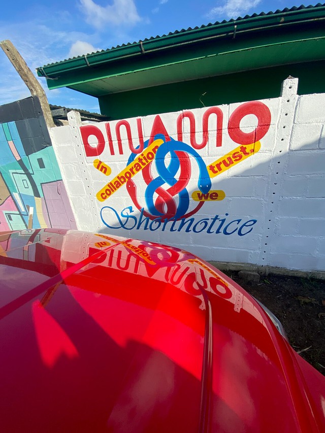
Tell us about the Dinamo x Shortnotice MURAL you just painted in Paramaribo!

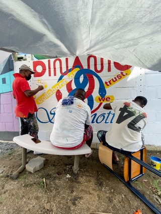
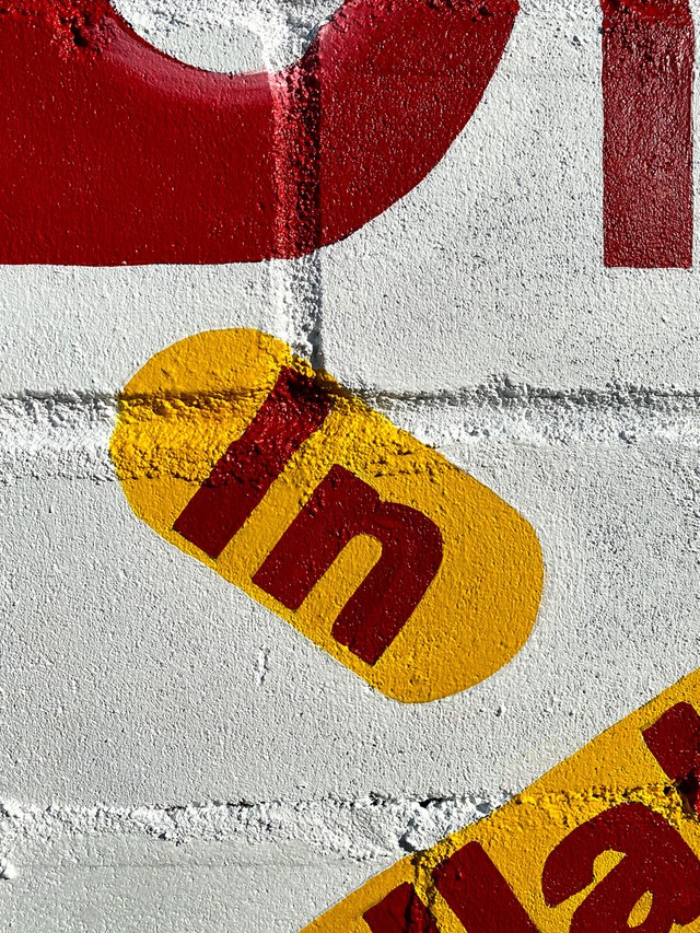
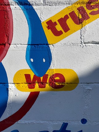
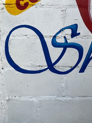
To celebrate our new collaboration, we commissioned a mural in the center of Paramaribo, the capital of Suriname. In general, painted advertisements are on almost every commercial building of Suriname—it’s just as common as printed billboards.

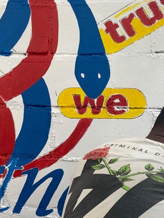
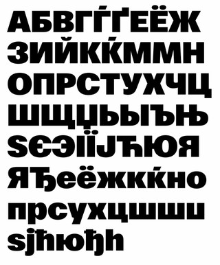
We’ve long admired these murals, and Mathias has worked locally on them before, while also collaborating with a nearby restaurant and chicken farm. We’ve always appreciated how these murals are based on digital designs with popular fonts and 3D effects, and we were looking for an opportunity to create one as Shortnotice. And so, we designed the Dinamo mural and commissioned Fabian de Randamie to bring it to life.

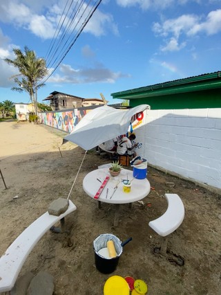
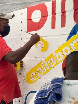
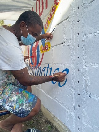
Fabian is THE billboard painter in Paramaribo and we were thrilled that we got to work with him. He and his brothers, Rayen and Guillermo De Randamie, painted the design in four days. First, they drew the letters with a sharpie, and then they filled them with colors and shadow. We learned a lot about the craft of mural painting from collaborating with them.

Fabian, Rayen, and Guillermo drawing outlines of the design with sharpies, having just painted the surface white...

Tracing the colors of the design...

More tracing...

Fabian painting the lettershapes of the typeface Vivaldi.

Waiting for the outlines to dry before adding 3D effects to the top layer...

Finishing touches!

Glow and shadings applied by the masterful Fabian.

STUDIO UPDATES

From now on, we’ll transmit our Dinamo Updates to your screens in FIVE photos 😅—just click the pics to learn more. This month, it was showers of animated type, Butterfly serifs, and Cyrillic language translations filling our desks and walls...

We’ve published a case study on our collaboration with Studio Dumbar and its D&AD Festival identity.

ABC Gaisyr, our latest release with house style Butterfly Serifs, is now available to unlock in Early Access.

Fabiola has begun the process of adding Italics to all of ABC Gravity.

New, Moscow-based team member Olga Umpeleva is adding Cyrillic translations to a couple of Dinamo classics. Welcome Olga!

We’ve almost completed the second hand writing variation—Outline—of our project with artist Stefan Marx. Team: Tanja, Erkin, Stefan, & Johannes.

Fonts in Use

Dinamo team member Tina keeps her eyes on how our fonts get used each month and archives it all in our continually growing, geometric waterfall. Here are Tina’s favorite applications from the last weeks:

MONUMENT GROTESK MONO featured in Adidas and Prada's joint Re-Source project. Identity by RNA Labs and Zach Liebermann @rna__labs @prada @adidas @zach.liebermann

GINTO in the new A24 zine “American Hustlers” edited by Sean Baker. Design and more from @shira_no_filter @gourmet___bathing @witchpleeze @margaret__rhodes @kyra.chan

ESTRAGON baked into this gorgeous cake by @works.works @monthlycake_

P.S.

  • We enjoyed this interview with Angus Cloud talking about his role as Fez in Euphoria. He was cast after being spotted in a burger joint and we hope to see more of the Fez and Lex romance unfolding soon! (Episode 5 just landed!)
  • Zürich folk: A new exhibition about the state of digitization just opened at the Museum für Gestaltung. We submitted our own contribution. And digital eyes can also check out its online publication.
  • Our friends at Mouthwash and Rose LA just teamed up to relaunch the Rose website, which uses our own Oracle and Laica. Lots to appreciate about the team’s ingredient-driven approach to edibles. 🌸
  • “Bitcoin is overthrowing the financial system in the same way a Che Guevara t-shirt on sale for $5 at Primark is overthrowing capitalism”—Stephen Diehl talks bitcoin, Gamestop, and the commoditization of populist rage.
  • There’s a lot that we can relate to in this Creative Independent conversation with Phillip Farris (Norma Jean), and how there’s a difference between your job and your work.

Thank you for checking in with our latest issue of The Dinamo Update. You can read all of the back issues in our archive.

Speak soon,
Team Dinamo 🐋

Dinamo Typefaces GmbH, Glasower Str 44-47, 12051 Berlin
Copyright ©2024, All Rights Reserved