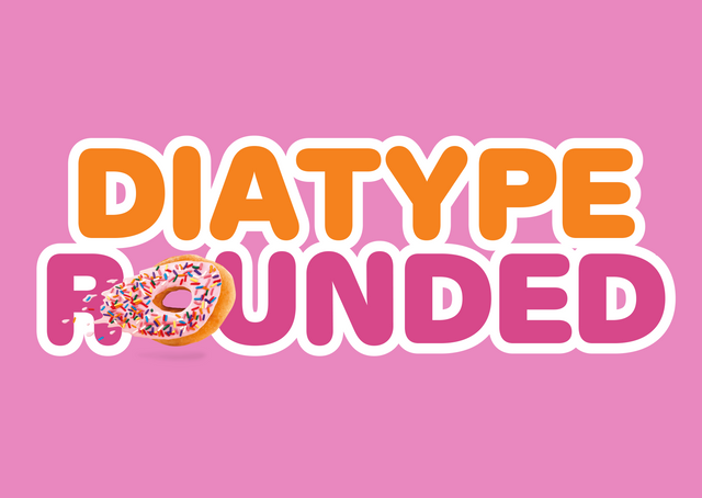
Channeling the mood of rounded typewriter typefaces from the ’70s and ’80s —

Diatype R🍩unded

Hold my napkin: Diatype Rounded has arrived, Diatype’s friendlier cousin with rounded terminals in both standard and mono styles.

Diatype became a quick Dinamo classic as soon as we released it in 2020. This new family is even easier on the eye. Got a yogurt cup to design? Smash Diatype Rounded on it.

8 weights and italics…

Say Aa. When is the last time you flossed? 🪥

Core characters

The Rounded styles of Diatype feel oddly mechanical — as if each character has been engraved with a chunky tool in one continuous line. The overall vibe is bold, a little pop, and has an understated sense of humor to it. Imagine someone tried redrawing Diatype while wearing boxing gloves! Good luck pal.

We rounded those beauties one by one 💅

Five mono companions

Ben, another well g-Rounded friend of the font

Back Story

Susi+Ueli Berger, Kunst am Bau und im öffentlichen Raum 1968–2008

ABC Diatype Rounded came into being when art school friends Fabian Harb and Dan Solbach needed a typeface for a new Susi and Ueli Berger catalog released for an exhibition on the artist couple at Kunsthaus Langenthal.

Dan and Fabian penned a sketch softening Diatype’s sharp corners into smooth curves. This then became the blueprint for ABC Diatype Rounded Mono and later Rounded standard, brought to life by the eyes of Renan Rosatti and Arnaud Chemin. They meticulously rounded each single letter while channeling the mood of typewriter typefaces from the ’70s and ’80s.

Hey Fabian, friend, are you still awake?

Dan

Sure hihi! Browsing through some specimens, eating Haribos.

Fabian

As usual. Look, I like Diatype, but it feels so harsh. How about we turn it into a “Rundschrift” for the artist catalog we’re designing?

Dan

Handsome idea, let’s do it! *blushing*

Fabian

Design by Fabian Harb and Dan Solbach with Maria Peskina. Using a custom version of Diatype Rounded by yours truly.

Dan & Fabian’s early tests and discoveries (Mono ligatures!)

Photos by Emma Affoua Kouassi

Putting those rounded Mono’s to the test

😳 Ben u didn't…!!

Alternates

With the Dinamo Font Customizer™, you can customize our fonts as you purchase them — for free. Here’s what’s possible with Diatype Rounded:

Achieve total vibe change with just a few clicks

Alt G

Alt R

Single storey a

Schoolbook 1

Schoolbook 4

Schoolbook 3

Oh what I think? He’s got the flat-rate so he can indulge in *all* of the eight available weights

Process

We carefully adjusted all the over- and undershoots to reinforce the sturdy and balanced baseline, x-height, and cap height.

I'll

leave

it at

that

Meet the cousins

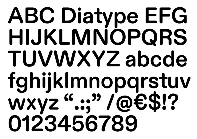
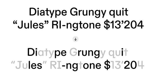
Diatype is a warm-hearted exploration of the Swiss Neo-grotesque genre. Its name harkens back to the clunky, pre-digital typesetting machines that informed its friendly shapes.

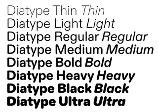
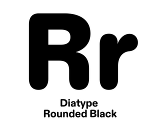
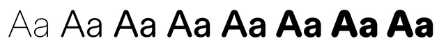
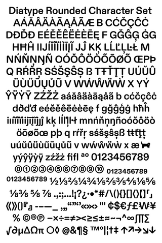
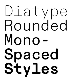
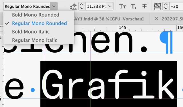
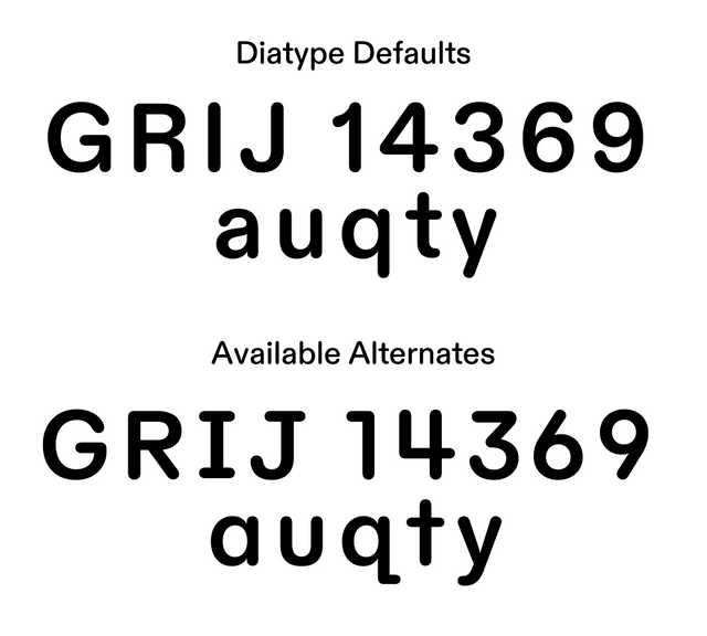
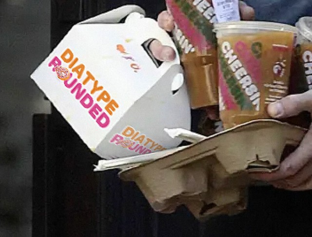
The font’s standard variation is available in normal, semi-mono, and mono styles, and the new Diatype Rounded come in both normal and mono cuts.

Visit ABC Diatype

Visit ABC Diatype Rounded

That should be everything

You = 🪨

To our previous Diatype customers: bless you. With your purchases, and designs, you’ve made this extension possible 💚

Talk soon,
Team Dinamo

Dinamo Typefaces GmbH, Glasower Str 44-47, 12051 Berlin
Copyright ©2024, All Rights Reserved