Kunsthalle Zürich
- Year:
- 2017
- Timing:
- 3 Months
- Team:
- Fabian Harb
- Johannes Breyer
- Domain:
- Arts & Culture
- Technology
- Medium:
- Typeface
- Type Consulting
- Technology
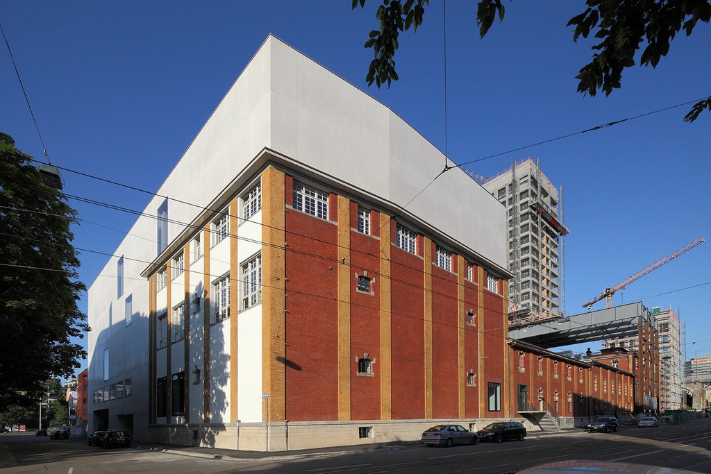
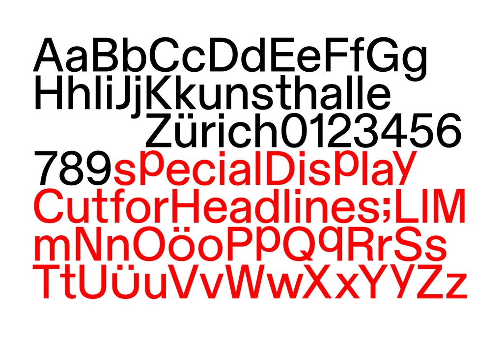
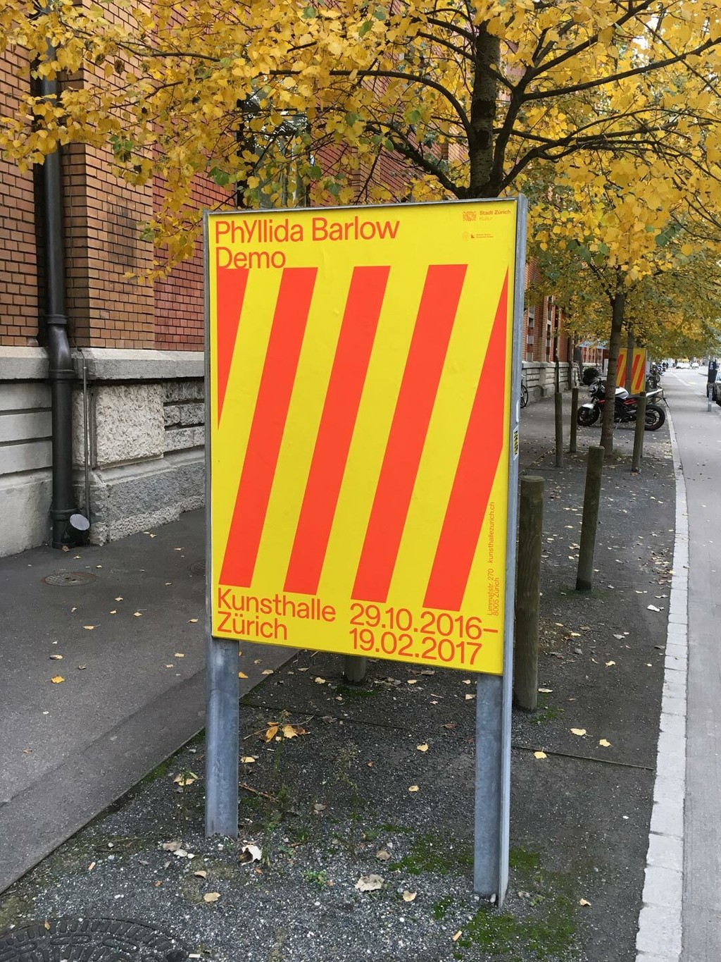
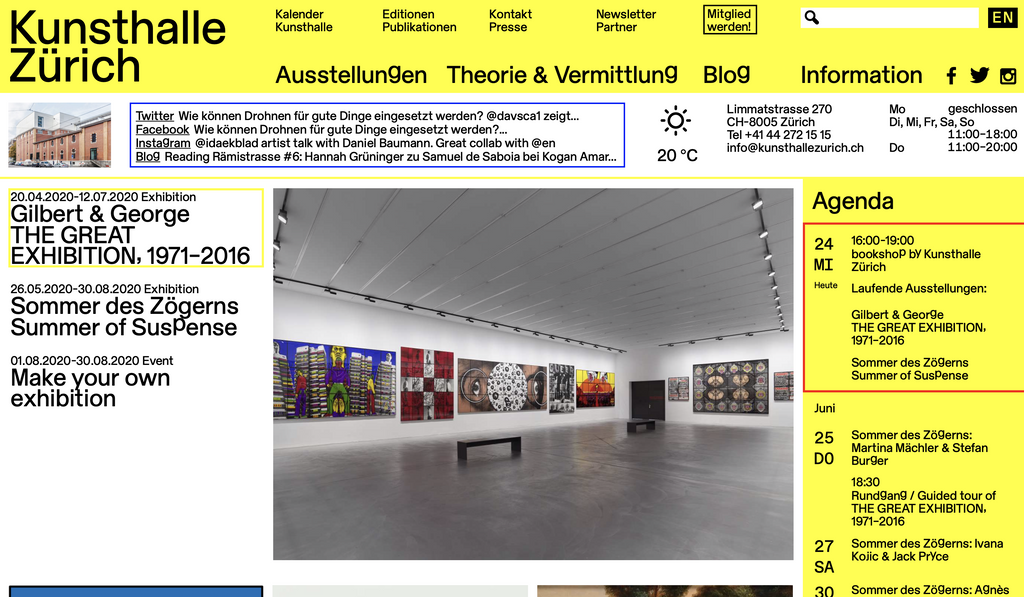
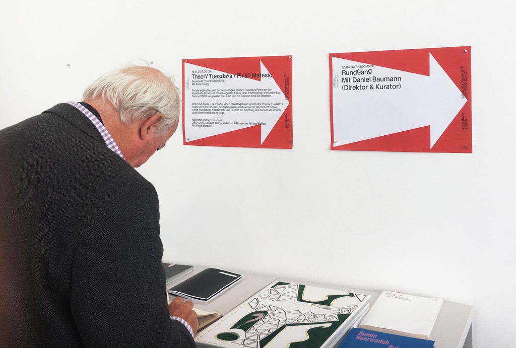
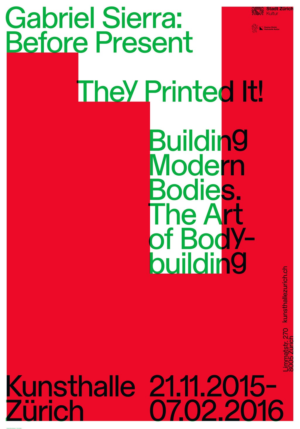
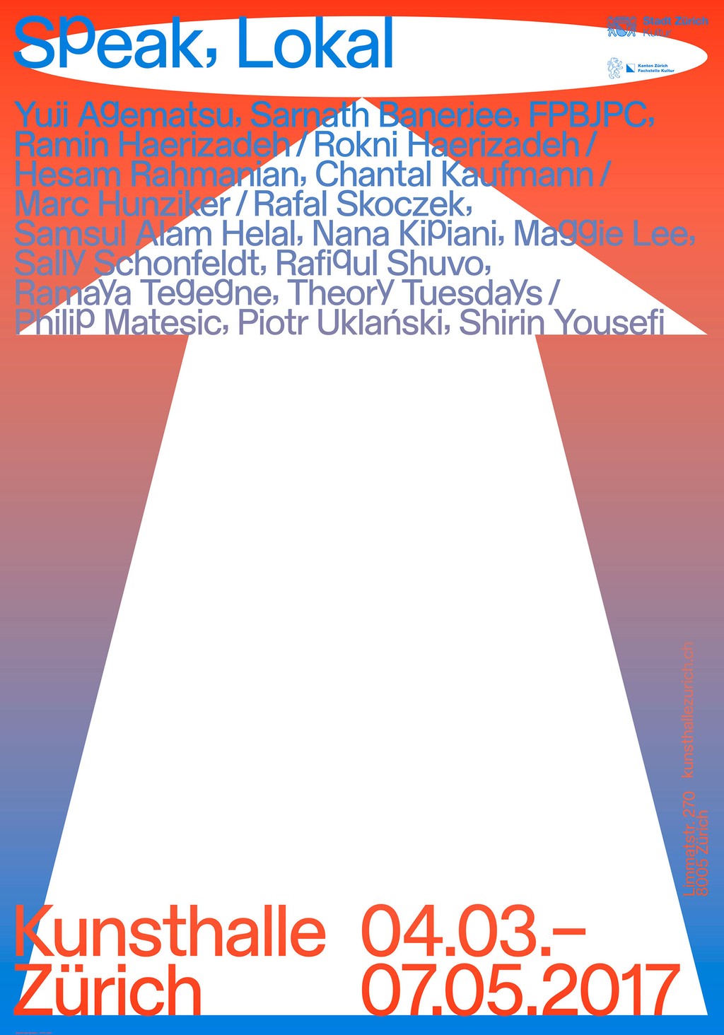
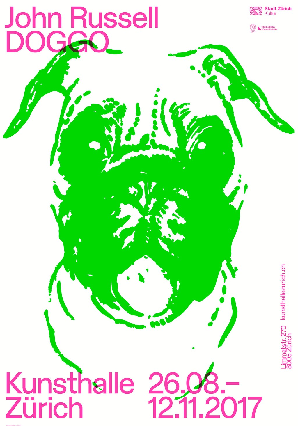
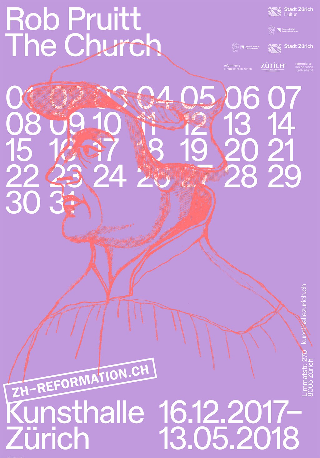
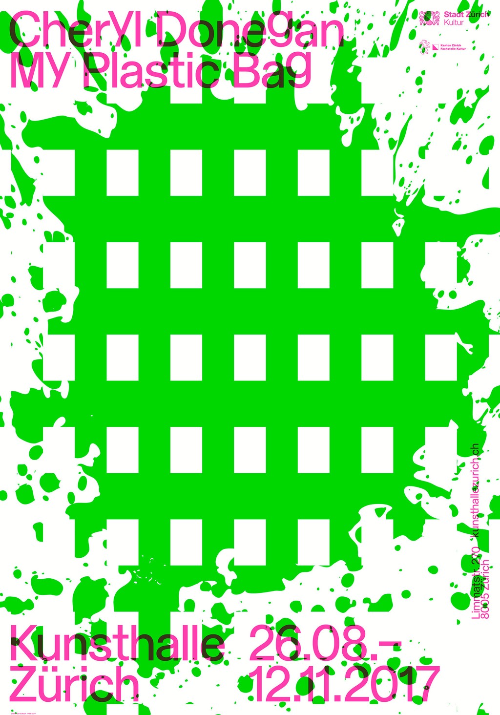
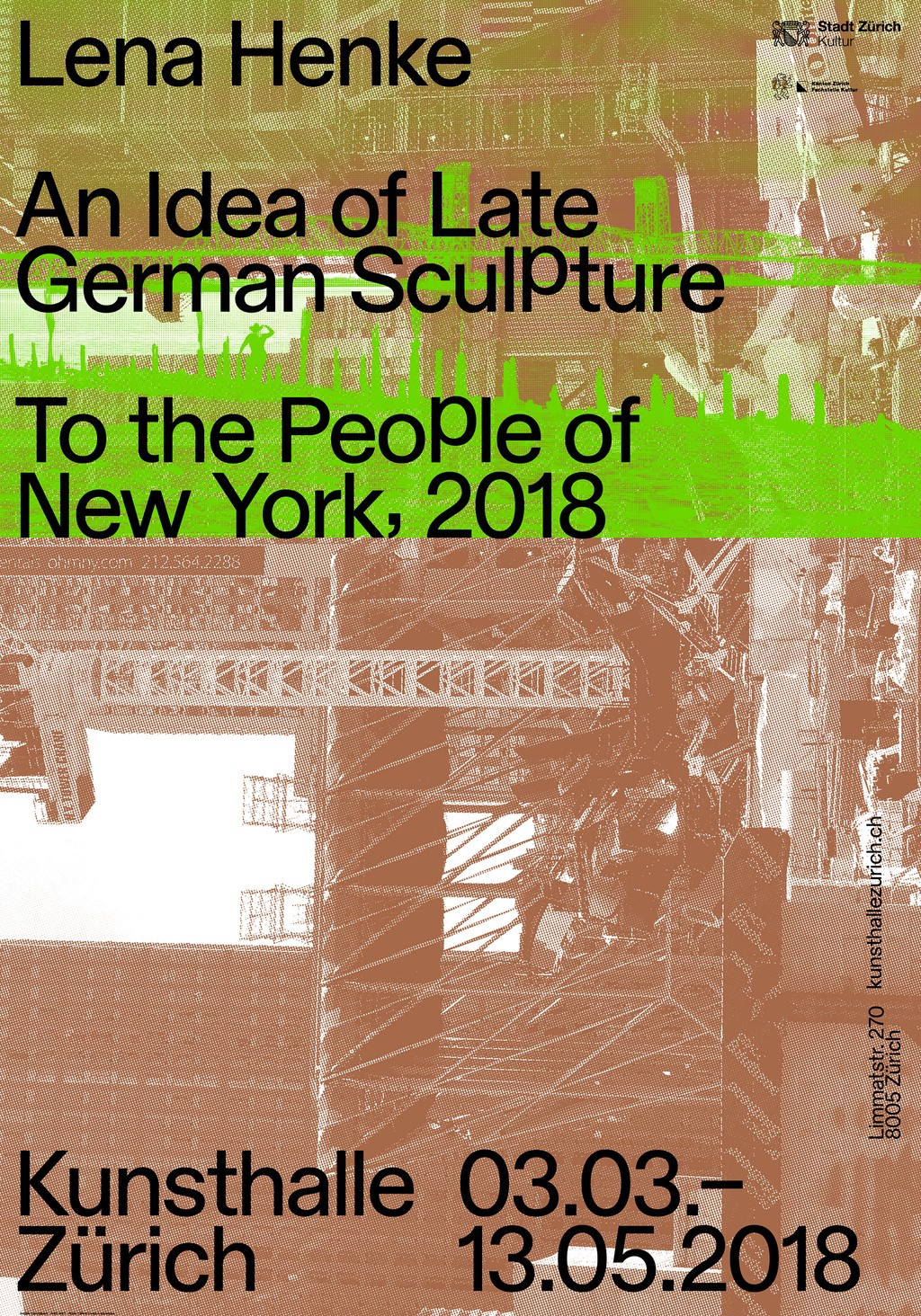
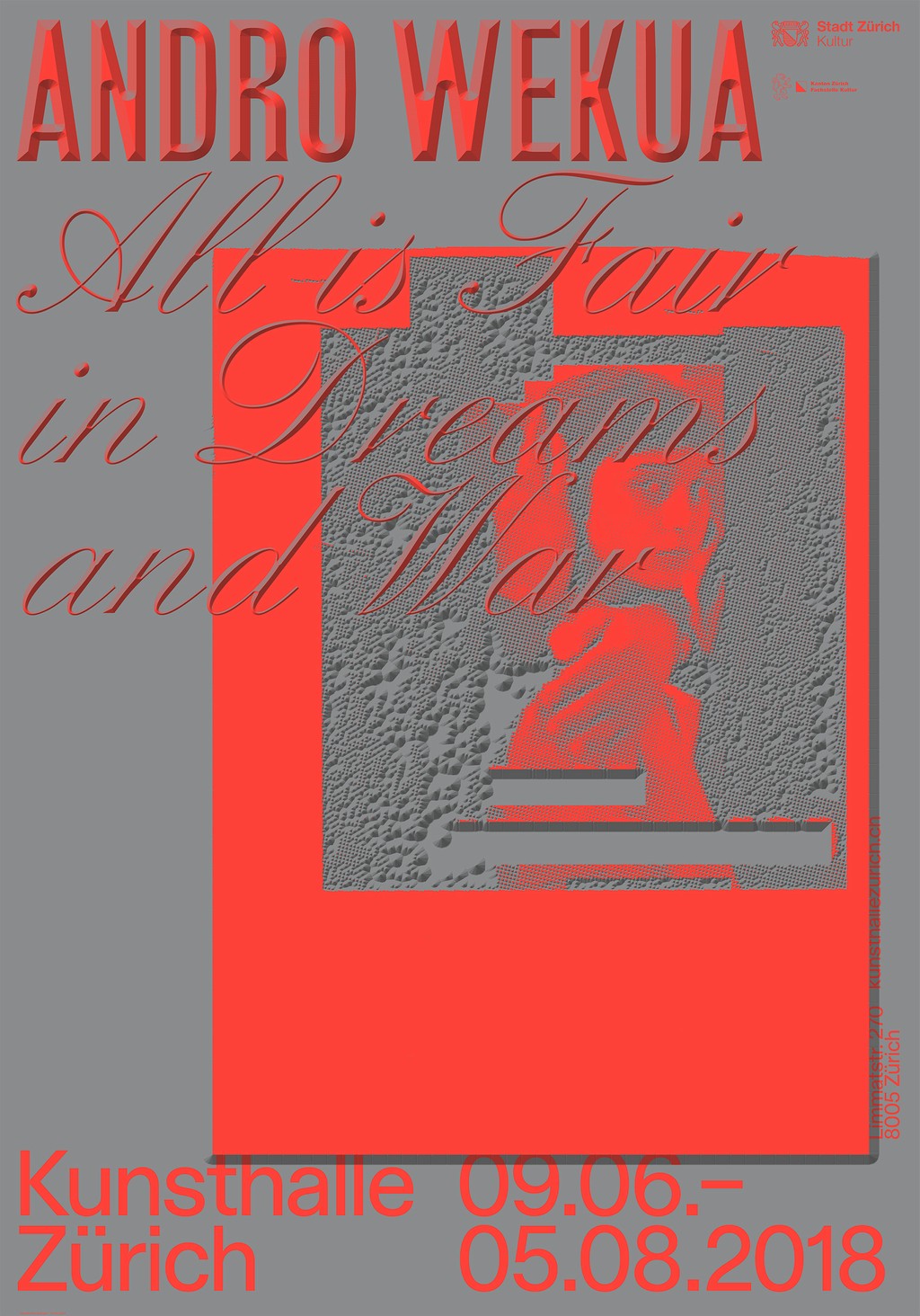
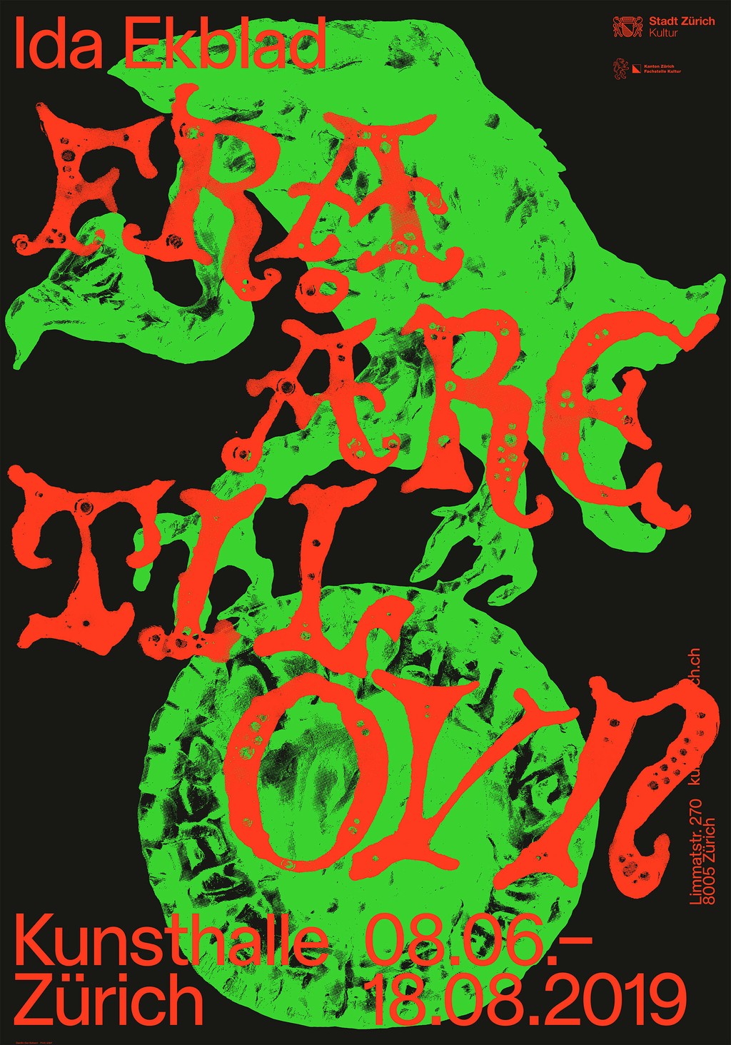
Kunsthalle Zürich commissioned us to develop a new custom typeface in one weight and corresponding Italics for its 2015 redesign, which was led by the graphic designer Dan Solbach.
Established in 1985, Kunsthalle Zürich is an exhibition space for contemporary arts; it’s shown the likes of Richard Prince, Isa Genzken, Wade Guyton, Christopher Williams, Liam Gillick, Seth Price, General Idea, and Ed Adkins.
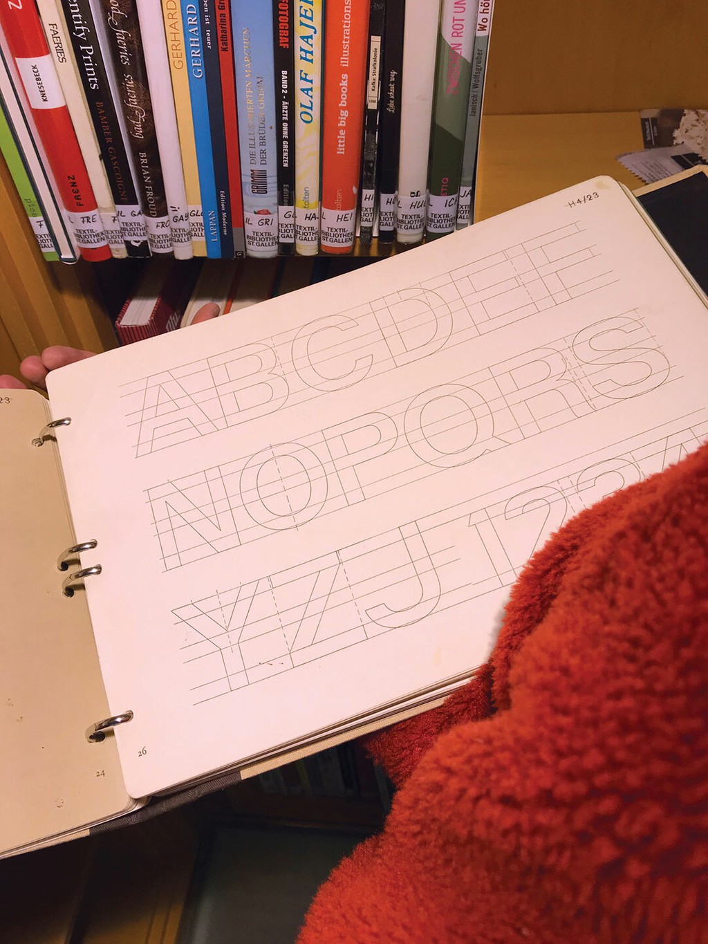
We created a font inspired by a twentieth century grotesque designed by the Zurich based type educator Walter Käch called “Rauchwaren”—the now antiquated term relates to smoking and tobacco products.
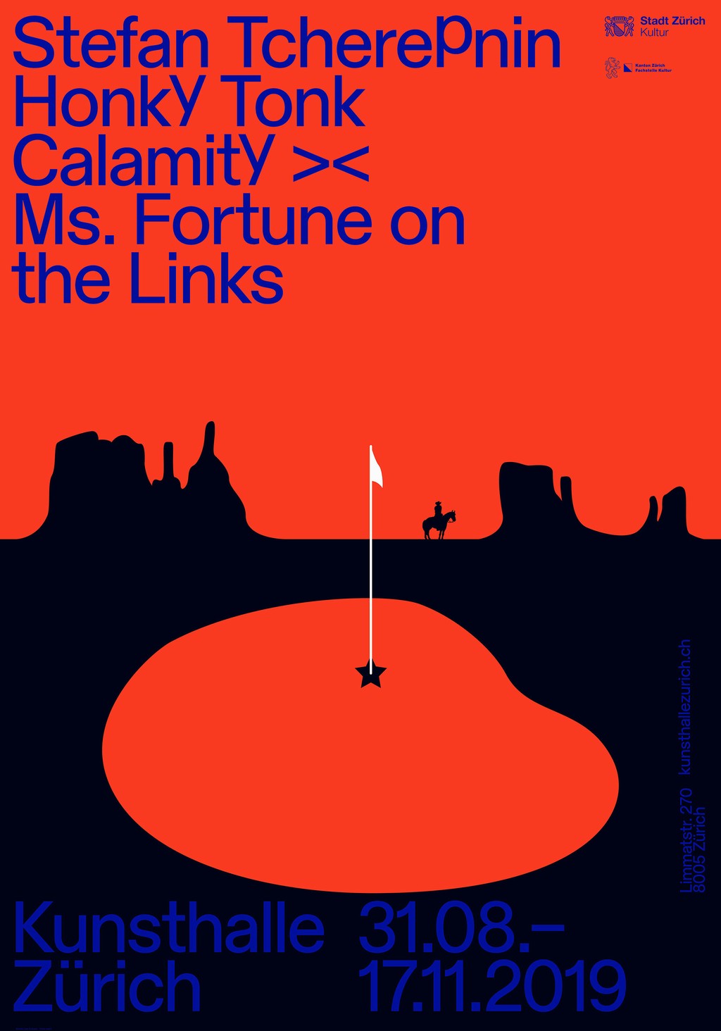
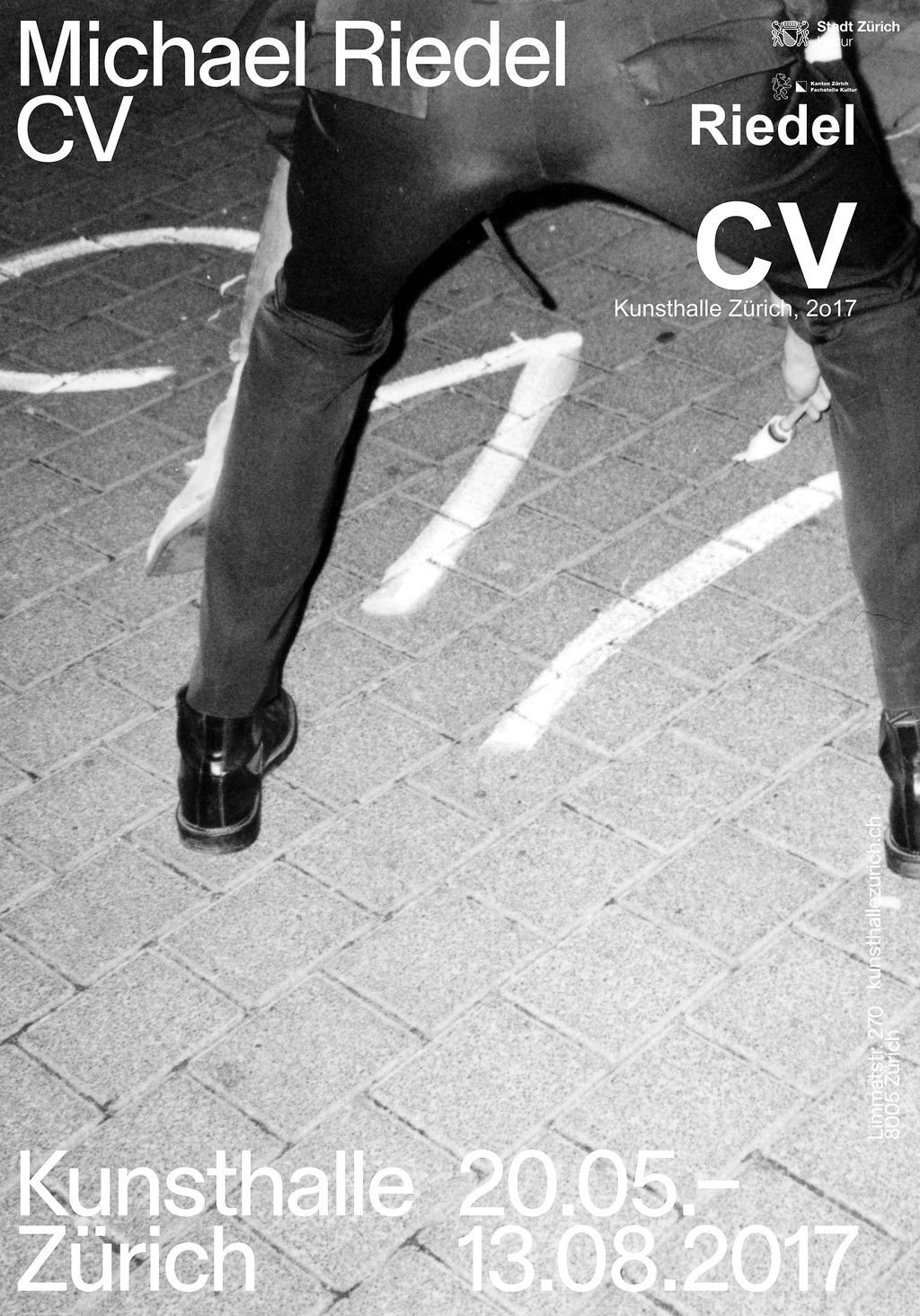
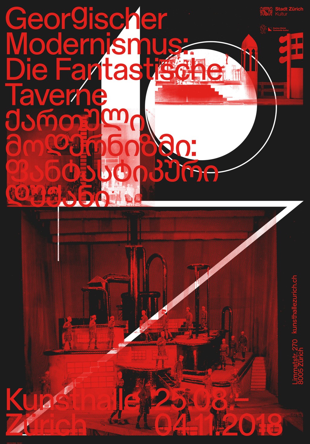
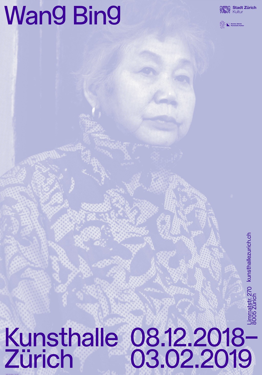
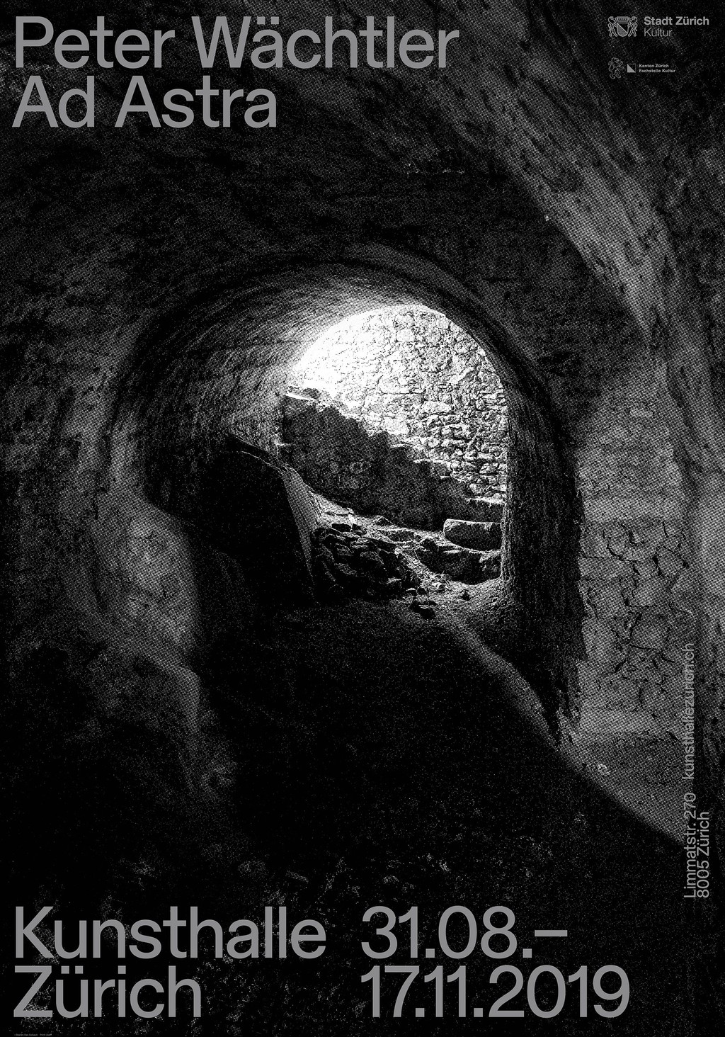
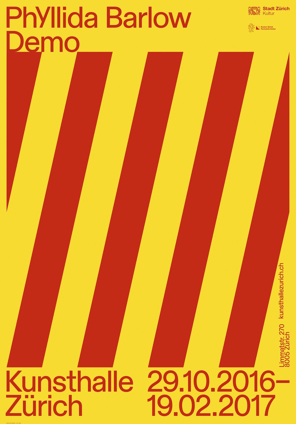
Behind the Scenes
Kunsthalle Zürich's Lilly-Pauline Koper describes the process of designing Rauchwaren in tandem with Dan Solbach’s identity overhaul.
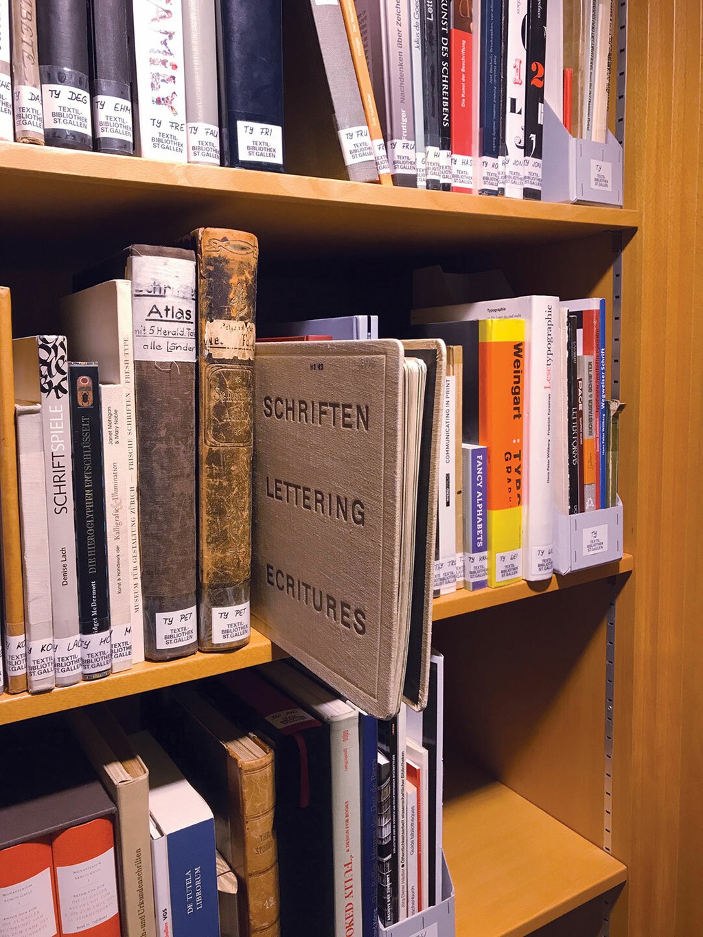
"The Kunsthalle Zürich’s typeface is loosely based on a draft by [early and mid twentieth century type designer] Walter Käch, who was based in Zurich and taught at the city’s Kunstgewerbeschule Zürich (one of his students was Adrian Frutiger). He published a manual-like folder for his course called Schriften, Lettering, Ecritures: the Principle Types of Running Hand and Drawn Characters (1949), which included instructions and examples of various type classifications. Some of these clearly show similarity to Helvetica (1957) and Univers (1959), and they sport great names like Segel Club ('sailing club'), Velo ('bicycle') and Röntgentherapie ('x-ray therapy'). For us, the most interesting design in the folder is the grotesque Rauchwaren ('smoking goods')—it served as the basis for our Kunsthalle Zürich corporate typeface.
"Even though Schriften, Lettering, Ecritures, and its connection to Zürich, were central to our concept, we quickly realized that a faithful digital copy of Käch’s design was too static and musty. We tried to isolate key features of his design, and recreate them for today’s context. In that sense, the message of our design became a plea: Respect history, but reflect and act on contemporary needs. As we left our historical source behind us, we first felt a bit bad sticking with the name ‘Rauchwaren.’ But our attempts to find something equally striking was not so simple, so we deemed it more honest to Käch’s original name.
"The proportions of the typeface became a focal point of discussion. On the one hand, the identity’s designer Dan Solbach created a visual language heavily based on information hierarchies. We therefore thought a special display version of the typeface for titling could be an interesting addition to the straightforward text version. On the other hand, we were creating the new identity and typeface in tandem, so the typeface could react to layout requirements. When text-heavy ads were designed to announce a new curator’s program, shortening the descenders not only seemed like the most effective solution to this specific problem, but it also re-informed the rest of the design process in an interesting way.
"Every design carries traces of the context it was designed for. So if a typeface is created for a specific situation, it can not only represent precise ideas, opinions, and intentions, but it can also deliver a unique appearance difficult to reproduce by anyone else. Most of the time, defining and articulating the factors making up a typeface’s ‘DNA’ is just as challenging and insightful for the designers as it is for the institution." – Lilly-Pauline Koper
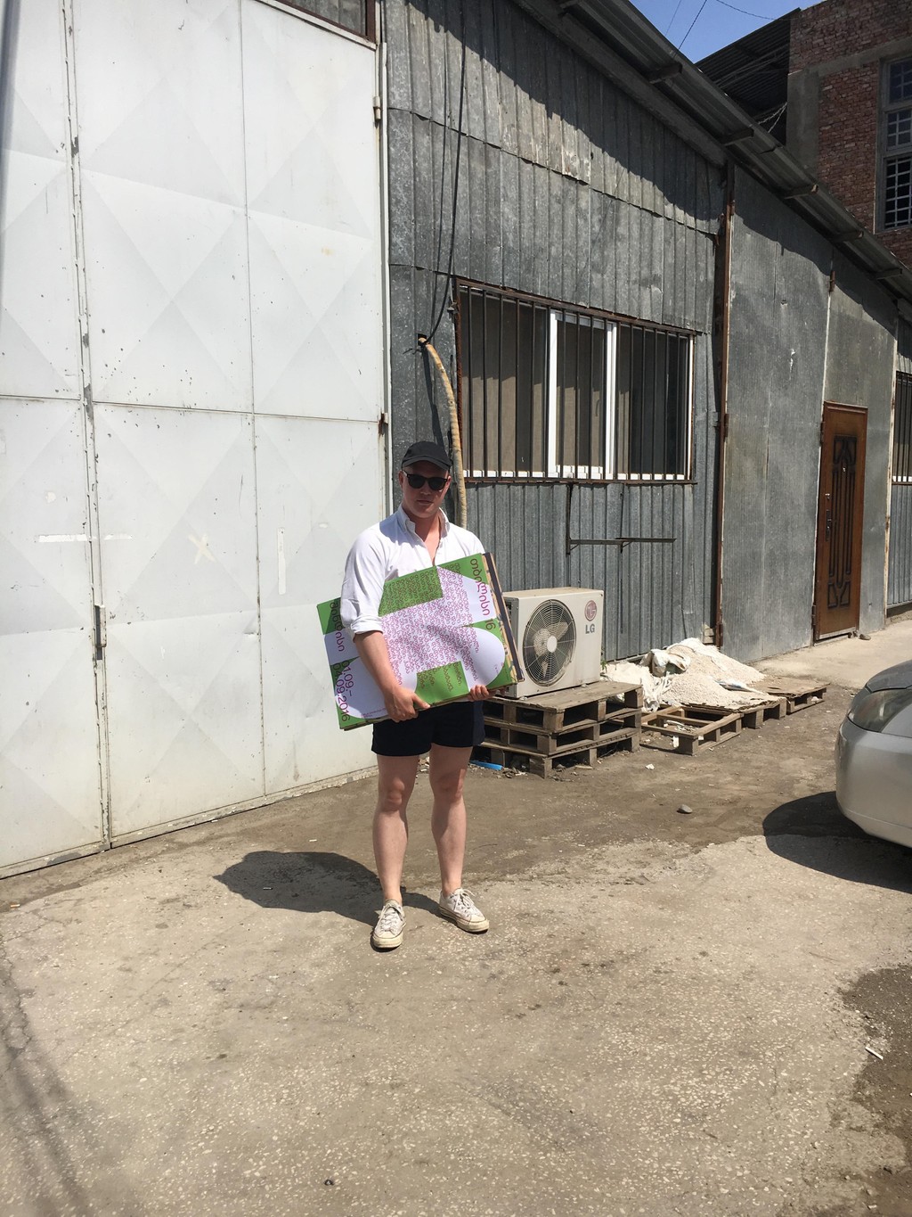
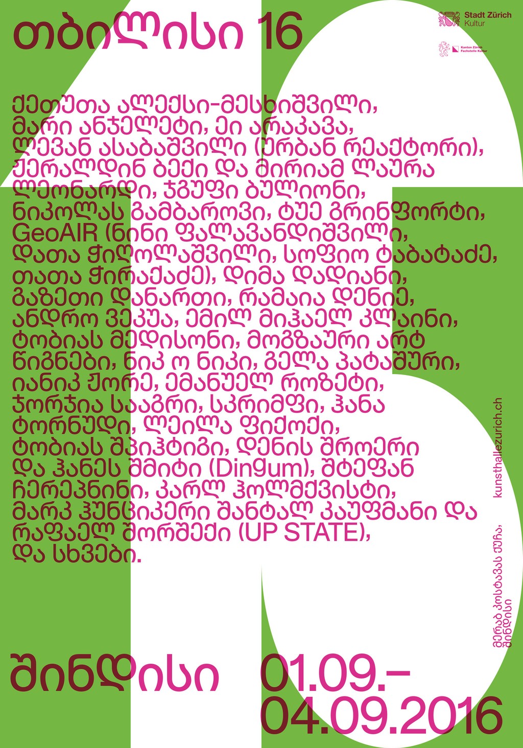
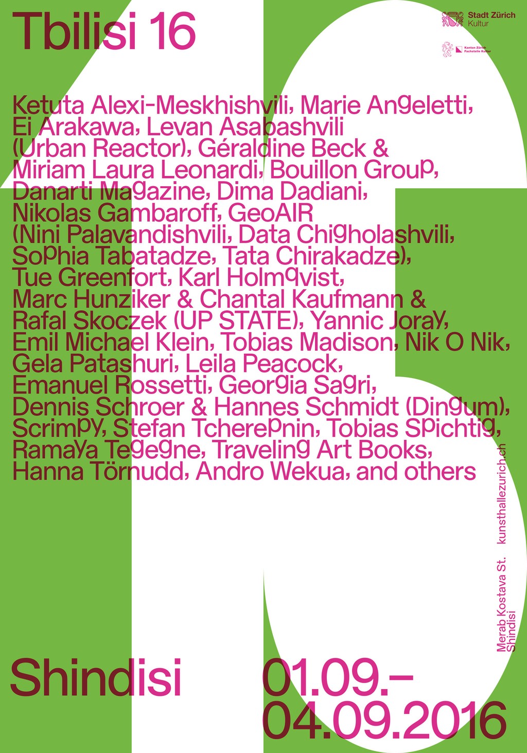
Dan Solbach picking posters up in Tbilisi, Georgia
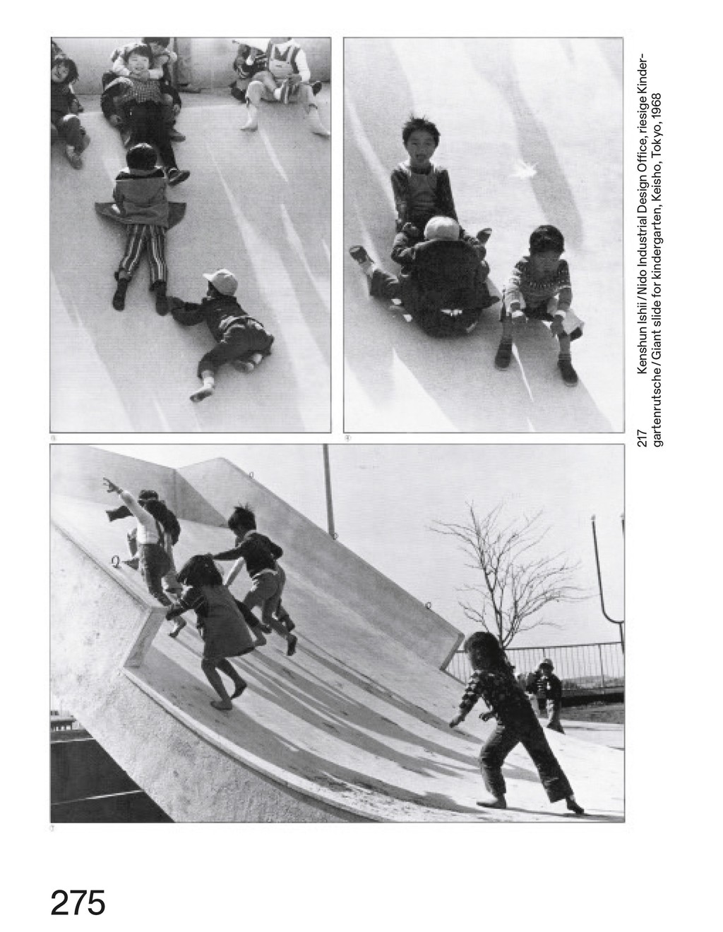
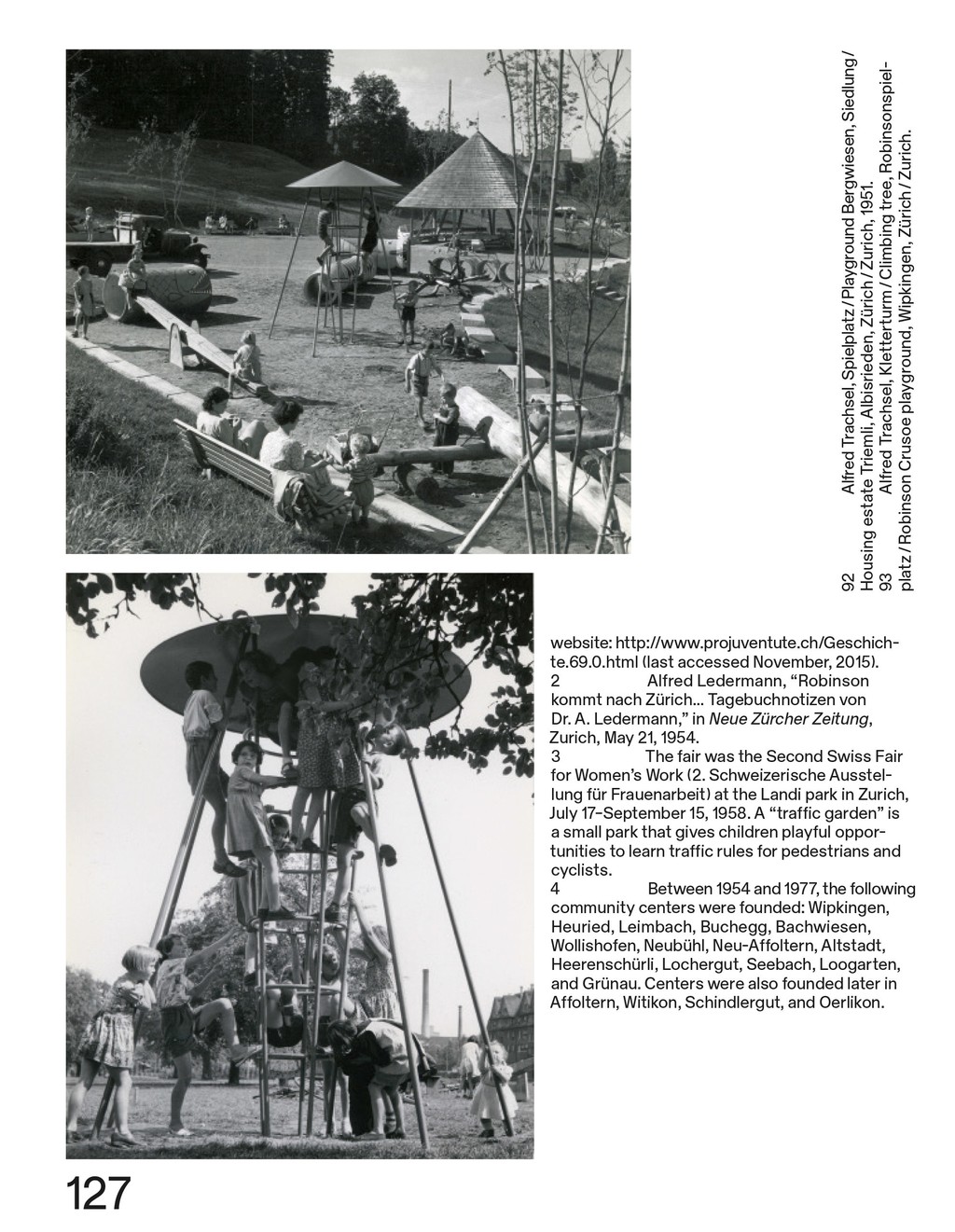
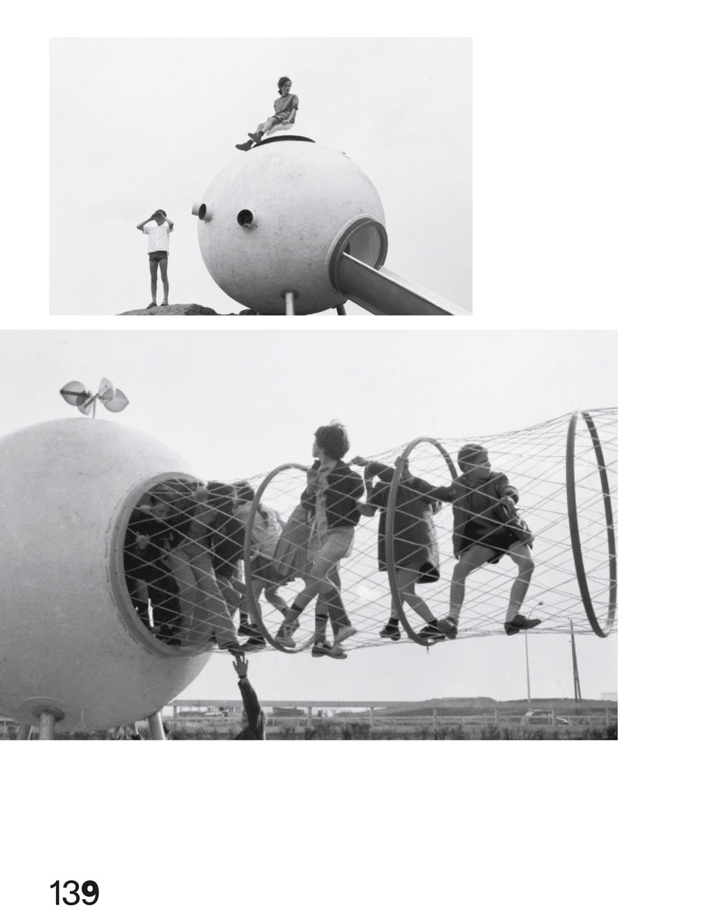
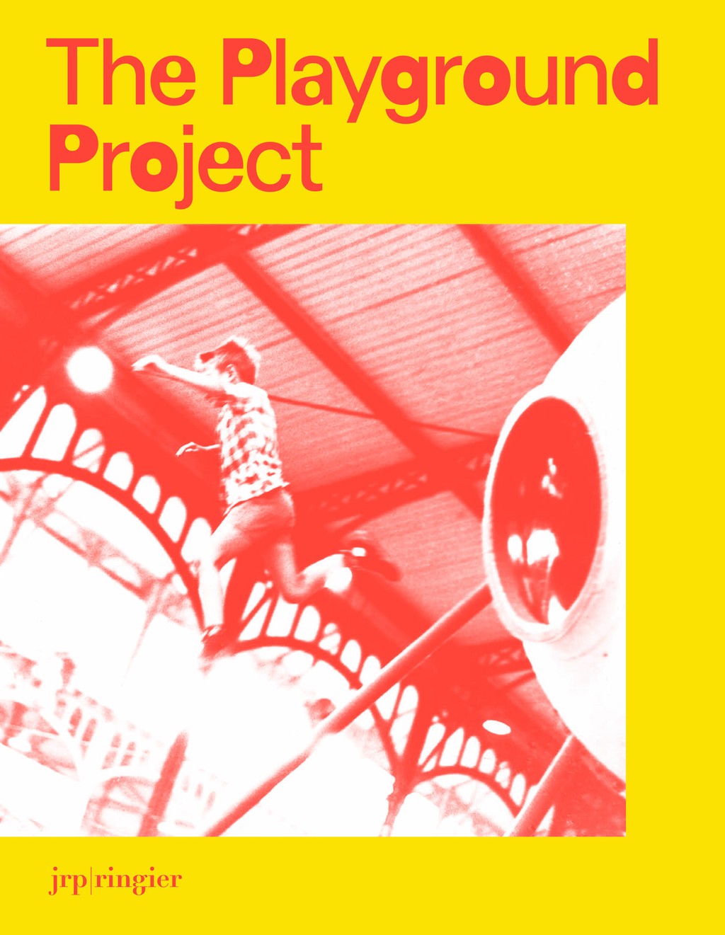
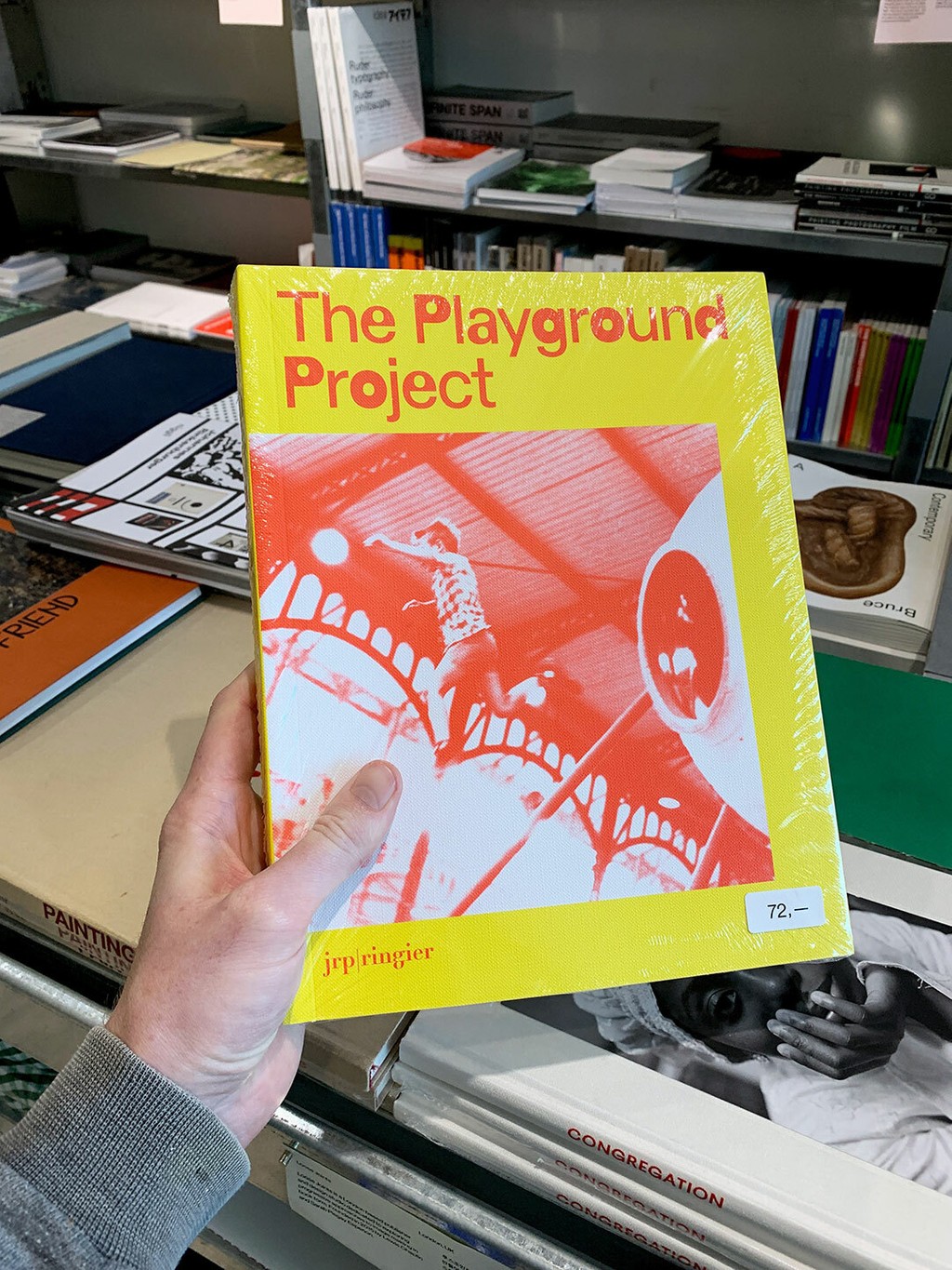
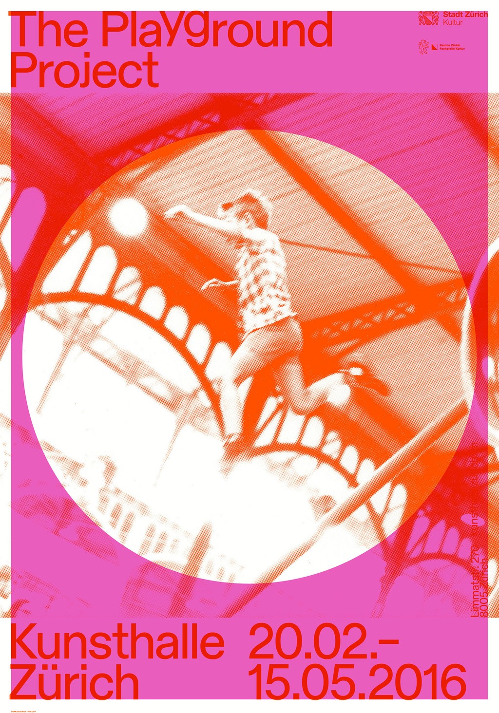
Stumbling across The Playground Project in Seoul’s finest bookstore, Post Poetics
Credits
Graphic Design: Dan Solbach
Web Development: Christoph Knoth
Type Design: Dinamo (Fabian Harb)
Photography: Dan Solbach, Daniel Baumann, Dinamo